Recraft Design System
Recraft's design system as a DESIGN.md file. Black #000000 canvas, ABC Gravity Condensed display, chartreuse #d2fc31 CTA, 19 components. For React and AI tools.
Add shadcn.io to your AI agent. · Pro It installs blocks, icons and templates in your design system from a prompt, with Pro.
Set up MCP- Primary
- #d2fc31
- Typeface
- Geist
- Shape
- Mixed
- Base radius
- 0px
- Colors
- 8
- Type tokens
- 15
- Components
- 19
- Spacing values
- 10
About
About Recraft DESIGN.md
Curated by Dov Azencot · Updated May 13, 2026 · Source recraft.ai (opens in a new tab)
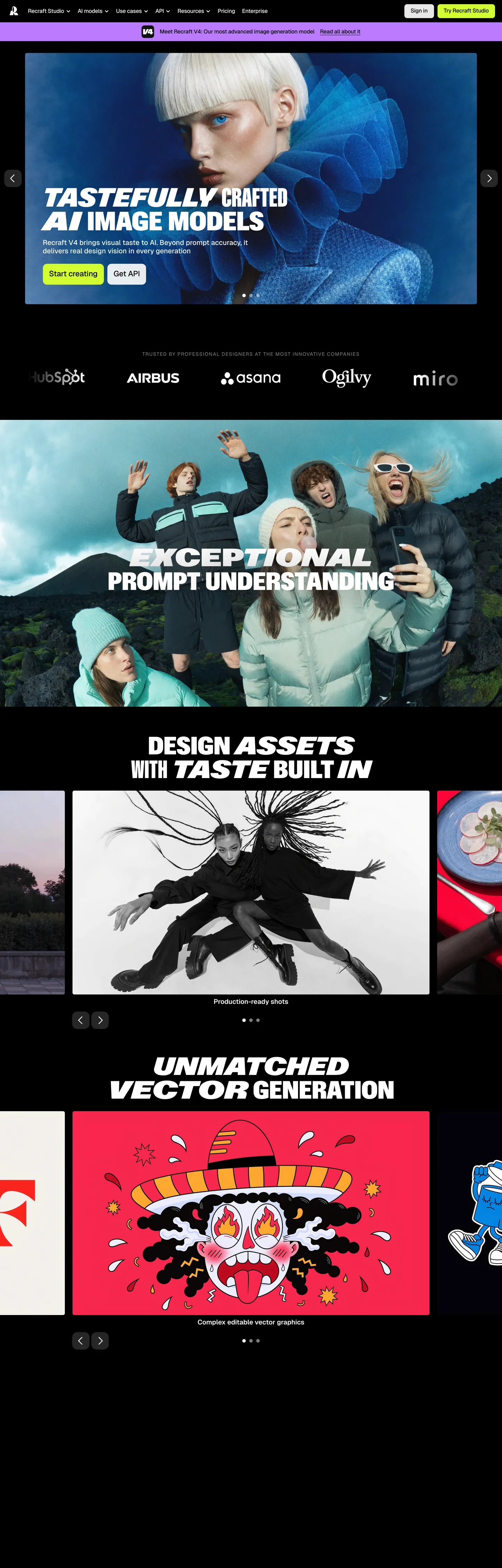
Recraft's marketing surface anchors on the most uncompromising canvas in the AI-image category — a pure "#000000" floor with "#ffffff" type, broken only by an editorial photography band and a chartreuse "#d2fc31" pill that says Try Recraft Studio. The brand voice is not a logo, not an accent color, and not a gradient field. It is the display face itself: ABC Gravity Condensed at weight 900, set in uppercase at 76px on the hero headline and 72px on every section opener, with a 68.4px line-height that pulls vertical metrics tight against the canvas. Where the AI-tool category defaults to humanist sans on a warm cream or a midnight gradient, Recraft commits to pure black and a display family with six tracked widths — Condensed, SemiCondensed, Compressed, Extended, Expanded Italic, and Normal Italic — each surfacing on a single section heading as a typographic flex.
This DESIGN.md packages that discipline into a machine-readable spec built on the Google Labs format. Inside: 8 colors tokens grouped into canvas (Black "#000000" at 1383 occurrences, White "#ffffff" at 238), structural ink (Electric Blue "#0000ee" at 200 — the system's hyperlink default, wired into the primary CTA's text and border), surface chrome (Soft Gray "#e4e4e4", Mid Gray "#707070"), and a brand triad (Chartreuse "#d2fc31", Violet "#bb7bff", Deep Violet "#6a3eff") used in single-digit counts. Sixteen typography tokens spanning Gravity at 72–76px down to Geist 10px at 1.5px tracking. A 5-tier radius scale dominated by 5px (127 declarations), a 10px-base spacing rhythm (104 declarations), and 19 components recipes from the chartreuse pill down to the customer-logo strip.
Drop the file into Claude, Cursor, or GitHub Copilot and the agent reproduces Recraft's discipline — black canvas, Gravity display, chartreuse-on-electric-blue CTA, 5px corners on everything — rather than a generic dark-AI theme. Or reference the tokens directly: every hex and tracking value is a quoted string ready for Tailwind config or CSS variables. The system is worth studying because it answers a hard category question with conviction: when the product output is generated imagery and vector artwork, the marketing chrome can be radically typographic and chromatically monastic. Where most AI-image brands lead with a glow gradient or example marquee, Recraft leads with a 76px headline in Gravity and a single yellow-green pill.
What makes it distinct
5
- Display face as voiceABC Gravity Condensed at weight 900 / 72–76px / uppercase carries every heading; six Gravity widths (Condensed, SemiCondensed, Compressed, Extended, Expanded, Normal) form the typographic identity
- Single chartreuse voltage#d2fc31 used twice on the entire page, both as the Try Recraft Studio pill fill with a #0000ee text + border pairing
- Binary canvas1383 of all colored declarations resolve to #000000 (text + border); the page never lifts to a charcoal surface tier
- 5px universal radius127 of 173 corner declarations land at 5px; cards, pills, inputs and tiles all share the same tight geometry
- Geist as body counterweightGeist 500 at 16px / 20.8px with negative tracking carries every paragraph and nav link below the display tier
recraft.ai
Live at recraft.ai
A snapshot of the brand in production. Scroll the frame to see the whole page.
Colors
8 colors
Recraft's system runs on #d2fc31 as its primary voltage, used in 2 of 19 components. Type is set in Geist across 15 tokens from 10px to 76px, weights 400–900. Shape language is mixed across 19 components, blending pills, soft rounds, and squarer corners.
Surface
Page and card backgrounds · 1
Text
Headlines, body, captions · 2
Borders & Hairlines
Dividers, outlines, rules · 1
Other
Specialty colors · 4
Typography
15 type tokens
Set in Geist across 15 tokens, from 10px to 76px, weights 400–900. Shown in its own stack: where the font isn't installed, the fallback the file names stands in.
- display-hero76px · weight 900 · lh 68.4px · tracking 0The quick brown fox jumps over the lazy dog
- display-h272px · weight 900 · lh 68.4px · tracking 0The quick brown fox jumps over the lazy dog
- display-expanded72px · weight 900 · lh 68.4px · tracking 0The quick brown fox jumps over the lazy dog
- display-extended72px · weight 900 · lh 68.4px · tracking 0The quick brown fox jumps over the lazy dog
- display-compressed76px · weight 900 · lh 68.4px · tracking 0The quick brown fox jumps over the lazy dog
- display-normal-italic76px · weight 900 · lh 68.4px · tracking 0The quick brown fox jumps over the lazy dog
- display-semicondensed24px · weight 900 · lh 28.8px · tracking 0The quick brown fox jumps over the lazy dog
- body-md16px · weight 500 · lh 20.8px · tracking -0.32pxThe quick brown fox jumps over the lazy dog
- body-md-regular16px · weight 400 · lh 19.2px · tracking 0The quick brown fox jumps over the lazy dog
- body-lg19px · weight 600 · lh 22.8px · tracking 0The quick brown fox jumps over the lazy dog
- body-emph22px · weight 500 · lh 28.6px · tracking -0.22pxThe quick brown fox jumps over the lazy dog
- label-md20px · weight 500 · lh 24px · tracking 0The quick brown fox jumps over the lazy dog
- label-sm-tracked14px · weight 500 · lh 16.8px · tracking 1.4pxThe quick brown fox jumps over the lazy dog
- micro-tracked10px · weight 500 · lh 12px · tracking 1.5pxThe quick brown fox jumps over the lazy dog
- button-md12px · weight 400 · lh 16px · tracking 0The quick brown fox jumps over the lazy dog
Layout
Radii and spacing
6 corner radii and 10 spacing values. Shape language: mixed.
Radii
- none0px
- chrome5px
- pill6px
- card8px
- tile15px
- ring50%
Spacing
- xxs2px
- xs4px
- sm5px
- md8px
- base10px
- lg12px
- xl20px
- 2xl40px
- 3xl60px
- 4xl120px
Components
19 components
Each rendered from its tokens (color, type, radius, padding) on Recraft's own canvas.
- Top Navtop-navTop Nav
- Hero Bandhero-bandHero Band
- Section Bandsection-bandSection Band
- Hero Headinghero-headingHero Heading
- Section Headingsection-headingSection Heading
- Italic Display Shoutitalic-display-shoutItalic Display Shout
- Body Paragraphbody-paragraphBody Paragraph
- Body Emphasisbody-emphasisBody Emphasis
- Button Primarybutton-primaryButton Primary
- Button Primary Hoverbutton-primary-hoverButton Primary Hover
- Nav Linknav-linkNav Link
- Customer Logo Stripcustomer-logo-stripCustomer Logo Strip
- Image Tileimage-tileImage Tile
- Violet Tileviolet-tileViolet Tile
- Violet Tile Deepviolet-tile-deepViolet Tile Deep
- Carousel Dotcarousel-dotCarousel Dot
- Carousel Dot Activecarousel-dot-activeCarousel Dot Active
- Caption Metacaption-metaCaption Meta
- Footer Bandfooter-bandFooter Band
In use
The system, in use
Recraft's tokens on the kind of product it builds.
Build something people actually use.
A short paragraph of marketing copy that previews how the brand's display tier and body tier read together. Two sentences is usually enough.
FAQ
Recraft design system FAQ
Common questions about Recraft's tokens, components, and how to use this DESIGN.md in your project.
Read next
Related reading
Specs, directories, and component libraries that pair with this design system.
- Browse all design systemsThe full directory of DESIGN.md files on shadcn.io, with live mockups for each.shadcn.io
- Recraft — official siteThe text-to-image and vector generation studio behind one of the most-used AI design platforms for designers and sellers.recraft.ai (opens in a new tab)
- The DESIGN.md specificationGoogle Labs' open spec for machine-readable design system files — the format this page is built on.github.com (opens in a new tab)
Use it
Use Recraft in your project
One machine-readable file. Drop it into Claude, Cursor, or any AI tool that reads DESIGN.md.
Download the DESIGN.md
One machine-readable file: every color, type, radius, spacing, and component token of Recraft.
Feed it to your AI tool
Drop it into Claude, Cursor, or GitHub Copilot. The agent writes React components and Tailwind classes that match Recraft's visual language.
Reference the tokens directly
Or paste the values into your Tailwind config, CSS variables, or component library: every color, size and radius is a quoted, ready-to-copy value.
Read the full DESIGN.md: overview, rationale, do’s and don’ts
Overview
Recraft's marketing surface is the most chromatically monastic page in the AI-image-tool category — a pure {colors.canvas} ("#000000") floor with {colors.on-canvas} ("#ffffff") type, broken only by editorial photography, two violet artwork tiles, and a single {colors.voltage} ("#d2fc31") pill that says Try Recraft Studio. There is no charcoal lift, no gradient atmosphere, no light-mode interlude. The hero is the wordmark "tastefully crafted AI image models" set in {typography.display-hero} — ABC Gravity Condensed at weight 900 / 76px / 68.4px leading / uppercase — against the black canvas, with a single chartreuse pill below it and a customer-logo strip beneath that.
Display face as voice: where most AI brands run a humanist sans for display and rely on chromatic accent to carry identity, Recraft commits to ABC Gravity at weight 900 across every section opener, and parades six different Gravity widths through the page — Condensed and SemiCondensed in the hero stack, Compressed and Extended on the typography showcase, Expanded Italic and Normal Italic as one-shot section heads. The brand voice is the type itself, not the colour.
Chartreuse-on-electric-blue scarcity: the page renders {colors.voltage} ("#d2fc31") exactly twice — both times on the same Try Recraft Studio pill — paired with {colors.electric-blue} ("#0000ee") text and a 1px border in the same blue. Where the convention in this category is to fill the primary CTA with a saturated violet or teal, Recraft pairs a 1990s magazine yellow-green against a default browser hyperlink blue. The pairing is deliberately unfashionable for an AI product and reads as a creative-tool signal, not an enterprise-AI signal.
Key Characteristics:
- Black
{colors.canvas}("#000000") at 1383 declarations carries the hero, every section, customer-logo strip, and footer. No charcoal tier exists. - ABC Gravity Condensed at weight 900 / 76px on the hero h1, 72px on every section h2 —
{typography.display-hero}and{typography.display-h2}. - Six Gravity widths declared: Condensed, SemiCondensed, Compressed, Extended Italic, Expanded Italic, Normal Italic. The font family ladder is the system's voice.
- Single chartreuse voltage
{colors.voltage}("#d2fc31") paired with{colors.electric-blue}("#0000ee") on the only chromatic CTA on the page. - 5px universal radius
{rounded.chrome}carries 127 of 173 corner declarations — cards, pills, image tiles, nav buttons all share it. - Geist
{typography.body-md}at weight 500 / 16px / 20.8px / -0.32px tracking is the workhorse body — every paragraph, every nav link. - Violet pair
{colors.violet-soft}("#bb7bff") and{colors.violet-deep}("#6a3eff") appears once each as artwork-tile fills, never as CTA or text. - Spacing rhythm anchors on 10px (104 declarations) and 20px (38 declarations) — a base-10 grid rather than the 4 or 8px base most current SaaS systems use.
Colors
Canvas & ink
- Canvas (
{colors.canvas}— "#000000") — frequency 1383. Used as text (687), border (687), background (9). The dominant tone on the page. Carries hero, every section band, the customer-logo strip, footer, and almost every typographic line ascolor: blackagainst the white sections inside photographic insets. - On Canvas (
{colors.on-canvas}— "#ffffff") — frequency 238. Used as text (106), border (106), background (26). The hero h1 fill, every section heading, body type, and the white card surfaces that appear once or twice as image-tile inserts.
Voltage
- Voltage (
{colors.voltage}— "#d2fc31") — frequency 2. Used as background (2). The chartreuse pill fill on the Try Recraft Studio CTA. Appears nowhere else on the page — no headline highlight, no footer accent, no hover state visible at extract time. - Electric Blue (
{colors.electric-blue}— "#0000ee") — frequency 200. Used as text (100), border (100). The default browser hyperlink colour, but here it is wired as the system's link voice and as the text + border pairing on the chartreuse CTA. Inverts the typical SaaS pattern where the link colour is a brand-tuned blue.
Surface chrome
- Hairline (
{colors.hairline}— "#e4e4e4") — frequency 15. Used as background (15). Pagination dots, the inactive states of carousel controls, and a small set of structural separators. The only non-monochrome neutral on the page. - Ink Muted (
{colors.ink-muted}— "#707070") — frequency 2. Used as text (1), border (1). Caption-tier copy below sample artwork, and a single hairline on the customer-logo strip.
Artwork tiles
- Violet Soft (
{colors.violet-soft}— "#bb7bff") — frequency 1. Used as background (1). Single artwork-tile fill behind one of the vector-generation samples. Never appears on chrome. - Violet Deep (
{colors.violet-deep}— "#6a3eff") — frequency 1. Used as background (1). The deeper counterpart of the violet pair, on a second artwork tile. Reserved for tile fills inside the showcase grid.
Typography
Font family
The system runs ABC Gravity in six declared widths — Condensed, SemiCondensed, Compressed, Extended Italic, Expanded Italic, Normal Italic — all at weight 900, all uppercase, on every headline role. Geist carries every paragraph, nav link, caption, and footer line at weights 400, 500, and 600 / 10–22px / mostly negative tracking. The split is binary: Gravity for shout, Geist for read.
The voice split is intentional:
- ABC Gravity (weight 900, uppercase, 68.4px leading) → h1, h2, italic display shouts, the typographic showcase grid
- Geist (weights 400–600, mixed-case) → body, navigation, captions, footer, micro-tracked labels
Hierarchy
| Token | Family | Size | Weight | Line Height | Letter Spacing | Use |
|---|---|---|---|---|---|---|
{typography.display-hero} | ABC Gravity Condensed | 76px | 900 | 68.4px | 0 | The hero h1 — "tastefully crafted AI image models" |
{typography.display-h2} | ABC Gravity Condensed | 72px | 900 | 68.4px | 0 | Every section opener — "exceptional prompt understanding", "design assets with taste built in" |
{typography.display-expanded} | ABC Gravity Expanded Italic | 72px | 900 | 68.4px | 0 | Italic shout variants on a small set of section heads |
{typography.display-extended} | ABC Gravity Extended Italic | 72px | 900 | 68.4px | 0 | Extended-width italic shout — paired with the Expanded variant on alternating section opens |
{typography.display-compressed} | ABC Gravity Compressed | 76px | 900 | 68.4px | 0 | The compressed-width hero variant — one-shot display flex |
{typography.display-normal-italic} | ABC Gravity Normal Italic | 76px | 900 | 68.4px | 0 | Normal-width italic — used once as a section flourish |
{typography.display-semicondensed} | ABC Gravity SemiCondensed | 24px | 900 | 28.8px | 0 | The smaller display tier — micro headings inside content tiles |
{typography.body-md} | Geist | 16px | 500 | 20.8px | -0.32px | The workhorse body — every paragraph, nav link, descriptive copy |
{typography.body-md-regular} | Geist | 16px | 400 | 19.2px | 0 | Plain body variant for footer legal and dense paragraph blocks |
{typography.body-lg} | Geist | 19px | 600 | 22.8px | 0 | Pull-quote tier — slightly larger body for highlighted statements |
{typography.body-emph} | Geist | 22px | 500 | 28.6px | -0.22px | Body emphasis at the largest non-display tier |
{typography.label-md} | Geist | 20px | 500 | 24px | 0 | Medium labels — one-shot subhead copy |
{typography.label-sm-tracked} | Geist | 14px | 500 | 16.8px | 1.4px | Tracked uppercase-style labels above the customer-logo strip |
{typography.micro-tracked} | Geist | 10px | 500 | 12px | 1.5px | The smallest text on the page — meta captions on sample-artwork tiles |
{typography.button-md} | Geist | 12px | 400 | 16px | 0 | The chartreuse pill's label and nav-link copy |
Principles
H1 and h2 always run at weight 900 — never 700 or 500 mid-display. The display-tier line-height (68.4px on 72–76px sizes) is intentionally tight, creating overlap between consecutive lines and pulling the shout into a poster-like block. Body line-height is the inverse — {typography.body-md} runs at 1.3 (20.8 / 16) with -0.32px tracking, generous for a 16px Geist setting. Switching the display to a humanist sans erases the brand voice; the Gravity-versus-Geist contrast IS the typographic system.
Substitutes
If ABC Gravity is unavailable, Antonio at weight 700+ is the closest open-source substitute for the Condensed and SemiCondensed widths — both are tall condensed sans with high-contrast strokes. Oswald at weight 600+ also works for Condensed roles. Anton is the closest match for the heaviest weight 900 cap. For Geist, Inter at the same weights is the cleanest swap — both are geometric-leaning sans built for screen reading at 12–22px.
Layout
Spacing system
- Base unit: 10px (104 declarations) — Recraft anchors on a base-10 grid rather than the 4 or 8px base most current SaaS systems use.
- Tokens:
{spacing.xxs}("2px") ·{spacing.xs}("4px") ·{spacing.sm}("5px") ·{spacing.md}("8px") ·{spacing.base}("10px") ·{spacing.lg}("12px") ·{spacing.xl}("20px") ·{spacing.2xl}("40px") ·{spacing.3xl}("60px") ·{spacing.4xl}("120px"). - Section padding:
{spacing.3xl}(60px) vertical between bands, with horizontal{spacing.4xl}(120px) gutters on the wide section bleeds. - Pill CTA padding: "18px 18px 20px" — an asymmetric vertical pad (top 18 / bottom 20) that drops the label into optical center against the Gravity hero above.
- Card internal padding:
{spacing.base}(10px) inside the artwork tiles;{spacing.xl}(20px) around the customer-logo strip and the carousel inserts.
Grid & container
- Hero composition: centered single column — the Gravity headline spans 800px wide, with the chartreuse pill stacked below and the customer-logo strip aligned beneath.
- Section grids: alternating photography-band and showcase-grid rhythm — every other section is a full-bleed photographic insert, and the in-between bands carry vector and design-asset showcases.
- Customer-logo strip: horizontal row of "Airbus", "Asana", "Ogilvy", "Miro" wordmarks in
{colors.on-canvas}against{colors.canvas}, set in{typography.label-sm-tracked}. - Sample-artwork tiles: rounded
{rounded.chrome}(5px) cards on{colors.canvas}with content variants on{colors.violet-soft}and{colors.violet-deep}fills.
Rhythm
The page anchors on 60px vertical section padding and 120px horizontal bleed — a luxury-magazine rhythm rather than a tight-card-grid SaaS rhythm. Headline hierarchy is binary — h1 at 76px and h2 at 72px share the same family and weight, with only a 4px size delta. There is no display ladder above 76px, and the only sub-display tier is {typography.display-semicondensed} at 24px.
Elevation & Depth
| Level | Treatment | Use |
|---|---|---|
| Flat | No shadow, no border | Hero band, body paragraphs, footer, every section background |
| Hairline | Bottom 1px {colors.hairline} ("#e4e4e4") | Customer-logo strip separator, carousel dot inactive state |
| Tile fill | {colors.violet-soft} or {colors.violet-deep} | Sample artwork tiles inside the vector-generation showcase |
| Voltage pill | {colors.voltage} fill + 1px {colors.electric-blue} border | The single chartreuse Try Recraft Studio CTA |
The elevation philosophy is flat-as-canvas — depth comes from photographic insets and from the typographic density of the Gravity headlines, never from CSS box-shadow. The page declares zero drop shadows in the extracted CSS — the entire surface reads as a stack of black bands with white type and an occasional violet or chartreuse tile inserted as a punctuation mark.
The violet pair ({colors.violet-soft} and {colors.violet-deep}) is the only deviation from the black canvas, and even then the tiles share the same 5px radius and flush-edge geometry as every other content block. There are no soft drop shadows, no hairline ladders, no surface lifts.
Shapes
Border radius scale
| Token | Value | Use |
|---|---|---|
{rounded.none} | "0px" | Section bands, body text containers, customer-logo strip — flat geometry on type content |
{rounded.chrome} | "5px" | The dominant radius — 127 of 173 corner declarations. Cards, pills, image tiles, nav controls. |
{rounded.pill} | "6px" | Tighter pill variant — 13 occurrences, used on smaller secondary buttons |
{rounded.card} | "8px" | The Try Recraft Studio pill specifically — 2 occurrences, the only 8px corner on the page |
{rounded.tile} | "15px" | Larger card surface for a small set of feature blocks |
{rounded.ring} | "50%" | Avatar bullets and carousel dot indicators — 12 occurrences |
There is no 4px or 12px tier on the marketing surface. The geometry is dominated by 5px (127 declarations) with 6px, 8px, and 15px appearing in single-digit and low-double-digit counts. The 5px discipline reads as a deliberate counter-positioning against the 16–24px soft-corner default that dominates SaaS marketing in this cycle.
Imagery & illustrations
The page leads with high-contrast editorial photography — a portrait of a model in a green wig against a blue field, a group photo with overlaid handwritten "EXCEPTIONAL PROMPT UNDERSTANDING" stencil, an inked black-and-white illustration in the design-assets showcase, and a Día de los Muertos-style vector skull against a magenta canvas in the vector-generation band. The photography reads as art-direction-led, not stock-led — every band is built around a single dominant image, not a grid of small thumbnails.
Components
Top navigation
{components.top-nav} — Black nav bar pinned to the top of the page. Background {colors.canvas} ("#000000"), text {colors.on-canvas}. Carries the Recraft wordmark at left, primary menu items at center, and the chartreuse Try Recraft Studio pill at right. Menu items in {typography.body-md} (Geist 16px / 500). Padding "20px", height "60px".
Hero & section bands
{components.hero-band} — The black hero anchored at top of every marketing page. Background {colors.canvas}, text {colors.on-canvas}. Centered single-column composition: ABC Gravity headline, chartreuse pill, customer-logo strip beneath.
{components.section-band} — Every subsequent section. Same black canvas, same white type, alternating with full-bleed photography insets. Padding "60px 0px".
{components.hero-heading} — The "tastefully crafted AI image models" h1. Type {typography.display-hero} (ABC Gravity Condensed 76px / 900 / 68.4px leading), color {colors.on-canvas}. Centered, ~800px wide, no margin above or below beyond the section padding.
{components.section-heading} — Every section h2. Type {typography.display-h2} (ABC Gravity Condensed 72px / 900), color {colors.on-canvas}. Used on "exceptional prompt understanding", "design assets with taste built in", "unmatched vector generation".
{components.italic-display-shout} — The italic variant of the section opener. Type {typography.display-expanded} (ABC Gravity Expanded Italic 72px / 900 / uppercase). Used as the contrasting italic stop on alternating section heads.
Body type
{components.body-paragraph} — Default running text. Type {typography.body-md} (Geist 16px / 500 / 20.8px leading / -0.32px tracking), color {colors.on-canvas}. Width caps at ~720px centered against the black canvas.
{components.body-emphasis} — Pull-quote-tier body. Type {typography.body-emph} (Geist 22px / 500 / 28.6px leading / -0.22px tracking), color {colors.on-canvas}. Used on the largest non-display body lines.
Buttons & links
{components.button-primary} — The signature chartreuse pill CTA. Background {colors.voltage} ("#d2fc31"), text {colors.electric-blue} ("#0000ee"), 1px border in {colors.electric-blue}, type {typography.button-md} (Geist 12px / 400), padding "18px 18px 20px", height "40px", rounded {rounded.card} (8px). The only chromatic CTA on the entire marketing surface.
{components.button-primary-hover} — Press state inferred from the static page. Same fill and border, opacity drops to "0.9". The exact hover delta is not extracted — see Known Gaps.
{components.nav-link} — Top-nav link items. Text {colors.electric-blue} ("#0000ee"), type {typography.button-md}, padding "0", height "40px". The link colour matches the default browser hyperlink — a deliberate stylistic choice rather than a brand-tuned blue.
Showcase grid & tiles
{components.customer-logo-strip} — Horizontal logo row showing "Airbus", "Asana", "Ogilvy", "Miro", "Mira" beneath the hero. Background {colors.canvas}, text {colors.on-canvas}, type {typography.label-sm-tracked} (Geist 14px / 500 / 1.4px tracking). Padding "20px 0px".
{components.image-tile} — A single full-bleed photographic insert. Background {colors.canvas}, rounded {rounded.chrome} (5px), no padding. Carries one editorial image per section.
{components.violet-tile} — Showcase tile with violet artwork backing. Background {colors.violet-soft} ("#bb7bff"), text {colors.on-canvas}, rounded {rounded.chrome} (5px), padding "10px".
{components.violet-tile-deep} — Deeper violet variant for the second artwork tile. Background {colors.violet-deep} ("#6a3eff"), same geometry and padding as the soft variant.
Carousel & meta
{components.carousel-dot} — Inactive pagination indicator. Background {colors.hairline} ("#e4e4e4"), rounded {rounded.ring} (50%), height "8px". Sits below the showcase carousel.
{components.carousel-dot-active} — Active state. Background {colors.on-canvas} ("#ffffff"), same ring geometry.
{components.caption-meta} — Caption-tier copy below sample artwork. Background transparent, text {colors.ink-muted} ("#707070"), type {typography.micro-tracked} (Geist 10px / 500 / 1.5px tracking). Padding "5px 0px".
Footer
{components.footer-band} — Black footer band that closes every page. Background {colors.canvas}, text {colors.on-canvas}, type {typography.body-md-regular} (Geist 16px / 400). Padding "40px 20px". Carries legal links and the secondary nav row.
Do's and Don'ts
Do
- Anchor every page on
{colors.canvas}("#000000"). A charcoal surface tier (any near-black above the pure floor) flattens the contrast and makes the chartreuse pill read as a muted accent rather than a single voltage point. - Render every headline in ABC Gravity at weight 900 / uppercase. Switching to weight 700 reads as the same family at a different stop; switching to a humanist sans erases the brand voice.
- Use
{colors.voltage}("#d2fc31") only on the primary CTA and only with{colors.electric-blue}("#0000ee") text. The two-color pairing IS the brand signal. - Apply
{rounded.chrome}(5px) on every chrome surface — cards, pills, image tiles, nav controls. A 12px or 16px radius reads as foreign. - Set body in Geist at weight 500 / 16px / -0.32px tracking. The negative tracking pulls the body into typographic conversation with the Gravity display above.
- Treat the violet pair (
{colors.violet-soft}and{colors.violet-deep}) as artwork backings only — never as CTA fills or section grounds.
Don't
- Don't pair the chartreuse pill with white or black text. The page declares
{colors.electric-blue}("#0000ee") for both the label and the 1px border — a default-hyperlink blue, deliberately chosen against the brand-tuned-blue convention. - Don't run an h1 above 76px on the marketing surface. The Gravity headline at 76px / 68.4px leading is the largest typographic object; a 96px or 120px headline would compete with the chartreuse pill rather than introduce it.
- Don't bold the Geist body. Body sits at weight 500 — bumping to 600 or 700 erases the negative-tracking signature and pushes Geist into a heavier register that fights the Gravity display.
- Don't apply drop shadows. The CSS declares no
--drop-shadowvariables and the page renders zero box-shadows; depth comes from the photographic insets and the typographic density only. - Don't use a 4px corner radius on cards. The system anchors on 5px (127 declarations) and the 1-pixel difference reads as off-grid.
- Don't widen the colour palette. The 8-token palette is the discipline; introducing a "brand teal" or "accent magenta" inverts the chromatic monasticism that positions Recraft against the rest of the AI-image category.
Known Gaps
- The actual Recraft Studio (prompt input, generation grid, vector editor, style controls) lives behind authentication and is not represented in this marketing-surface document.
- Hover states, focus rings, and the press-darker variant of the chartreuse pill are not extracted — the page uses interactivity that does not capture in a static snapshot.
- The violet pair (
{colors.violet-soft}and{colors.violet-deep}) appears once each as tile fills, so their broader ramp inside the product is inferred rather than observed. - Form validation, error states, and dark/light mode adaptations are out of scope — the page renders only one mode, and forms only appear in the sign-up funnel which was not captured at extraction time.
- The exact tracking on the ABC Gravity display tier is reported as "normal" in the extracted CSS — the brand may be running OpenType features (small caps, alternate widths) that do not surface in the computed letter-spacing value.
- The chartreuse-on-electric-blue pairing's exact contrast ratio (WCAG AA / AAA conformance) is not verified — the colour pairing is a brand-led choice and may require an accessible alternative for body-tier copy.
AI & LLM Platforms
More systems like this
More DESIGN.md files in AI & LLM Platforms.
Pricing
Build it with Pro
The DESIGN.md files are free. Pro adds 6,000+ blocks, premium templates and the MCP server, so your AI editor builds in your system for you.
4.9/5 out of 5 · 150+ reviewsfrom 150+ founders and developers.
Billing
Billed once a year in USD. Cancel anytime.
- How many people can use the license.
- Client work, SaaS products and anything you charge for.
- Production-ready React sections: hero, pricing, features, dashboards and more.
- Complete multi-page sites you can ship as they are.
- React icons from every major library, installable with one command.
- Presets that restyle every block, in light and dark.
- Lets your AI editor search, preview and install blocks for you.
- Priority requests are answered first.
Individual
For personal projects & open source
$32instead of $49/mo
$389 billed yearly
- Seats: 1 seat
- Commercial use: Personal & open source only
- Pro blocks: 6,000+ blocks
- Templates: All 14 templates
- React icons: 294k+ icons
- Themes: All 59 themes
- MCP server: Basic usage
- Support: Standard
Team
Most popularFor freelancers, agencies & startups
$66instead of $99/mo
$789 billed yearly · ≈ $13/dev/mo
- Seats: Up to 5 seats
- Commercial use: Included
- Pro blocks: 6,000+ blocks
- Templates: All 14 templates
- React icons: 294k+ icons
- Themes: All 59 themes
- MCP server: High usage
- Support: Priority
Organization
For companies with larger teams
$132instead of $199/mo
$1,589 billed yearly
- Seats: Unlimited seats
- Commercial use: Included
- Pro blocks: 6,000+ blocks
- Templates: All 14 templates
- React icons: 294k+ icons
- Themes: All 59 themes
- MCP server: Unlimited usage
- Support: Priority
Billed once a year in USD. Cancel anytime.
Individual
For personal projects & open source
$32instead of $49/mo
$389 billed yearly
- How many people can use the license.Seats: 1 seat
- Client work, SaaS products and anything you charge for.Commercial use: Personal & open source only
- Production-ready React sections: hero, pricing, features, dashboards and more.Pro blocks: 6,000+ blocks
- Complete multi-page sites you can ship as they are.Templates: All 14 templates
- React icons from every major library, installable with one command.React icons: 294k+ icons
- Presets that restyle every block, in light and dark.Themes: All 59 themes
- Lets your AI editor search, preview and install blocks for you.MCP server: Basic usage
- Priority requests are answered first.Support: Standard
Team
Most popularFor freelancers, agencies & startups
$66instead of $99/mo
$789 billed yearly · ≈ $13/dev/mo
Everything in Individual, plus
- How many people can use the license.Seats: Up to 5 seats
- Client work, SaaS products and anything you charge for.Commercial use: Included
- Lets your AI editor search, preview and install blocks for you.MCP server: High usage
- Priority requests are answered first.Support: Priority
Organization
For companies with larger teams
$132instead of $199/mo
$1,589 billed yearly
Everything in Team, plus
- How many people can use the license.Seats: Unlimited seats
- Lets your AI editor search, preview and install blocks for you.MCP server: Unlimited usage
- Secure checkout via Stripe
- Code lives in your repo
- Keep what you've shipped if you cancel
- License terms
Your system, built for you
Every block, template and icon, installed by your AI agent in your design system. The DESIGN.md files stay free.