Rare Beauty Design System
Rare Beauty's marketing design system: Ogg Regular serif headers in deep plum, Neue Hass Unica tracked-uppercase UI text, pill geometry, and earthy gradient illustration. Tokens for React, Next.js, and AI coding tools.
Add shadcn.io to your AI agent. · Pro It installs blocks, icons and templates in your design system from a prompt, with Pro.
Set up MCP- Primary
- #000000
- Typeface
- Neue Hass Unica Regular
- Shape
- Soft
- Base radius
- 0px
- Colors
- 14
- Type tokens
- 12
- Components
- 16
- Spacing values
- 7
About
About Rare Beauty DESIGN.md
Curated by Dov Azencot · Updated May 19, 2026 · Source rarebeauty.com (opens in a new tab)
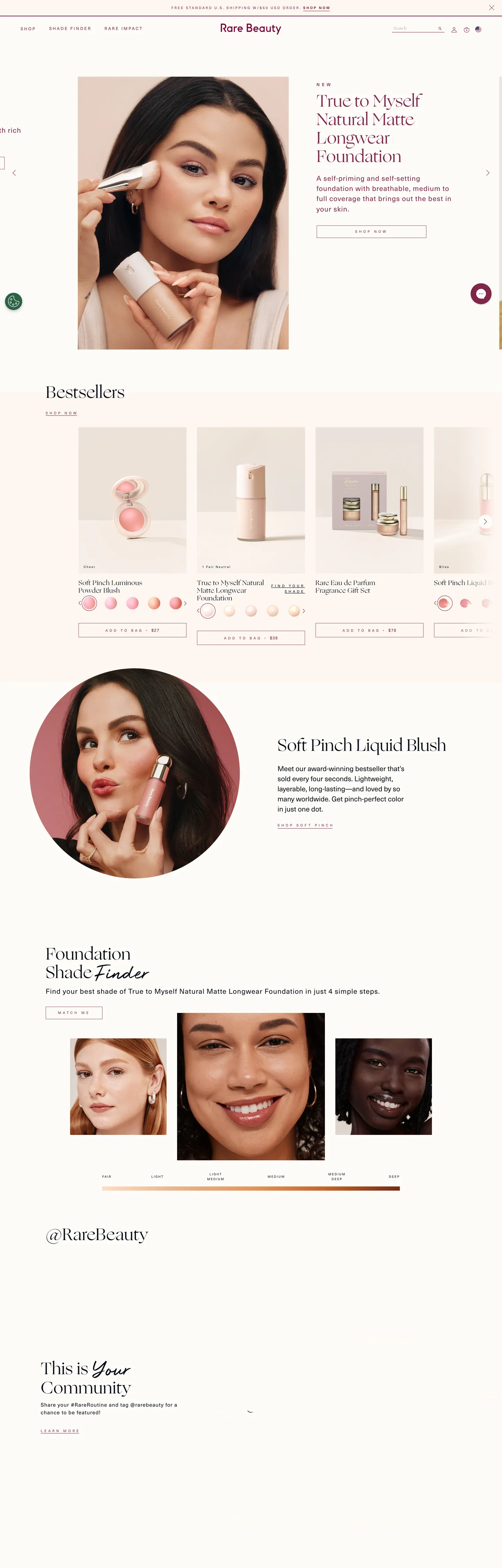
Rare Beauty's site opens on a full-bleed photograph of Selena Gomez holding the True to Myself Foundation, with the h2 headline set in Ogg Regular at 48px in deep plum — a serif typeface you would more likely find in Vogue than on a DTC makeup storefront. Below the photograph the page shifts to a product grid and editorial rails, all of it carrying that same serif for section titles while Neue Hass Unica handles every chip, button, and navigation label at 10-12px in tracked uppercase. The combination is not what the category convention is — most beauty brands (Charlotte Tilbury, NARS, Fenty) run a single geometric sans across both tiers. Where they flatten the display tier to a geometric sans and let photography carry personality, Rare Beauty inverts it and lets the typeface carry personality against the photography.
The DESIGN.md file packages the extracted system into a machine-readable spec for React and AI tools. Inside: 14 colors tokens organized around a single deep-plum voltage (#7f2549, 211 total occurrences as text and border), a near-black ink tone (#000914 at 768 occurrences), a warm-cream canvas tint (#fff7e7) used for subtle section backgrounds, and a set of earthy peach-terracotta gradient stops that exist only in decorative illustration. Twelve typography tokens span Ogg Regular at 18-48px for display and heading, Neue Hass Unica Regular/Medium at 9-20px with letter-spacing 1-6.4px for UI, and the proprietary Rare Script at 48px for brand logotype moments. Two radius values — 50% circles and 100px pills — define the entire shape language. Sixteen component definitions cover the full-bleed hero, editorial product card, outline CTA button, nav link chip, and text input.
Feed this file to Claude or Cursor to reproduce Rare Beauty's specific moves: an Ogg serif display tier for headings (substitute Freight Display or Cormorant Garamond), tracked-uppercase Neue Hass Unica for all UI chrome (substitute Inter at 400 with manual letter-spacing), deep plum as the single brand voltage for text and borders, and full-pill geometry everywhere. The one disciplined move worth studying is the absence of any brand-colored fill — the brand color appears only as text and outline, never as a button background or section surface. The canvas stays white; the plum carries the brand through type alone.
What makes it distinct
5
- Serif display in e-commerceOgg Regular at 48px carries every h2/h3, the only beauty site in the directory with an editorial serif headline tier
- Tracked uppercase as UI voiceNeue Hass Unica at 10-12px / 3-5px letter-spacing runs every button, nav link, and label, giving the chrome a fashion-editorial feel
- Deep plum voltagethe brand's near-burgundy #7f2549 appears 211 times as both text and border, driving every headline and interactive element against the white canvas
- Pill-only radiusthe system uses 50% circles and 100px pills exclusively; there is no 4-8px card rounding anywhere on the page
- No solid brand fillthe primary button and nav links are text-only or outline; the only background color is pure white, with peach-terracotta appearing only in gradient illustrations
rarebeauty.com
Live at rarebeauty.com
A snapshot of the brand in production. Scroll the frame to see the whole page.
Colors
14 colors
Rare Beauty's system anchors on #000000 (ink-true) as its primary color. Type is set in Neue Hass Unica Regular across 12 tokens from 9px to 48px, weights 400–500. Shape language is soft — components average 57px corner radius, with no sharp interactive edges.
Brand & Accent
Sparing, CTA-only voltage · 2
Surface
Page and card backgrounds · 2
Text
Headlines, body, captions · 3
Borders & Hairlines
Dividers, outlines, rules · 1
Other
Specialty colors · 6
Typography
12 type tokens
Set in Neue Hass Unica Regular across 12 tokens, from 9px to 48px, weights 400–500. Shown in its own stack: where the font isn't installed, the fallback the file names stands in.
- display-xl48px · weight 400 · lh 53pxThe quick brown fox jumps over the lazy dog
- display-md19px · weight 400 · lh 22px · tracking 0.5pxThe quick brown fox jumps over the lazy dog
- display-sm18px · weight 400 · lh 20.7pxThe quick brown fox jumps over the lazy dog
- brand-script48px · weight 400 · lh 79pxThe quick brown fox jumps over the lazy dog
- label-lg20px · weight 400 · lh 29px · tracking 1pxThe quick brown fox jumps over the lazy dog
- body-md15px · weight 400 · lh 22px · tracking 1pxThe quick brown fox jumps over the lazy dog
- nav-link12px · weight 400 · lh 15px · tracking 3pxThe quick brown fox jumps over the lazy dog
- label-caps12px · weight 400 · lh 23px · tracking 1pxThe quick brown fox jumps over the lazy dog
- button-md10px · weight 400 · lh 18px · tracking 5pxThe quick brown fox jumps over the lazy dog
- caption11px · weight 400 · lh 18.04px · tracking 1.5pxThe quick brown fox jumps over the lazy dog
- meta-sm9px · weight 400 · lh 14px · tracking 2pxThe quick brown fox jumps over the lazy dog
- section-label12px · weight 500 · lh 20.04px · tracking 2.5pxThe quick brown fox jumps over the lazy dog
Layout
Radii and spacing
3 corner radii and 7 spacing values. Shape language: soft.
Radii
- none0px
- pill100px
- full50%
Spacing
- xxs2px
- xs5px
- sm8px
- md10px
- base16px
- lg21px
- xl23px
Components
16 components
Each rendered from its tokens (color, type, radius, padding) on Rare Beauty's own canvas.
- Hero Sectionhero-sectionHero Section
- Hero Headinghero-headingHero Heading
- Body Paragraphbody-paragraphBody Paragraph
- Section Headingsection-headingSection Heading
- Brand Logotypebrand-logotypeBrand Logotype
- Button Primarybutton-primaryButton Primary
- Button Primary Hoverbutton-primary-hoverButton Primary Hover
- Button Secondarybutton-secondaryButton Secondary
- Top Navtop-navTop Nav
- Nav Linknav-linkNav Link
- CardcardCard
- Product Titleproduct-titleProduct Title
- Section Labelsection-labelSection Label
- Type here…text-inputText Input
- CaptioncaptionCaption
- Color Swatchcolor-swatchColor Swatch
In use
The system, in use
Rare Beauty's tokens on the kind of product it builds.
Build something people actually use.
A short paragraph of marketing copy that previews how the brand's display tier and body tier read together. Two sentences is usually enough.
FAQ
Rare Beauty design system FAQ
Common questions about Rare Beauty's tokens, components, and how to use this DESIGN.md in your project.
Read next
Related reading
Specs, directories, and component libraries that pair with this design system.
- Browse all design systemsThe full directory of DESIGN.md files on shadcn.io, with live mockups for each.shadcn.io
- Rare Beauty — official siteRare Beauty's public marketing site — the source of truth for the live tokens captured in this file.rarebeauty.com (opens in a new tab)
- The DESIGN.md specificationGoogle Labs' open spec for machine-readable design system files — the format this page is built on.github.com (opens in a new tab)
Use it
Use Rare Beauty in your project
One machine-readable file. Drop it into Claude, Cursor, or any AI tool that reads DESIGN.md.
Download the DESIGN.md
One machine-readable file: every color, type, radius, spacing, and component token of Rare Beauty.
Feed it to your AI tool
Drop it into Claude, Cursor, or GitHub Copilot. The agent writes React components and Tailwind classes that match Rare Beauty's visual language.
Reference the tokens directly
Or paste the values into your Tailwind config, CSS variables, or component library: every color, size and radius is a quoted, ready-to-copy value.
Read the full DESIGN.md: overview, rationale, do’s and don’ts
Overview
Rare Beauty's site does something uncommon in beauty e-commerce. Serif as the brand voice: the h2 and h3 display tier runs Ogg Regular — a humanist serif from OH no Type Co — at 48px in deep plum, the same typeface used for editorial fashion spreads in print. Where Charlotte Tilbury, NARS, and Fenty reach for geometric sans-serifs at the display tier and let the photography carry all warmth, Rare Beauty lets the typeface itself signal warmth, softness, and editorial authority. The result is a page where the headline is doing as much brand work as the product photography beside it.
The supporting voice is Neue Hass Unica, handled entirely in tracked uppercase at small sizes. Buttons run 10px with 5px letter-spacing; navigation links run 12px with 3px letter-spacing; section labels run 12px with 2.5px letter-spacing. This is not a conventional "small text is just smaller" approach — it's a deliberate fashion-editorial treatment that turns every UI label into a caption.
Tracked-uppercase restraint: the deep-plum voltage (#7f2549) appears 211 times across the page but never as a background fill. It lives only in text and borders — headlines, nav links, the search input, and product callouts. The canvas stays white throughout; the brand communicates entirely through type color and outline, not fill.
Key Characteristics:
- Deep plum (#7f2549) carries 211 page elements as text and border exclusively — zero background-fill occurrences.
- Ogg Regular at 48px for display headlines: the only beauty brand in the directory with an editorial serif at the h2/h3 tier.
- Neue Hass Unica at 9-12px with 1-6.4px letter-spacing uppercase for all UI chrome — buttons, nav, labels, captions.
- Two radius values only: 50% circle (105 occurrences on swatches and icon buttons) and 100px pill (on CTA buttons and search input).
- Earthy peach-to-terracotta gradient (#ffdcc6 → #732a18) appears only in decorative illustration, not in any UI surface.
- Rare Script proprietary logotype at 48px for brand wordmark moments — no open-source substitute.
- Pure-white canvas throughout: no grey tints, no section fills, no surface gradients on the page body.
Colors
Brand Voltage
- Plum (
{colors.plum}— #7f2549): frequency 211. Used as text (106), border (105). The brand's single chromatic moment — drives every display headline, nav link, search input, and product callout. Never appears as a background fill; the plum communicates entirely through type and outline.
Structural
- Ink (
{colors.ink}— #000914): frequency 768. Used as text (384), border (384). The dominant text and structural border tone — a very slightly warm near-black (the blue hue channel at 9/255 gives it a trace of depth). Body paragraphs, product names, and most hairline dividers run this color. - Ink True (
{colors.ink-true}— #000000): frequency 726. Used as text (362), border (362), shadow (2). The secondary near-black — pure black used on some button borders and structural elements. Wired as--rc-active-color. - Ink Mid (
{colors.ink-mid}— #464545): frequency 94. Used as text (47), border (47). A medium charcoal for secondary labels and non-primary structural chrome. - Canvas (
{colors.canvas}— #ffffff): the page floor. Pure white runs the full body — no warm tint, no grey wash. - Surface Warm (
{colors.surface-warm}— #fff7e7): frequency 51. Used as text (20), bg (11), border (20). A warm cream clustered from several near-white values. Appears on subtle section-background bands and card hover states. - Hairline (
{colors.hairline}— #efefef): wired as--rc-active-bg. Declared but frequency zero in the captured render — the system's background treatment for active/focus UI states.
Gradient Illustration (illustration only — never UI chrome)
- Peach Light (
{colors.gradient-peach-light}— #ffdcc6): gradient only (1 occurrence). The pale warm peach at the top of the brand's earthy skin-tone gradient. - Peach Mid (
{colors.gradient-peach-mid}— #ebb288): gradient only. Medium peach — the warm mid-stop. - Terracotta Light (
{colors.gradient-terracotta-light}— #e5955b): gradient only. A warm terracotta-orange mid-stop. - Terracotta Mid (
{colors.gradient-terracotta-mid}— #c86128): gradient only. Deep warm rust. - Terracotta Dark (
{colors.gradient-terracotta-dark}— #732a18): gradient only. The deep terracotta anchor of the illustration gradient. - Accent Sky (
{colors.accent-sky}— #6aaae4): bg only (1 occurrence). A sky-blue used on a single product image background — not part of the UI system. - Accent Periwinkle (
{colors.accent-periwinkle}— #6699cc): bg only (1 occurrence). A periwinkle used on a second product image background — not UI.
Typography
Font Families
The system runs three families. Ogg Regular (OH no Type Co) handles every display surface — the 48px h2/h3 product headlines, the 19px editorial sub-heads, and notably the 30px search input field, so even the search box inherits the serif's warmth. Neue Hass Unica (Linotype, in Regular and Medium weights) handles all UI chrome — buttons at 10px/5px tracking, nav links at 12px/3px tracking, section labels at 12px/2.5px tracking, and captions down to 9px/2px tracking. Rare Script (proprietary) appears at 48px for logotype wordmark moments in section headers — it is the cursive signature that pairs with the Rare Beauty brand mark.
Hierarchy
| Token | Family | Size | Weight | Tracking | Use |
|---|---|---|---|---|---|
{typography.display-xl} | Ogg Regular | 48px | 400 | 0 | h2/h3 product headlines |
{typography.display-md} | Ogg Regular | 19px | 400 | 0.5px | Sub-section titles |
{typography.display-sm} | Ogg Regular | 18px | 400 | 0 | Labels on forms |
{typography.brand-script} | Rare Script | 48px | 400 | 0 | Brand logotype moments |
{typography.label-lg} | Neue Hass Unica | 20px | 400 | 1px | Body lead paragraphs |
{typography.body-md} | Neue Hass Unica | 15px | 400 | 1px | Running body text |
{typography.nav-link} | Neue Hass Unica | 12px | 400 | 3px | Top-nav links (uppercase) |
{typography.label-caps} | Neue Hass Unica | 12px | 400 | 1px | Product category labels |
{typography.button-md} | Neue Hass Unica | 10px | 400 | 5px | CTA button text (uppercase) |
{typography.caption} | Neue Hass Unica | 11px | 400 | 1.5px | Link captions |
{typography.meta-sm} | Neue Hass Unica | 9px | 400 | 2px | Small metadata |
{typography.section-label} | Neue Hass Unica Medium | 12px | 500 | 2.5px | Section headers (uppercase) |
Note on Font Substitutes
Ogg Regular is licensed. Cormorant Garamond at weight 300 transfers the spindly humanist feel at display sizes; Freight Display Pro at weight book is another close match. For Neue Hass Unica, Inter at 400 with manual letter-spacing: 0.2-0.4em reproduces the tracked-uppercase UI voice. There is no close open-source match for Rare Script; Parisienne or Great Vibes (Google Fonts) share the loose script quality.
Layout
Spacing System
- Base unit: 5px appears 106 times — unusually, the system's smallest repeated unit is 5px rather than 4px or 8px.
- Tokens:
{spacing.xxs}2px ·{spacing.xs}5px ·{spacing.sm}8px ·{spacing.md}10px ·{spacing.base}16px ·{spacing.lg}21px ·{spacing.xl}23px. - Button padding:
{spacing.xs}5px vertical,{spacing.xl}~34px horizontal — produces a tall, narrow-padded pill button. - Section vertical rhythm: variable, driven by photography breakpoints rather than a fixed grid cadence.
Grid & Container
- Hero: full-width editorial photograph, text overlaid or beside in a two-column split at desktop.
- Product grid: a 4-column carousel/grid of product cards below the hero.
- Editorial rails: alternating full-width image sections with a centered text column.
- The site captures a mobile-first layout at 375px width; the desktop container is ~1440px.
Rhythm
The page alternates between photography-led (full-bleed or half-bleed hero sections) and grid-led (product card carousels and 3-up editorial panels). Section breaks use warm-cream (#fff7e7) tinted backgrounds to signal category shifts rather than structural dividers.
Elevation
The system has essentially no shadow tier. One shadow value is noted in the extracted color data (#000000 with shadow usage 2), but it is confined to micro-elevation on floating UI elements. Cards have no shadow; the product grid cards sit flush on the white canvas with hairline borders providing the only depth signal.
Shapes
The radius scale is binary: full circles and full pills, with nothing in between.
{rounded.none}0px — all card and section edges. The grid cards are sharp-cornered rectangles.{rounded.pill}100px — the primary CTA button and the search input field. The pill reads warm and tappable against the flat grid.{rounded.full}50% — color swatches and circular icon buttons throughout the product pages.
There is no 4px, 8px, or 16px middle tier. A developer importing a card-radius from another system will get sharp corners or a full pill; there is no conventional "rounded card" option here.
Components
hero-section — White canvas, deep-plum {colors.plum} headline in Ogg at 48px. Full-width photography carries the visual weight; text sits beside or overlaid at desktop.
hero-heading — Deep-plum {colors.plum} Ogg Regular at {typography.display-xl}, zero padding. The system's loudest typographic moment.
button-primary — White fill, ink {colors.ink} text in tracked-uppercase {typography.button-md} (10px / 5px tracking), 100px pill {rounded.pill}, 7px vertical / 34px horizontal padding. The canonical CTA: "Shop Now" / "Add to Bag".
button-primary-hover — Inverts to ink-fill {colors.ink} / white text — a fill swap with no border change.
button-secondary — Transparent fill, deep-plum {colors.plum} text and border, same pill geometry. Used for secondary editorial CTAs.
top-nav — White surface, deep-plum nav links in tracked-uppercase {typography.nav-link} (12px / 3px tracking), 48px height, sharp corners.
nav-link — Transparent background, deep-plum text, 12px / 3px tracking uppercase. Padding 0px baseline with 6px horizontal margin.
card — White surface, ink text, sharp corners, 16px top padding. No shadow. Product cards carry a product image, name in Ogg Regular, shade chips in full-circle swatches, and a price in Neue Hass Unica.
product-title — Ogg Regular at {typography.display-md} (19px / 400), ink text.
section-label — Neue Hass Unica Medium at {typography.section-label} (12px / 500 / 2.5px uppercase tracking), ink text. Heads editorial content sections.
text-input — White fill, plum text in Ogg Regular at 30px (the search input uses the serif typeface — unusual for a form field), 100px pill, 7px top / 18px horizontal padding, 54px height, ink border.
caption — Neue Hass Unica 11px / 1.5px tracking, ink text, transparent background. Below product swatches and image attributions.
color-swatch — Transparent fill, 50% full-circle radius, 24px height. Product shade selector chips.
brand-logotype — Rare Script at {typography.brand-script} (48px / 400), plum text. Reserved for editorial section headers where the brand name appears in the custom cursive signature.
body-paragraph — Neue Hass Unica at {typography.label-lg} (20px / 400 / 1px tracking), ink text. Lead body copy in editorial rails.
Do's and Don'ts
Do use {colors.plum} (#7f2549) for text and borders only. The plum never fills a background — applying it as a button background or section fill breaks the brand's deliberate "type-only voltage" approach.
Do keep the display tier in Ogg Regular. Swapping to a sans-serif for headlines destroys the brand's distinguishing move — the entire editorial authority of the page depends on the serif at 48px contrasting with the tracked-uppercase sans UI chrome.
Do set every button and nav label in tracked uppercase at 10-12px / 3-5px letter-spacing. The compression and tracking together are the fashion-editorial signal; removing either makes the UI chrome indistinguishable from any generic DTC brand.
Do maintain full-pill geometry for interactive buttons and inputs. The 100px radius is the brand's "warmth signal" on an otherwise sharp-cornered card grid.
Don't use the gradient stops ({colors.gradient-peach-light} through {colors.gradient-terracotta-dark}) in UI chrome. These five values are illustration-only — using them as button fills or card backgrounds reads as a branding conflict with the monochromatic plum-on-white system.
Don't add card shadows or card-radius rounding. The grid cards are intentionally sharp-cornered and shadow-free; adding a 4-8px radius or a drop shadow would make the product grid read like a generic Shopify theme rather than the editorial grid the brand uses.
Don't introduce grey canvas tints for section backgrounds. The warm-cream {colors.surface-warm} (#fff7e7) is the only permitted section tint — a neutral light grey cuts against the warmth the system's typography communicates.
Don't use the search input's Ogg Regular typeface anywhere outside the search field. The serif-in-input move is a deliberate brand signature for one specific surface; repeating it on other inputs (email, address, quantity) undermines the scarcity of the gesture.
Known Gaps
- Hover and focus states: only
{component.button-primary-hover}is documented; the full state matrix (focus rings on inputs, active tab states, disabled button opacity) is not captured from the marketing surface. - Dark mode: the marketing site is light-only. No dark-mode variant is exposed or hinted at in the extracted CSS custom properties.
- Mobile navigation: the desktop nav (full horizontal) collapses to a hamburger on mobile but the mobile drawer structure and typography are not captured in the extracted data.
- Product page surfaces: this file captures the marketing homepage and editorial rails only. The full product detail page, cart drawer, and checkout flow carry their own component instances not represented here.
- Animation: the carousel auto-advance, swatch hover transitions, and product image fade have no captured easing or duration values.
- Accessibility states: focus ring color, skip-link appearance, and ARIA-announced states are not represented in the extracted token set.
- Third-party widgets: the loyalty program modal and product quiz overlays use third-party components whose styling is not captured in the page extraction.
E-commerce & Retail
More systems like this
More DESIGN.md files in E-commerce & Retail.
Pricing
Build it with Pro
The DESIGN.md files are free. Pro adds 6,000+ blocks, premium templates and the MCP server, so your AI editor builds in your system for you.
4.9/5 out of 5 · 150+ reviewsfrom 150+ founders and developers.
Billing
Billed once a year in USD. Cancel anytime.
- How many people can use the license.
- Client work, SaaS products and anything you charge for.
- Production-ready React sections: hero, pricing, features, dashboards and more.
- Complete multi-page sites you can ship as they are.
- React icons from every major library, installable with one command.
- Presets that restyle every block, in light and dark.
- Lets your AI editor search, preview and install blocks for you.
- Priority requests are answered first.
Individual
For personal projects & open source
$32instead of $49/mo
$389 billed yearly
- Seats: 1 seat
- Commercial use: Personal & open source only
- Pro blocks: 6,000+ blocks
- Templates: All 14 templates
- React icons: 294k+ icons
- Themes: All 59 themes
- MCP server: Basic usage
- Support: Standard
Team
Most popularFor freelancers, agencies & startups
$66instead of $99/mo
$789 billed yearly · ≈ $13/dev/mo
- Seats: Up to 5 seats
- Commercial use: Included
- Pro blocks: 6,000+ blocks
- Templates: All 14 templates
- React icons: 294k+ icons
- Themes: All 59 themes
- MCP server: High usage
- Support: Priority
Organization
For companies with larger teams
$132instead of $199/mo
$1,589 billed yearly
- Seats: Unlimited seats
- Commercial use: Included
- Pro blocks: 6,000+ blocks
- Templates: All 14 templates
- React icons: 294k+ icons
- Themes: All 59 themes
- MCP server: Unlimited usage
- Support: Priority
Billed once a year in USD. Cancel anytime.
Individual
For personal projects & open source
$32instead of $49/mo
$389 billed yearly
- How many people can use the license.Seats: 1 seat
- Client work, SaaS products and anything you charge for.Commercial use: Personal & open source only
- Production-ready React sections: hero, pricing, features, dashboards and more.Pro blocks: 6,000+ blocks
- Complete multi-page sites you can ship as they are.Templates: All 14 templates
- React icons from every major library, installable with one command.React icons: 294k+ icons
- Presets that restyle every block, in light and dark.Themes: All 59 themes
- Lets your AI editor search, preview and install blocks for you.MCP server: Basic usage
- Priority requests are answered first.Support: Standard
Team
Most popularFor freelancers, agencies & startups
$66instead of $99/mo
$789 billed yearly · ≈ $13/dev/mo
Everything in Individual, plus
- How many people can use the license.Seats: Up to 5 seats
- Client work, SaaS products and anything you charge for.Commercial use: Included
- Lets your AI editor search, preview and install blocks for you.MCP server: High usage
- Priority requests are answered first.Support: Priority
Organization
For companies with larger teams
$132instead of $199/mo
$1,589 billed yearly
Everything in Team, plus
- How many people can use the license.Seats: Unlimited seats
- Lets your AI editor search, preview and install blocks for you.MCP server: Unlimited usage
- Secure checkout via Stripe
- Code lives in your repo
- Keep what you've shipped if you cancel
- License terms
Your system, built for you
Every block, template and icon, installed by your AI agent in your design system. The DESIGN.md files stay free.