Skip to content

ProPublica Design System

ProPublica's investigative-news design system. Feature Headline serif display, Brut Grotesque grotesque chrome, salmon-red donate CTA on warm-black neutral palette. Tokens for React, Next.js, and AI coding tools.

Add shadcn.io to your AI agent. · Pro It installs blocks, icons and templates in your design system from a prompt, with Pro.

Set up MCP
Primary
#ff4c3c
Typeface
Brut Grotesque
Shape
Soft
Base radius
4px
Colors
12
Type tokens
13
Components
14
Spacing values
8

About

About ProPublica DESIGN.md

Curated by Dov Azencot · Updated May 19, 2026 · Source propublica.org (opens in a new tab)

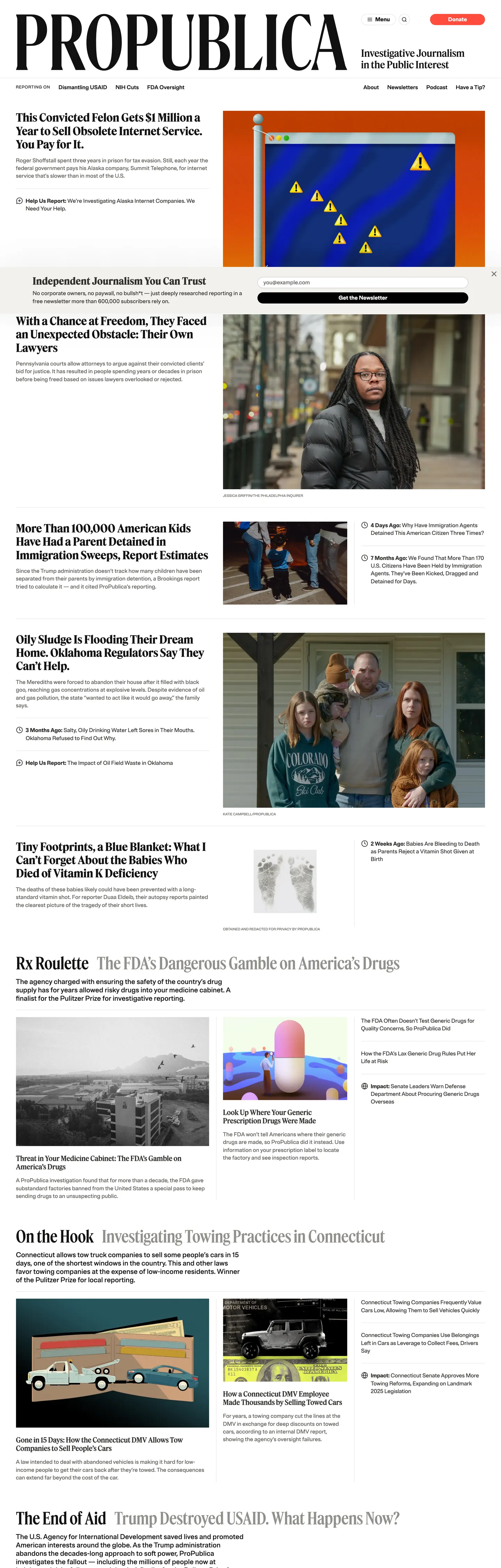
ProPublica's homepage does something most news organizations have abandoned in the age of attention-maximizing feeds: it acts like a newspaper front page. The logotype "PROPUBLICA" renders large and plain in Brut Grotesque at the masthead, the story grid below it uses a strict 14-column rule, and the only chromatic brand signal on the entire page is the salmon-red pill that says "Donate" — 16 total occurrences, all background fills, all on that one element. Where the New York Times uses its corporate blue for links and section labels, and where Axios saturates every hed with a bold accent, ProPublica reserves its brand voltage for the one financial ask that keeps the newsroom alive and nowhere else.

The DESIGN.md file packages the system into a machine-readable spec for React and AI tools. Inside: 12 colors tokens organized into a brand tier (one salmon-red voltage), a structural tier of warm neutrals stepping from near-black warm-black through charcoal, mid-gray, and warm-white, and a semantic tier of two blue link tones. Fourteen typography tokens span two families — Feature Headline (a display serif) and Brut Grotesque (a grotesque sans) — across a range from a 12px/800 uppercase label up to a 120px/500 editorial numeral. The grid is 14-column at 3.7rem columns with 2.5rem gutters, and vertical rhythm steps in 2rem increments.

Feed this file to Claude or Cursor and it reproduces ProPublica's specific moves: warm-toned neutrals instead of cool grays, a serif-for-editorial-content and grotesque-for-chrome split, and a single held-in-reserve brand accent that appears only on the donate button. The one disciplined move worth borrowing regardless of editorial context: the two-family split where the sans handles all chrome (nav, bylines, timestamps, labels) and the serif handles all content (heds, deks, article bodies). It enforces a visual hierarchy without requiring color.

What makes it distinct

5

  1. Serif display hierarchyFeature Headline at 48px weight 500 anchors every story hed; a second weight-700 variant at 32px handles section fronts
  2. Single salmon-red voltagethe brand color appears exactly 16 times, all as background fills on the donate CTA pill; every other chromatic moment comes from editorial photography
  3. Brut Grotesque as chrome voiceall navigation, bylines, timestamps, and category labels run in the grotesque; the serif is editorial-only
  4. Warm-toned neutralsthe palette steps from near-black warm-black through charcoal, mid-gray, and warm-white; no cool grays or pure whites in the editorial surface
  5. 120px editorial numerala Feature Headline display numeral at weight 500 appears as a section count device, the loudest single typographic moment on the page

propublica.org

Live at propublica.org

A snapshot of the brand in production. Scroll the frame to see the whole page.

ProPublica's website at propublica.org

Colors

12 colors

ProPublica's system runs on #ff4c3c as its primary voltage, used in 1 of 14 components. Type is set in Brut Grotesque across 13 tokens from 10px to 120px, weights 400–800. Shape language is soft — components average 599px corner radius, with no sharp interactive edges.

Brand & Accent

Sparing, CTA-only voltage · 1

Surface

Page and card backgrounds · 2

Text

Headlines, body, captions · 6

Borders & Hairlines

Dividers, outlines, rules · 3

Typography

13 type tokens

Set in Brut Grotesque across 13 tokens, from 10px to 120px, weights 400–800. Shown in its own stack: where the font isn't installed, the fallback the file names stands in.

  • display-xl48px · weight 500 · lh 48px · tracking -0.48pxThe quick brown fox jumps over the lazy dog
  • display-lg32px · weight 700 · lh 38.4px · tracking -0.32pxThe quick brown fox jumps over the lazy dog
  • display-md24px · weight 500 · lh 28.8px · tracking -0.24pxThe quick brown fox jumps over the lazy dog
  • display-sm20px · weight 500 · lh 24px · tracking -0.2pxThe quick brown fox jumps over the lazy dog
  • display-numeral120px · weight 500 · lh 120pxThe quick brown fox jumps over the lazy dog
  • body-lg20px · weight 500 · lh 24pxThe quick brown fox jumps over the lazy dog
  • body-md16px · weight 400 · lh 25.6pxThe quick brown fox jumps over the lazy dog
  • body-sm14px · weight 400 · lh 19.6pxThe quick brown fox jumps over the lazy dog
  • label-bold16px · weight 800 · lh 19.2pxThe quick brown fox jumps over the lazy dog
  • label-caps12px · weight 800 · lh 16.8px · tracking 0.6pxThe quick brown fox jumps over the lazy dog
  • label-micro10px · weight 400 · lh 14pxThe quick brown fox jumps over the lazy dog
  • nav-link16px · weight 600 · lh 19.2pxThe quick brown fox jumps over the lazy dog
  • button-md16px · weight 700 · lh 16pxThe quick brown fox jumps over the lazy dog

Layout

Radii and spacing

3 corner radii and 8 spacing values. Shape language: soft.

Radii

  • none0px
  • sm4px
  • full999px

Spacing

  • xs4px
  • sm8px
  • md12px
  • base16px
  • lg20px
  • xl24px
  • 2xl32px
  • 3xl40px

Components

14 components

Each rendered from its tokens (color, type, radius, padding) on ProPublica's own canvas.

  • Button Primary
    button-primaryButton Primary
  • Button Secondary
    button-secondaryButton Secondary
  • Top Nav
    top-navTop Nav
  • Nav Link
    nav-linkNav Link
  • Hero Heading
    hero-headingHero Heading
  • Section Heading
    section-headingSection Heading
  • Body Paragraph
    body-paragraphBody Paragraph
  • Byline
    bylineByline
  • Category Label
    category-labelCategory Label
  • Card
    cardCard
  • Type here…
    text-inputText Input
  • Newsletter Strip
    newsletter-stripNewsletter Strip
  • Editorial Numeral
    editorial-numeralEditorial Numeral
  • Footer
    footerFooter

In use

The system, in use

ProPublica's tokens on the kind of product it builds.

Build something people actually use.

A short paragraph of marketing copy that previews how the brand's display tier and body tier read together. Two sentences is usually enough.

Get startedLearn more
Marketing heroHeadline, sub-copy, primary CTA — the universal homepage opener.
Reporting · 14 min read

The quiet collapse of an old idea

For decades the consensus held that the system would correct itself. Then it didn't. This is the inside story of what changed, told by the people who watched it unravel.

"Nobody noticed because the failure was indistinguishable from progress."

By Sam Reporter · Updated 2 hours ago

Editorial articleMagazine-style longform with display headline.

FAQ

ProPublica design system FAQ

Common questions about ProPublica's tokens, components, and how to use this DESIGN.md in your project.

Read next

Specs, directories, and component libraries that pair with this design system.

Use it

Use ProPublica in your project

One machine-readable file. Drop it into Claude, Cursor, or any AI tool that reads DESIGN.md.

Download DESIGN.md
  1. Download the DESIGN.md

    One machine-readable file: every color, type, radius, spacing, and component token of ProPublica.

  2. Feed it to your AI tool

    Drop it into Claude, Cursor, or GitHub Copilot. The agent writes React components and Tailwind classes that match ProPublica's visual language.

  3. Reference the tokens directly

    Or paste the values into your Tailwind config, CSS variables, or component library: every color, size and radius is a quoted, ready-to-copy value.

Read the full DESIGN.md: overview, rationale, do’s and don’ts

Overview

ProPublica's homepage acts like a broadsheet newspaper front page in a media landscape that has mostly traded editorial restraint for algorithmic density. Serif-sans labor split. Feature Headline carries every piece of journalism — headlines, deks, pull-quotes, section heds — while Brut Grotesque handles every piece of chrome: navigation, bylines, timestamps, category labels, and the donate button. The two families never cross roles. Where the New York Times uses its blue on links across hundreds of elements, and where The Atlantic uses its orange on section labels and featured cards, ProPublica holds its salmon-red for exactly 16 elements — all background fills, all on the donate CTA pill — and nowhere else.

The structural palette is entirely warm neutrals. Near-black warm-black carries the editorial heds, charcoal ink-soft carries running text, warm-white surface-warm is the body floor, and a six-step warm gray scale runs the dividers and borders. There is no cool gray and no pure black in the chrome — only nine pure-black occurrences exist in the entire captured page, mostly divider borders. This deliberate warmth is the print-credibility signal: broadsheet ink and newsprint were never truly black and white.

Key Characteristics:

  • Single salmon-red voltage ({colors.primary}) reserved for the donate CTA pill — 16 occurrences, all background fills, zero link or text uses.
  • Two-family typographic division: Feature Headline serif for all editorial content, Brut Grotesque grotesque for all chrome — the split enforces hierarchy without color.
  • Warm neutral gray scale — six steps from warm-black through charcoal, mid-gray, and warm-white; no cool grays, no pure whites in the editorial surface.
  • 14-column fractional grid (3.7rem columns, 2.5rem gutters) — a print-derived measure that produces organic text widths rather than screen-aligned columns.
  • 120px Feature Headline editorial numeral — the loudest typographic moment on the page, used as a section-count device.
  • Uppercase Brut Grotesque labels at 12px/800/0.6px tracking — the only all-caps moment in the system; used for category tags above story heds.
  • Zero border-radius on article cards — the editorial grid is flush-edge, with dividers as the only separation device.

Colors

Brand

  • Salmon Red ({colors.primary} — #ff4c3c): frequency 16. Used as background only — all 16 occurrences are background fills on the Donate CTA pill. Wired as --p-color-salmon-02 and --p-dyn-color-salmon-02. The single chromatic brand voltage on the page; every other color is a warm neutral or editorial photography.

Text

  • Warm Black ({colors.ink} — #111110): frequency 99. Used as text (51), border (47), background (1). The headline and primary text tone — a near-black with a perceptible warm undertone. Wired as --p-color-warm-black and --p-color-text-hed.
  • Ink Soft ({colors.ink-soft} — #31302d): frequency 385. The dominant body text tone — 198 as text, 183 as border. This is the most-used color in the system, running body paragraphs, dividers, and most layout edges. Wired as --p-color-gray-05 and --p-color-text-body.
  • Ink Muted ({colors.ink-muted} — #5f5e59): frequency 64. Secondary text — 32 as text, 32 as border. Used for bylines, timestamps, and supplementary labels. Wired as --p-color-gray-04 and --p-color-text-meta.
  • Ink Subtle ({colors.ink-subtle} — #92908b): frequency 160. Tertiary text — 80 as text, 80 as border. Used for supplementary captions and the least-prominent metadata. Wired as --p-color-gray-03 and --p-color-text-supp.

Surface

  • Canvas ({colors.canvas} — #ffffff): frequency 17. Pure white — 9 as background fill on article thumbnail surfaces and the top-nav. Used sparingly; the page body runs on warm-white, not pure white.
  • Surface Warm ({colors.surface-warm} — #f2f1ed): frequency 110. The page body floor — 55 as text on dark surfaces, 54 as border. The newsletter signup strip uses this as its text color against the dark band. Wired as --p-color-warm-white.

Hairlines

  • Hairline ({colors.hairline} — #e3e2dd): frequency 3. The faintest divider tone — used for the lightest section separations. Wired as --p-color-gray-01 and --wp-editor-canvas-background.
  • Hairline Mid ({colors.hairline-mid} — #c8c6c0): frequency 73. The primary divider tone — 37 as border, 36 as text. Used for most article-card bottom rules and section dividers. Wired as --p-color-gray-02.
  • Hairline Dark ({colors.hairline-dark} — #92908b): frequency 160. The boldest divider/rule weight. Wired as --p-color-gray-03.

Link

  • Link Blue ({colors.link-blue} — #52a7e0): frequency 4. Used as text (2) and border (2) for hyperlinks within article bodies. Wired as --p-color-blue-02 and the light value of --p-dyn-color-blue-02.
  • Link Blue Dark ({colors.link-blue-dark} — #006eb7): frequency 2. Deeper blue for link hover or dark-mode contexts. Wired as --p-color-blue-03.

Typography

Font Families

The system runs two families in strict division-of-labor. Feature Headline — a licensed display serif (fallbacks: "Georgia Adjusted", Georgia, serif) — handles all editorial content: article headlines, section heds, deks, pull-quotes, and the 120px section numeral. Brut Grotesque — a licensed grotesque sans (fallbacks: system-ui, Roboto, "Segoe UI", Helvetica, Arial, sans-serif) — handles all chrome: navigation, bylines, timestamps, category labels, and the donate button. The families never trade roles.

Hierarchy

TokenSizeWeightLine HeightUse
{typography.display-numeral}120px500120pxSection count numeral (editorial device)
{typography.display-xl}48px50048pxPrimary story hed / hero headline
{typography.display-lg}32px70038.4pxSection front headlines
{typography.display-md}24px50028.8pxh4 sub-section heds
{typography.display-sm}20px50024pxCard headlines and h3
{typography.body-lg}20px50024pxLead paragraph / dek
{typography.body-md}16px40025.6pxRunning text
{typography.body-sm}14px40019.6pxSecondary body / caption
{typography.label-bold}16px80019.2pxBylines and nav labels
{typography.label-caps}12px80016.8pxCategory tags (0.6px letter-spacing, uppercase)
{typography.label-micro}10px40014pxSmallest metadata
{typography.nav-link}16px60019.2pxTop-nav items
{typography.button-md}16px70016pxDonate button label

Principles

Feature Headline weight ranges from 500 to 700 — always a text-weight display serif, never a thin weight. The editorial-numeral token at 120px / 500 is the loudest typographic moment; it is used as a section count device rather than a headline, so its size is structural rather than conversational. Brut Grotesque's weights span 400 through 800 — the 800 weight serves the dual role of bylines and category labels, keeping the chrome voice disciplined even at its boldest.

Note on Font Substitutes

Feature Headline is a licensed display serif. Playfair Display or Source Serif 4 transfer well at the same optical sizes; both have comparable display personality and similar x-height. For the 120px numeral tier, Libre Baskerville at weight 400 reads close in spirit. For Brut Grotesque, Inter or DM Sans at the same weights are the cleanest open-source matches.

Layout

Spacing System

  • Base unit: 4px, with 8px as the dominant rhythm unit.
  • Tokens: {spacing.xs} 4px · {spacing.sm} 8px · {spacing.md} 12px · {spacing.base} 16px · {spacing.lg} 20px · {spacing.xl} 24px · {spacing.2xl} 32px · {spacing.3xl} 40px.
  • Section padding (vertical): 2rem (--p-vert-rhythm-sm) between article rows; 5rem (--p-vert-rhythm-lg) between major page sections.
  • Card top padding: 24px (top only, zero sides and bottom) — cards stack against each other without padding; the horizontal divider between them is the visual separator.

Grid & Container

  • Column count: 14, each column 3.7rem wide, gutters 2.5rem.
  • Full content width: calc(3.7rem × 14 + 2.5rem × 13) ≈ 1026px at 16px root.
  • Typical spans: 8-column main story well, 3-column sidebar, 5-column featured secondary.
  • Hero story: full 8-column span with a dominant Feature Headline hed at 48px.

Rhythm

The page reads as a traditional broadsheet front: dense above the fold (masthead + lead story + secondary stories in parallel columns), thinning below the fold into section-labeled story lists. Dividers (1px warm-gray rules at {colors.hairline-mid}) are the primary rhythmic device — not padding or whitespace. This is a compression-friendly layout: more stories per vertical inch than comparable news sites, by deliberate editorial philosophy.

Elevation

The system has no shadow tier on editorial surfaces. Story cards sit flush on the warm-white canvas with no lift; the divider rules between them are the sole separation. The only captured shadow is one occurrence on a single element (a tooltip or popover). ProPublica's editorial philosophy extends to the elevation language — shadows imply product-UI chrome, not a news surface, and the system avoids them entirely in the story grid.

Shapes

The radius scale is nearly flat, with a single pill exception:

  • {rounded.none} 0px — every article card, every divider, every editorial container. The grid is flush-edge.
  • {rounded.sm} 4px — one occurrence, on a small UI affordance (likely a tag chip or form control).
  • {rounded.full} 999px — the donate CTA pill and the newsletter email input. The pill is the only rounded surface; it reads as the single "product" moment on an otherwise newspaper-flat editorial surface.

The system's radius discipline is the most austere in the news-publishing category. The Guardian uses 4px cards, the NYT uses 4-8px media cards — ProPublica uses zero. Every editorial container terminates at a right angle.

Components

button-primary — The donate CTA. Salmon-red {colors.primary} fill, white text, {rounded.full} 999px pill, 0px × 16px padding, 32px height. "Donate" is the canonical label. The pill shape on an otherwise flush-edge system is the most visually dissonant element on the page — deliberately so.

button-secondary — Transparent fill with warm-gray hairline border, ink-soft text, {rounded.full} pill. Used for secondary engagement CTAs below stories.

top-nav — Canvas white surface, 1px warm-gray bottom hairline. Houses the "PROPUBLICA" logotype flush left, topic navigation (Dismantling USAID, Immigration, etc.) in Brut Grotesque 600, and the donate pill flush right.

nav-link — Transparent background, warm-black text in {typography.nav-link} (16px / 600), no padding. Topic links sit flush in the nav band. On the captured page these are topical series links rather than standard section nav.

hero-heading — Warm-black text, Feature Headline 48px / 500, -0.48px tracking. The leading story headline, rendering in the serif display voice against a white or warm-white surface.

section-heading — Feature Headline 32px / 700, warm-black text. Used for secondary story heds in the main story grid.

body-paragraph — Brut Grotesque 20px / 500, ink-soft text. The lead paragraph / dek style — the grotesque here is unusual for news (most publications use their serif for body) but ProPublica keeps the serif strictly in headline positions.

byline — Brut Grotesque 16px / 800, ink-muted text. The visual weight at 800 is the highest in the system; byline authors get the boldest grotesque treatment.

category-label — Brut Grotesque 12px / 800, warm-black text, 0.6px letter-spacing, uppercase. Appears above story heds as a section/series tag.

card — Canvas white surface, {rounded.none} flush edges, 24px top padding only. Divides from adjacent cards with a 1px {colors.hairline-mid} top border. Holds a category label, headline, dek, and byline block.

text-input — Transparent background, warm-white text on the dark newsletter strip, {rounded.full} pill, 8px × 16px padding, 35px height, 1px ink-muted border.

newsletter-strip — Ink-soft dark background, warm-white text, 32px × 40px padding. The single dark band on an otherwise light editorial page — hosts the email signup form.

editorial-numeral — Feature Headline 120px / 500, warm-black text. Used as a section count device (e.g., a "27" displayed above "More than 100,000 American kids held").

footer — Canvas white, ink-muted text, body-sm (14px / 400), 40px top padding, 1px hairline top border.

Do's and Don'ts

Do treat the serif as editorial-only and the grotesque as chrome-only. The two-family split is the system's most load-bearing convention — a Feature Headline in a nav link or a Brut Grotesque article headline immediately breaks the editorial credibility signal.

Do use {colors.surface-warm} (#f2f1ed) as the page body floor. The warm-white is the editorial-credibility decision; swapping to pure #ffffff shifts the page toward SaaS white rather than newsprint warmth.

Do hold the salmon-red for the donate CTA only. The system's discipline is the 16-occurrence, background-fills-only rule. Adding it to links, hover states, or section labels reduces it from a financial ask to a brand accent.

Do use the 14-column fractional grid at the canonical 3.7rem / 2.5rem values. The fractional column width is what produces the organic text measure — rounding to 60px columns shifts the feel to a screen-product layout.

Don't add border-radius to editorial cards. The {rounded.none} rule on cards is the system's single most austere move — zero radius on every editorial container. Adding 4px or 8px cards would immediately read as news-product UI rather than newspaper editorial.

Don't use {colors.primary} (#ff4c3c) as a link or hover color anywhere in the editorial content. Its 16-occurrence restraint is the brand's discipline signal. Link color in article bodies is {colors.link-blue}.

Don't render display headlines in Brut Grotesque at weight 800. The 800 weight exists for bylines and category labels only — using it on headlines would create competing typographic loudness and break the serif/sans division.

Don't introduce a shadow tier on article cards. Shadows on editorial content read as product-UI intent. The flush-edge divider system is the ProPublica convention.

Known Gaps

  • Dark mode: the site ships a dark variant (--p-dyn-color-* variables use light-dark() syntax throughout), but the captured surface is light-mode only. The dark values invert the warm-neutral scale — warm-black becomes warm-white and vice versa.
  • Article body typography: the body copy inside long-form articles likely uses Tiempos Text (a licensed serif wired as --p-fonts-serif) rather than Brut Grotesque, but this was not rendered in the captured marketing surface.
  • Monospace family: --p-fonts-mono is declared (ui-monospace, Menlo, Roboto Mono, Consolas) for data journalism tables and code blocks, but no mono-style components appeared in the captured page.
  • Hover and focus states: only the resting state of the donate button is captured. Interactive states (hover, focus ring, active press) are not documented.
  • Section-specific color variants: the CSS exposes additional tonal families (salmon, magenta, indigo, gold, green tiers) that appear to belong to content-type and topic-specific contexts (e.g., data visualization, series branding) but were absent from the captured homepage surface.
  • Inline interactive elements: sponsored content labels, paywall nudges, and share-tool overlays that appear contextually in article pages were not present in the homepage capture.

News & Publishing

More systems like this

More DESIGN.md files in News & Publishing.

Pricing

Build it with Pro

The DESIGN.md files are free. Pro adds 6,000+ blocks, premium templates and the MCP server, so your AI editor builds in your system for you.

4.9/5 out of 5 · 150+ reviewsfrom 150+ founders and developers.

Billed once a year in USD. Cancel anytime.

Individual

For personal projects & open source

$32instead of $49/mo

$389 billed yearly

  • How many people can use the license.Seats: 1 seat
  • Client work, SaaS products and anything you charge for.Commercial use: Personal & open source only
  • Production-ready React sections: hero, pricing, features, dashboards and more.Pro blocks: 6,000+ blocks
  • Complete multi-page sites you can ship as they are.Templates: All 14 templates
  • React icons from every major library, installable with one command.React icons: 294k+ icons
  • Presets that restyle every block, in light and dark.Themes: All 59 themes
  • Lets your AI editor search, preview and install blocks for you.MCP server: Basic usage
  • Priority requests are answered first.Support: Standard

Team

Most popular

For freelancers, agencies & startups

$66instead of $99/mo

$789 billed yearly · ≈ $13/dev/mo

Everything in Individual, plus

  • How many people can use the license.Seats: Up to 5 seats
  • Client work, SaaS products and anything you charge for.Commercial use: Included
  • Lets your AI editor search, preview and install blocks for you.MCP server: High usage
  • Priority requests are answered first.Support: Priority

Organization

For companies with larger teams

$132instead of $199/mo

$1,589 billed yearly

Everything in Team, plus

  • How many people can use the license.Seats: Unlimited seats
  • Lets your AI editor search, preview and install blocks for you.MCP server: Unlimited usage
  • Secure checkout via Stripe
  • Code lives in your repo
  • Keep what you've shipped if you cancel
  • License terms

Your system, built for you

Every block, template and icon, installed by your AI agent in your design system. The DESIGN.md files stay free.

Get Pro