Skip to content

Pitchfork Design System

Pitchfork's home page as a DESIGN.md file. Pure black ink on white canvas, FeatureFlatDisplay display, Walfork uppercase labels, single red badge, 15 components. For React, Next.js, and AI tools.

Add shadcn.io to your AI agent. · Pro It installs blocks, icons and templates in your design system from a prompt, with Pro.

Set up MCP
Primary
#ff3530
Typeface
Walfork
Shape
Sharp
Base radius
0px
Colors
10
Type tokens
11
Components
15
Spacing values
7

About

About Pitchfork DESIGN.md

Curated by Dov Azencot · Updated May 18, 2026 · Source pitchfork.com (opens in a new tab)

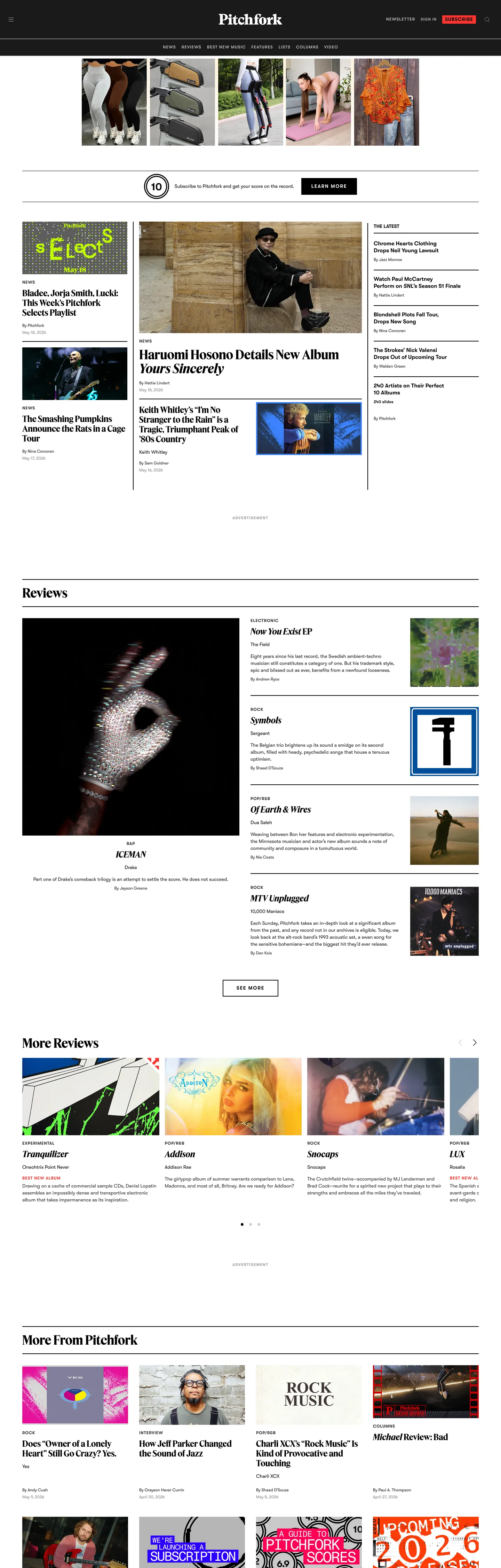
Pitchfork's home page is the rare music-publication site that does not behave like a music-product site. There is no dark canvas, no gradient hero, no large now-playing card, no album-of-the-week takeover. The page floor is pure white, the ink is pure black (#000000), and every chromatic moment on the page comes from the album-art thumbnails sitting inside a tight five-column wire-service grid. Where Apple Music throws a radial gradient under a 128px display headline and Bandcamp lets cover art bleed into a saturated brand wash, Pitchfork puts the artwork inside a hairline-edged tile and keeps the editorial chrome monochrome. The result reads like the front page of a print music section rather than a streaming surface.

The DESIGN.md file packages the captured tokens for React tooling. Inside: ten color tokens (six neutrals from pure black through #b3b3b3 gray to pure white, the saturated red badge accent #ff3530, the deep #2b2b2b primary, the soft #1a1a1a near-black, and a single warm #eeeeee surface). Two typefaces: FeatureFlatDisplay for every editorial headline (24–36px at weight 700) and Walfork for every body, label, byline, and nav link (11–16px at weights 400 and 600). The radius scale collapses to 1px — there is essentially no rounded geometry on the page. Spacing runs on a 4 / 8 / 16 / 32 / 64 ladder, and fourteen component definitions cover the album-tile, the "Best New Music" red badge, the hard-edged black CTA button, the uppercase kicker label, and the top-nav.

Feed this file to Claude, Cursor, or any agent that reads structured design tokens and it will reproduce Pitchfork's specific moves: pure-white canvas instead of a faint cream, hard 1px corners instead of the 8–16px softness that consumer-media sites lean on, uppercase Walfork small-caps as the universal label tier, and the red badge held in extreme scarcity so the BNM stamp keeps its weight. The single move worth borrowing for any editorial product: let the cover-art grid carry the chroma and starve the brand chrome of color. The harder move is restraint — most teams add a tinted hero band the moment they have one to spare.

What makes it distinct

5

  1. Album-art as voltagethe cover thumbnails carry the page's chromatic load, the brand chrome stays pure black on white
  2. Single red flag#ff3530 is reserved for the BNM badge and Listen tag, two surfaces total in the captured page
  3. FeatureFlatDisplay 36px / 700the editorial display tier, no second display family, no script or serif accent
  4. Walfork uppercase labels11–14px small-caps with 0.825–1.75px tracking does every kicker, byline, and category tag
  5. 1px roundingthe only radius in the captured CSS is 1px; cards, buttons, and inputs all sit at hard right angles

pitchfork.com

Live at pitchfork.com

A snapshot of the brand in production. Scroll the frame to see the whole page.

Pitchfork's website at pitchfork.com

Colors

10 colors

Pitchfork's system runs on #ff3530 as its primary voltage, used in 2 of 15 components. Type is set in Walfork across 11 tokens from 11px to 36px, weights 400–700. Shape language is sharp — components average 0px corner radius, favoring crisp rectangles.

Brand & Accent

Sparing, CTA-only voltage · 1

Surface

Page and card backgrounds · 2

Text

Headlines, body, captions · 4

Borders & Hairlines

Dividers, outlines, rules · 3

Typography

11 type tokens

Set in Walfork across 11 tokens, from 11px to 36px, weights 400–700. Shown in its own stack: where the font isn't installed, the fallback the file names stands in.

  • display-xl36px · weight 700 · lh 40pxThe quick brown fox jumps over the lazy dog
  • display-md24px · weight 700 · lh 28pxThe quick brown fox jumps over the lazy dog
  • heading-sm16px · weight 600 · lh 20pxThe quick brown fox jumps over the lazy dog
  • body-md14px · weight 400 · lh 20pxThe quick brown fox jumps over the lazy dog
  • body-sm12px · weight 400 · lh 16pxThe quick brown fox jumps over the lazy dog
  • label-md14px · weight 600 · lh 16px · tracking 1.75pxThe quick brown fox jumps over the lazy dog
  • label-sm12px · weight 600 · lh 16px · tracking 0.996pxThe quick brown fox jumps over the lazy dog
  • label-xs11px · weight 600 · lh 16px · tracking 1.5pxThe quick brown fox jumps over the lazy dog
  • nav-link12px · weight 600 · lh 16px · tracking 0.996pxThe quick brown fox jumps over the lazy dog
  • byline12px · weight 600 · lh 16px · tracking 0.825pxThe quick brown fox jumps over the lazy dog
  • h2-section14px · weight 700 · lh 20pxThe quick brown fox jumps over the lazy dog

Layout

Radii and spacing

3 corner radii and 7 spacing values. Shape language: sharp.

Radii

  • none0px
  • xs1px
  • full9999px

Spacing

  • xs4px
  • sm8px
  • base16px
  • lg24px
  • xl32px
  • 2xl48px
  • 3xl64px

Components

15 components

Each rendered from its tokens (color, type, radius, padding) on Pitchfork's own canvas.

  • Top Nav
    top-navTop Nav
  • Nav Link
    nav-linkNav Link
  • Section Heading
    section-headingSection Heading
  • Hero Heading
    hero-headingHero Heading
  • Story Heading
    story-headingStory Heading
  • Body Paragraph
    body-paragraphBody Paragraph
  • Byline
    bylineByline
  • Kicker Label
    kicker-labelKicker Label
  • Album Tile
    album-tileAlbum Tile
  • Bnm Badge
    bnm-badgeBnm Badge
  • Listen Tag
    listen-tagListen Tag
  • Button Primary
    button-primaryButton Primary
  • Button Secondary
    button-secondaryButton Secondary
  • Type here…
    text-inputText Input
  • Footer
    footerFooter

In use

The system, in use

Pitchfork's tokens on the kind of product it builds.

Build something people actually use.

A short paragraph of marketing copy that previews how the brand's display tier and body tier read together. Two sentences is usually enough.

Get startedLearn more
Marketing heroHeadline, sub-copy, primary CTA — the universal homepage opener.
Reporting · 14 min read

The quiet collapse of an old idea

For decades the consensus held that the system would correct itself. Then it didn't. This is the inside story of what changed, told by the people who watched it unravel.

"Nobody noticed because the failure was indistinguishable from progress."

By Sam Reporter · Updated 2 hours ago

Editorial articleMagazine-style longform with display headline.

FAQ

Pitchfork design system FAQ

Common questions about Pitchfork's tokens, components, and how to use this DESIGN.md in your project.

Read next

Specs, directories, and component libraries that pair with this design system.

Use it

Use Pitchfork in your project

One machine-readable file. Drop it into Claude, Cursor, or any AI tool that reads DESIGN.md.

Download DESIGN.md
  1. Download the DESIGN.md

    One machine-readable file: every color, type, radius, spacing, and component token of Pitchfork.

  2. Feed it to your AI tool

    Drop it into Claude, Cursor, or GitHub Copilot. The agent writes React components and Tailwind classes that match Pitchfork's visual language.

  3. Reference the tokens directly

    Or paste the values into your Tailwind config, CSS variables, or component library: every color, size and radius is a quoted, ready-to-copy value.

Read the full DESIGN.md: overview, rationale, do’s and don’ts

Overview

Pitchfork's home page is the rare music-publication surface that does not behave like a streaming product. Editorial wire-service. The canvas is pure white, the ink is pure black ({colors.ink} — #000000), and every chromatic moment on the page comes from the album-art thumbnails sitting inside a five-column hairline-divided grid. Where Apple Music throws a radial gradient under a 128px display headline, Bandcamp lets cover art bleed into a saturated brand wash, and Spotify holds the page on a near-black canvas, Pitchfork keeps the editorial chrome monochrome and trusts the artwork to carry the chroma. The grid alternates a wide hero-story tile with a stacked three-up of secondary stories and a vertical "More" rail — a front-page composition that reads as print rather than product.

The single brand voltage is the saturated red {colors.primary} (#ff3530), used twice on the captured page: the round "BNM" (Best New Music) stamp that overlays select album thumbnails, and the "Listen" pill on audio-anchored stories. Five usages out of more than 1,750 captured color occurrences — the scarcity is the point. The badge has trained two decades of Pitchfork readers to scan a thumbnail grid for that red dot; spreading the color across hero bands or button fills would erode the verdict's weight. The remaining color set is a graded monochrome ladder ({colors.ink-soft} #1a1a1a, {colors.ink-deep} #2b2b2b, {colors.ink-muted} #828282, three hairline tones from {colors.hairline-strong} to {colors.hairline-soft}, the warm {colors.surface-warm} #eeeeee), each doing one tonal job at a single point on the gray-to-white ramp.

Typography splits between two families. FeatureFlatDisplay at 36px / 700 is the hero-story tier; the same family at 24px / 700 carries secondary stack headlines. Walfork — a tighter sans — runs everything else at 11–16px in weights 400 and 600, with the 600-weight tier carrying uppercase transforms and 0.825–1.75px letter-spacing for every kicker, byline, category tag, and nav link. There is no script accent, no italic display, no serif body alternative. The radius scale collapses to a 1px hairline; the page geometry sits at hard right angles throughout.

Key Characteristics:

  • Pure-white canvas ({colors.canvas} — #ffffff), pure-black ink ({colors.ink} — #000000), no faint cream tint anywhere — the contrast is print-grade.
  • Single red badge ({colors.primary} — #ff3530) reserved for the BNM stamp and the Listen pill. Five total usages on the captured page.
  • Five-column album-art grid with 1px {colors.hairline-soft} (#cccccc) dividers separating tiles — depth from rules, never from shadows.
  • FeatureFlatDisplay 36px / 700 / 40px-leading is the loudest typographic moment. There is no 56px or 72px display tier.
  • Walfork uppercase small-caps at 11–14px with 0.825–1.75px tracking carries every label, kicker, byline, and nav link in the system.
  • 1px is the only non-zero radius in the captured CSS — buttons, inputs, tiles, and badges all sit at hard corners (the BNM circle is the lone full-radius exception).
  • Spacing on a 4 / 8 / 16 / 32 / 64 ladder with 8px the dominant module (100 occurrences) and 16px the second (75) — tight wire-service density rather than generous editorial whitespace.
  • Footer text drops to {colors.hairline} (#b3b3b3) — the only place a muted gray functions as primary copy color.

Colors

Brand

  • Pitchfork Red ({colors.primary} — #ff3530): frequency 5. Used as background (1), text (2), border (2). The saturated red badge — appears as the round "BNM" (Best New Music) circular stamp on review thumbnails and as the "Listen" pill flag on audio-anchored stories. Scarcity is the design: out of 1,754 color occurrences captured on the home page, the red accounts for five.

Text

  • Ink ({colors.ink} — #000000): frequency 1754 across text (876) and border (876). The dominant chrome color in the system — every editorial headline, body paragraph, kicker label, and dividing rule. Pure black, not softened to charcoal; the wire-service contrast is intentional.
  • Ink Deep ({colors.ink-deep} — #2b2b2b): frequency 322 — text (161) and border (161). A second near-black tone used on secondary body copy and finer dividing rules where pure ink would feel too heavy.
  • Ink Soft ({colors.ink-soft} — #1a1a1a): frequency 187 — text (92), border (92), background (3). Used on the persistent ticker band and a small set of dark-backgrounded promotional tiles below the fold.
  • Ink Muted ({colors.ink-muted} — #828282): frequency 32 — text and border evenly. The metadata tone for timestamps, photographer credits, and sub-deck text.

Hairline

  • Hairline ({colors.hairline} — #b3b3b3): frequency 72. Used both as text on the footer caption row and as the medium-tone dividing rule between secondary tiles. The only tone that functions as both copy and rule.
  • Hairline Soft ({colors.hairline-soft} — #cccccc): frequency 48. The default 1px rule color separating cards in the album-art grid and column dividers between stacked stories.
  • Hairline Strong ({colors.hairline-strong} — #979797): frequency 6. Used on form input outlines and a small set of UI affordances where the hairline needs to read more confidently than the cccccc default.

Surface

  • Canvas ({colors.canvas} — #ffffff): frequency 12 across text (6), background (1), and border (5). Pure white — the page floor and every card surface. There is no faint cream or warm tint anywhere in the system.
  • Surface Warm ({colors.surface-warm} — #eeeeee): frequency 8. A single warm-gray surface used on the persistent newsletter sign-up band and a small set of in-line promotional callouts below the fold.

Typography

Font Families

The system runs two voices: FeatureFlatDisplay for every editorial display tier and Walfork for every body, label, kicker, byline, and nav surface. FeatureFlatDisplay is a Condé Nast custom display face; Walfork is the supporting sans. Both fall back to "helvetica", sans-serif. There is no serif tier, no italic display alternative, and no script accent — the page is unapologetically two-family.

The pairing is the typographic split: FeatureFlatDisplay does the editorial speaking, Walfork does the editorial chrome — labels, bylines, kickers, nav, footnotes. The 600-weight Walfork tier carries every uppercase small-caps moment in the system; there is no all-caps FeatureFlatDisplay headline anywhere on the page.

Hierarchy

TokenSizeWeightLine HeightLetter SpacingUse
{typography.display-xl}36px70040px0Hero-story headline ("Haruomi Hosono Details New Album Yours Sincerely")
{typography.display-md}24px70028px0Secondary stack headline, "More From Pitchfork" tile headline
{typography.heading-sm}16px60020px0Sub-section title, review-card headline
{typography.body-md}14px40020px0Default paragraph body, story dek
{typography.body-sm}12px40016px0Metadata, byline date, photographer credit
{typography.label-md}14px60016px1.75pxSection kicker, "Reviews" / "More Reviews" header
{typography.label-sm}12px60016px0.996pxCategory tag, nav link, kicker chip
{typography.label-xs}11px60016px1.5pxBNM badge label, Listen tag label
{typography.nav-link}12px60016px0.996pxTop-nav link label
{typography.byline}12px60016px0.825pxAuthor byline above story cards
{typography.h2-section}14px70020px0"The Latest", "Reviews", "More From Pitchfork" h2

Principles

Display weight sits at 700, not 800 or 900. The 36px hero-story headline is the loudest typographic moment in the system — deliberately measured at the size a print front page would set its lead story, not the 72–128px that a streaming product would reach for. The 24px secondary tier carries every stack-story headline below the lead. There is no 56px or 72px display step.

Every uppercase label in the system lives in the Walfork 600-weight tier at 11–14px with 0.825–1.75px tracking. The tracking widens as the size shrinks — the 11px BNM badge label sits at the widest 1.5px tracking, the 12px kicker at 0.996px, the 14px section kicker at 1.75px. The widening reads as small-caps weight rather than caps-shouting; the 600 weight keeps the labels readable at hairline sizes without tipping into bold.

Note on Font Substitutes

FeatureFlatDisplay and Walfork are both proprietary Condé Nast faces. The closest open-source substitutes for FeatureFlatDisplay are Source Serif 4 Display or Tiempos Headline at the same 700 weight; the proportions transfer cleanly at 24–36px. For Walfork, Inter at the same weights covers the body and chrome tier, and Inter with text-transform: uppercase and the same letter-spacing values reproduces the small-caps treatment. The fallback stack already walks helvetica, sans-serif so a Helvetica-rendering OS will read close to the captured page out of the box.

Layout

Spacing System

  • Base unit: 8px (100 occurrences in the captured page).
  • Tokens: {spacing.xs} 4px · {spacing.sm} 8px · {spacing.base} 16px · {spacing.lg} 24px · {spacing.xl} 32px · {spacing.2xl} 48px · {spacing.3xl} 64px.
  • Inline gaps: 16px (75 occurrences) is the dominant inter-tile gap inside the album-art grid; 8px is the dominant inter-element gap inside a single story tile.
  • Section padding (vertical): 32px between major sections, 64px in the side gutter between the editorial grid and the rail. The 16-0-32 pattern (top 16, bottom 32) is the standard story-tile margin.
  • Card internal padding: 0 on the album-tile (the artwork extends edge-to-edge inside the hairline border); 16px on the secondary-story stack; 24px on the newsletter sign-up band.

Grid & Container

  • Max content width: ~1312px on the body container (the footer caption spans the full 1312px width in the captured page).
  • Five-column hero grid: wide hero-story tile (~640px), stacked three-up of secondary stories (~320px each), vertical "More" rail (~240px). Sums to the 1312px content max.
  • Reviews band: featured review on the left (~640px), stacked two-up to its right (~320px each), with the album-thumbnail rail extending to the right edge.
  • "More Reviews" four-up: four equal-width thumbnail tiles in a single row, separated by 16px gaps and 1px {colors.hairline-soft} dividers.
  • "More From Pitchfork" four-up: four wide editorial tiles, each pairing a 16:9 illustration with a 24px / 700 headline beneath.

Rhythm

The page is unapologetically dense. There is no atmospheric hero band, no looping video, no full-bleed pull quote. The grid is a stack of bands — Lead Stories, The Latest, Reviews, More Reviews, More From Pitchfork — each separated by a 32–64px gap and a 1px {colors.hairline-soft} rule. The rhythm reads as front-page wire-service; the same content treatment on a streaming product would look hollow, but on an editorial site of record it reads as authority.

Elevation

The system has no shadow tier at all. The captured CSS has 1 shadow occurrence on the entire home page, and that single instance is on the cookie-consent overlay — not on any editorial surface. Depth and separation come entirely from 1px {colors.hairline-soft} (#cccccc) dividing rules between tiles, and from the album-art photography that fills each card edge-to-edge. There is no card lift, no hover shadow, no focus halo.

  • Flat (no shadow): every editorial tile, the top-nav, the footer, the newsletter band — 100% of brand surfaces.
  • Hairline elevation: 1px {colors.hairline-soft} between tiles, 1px {colors.hairline} (#b3b3b3) on the medium-tone dividers, 1px {colors.hairline-strong} (#979797) on form input outlines.
  • No hover lift: the captured page has no :hover shadow state on any tile. Hover affordance comes from the headline color shifting from {colors.ink} to {colors.ink-deep}, not from elevation.

Shapes

The radius scale is almost entirely zero. The captured CSS exposes a single radius value (1px) used on form inputs and a small set of badge surfaces. Every other surface in the system sits at hard right angles.

  • {rounded.none} 0px — the dominant radius. Buttons, tiles, cards, nav surfaces, headers, and the newsletter band all use hard corners.
  • {rounded.xs} 1px — the only non-zero rounded tier, used on text-input outlines and the rectangular "Listen" tag.
  • {rounded.full} 9999px — the BNM (Best New Music) circular badge, the single fully-rounded element on the page.

There is no 4px, 6px, 8px, 12px, or 16px middle tier. The hard-edge geometry is part of the print-front-page identity; rounding the corners would soften the wire-service density into a consumer-product softness the brand does not want.

Components

top-nav — White {colors.canvas} surface, 64px height, 16x32 padding, 1px bottom hairline {colors.hairline-soft}. Pitchfork wordmark centered, primary section links (News / Reviews / Features / Lists / Newsletter) inset, account links flush right.

nav-link — Transparent fill, {colors.ink-muted} text in {typography.nav-link} (12px / 600 / uppercase / 0.996px tracking). Hover state lifts the color to {colors.ink} without a background fill.

section-heading — {typography.h2-section} (14px / 700 / 20px-leading) ink text. Used as the h2 above each major band ("The Latest", "Reviews", "More Reviews", "More From Pitchfork"). Sits 32px above the band and 16px above the first tile.

hero-heading — {typography.display-xl} (36px / 700 / 40px-leading) ink text. The lead-story headline ("Haruomi Hosono Details New Album Yours Sincerely"). 0 padding — the headline butts directly against the album-art block above and the byline beneath.

story-heading — {typography.display-md} (24px / 700 / 28px-leading) ink text. The secondary-story headline in the three-up stack and the four-up "More From Pitchfork" tiles.

body-paragraph — {typography.body-md} (14px / 400 / 20px-leading) ink text. The story dek that sits beneath each headline and the running paragraph body inside review cards.

byline — {typography.byline} (12px / 600 / uppercase / 0.825px tracking) {colors.ink-muted} text. Author name and timestamp above each story card. The 600-weight uppercase treatment reads as wire-service editorial credit rather than a casual byline.

kicker-label — {typography.label-md} (14px / 600 / uppercase / 1.75px tracking) ink text. The category kicker above each story headline ("Rising", "5-10-15-20", "Listen"). 0-0-8 padding so it sits flush above the headline.

album-tile — White {colors.canvas} fill, {colors.hairline-soft} 1px border, hard corners ({rounded.none}), 0 padding. The artwork fills the tile edge-to-edge. Used in the five-column album-art grid and the four-column "More Reviews" row.

bnm-badge — {colors.primary} (#ff3530) circular fill, white text in {typography.label-xs} (11px / 600 / uppercase / 1.5px tracking). 32px height with {rounded.full} so the badge renders as a perfect circle. Overlays the bottom-left of select album-tile thumbnails to mark Best New Music.

listen-tag — {colors.primary} rectangular fill, white label, {rounded.xs} 1px corners, 4x8 padding. The audio-anchored story flag.

button-primary — Black {colors.ink} fill, white text, {typography.label-md} (14px / 600 / uppercase / 1.75px tracking), hard corners, 0x16 padding, 48px height. The newsletter sign-up CTA and the "Subscribe" CTA in the persistent ticker band.

button-secondary — White {colors.canvas} fill, ink text, 1px ink border, hard corners, 48px height. Used on inline "Load more" and "Continue" affordances inside review cards.

text-input — White {colors.canvas} fill, ink text, {rounded.xs} 1px outline in {colors.hairline-soft}, 8x16 padding, 40px height. The newsletter email field. No focus glow — the outline thickens to 2px instead.

footer — White canvas, {colors.hairline} (#b3b3b3) text in {typography.body-sm}, 32x64 padding. The only place a muted gray functions as primary copy color — the footer caption ("© 2026 Condé Nast. All rights reserved...") sits at 12px / 400 in #b3b3b3 against pure white, almost a watermark.

Do's and Don'ts

Do treat the red {colors.primary} (#ff3530) as a critic's badge. It marks Best New Music and Listen audio-anchored stories — nothing else. If you reach for it on a CTA or a hover state, you have erased the badge's editorial weight.

Do keep the canvas at pure {colors.canvas} (#ffffff) and the ink at pure {colors.ink} (#000000). The wire-service contrast is the brand's print-front-page identity; softening either tone toward a cream or a charcoal loses the editorial seriousness.

Do use Walfork at weight 600 with text-transform: uppercase and 0.825–1.75px letter-spacing for every kicker, byline, category tag, and nav link. There is no second small-caps tier in the system; reaching for a serif italic or a styled sans-caps tracks outside the family discipline.

Do separate tiles with 1px {colors.hairline-soft} (#cccccc) rules rather than shadows. The system has no elevation layer — the rules carry the depth job, and adding a shadow band would feel like importing a streaming-product idiom into a publication of record.

Don't use {colors.primary} (#ff3530) on a CTA, a hover state, or a body link. The captured page has five total red occurrences across 1,754 color usages; multiplying them into button fills or focus rings would dilute the BNM badge from a verdict into a brand decoration.

Don't introduce a 4–16px middle radius tier. The system runs at 0 / 1 / 9999px and nothing in between; adding a rounded {rounded.md} would soften the hard-edged wire-service geometry into consumer-product softness.

Don't swap the ink to a charcoal like {colors.ink-deep} (#2b2b2b) for body text. That tone is reserved for secondary copy and fine-grain rules; running body paragraphs in #2b2b2b instead of pure black flattens the contrast that gives Pitchfork its print-grade authority.

Don't add card shadows or hover lifts to the album-art tiles. The captured CSS has zero shadow occurrences on editorial surfaces; introducing a box-shadow on the tile grid would make the page read like a Spotify-style streaming surface rather than a music publication.

Known Gaps

  • Dark mode: the captured marketing surface is light-only. No dark variant is exposed on the public home page.
  • Hover and focus states: the captured CSS does not expose :hover shadow or background-fill states on the tile grid; the only documented hover is the headline color shift from {colors.ink} to {colors.ink-deep}.
  • Form input error states: the newsletter email field carries only the resting state; validation styling and error tints are not captured.
  • Mobile breakpoints: the captured render is desktop-only at 1440px. The mobile-collapsed grid (single-column, condensed tile padding) is not represented.
  • Article-page templates: this DESIGN.md captures the home page only. The individual review-page chrome (the giant scoring number, the artist-info inset, the genre-tag rail) is a richer system not exposed here.
  • Score number tier: the famous Pitchfork decimal score (e.g. "8.4", "9.3") sets at a much larger display size on individual review pages — that tier is not present on the home page and is not captured.
  • Subscription / paywall surfaces: the Pitchfork+ subscription overlay carries its own narrow token set and is not exposed on the captured home page.

News & Publishing

More systems like this

More DESIGN.md files in News & Publishing.

Pricing

Build it with Pro

The DESIGN.md files are free. Pro adds 6,000+ blocks, premium templates and the MCP server, so your AI editor builds in your system for you.

4.9/5 out of 5 · 150+ reviewsfrom 150+ founders and developers.

Billed once a year in USD. Cancel anytime.

Individual

For personal projects & open source

$32instead of $49/mo

$389 billed yearly

  • How many people can use the license.Seats: 1 seat
  • Client work, SaaS products and anything you charge for.Commercial use: Personal & open source only
  • Production-ready React sections: hero, pricing, features, dashboards and more.Pro blocks: 6,000+ blocks
  • Complete multi-page sites you can ship as they are.Templates: All 14 templates
  • React icons from every major library, installable with one command.React icons: 294k+ icons
  • Presets that restyle every block, in light and dark.Themes: All 59 themes
  • Lets your AI editor search, preview and install blocks for you.MCP server: Basic usage
  • Priority requests are answered first.Support: Standard

Team

Most popular

For freelancers, agencies & startups

$66instead of $99/mo

$789 billed yearly · ≈ $13/dev/mo

Everything in Individual, plus

  • How many people can use the license.Seats: Up to 5 seats
  • Client work, SaaS products and anything you charge for.Commercial use: Included
  • Lets your AI editor search, preview and install blocks for you.MCP server: High usage
  • Priority requests are answered first.Support: Priority

Organization

For companies with larger teams

$132instead of $199/mo

$1,589 billed yearly

Everything in Team, plus

  • How many people can use the license.Seats: Unlimited seats
  • Lets your AI editor search, preview and install blocks for you.MCP server: Unlimited usage
  • Secure checkout via Stripe
  • Code lives in your repo
  • Keep what you've shipped if you cancel
  • License terms

Your system, built for you

Every block, template and icon, installed by your AI agent in your design system. The DESIGN.md files stay free.

Get Pro