Pika Design System
Pika's idea-to-video login surface as a DESIGN.md file. 50/50 cream-vs-black split, Telka Extended at weight 900 uppercase, single warm cream voltage, and tokens ready for React, Next.js, and AI coding tools.
Add shadcn.io to your AI agent. · Pro It installs blocks, icons and templates in your design system from a prompt, with Pro.
Set up MCP- Primary
- #ffedd2
- Typeface
- telka
- Shape
- Mixed
- Base radius
- 6px
- Colors
- 6
- Type tokens
- 8
- Components
- 14
- Spacing values
- 8
About
About Pika DESIGN.md
Curated by Dov Azencot · Updated May 19, 2026 · Source pika.art (opens in a new tab)
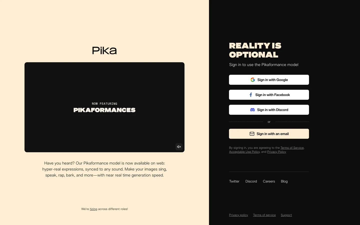
Pika treats its entry surface as a vertical diptych. The left half is warm cream holding a black-tile video panel that auto-loops a "NOW FEATURING / PIKAFORMANCES" caption; the right half is near-black carrying a single 32px Telka Extended display line in uppercase warm cream ("REALITY IS OPTIONAL"), a small sub-paragraph in structural white, and a four-button OAuth stack. There is no border, no gradient, no transition rule between the two halves — the canvas split itself does all the structural work the brand chrome would normally do on a SaaS landing page.
The DESIGN.md file packages the system into a machine-readable spec for React tooling. Inside: 6 colors tokens drawn from the captured surface — pure white, near-black ink, the warm cream voltage, and two near-black surface tones — none of them tied to a brand var-family because Pika's CSS exposes only `--color-white` and `--color-black` on root; the cream is the brand's single chromatic move and lives inline. 11 typography tokens run Telka and Telka Extended at weights 300, 400, 450, 500, and 900; the heaviest moment sits exactly once at the display tier. 6 radius tokens center on a 6px workhorse with a 10px secondary; 7 spacing tokens descend from 80px hero gutters to 4px micro-tap. 14 components tokens cover the cream pill-CTA, the white OAuth button, the small video tile, the divider rule, the wide page split, and the footer chip set.
Feed this file to an AI coding tool and it reproduces Pika's specific moves: the vertical-diptych canvas instead of a single-color hero, the single warm cream voltage carrying display + wordmark + email-CTA fill, Telka Extended weight 900 reserved for one display moment per surface, white OAuth buttons sitting flat on near-black with no card chrome. The split-canvas move only works if your product has a media artifact (a video, a render, a generated frame) confident enough to own half the page — Pika has Pikaformances; most consumer-AI brands need an interstitial card layer to make the same composition read.
What makes it distinct
5
- Two-half canvasthe entire above-fold reads as a 50/50 vertical split, cream left and near-black right, with no border between them; the page IS the divider
- Single warm cream voltagethe cream hue carries the wordmark, the display heading, and the email-CTA fill, the only non-grayscale color anywhere on the surface
- Telka Extended at weight 900the one display moment runs uppercase at 32px / 36px line-height with 0.32px tracking, a wide-condensed display drawn just for the brand
- Telka regular at 300-450 weightsevery body, link, and OAuth-button label sits between 300 and 450, no 700+ moment outside the single display block
- No card chromesign-in buttons are 6px-radius white pills with brand-glyph monograms, sitting flat on the near-black floor with no border, no shadow, no surrounding card
pika.art
Live at pika.art
A snapshot of the brand in production. Scroll the frame to see the whole page.
Colors
6 colors
Pika's system runs on #ffedd2 as its primary voltage, used in 2 of 14 components. Type is set in telka across 8 tokens from 12px to 32px, weights 300–900. Shape language is mixed across 14 components, blending pills, soft rounds, and squarer corners.
Brand & Accent
Sparing, CTA-only voltage · 1
Surface
Page and card backgrounds · 2
Text
Headlines, body, captions · 2
Other
Specialty colors · 1
Typography
8 type tokens
Set in telka across 8 tokens, from 12px to 32px, weights 300–900. Shown in its own stack: where the font isn't installed, the fallback the file names stands in.
- display-xl32px · weight 900 · lh 36px · tracking 0.32pxThe quick brown fox jumps over the lazy dog
- body-lg16px · weight 300 · lh 24pxThe quick brown fox jumps over the lazy dog
- body-md14px · weight 450 · lh 20px · tracking -0.28pxThe quick brown fox jumps over the lazy dog
- body-md-light14px · weight 300 · lh 20px · tracking -0.28pxThe quick brown fox jumps over the lazy dog
- button-md14px · weight 400 · lh 20pxThe quick brown fox jumps over the lazy dog
- label-sm12px · weight 300 · lh 16px · tracking 0.12pxThe quick brown fox jumps over the lazy dog
- caption12px · weight 400 · lh 16px · tracking 0.12pxThe quick brown fox jumps over the lazy dog
- wordmark-md28px · weight 500 · lh 32pxThe quick brown fox jumps over the lazy dog
Layout
Radii and spacing
5 corner radii and 8 spacing values. Shape language: mixed.
Radii
- none0px
- sm4px
- md6px
- lg10px
- pill9999px
Spacing
- xs4px
- sm6px
- base8px
- md10px
- lg20px
- xl28px
- 2xl32px
- 3xl56px
Components
14 components
Each rendered from its tokens (color, type, radius, padding) on Pika's own canvas.
- Hero Splithero-splitHero Split
- Hero Split Darkhero-split-darkHero Split Dark
- Hero Headinghero-headingHero Heading
- WordmarkwordmarkWordmark
- Body Paragraphbody-paragraphBody Paragraph
- Body Paragraph Darkbody-paragraph-darkBody Paragraph Dark
- Button Primarybutton-primaryButton Primary
- Button Oauthbutton-oauthButton Oauth
- Video Tilevideo-tileVideo Tile
- Feature Captionfeature-captionFeature Caption
- Divider Ordivider-orDivider Or
- Footer Linkfooter-linkFooter Link
- Legal Linklegal-linkLegal Link
- Footer Chipfooter-chipFooter Chip
In use
The system, in use
Pika's tokens on the kind of product it builds.
Build something people actually use.
A short paragraph of marketing copy that previews how the brand's display tier and body tier read together. Two sentences is usually enough.
FAQ
Pika design system FAQ
Common questions about Pika's tokens, components, and how to use this DESIGN.md in your project.
Read next
Related reading
Specs, directories, and component libraries that pair with this design system.
- Browse all design systemsThe full directory of DESIGN.md files on shadcn.io, with live mockups for each.shadcn.io
- Pika — official sitePika's public marketing site — the source of truth for the live tokens captured in this file.pika.art (opens in a new tab)
- The DESIGN.md specificationGoogle Labs' open spec for machine-readable design system files — the format this page is built on.github.com (opens in a new tab)
Use it
Use Pika in your project
One machine-readable file. Drop it into Claude, Cursor, or any AI tool that reads DESIGN.md.
Download the DESIGN.md
One machine-readable file: every color, type, radius, spacing, and component token of Pika.
Feed it to your AI tool
Drop it into Claude, Cursor, or GitHub Copilot. The agent writes React components and Tailwind classes that match Pika's visual language.
Reference the tokens directly
Or paste the values into your Tailwind config, CSS variables, or component library: every color, size and radius is a quoted, ready-to-copy value.
Read the full DESIGN.md: overview, rationale, do’s and don’ts
Overview
Pika's entry surface inverts the SaaS sign-in convention. Diptych canvas. Where most consumer-AI brands paint a single hero gradient and overlay a centered card, Pika splits the page into two equal vertical halves — warm cream on the left holding a looping Pikaformances video tile, near-black on the right holding the OAuth stack — with a hard seam at the 50% mark and no border between them. The canvas split itself does all the structural work the brand chrome would normally do, and the seam reads as the navigation rule, the hero divider, and the brand statement at once.
The chromatic discipline reinforces the move. Outside of pure black and pure white, the system has exactly one color — a warm cream ({colors.primary} — #ffedd2) — and it appears three times on the captured page: as the left-half canvas fill, as the display-text color on the right-half headline, and as the email-button background. Where Cloudflare gives a brand voltage the entire above-fold canvas and Spline holds it in reserve for a single CTA pill, Pika does both: the cream IS the left-canvas voltage and the right-canvas display voltage simultaneously, while pure white carries every OAuth button and pure black carries the right-half floor.
Typography is two cuts of one custom family. Telka (the standard geometric sans) handles every body, link, and OAuth-button label at weights 300-450. Telka Extended (a wide-condensed display cut) appears exactly once per surface, at 32px / 36px line-height in weight 900, uppercased with 0.32px positive tracking — the brand's "REALITY IS OPTIONAL" line. The weight-900 reservation for a single block is the move that gives the page its tonal weight: every other text element on the captured surface stays modest, so the display tier carries all of the typographic force.
Key Characteristics:
- Vertical 50/50 canvas split — cream (
{colors.canvas}— #ffedd2) left, near-black ({colors.ink}— #0d0d0d) right, hard seam at 50% page width, no border, no gradient transition. - Single warm cream voltage (
{colors.primary}) used three times: left-canvas fill, display headline color, email-CTA background fill. - Telka Extended at weight 900 uppercase, 32px / 36px line-height with positive 0.32px tracking — the one display moment per surface, no 700+ weight anywhere else.
- Telka at weights 300 / 400 / 450 across body, link, button label, and footer chip — no semibold tier (500 + ) on the captured page.
- OAuth buttons render as pure white pills with 6px rounding, sitting flat on the near-black canvas with no border, no shadow, no surrounding card.
- Video tile on the left half sits at 6px radius — the same workhorse value as the OAuth buttons; the system has no separate "media surface" radius tier.
- Footer renders two parallel link rows — warm cream side ("Twitter / Discord / Careers / Blog") and near-black side ("Privacy / Terms / Support") — mirroring the canvas split into the bottom band.
Colors
Brand
- Cream Primary (
{colors.primary}— #ffedd2): frequency 3. Used as text (1), background (2). The single chromatic move on the surface — fills the left-canvas hero, carries the display-headline text on the near-black right half, and fills the email-CTA pill. The hue is wired inline rather than as a CSS variable; root scope only declares pure black and pure white.
Surface
- Canvas (
{colors.canvas}— #ffedd2): the left-half canvas fill. Shares the same hex as the cream primary because the brand uses one warm tone to do both jobs — the voltage on the dark side becomes the canvas on the light side. - Ink Deep (
{colors.ink-deep}— #000000): pure black, declared as--color-blackin root. Used for the wordmark on the cream canvas and as the video-tile fill on the left half. - Ink (
{colors.ink}— #0d0d0d): frequency 14 — the right-half canvas surface and the dominant ink color across the captured page. Wired inline; not exposed as a custom property. - Surface Dark (
{colors.surface-dark}— #1f1f1f): frequency 1. A single secondary near-black tone — slightly lifted off the right-canvas floor, used for the divider band beneath the OAuth buttons.
Text
- Paper (
{colors.paper}— #ffffff): frequency 37 (text 34, background 3) — the dominant text color on the near-black right half, on every OAuth button label, and on the small sub-paragraph beneath the display. Wired as--color-white.
Typography
Font Families
The system runs two cuts of one custom typeface family. Telka is a geometric sans that carries every body, link, OAuth-button label, footer chip, and caption — appearing in weights 300, 400, and 450 across the captured surface. Telka Extended is a wide-condensed display cut that carries the wordmark and the single 32px display headline; the heaviest weight (900) on the page is reserved for one block per surface.
There is no second voice. No mono, no serif, no system-stack fallback for label or metadata duties — Telka handles every text job under 28px and Telka Extended handles everything above.
Hierarchy
| Token | Size | Weight | Line Height | Letter Spacing | Use |
|---|---|---|---|---|---|
{typography.display-xl} | 32px | 900 | 36px | 0.32px | Hero h1 ("REALITY IS OPTIONAL"), uppercase |
{typography.wordmark-md} | 28px | 500 | 32px | 0 | "Pika" wordmark on the cream canvas |
{typography.body-lg} | 16px | 300 | 24px | 0 | Sub-paragraph beneath the video tile |
{typography.body-md} | 14px | 450 | 20px | -0.28px | OAuth-button labels, primary span text |
{typography.body-md-light} | 14px | 300 | 20px | -0.28px | Inline links, footer link row |
{typography.button-md} | 14px | 400 | 20px | 0 | Email-CTA button label |
{typography.label-sm} | 12px | 300 | 16px | 0.12px | Legal-link row, "or" divider, footer legend |
{typography.caption} | 12px | 400 | 16px | 0.12px | "NOW FEATURING" caption above the video tile |
Principles
The weight ladder is bottom-heavy: 300 / 400 / 450 / 500 across body and label, with a single 900-weight spike at the display tier. There is no semibold (600) and no bold (700) on the captured surface — Telka Extended at 900 is the only weight above 500, and it appears exactly once. Where most AI brands run a 400 body / 600 heading / 700-800 display ladder, Pika compresses the lower tiers and reserves the entire upper register for one block.
Positive tracking (+0.12 to +0.32px) appears on the small-caps captions and on the uppercase display headline; the body tier uses negative tracking (-0.28px). The split between positive-tracked uppercase and negative-tracked sentence-case is the typographic signal for "label vs. prose" — replacing the standard size-and-weight contrast that most systems lean on.
Note on Font Substitutes
Telka and Telka Extended are proprietary. The closest open-source substitutes: Inter at weights 300-500 for the body tier (proportions transfer cleanly at 14-16px sizes), and Industry, Druk Wide, or Bagoss Condensed at weight 900 for the Telka Extended display tier (a wide-grotesk condensed cut is required to match the visual rhythm; a tall-condensed substitute will look wrong).
Layout
Spacing System
- Base unit: 4px (with 8px and 10px as the dominant modules).
- Tokens:
{spacing.xs}4px ·{spacing.sm}6px ·{spacing.base}8px ·{spacing.md}10px ·{spacing.lg}20px ·{spacing.xl}28px ·{spacing.2xl}32px ·{spacing.3xl}56px. - Page split gutter: 32px / 80px on the cream half, 56px / 64px on the near-black half — the asymmetry pulls the right-half content slightly tighter to balance the heavier display tier.
- OAuth-button padding: 10×16px, 40px height — the workhorse interactive cell on the right canvas.
- Footer band padding: 6-8px on link cells, 56-64px on the surrounding band.
Grid & Container
- Page width: unbounded — the diptych fills the viewport edge-to-edge, splitting at exactly 50%.
- Left half: centered video tile at ~620px max-width, sub-paragraph at ~531px max-width, both stacked on a 320px-wide horizontal-center axis aligned to the wordmark.
- Right half: OAuth-button stack at 320px max-width, vertically centered with the display headline above and the divider + email CTA + legal copy beneath.
- Footer: mirrors the split — cream side carries "Twitter / Discord / Careers / Blog," near-black side carries "Privacy policy / Terms of service / Support."
Rhythm
The page is a single fold. There is no scroll-into-view band, no below-the-fold editorial section, no second hero. The diptych is the whole composition, and the rhythm comes entirely from the vertical seam at 50% and the asymmetric padding within each half. The cream half breathes more (32-80px gutters); the near-black half compresses tighter (56-64px) to make room for the heavier display tier.
Elevation
The system has essentially no shadow tier. The captured surface uses zero shadow occurrences across every component — neither the OAuth buttons, the video tile, the email CTA, nor the footer chips carry any shadow. Elevation is carried entirely by canvas contrast (cream vs. near-black) and by the white-on-near-black fill of the OAuth buttons.
- Flat (no shadow): every component on the captured surface — 100% of surfaces.
- Contrast lift: white OAuth buttons on the near-black right canvas read as "elevated" purely through the lightness gap (~94 points of contrast on the OKLCH lightness axis).
- No hairline borders: the system runs zero border declarations on the captured surface — neither the OAuth buttons nor the video tile carry a border tone.
Shapes
The radius scale is conservative-small, centered on 6px:
{rounded.none}0px — display headline, body paragraph, footer link cells.{rounded.sm}4px — declared but absent from the captured surface (reserved for inline chips in deeper surfaces).{rounded.md}6px — the workhorse radius. Used on the OAuth buttons (5 occurrences), the email CTA, and the video tile.{rounded.lg}10px — used on the small footer-chip set (1 occurrence) — the only step up from the 6px workhorse.{rounded.pill}9999px — declared but absent from the entry surface; reserved for inline status chips in the deeper product editor.
There is no 12 / 16 / 24px tier. Every interactive component on the entry surface sits at 6px or 10px — the system explicitly skips the softer-rounded tier most consumer-AI brands lean on, keeping the components reading as quiet functional UI rather than decorative chrome.
Components
hero-split — The left half. Cream {colors.canvas} fill, ink text, 32×80px padding. Holds the "Pika" wordmark at the top and the video tile centered below.
hero-split-dark — The right half. Near-black {colors.ink} fill, paper text, 56×64px padding. Holds the display headline at the top, the OAuth-button stack centered, the email CTA + legal copy beneath.
hero-heading — Warm cream {colors.primary} text on the near-black right canvas, Telka Extended 32px / 900, uppercased with 0.32px positive tracking. The single display moment on the surface — appears exactly once.
wordmark — Pure-black {colors.ink-deep} text on the cream left canvas, Telka Extended 28px / 500, sentence case. "Pika" — the standard wordmark.
body-paragraph — Paper {colors.paper} text at {typography.body-md-light}, used for the OAuth-button labels and the legal sub-copy on the right half.
body-paragraph-dark — Ink {colors.ink} text at {typography.body-lg}, used for the sub-paragraph beneath the video tile on the left half ("Have you heard? Our Pikaformance model is now available on web…").
button-primary — The email CTA. Cream {colors.primary} fill, ink text, {rounded.md} 6px radius, 10×16px padding, 40px height. "Sign in with an email" is the canonical instance, sitting beneath the OAuth stack as the visual anchor of the right half.
button-oauth — Pure white {colors.paper} fill, ink text, 6px radius, 10×16px padding, 40px height. Used three times — Google, Facebook, Discord — each with the brand-glyph monogram flush left, the label text centered.
video-tile — Pure-black {colors.ink-deep} fill, paper text, 6px radius, no padding (the video fills the tile edge-to-edge). Auto-loops the Pikaformances demo with a "NOW FEATURING / PIKAFORMANCES" caption rendered in cream + paper Telka Extended weight 900 over the muted-audio glyph.
feature-caption — Paper text at {typography.label-sm} (12px / 300), positive tracking. The "NOW FEATURING" small-caps label above the Pikaformances treatment inside the video tile.
divider-or — Paper text at {typography.label-sm}, surrounded by hairline dashed rules on either side. The "or" divider band between the OAuth stack and the email CTA.
footer-link — Ink text at {typography.body-md-light}, 6px padding. The cream-side footer row — "Twitter / Discord / Careers / Blog" — sitting on the left-canvas continuation.
legal-link — Paper text at {typography.label-sm}, 6px padding, underlined. The near-black-side footer row — "Privacy policy / Terms of service / Support" — sitting on the right-canvas continuation.
footer-chip — Ink text at {typography.caption}, 10px rounded, 6px padding. The "We're hiring across different roles!" call-out anchored at the bottom of the cream half.
Do's and Don'ts
Do treat the canvas split as a hard 50/50 seam. The single move that defines this system is the cream-vs-near-black diptych meeting at exactly 50% page width with no border between halves. Softening the seam (a gradient, a 1px rule, a 60/40 weighting) collapses the composition into a generic two-column hero and erases the brand statement.
Do keep the warm cream {colors.primary} (#ffedd2) as the only chromatic move. Adding a second brand color — a magenta, a violet, a teal — dilutes the disciplined contrast. The cream is doing three jobs at once (canvas, display, CTA fill); a second hue would force one of those jobs onto a competing voice.
Do reserve Telka Extended weight 900 for one display moment per surface. The system gets its tonal weight from the single 32px / 900 uppercase block — repeating the treatment on a second headline or a third H2 destroys the singularity and tips the page into shouting.
Do render OAuth buttons as pure white pills on the near-black canvas with zero border and zero shadow. The contrast lift alone (94 points on the OKLCH lightness axis) does all the elevation work; adding a 1px hairline or a soft drop shadow turns them into card chrome and breaks the flat-composition discipline.
Don't swap the near-black {colors.ink} (#0d0d0d) for pure #000000 on the right canvas. The system uses pure black only for the wordmark and the video tile (small surfaces); the right canvas is deliberately slightly-lifted near-black to leave headroom for the video tile to read as the darkest element on the surface.
Don't introduce a 12px or 16px radius tier on the entry surface. The system is binary: 6px (the workhorse) and 10px (the footer chip). Adding a softer-rounded tier shifts the interactive cells into decorative-card territory and undercuts the quiet-UI discipline that lets the diptych canvas carry the brand work.
Don't add semibold (500-600) body text to the right canvas. Every body and link sits at weight 300, 400, or 450 — the single 900-weight spike at the display tier carries all of the typographic force, and a competing 600-weight body run would flatten the weight contrast that gives the display its impact.
Don't stack the OAuth and email CTAs as a horizontal row. The buttons sit as a vertical 4-stack with a centered "or" divider band between OAuth and email — collapsing them into a horizontal row breaks the right-canvas rhythm and forces the display tier into a tighter vertical zone where the 32px line-height begins to crowd the sub-paragraph.
Known Gaps
- Marketing surface: the captured page is the sign-in entry surface only. Pika's product editor, the Pikaframes timeline, the generation queue, and the credit-management surfaces are not represented here.
- Hover and focus states: the OAuth buttons and the email CTA show only the resting state; the full state matrix (hover fill, focus ring, active press, disabled tints) is not exposed on the captured surface.
- Form input error states: the email-sign-in flow opens a secondary surface that carries the actual
text-inputcomponent; the captured entry surface holds only the CTA that triggers it. - Motion: the left-half video tile auto-loops a Pikaformances demo, but the spec captures end-state values only. Easing curves, loop timing, and the muted-audio interaction live in the live runtime.
- Dark mode: the captured surface is the canonical entry — there is no separate light variant. The right half is the dark canvas and the left half is the cream canvas by construction; the system does not expose a single-canvas dark/light toggle.
- Subscription tiers: Pika exposes paid Pro and higher-tier credit plans in the account surface, but no tier-specific accent colors appear on the captured entry surface.
- Full color palette: only 5 colors render at frequency > 0 on the captured entry surface. The deeper product likely exposes a fuller palette (status colors, error reds, success greens, queue-state ambers) that is not represented here.
AI & LLM Platforms
More systems like this
More DESIGN.md files in AI & LLM Platforms.
Pricing
Build it with Pro
The DESIGN.md files are free. Pro adds 6,000+ blocks, premium templates and the MCP server, so your AI editor builds in your system for you.
4.9/5 out of 5 · 150+ reviewsfrom 150+ founders and developers.
Billing
Billed once a year in USD. Cancel anytime.
- How many people can use the license.
- Client work, SaaS products and anything you charge for.
- Production-ready React sections: hero, pricing, features, dashboards and more.
- Complete multi-page sites you can ship as they are.
- React icons from every major library, installable with one command.
- Presets that restyle every block, in light and dark.
- Lets your AI editor search, preview and install blocks for you.
- Priority requests are answered first.
Individual
For personal projects & open source
$32instead of $49/mo
$389 billed yearly
- Seats: 1 seat
- Commercial use: Personal & open source only
- Pro blocks: 6,000+ blocks
- Templates: All 14 templates
- React icons: 294k+ icons
- Themes: All 59 themes
- MCP server: Basic usage
- Support: Standard
Team
Most popularFor freelancers, agencies & startups
$66instead of $99/mo
$789 billed yearly · ≈ $13/dev/mo
- Seats: Up to 5 seats
- Commercial use: Included
- Pro blocks: 6,000+ blocks
- Templates: All 14 templates
- React icons: 294k+ icons
- Themes: All 59 themes
- MCP server: High usage
- Support: Priority
Organization
For companies with larger teams
$132instead of $199/mo
$1,589 billed yearly
- Seats: Unlimited seats
- Commercial use: Included
- Pro blocks: 6,000+ blocks
- Templates: All 14 templates
- React icons: 294k+ icons
- Themes: All 59 themes
- MCP server: Unlimited usage
- Support: Priority
Billed once a year in USD. Cancel anytime.
Individual
For personal projects & open source
$32instead of $49/mo
$389 billed yearly
- How many people can use the license.Seats: 1 seat
- Client work, SaaS products and anything you charge for.Commercial use: Personal & open source only
- Production-ready React sections: hero, pricing, features, dashboards and more.Pro blocks: 6,000+ blocks
- Complete multi-page sites you can ship as they are.Templates: All 14 templates
- React icons from every major library, installable with one command.React icons: 294k+ icons
- Presets that restyle every block, in light and dark.Themes: All 59 themes
- Lets your AI editor search, preview and install blocks for you.MCP server: Basic usage
- Priority requests are answered first.Support: Standard
Team
Most popularFor freelancers, agencies & startups
$66instead of $99/mo
$789 billed yearly · ≈ $13/dev/mo
Everything in Individual, plus
- How many people can use the license.Seats: Up to 5 seats
- Client work, SaaS products and anything you charge for.Commercial use: Included
- Lets your AI editor search, preview and install blocks for you.MCP server: High usage
- Priority requests are answered first.Support: Priority
Organization
For companies with larger teams
$132instead of $199/mo
$1,589 billed yearly
Everything in Team, plus
- How many people can use the license.Seats: Unlimited seats
- Lets your AI editor search, preview and install blocks for you.MCP server: Unlimited usage
- Secure checkout via Stripe
- Code lives in your repo
- Keep what you've shipped if you cancel
- License terms
Your system, built for you
Every block, template and icon, installed by your AI agent in your design system. The DESIGN.md files stay free.