Skip to content

Patek Philippe Design System

Patek Philippe's marketing design system as a DESIGN.md file. Four-color palette, Lora serif navigation, Open Sans uppercase display, warm taupe #8c7a66, 14 components. For React, Next.js, and AI tools.

Add shadcn.io to your AI agent. · Pro It installs blocks, icons and templates in your design system from a prompt, with Pro.

Set up MCP
Primary
#8c7a66
Typeface
openSans
Shape
Soft
Base radius
10px
Colors
6
Type tokens
12
Components
14
Spacing values
8

About

About Patek Philippe DESIGN.md

Curated by Dov Azencot · Updated May 19, 2026 · Source patek.com (opens in a new tab)

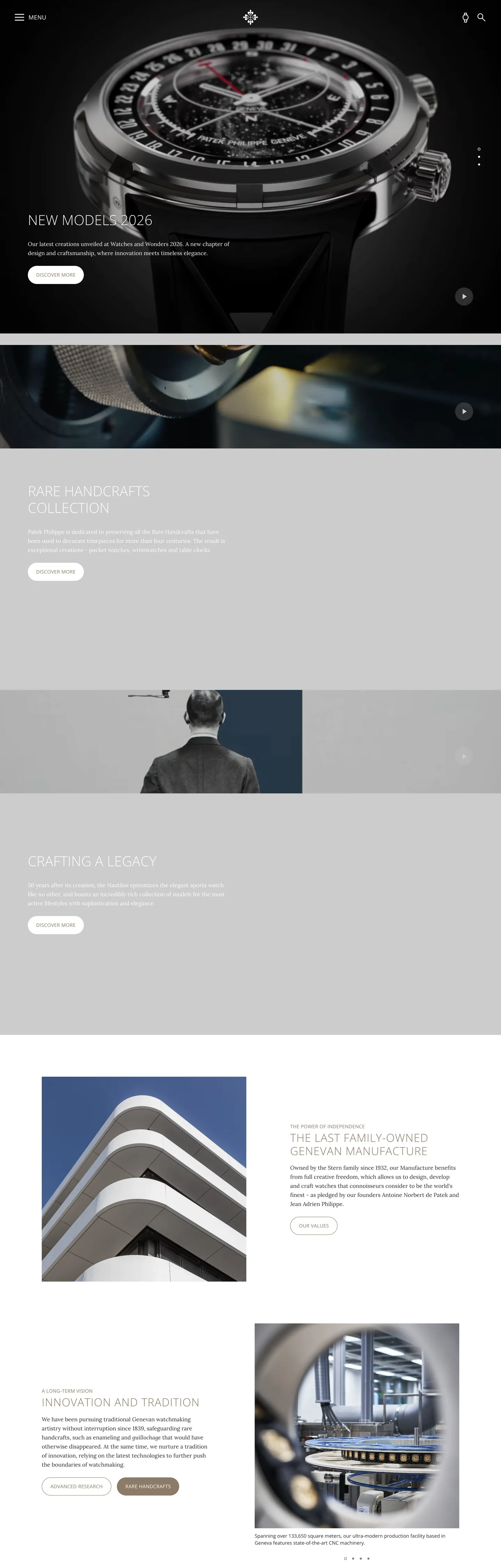
Patek Philippe's marketing site treats the watch as a cultural object, not a commercial product — and the design system builds a frame appropriate for that ambition. The above-fold hero is full-bleed dark photography (a near-black background carrying an intricate watch movement or dial in extreme close-up) with Open Sans weight 300 uppercase display text floating over it in white. Below the fold the page moves through grey editorial panels, alternating between dark-photography sections and light-grey article layouts. The system uses only four distinct hex values across 1499 scanned elements: a dark charcoal (#2e2e33) for all structural chrome, white for canvas and overlaid text, a warm taupe (#8c7a66) for secondary accents and decorative marks, and pure black for full-bleed dark panels. Where Rolex holds color back entirely and Omega uses a crimson voltage in headings, Patek Philippe's chromatic restraint is even more complete — the taupe is the sole accent and it never appears in a CTA.

This DESIGN.md packages the system into a machine-readable spec using the Google Labs open format. Inside: 6 colors tokens drawn from the four-color palette; 12 typography tokens pairing Lora (a variable-weight serif) for navigation links and body copy with Open Sans (a geometric sans) for every uppercase heading, label, and h1/h2 — the editorial serif-plus-geometric-sans combination is the system's distinguishing typographic move; a near-flat radius vocabulary (circular at 50% for the play-button icon, 999px full pill for the progress indicator, 10px for a single small surface); 8 spacing tokens derived from the extracted 16/24/80px rhythm; and 14 components covering the top navigation, hero photography band, uppercase display headings, serif body text, the taupe-accented label, progress pill, editorial grey panel, and footer.

Feed this file to an AI coding tool and it reproduces Patek Philippe's stance: four structural colors plus one warm taupe accent, Lora for editorial navigation, Open Sans weight 300 uppercase for display, full-bleed dark photography without decorative chrome, and near-flat geometry with circular-only rounded forms. The one move worth borrowing is the serif-for-navigation discipline — using a literary typeface for nav links signals that every page is worth reading, not just browsing.

What makes it distinct

5

  1. Four-color palettethe entire marketing surface runs on charcoal (#2e2e33), white, taupe (#8c7a66), and pure black — no additional chromatic accent
  2. Serif navigation linksLora at 15px for nav links and body copy, Open Sans for every uppercase label and heading — the editorial split positions the brand as a publisher, not a retailer
  3. Weight 300 display at 40px uppercaseOpen Sans light-weight uppercase with generous tracking defines the primary h1/h2; Rolex and Omega use weight 700 for the same role
  4. Warm taupe as the single accent#8c7a66 appears 67 times as secondary label color and decorative divider, never as a CTA fill
  5. Full-bleed dark photographynear-black watch imagery fills the hero and editorial bands above the fold; the page goes to grey editorial panels below

patek.com

Live at patek.com

A snapshot of the brand in production. Scroll the frame to see the whole page.

Patek Philippe's website at patek.com

Colors

6 colors

Patek Philippe's system runs on #8c7a66 as its primary voltage, used in 2 of 14 components. Type is set in openSans across 12 tokens from 14px to 40px, weights 300–400. Shape language is soft — components average 200px corner radius, with no sharp interactive edges.

Brand & Accent

Sparing, CTA-only voltage · 1

Surface

Page and card backgrounds · 2

Text

Headlines, body, captions · 2

Other

Specialty colors · 1

Typography

12 type tokens

Set in openSans across 12 tokens, from 14px to 40px, weights 300–400. Shown in its own stack: where the font isn't installed, the fallback the file names stands in.

  • display-xl40px · weight 300 · lh 48px · tracking 0.12pxThe quick brown fox jumps over the lazy dog
  • display-lg32px · weight 300 · lh 38px · tracking 1.08pxThe quick brown fox jumps over the lazy dog
  • display-md24px · weight 300 · lh 30px · tracking 0.72pxThe quick brown fox jumps over the lazy dog
  • heading-sm17px · weight 400 · lh 14px · tracking 0.34pxThe quick brown fox jumps over the lazy dog
  • label-lg16px · weight 300 · lh 20px · tracking 0.48pxThe quick brown fox jumps over the lazy dog
  • label-md14px · weight 400 · lh 26px · tracking 0.28pxThe quick brown fox jumps over the lazy dog
  • label-sm14px · weight 400 · lh 18px · tracking 0.28pxThe quick brown fox jumps over the lazy dog
  • body-md16px · weight 400 · lh 26pxThe quick brown fox jumps over the lazy dog
  • body-sm15px · weight 400 · lh 19pxThe quick brown fox jumps over the lazy dog
  • button-md14px · weight 400 · lh 20px · tracking 0.28pxThe quick brown fox jumps over the lazy dog
  • nav-link15px · weight 400 · lh 19pxThe quick brown fox jumps over the lazy dog
  • meta-label14px · weight 400 · lh 20pxThe quick brown fox jumps over the lazy dog

Layout

Radii and spacing

4 corner radii and 8 spacing values. Shape language: soft.

Radii

  • none0px
  • sm10px
  • full999px
  • circle50%

Spacing

  • xs4px
  • sm8px
  • md12px
  • base16px
  • lg24px
  • xl36px
  • 2xl48px
  • 3xl80px

Components

14 components

Each rendered from its tokens (color, type, radius, padding) on Patek Philippe's own canvas.

  • Button Primary
    button-primaryButton Primary
  • Button Secondary
    button-secondaryButton Secondary
  • Top Nav
    top-navTop Nav
  • Nav Link
    nav-linkNav Link
  • Hero Heading
    hero-headingHero Heading
  • Section Heading
    section-headingSection Heading
  • Section Subheading
    section-subheadingSection Subheading
  • Body Paragraph
    body-paragraphBody Paragraph
  • Body On Light
    body-on-lightBody On Light
  • Accent Label
    accent-labelAccent Label
  • Hero Band
    hero-bandHero Band
  • Play Button
    play-buttonPlay Button
  • Editorial Panel
    editorial-panelEditorial Panel
  • Footer
    footerFooter

In use

The system, in use

Patek Philippe's tokens on the kind of product it builds.

Build something people actually use.

A short paragraph of marketing copy that previews how the brand's display tier and body tier read together. Two sentences is usually enough.

Get startedLearn more
Marketing heroHeadline, sub-copy, primary CTA — the universal homepage opener.
Reporting · 14 min read

The quiet collapse of an old idea

For decades the consensus held that the system would correct itself. Then it didn't. This is the inside story of what changed, told by the people who watched it unravel.

"Nobody noticed because the failure was indistinguishable from progress."

By Sam Reporter · Updated 2 hours ago

Editorial articleMagazine-style longform with display headline.

FAQ

Patek Philippe design system FAQ

Common questions about Patek Philippe's tokens, components, and how to use this DESIGN.md in your project.

Read next

Specs, directories, and component libraries that pair with this design system.

Use it

Use Patek Philippe in your project

One machine-readable file. Drop it into Claude, Cursor, or any AI tool that reads DESIGN.md.

Download DESIGN.md
  1. Download the DESIGN.md

    One machine-readable file: every color, type, radius, spacing, and component token of Patek Philippe.

  2. Feed it to your AI tool

    Drop it into Claude, Cursor, or GitHub Copilot. The agent writes React components and Tailwind classes that match Patek Philippe's visual language.

  3. Reference the tokens directly

    Or paste the values into your Tailwind config, CSS variables, or component library: every color, size and radius is a quoted, ready-to-copy value.

Read the full DESIGN.md: overview, rationale, do’s and don’ts

Overview

Patek Philippe's marketing system is built on a principle of editorial gravity — the page moves with the unhurried cadence of a luxury print magazine, not with the conversion urgency of an e-commerce site. The palette is the sparsest in the Swiss watch category: four distinct hex values across 1499 scanned elements, the lowest count in the extraction set. Charcoal #2e2e33 carries all structural chrome (navigation, body text, hairline rules), white handles the canvas and overlaid photography text, warm taupe #8c7a66 provides the single chromatic signal in secondary labels and decorative dividers, and pure black fills the full-bleed dark-photography panels. Where Omega uses a saturated crimson voltage in section headings and Rolex holds one forest-green accent in the nav crown, Patek Philippe holds its taupe entirely out of action contexts — the CTA is a charcoal pill, never taupe.

Serif navigation as editorial signal: unlike the near-universal convention of sans-serif navigation in luxury e-commerce, Patek Philippe routes nav links through Lora — a variable-weight serif — at 15px / 400. Open Sans handles every uppercase heading, label, and UI element. The split functions as a semantic marker: Lora text is "read this slowly," Open Sans text is "this is a label or heading." Most brands treat typography as a single-family decision; Patek Philippe uses the family split to encode reading speed.

The shape language is near-flat with circular controls: most surfaces use 0px sharp corners, the primary CTA uses a 999px full pill, and the play-button control is a 50% circle at 80px diameter. No intermediate rounding exists.

Key Characteristics:

  • Four-color palette: charcoal (#2e2e33), white, taupe (#8c7a66), pure black — nothing else across 1499 scanned elements.
  • Lora serif for navigation links and body copy; Open Sans for all uppercase headings, labels, and UI.
  • Open Sans weight 300 uppercase for display — h1/h2 at 40px / weight 300, not the 700 that Rolex and Omega use.
  • Taupe (#8c7a66) as secondary-label accent — 67 total occurrences, never in a CTA or primary action.
  • Full-bleed dark photography (near-black backgrounds) in hero and editorial panels, alternating with light-grey body sections.
  • Near-flat radius: 0px for cards and bands, 999px for the primary CTA pill, 50% for the circular play-button control.
  • 80px vertical section padding — more generous than Rolex's 60px; editorial breathing room.
  • Sparse spacing base (4-16px system) for internal component spacing, generous section-level padding (80px).

Colors

Structural

  • Ink ({colors.ink} — #2e2e33): frequency 565 — the dominant color across the entire page. 281 as text, 281 as border. A dark charcoal with a very slight violet-grey hue (oklch c: 0.009, h: 286°), never pure black. Carries all body text, navigation labels, sub-headings, and hairline borders. The extraction's dominant color by a factor of 7 over the next most frequent.
  • Canvas ({colors.canvas} — #ffffff): frequency 79 — white editorial body canvas, CTA text, and overlaid text on dark photography. Also merged from #f8f7f7 (a near-identical near-white used for the light-grey editorial panels, wired as the surface-grey alternate).
  • Accent ({colors.accent} — #8c7a66): frequency 67 — 33 as text, 33 as border, 1 as background fill. A warm muted taupe that reads as the brand's second-voice tone. Used for secondary label spans ("Learn more," sub-category dividers), never as a primary action fill. This is the only chromatic color in the system.
  • Pure Black ({colors.pure-black} — #000000): frequency 5 — 3 as background, 1 as text, 1 as border. The full-bleed dark photography panels and the hero band canvas. Not used for body text — charcoal (#2e2e33) handles running text.

Surface

  • Surface Grey ({colors.surface-grey} — #f8f7f7): the near-white canvas for light editorial panels; merged into the {colors.canvas} cluster at the extraction level. Appears as the background of below-fold article-style sections.
  • Ink Light ({colors.ink-light} — #ffffff): white text and overlaid typography on the full-bleed dark photography panels. Structurally the same as canvas white — semantically used as overlay text rather than surface fill.

Typography

Font Families

The system runs two families with strictly divided roles. Lora (a variable-weight serif, loaded as the CSS variable --font-primary) carries navigation links and body paragraphs — the "read slowly" voice. Open Sans (--font-secondary) carries every uppercase heading, label, sub-navigation chip, and UI element — the "this is structured information" voice. A third family, Erbaum (--font-alt), appears in the CSS variables but does not appear in the extracted rendering — likely reserved for a specific sub-brand or future context.

The Lora-for-navigation pattern is the typographic signature. Among the luxury watch brands in the extraction set, only Patek Philippe routes nav links through a serif. The effect is that the nav reads like a table of contents rather than a menu bar.

Hierarchy

TokenSizeWeightLine HeightLetter SpacingUse
{typography.display-xl}40px30048px0.12pxHero h1 ("New models 2026"), major section h2 (uppercase)
{typography.display-lg}32px30038px1.08pxSection h2 (uppercase, generous tracking)
{typography.display-md}24px30030px0.72pxSub-section h3 (uppercase)
{typography.heading-sm}17px40014px0.34pxSmall h4 / emphasis spans (uppercase)
{typography.label-lg}16px30020px0.48pxCategory labels (uppercase, light weight)
{typography.label-md}14px40026px0.28pxDefault uppercase label / sub-nav chip
{typography.label-sm}14px40018px0.28pxCompact uppercase label
{typography.body-md}16px40026px0Lora serif — default body paragraphs
{typography.body-sm}15px40019px0Lora serif — nav links, footer text
{typography.button-md}14px40020px0.28pxOpen Sans — CTA button label (uppercase)
{typography.nav-link}15px40019px0Lora serif — primary navigation links
{typography.meta-label}14px40020px0Open Sans — metadata spans

Principles

Display weight stays at 300 across every heading tier. Not 700, not 600 — 300. The hero h1 at 40px / 300 uppercase is among the lightest typographic moments for a display heading in the luxury-watch category. This is the deliberate anti-gesture: the brand trusts the watch photograph to carry visual authority, and the heading floats over it without competing. The 1.08px letter-spacing on the 32px h2 adds presence without weight — the opposite of bold.

Open Sans uppercase with generous tracking is the system's "announcement" mode; Lora is the "editorial conversation" mode. The two voices never appear at the same size tier.

Note on Font Substitutes

Lora is freely available on Google Fonts. Open Sans is also on Google Fonts — these are the closest-to-zero-friction substitutes in the extraction set. The Erbaum alternate has no obvious open-source equivalent; its role is unclear from the captured surface.

Layout

Spacing System

  • Base unit: 4px.
  • Tokens: {spacing.xs} 4px · {spacing.sm} 8px · {spacing.md} 12px · {spacing.base} 16px · {spacing.lg} 24px · {spacing.xl} 36px · {spacing.2xl} 48px · {spacing.3xl} 80px.
  • Component internal padding: 0×12px for nav links, 0×24px for CTA pills, 12px for compact containers.
  • Section vertical padding: 80px at the major editorial bands — the most frequent large-spacing value (5 occurrences at 0px 80px). Section ends carry 170px bottom padding on the hero and footer.

Grid & Container

  • Max content width: inferred ~1280px on editorial bands. No explicit CSS grid variable exposed (unlike Rolex's 12-column declaration).
  • Hero band: full-bleed dark photography. Content centered with display text floating in the lower third of the band.
  • Below-fold editorial sections: alternating between full-width dark-photography panels and constrained-width grey editorial panels at 80px horizontal padding.

Rhythm

The page alternates between cinematic dark panels (full-bleed watch photography, white uppercase text) and light-grey editorial panels (Lora body copy, charcoal text, taupe accents). The transition is abrupt — no gradient fade between bands. The rhythm creates two reading modes: visual (dark panels) and textual (light panels), reflecting the dual audience of the brand's site (collectors who want technical depth, admirers who want the image).

Elevation

No shadow tier. The system achieves depth through photography contrast: dark-panel photography reads as depth against light-canvas editorial sections. The taupe accent (#8c7a66) carries border rules and decorative dividers, providing the only surface-level element distinction. Cards and editorial panels are flat — no box-shadow appears in the extracted component data.

Shapes

The radius vocabulary is binary with a circular mode:

  • {rounded.none} 0px — all editorial panels, section containers, and the hero band. Sharp corners throughout.
  • {rounded.sm} 10px — a single secondary surface, 1 occurrence.
  • {rounded.full} 999px — the primary CTA button pill. 10 occurrences, the fully-rounded button shape.
  • {rounded.circle} 50% — the play-button control. 11 occurrences, a circular icon button at 80×80px.

The play-button circle is the system's most distinctive radius move: a fully circular control centered over the hero video, rendered in charcoal on a dark panel. It is the only circular form among the captured luxury watch brands.

Components

button-primary — Charcoal (#2e2e33) fill, white text, 999px full-pill radius, 0×24px padding, 40px height. Open Sans 14px / 400 uppercase with 0.28px tracking. The CTA label is "Discover" — the fill is charcoal, not taupe; the accent color is held back.

button-secondary — Transparent fill, taupe (#8c7a66) text and 1px taupe border, 0px radius. Used for secondary editorial actions.

top-nav — White canvas, charcoal text, Lora nav-link (15px / 400 serif), 0px radius, 24px horizontal padding, 60px height. The Patek Philippe cross emblem left, nav links (Watches / Collections / Maison / Our values / Boutiques) center-right, a compact language/account utility cluster far right. All nav labels in Lora serif — the most visually distinctive nav typography in the dataset.

nav-link — Transparent background, charcoal text, Lora serif at 15px / 400. No uppercase, no tracking — reads as editorial prose navigation rather than a structured menu.

hero-heading — Transparent background, white text, display-xl (40px / 300 / 48px / 0.12px / uppercase). Floats over the full-bleed dark watch photography.

section-heading — Charcoal ink text, display-lg (32px / 300 / 38px / 1.08px / uppercase). Used for "Rare Handcrafts Collection" and other below-fold section titles.

section-subheading — Charcoal text, display-md (24px / 300 / 30px / 0.72px / uppercase). Sub-section headers in the editorial grey panels.

body-paragraph — White text, Lora body-md (16px / 400 / 26px). Used over dark photography panels — the Lora serif body over dark contrast is the editorial signature.

body-on-light — Charcoal text, Lora body-md (16px / 400 / 26px). Default running text on light editorial panels.

accent-label — Taupe (#8c7a66) text, Open Sans label-md (14px / 400 uppercase). The secondary voice — sub-category attribution spans, "Learn more" links, decorative divider labels.

hero-band — Pure black canvas, white text, display-xl, 0px radius. 80px top/bottom padding, 170px bottom on the hero to give the typography generous footing above the fold.

play-button — Charcoal fill, white icon, 50% circle (80×80px). The circular video play control centered over the hero watch photography.

editorial-panel — Light-grey canvas (#f8f7f7), charcoal text, Lora body-md, 0px radius, 80px padding. The alternating light editorial panel below the fold.

footer — White canvas, charcoal text, Lora body-sm (15px / 400), 80px side / 170px bottom padding. Multi-column link grid: Watches / Collections / Maison / Our values / Boutiques.

Do's and Don'ts

Do use Lora for every navigation link and body paragraph. The serif-for-navigation choice is the system's editorial signature — swapping nav links to Open Sans would make the brand read as any other Swiss luxury e-commerce site.

Do keep display headings at Open Sans weight 300 uppercase. The 40px / weight 300 hero h1 is deliberate restraint — the watch photography carries visual authority, the heading floats without competing. Bumping to weight 700 turns the editorial into a SaaS announcement.

Do hold the taupe (#8c7a66) in secondary-label roles only. It appears 67 times as a decorative and attributive color — never as a CTA fill. Using taupe as an action color would break the four-color discipline.

Do maintain the circular play-button (50% radius) as the only non-flat rounded form besides the CTA pill. The circle-or-pill-or-nothing radius rule is the shape signature.

Don't introduce a fourth chromatic color — the extraction found exactly 4 hex values across 1499 elements. Adding a brand blue, a gold, or an additional green would exceed the system's palette discipline.

Don't use Open Sans at weight 700 for body copy. The system's Open Sans weight range is 300-400; weight 700 appears nowhere in the captured extraction. The heavy weight is Lora's domain in the serif voice, not Open Sans's.

Don't apply the 999px CTA pill to secondary buttons. The full pill is reserved for the primary "Discover" CTA — secondary actions use a rectangular frame with taupe border at 0px radius.

Don't use the circular play-button (50% radius) outside of video control contexts. It is calibrated at 80px diameter to signal a very specific interaction; a smaller or larger circle in a different context would read as a UI aberration.

Known Gaps

  • Erbaum typeface: declared in CSS as --font-alt: 'erbaum' but does not appear in the captured rendering. Its role — possibly a seasonal display variant or a sub-brand accent — is not documented here.
  • CTA hover and focus states: the charcoal CTA pill's hover variant was not captured in the extraction; CSS variables do not expose an explicit hover color.
  • Form input states: no text input appears in the extracted components; boutique-finder and configurator forms on patek.com carry inputs not exposed in the marketing page.
  • Motion: the hero watch photographs use scroll-triggered entrance animations and the play-button triggers a video modal; easing curves and duration values are not captured here.
  • Dark mode: the system is light-only on the marketing surface. No dark-mode alternative was captured.
  • Gold and precious-metal accents: the watch photography itself contains gold, rose-gold, and platinum tones, but these live inside photograph content rather than in the design system's CSS. No gold or metallic hex is extracted.

E-commerce & Retail

More systems like this

More DESIGN.md files in E-commerce & Retail.

Pricing

Build it with Pro

The DESIGN.md files are free. Pro adds 6,000+ blocks, premium templates and the MCP server, so your AI editor builds in your system for you.

4.9/5 out of 5 · 150+ reviewsfrom 150+ founders and developers.

Billed once a year in USD. Cancel anytime.

Individual

For personal projects & open source

$32instead of $49/mo

$389 billed yearly

  • How many people can use the license.Seats: 1 seat
  • Client work, SaaS products and anything you charge for.Commercial use: Personal & open source only
  • Production-ready React sections: hero, pricing, features, dashboards and more.Pro blocks: 6,000+ blocks
  • Complete multi-page sites you can ship as they are.Templates: All 14 templates
  • React icons from every major library, installable with one command.React icons: 294k+ icons
  • Presets that restyle every block, in light and dark.Themes: All 59 themes
  • Lets your AI editor search, preview and install blocks for you.MCP server: Basic usage
  • Priority requests are answered first.Support: Standard

Team

Most popular

For freelancers, agencies & startups

$66instead of $99/mo

$789 billed yearly · ≈ $13/dev/mo

Everything in Individual, plus

  • How many people can use the license.Seats: Up to 5 seats
  • Client work, SaaS products and anything you charge for.Commercial use: Included
  • Lets your AI editor search, preview and install blocks for you.MCP server: High usage
  • Priority requests are answered first.Support: Priority

Organization

For companies with larger teams

$132instead of $199/mo

$1,589 billed yearly

Everything in Team, plus

  • How many people can use the license.Seats: Unlimited seats
  • Lets your AI editor search, preview and install blocks for you.MCP server: Unlimited usage
  • Secure checkout via Stripe
  • Code lives in your repo
  • Keep what you've shipped if you cancel
  • License terms

Your system, built for you

Every block, template and icon, installed by your AI agent in your design system. The DESIGN.md files stay free.

Get Pro