Patagonia Design System
Patagonia's marketing system as a DESIGN.md file. Ridgeway Sans, ink-on-white chrome, 64px hero over wilderness photography, no chromatic brand accent. For React, Next.js, and AI coding tools.
Add shadcn.io to your AI agent. · Pro It installs blocks, icons and templates in your design system from a prompt, with Pro.
Set up MCP- Primary
- #91abe9
- Typeface
- Ridgeway Sans
- Shape
- Mixed
- Base radius
- 8px
- Colors
- 9
- Type tokens
- 11
- Components
- 17
- Spacing values
- 8
About
About Patagonia DESIGN.md
Curated by Dov Azencot · Updated May 18, 2026 · Source patagonia.com (opens in a new tab)
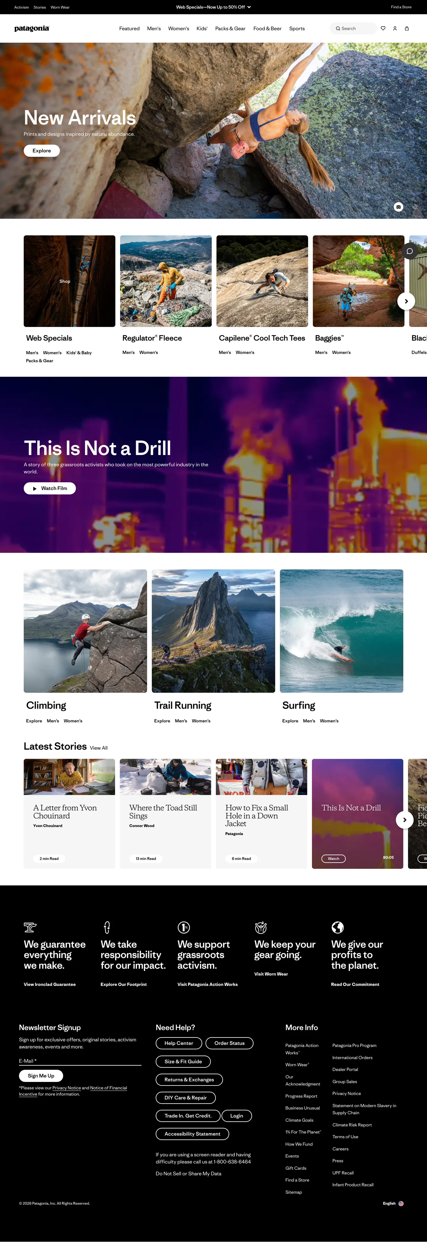
Patagonia's marketing site is the rare consumer-retail surface that trusts photography to do almost every visual job. Above the fold, a climber in a red helmet hangs off a granite face under a 64px "New Arrivals" headline; one band down, a thermal-spectrum surf-break image carries "This Is Not a Drill" in the same display tier; below the fold, three category tiles (Climbing, Trail Running, Surfing) are full-bleed photos with the category name laid directly on the image rather than under a rounded card. There is no chromatic brand color anywhere on the chrome. The page runs ink black on warm white, the body weight is a hair-thin 300, and the inverted footer band carries five white pictogram tiles spelling out the brand's commitments — "we guarantee everything we make," "we take responsibility for our impact," "we support causes activism," "we keep your gear going," "we give your profile to the planet."
The DESIGN.md file packages the system into a machine-readable spec. Inside: 9 colors tokens drawn from a near-monochrome ink-on-white palette plus the Bootstrap structural neutrals that ship under the Patagonia chrome; 11 typography tokens running Ridgeway Sans (a proprietary sans) at weights 300 and 500, with a single Copernicus serif token reserved for a quiet editorial flourish in the sub-headline tier; 5 corner-radius tokens centered on 8px (buttons) and 30px (pill secondaries); 8 spacing values on a 4px base; and 17 components definitions covering the ink-fill primary button, the pill-outline secondary, full-bleed photo hero, category photo tile, story card, newsletter sign-up, and the inverted black footer with its icon-rail and link grid.
Feed this file to an AI coding tool and it reproduces Patagonia's specific moves: warm-white canvas instead of pure white, ink-black CTAs instead of a brand accent, Ridgeway Sans at 300/500 across every tier, 64px display headlines designed to share a frame with photography, 8px button radius, and the inverted-black footer with white icon rails. The one move worth borrowing only if your product can stand behind it: the absence of any chromatic brand voltage. Patagonia gets away with monochrome chrome because the photography carries the entire emotional register; most consumer brands need at least one electric color moment to compensate for stock-photo realism.
What makes it distinct
5
- Photography as protagonistevery above-the-fold band is a full-bleed climbing, surfing, or trail-running photo with a white headline laid directly over the image, no overlay scrim
- Zero chromatic brand voltageink black carries every CTA, link, and nav label; the only color on the marketing surface comes from the imagery itself
- Ridgeway Sans at weight 300 for body and 500 for displaythe hero h1 at 64px is the loudest typographic moment, deliberately measured to share the frame with the photo behind it
- Inverted black footer bandthe page floor flips from warm white to pure black with five white pictogram tiles (guarantee, responsibility, activism, profile, planet) above the link grid
- Tight 8px button radius and 30px pill secondarythere is no soft-rounded card geometry; even category tiles are square photo plates with text beneath rather than rounded cards
patagonia.com
Live at patagonia.com
A snapshot of the brand in production. Scroll the frame to see the whole page.
Colors
9 colors
Patagonia's system anchors on #91abe9 (focus-ring) as its primary color. Type is set in Ridgeway Sans across 11 tokens from 12px to 64px, weights 300–700. Shape language is mixed across 17 components, blending pills, soft rounds, and squarer corners.
Surface
Page and card backgrounds · 3
Text
Headlines, body, captions · 4
Borders & Hairlines
Dividers, outlines, rules · 1
Other
Specialty colors · 1
Typography
11 type tokens
Set in Ridgeway Sans across 11 tokens, from 12px to 64px, weights 300–700. Shown in its own stack: where the font isn't installed, the fallback the file names stands in.
- display-xl64px · weight 500 · lh 70.4px · tracking -1.28pxThe quick brown fox jumps over the lazy dog
- display-md32px · weight 500 · lh 35.2px · tracking -0.64pxThe quick brown fox jumps over the lazy dog
- display-sm24px · weight 500 · lh 26.4px · tracking -0.48pxThe quick brown fox jumps over the lazy dog
- display-serif24px · weight 500 · lh 26.4px · tracking -1.2pxThe quick brown fox jumps over the lazy dog
- body-lg16px · weight 300 · lh 24pxThe quick brown fox jumps over the lazy dog
- body-md14px · weight 300 · lh 24.5pxThe quick brown fox jumps over the lazy dog
- body-emphasis14px · weight 700 · lh 24.5pxThe quick brown fox jumps over the lazy dog
- label-md14px · weight 500 · lh 16.8pxThe quick brown fox jumps over the lazy dog
- button-md16px · weight 500 · lh 19.2pxThe quick brown fox jumps over the lazy dog
- nav-link12px · weight 300 · lh 18pxThe quick brown fox jumps over the lazy dog
- caption12px · weight 700 · lh 18pxThe quick brown fox jumps over the lazy dog
Layout
Radii and spacing
5 corner radii and 8 spacing values. Shape language: mixed.
Radii
- none0px
- sm8px
- lg30px
- xl40px
- full9999px
Spacing
- xs4px
- sm8px
- md12px
- base16px
- lg20px
- xl24px
- 2xl40px
- 3xl80px
Components
17 components
Each rendered from its tokens (color, type, radius, padding) on Patagonia's own canvas.
- Button Primarybutton-primaryButton Primary
- Button Primary Hoverbutton-primary-hoverButton Primary Hover
- Button Secondarybutton-secondaryButton Secondary
- Button On Photobutton-on-photoButton On Photo
- Top Navtop-navTop Nav
- Nav Linknav-linkNav Link
- Hero Photo Bandhero-photo-bandHero Photo Band
- Hero Heading On Photohero-heading-on-photoHero Heading On Photo
- Section Headingsection-headingSection Heading
- Category Photo Tilecategory-photo-tileCategory Photo Tile
- Story Cardstory-cardStory Card
- Newsletter Inputnewsletter-inputNewsletter Input
- Newsletter Submitnewsletter-submitNewsletter Submit
- Footer Bandfooter-bandFooter Band
- Footer Icon Tilefooter-icon-tileFooter Icon Tile
- Footer Linkfooter-linkFooter Link
- Legal Bandlegal-bandLegal Band
In use
The system, in use
Patagonia's tokens on the kind of product it builds.
Build something people actually use.
A short paragraph of marketing copy that previews how the brand's display tier and body tier read together. Two sentences is usually enough.
FAQ
Patagonia design system FAQ
Common questions about Patagonia's tokens, components, and how to use this DESIGN.md in your project.
Read next
Related reading
Specs, directories, and component libraries that pair with this design system.
- Browse all design systemsThe full directory of DESIGN.md files on shadcn.io, with live mockups for each.shadcn.io
- Patagonia — official sitePatagonia's public marketing site — the source of truth for the live tokens captured in this file.patagonia.com (opens in a new tab)
- The DESIGN.md specificationGoogle Labs' open spec for machine-readable design system files — the format this page is built on.github.com (opens in a new tab)
Use it
Use Patagonia in your project
One machine-readable file. Drop it into Claude, Cursor, or any AI tool that reads DESIGN.md.
Download the DESIGN.md
One machine-readable file: every color, type, radius, spacing, and component token of Patagonia.
Feed it to your AI tool
Drop it into Claude, Cursor, or GitHub Copilot. The agent writes React components and Tailwind classes that match Patagonia's visual language.
Reference the tokens directly
Or paste the values into your Tailwind config, CSS variables, or component library: every color, size and radius is a quoted, ready-to-copy value.
Read the full DESIGN.md: overview, rationale, do’s and don’ts
Overview
Patagonia's marketing chrome does the rare thing in consumer retail. Photography as protagonist. Every above-the-fold band hands the entire visual job to a full-bleed wilderness photograph — a climber in a red helmet on granite, a thermal-spectrum surf still, three category plates of climbing, trail running, and surfing rendered as edge-to-edge bitmaps with the category name laid directly on the image rather than under a rounded card. Where Arc'teryx leans on dramatic gradients to suggest mountain atmosphere, where Lululemon paints its athletes against saturated brand-color backdrops, and where REI builds rounded marketing cards over product cutouts, Patagonia hands the frame over entirely to documentary imagery and pulls all chrome — type, buttons, links, dividers — into ink black on warm white so the photography stays the brand's voice.
The chromatic restraint is uncompromising. The captured page renders ink ({colors.ink} — #000000) 661 times across text, borders, and shadows; warm white ({colors.canvas} — #ffffff) 444 times across text, backgrounds, and borders. There is no chromatic brand voltage anywhere on the marketing surface — the page's only chromatic tokens ({colors.focus-ring} — #91abe9, {colors.link-swiper} — #007aff) ship from Bootstrap's default Swiper carousel theme and the WCAG focus-ring, not from Patagonia's own brand palette. This is the inverse of single-voltage discipline at Airbnb or Cloudflare: instead of holding one electric accent in reserve, Patagonia holds the entire chrome in monochrome and lets the photographs carry every chromatic moment. The activist banner pattern of "Don't buy this jacket" lives in the same register — ink type on warm white, no decorative bling.
Type runs Ridgeway Sans (a proprietary Patagonia sans wired into --pata-font-sans) at weight 300 for body and weight 500 for display. The hero h1 ("New Arrivals", "This Is Not a Drill") sits at 64px / 500 with -1.28px tracking — the loudest typographic moment in the system, and deliberately measured to share a frame with the photograph behind it rather than to dominate the page. There is no 700+ bold weight on the marketing surface. A single Copernicus token (the Palatino-family serif Patagonia keeps under --pata-font-serif) appears at 24px / 500 with -1.2px tracking for one quiet editorial moment, the only serif tier in the system.
Key Characteristics:
- Warm-white canvas (
{colors.canvas}— #ffffff) with a near-white--bs-light-bg-subtle(#fafafa) lift between editorial bands — no pure-white clinical floor. - Zero chromatic brand voltage. Ink black (
{colors.ink}) carries every CTA, nav label, link, body line, and hairline. The chromatic load lives entirely in the photography. - Inverted footer band: black
{colors.ink}page floor with five white pictogram tiles ({component.footer-icon-tile}) spelling out the brand's commitments — guarantee, responsibility, activism, gear repair, planet ownership. - Ridgeway Sans at weights 300 (body) and 500 (display), with Copernicus serif reserved for one editorial sub-headline tier. No 700+ bold weight on the marketing chrome.
- Tight 8px button radius (
{rounded.sm}, 49 occurrences) and 30px pill secondary ({rounded.lg}, 19 occurrences) — no 12-20px middle tier; the scale jumps cleanly from square-ish to pill. - Square photo plates on the category grid:
{rounded.none}edge-to-edge bitmaps with the category name laid over the image, not rounded cards underneath. - 4.8rem (48px) horizontal nav padding wired into
--nav-container-padding-x— the entire page sits inside a generous, editorial-width gutter rather than a tight SaaS container. - The system's 96px primary nav height plus 48px secondary nav (
--pat-primary-nav-height+--pat-secondary-nav-height) totals 144px of fixed header — tall by web convention, but it lets the photo bands below feel framed rather than crowded.
Colors
Brand
- Ink (
{colors.ink}— #000000): frequency 661. Used as text (339), border (306), shadow (10), background (6). Wired into Bootstrap's--bs-primary,--bs-body-color,--bs-link-color,--bs-dark. The single load-bearing color in the system — every CTA fill, every nav label, every body line, every hairline runs ink black. The chrome's only voltage. - Ink Soft (
{colors.ink-soft}— #333333): frequency 1. Used as background (1). Wired as--bs-gray-800. Reserved for the hover/press state on the primary CTA — a single step lighter than pure ink so the button reads as pressed without color shift. - Ink Muted (
{colors.ink-muted}— #4a4a4a): frequency 6. Used as text (3), border (3). Wired as--bs-gray-700,--bs-dark-text-emphasis. Reserved for secondary running text and the "Need Help?" sub-label tier in the footer link grid — the one near-black that isn't pure ink.
Surface
- Canvas (
{colors.canvas}— #ffffff): frequency 444. Used as text (203), border (202), background (39). Wired as--bs-body-bg,--bs-white,--bs-light,--bs-tertiary-bg. The warm-white page floor under all editorial bands, the white text laid over every photo plate, and the fill for cards lifted off the warm-floor lift band. - Surface-1 (
{colors.surface-1}— #f2f2f2): frequency 2. Used as text (1), border (1). Wired as--bs-secondary-bg,--bs-info-bg-subtle. The single lifted neutral tile in the system — used on the small story-card grid below the category band.
Hairlines
- Hairline (
{colors.hairline}— #cccccc) and Surface-2 ({colors.surface-2}— #cccccc): frequency 2. Used as text (1), border (1). Wired as--bs-gray-400,--bs-primary-bg-subtle. The 1px divider tone between editorial bands and around form inputs — soft enough to read as a horizon line rather than a hard edge.
System (non-brand)
- Focus Ring (
{colors.focus-ring}— #91abe9): frequency 0 on the captured surface, but declared as--bs-focus-ring-colorand--bs-info. Layer-tagged "brand" by the extractor due to the variable name, but in practice it is the WCAG focus indicator inherited from Bootstrap's default theme, not a Patagonia design decision. - Swiper Link (
{colors.link-swiper}— #007aff): frequency 16. Used as text (8), border (8). Wired as--swiper-theme-color. The default carousel-navigation accent shipped by the Swiper.js carousel that powers the homepage band sliders. Not part of Patagonia's brand palette — it ships from the third-party carousel library and is never used outside that scope.
Typography
Font Family
The system runs Ridgeway Sans (a proprietary Patagonia sans wired into --pata-font-sans) for everything except a single quiet editorial moment. Fallbacks walk system-ui, -apple-system, "Segoe UI", Roboto, "Helvetica Neue", Arial, "Noto Sans", "Liberation Sans", sans-serif. A second token references Copernicus (the Palatino-family transitional serif Patagonia ships under --pata-font-serif) with the full Palatino fallback chain — used at 24px / 500 for a single editorial sub-headline, the only serif tier in the system.
There is also a deeply localized Japanese type stack under --pata-font-sans-regular-ja and --pata-font-sans-bold-ja (Hiragino Kaku Gothic Pro), suggesting the marketing system is built to swap typeface families per locale rather than to render one global family.
Hierarchy
| Token | Size | Weight | Line Height | Letter Spacing | Use |
|---|---|---|---|---|---|
{typography.display-xl} | 64px | 500 | 70.4px | -1.28px | Hero h1 ("New Arrivals", "This Is Not a Drill") over full-bleed photography |
{typography.display-md} | 32px | 500 | 35.2px | -0.64px | Section heads ("Latest Stories", "Newsletter Signup") |
{typography.display-sm} | 24px | 500 | 26.4px | -0.48px | Category-tile labels ("Climbing", "Trail Running", "Surfing") laid over photo plates |
{typography.display-serif} | 24px | 500 | 26.4px | -1.2px | The single editorial Copernicus serif moment in the system |
{typography.body-lg} | 16px | 300 | 24px | 0 | Default running text and CTA labels |
{typography.body-md} | 14px | 300 | 24.5px | 0 | Secondary body, link rows, story-card meta |
{typography.body-emphasis} | 14px | 700 | 24.5px | 0 | The system's rare bold tier — <strong> inside body copy only |
{typography.label-md} | 14px | 500 | 16.8px | 0 | Footer column heads and category chip labels |
{typography.button-md} | 16px | 500 | 19.2px | 0 | Primary and secondary CTA labels |
{typography.nav-link} | 12px | 300 | 18px | 0 | Top-nav category labels, footer link rows |
{typography.caption} | 12px | 700 | 18px | 0 | Footer legal labels and category-strip micro-labels |
Principles
Display weight tops out at 500. The hero h1 at 64px / 500 with -1.28px tracking is the loudest typographic moment, and it lives over a full-bleed climbing photograph — the weight is deliberately calibrated to share the frame with the photo rather than to dominate it. Body sits at weight 300, which on web is unusually thin for retail and reads as editorial-magazine rather than e-commerce. The system has only one true bold tier ({typography.body-emphasis} at 14px / 700), reserved for <strong> inside running text — there is no 700+ display weight anywhere on the marketing surface.
The single Copernicus serif token is the system's tonal counterweight. It appears once at 24px / 500 with tight -1.2px tracking, used for a quiet editorial sub-headline that signals "this is a story, not a product card" — the typographic version of the brand's activist-publishing voice.
Note on Font Substitutes
Ridgeway Sans is proprietary. Inter at the same weights is the closest open-source substitute; tighten line-heights by ~3% to match Ridgeway's slightly tighter cap height at the 64px display tier. For the Copernicus serif, EB Garamond or Source Serif Pro at the same size and tracking transfer the editorial register cleanly.
Layout
Spacing System
- Base unit: 4px (with 8px as the dominant module).
- Tokens:
{spacing.xs}4px ·{spacing.sm}8px ·{spacing.md}12px ·{spacing.base}16px ·{spacing.lg}20px ·{spacing.xl}24px ·{spacing.2xl}40px ·{spacing.3xl}80px. - Section padding (horizontal): 80px (
{spacing.3xl}) on the editorial bands, wired as--nav-container-padding-x: 4.8rem— the entire page sits inside a generous editorial gutter rather than a tight SaaS container. - Button padding: 9px vertical, 28px horizontal — the dominant CTA shape in the system (11 occurrences across the captured page).
- Photo-band internal padding: 0 — every hero and category photo plate runs edge-to-edge with type laid directly over the image.
Grid & Container
- Max content width: ~1280px on editorial bands, full-bleed on hero and category photo bands.
- Top nav: 96px primary nav (
--pat-primary-nav-height) + 48px secondary nav (--pat-secondary-nav-height) = 144px fixed header total. Houses the Patagonia logo flush left, six product/cause category links (Activism, Stories, Sports, Shop, etc.) center-left, account utilities (search, profile, bag) flush right. - Hero photo band: full-bleed climbing or surfing photograph with the 64px white headline laid in the lower-left third of the frame.
- Category strip: 4-column small-tile grid below the hero with editorial micro-labels per tile.
- Category photo grid: 3-column full-bleed photo plates (Climbing, Trail Running, Surfing) with white display-sm labels laid over the image, no rounded card underneath.
- Story grid: 4-column small story cards with photo top + title + meta beneath.
- Footer: Black inverted band with 5-tile pictogram row above a 4-column link grid (Need Help / More info / Newsletter / Social).
Rhythm
The page alternates between full-bleed photographic bands (hero, category grid, story photos) and constrained editorial bands (story cards, footer link grid). There is no atmospheric gradient or background-color shift between bands — every section terminates on the same warm-white canvas, and depth comes from the photography itself rather than from chrome treatment.
Elevation
The system has essentially no shadow tier. The chrome is too restrained for traditional drop shadows to fit — instead, hierarchy comes from the lightness gap between warm-white canvas ({colors.canvas} — #ffffff), the near-white floor lift (#fafafa from --bs-light-bg-subtle), and the {colors.surface-1} (#f2f2f2) story-card fill.
- Flat (no shadow): body, hero, footer, every editorial band — 99% of surfaces.
- Tonal lift:
{colors.surface-1}(#f2f2f2) story-card tiles sit on warm white — the 4-point lightness gap reads as elevation without any shadow being drawn. - Photo plate as elevation: the category and hero photographs themselves do the work of separating sections — a full-bleed climbing image against a warm-white band reads as a clear band boundary without any chrome treatment.
- Bootstrap shadow defaults: the
--bs-box-shadowtoken (0 .5rem 1remat low alpha) ships under the chrome but is not applied to any captured marketing surface — it lives in component defaults that the page does not invoke.
Shapes
The radius scale is tight and split, with no card-radius middle tier:
{rounded.none}0px — full-bleed photo plates on the category grid, hero photo bands, and editorial dividers.{rounded.sm}8px — the dominant button radius (49 occurrences). Primary CTA, secondary CTA, text input, story card.{rounded.lg}30px — the pill secondary radius (19 occurrences). Category chips and pill-outline CTAs.{rounded.xl}40px — large pill rounding (2 occurrences). Reserved for the very few oversized pill controls.{rounded.full}9999px — icon avatars and circular profile thumbnails (50% radius rendering as full circles on square elements, 4 occurrences).
There is no 12-20px middle tier between square buttons and pill secondaries. The absence of a card radius gives the chrome its editorial-magazine feel rather than its app-store feel — product cards and category tiles are square photo plates with type beneath, not rounded glass surfaces.
Components
button-primary — The signature CTA. Ink fill ({colors.ink}), white text, {rounded.sm} 8px radius, 9x28 padding, 40px height. "Shop New Arrivals", "Read More", "Sign Up" — every primary CTA on the page renders in pure ink black, not in a brand accent color. Used 11 times across the captured surface.
button-primary-hover — Background flips to {colors.ink-soft} (#333333) — a single step lighter than pure ink, signaling pressed without color shift.
button-secondary — Transparent fill with ink text and a 1px ink outline at {rounded.lg} 30px pill rounding. Used for "Learn More" and "Read the Story" sub-CTAs beneath display headlines.
button-on-photo — White fill with ink text at {rounded.sm} 8px, 9x28 padding. Used as the over-photo CTA on hero bands — the one place the primary CTA inverts from ink-on-white to white-on-photo so it reads against the dark zones of wilderness imagery.
top-nav — Warm-white surface, 96px height, 0x48px padding. Houses the Patagonia logo flush left, six top-level category links center-left, account utilities (search, profile, bag) flush right. Beneath it sits a 48px secondary nav for sub-category drill-down, totaling 144px of fixed header.
nav-link — Transparent background, ink text in {typography.nav-link} (12px / 300), 0x12px padding. The 300 weight at 12px is unusually light for primary navigation — it lets the photo bands below feel framed rather than crowded by nav weight.
hero-photo-band — Full-bleed photograph with zero padding and {rounded.none} corners. The display-xl headline is laid in the lower-left third of the frame; the over-photo CTA sits beneath it. No overlay scrim or gradient is applied — the photograph is shown at full opacity, and white type is placed against whichever zone of the image reads dark enough for contrast.
hero-heading-on-photo — White text at {typography.display-xl} (64px / 500, -1.28px tracking), no background, 0 padding. The system's loudest typographic moment.
section-heading — Ink text at {typography.display-md} (32px / 500, -0.64px tracking). Used for "Latest Stories", "Newsletter Signup", and the editorial section heads inside the warm-white bands.
category-photo-tile — Full-bleed photograph with the category name laid directly on the image in white display-sm. {rounded.none} corners, 0 padding. The 3-column category grid (Climbing, Trail Running, Surfing) renders this pattern repeated edge-to-edge.
story-card — Warm-white fill ({colors.canvas}), ink text, {rounded.sm} 8px radius, 16px internal padding, 1px hairline border. The small editorial card on the "Latest Stories" grid — photo top, title in {typography.body-md}, meta line beneath in muted ink.
newsletter-input — Warm-white fill, ink text in {typography.body-lg}, {rounded.sm} 8px radius, 12x16 padding, 48px height, 1px ink outline. Sits inside the "Newsletter Signup" band below the story grid, paired with the ink-fill submit button.
newsletter-submit — Ink fill, white text, 8px radius, 12x28 padding, 48px height. The same shape as the primary button, sized up for the newsletter band's input pairing.
footer-band — Ink fill ({colors.ink} — #000000), white text, 40x80 padding. The page floor flips from warm white to pure black for the footer — the only inverted band in the system. Houses the 5-tile icon pictogram row above the 4-column link grid.
footer-icon-tile — Transparent fill, white SVG pictogram + label, 16px padding. Five tiles spell out the brand's commitments: "we guarantee everything we make", "we take responsibility for our impact", "we support causes activism", "we keep your gear going", "we give your profile to the planet". Each pictogram is a thin-line monochrome SVG, not a filled illustration.
footer-link — Transparent background, white text in {typography.nav-link} (12px / 300), no padding. The link rows under "Need Help?", "More Info", and "Social" columns of the footer grid.
legal-band — Ink fill, white text in {typography.caption} (12px / 700), 16x80 padding. The bottom legal strip with copyright, country/language picker, and accessibility links.
Do's and Don'ts
Do trust the photography to do every chromatic job. The chrome's restraint is what gives wilderness imagery its full emotional register — adding a brand accent voltage to the chrome would compete with the photo's own colors and make the page read as decorated rather than documentary.
Do keep body text at weight 300 and display at weight 500. The thin-light register is what gives Patagonia's chrome its editorial-magazine feel rather than its e-commerce feel; the absence of a 700+ display weight is the brand's tonal signature.
Do use {rounded.none} 0px corners on photo plates and {rounded.sm} 8px on buttons. The square-edge photography against tight 8px CTAs is the shape contract — softening photo plates to rounded cards would convert the editorial-magazine register into a generic retail register.
Do flip to black {colors.ink} background in the footer band. The inverted footer is the only chrome moment in the system that reads as "brand voice" rather than as "container" — it's the visual signature of the brand's commitments and should stay inverted from the warm-white page floor.
Don't introduce a chromatic brand accent — not even the Bootstrap --bs-info pale-blue or --bs-blue mid-blue that ship under the chrome as defaults. The photography supplies every chromatic moment on the marketing surface, and adding a chrome accent would make every photo band feel decorated rather than direct. For interactive accents, use {colors.ink} instead.
Don't use {colors.link-swiper} (#007aff) outside the Swiper carousel arrows. It's a third-party library default that ships under the chrome, not a Patagonia design decision — using it for links, focus rings, or callouts would inject a chromatic moment the system deliberately rejects.
Don't introduce a card radius between 8px and 30px. The scale jumps deliberately from square-ish buttons straight to pill secondaries; a 12px or 16px middle tier would soften the chrome into a generic retail register and lose the editorial-magazine geometry the system depends on.
Don't add a drop-shadow tier to lift cards off the warm-white canvas. The 4-point lightness gap between {colors.canvas} (#ffffff) and {colors.surface-1} (#f2f2f2) is the elevation contract — adding a shadow would convert the warm-floor band into a layered SaaS surface and break the flat editorial register.
Known Gaps
- Hover and focus states: documented for
{component.button-primary-hover}only; the full state matrix (focus rings, disabled tints, error states) is not captured from the marketing surface. The declared{colors.focus-ring}(#91abe9) ships from Bootstrap defaults and is not Patagonia's own focus indicator. - Form input error states:
{component.newsletter-input}carries the resting state; error / validation styling lives inside the product cart and account flows and is not exposed on the marketing site. - Dark mode: the captured marketing surface is light-only. There is no dark variant declared in the CSS variables beyond the inverted footer band.
- Product detail pages: this DESIGN.md captures the marketing homepage only. Product detail pages (which house size pickers, color swatches, fit guides, repair links, and the Worn Wear used-gear marketplace) carry a different component grammar that is not represented here.
- Activist long-form bands: Patagonia's seasonal activist marketing — the "Don't buy this jacket" pattern, op-ed-style banners over photography — uses a separate editorial type system with much longer running text. The homepage captures only the standing chrome, not these campaign-band layouts.
- Bootstrap structural neutrals: the system ships under Bootstrap 5, which loads dozens of semantic structural colors (
--bs-success,--bs-warning,--bs-danger, etc.) that never render on the marketing chrome. They are present in CSS but unused at the page level — included here only as a footnote about the framework underneath.
E-commerce & Retail
More systems like this
More DESIGN.md files in E-commerce & Retail.
Pricing
Build it with Pro
The DESIGN.md files are free. Pro adds 6,000+ blocks, premium templates and the MCP server, so your AI editor builds in your system for you.
4.9/5 out of 5 · 150+ reviewsfrom 150+ founders and developers.
Billing
Billed once a year in USD. Cancel anytime.
- How many people can use the license.
- Client work, SaaS products and anything you charge for.
- Production-ready React sections: hero, pricing, features, dashboards and more.
- Complete multi-page sites you can ship as they are.
- React icons from every major library, installable with one command.
- Presets that restyle every block, in light and dark.
- Lets your AI editor search, preview and install blocks for you.
- Priority requests are answered first.
Individual
For personal projects & open source
$32instead of $49/mo
$389 billed yearly
- Seats: 1 seat
- Commercial use: Personal & open source only
- Pro blocks: 6,000+ blocks
- Templates: All 14 templates
- React icons: 294k+ icons
- Themes: All 59 themes
- MCP server: Basic usage
- Support: Standard
Team
Most popularFor freelancers, agencies & startups
$66instead of $99/mo
$789 billed yearly · ≈ $13/dev/mo
- Seats: Up to 5 seats
- Commercial use: Included
- Pro blocks: 6,000+ blocks
- Templates: All 14 templates
- React icons: 294k+ icons
- Themes: All 59 themes
- MCP server: High usage
- Support: Priority
Organization
For companies with larger teams
$132instead of $199/mo
$1,589 billed yearly
- Seats: Unlimited seats
- Commercial use: Included
- Pro blocks: 6,000+ blocks
- Templates: All 14 templates
- React icons: 294k+ icons
- Themes: All 59 themes
- MCP server: Unlimited usage
- Support: Priority
Billed once a year in USD. Cancel anytime.
Individual
For personal projects & open source
$32instead of $49/mo
$389 billed yearly
- How many people can use the license.Seats: 1 seat
- Client work, SaaS products and anything you charge for.Commercial use: Personal & open source only
- Production-ready React sections: hero, pricing, features, dashboards and more.Pro blocks: 6,000+ blocks
- Complete multi-page sites you can ship as they are.Templates: All 14 templates
- React icons from every major library, installable with one command.React icons: 294k+ icons
- Presets that restyle every block, in light and dark.Themes: All 59 themes
- Lets your AI editor search, preview and install blocks for you.MCP server: Basic usage
- Priority requests are answered first.Support: Standard
Team
Most popularFor freelancers, agencies & startups
$66instead of $99/mo
$789 billed yearly · ≈ $13/dev/mo
Everything in Individual, plus
- How many people can use the license.Seats: Up to 5 seats
- Client work, SaaS products and anything you charge for.Commercial use: Included
- Lets your AI editor search, preview and install blocks for you.MCP server: High usage
- Priority requests are answered first.Support: Priority
Organization
For companies with larger teams
$132instead of $199/mo
$1,589 billed yearly
Everything in Team, plus
- How many people can use the license.Seats: Unlimited seats
- Lets your AI editor search, preview and install blocks for you.MCP server: Unlimited usage
- Secure checkout via Stripe
- Code lives in your repo
- Keep what you've shipped if you cancel
- License terms
Your system, built for you
Every block, template and icon, installed by your AI agent in your design system. The DESIGN.md files stay free.