OpenCode Design System
OpenCode's design system as a DESIGN.md file. Berkeley Mono, #fdfcfc cream canvas, #201d1d ink, 21 components. For React, Next.js, and AI tools.
Add shadcn.io to your AI agent. · Pro It installs blocks, icons and templates in your design system from a prompt, with Pro.
Set up MCP- Primary
- #201d1d
- Typeface
- Berkeley Mono
- Shape
- Sharp
- Base radius
- 4px
- Colors
- 28
- Type tokens
- 8
- Components
- 21
- Spacing values
- 8
About
About OpenCode DESIGN.md
Curated by Dov Azencot · Updated May 12, 2026 · Source opencode.ai (opens in a new tab)
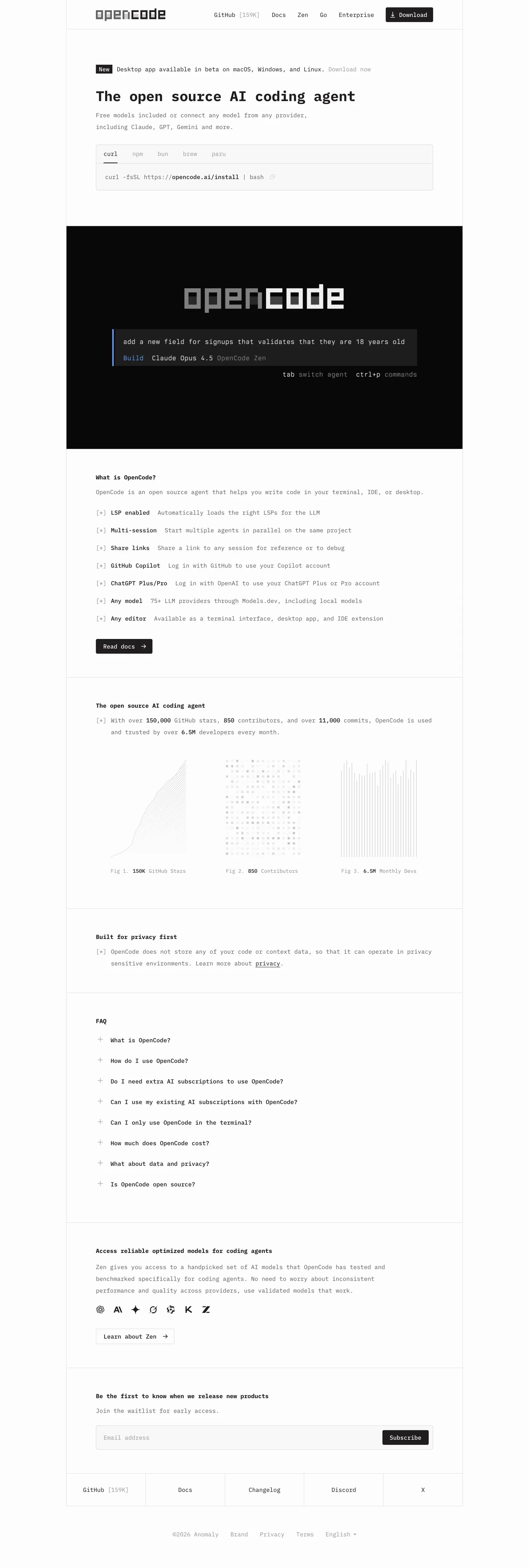
OpenCode's marketing site reads like a manpage. The hero headline at 38px sits in the same Berkeley Mono face as the 14px footer fine print, the bullets are bracketed ASCII markers (`[+]`, `[-]`, `[x]`), and the wordmark in the primary nav is a block-pixel character grid rather than a vector logo. The entire visual moment in the system is a single dark TUI mockup near-black at #201d1d, with a Build command line, a model selector, and tab / ctrl-p keybinding hints. Everything else is flat-on-cream — no shadows, no gradients, no photography, no italic, no sans-serif. The brand identity is one font and one weight away from being a 1990s `whatis` page rendered at modern resolutions.
This page captures the full system as a DESIGN.md file. Inside the spec: 28 colors tokens (one cream canvas, one near-black ink, four neutral grays for body / mute / stone / ash, plus the full Apple HIG semantic ramp at #007aff / #ff3b30 / #ff9f0a / #30d158), 8 typography roles all on Berkeley Mono with weights 400 / 500 / 700, an 8-step spacing scale topped by 96px section rhythm, a two-value radius vocabulary at 4px and 0px, and 21 components entries covering buttons, inputs, the install snippet, the hero TUI mockup, and the ASCII-bullet list row. The format is the Google Labs DESIGN.md specification.
Feed the file to Claude Code, Cursor, or GitHub Copilot and the agent will generate React components that match OpenCode's restraint rather than a generic shadcn theme. Reference the tokens directly in Tailwind config or CSS variables — every hex and px value is a quoted entry you can paste. The system is worth studying because almost no marketing site commits to monospace this hard; the typographic discipline of "the marketing page is a man page" is the rarest thing in consumer-facing tooling.
What makes it distinct
5
- 100% Berkeley Monoevery word on the page in one monospaced face, with no sans-serif fallback anywhere in the chrome
- Single warm cream canvas#fdfcfc carries every page body, with no gray section bands or surface alternation
- ASCII bracket markers[+], [-], [x] glyphs replace every icon and bullet, treating brackets as the only iconography
- One dark surface used once#201d1d hero TUI mockup is the entire visual moment, reserved as a narrative device
- Two-value radius vocabulary4px on interactive elements, 0px on every container, with no decorative rounding
opencode.ai
Live at opencode.ai
A snapshot of the brand in production. Scroll the frame to see the whole page.
Colors
28 colors
OpenCode's system runs on #201d1d as its primary voltage, used in 1 of 21 components. Type is set in Berkeley Mono across 8 tokens from 14px to 38px, weights 400–700. Shape language is sharp — components average 2px corner radius, favoring crisp rectangles.
Brand & Accent
Sparing, CTA-only voltage · 4
Surface
Page and card backgrounds · 5
Text
Headlines, body, captions · 6
Borders & Hairlines
Dividers, outlines, rules · 2
Semantic
Status, errors, success, links · 4
Other
Specialty colors · 7
Typography
8 type tokens
Set in Berkeley Mono across 8 tokens, from 14px to 38px, weights 400–700. Shown in its own stack: where the font isn't installed, the fallback the file names stands in.
- display-xl38px · weight 700 · lh 1.5The quick brown fox jumps over the lazy dog
- heading-md16px · weight 700 · lh 1.5The quick brown fox jumps over the lazy dog
- body-md16px · weight 400 · lh 1.5The quick brown fox jumps over the lazy dog
- body-strong16px · weight 500 · lh 1.5The quick brown fox jumps over the lazy dog
- body-tight16px · weight 500 · lh 1The quick brown fox jumps over the lazy dog
- link-md16px · weight 400 · lh 1.5The quick brown fox jumps over the lazy dog
- button-md16px · weight 500 · lh 2The quick brown fox jumps over the lazy dog
- caption-md14px · weight 400 · lh 2The quick brown fox jumps over the lazy dog
Layout
Radii and spacing
3 corner radii and 8 spacing values. Shape language: sharp.
Radii
- none0px
- sm4px
- full9999px
Spacing
- xxs1px
- xs4px
- sm8px
- md12px
- lg16px
- xl24px
- xxl32px
- section96px
Components
21 components
Each rendered from its tokens (color, type, radius, padding) on OpenCode's own canvas.
- Button Primarybutton-primaryButton Primary
- Button Primary Activebutton-primary-activeButton Primary Active
- Button Secondarybutton-secondaryButton Secondary
- Button Tabbutton-tabButton Tab
- Button Tab Activebutton-tab-activeButton Tab Active
- Button Disabledbutton-disabledButton Disabled
- Badge Newsbadge-newsBadge News
- Type here…text-inputText Input
- Type here…text-input-focusedText Input Focused
- TextareatextareaTextarea
- Install Snippetinstall-snippetInstall Snippet
- Hero Tui Mockuphero-tui-mockupHero Tui Mockup
- Tui Prompt Rowtui-prompt-rowTui Prompt Row
- List Rowlist-rowList Row
- Faq Rowfaq-rowFaq Row
- Testimonial Rowtestimonial-rowTestimonial Row
- Chart Tilechart-tileChart Tile
- Primary Navprimary-navPrimary Nav
- Footer Sectionfooter-sectionFooter Section
- Link Inlinelink-inlineLink Inline
- Badge Section Labelbadge-section-labelBadge Section Label
In use
The system, in use
OpenCode's tokens on the kind of product it builds.
Build something people actually use.
A short paragraph of marketing copy that previews how the brand's display tier and body tier read together. Two sentences is usually enough.
FAQ
OpenCode design system FAQ
Common questions about OpenCode's tokens, components, and how to use this DESIGN.md in your project.
Read next
Related reading
Specs, directories, and component libraries that pair with this design system.
Use it
Use OpenCode in your project
One machine-readable file. Drop it into Claude, Cursor, or any AI tool that reads DESIGN.md.
Download the DESIGN.md
One machine-readable file: every color, type, radius, spacing, and component token of OpenCode.
Feed it to your AI tool
Drop it into Claude, Cursor, or GitHub Copilot. The agent writes React components and Tailwind classes that match OpenCode's visual language.
Reference the tokens directly
Or paste the values into your Tailwind config, CSS variables, or component library: every color, size and radius is a quoted, ready-to-copy value.
Read the full DESIGN.md: overview, rationale, do’s and don’ts
Overview
OpenCode's marketing site is rendered entirely in Berkeley Mono — every word on the page, from the 38px hero headline down to the 14px footer fine print, sits in the same monospaced face. The visual identity comes from that single typographic decision: the page reads like a manpage or a static-site README, complete with bracketed [+] / [-] / [x] ASCII markers used in place of icons or bullets, and a wordmark rendered as block-pixel ASCII art at the top of the nav. There is no sans-serif anywhere, no display face, no italics, no decorative ornament — the system is one font and one weight away from being a 1990s whatis page rendered at modern resolutions.
The chrome is austere: warm cream canvas ({colors.canvas} — #fdfcfc with a faint blush), nearly-black ink ({colors.ink} — #201d1d), and a 4-tier neutral gray ladder for body, metadata, and disabled text. Cards don't exist as raised surfaces — sections are just hairline-bordered text blocks ({colors.hairline} 1px) sitting directly on the canvas with {spacing.section} (96px) air between them. The single "visual" moment in the entire system is a full-bleed dark hero card ({colors.surface-dark} — true near-black) that mocks up the OpenCode TUI itself: a terminal frame with tab / ctrl-p keybinding hints, a "Build" command line, and the OpenCode wordmark rendered as a pixel-block ASCII title.
The semantic palette is unusual for a brand-marketing site: it ships the full Apple Human Interface Guidelines accent ramp — {colors.accent} (Apple Blue #007aff), {colors.danger} (#ff3b30), {colors.warning} (#ff9f0a), {colors.success} (#30d158) plus their hover/active deepenings — even though the marketing surfaces themselves only use these colors in the dark hero TUI mockup as syntax-highlight stand-ins. The wider palette belongs to the in-product TUI; the marketing pages mostly stay in monochrome.
Key Characteristics:
- 100% Berkeley Mono typography across every text role — no sans-serif fallback anywhere in the chrome
- Warm cream
{colors.canvas}("#fdfcfc") as the only body background — no surface alternation across sections - Single dark surface (
{colors.surface-dark}—"#201d1d") reserved exclusively for the hero TUI mockup - 4px radius (
{rounded.sm}) on every interactive element; sections themselves are sharp rectangles bordered in 1px hairline - ASCII bracket markers (
[+],[-],[x]) used as bullet glyphs in feature lists and FAQ rows - Block-pixel ASCII wordmark in the primary nav and inside the hero TUI — the brand identity is its own ASCII art
- 96px
{spacing.section}rhythm between every section, with no decorative dividers; only thin 1px{colors.hairline}rules separate content blocks
Known Gaps
- Mobile screenshots not captured — responsive behavior synthesizes OpenCode's mobile pattern (hamburger drawer, single-column, footer accordion) from desktop evidence and the breakpoint stack.
- Hover states not documented by system policy.
- In-product TUI screenshots beyond the marketing hero mockup are not in the captured set; the actual
opencodeterminal interface (full keybindings, panels, status bar) is not documented here. /gopage not extracted — the marketing page for the Go SDK likely shares the same chrome but introduces code-sample blocks not documented above.- Form validation state styling (success / error inline messages) not present in the captured surfaces.
Developer Tools & IDEs
More systems like this
More DESIGN.md files in Developer Tools & IDEs.
Pricing
Build it with Pro
The DESIGN.md files are free. Pro adds 6,000+ blocks, premium templates and the MCP server, so your AI editor builds in your system for you.
4.9/5 out of 5 · 150+ reviewsfrom 150+ founders and developers.
Billing
Billed once a year in USD. Cancel anytime.
- How many people can use the license.
- Client work, SaaS products and anything you charge for.
- Production-ready React sections: hero, pricing, features, dashboards and more.
- Complete multi-page sites you can ship as they are.
- React icons from every major library, installable with one command.
- Presets that restyle every block, in light and dark.
- Lets your AI editor search, preview and install blocks for you.
- Priority requests are answered first.
Individual
For personal projects & open source
$32instead of $49/mo
$389 billed yearly
- Seats: 1 seat
- Commercial use: Personal & open source only
- Pro blocks: 6,000+ blocks
- Templates: All 14 templates
- React icons: 294k+ icons
- Themes: All 59 themes
- MCP server: Basic usage
- Support: Standard
Team
Most popularFor freelancers, agencies & startups
$66instead of $99/mo
$789 billed yearly · ≈ $13/dev/mo
- Seats: Up to 5 seats
- Commercial use: Included
- Pro blocks: 6,000+ blocks
- Templates: All 14 templates
- React icons: 294k+ icons
- Themes: All 59 themes
- MCP server: High usage
- Support: Priority
Organization
For companies with larger teams
$132instead of $199/mo
$1,589 billed yearly
- Seats: Unlimited seats
- Commercial use: Included
- Pro blocks: 6,000+ blocks
- Templates: All 14 templates
- React icons: 294k+ icons
- Themes: All 59 themes
- MCP server: Unlimited usage
- Support: Priority
Billed once a year in USD. Cancel anytime.
Individual
For personal projects & open source
$32instead of $49/mo
$389 billed yearly
- How many people can use the license.Seats: 1 seat
- Client work, SaaS products and anything you charge for.Commercial use: Personal & open source only
- Production-ready React sections: hero, pricing, features, dashboards and more.Pro blocks: 6,000+ blocks
- Complete multi-page sites you can ship as they are.Templates: All 14 templates
- React icons from every major library, installable with one command.React icons: 294k+ icons
- Presets that restyle every block, in light and dark.Themes: All 59 themes
- Lets your AI editor search, preview and install blocks for you.MCP server: Basic usage
- Priority requests are answered first.Support: Standard
Team
Most popularFor freelancers, agencies & startups
$66instead of $99/mo
$789 billed yearly · ≈ $13/dev/mo
Everything in Individual, plus
- How many people can use the license.Seats: Up to 5 seats
- Client work, SaaS products and anything you charge for.Commercial use: Included
- Lets your AI editor search, preview and install blocks for you.MCP server: High usage
- Priority requests are answered first.Support: Priority
Organization
For companies with larger teams
$132instead of $199/mo
$1,589 billed yearly
Everything in Team, plus
- How many people can use the license.Seats: Unlimited seats
- Lets your AI editor search, preview and install blocks for you.MCP server: Unlimited usage
- Secure checkout via Stripe
- Code lives in your repo
- Keep what you've shipped if you cancel
- License terms
Your system, built for you
Every block, template and icon, installed by your AI agent in your design system. The DESIGN.md files stay free.