On Design System
On's storefront as a DESIGN.md file. On sans 49.584px hero, ink #000000, 19 colors tokens, 17 components. For React, Next.js, and AI tools.
Add shadcn.io to your AI agent. · Pro It installs blocks, icons and templates in your design system from a prompt, with Pro.
Set up MCP- Primary
- #151522
- Typeface
- On
- Shape
- Mixed
- Base radius
- 4px
- Colors
- 19
- Type tokens
- 12
- Components
- 17
- Spacing values
- 9
About
About On DESIGN.md
Curated by Dov Azencot · Updated May 13, 2026 · Source on.com (opens in a new tab)
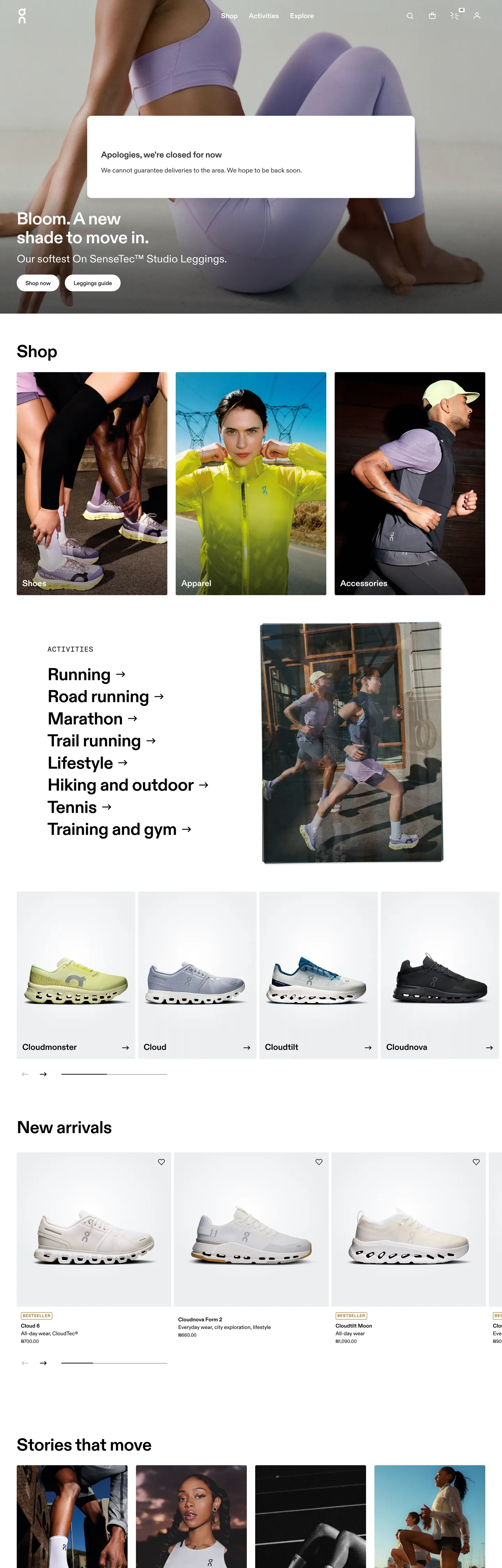
On's storefront reads like a Swiss product brochure compiled for the browser. The chrome is reductive to the point of being almost stubborn — ink `#000000` carries 906 occurrences across the captured page (420 as text, 417 as hairline border, 46 inside gradient overlays, plus 18 as shadow), while the canvas runs pure `#ffffff` at 323. Where most performance-running brands inject saturated voltage — neon yellow, signal orange, electric green — to telegraph athletic energy, On withholds entirely. The only chromatic note in the entire chrome is the unstyled hyperlink: bright `#0000ee` reaches 190 occurrences as both text and border, used on the vertical activity list ("Running →", "Road running →", "Marathon →", "Trail running →"), and the visited-link brown `#995c00` reaches 32. These are not brand colors. They are the browser's defaults, surfaced deliberately as a brutalist signal that On trusts the photograph and the type to do every other job.
This page packages the storefront into a DESIGN.md file written to the Google Labs open spec. Inside: 19 colors tokens grouped into ink, canvas, link, status, and graded-neutral layers; 12 typography roles built around a proprietary On sans display tier at 49.584px / weight 700 with `-0.49584px` letter-spacing, paired with On Semi Mono at 12px uppercase tracked `0.72px` for category caps; a 6-step radius vocabulary anchored on the observed `4px` (24 hits) with a `40px` pill reserved for chips; a 9-step spacing scale extracted from the `8px` (69 hits) and `24px` (26 hits) rhythm; and 17 components entries covering the top nav, the hero portrait with overlay heading, the activity list with right-pointing arrow glyphs, the 4-up product card grid, the swatch picker, the editorial "Stories that move" tile, and the inverted newsletter footer.
Feed the file to Claude, Cursor, or GitHub Copilot and the agent reproduces On's reductive chrome — the heroic h1/h2 parity at 49.584px, the hyperlink-blue activity list, the 4px-cornered product cards on `#ffffff`, the inverted black newsletter input — rather than inventing a generic athletic-template with neon accents and saturated badges. Reference tokens directly when you want one specific value: `{colors.ink}` resolves to `#000000`, `{typography.display-h1}` to On sans 49.584px / 700 / `-0.49584px`, `{colors.link}` to `#0000ee`, and `{rounded.pill}` to 40px. The reason this system rewards study is that most running brands chase velocity through chromatic noise, while On chases it through typographic parity — every section header and every hero shares the same 49.584px ceiling, and the photograph carries the rest.
What makes it distinct
5
- Hyperlink-blue as accentOn uses the browser-default `#0000ee` (190 occurrences as text and border) for category list items, never restyling it to a brand voltage
- Heroic h1/h2 paritydisplay sits at 49.584px / 700 with `-0.49584px` tracking, and the section h2 ('Shop') uses the identical size, not a downscaled tier
- Two-typeface splitproprietary On sans for body and display, On Semi Mono for 12px uppercase category captions with `0.72px` tracking
- 4px-base radius vocabulary24 occurrences of `4px` corners against 8 occurrences of `3px` and 4 of `40px` pill, with a hard `0px` on every photographic tile
- Footer newsletter inverts the canvassingle `#000000` input with `#666666` placeholder, 64px height, no border, sitting under the otherwise white-canvas chrome
on.com
Live at on.com
A snapshot of the brand in production. Scroll the frame to see the whole page.
Colors
19 colors
On's system anchors on #151522 (ink-graphite) as its primary color. Type is set in On across 12 tokens from 12px to 49.584px, weights 400–700. Shape language is mixed across 17 components, blending pills, soft rounds, and squarer corners.
Surface
Page and card backgrounds · 3
Text
Headlines, body, captions · 10
Borders & Hairlines
Dividers, outlines, rules · 1
Semantic
Status, errors, success, links · 1
Other
Specialty colors · 4
Typography
12 type tokens
Set in On across 12 tokens, from 12px to 49.584px, weights 400–700. Shown in its own stack: where the font isn't installed, the fallback the file names stands in.
- display-h149.584px · weight 700 · lh 1.1 · tracking -0.49584pxThe quick brown fox jumps over the lazy dog
- display-h249.584px · weight 700 · lh 1.1 · tracking -0.49584pxThe quick brown fox jumps over the lazy dog
- heading-link30.8px · weight 400 · lh 1.3The quick brown fox jumps over the lazy dog
- heading-md24.176px · weight 700 · lh 1.2The quick brown fox jumps over the lazy dog
- nav-link20px · weight 700 · lh 1.5The quick brown fox jumps over the lazy dog
- body-md16px · weight 400 · lh 1.5 · tracking 0.2pxThe quick brown fox jumps over the lazy dog
- body-strong15.312px · weight 700 · lh 1.5The quick brown fox jumps over the lazy dog
- body-sm15.312px · weight 400 · lh 1.5The quick brown fox jumps over the lazy dog
- caption-sm13.392px · weight 400 · lh 1.5The quick brown fox jumps over the lazy dog
- mono-cap12px · weight 500 · lh 1.5 · tracking 0.72pxThe quick brown fox jumps over the lazy dog
- mono-lg20px · weight 400 · lh 1 · tracking 1.2pxThe quick brown fox jumps over the lazy dog
- input-md16px · weight 400 · lh 1The quick brown fox jumps over the lazy dog
Layout
Radii and spacing
7 corner radii and 9 spacing values. Shape language: mixed.
Radii
- none0px
- xs2px
- sm3px
- md4px
- lg12px
- pill40px
- full9999px
Spacing
- xxs2px
- xs4px
- sm7px
- md8px
- base12px
- lg16px
- xl24px
- xxl48px
- section81px
Components
17 components
Each rendered from its tokens (color, type, radius, padding) on On's own canvas.
- Top Navtop-navTop Nav
- Nav Link On Imagenav-link-on-imageNav Link On Image
- Hero Framehero-frameHero Frame
- Hero Headinghero-headingHero Heading
- Section Headingsection-headingSection Heading
- Button Primarybutton-primaryButton Primary
- Button Secondary On Imagebutton-secondary-on-imageButton Secondary On Image
- Activity Linkactivity-linkActivity Link
- Activity Link Visitedactivity-link-visitedActivity Link Visited
- Mono Category Capmono-category-capMono Category Cap
- Product Cardproduct-cardProduct Card
- Product Card Imageproduct-card-imageProduct Card Image
- Swatch Chipswatch-chipSwatch Chip
- Swatch Dotswatch-dotSwatch Dot
- Editorial Tileeditorial-tileEditorial Tile
- Mono Pill Tagmono-pill-tagMono Pill Tag
- Newsletter Inputnewsletter-inputNewsletter Input
In use
The system, in use
On's tokens on the kind of product it builds.
Build something people actually use.
A short paragraph of marketing copy that previews how the brand's display tier and body tier read together. Two sentences is usually enough.
FAQ
On design system FAQ
Common questions about On's tokens, components, and how to use this DESIGN.md in your project.
Read next
Related reading
Specs, directories, and component libraries that pair with this design system.
- Browse all design systemsThe full directory of DESIGN.md files on shadcn.io, with live mockups for each.shadcn.io
- On — official siteThe On storefront this DESIGN.md was extracted from on 2026-05-13.on.com (opens in a new tab)
- The DESIGN.md specificationGoogle Labs' open spec for machine-readable design system files — the format this page is built on.github.com (opens in a new tab)
Use it
Use On in your project
One machine-readable file. Drop it into Claude, Cursor, or any AI tool that reads DESIGN.md.
Download the DESIGN.md
One machine-readable file: every color, type, radius, spacing, and component token of On.
Feed it to your AI tool
Drop it into Claude, Cursor, or GitHub Copilot. The agent writes React components and Tailwind classes that match On's visual language.
Reference the tokens directly
Or paste the values into your Tailwind config, CSS variables, or component library: every color, size and radius is a quoted, ready-to-copy value.
Read the full DESIGN.md: overview, rationale, do’s and don’ts
Overview
On's storefront is built on a single, almost stubbornly reductive idea: the chrome carries no color, and the photograph carries everything. Ink #000000 lands 906 times on the captured page (420 as text, 417 as hairline border, 46 inside gradient overlays, 18 as shadow); canvas #ffffff lands 323. Across the hero portrait, the activity list, the Shop heading, the 4-up product grid, and the editorial "Stories that move" tile, the same monochrome chrome reappears in identical proportions — only the photograph and the copy change. Where most performance-running brands inject neon yellow, signal orange, or electric green to telegraph athletic energy, On withholds entirely and lets the shoe photograph be the only colored object on the page.
Hyperlink as accent: the only chromatic note in the chrome is the browser-default unstyled <a> color. Bright #0000ee reaches 190 occurrences (95 text, 95 border, because every link is also underlined) on the vertical activity list — "Running →", "Road running →", "Marathon →", "Trail running →", "Lifestyle →", "Hiking and outdoor →", "Tennis →", "Training and gym →". Visited brown #995c00 reaches 32. These are not styled. On is declaring that the only color in the system is the color the user agent provides for free, and the activity list is the one place it surfaces. Restyling the link would erase the move.
Heroic h1/h2 parity: the hero heading "Bloom. A new shade to move in." and the section heading "Shop" both sit at 49.584px / weight 700 / -0.49584px letter-spacing — identical tokens. There is no downscaled h2 tier on the homepage. The 30.8px tier exists only for paragraph-shaped link copy, and the 24.176px tier exists for sub-section labels. Unlike the convention of a 64–48–32–24 display ramp, On flattens the top two tiers into a single ceiling — the section header carries the same weight as the campaign.
Colors
- Ink (
#000000) — frequency 906. Used as text (420), border (417), shadow (18), gradient (46), bg (5). The load-bearing token: every headline, every hairline, every body line, and the inverted newsletter input fill. - Canvas (
#ffffff) — frequency 323. Used as text (131), bg (11), border (135), gradient (46). The page surface and the on-image text color for the hero portrait. - Hyperlink (
#0000ee) — frequency 190. Used as text (95), border (95). The browser's default unstyled<a>color, surfaced deliberately on the activity list as the only saturated accent. - Link-visited (
#995c00) — frequency 32. Used as text (16), border (16). The browser's default visited-state brown; appears on activity items the user has already opened. - Ink-secondary (
#333333) — frequency 22. Used as text (11), border (11). Body paragraph copy in the geo-availability message; the workhorse soft-text role. - Surface-gradient-pale (
#eceef0) — frequency 10. Used as gradient (10). Product-card photographic backdrop and the soft gradient under swatch chips. - Status-error (
#ed0000) — frequency 2. Used as text (1), border (1). Form validation only; never decorative. - Ink-tertiary (
#999999) — frequency 1. Used as bg (1). Disabled-state placeholder fill. - Ink-graphite (
#151522) — frequency 1. Used as bg (1). A near-black with a violet cast on one editorial overlay. - Ink-mute (
#666666) — frequency 1. Used as text (1). The newsletter input placeholder color. - Swiper-theme (
#007aff) — declared on:rootvia--swiper-theme-color. Never rendered in the captured page; reserved for the product-carousel pagination dots.
Typography
On runs a proprietary On sans (system fallback to Noto Sans JP / Noto Sans KR / sans-serif) across every display and body role, plus On Semi Mono and On Mono for the 12px uppercase category captions and the 20px uppercase mono-lg tier. Hero h1 and section h2 share the identical 49.584px / weight 700 / -0.49584px letter-spacing — a heroic display ceiling that flattens the top of the type hierarchy into one tier. Below the ceiling, the system uses 30.8px / 400 for paragraph-shaped link copy, 24.176px / 700 for sub-section labels, 20px / 700 for nav links, and a 15.312px / 400 body tier (with a 15.312px / 700 strong variant) for product names and meta. Body-md sits at 16px / 400 with 0.2px tracking — the only positive tracking value in the body tier.
The mono pair carries the brand's Swiss-engineering signal. On Semi Mono at 12px / 500 uppercase with 0.72px tracking renders the category caps below each product card (e.g. "Cloudsurfer", "Cloud", "CloudX", "Cloudboom"), and On Mono at 20px / 400 uppercase with 1.2px tracking carries the larger editorial labels. Substitution path: Inter Display at weight 700 with -1% tracking for the heroic 49.584px tier, paired with JetBrains Mono or IBM Plex Mono at 12px uppercase tracked 0.72px for the captions.
Layout
The page runs on a 12-column grid inside a roughly 1440px maximum content width, with section padding extracted as 0px 47.952px (≈ 48px) horizontal gutters. Vertical rhythm follows an 8px base — the spacing array shows 69 occurrences of 8px, 26 of 24px, 17 of 4px, and 8 of 12px. The dominant section break is 81.104px (the section spacing token), which separates the hero portrait from the Shop heading and the activity list from the product grid. Inside cards, the rhythm tightens to 4px / 7px / 8px. The activity list sits as a vertical column at roughly 33% page width, with each link receiving 4px 0px vertical padding — a paragraph-shaped stack rather than a grid of pills.
Elevation & Depth
Depth is achieved by photography and hairlines rather than shadow. The captured page declares #000000 shadow 18 times — exclusively on the announcement banner pill and the geo-availability dialog, never on cards or buttons. Surface elevation comes from three devices: a #eceef0 gradient backdrop behind each product photograph (10 occurrences), a 1px #000000 hairline border between the top-nav and the hero overlay, and the inverted black newsletter section that drops the user into a dark band at the page foot. Where most retailers ladder a card with a 0/2/8/24px shadow scale, On runs flat — the photograph carries the weight, the gradient backdrop carries the soft separation, and the hairline carries every other line of demarcation.
Shapes
Six radius values appear in the captured page: 4px at 24 occurrences (the dominant corner — product tiles, swatch chips, small surfaces), 3px at 8 (inner-card details and the announcement-bar pill stroke), 50% at 10 (icon buttons and swatch dots), 40px at 4 (the mono-pill tag used on the editorial tile), 2px at 1, and 12px at 1. The product card lands on 4px — soft enough that the photograph does not read like a printed catalog, hard enough that the corner never competes with the silhouette of the shoe. The hero portrait itself sits at 0px. The jump goes 4 → 12 → 40; there is no 8px, 16px, 24px, or 32px corner anywhere in the chrome.
Components
- top-nav:
{colors.canvas}background,{colors.ink}text,{typography.nav-link}at 20px / 700,0pxradius,56pxheight, no border. - nav-link-on-image: transparent fill,
{colors.on-ink}text for the nav links that sit over the hero photograph. - hero-frame: full-bleed
0px-cornered black overlay scrim; the photograph beneath carries every other color note. - hero-heading: 49.584px / 700
{colors.on-ink}typeset directly onto the portrait — captured at 109px rendered height for "Bloom. A new shade to move in." - section-heading: identical 49.584px / 700 tier to the hero, used on "Shop" and "New arrivals" — flattens the h1/h2 ceiling.
- button-primary:
{colors.ink}fill,{colors.on-ink}text,4pxradius, 12/24px padding, 44px height. Used for the hero "Explore" CTA. - button-secondary-on-image:
{colors.canvas}fill,{colors.ink}text, otherwise identical to primary — sits beside the primary on the hero scrim. - activity-link: the brutalist move — 49.584px / 700 in
{colors.link}#0000eewith underline, padded4px 0pxper line. - activity-link-visited: identical to activity-link but text shifts to
{colors.link-visited}#995c00once visited. - mono-category-cap: 12px On Semi Mono uppercase with
0.72pxtracking, used as the small label under each product image ("Cloudsurfer", "Cloud", etc.). - product-card:
{colors.canvas}surface,4pxradius, no border, sits in the 4-up grid. - product-card-image:
{colors.surface-gradient-pale}#eceef0photographic backdrop with a4pxradius — the only place the gradient pale appears. - swatch-chip: small
4px-cornered swatch picker with a 1px{colors.ink}border. - swatch-dot:
9999pxcircular swatch indicator filled with{colors.ink}at 12px height. - editorial-tile: the "Stories that move" surface —
{typography.heading-md}at 24.176px / 700 inside a4px-cornered tile with16pxpadding. - mono-pill-tag: 12px On Semi Mono uppercase inside a
40pxpill — the one place a pill geometry appears in the system, reserved for editorial category tags. - newsletter-input: the inverted-canvas signature —
{colors.ink}fill,{colors.ink-mute}placeholder, 64px height,0pxradius, no border. Sits inside the black footer band.
Do's and Don'ts
- Don't restyle the activity-list links from
#0000eeto a brand voltage — the unstyled browser default is the design. Restyling erases the brutalist signal. - Don't ladder a 64–48–32–24 display ramp. On's display ceiling is a single 49.584px tier shared by h1 and h2; the next tier is 30.8px / weight 400, not 32px / 700.
- Don't use
#eceef0as a chip or button background — it is a gradient-only token (10 occurrences, all as gradient) reserved for the product-image backdrop. For light surfaces, use{colors.canvas}#ffffff. - Don't add a drop shadow to the product card. On's depth comes from the
#eceef0photographic gradient and a 1px ink hairline; the card itself is shadowless. - Don't soften the newsletter input to a
4pxor8pxcorner. The 64px-tall0px-radius black field is the system's one inversion — corner-radius would push it toward a generic input. - Don't apply the
40pxpill geometry to a primary CTA. The pill is reserved for editorial mono tags; primary buttons sit at4px. - Do keep On Semi Mono at 12px /
0.72pxtracking, uppercase, for every category cap. The Swiss-engineering signal lives in the mono tier — collapsing it to the body sans erases the brand's voice. - Do preserve the negative
-0.49584pxtracking on the 49.584px display tier when substituting a different sans. On's optical density depends on it.
Known Gaps
- PDP not captured — product detail page typography (size selector, add-to-bag CTA placement, fit-finder) is not part of the homepage capture.
- Cyclon subscription flow and membership chrome are not present in the captured page; the recurring-rental Cyclon shoes have a dedicated visual treatment that isn't documented here.
- Hover and focus states are not extracted — On's CSS does not surface them on the
:rootvariable cascade the extractor reads. - Geo-picker and currency dialog are not visible in the captured page (the geo-availability message that triggered the
#333333body paragraph is the closest analog). - On sans weight 600 referenced in On's font kit is not present on the homepage — weights 400, 500, and 700 are extracted but the demi tier is not.
- Primary CTA selector returned null — On uses a custom anchor element rather than a
<button>for the hero call-to-action, so the extractor's primary-button probe captured nothing; thebutton-primarytoken above is reconstructed from the visible "Explore" CTA in the screenshot.
E-commerce & Retail
More systems like this
More DESIGN.md files in E-commerce & Retail.
Pricing
Build it with Pro
The DESIGN.md files are free. Pro adds 6,000+ blocks, premium templates and the MCP server, so your AI editor builds in your system for you.
4.9/5 out of 5 · 150+ reviewsfrom 150+ founders and developers.
Billing
Billed once a year in USD. Cancel anytime.
- How many people can use the license.
- Client work, SaaS products and anything you charge for.
- Production-ready React sections: hero, pricing, features, dashboards and more.
- Complete multi-page sites you can ship as they are.
- React icons from every major library, installable with one command.
- Presets that restyle every block, in light and dark.
- Lets your AI editor search, preview and install blocks for you.
- Priority requests are answered first.
Individual
For personal projects & open source
$32instead of $49/mo
$389 billed yearly
- Seats: 1 seat
- Commercial use: Personal & open source only
- Pro blocks: 6,000+ blocks
- Templates: All 14 templates
- React icons: 294k+ icons
- Themes: All 59 themes
- MCP server: Basic usage
- Support: Standard
Team
Most popularFor freelancers, agencies & startups
$66instead of $99/mo
$789 billed yearly · ≈ $13/dev/mo
- Seats: Up to 5 seats
- Commercial use: Included
- Pro blocks: 6,000+ blocks
- Templates: All 14 templates
- React icons: 294k+ icons
- Themes: All 59 themes
- MCP server: High usage
- Support: Priority
Organization
For companies with larger teams
$132instead of $199/mo
$1,589 billed yearly
- Seats: Unlimited seats
- Commercial use: Included
- Pro blocks: 6,000+ blocks
- Templates: All 14 templates
- React icons: 294k+ icons
- Themes: All 59 themes
- MCP server: Unlimited usage
- Support: Priority
Billed once a year in USD. Cancel anytime.
Individual
For personal projects & open source
$32instead of $49/mo
$389 billed yearly
- How many people can use the license.Seats: 1 seat
- Client work, SaaS products and anything you charge for.Commercial use: Personal & open source only
- Production-ready React sections: hero, pricing, features, dashboards and more.Pro blocks: 6,000+ blocks
- Complete multi-page sites you can ship as they are.Templates: All 14 templates
- React icons from every major library, installable with one command.React icons: 294k+ icons
- Presets that restyle every block, in light and dark.Themes: All 59 themes
- Lets your AI editor search, preview and install blocks for you.MCP server: Basic usage
- Priority requests are answered first.Support: Standard
Team
Most popularFor freelancers, agencies & startups
$66instead of $99/mo
$789 billed yearly · ≈ $13/dev/mo
Everything in Individual, plus
- How many people can use the license.Seats: Up to 5 seats
- Client work, SaaS products and anything you charge for.Commercial use: Included
- Lets your AI editor search, preview and install blocks for you.MCP server: High usage
- Priority requests are answered first.Support: Priority
Organization
For companies with larger teams
$132instead of $199/mo
$1,589 billed yearly
Everything in Team, plus
- How many people can use the license.Seats: Unlimited seats
- Lets your AI editor search, preview and install blocks for you.MCP server: Unlimited usage
- Secure checkout via Stripe
- Code lives in your repo
- Keep what you've shipped if you cancel
- License terms
Your system, built for you
Every block, template and icon, installed by your AI agent in your design system. The DESIGN.md files stay free.