Omega Design System
Omega's marketing design system as a DESIGN.md file. Crimson #c40d2e in headings, proprietary omegact typeface, grey-dominant structural canvas, 14 components. For React, Next.js, and AI tools.
Add shadcn.io to your AI agent. · Pro It installs blocks, icons and templates in your design system from a prompt, with Pro.
Set up MCP- Primary
- #c40d2e
- Typeface
- omegact
- Shape
- Sharp
- Base radius
- 0px
- Colors
- 8
- Type tokens
- 14
- Components
- 14
- Spacing values
- 8
About
About Omega DESIGN.md
Curated by Dov Azencot · Updated May 19, 2026 · Source omegawatches.com (opens in a new tab)
Omega's marketing site makes a move that no other Swiss watch brand makes in this extraction set: it puts the brand voltage directly in the headline. Section headings like "AQUA TERRA IN BLACK" and collection names render in crimson #c40d2e — a saturated, slightly dark red that appears 42 times across the captured page, predominantly as text and border color. Rolex holds its forest green out of headings entirely; Patek Philippe uses taupe only in secondary-label roles; Omega uses its crimson to name the watch before the photograph registers. The effect is that the product name carries a weight of announcement before visual context. Where you would normally read a watch name in charcoal or white, Omega renders it in the brand's red.
This DESIGN.md packages the system into a machine-readable spec using the Google Labs open format. Inside: 8 colors tokens organized around a grey-dominant structural palette with crimson as the typographic voltage; 14 typography tokens all running the proprietary omegact typeface with aggressive letter spacing — 6.08px at 38px display, 7.68px at 48px — and weight 400 as the norm with weight 700 for uppercase labels and buttons; a near-flat radius vocabulary (50% circle on a single icon, 0px everywhere else); 8 spacing tokens derived from the extracted 3-15px rhythm; and 14 components covering the top nav, hero photography band, crimson section headings, body paragraphs, flat-text CTAs, newsletter input, and the watch-collection card grid.
Feed this file to an AI coding tool and it will reproduce Omega's specific choices: grey-dominant canvas with crimson headings, omegact-equivalent typeface at aggressive tracking, zero-radius architectural surfaces, flat-text actions instead of pill CTAs, and the newsletter input as the only form element on the marketing surface. The one move worth studying is the crimson-in-headings discipline — it works because the brand has sustained the red across decades of product identity; the same move with a newly-chosen accent would read as arbitrary.
What makes it distinct
5
- Crimson in headings#c40d2e appears as the text color for hero section headings and collection labels, not as a CTA fill; Rolex and Patek Philippe keep brand colors out of typography entirely
- omegact as a single-family systemevery surface from 10px nav labels to 48px display heads uses the proprietary omegact, with weight 400 for reading and weight 700 for emphasis
- No rounded corners anywherethe only radius in the system is a 50% circle on a single icon control; every button, card, and band is 0px sharp
- Flat-text buttonsthe primary action uses uppercase 13px text at 1.3px tracking with no background fill, no border, and no pill geometry
- Aggressive letter-spacing on display6.08px tracking at 38px and 7.68px at 48px, the widest display-tracking in the watch-brand set
omegawatches.com
Live at omegawatches.com
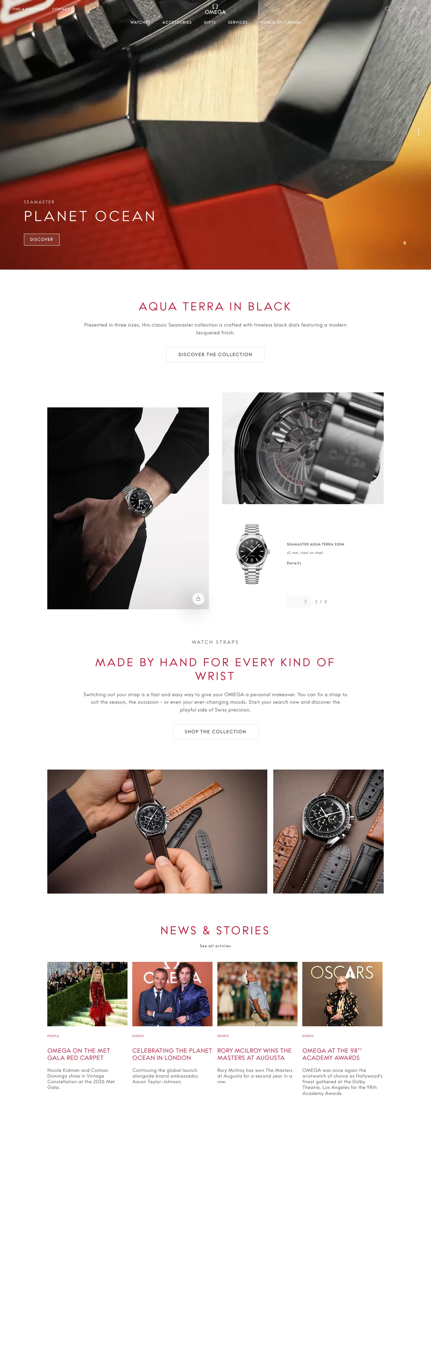
A snapshot of the brand in production. Scroll the frame to see the whole page.
Colors
8 colors
Omega's system runs on #c40d2e as its primary voltage, used in 2 of 14 components. Type is set in omegact across 14 tokens from 10px to 48px, weights 400–700. Shape language is sharp — components average 0px corner radius, favoring crisp rectangles.
Brand & Accent
Sparing, CTA-only voltage · 1
Surface
Page and card backgrounds · 2
Text
Headlines, body, captions · 3
Borders & Hairlines
Dividers, outlines, rules · 1
Other
Specialty colors · 1
Typography
14 type tokens
Set in omegact across 14 tokens, from 10px to 48px, weights 400–700. Shown in its own stack: where the font isn't installed, the fallback the file names stands in.
- display-xl48px · weight 400 · lh 58px · tracking 7.68pxThe quick brown fox jumps over the lazy dog
- display-lg38px · weight 400 · lh 46px · tracking 6.08pxThe quick brown fox jumps over the lazy dog
- display-md20px · weight 400 · lh 24px · tracking 1pxThe quick brown fox jumps over the lazy dog
- heading-sm16px · weight 700 · lh 18px · tracking 1.6pxThe quick brown fox jumps over the lazy dog
- body-lg17px · weight 400 · lh 26px · tracking 0.64pxThe quick brown fox jumps over the lazy dog
- body-md16px · weight 400 · lh 19px · tracking 0.64pxThe quick brown fox jumps over the lazy dog
- body-sm13px · weight 400 · lh 17px · tracking 0.64pxThe quick brown fox jumps over the lazy dog
- label-lg14px · weight 700 · lh 21px · tracking 0.64pxThe quick brown fox jumps over the lazy dog
- label-md13px · weight 700 · lh 26px · tracking 1.3pxThe quick brown fox jumps over the lazy dog
- label-sm12px · weight 700 · lh 18px · tracking 0.64pxThe quick brown fox jumps over the lazy dog
- nav-label10px · weight 400 · lh 19px · tracking 0.6pxThe quick brown fox jumps over the lazy dog
- caption11px · weight 400 · lh 14px · tracking 0.64pxThe quick brown fox jumps over the lazy dog
- button-md13px · weight 700 · lh 20px · tracking 1.3pxThe quick brown fox jumps over the lazy dog
- input-md16px · weight 400 · lh 1.4 · tracking 0.64pxThe quick brown fox jumps over the lazy dog
Layout
Radii and spacing
2 corner radii and 8 spacing values. Shape language: sharp.
Radii
- none0px
- circle50%
Spacing
- xxs2px
- xs3px
- sm8px
- md10px
- base12px
- lg15px
- xl20px
- 2xl22px
Components
14 components
Each rendered from its tokens (color, type, radius, padding) on Omega's own canvas.
- Button Primarybutton-primaryButton Primary
- Button Ghostbutton-ghostButton Ghost
- Top Navtop-navTop Nav
- Nav Linknav-linkNav Link
- Hero Headinghero-headingHero Heading
- Display Headingdisplay-headingDisplay Heading
- Body Paragraphbody-paragraphBody Paragraph
- Hero Bandhero-bandHero Band
- Section Labelsection-labelSection Label
- Collection Cardcollection-cardCollection Card
- News Cardnews-cardNews Card
- Type here…text-inputText Input
- FooterfooterFooter
- Footer Linkfooter-linkFooter Link
In use
The system, in use
Omega's tokens on the kind of product it builds.
Build something people actually use.
A short paragraph of marketing copy that previews how the brand's display tier and body tier read together. Two sentences is usually enough.
FAQ
Omega design system FAQ
Common questions about Omega's tokens, components, and how to use this DESIGN.md in your project.
Read next
Related reading
Specs, directories, and component libraries that pair with this design system.
- Browse all design systemsThe full directory of DESIGN.md files on shadcn.io, with live mockups for each.shadcn.io
- Omega — official siteOmega's public marketing site — the source of truth for the live tokens captured in this file.omegawatches.com (opens in a new tab)
- The DESIGN.md specificationGoogle Labs' open spec for machine-readable design system files — the format this page is built on.github.com (opens in a new tab)
Use it
Use Omega in your project
One machine-readable file. Drop it into Claude, Cursor, or any AI tool that reads DESIGN.md.
Download the DESIGN.md
One machine-readable file: every color, type, radius, spacing, and component token of Omega.
Feed it to your AI tool
Drop it into Claude, Cursor, or GitHub Copilot. The agent writes React components and Tailwind classes that match Omega's visual language.
Reference the tokens directly
Or paste the values into your Tailwind config, CSS variables, or component library: every color, size and radius is a quoted, ready-to-copy value.
Read the full DESIGN.md: overview, rationale, do’s and don’ts
Overview
Omega's marketing site violates the dominant Swiss-watch convention by placing brand color directly inside typography. Crimson-as-announcement: the section heading "AQUA TERRA IN BLACK" renders in #c40d2e — a saturated crimson that appears 18 times as text color, 19 times as border color, and once as background fill across 2551 scanned elements. Rolex keeps its forest green out of headings entirely; Patek Philippe puts its taupe only in secondary-label roles. Omega makes the watch name itself the most chromatic element on the page, a gesture that works because the brand's red is as legible as a house color as the Ferrari red or the Hermès orange.
The typographic system is a single-family monoculture. Every visible surface — from 10px uppercase navigation labels through 48px display headings — runs omegact, a proprietary typeface declared across multiple CSS variants: the base omegact (standard and bold), austin-italic (for italic editorial moments), and omega-script-italic (for script-style credits). Where Patek Philippe's Lora-plus-Open-Sans pairing creates two reading speeds, Omega creates one reading speed and varies it through letter-spacing rather than family. The display spacing — 6.08px at 38px, 7.68px at 48px — is the widest extracted tracking in the watch-brand set.
The shape language is architecturally flat: no rounded corners anywhere on the marketing surface except a single 50% circle on a control element. Buttons are flat uppercase text links with no fill, no border, and no radius. This is the furthest-right position on the rounded/sharp spectrum among the three watch brands.
Key Characteristics:
- Crimson (#c40d2e) used as section heading text color — the typographic voltage, not a CTA fill. 42 total occurrences.
- Grey ink (#555555) as the dominant structural text tone — 1047 occurrences, predominantly as text and border.
- Single-family omegact across every size tier from 10px nav to 48px display.
- Aggressive display letter-spacing: 6.08px at 38px, 7.68px at 48px — creates a monumental, stamp-like uppercase.
- Zero rounded corners (except one 50% circle control). No pills, no cards with radius, no input rounding.
- Flat-text CTAs — "SHOP THE COLLECTION" in 13px / 700 uppercase with no button background or border.
- Newsletter text input is the only form element — hairline (#e2e2e2) border, 49px height, 0px radius.
- 8px base spacing; 3px appears 45 times (inner label padding), the most frequent spacing value.
Colors
Structural
- Ink (
{colors.ink}— #555555): frequency 1047 — the dominant color by an extreme margin. 526 as text, 521 as border. A mid-grey — not charcoal, not near-black — that reads cooler than Patek Philippe's blue-grey charcoal and warmer than Rolex's near-black. Merged from two near-identical mid-grey values. The page reads as grey rather than dark. - Canvas (
{colors.canvas}— #ffffff): frequency 93 — white editorial canvas, CTA text on hero, newsletter input background. Also merged from #f9f9f9 (the near-white surface for off-white card backgrounds). - Hairline (
{colors.hairline}— #e2e2e2): frequency 5 — 4 as border, 1 as text. The newsletter input border and subtle divider rules. Merged from two near-identical light-grey values. - Ink Dark (
{colors.ink-dark}— #212121): frequency 2, shadow only. Used for subtle drop-shadow on UI elements; not a text color. - Pure Black (
{colors.pure-black}— #000000): frequency 5 — 2 as background, 1 as gradient. The full-bleed hero photography panel.
Brand
- Primary (
{colors.primary}— #c40d2e): frequency 42. 18 as text, 19 as border, 1 as background, 4 as shadow. The Omega brand red — used for section headings ("AQUA TERRA IN BLACK"), collection label spans, decorative hairline dividers under section heads, and subtle CTA hover shadows. The single chromatic color in the system.
Surface
- Ink Light (
{colors.ink-light}— #ffffff): white text and nav-link color on dark hero bands. Structurally white, semantically overlay. - Surface Off-white (
{colors.surface-off-white}— #f9f9f9): the warm near-white for card backgrounds in the news-and-stories grid, distinct from the flat white canvas.
Typography
Font Family
The system runs omegact as the single typeface for every visible surface. The CSS variable declarations reveal a four-variant family: omegact for base/light/bold text, austin-italic (loaded as --font-family-austin) for editorial italic moments, omega-script-italic for script-style credits and atmospheric labels. Only omegact and its bold variant appear in the captured marketing extraction — the italic and script variants presumably appear in watch-detail editorial sections not captured by the extractor.
Hierarchy
| Token | Size | Weight | Line Height | Letter Spacing | Use |
|---|---|---|---|---|---|
{typography.display-xl} | 48px | 400 | 58px | 7.68px | Largest display heading (uppercase) |
{typography.display-lg} | 38px | 400 | 46px | 6.08px | Section heading ("AQUA TERRA IN BLACK" — in crimson) |
{typography.display-md} | 20px | 400 | 24px | 1px | Sub-section title ("MADE BY HAND FOR EVERY KIND OF WRIST") |
{typography.heading-sm} | 16px | 700 | 18px | 1.6px | Section-title label variant |
{typography.body-lg} | 17px | 400 | 26px | 0.64px | Default editorial body paragraph |
{typography.body-md} | 16px | 400 | 19px | 0.64px | Secondary body text and nav paragraphs |
{typography.body-sm} | 13px | 400 | 17px | 0.64px | Caption rows, card sub-text |
{typography.label-lg} | 14px | 700 | 21px | 0.64px | Bold uppercase label |
{typography.label-md} | 13px | 700 | 26px | 1.3px | Button / CTA label (uppercase bold) |
{typography.label-sm} | 12px | 700 | 18px | 0.64px | Small uppercase bold label |
{typography.nav-label} | 10px | 400 | 19px | 0.6px | Navigation labels (uppercase, smallest tier) |
{typography.caption} | 11px | 400 | 14px | 0.64px | Micro-caption, metadata |
{typography.button-md} | 13px | 700 | 20px | 1.3px | Flat-text CTA ("SHOP THE COLLECTION") |
{typography.input-md} | 16px | 400 | 1.4 | 0.64px | Newsletter input placeholder and entered text |
Principles
Weight 400 is the reading weight; weight 700 is the emphasis weight. There is no 300-weight body like Patek Philippe and no 500-weight display like Spline or Cloudflare — omegact runs a binary weight system (light body vs. bold labels/CTAs) rather than a graduated scale. The letter-spacing is the variation device: body at 0.64px, labels at 1.3-1.6px, display at 6-7.68px. The 7.68px tracking on a 48px head is 0.16em — wide enough that the letters read as individually spaced objects rather than as a word.
Note on Font Substitutes
omegact is proprietary. Gill Sans or Neue Haas Grotesk are the closest open-source approximates; both have the right balance of geometric structure and organic texture at the body sizes. For the aggressive tracking at display sizes, any geometric sans at letter-spacing: 0.16em will approximate the visual rhythm. The austin-italic and omega-script-italic variants have no obvious open-source equivalents.
Layout
Spacing System
- Base unit: the most frequent spacing value is 3px (45 occurrences) — appearing as tight inner padding on label spans and border offsets. The second most frequent is 2px (52 occurrences in a
2px 0pxpattern). This makes Omega's internal spacing tighter than any other brand in the watch extraction set. - Tokens:
{spacing.xxs}2px ·{spacing.xs}3px ·{spacing.sm}8px ·{spacing.md}10px ·{spacing.base}12px ·{spacing.lg}15px ·{spacing.xl}20px ·{spacing.2xl}22px. - Section padding: 15px at top-of-section band (minimal), 100px at the very top of page for the header offset.
- CTA padding: 0px — flat-text CTAs carry no padding.
Grid & Container
- Max content width: inferred ~1440px on the hero (the element scanner found 890px-wide heading elements at full width, suggesting a constrained editorial column at ~890px).
- Hero band: full-bleed dark photography for the "PLANET OCEAN" hero above the fold, with the collection name in crimson below it.
- Below-fold layout: editorial single-column for "AQUA TERRA IN BLACK" section; 2-column for the watch-detail split; 4-column news-and-stories grid at the bottom.
Rhythm
The page alternates between full-bleed photography sections and white editorial sections. The hero is pure black with no structural text visible except a small location label; the first below-fold section introduces the crimson heading "AQUA TERRA IN BLACK" on a white canvas, which functions as the page's first explicit brand moment after the photography.
Elevation
No shadow tier for cards or sections. The 4 crimson shadow occurrences are on the primary CTA flat-text link — a subtle color shadow that adds presence to the text on hover. The 2 near-black (#212121) shadow occurrences are on other UI elements. Cards and editorial panels sit flat on the white canvas with hairline borders as the only distinction. The newsletter input has a hairline (#e2e2e2) border at 1px.
Shapes
The radius vocabulary is a single near-flat with one circular exception:
{rounded.none}0px — all surfaces, all bands, all cards, all buttons, all inputs. The system is architecturally flat.{rounded.circle}50% — one circular icon control, 1 occurrence. The sole departure from the flat vocabulary.
No pill, no intermediate radius, no 4-8px rounding anywhere in the extraction. This is the most radically flat radius system among the watch brands in the extraction set.
Components
button-primary — Flat-text CTA. Transparent fill, grey (#555555) text, omegact 13px / 700 uppercase at 1.3px tracking, 0px radius, no border, no padding. "SHOP THE COLLECTION" and "DISCOVER THE COLLECTION" are the canonical instances. Not a button in the visual sense — an editorial instruction.
button-ghost — White text on dark backgrounds. Same flat-text pattern for CTA links that appear over the hero photography.
top-nav — White canvas, 100px height (set via CSS --header-height: 100px). The Omega greek letter mark left, navigation categories (WATCHES / JEWELLERY / WORLD OF OMEGA / CERTIFIED PRE-OWNED / FIND A BOUTIQUE) center, utility cluster (search, wishlist, account, language, boutique) right. All nav labels in omegact 10px / 400 uppercase at 0.6px tracking — the smallest nav typography in the luxury watch set.
nav-link — Transparent background, white text at nav-label (10px / 400 uppercase), 0×8px padding, 40px height. Used in both the top nav and the dark hero overlay nav.
hero-heading — Transparent background, crimson (#c40d2e) text, display-lg (38px / 400 / 6.08px tracking / uppercase). The canonical instance is "AQUA TERRA IN BLACK" — the watch collection name in brand red on a white editorial band.
display-heading — Charcoal-grey ink text, display-md (20px / 400 / 1px tracking / uppercase). Used for secondary section heads like "MADE BY HAND FOR EVERY KIND OF WRIST."
body-paragraph — Grey (#555555) text, body-lg (17px / 400 / 0.64px tracking). The default running editorial paragraph beneath section headings.
hero-band — Pure black canvas, white text, display-lg typography, 0px radius, 15px vertical padding. The full-bleed "PLANET OCEAN" hero above the fold with watch photography filling the band.
section-label — Crimson (#c40d2e) text, label-md (13px / 700 uppercase / 1.3px tracking). Used for sub-section category labels ("SHOP THE COLLECTION") and decorative span labels that appear above collection headings in the crimson voice.
collection-card — White canvas, grey text, 0px radius, 15px padding. Each watch collection tile: watch photograph, collection name in grey heading, short description, flat-text CTA.
news-card — White canvas (near-white #f9f9f9 variant), grey text, 0px radius, 12×0px padding. Used in the 4-column News & Stories grid at the bottom of the page — article photo + headline + category label.
text-input — White fill, grey text, omegact input-md (16px / 400 / 0.64px), 0px radius, 0×20px padding, 49px height, 1px hairline (#e2e2e2) border. The newsletter signup input — the only form field on the marketing surface.
footer — White canvas, grey text, omegact body-sm (13px / 400), 15px padding. Multi-column footer: WATCHES / JEWELLERY / WORLD OF OMEGA / CERTIFIED PRE-OWNED / FIND A BOUTIQUE / CUSTOMER SERVICE / LEGAL / social icons.
footer-link — Transparent background, grey text, omegact caption (11px / 400). Footer navigation items.
Do's and Don'ts
Do use crimson (#c40d2e) as a text color for primary section headings and collection names — this is the system's defining move. The brand red appears in h2/h3 heading roles, not in button fills. Using crimson as a CTA background instead would invert the system's typography-first declaration.
Do apply aggressive letter-spacing to display typography — 6.08px at 38px, 7.68px at 48px. The wide tracking is not decorative; it is the display signature. Reducing it to a standard 0.1em would make the display text read as generic uppercase rather than as Omega.
Do keep the flat-text CTA pattern. "SHOP THE COLLECTION" at 13px / 700 uppercase / 1.3px tracking with no background or border is the primary action pattern — introducing a filled or outlined button would break the editorial-instruction register.
Do use the grey ink {colors.ink} — not charcoal, not near-black — for body text. The mid-grey reads warmer and less heavy than near-black; it is what keeps the page readable despite the aggressive tracking on display elements.
Don't introduce rounded corners. The system is 0px flat everywhere except the single circular icon control. Adding a 4px or 8px card radius would introduce warmth the brand explicitly avoids.
Don't use the crimson (#c40d2e) as a border-only rule without also using it as text in the same context. The system pairs crimson text with crimson borders in the same section (heading + decorative divider), and the two reinforce each other. Lone crimson borders without crimson text reads as an inconsistency.
Don't apply the 6.08-7.68px display tracking to body-sized text. Tracking at that scale works at 38-48px because the large optical size gives each letter room. At 16-17px body size, the same tracking would destroy legibility — the body spacing is 0.64px, not 6px.
Don't use weight 300 anywhere. omegact's weight system is binary (400 body / 700 emphasis). Unlike Patek Philippe's Open Sans weight-300 display, Omega keeps its light variant at 400. The CSS declares --font-weight-light: 300 but no extracted element uses it.
Known Gaps
- CTA hover states: the 4 crimson shadow occurrences suggest a hover shadow on the flat-text CTA, but the exact shadow value was not captured in the extraction's component-level data.
- austin-italic and omega-script-italic: both are declared in CSS variables but do not appear in the extracted typography samples. Their roles — editorial italic moments, script credits — are present on product-detail and watchmaking pages not captured here.
- Form validation: the newsletter input's focus, error, and success states are not represented; only the resting state was captured.
- Motion: the hero photography uses scroll-triggered fade-ins and the watch product carousel uses swipe gestures; easing curves and timing functions are not captured here.
- Dark editorial surfaces: the hero band is pure black, but the page transitions immediately to a white editorial canvas below. No dark-card or dark-surface pattern exists in the captured rendering that would extend the hero's atmosphere to below-fold sections.
- Spacing at the section level: the 100px header height creates a fixed offset, and the section-level padding (15-22px) is unusually tight compared to Patek Philippe's 80px. Large-scale editorial spacing values that appear on specific product-detail or campaign pages are not represented.
E-commerce & Retail
More systems like this
More DESIGN.md files in E-commerce & Retail.
Pricing
Build it with Pro
The DESIGN.md files are free. Pro adds 6,000+ blocks, premium templates and the MCP server, so your AI editor builds in your system for you.
4.9/5 out of 5 · 150+ reviewsfrom 150+ founders and developers.
Billing
Billed once a year in USD. Cancel anytime.
- How many people can use the license.
- Client work, SaaS products and anything you charge for.
- Production-ready React sections: hero, pricing, features, dashboards and more.
- Complete multi-page sites you can ship as they are.
- React icons from every major library, installable with one command.
- Presets that restyle every block, in light and dark.
- Lets your AI editor search, preview and install blocks for you.
- Priority requests are answered first.
Individual
For personal projects & open source
$32instead of $49/mo
$389 billed yearly
- Seats: 1 seat
- Commercial use: Personal & open source only
- Pro blocks: 6,000+ blocks
- Templates: All 14 templates
- React icons: 294k+ icons
- Themes: All 59 themes
- MCP server: Basic usage
- Support: Standard
Team
Most popularFor freelancers, agencies & startups
$66instead of $99/mo
$789 billed yearly · ≈ $13/dev/mo
- Seats: Up to 5 seats
- Commercial use: Included
- Pro blocks: 6,000+ blocks
- Templates: All 14 templates
- React icons: 294k+ icons
- Themes: All 59 themes
- MCP server: High usage
- Support: Priority
Organization
For companies with larger teams
$132instead of $199/mo
$1,589 billed yearly
- Seats: Unlimited seats
- Commercial use: Included
- Pro blocks: 6,000+ blocks
- Templates: All 14 templates
- React icons: 294k+ icons
- Themes: All 59 themes
- MCP server: Unlimited usage
- Support: Priority
Billed once a year in USD. Cancel anytime.
Individual
For personal projects & open source
$32instead of $49/mo
$389 billed yearly
- How many people can use the license.Seats: 1 seat
- Client work, SaaS products and anything you charge for.Commercial use: Personal & open source only
- Production-ready React sections: hero, pricing, features, dashboards and more.Pro blocks: 6,000+ blocks
- Complete multi-page sites you can ship as they are.Templates: All 14 templates
- React icons from every major library, installable with one command.React icons: 294k+ icons
- Presets that restyle every block, in light and dark.Themes: All 59 themes
- Lets your AI editor search, preview and install blocks for you.MCP server: Basic usage
- Priority requests are answered first.Support: Standard
Team
Most popularFor freelancers, agencies & startups
$66instead of $99/mo
$789 billed yearly · ≈ $13/dev/mo
Everything in Individual, plus
- How many people can use the license.Seats: Up to 5 seats
- Client work, SaaS products and anything you charge for.Commercial use: Included
- Lets your AI editor search, preview and install blocks for you.MCP server: High usage
- Priority requests are answered first.Support: Priority
Organization
For companies with larger teams
$132instead of $199/mo
$1,589 billed yearly
Everything in Team, plus
- How many people can use the license.Seats: Unlimited seats
- Lets your AI editor search, preview and install blocks for you.MCP server: Unlimited usage
- Secure checkout via Stripe
- Code lives in your repo
- Keep what you've shipped if you cancel
- License terms
Your system, built for you
Every block, template and icon, installed by your AI agent in your design system. The DESIGN.md files stay free.