Ollama Design System
Ollama's design system as a DESIGN.md file. Pure black #000000 on #ffffff canvas, SF Pro Rounded, 22 components. For React, Next.js, and AI tools.
Add shadcn.io to your AI agent. · Pro It installs blocks, icons and templates in your design system from a prompt, with Pro.
Set up MCP- Primary
- #000000
- Typeface
- ui-sans-serif
- Shape
- Pill
- Base radius
- 8px
- Colors
- 21
- Type tokens
- 13
- Components
- 22
- Spacing values
- 8
About
About Ollama DESIGN.md
Curated by Dov Azencot · Updated May 12, 2026 · Source ollama.com (opens in a new tab)
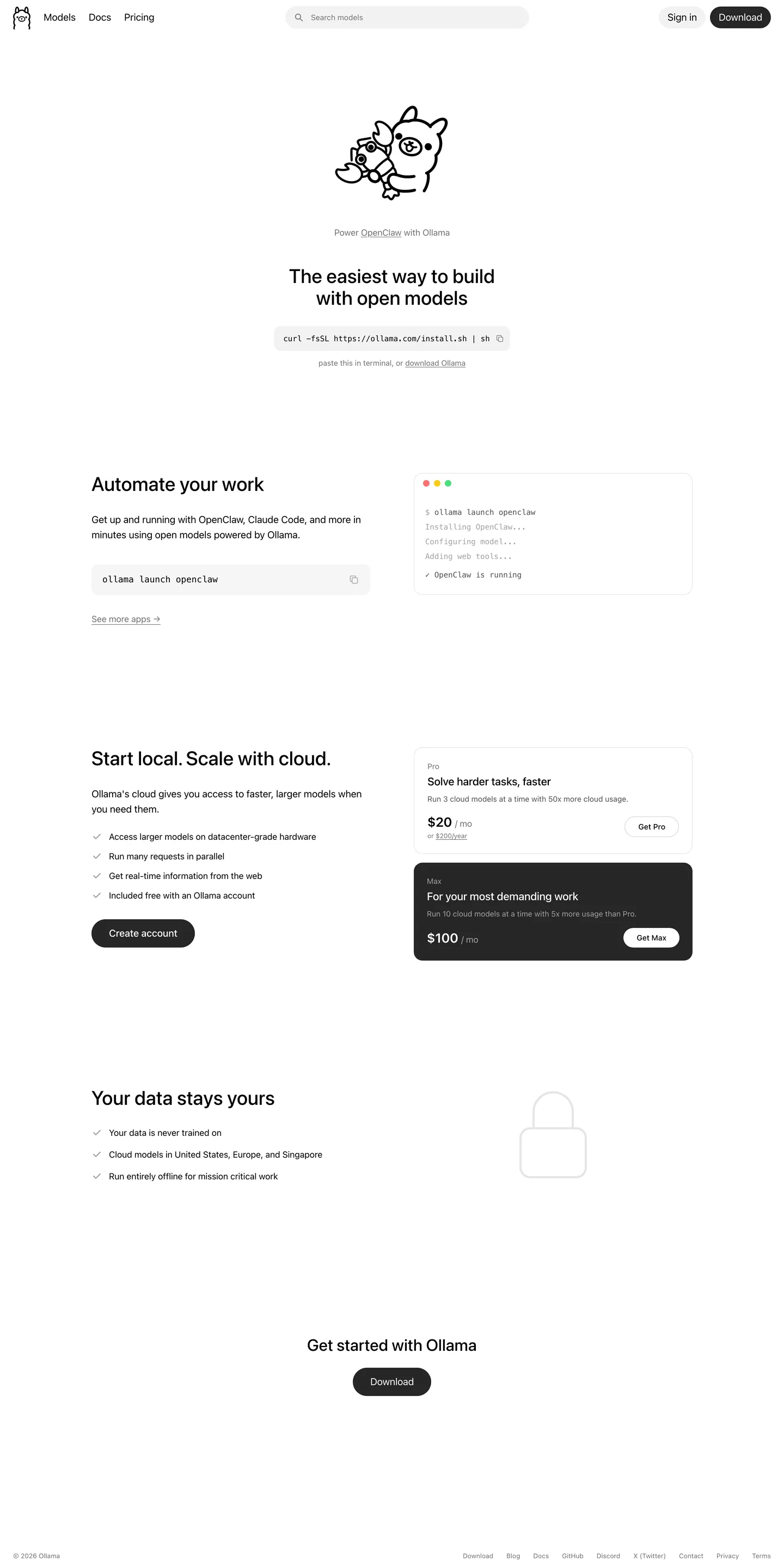
Ollama runs the most aggressively under-designed marketing surface in AI tooling, and the restraint is the brand. The home page reads like a Markdown README rendered with care: a 36px center-aligned headline above an inline curl install snippet in a soft-gray pill, a single black Download CTA, and a hand-drawn llama as the only ornament. There is no gradient, no hero photography, no marketing pyrotechnics. Pricing tiers, FAQs, and the "your data stays yours" strip all sit on the same paper-white canvas (#ffffff) with quiet #737373 body text carrying the prose. The single inverted moment in the entire system is the dark #171717 Max pricing card, which breaks the flat-white rhythm exactly once per page.
This DESIGN.md file captures the system in machine-readable form: 21 colors tokens grouped into surface, text, hairline, and semantic terminal-light groups, 13 typography tokens (SF Pro Rounded display, ui-sans-serif body, ui-monospace code), five corner radii (with 9999px and 12px doing nearly all the work), eight spacing tokens, and 22 components — buttons, inputs, the signature install-snippet pill, terminal mockup card, pricing cards in both light and inverted dark variants, FAQ rows, nav, and footer. The format follows Google Labs' DESIGN.md spec so the same tokens resolve cleanly into Tailwind config, CSS variables, or component-library code.
Feed the file to Claude, Cursor, or GitHub Copilot and the agent will reproduce Ollama's restraint instead of inventing decoration. Reference {colors.primary} or {rounded.full} directly in React components, or use the spec as an audit lens against your own marketing site. The system is worth studying for one reason: it proves a heavily technical product can ship a public surface that looks like its own CLI output, and the restraint scales — every section is the same long-form Markdown column, and every new component falls out of the existing pill plus flat-card plus terminal-mockup vocabulary.
What makes it distinct
5
- Two-color chromepure black #000000 on pure white #ffffff with three neutral grays, no brand accent at all
- Pill geometry everywhereevery interactive element collapses to 9999px radius; cards use 12px and nothing else
- One inverted moment per pagethe dark #171717 Max pricing card is the only attention-grabbing surface in the entire system
- Install snippet as hero CTAan inline curl pill at 48px height replaces the standard hero illustration
- Stock Apple typographySF Pro Rounded display, ui-sans-serif body, ui-monospace code, treated as a non-decision
ollama.com
Live at ollama.com
A snapshot of the brand in production. Scroll the frame to see the whole page.
Colors
21 colors
Ollama's system runs on #000000 as its primary voltage, used in 1 of 22 components. Type is set in ui-sans-serif across 13 tokens from 12px to 36px, weights 400–600. Shape language leans on pill geometry — fully rounded surfaces dominate the component library.
Brand & Accent
Sparing, CTA-only voltage · 1
Surface
Page and card backgrounds · 4
Text
Headlines, body, captions · 8
Borders & Hairlines
Dividers, outlines, rules · 2
Other
Specialty colors · 6
Typography
13 type tokens
Set in ui-sans-serif across 13 tokens, from 12px to 36px, weights 400–600. Shown in its own stack: where the font isn't installed, the fallback the file names stands in.
- display-xl36px · weight 500 · lh 1.11The quick brown fox jumps over the lazy dog
- display-lg30px · weight 500 · lh 1.2The quick brown fox jumps over the lazy dog
- heading-lg24px · weight 600 · lh 1.33The quick brown fox jumps over the lazy dog
- heading-md20px · weight 500 · lh 1.4The quick brown fox jumps over the lazy dog
- heading-sm18px · weight 500 · lh 1.56The quick brown fox jumps over the lazy dog
- body-md16px · weight 400 · lh 1.5The quick brown fox jumps over the lazy dog
- body-strong16px · weight 500 · lh 1.5The quick brown fox jumps over the lazy dog
- body-sm14px · weight 400 · lh 1.43The quick brown fox jumps over the lazy dog
- body-sm-strong14px · weight 500 · lh 1.43The quick brown fox jumps over the lazy dog
- caption-sm12px · weight 400 · lh 1.33The quick brown fox jumps over the lazy dog
- code-md16px · weight 400 · lh 1.5The quick brown fox jumps over the lazy dog
- code-sm14px · weight 400 · lh 1.43The quick brown fox jumps over the lazy dog
- button-md14px · weight 500 · lh 1The quick brown fox jumps over the lazy dog
Layout
Radii and spacing
5 corner radii and 8 spacing values. Shape language: pill.
Radii
- none0px
- sm6px
- md8px
- lg12px
- full9999px
Spacing
- xxs2px
- xs4px
- sm8px
- md12px
- lg16px
- xl24px
- xxl32px
- section88px
Components
22 components
Each rendered from its tokens (color, type, radius, padding) on Ollama's own canvas.
- Button Primarybutton-primaryButton Primary
- Button Primary Activebutton-primary-activeButton Primary Active
- Button Secondarybutton-secondaryButton Secondary
- Button Pill On Darkbutton-pill-on-darkButton Pill On Dark
- Button Disabledbutton-disabledButton Disabled
- Search Pillsearch-pillSearch Pill
- Search Pill Focusedsearch-pill-focusedSearch Pill Focused
- Type here…text-inputText Input
- Type here…text-input-focusedText Input Focused
- Install Snippetinstall-snippetInstall Snippet
- Command Tagcommand-tagCommand Tag
- Terminal Cardterminal-cardTerminal Card
- Terminal Traffic Lightsterminal-traffic-lightsTerminal Traffic Lights
- Pricing Cardpricing-cardPricing Card
- Pricing Card Darkpricing-card-darkPricing Card Dark
- Feature Bulletfeature-bulletFeature Bullet
- Faq Rowfaq-rowFaq Row
- Link Inlinelink-inlineLink Inline
- Link Mutelink-muteLink Mute
- Primary Navprimary-navPrimary Nav
- Footer Sectionfooter-sectionFooter Section
- Cta Strip Darkcta-strip-darkCta Strip Dark
In use
The system, in use
Ollama's tokens on the kind of product it builds.
Build something people actually use.
A short paragraph of marketing copy that previews how the brand's display tier and body tier read together. Two sentences is usually enough.
FAQ
Ollama design system FAQ
Common questions about Ollama's tokens, components, and how to use this DESIGN.md in your project.
Read next
Related reading
Specs, directories, and component libraries that pair with this design system.
Use it
Use Ollama in your project
One machine-readable file. Drop it into Claude, Cursor, or any AI tool that reads DESIGN.md.
Download the DESIGN.md
One machine-readable file: every color, type, radius, spacing, and component token of Ollama.
Feed it to your AI tool
Drop it into Claude, Cursor, or GitHub Copilot. The agent writes React components and Tailwind classes that match Ollama's visual language.
Reference the tokens directly
Or paste the values into your Tailwind config, CSS variables, or component library: every color, size and radius is a quoted, ready-to-copy value.
Read the full DESIGN.md: overview, rationale, do’s and don’ts
Overview
Ollama's site is the most aggressively under-designed marketing surface in the AI tooling space, and that is the entire point. The home page reads like a Markdown README rendered with care: a 36px center-aligned heading sits above an inline curl install snippet inside a soft-gray pill, a single black "Download" CTA, and a hand-drawn llama mascot as the only ornament. Everything else — automate-your-work block, "Start local. Scale cloud." pricing pair, "Your data stays yours" guarantee strip, FAQ wall on /pricing — sits on the same paper-white canvas ({colors.canvas}) with quiet {colors.body} neutrals carrying the prose. The system is the documentation, and the documentation is the system.
The design philosophy is geometric: every interactive element collapses to {rounded.full} (9999px) — buttons, search pills, install-snippet pills, text inputs, and the terminal-traffic-light dots. There are no decorative drop shadows, no gradients, no hero illustrations beyond the llama. Cards (the rare ones, on /pricing) use a soft {rounded.lg} (12px) and a 1px hairline. The single inverted moment in the entire system is the dark "Max" pricing tier — {colors.surface-dark} with white text — which acts as the only attention-grabbing surface in an otherwise studiously flat layout.
Typography pairs SF Pro Rounded (display headings, weight 500–600) with the operating system's default sans (ui-sans-serif) for body and ui-monospace for code. The roundness of the heading face is the only "personality" the chrome carries — it gently echoes the {rounded.full} button geometry without being decorative about it.
Key Characteristics:
- Paper-white
{colors.canvas}end-to-end with no surface alternation — the whole page is one continuous sheet - Center-aligned hero with
{typography.display-xl}SF Pro Rounded headline, no eyebrow, no subhead beyond a small "Power OpenClaw with Ollama" line under the llama - Pill geometry everywhere: every button and pill input is
{rounded.full}; cards use{rounded.lg}; nothing is sharp-cornered except section dividers - Single-color CTA system: pure black
{colors.primary}pills carry every action; "Get Pro" / "Get Max" inside pricing cards are the only variations - Inline
curlinstall snippet rendered as a pill with{typography.code-md}— the most signature element, sitting directly under the hero headline - Terminal-mockup card with macOS traffic-light dots and inline
ollama launch openclawexample — the home page's only "product preview" - Inverted dark
{component.pricing-card-dark}for the highest-tier "Max" plan, breaking the flat-white rhythm exactly once per page
Known Gaps
- Mobile screenshots not captured — responsive behavior synthesizes Ollama's known mobile pattern (hamburger drawer, 1-up pricing stack, install-snippet wrap) from desktop evidence and the extracted breakpoint stack.
- Hover states not documented by system policy.
- Form field styling beyond search and install-snippet is not present in the captured surfaces — there is no visible long-form form on the home or pricing pages.
- Authenticated chrome (account dropdown, billing settings, model dashboard) not in the captured pages.
- Models / Docs pages not in the captured set — those surfaces likely add a sidebar and a docs typography tier that this document does not describe.
AI & LLM Platforms
More systems like this
More DESIGN.md files in AI & LLM Platforms.
Pricing
Build it with Pro
The DESIGN.md files are free. Pro adds 6,000+ blocks, premium templates and the MCP server, so your AI editor builds in your system for you.
4.9/5 out of 5 · 150+ reviewsfrom 150+ founders and developers.
Billing
Billed once a year in USD. Cancel anytime.
- How many people can use the license.
- Client work, SaaS products and anything you charge for.
- Production-ready React sections: hero, pricing, features, dashboards and more.
- Complete multi-page sites you can ship as they are.
- React icons from every major library, installable with one command.
- Presets that restyle every block, in light and dark.
- Lets your AI editor search, preview and install blocks for you.
- Priority requests are answered first.
Individual
For personal projects & open source
$32instead of $49/mo
$389 billed yearly
- Seats: 1 seat
- Commercial use: Personal & open source only
- Pro blocks: 6,000+ blocks
- Templates: All 14 templates
- React icons: 294k+ icons
- Themes: All 59 themes
- MCP server: Basic usage
- Support: Standard
Team
Most popularFor freelancers, agencies & startups
$66instead of $99/mo
$789 billed yearly · ≈ $13/dev/mo
- Seats: Up to 5 seats
- Commercial use: Included
- Pro blocks: 6,000+ blocks
- Templates: All 14 templates
- React icons: 294k+ icons
- Themes: All 59 themes
- MCP server: High usage
- Support: Priority
Organization
For companies with larger teams
$132instead of $199/mo
$1,589 billed yearly
- Seats: Unlimited seats
- Commercial use: Included
- Pro blocks: 6,000+ blocks
- Templates: All 14 templates
- React icons: 294k+ icons
- Themes: All 59 themes
- MCP server: Unlimited usage
- Support: Priority
Billed once a year in USD. Cancel anytime.
Individual
For personal projects & open source
$32instead of $49/mo
$389 billed yearly
- How many people can use the license.Seats: 1 seat
- Client work, SaaS products and anything you charge for.Commercial use: Personal & open source only
- Production-ready React sections: hero, pricing, features, dashboards and more.Pro blocks: 6,000+ blocks
- Complete multi-page sites you can ship as they are.Templates: All 14 templates
- React icons from every major library, installable with one command.React icons: 294k+ icons
- Presets that restyle every block, in light and dark.Themes: All 59 themes
- Lets your AI editor search, preview and install blocks for you.MCP server: Basic usage
- Priority requests are answered first.Support: Standard
Team
Most popularFor freelancers, agencies & startups
$66instead of $99/mo
$789 billed yearly · ≈ $13/dev/mo
Everything in Individual, plus
- How many people can use the license.Seats: Up to 5 seats
- Client work, SaaS products and anything you charge for.Commercial use: Included
- Lets your AI editor search, preview and install blocks for you.MCP server: High usage
- Priority requests are answered first.Support: Priority
Organization
For companies with larger teams
$132instead of $199/mo
$1,589 billed yearly
Everything in Team, plus
- How many people can use the license.Seats: Unlimited seats
- Lets your AI editor search, preview and install blocks for you.MCP server: Unlimited usage
- Secure checkout via Stripe
- Code lives in your repo
- Keep what you've shipped if you cancel
- License terms
Your system, built for you
Every block, template and icon, installed by your AI agent in your design system. The DESIGN.md files stay free.