The New York Times Design System
NYTimes.com as a DESIGN.md file. Cheltenham/Franklin/Imperial type stack, breaking-news red #d0021b, near-black #121212 ink, 21 components. For React + AI tools.
Add shadcn.io to your AI agent. · Pro It installs blocks, icons and templates in your design system from a prompt, with Pro.
Set up MCP- Primary
- #121212
- Typeface
- nyt-franklin
- Shape
- Sharp
- Base radius
- 4px
- Colors
- 20
- Type tokens
- 12
- Components
- 21
- Spacing values
- 11
About
About The New York Times DESIGN.md
Curated by Dov Azencot · Updated May 13, 2026 · Source nytimes.com (opens in a new tab)
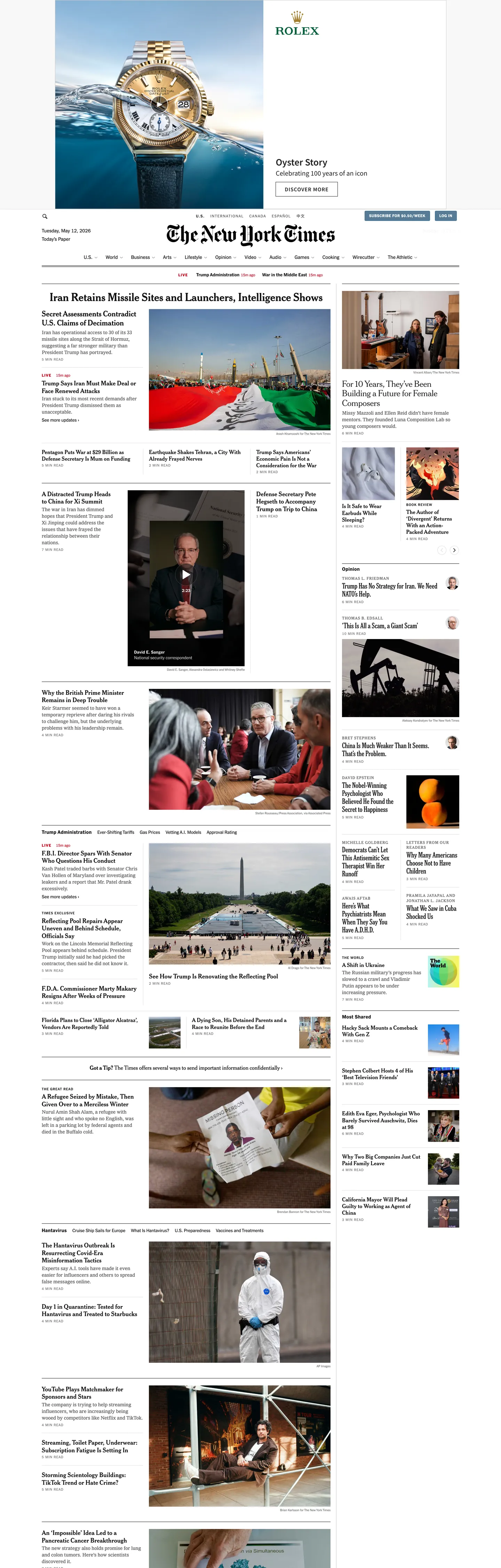
The New York Times homepage reads less like a digital product and more like a print front page that learned to scroll. The canvas is white ("#ffffff"), the ink is a near-black "#121212" rather than pure "#000000", and the wordmark is the 174-year-old Old English script — set as a static SVG above a thin "#dfdfdf" rule that runs the full container width. Headlines never escape nyt-cheltenham serif at 16–20px in weight 700; the body sits in nyt-imperial at 14px / 400 with a tight 19px leading; every UPPERCASE section eyebrow uses nyt-franklin 10px / 500 with an unusually aggressive 1px tracking — the eyebrow tier alone accounts for 65 of the page's 280-odd text-color instances. There is no hero illustration, no gradient wash, no animated marquee. The brand voltage is the masthead itself.
This DESIGN.md file packages the homepage into a structured spec. Inside: 20 colors tokens organized into ink (near-black #121212, secondary #363636, tertiary #5a5a5a, quaternary #727272), surface (#ffffff canvas, #ebebeb tint, #dfdfdf quaternary stroke), and chromatic signals — breaking-news red "#d0021b", developing-story orange "#e6540a", editorial blue "#326891" with its darker "#a61b1e" negative variant, editorial-accent blue "#2671dc", positive green "#267c30", and the single highlighter yellow "#fefad1"; 11 typography tokens spanning nyt-cheltenham serif headlines (16–20px), nyt-franklin sans UI work (8.96–14px), nyt-imperial body (14px), nyt-karnak display, and nyt-cheltenham-text-cond condensed; a 3-step radius scale dominated by "3px" corners; an 11-step spacing scale built on a 4px unit with a "10px" workhorse; and 21 components specifications covering the top nav, masthead wordmark, story cards, photo packages, breaking-news banners, and the section eyebrow. The format follows the Google Labs DESIGN.md specification.
Feed the file to Claude, Cursor, or GitHub Copilot and the agent reproduces the Times' wire-service-meets-serif voice — white canvas, near-black ink, nyt-cheltenham serif headlines, UPPERCASE nyt-franklin labels, square-corner cards at "3px" radius, chromatic editorial semantics, and the load-bearing absence of a branded CTA color. Reference the tokens to paste hex values into Tailwind config, or audit any news surface against the spec's discipline. Where most editorial sites since 2020 have chased the Apple News tile-rounded aesthetic or The Verge's neon hazard chrome, the Times has bet the opposite direction — that restraint, serif typography at 16–20px, and chromatic semantics tied to specific editorial functions can outlast a decade of redesign cycles. That bet is the design.
What makes it distinct
5
- Four-family newsroom stacknyt-cheltenham for 16–20px serif headlines, nyt-franklin for UPPERCASE labels, nyt-imperial for 14px body, nyt-karnak for the rare display callout
- Editorial signal palettebreaking-news red #d0021b, developing orange #e6540a, editorial blue #326891, never used as button fills or wash backgrounds
- 1px UPPERCASE eyebrow trackingnyt-franklin 10px / 500 with 1px letter-spacing carries 65+ section kickers, the densest editorial-label tier in this directory
- Square-corner defaultstory cards at 3px radius, image circles at 50%, near-zero pill geometry across 21 components slots
- Hairline-as-elevation#ebebeb tertiary tints and #dfdfdf quaternary strokes carry every column rule; zero drop shadows on the captured homepage
nytimes.com
Live at nytimes.com
A snapshot of the brand in production. Scroll the frame to see the whole page.
Colors
20 colors
The New York Times's system runs on #121212 as its primary voltage, used in 11 of 21 components. Type is set in nyt-franklin across 12 tokens from 8.96px to 20px, weights 400–800. Shape language is sharp — components average 1px corner radius, favoring crisp rectangles.
Surface
Page and card backgrounds · 2
Text
Headlines, body, captions · 6
Other
Specialty colors · 12
Typography
12 type tokens
Set in nyt-franklin across 12 tokens, from 8.96px to 20px, weights 400–800. Shown in its own stack: where the font isn't installed, the fallback the file names stands in.
- headline-md20px · weight 700 · lh 1.15 · tracking 0.05pxThe quick brown fox jumps over the lazy dog
- headline-sm18px · weight 700 · lh 1.2 · tracking 0.18pxThe quick brown fox jumps over the lazy dog
- headline-xs16px · weight 700 · lh 1.2 · tracking 0.16pxThe quick brown fox jumps over the lazy dog
- body-md14px · weight 400 · lh 1.36 · tracking 0.1pxThe quick brown fox jumps over the lazy dog
- nav-link14px · weight 500 · lh 1.0 · tracking 0.1pxThe quick brown fox jumps over the lazy dog
- link-md13px · weight 500 · lh 1.23 · tracking 0The quick brown fox jumps over the lazy dog
- eyebrow-md10px · weight 500 · lh 1.25 · tracking 1pxThe quick brown fox jumps over the lazy dog
- eyebrow-strong10px · weight 600 · lh 1.25 · tracking 1pxThe quick brown fox jumps over the lazy dog
- eyebrow-loud11px · weight 800 · lh 1.25 · tracking 1.1pxThe quick brown fox jumps over the lazy dog
- caption-micro8.96px · weight 400 · lh 1.2 · tracking 0The quick brown fox jumps over the lazy dog
- display-slab16px · weight 700 · lh 1.15 · tracking 0.25pxThe quick brown fox jumps over the lazy dog
- headline-condensed20px · weight 700 · lh 1.15 · tracking 0.05pxThe quick brown fox jumps over the lazy dog
Layout
Radii and spacing
4 corner radii and 11 spacing values. Shape language: sharp.
Radii
- none0px
- xs3px
- sm4px
- full50%
Spacing
- micro2px
- xxs4px
- sm8px
- base10px
- md11px
- lg12px
- xl16px
- xxl24px
- section30px
- section-lg33px
- page60px
Components
21 components
Each rendered from its tokens (color, type, radius, padding) on The New York Times's own canvas.
- Masthead Wordmarkmasthead-wordmarkMasthead Wordmark
- Top Navtop-navTop Nav
- Nav Linknav-linkNav Link
- Nav Link Hovernav-link-hoverNav Link Hover
- Section Eyebrowsection-eyebrowSection Eyebrow
- Breaking News Pillbreaking-news-pillBreaking News Pill
- Live Indicatorlive-indicatorLive Indicator
- Developing Tagdeveloping-tagDeveloping Tag
- Story Cardstory-cardStory Card
- Story Card Headlinestory-card-headlineStory Card Headline
- Story Card Summarystory-card-summaryStory Card Summary
- BylinebylineByline
- TimestamptimestampTimestamp
- Photo Framephoto-framePhoto Frame
- Avatar Circleavatar-circleAvatar Circle
- Link Textlink-textLink Text
- Link Text Hoverlink-text-hoverLink Text Hover
- Highlight Markhighlight-markHighlight Mark
- Type here…text-inputText Input
- Type here…text-input-focusText Input Focus
- Divider Thindivider-thinDivider Thin
In use
The system, in use
The New York Times's tokens on the kind of product it builds.
Build something people actually use.
A short paragraph of marketing copy that previews how the brand's display tier and body tier read together. Two sentences is usually enough.
FAQ
The New York Times design system FAQ
Common questions about The New York Times's tokens, components, and how to use this DESIGN.md in your project.
Read next
Related reading
Specs, directories, and component libraries that pair with this design system.
- Browse all design systemsThe full directory of DESIGN.md files on shadcn.io, with live mockups for each.shadcn.io
- The New York Times — official siteThe newspaper itself — read the homepage to see the Cheltenham serif ladder and Old English masthead rule in motion.nytimes.com (opens in a new tab)
- The DESIGN.md specificationGoogle Labs' open spec for machine-readable design system files — the format this page is built on.github.com (opens in a new tab)
Use it
Use The New York Times in your project
One machine-readable file. Drop it into Claude, Cursor, or any AI tool that reads DESIGN.md.
Download the DESIGN.md
One machine-readable file: every color, type, radius, spacing, and component token of The New York Times.
Feed it to your AI tool
Drop it into Claude, Cursor, or GitHub Copilot. The agent writes React components and Tailwind classes that match The New York Times's visual language.
Reference the tokens directly
Or paste the values into your Tailwind config, CSS variables, or component library: every color, size and radius is a quoted, ready-to-copy value.
Read the full DESIGN.md: overview, rationale, do’s and don’ts
Overview
The New York Times homepage reads as a print front page that learned to scroll. The canvas is white ({colors.canvas} — #ffffff), the ink is a softened near-black ({colors.ink-primary} — #121212) rather than pure #000000, and the wordmark is the 174-year-old Old English script set as a static SVG above a thin {colors.stroke-quaternary} (#dfdfdf) rule that runs the full container width. There is no branded accent color in the manner of Bloomberg Orange or Stripe Indigo. The chromatic palette is functional editorial signal — breaking-news red {colors.signal-breaking} (#d0021b), developing-story orange {colors.signal-developing} (#e6540a), editorial blue {colors.signal-editorial} (#326891), positive green {colors.signal-positive} (#267c30), highlighter yellow {colors.signal-highlight} (#fefad1) — each bound through a CSS variable to one specific editorial function and never used as a button fill or background wash.
Restraint as masthead: where most editorial sites since 2020 have chased either the Apple News tile-rounded aesthetic or The Verge's neon hazard chrome, the Times holds every story card at {rounded.xs} 3px and every headline at 16–20px in nyt-cheltenham weight 700. There is no display-tier shout. The page packs 30+ story slots into a 4500px scroll without raising its voice above 20px. This is the inverse of The Verge's 107px Manuka headline or Medium's 120px GT Super — the Times trusts serif-headline information density and the masthead's iconic standing to carry the page.
Editorial-signal chromatic discipline: each color is bound through CSS variables — --color-signal-breaking for red, --color-signal-developing for orange, --color-signal-editorial for blue, --color-signal-positive for green, --color-signal-highlight for yellow — to a single function. Red is the breaking-news + live + error tier; orange is "developing story" only; blue is editorial column accent and link hover; green is markets-up and confirmation; yellow is keyword highlight. The discipline is rare in mainstream media — most publishers let red and green leak into generic toast and CTA roles, but the Times keeps each color pinned to a single newsroom signal so a reader scanning the page can map color directly to meaning.
The shape language is square-cornered with hairline rules. Three radius values appear on the homepage — {rounded.xs} 3px (the structural default, 10 occurrences), {rounded.sm} 4px (6 occurrences), and {rounded.full} 50% (6 occurrences, all on avatar circles and the breaking-news indicator). There is no 8px corner, no pill geometry, no rounded CTA. The Times refuses the iOS-tile aesthetic — story cards stay at 3px because a sharper corner reads as newsprint reproduction rather than as a SaaS dashboard tile.
Key Characteristics:
- No branded accent color: the brand voltage is the Old English wordmark itself, set as static SVG. Chromatic signals are scoped to functional editorial codes via
--color-signal-*variables. - Four-family newsroom stack: nyt-cheltenham for 16–20px serif headlines, nyt-franklin for UPPERCASE labels at 8.96–14px, nyt-imperial for 14px body, nyt-karnak for the rare display callout.
- 1px UPPERCASE eyebrow tracking: the 10px / 500 nyt-franklin eyebrow with 1px letter-spacing carries 65+ section kickers — the densest editorial-label tier on this page.
- Square-corner default: story cards at
{rounded.xs}3px, image circles at{rounded.full}50%, near-zero pill geometry across 19 component slots. - Hairline-as-elevation:
{colors.stroke-quaternary}#dfdfdf and{colors.surface-tint}#ebebeb carry every column rule and section divider; zero drop shadows on the captured homepage. - Headline ceiling at 20px: nyt-cheltenham weight 700 never exceeds 20px on the homepage. The page caps display scale where most editorial sites are still climbing.
- Chromatic editorial semantics: red for breaking, orange for developing, blue for editorial, green for positive, yellow for highlight — each color bound to a CSS variable for one signal.
- nyt-imperial body at 19px line-height: tight enough to pack column density, generous enough to read past 600 words without fatigue.
Colors
Ink Ladder
- Ink Primary (
{colors.ink-primary}— #121212) — frequency 3055. Used as text (1530), bg (0), border (1525). The workhorse near-black, bound to--color-content-primary,--color-background-inversePrimary, and--color-stroke-primary. Not pure black — a softened near-black that pulls the page toward newsprint warmth rather than OLED void. - Overlay Black (
{colors.overlay-black}— #000000) — frequency 1226. Used as text (610), border (610), gradient (6). The absolute black, bound to--color-overlay-blackand--color-static-gray100. Reserved for SVG icons, the editorial-overlay scrim on hero photography, and the page's truest dark accent. - Ink Tertiary (
{colors.ink-tertiary}— #5a5a5a) — frequency 546. Used as text (273), border (273). Bound to--color-content-tertiary. The secondary text layer — bylines, deks, and section secondary copy. - Ink Quaternary (
{colors.ink-quaternary}— #727272) — frequency 262. Used as text (131), border (131). Bound to--color-content-quaternary. Timestamp and metadata color. - Ink Quintary (
{colors.ink-quintary}— #8b8b8b) — bound to--color-content-quintaryand--color-stroke-secondary. The dim text-and-stroke color at the lowest legibility tier — photo credits and disabled secondary actions. - Ink Secondary (
{colors.ink-secondary}— #363636) — bound to--color-content-secondaryand--color-background-inverseSecondary. The deep gray for emphasized body copy and the inverse-secondary surface. - Ink Disabled (
{colors.ink-disabled}— #666666) — frequency 32. Used as text (16), border (16). The disabled text and placeholder color outside the main CSS-variable system.
Surface & Strokes
- Canvas White (
{colors.canvas}— #ffffff) — frequency 40. Used as text (8), bg (26), border (6). The default page surface, bound to--color-background-primary,--color-background-elevated,--color-background-secondary,--color-static-white, and--color-content-inversePrimary. Merged from a near-white cluster collapsed via OKLCH delta-E. - Surface Tint (
{colors.surface-tint}— #ebebeb) — frequency 228. Used as bg (228). Bound to--color-background-tertiary. The cream-paper tint used for photo placeholders, ad-creative backdrops, and the rare section-tinted rail. - Stroke Quaternary (
{colors.stroke-quaternary}— #dfdfdf) — bound to--color-stroke-quaternary. The structural hairline used on column rules, section dividers, and story-card outlines. - Stroke Strong (
{colors.stroke-strong}— #c7c7c7) — bound to--color-stroke-tertiaryand--color-background-quaternary. The darker hairline used on form input borders and emphasized rule dividers.
Editorial Signals
- Signal Breaking (
{colors.signal-breaking}— #d0021b) — frequency 38. Used as text (19), border (19). Bound to--color-signal-breaking. The breaking-news red — the LIVE pulse, the "BREAKING" kicker, the breaking-news rail. Never used as a button fill or wash. - Signal Negative (
{colors.signal-negative}— #a61b1e) — frequency 2. Used as text (1), border (1). Bound to--color-signal-negative. The darker red used for form-validation errors and markets-down indicators — distinct from breaking-news red so the two never collide on a single page. - Signal Developing (
{colors.signal-developing}— #e6540a) — bound to--color-signal-developing. The orange tag on stories still updating — distinct from the red breaking signal. Sits between red breaking and yellow highlight in the chromatic alarm ladder. - Signal Editorial (
{colors.signal-editorial}— #326891) — frequency 2. Used as border (2). Bound to--color-signal-editorial. The editorial-column accent and link-hover color. Sits in the same range as Bloomberg's Opinion blue but is darker and more saturated. - Signal Editorial Soft (
{colors.signal-editorial-soft}— #567b95) — frequency 2. Used as bg (2). The softer editorial blue, the only brand-layer color in the extraction. Used for in-line link defaults before the darker{colors.signal-editorial}takes over on hover. - Signal Accent (
{colors.signal-accent}— #2671dc) — bound to--color-signal-accent. The brighter accent blue for inline links inside subscription rails and the focus ring. - Signal Positive (
{colors.signal-positive}— #267c30) — bound to--color-signal-positive. The dedicated positive green — markets-up percentages, confirmation toasts, and success states. Sits in the same chromatic register as Bloomberg's markets-up but darker. - Signal Highlight (
{colors.signal-highlight}— #fefad1) — bound to--color-signal-highlight. The pale highlighter yellow used to mark search-result keywords and editor's-note inline emphasis. The only signal color that paints a fill rather than text or border.
Inverse
- Inverse Secondary (
{colors.inverse-secondary}— #363636) — bound to--color-background-inverseSecondary. The dark surface used inside the rare dark-canvas embed (puzzle previews and certain editorial graphics).
Gradient System
The Times uses no decorative gradients on the homepage. The only gradient-like treatment is the scrim under the hero photograph — a top-to-bottom #000000 fade to transparent, used to land the deck on the image. No mesh gradients, no brand-accent fades, no atmospheric blurs. The flat-color discipline is unusual for a media surface in 2026 — most publishers reach for a brand gradient at least once on the homepage, but the Times stays on the flat-color print register throughout.
Typography
Font Family
Four newsroom-licensed families do the work. nyt-cheltenham (a custom cut of Bertram Goodhue's 1896 Cheltenham, fallback cheltenham-fallback-georgia / georgia / times new roman) carries 16–20px serif headlines in weight 700 — the structural workhorse of the page. nyt-franklin (the digital cut of Franklin Gothic, fallback helvetica / arial) handles every UPPERCASE eyebrow, nav link, byline, and section label at 8.96–14px across weights 400/500/600/700/800. nyt-imperial (the Hoefler & Co. body-text cut, fallback georgia / times new roman) carries 14px / 400 body copy at 19px leading. nyt-karnak (a slab serif derived from W. A. Dwiggins' 1942 Karnak, fallback georgia) and nyt-cheltenham-text-cond appear rarely for display callouts and condensed headers.
Hierarchy
| Token | Size | Weight | Line Height | Letter Spacing | Use |
|---|---|---|---|---|---|
{typography.headline-md} | 20px | 700 | 1.15 | 0.05px | Lead story headlines in nyt-cheltenham-text-cond |
{typography.headline-sm} | 18px | 700 | 1.2 | 0.18px | Secondary story headlines in nyt-cheltenham |
{typography.headline-xs} | 16px | 700 | 1.2 | 0.16px | Tertiary story headlines and section labels |
{typography.body-md} | 14px | 400 | 1.36 | 0.1px | nyt-imperial body copy and story summaries |
{typography.nav-link} | 14px | 500 | 1.0 | 0.1px | Top-nav section links in nyt-franklin |
{typography.link-md} | 13px | 500 | 1.23 | 0 | Inline anchor links in nyt-franklin |
{typography.eyebrow-md} | 10px | 500 | 1.25 | 1px | UPPERCASE section eyebrows in nyt-franklin |
{typography.eyebrow-strong} | 10px | 600 | 1.25 | 1px | Emphasized eyebrows on developing-story rails |
{typography.eyebrow-loud} | 11px | 800 | 1.25 | 1.1px | The "BREAKING" eyebrow with breaking-news red text |
{typography.caption-micro} | 8.96px | 400 | 1.2 | 0 | Photo captions and ultra-fine credit lines |
{typography.display-slab} | 16px | 700 | 1.15 | 0.25px | The rare nyt-karnak slab callout |
{typography.headline-condensed} | 20px | 700 | 1.15 | 0.05px | Promotional headlines in nyt-cheltenham-text-cond |
Principles
nyt-cheltenham 16–20px is the headline ceiling, nyt-franklin 10px UPPERCASE is the eyebrow workhorse. Anything above 20px on the homepage lives inside an ad creative or a section-front interstitial; editorial story headlines never escape {typography.headline-md} 20px. The 10px / 500 / 1px-tracked eyebrow tier alone accounts for 65 of the 280-odd text-color instances across the page — the Times trusts UPPERCASE micro-eyebrows to carry section identity rather than scaling type.
Letter-spacing runs in three registers. Aggressively positive (1–1.1px) on UPPERCASE nyt-franklin eyebrows at 10–11px — the 1px tracking is what makes the eyebrow read as newsroom kicker rather than UI label. Slightly positive (0.05–0.25px) on nyt-cheltenham headlines to keep the serif at 16–20px from feeling cramped. Plain 0 tracking on body and nav links — the default. Negative tracking does not appear on the page.
Note on Font Substitutes
nyt-cheltenham, nyt-franklin, nyt-imperial, nyt-karnak, and nyt-cheltenham-text-cond are licensed Times-only cuts. Georgia substitutes acceptably for nyt-cheltenham and nyt-imperial at the published sizes — the metrics differ but the serif voice reads correctly. Source Serif or Tinos preserves the body-text behavior with slightly tighter metrics. Libre Franklin is the closest open-source substitute for nyt-franklin and tracks well at 10–14px UPPERCASE. Hoefler Text or Lyon Text match nyt-imperial at body sizes if licensed. For nyt-karnak, Roboto Slab or Zilla Slab substitute at the 16px callout size. The Times' type is deliberately conservative, so substitutes preserve the wire-service-meets-serif tone without retuning.
Layout
Spacing System
- Base unit: 4px with a 2px micro-step.
- Tokens:
{spacing.micro}2px ·{spacing.xxs}4px ·{spacing.sm}8px ·{spacing.base}10px ·{spacing.md}11px ·{spacing.lg}12px ·{spacing.xl}16px ·{spacing.xxl}24px ·{spacing.section}30px ·{spacing.section-lg}33px ·{spacing.page}60px. - Card internal padding: 16×12px on story cards; ad creatives expand to 24–30px.
- Inline spacing:
10pxis the most-used spacing value on the page (126 occurrences) — it controls the gap between byline avatars, eyebrow rails, and the section margin tier.
Grid & Container
- Max content width: ~1200px centered on desktop with a 60px outer page margin.
- Column patterns: the homepage resolves into a 4-column structural grid that recombines per section — a 1-column lead story with photography, a 3-column secondary-story rail, a 2-column "Top Stories" feed, and a 4-column lower index. The masthead and section nav span all four columns at 30–33px section gaps.
- Container padding: 16–24px mobile / 30–33px desktop on the outer edges.
- Gutters: 10–12px between columns, 8px between rows inside the secondary-story rail.
Whitespace Philosophy
The Times treats whitespace like a printed newspaper treats column gutters — a calibrated separator measured in single-digit pixels, not a dramatic reset. The page is paced by hairlines rather than open space: every section is bounded by a 1px {colors.stroke-quaternary} (#dfdfdf) rule, every column gutter is measured at 10–12px, every story card carries a 16×12px interior padding. The result is dense without feeling cramped. Where the Apple News surface lets air carry the layout, the Times lets hairline ruling carry it — closer to a print copy desk than to a magazine landing.
Border Radius Scale
{rounded.none}0px: the masthead wordmark, breaking-news kicker, and section eyebrow — square corners{rounded.xs}3px: the structural default (10 occurrences) — story cards and inline tags{rounded.sm}4px: form inputs and ad-creative tiles (6 occurrences){rounded.full}50%: byline avatars, the LIVE indicator dot, and round icon buttons (6 occurrences)
The 3px radius is the structural default because it softens the card edge just enough to read as a current-decade web product while staying close to the square-corner discipline of print. Story cards round at 3px, form inputs at 4px, indicators at 50%, and everything else stays square at 0px.
Elevation
The Times' depth philosophy is hairline-as-elevation. There are zero traditional box-shadows in the extracted top-frequency colors. Instead, the page leans on {colors.stroke-quaternary} (#dfdfdf) and {colors.surface-tint} (#ebebeb) 1px treatments to separate every column, section, and card.
| Level | Treatment | Use |
|---|---|---|
| 0 | No border, no shadow | Default canvas text and inline copy |
| 1 | 1px solid {colors.stroke-quaternary} (#dfdfdf) | Section dividers, story-card outlines, the masthead rule — the structural workhorse |
| 2 | 1px solid {colors.stroke-strong} (#c7c7c7) | Form input borders and emphasized rule dividers |
| 3 | 1px solid {colors.ink-quintary} (#8b8b8b) | Tertiary stroke on emphasized buttons and rare nav active states |
| 4 | 1px solid {colors.ink-primary} (#121212) | Focused input borders and active-state outlines |
| 5 | Saturated {colors.signal-breaking} (#d0021b) text or fill | Breaking-news voltage — color-as-attention rather than depth |
| 6 | Tinted {colors.surface-tint} (#ebebeb) bg | Photo placeholders and ad-creative backdrops — surface differentiation through a single tint step |
When something needs to stand out, it doesn't get a drop shadow — it gets a darker hairline, a black border on focus, or the breaking-news red text voltage. No gradients, no glows, no atmospheric blurs. The page stays flat throughout, and hierarchy is carried by hairline weight, ink-ladder tier, and editorial-signal color.
Components
Masthead & Navigation
masthead-wordmark — The "The New York Times" Old English script set as a static SVG, ink primary on canvas white, 48px tall with 10px vertical padding above the section-nav rule. Square corners at {rounded.none} — the wordmark never sits inside a tinted card or rounded chip.
top-nav — White fill, 36px height, nyt-franklin 14px / 500 nav links with 0.1px tracking. Bordered top-and-bottom by a 1px {colors.stroke-quaternary} hairline (#dfdfdf), 0px outer radius. Section labels — U.S., World, Business, Arts, Opinion — sit left-aligned with 10px gap between them.
nav-link — Transparent fill, near-black text, nyt-franklin 14px / 500. Padding 0×6×0×0 on the horizontal axis — the asymmetric right margin keeps section labels packed without colliding with their right neighbor. Hover transitions text to {colors.signal-accent} (#2671dc) over 150ms — the only place the brighter accent blue appears.
Eyebrows & Breaking
section-eyebrow — Transparent fill, near-black text, nyt-franklin 10px / 500 UPPERCASE with 1px letter-spacing — the structural section kicker (e.g., "POLITICS", "INTERNATIONAL"). Repeats 65+ times on the homepage. The 1px tracking is what makes the eyebrow read as newsroom kicker rather than UI label.
breaking-news-pill — Transparent fill, {colors.signal-breaking} (#d0021b) text, nyt-franklin 11px / 800 UPPERCASE with 1.1px tracking. The "BREAKING" kicker on the top breaking-news rail. The only place 800-weight UPPERCASE Franklin appears.
live-indicator — {colors.signal-breaking} 8px circle at {rounded.full} 50% radius. The LIVE pulse next to the breaking-news kicker. The only place breaking-news red paints a fill — and it's an 8px dot, never a button.
developing-tag — Transparent fill, {colors.signal-developing} (#e6540a) text, nyt-franklin 10px / 600 UPPERCASE with 1px tracking. The orange "DEVELOPING" tag on stories still updating — bound to --color-signal-developing and chromatically distinct from the red breaking signal.
Story Cards
story-card — Canvas white fill, 1px {colors.stroke-quaternary} (#dfdfdf) border, {rounded.xs} 3px radius, 16×12px interior padding. Headline in nyt-cheltenham 16–20px / 700, summary in nyt-imperial 14px / 400, byline in nyt-franklin 10px / 500. Hover: no lift, no scale — the headline color stays put; the cursor change is the only state signal.
story-card-headline — {typography.headline-md} 20px / 700 nyt-cheltenham near-black on white. Maximum three lines before truncating with ellipsis. Letter-spacing 0.05px keeps the 20px serif from feeling cramped.
story-card-summary — {typography.body-md} 14px / 400 nyt-imperial in {colors.ink-secondary} (#363636). The body summary is always 14px nyt-imperial at 19px leading — the Times pushes the body weight to read as long-form magazine prose rather than card-flavored snippet copy.
Bylines & Timestamps
byline — Transparent fill, {colors.ink-tertiary} (#5a5a5a) text, nyt-franklin 10px / 500 UPPERCASE with 1px tracking. "By Jane Doe and John Smith" — UPPERCASE author names sit immediately under the headline.
timestamp — Transparent fill, {colors.ink-quaternary} (#727272) text, nyt-franklin 8.96px / 400 lowercase. "12 min ago" — the smallest type token on the page, never tracked, never UPPERCASE.
avatar-circle — {colors.surface-tint} (#ebebeb) placeholder fill, 24px tall, {rounded.full} 50% radius. The byline avatar — never bordered, never shadowed.
Photography
photo-frame — {colors.surface-tint} (#ebebeb) placeholder background, 0px radius, 0px padding. The Times never rounds photo corners on the homepage — the placeholder tint is the only chrome around an image.
Links & Highlights
link-text — Transparent fill, {colors.signal-editorial-soft} (#567b95) text, nyt-franklin 13px / 500. The default inline link color — soft enough to recede in dense paragraphs.
link-text-hover — Hover transitions text to {colors.signal-editorial} (#326891) — the darker variant, never an underline-only state.
highlight-mark — {colors.signal-highlight} (#fefad1) background, near-black text, nyt-imperial 14px / 400, 0×2px horizontal padding. The keyword-mark used in search results and editor's-note emphasis. The only signal color that paints a fill.
Forms
text-input — White fill, 1px {colors.stroke-strong} (#c7c7c7) border, {rounded.sm} 4px radius, 8×12px padding. nyt-imperial 14px text in near-black, placeholder in {colors.ink-disabled} (#666666). On focus, border transitions to {colors.ink-primary} (#121212) — never to a blue ring.
divider-thin — {colors.stroke-quaternary} 1px horizontal rule. The structural separator used between sections, story rails, and footer columns. No spacing-rules variant exists — every divider is the same 1px hairline.
Do's and Don'ts
Do
- Use chromatic editorial signals through CSS variables —
--color-signal-breakingfor red,--color-signal-developingfor orange,--color-signal-editorialfor blue,--color-signal-positivefor green,--color-signal-highlightfor yellow. Each color tied to a single editorial function. - Hold headlines at 16–20px in nyt-cheltenham weight 700. The page caps display scale where most editorial sites are still climbing — the ceiling is the discipline.
- Apply 1px letter-spacing to all UPPERCASE nyt-franklin eyebrows at 10–11px. The aggressive tracking is what makes the eyebrow read as newsroom kicker rather than UI label.
- Use
{rounded.xs}3px on story cards. A 3px corner reads as newsprint reproduction; an 8px corner reads as Apple News. - Lean on
{colors.stroke-quaternary}(#dfdfdf) 1px hairlines for separation instead of shadows. The page has zero drop shadows on the captured homepage. - Set body copy in nyt-imperial 14px / 400 with 19px leading. The tight leading is what packs column density without sacrificing readability past 600 words.
Don't
- Don't paint
{colors.signal-breaking}(#d0021b) as a button fill or background wash. The hex appears 38 times across the page, all as text or as the 8px LIVE-indicator circle — never as a CTA fill. A filled breaking-news red button breaks the editorial-signal discipline and turns the page into a Salesforce-flavored newsroom. - Don't round story cards to 8px or higher. The 3px corner is the load-bearing shape decision — round it to
{rounded.sm}4px and the page reads like Apple News; round it to 8px and it stops looking like a newspaper-of-record entirely. - Don't let
{colors.signal-positive}(#267c30) or{colors.signal-breaking}(#d0021b) leak into generic "success" or "danger" semantics. Each color is bound to one editorial function — markets-up + confirmation for green, breaking + live + error for red. Using either for a generic toast drains its newsroom meaning. - Don't use nyt-cheltenham above 20px on editorial headlines. Display type scale lives in promotional creatives only; story headlines stay at 16–20px. Pushing nyt-cheltenham to 28–32px breaks the wire-service density and reads as marketing.
- Don't drop the eyebrow tier below 1px tracking. The 1px UPPERCASE letter-spacing on 10px nyt-franklin is the difference between "section kicker" and "tiny UI label". Lose the tracking and the eyebrow ladder collapses.
- Don't use
{colors.signal-developing}(#e6540a) on anything but updating stories. The orange is bound to--color-signal-developingand reserved for the "DEVELOPING" tag. Using it as a CTA, an accent, or a button fill breaks the chromatic-alarm-ladder semantics — red is breaking, orange is developing, yellow is highlight, and the three colors carry meaning only because they don't drift. - Don't reach for drop shadows when separating cards. The page uses #dfdfdf hairlines instead. A box-shadow on a story card reads as Material-flavored UI and pulls the layout out of the print tradition the masthead anchors.
- Don't substitute Inter for nyt-franklin at the 10px eyebrow tier. Inter's tight metrics make the 10px / 1px-tracked UPPERCASE eyebrow feel cramped. Use Libre Franklin instead — it preserves the tracking behavior without retuning.
Known Gaps
- Article-detail long-form chrome: the reading view past the homepage (story pages, opinion essays, magazine long-form) uses an additional set of pull-quote and inline-image components not captured in this homepage extraction.
- Games hub palette: Wordle, Spelling Bee, Connections, and the Crossword each carry sub-brand palettes (Wordle green/yellow, Connections category colors, Crossword cream surface) that are not in scope for this spec.
- Cooking and Wirecutter sub-brands: the Times' commerce-and-recipe surfaces use their own type stacks (nyt-magsans for Cooking, a customized Karnak for Wirecutter) and product-card vocabularies not extracted here.
- Subscriber paywall and account UI: the subscription-purchase flow, account settings, and the gift-article modal use a denser CTA vocabulary (filled black pills, larger nyt-franklin 14–16px buttons) not present on the public homepage.
- Dark mode for the body canvas: the homepage is light-only. CSS variable names (
--color-background-inversePrimary= #121212,--color-content-inversePrimary= #ffffff) suggest the inversion is engineered, but no dark-canvas toggle ships on this surface. - Animation timing: the LIVE pulse, breaking-news rail entrance, and image-carousel transitions use proprietary timing curves not captured by the static extraction.
- Full markets and elections chrome: the dedicated elections-night results page and the markets dashboard ship with denser table grids and additional chromatic signals (state-call red/blue, percentage gradients) not present on the captured homepage.
News & Publishing
More systems like this
More DESIGN.md files in News & Publishing.
Pricing
Build it with Pro
The DESIGN.md files are free. Pro adds 6,000+ blocks, premium templates and the MCP server, so your AI editor builds in your system for you.
4.9/5 out of 5 · 150+ reviewsfrom 150+ founders and developers.
Billing
Billed once a year in USD. Cancel anytime.
- How many people can use the license.
- Client work, SaaS products and anything you charge for.
- Production-ready React sections: hero, pricing, features, dashboards and more.
- Complete multi-page sites you can ship as they are.
- React icons from every major library, installable with one command.
- Presets that restyle every block, in light and dark.
- Lets your AI editor search, preview and install blocks for you.
- Priority requests are answered first.
Individual
For personal projects & open source
$32instead of $49/mo
$389 billed yearly
- Seats: 1 seat
- Commercial use: Personal & open source only
- Pro blocks: 6,000+ blocks
- Templates: All 14 templates
- React icons: 294k+ icons
- Themes: All 59 themes
- MCP server: Basic usage
- Support: Standard
Team
Most popularFor freelancers, agencies & startups
$66instead of $99/mo
$789 billed yearly · ≈ $13/dev/mo
- Seats: Up to 5 seats
- Commercial use: Included
- Pro blocks: 6,000+ blocks
- Templates: All 14 templates
- React icons: 294k+ icons
- Themes: All 59 themes
- MCP server: High usage
- Support: Priority
Organization
For companies with larger teams
$132instead of $199/mo
$1,589 billed yearly
- Seats: Unlimited seats
- Commercial use: Included
- Pro blocks: 6,000+ blocks
- Templates: All 14 templates
- React icons: 294k+ icons
- Themes: All 59 themes
- MCP server: Unlimited usage
- Support: Priority
Billed once a year in USD. Cancel anytime.
Individual
For personal projects & open source
$32instead of $49/mo
$389 billed yearly
- How many people can use the license.Seats: 1 seat
- Client work, SaaS products and anything you charge for.Commercial use: Personal & open source only
- Production-ready React sections: hero, pricing, features, dashboards and more.Pro blocks: 6,000+ blocks
- Complete multi-page sites you can ship as they are.Templates: All 14 templates
- React icons from every major library, installable with one command.React icons: 294k+ icons
- Presets that restyle every block, in light and dark.Themes: All 59 themes
- Lets your AI editor search, preview and install blocks for you.MCP server: Basic usage
- Priority requests are answered first.Support: Standard
Team
Most popularFor freelancers, agencies & startups
$66instead of $99/mo
$789 billed yearly · ≈ $13/dev/mo
Everything in Individual, plus
- How many people can use the license.Seats: Up to 5 seats
- Client work, SaaS products and anything you charge for.Commercial use: Included
- Lets your AI editor search, preview and install blocks for you.MCP server: High usage
- Priority requests are answered first.Support: Priority
Organization
For companies with larger teams
$132instead of $199/mo
$1,589 billed yearly
Everything in Team, plus
- How many people can use the license.Seats: Unlimited seats
- Lets your AI editor search, preview and install blocks for you.MCP server: Unlimited usage
- Secure checkout via Stripe
- Code lives in your repo
- Keep what you've shipped if you cancel
- License terms
Your system, built for you
Every block, template and icon, installed by your AI agent in your design system. The DESIGN.md files stay free.