Nuxt Design System
Nuxt's marketing design system: electric green (#00dc82) on a near-midnight canvas, Public Sans at 72px display, tight 6–8px radius, 16 colors tokens, 18 components. For React, Next.js, and AI tools.
Add shadcn.io to your AI agent. · Pro It installs blocks, icons and templates in your design system from a prompt, with Pro.
Set up MCP- Primary
- #00dc82
- Typeface
- Public Sans
- Shape
- Mixed
- Base radius
- 8px
- Colors
- 16
- Type tokens
- 13
- Components
- 18
- Spacing values
- 8
About
About Nuxt DESIGN.md
Curated by Dov Azencot · Updated May 19, 2026 · Source nuxt.com (opens in a new tab)
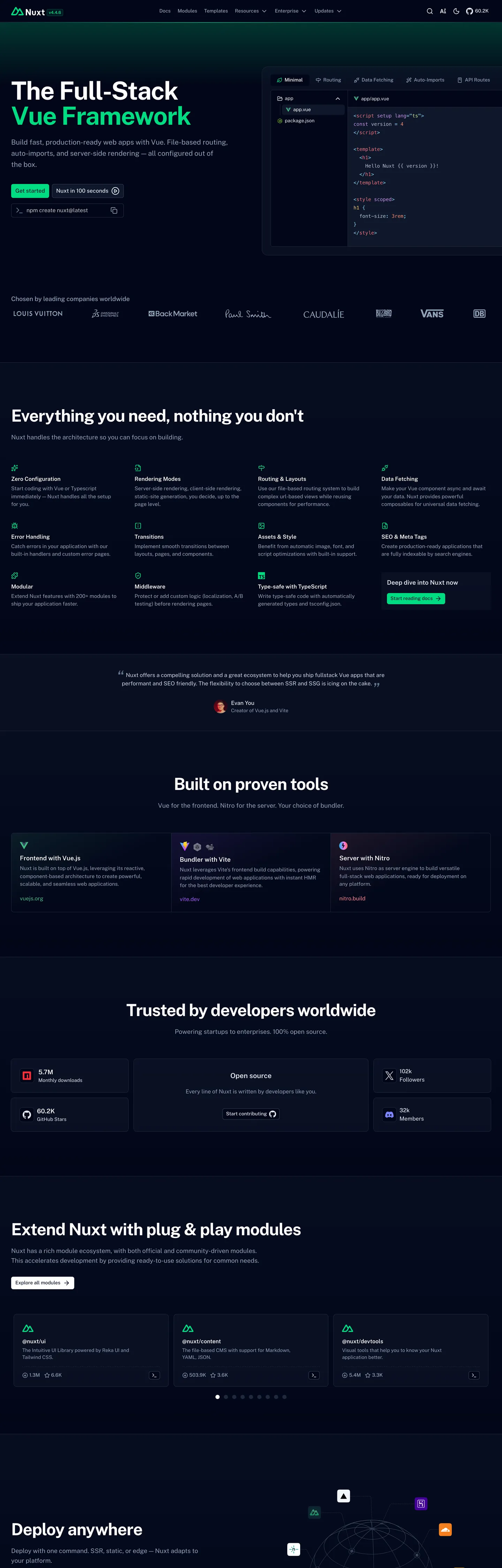
Nuxt's homepage opens with a typographic statement that most framework brands avoid: it names the underlying technology in the headline and highlights that word in the brand color. "The Full-Stack Vue Framework" runs at 72px, Public Sans, weight 700, tight -1.8px tracking — white text on a deep blue-black canvas — with only "Vue" rendered in electric green (#00dc82). The rest of the headline, the subheading, and every body paragraph on the page are white or cool-gray on dark. The electric green never appears as a canvas or section fill; it surfaces only as text color, border accent, and the sole CTA button fill ("Get started"). Where React-ecosystem frameworks (Next.js, Remix) design around framework-neutral palettes, Nuxt signals its Vue provenance directly through the color of one word.
The DESIGN.md file packages the system as machine-readable tokens for React and AI tools. Inside: 16 colors tokens anchored on the near-midnight canvas, a full 10-step green ramp wired as CSS custom properties (--ui-color-primary-50 through -950), and a monospace tier from the system stack; 14 typography tokens spanning Public Sans at 72px display through 10px micro-labels, all in a single typeface; 5 radius values centered on 6–8px; and 18 components definitions covering the green CTA, the white-text hero, the feature card grid, the module showcase, and the deploy-anywhere section.
Feed this file to Claude or Cursor and it reproduces Nuxt's specific moves: deep blue-black canvas, electric-green voltage appearing only as text or border accents and one CTA fill, Public Sans across all tiers including display, small 6–8px card radius rather than pill shapes, and the typographic single-word highlight technique. The one distinctive move worth studying: aliasing the brand color to the UI success semantic (--ui-success === --ui-primary === #00dc82) means any success indicator — a checkmark, a "done" badge, a validation state — carries the brand's authority automatically, without a second color decision.
What makes it distinct
5
- Vue-green voltage#00dc82 is wired as --ui-primary AND --ui-success AND --color-green-400, inheriting both Vue's brand hue and the UI success semantic; the brand color does double duty
- Single word highlightedthe hero h1 reads 'The Full-Stack Vue Framework' with only the word 'Vue' rendered in electric green; a typographic precision move that anchors the brand in the framework ecosystem
- Public Sans as the sole typefaceno display family, no serif, no mono for headings; the entire page runs Public Sans including the 72px hero and 14px captions
- 6px dominant radiusthe smallest tight-radius scale in any framework site captured in this directory; 73 occurrences of 6px versus 9999px for Astro or 100px for CrewAI
- Green scale depththe primary green ramps from #d9fbe8 (success-100) through #00dc82 (success-400) to #052e16 (success-950), wired as the full Nuxt UI color system in CSS custom properties
nuxt.com
Live at nuxt.com
A snapshot of the brand in production. Scroll the frame to see the whole page.
Colors
16 colors
Nuxt's system runs on #00dc82 as its primary voltage, used in 3 of 18 components. Type is set in Public Sans across 13 tokens from 12px to 72px, weights 400–700. Shape language is mixed across 18 components, blending pills, soft rounds, and squarer corners.
Brand & Accent
Sparing, CTA-only voltage · 7
Surface
Page and card backgrounds · 2
Text
Headlines, body, captions · 3
Borders & Hairlines
Dividers, outlines, rules · 1
Other
Specialty colors · 3
Typography
13 type tokens
Set in Public Sans across 13 tokens, from 12px to 72px, weights 400–700. Shown in its own stack: where the font isn't installed, the fallback the file names stands in.
- display-xl72px · weight 700 · lh 72px · tracking -1.8pxThe quick brown fox jumps over the lazy dog
- display-md48px · weight 700 · lh 48px · tracking -1.2pxThe quick brown fox jumps over the lazy dog
- heading-lg20px · weight 600 · lh 28pxThe quick brown fox jumps over the lazy dog
- heading-md18px · weight 600 · lh 28pxThe quick brown fox jumps over the lazy dog
- heading-sm14px · weight 600 · lh 20pxThe quick brown fox jumps over the lazy dog
- body-lg18px · weight 400 · lh 28pxThe quick brown fox jumps over the lazy dog
- body-md16px · weight 400 · lh 24pxThe quick brown fox jumps over the lazy dog
- body-sm15px · weight 400 · lh 22.5pxThe quick brown fox jumps over the lazy dog
- label-md16px · weight 500 · lh 24pxThe quick brown fox jumps over the lazy dog
- label-sm14px · weight 500 · lh 20pxThe quick brown fox jumps over the lazy dog
- caption12px · weight 500 · lh 16pxThe quick brown fox jumps over the lazy dog
- nav-link14px · weight 500 · lh 20pxThe quick brown fox jumps over the lazy dog
- mono-sm14px · weight 400 · lh 24pxThe quick brown fox jumps over the lazy dog
Layout
Radii and spacing
6 corner radii and 8 spacing values. Shape language: mixed.
Radii
- none0px
- xs4px
- sm6px
- md8px
- lg16px
- full9999px
Spacing
- xs4px
- sm6px
- md8px
- base12px
- lg16px
- xl24px
- 2xl32px
- 3xl64px
Components
18 components
Each rendered from its tokens (color, type, radius, padding) on Nuxt's own canvas.
- Button Primarybutton-primaryButton Primary
- Button Primary Hoverbutton-primary-hoverButton Primary Hover
- Button Secondarybutton-secondaryButton Secondary
- Top Navtop-navTop Nav
- Nav Linknav-linkNav Link
- Hero Headinghero-headingHero Heading
- Hero Heading Accenthero-heading-accentHero Heading Accent
- Section Headingsection-headingSection Heading
- Body Paragraphbody-paragraphBody Paragraph
- Body Paragraph Mutedbody-paragraph-mutedBody Paragraph Muted
- Card Darkcard-darkCard Dark
- Feature Tagfeature-tagFeature Tag
- Stat Blockstat-blockStat Block
- Type here…text-inputText Input
- Module Cardmodule-cardModule Card
- Logo Chiplogo-chipLogo Chip
- Code Blockcode-blockCode Block
- FooterfooterFooter
In use
The system, in use
Nuxt's tokens on the kind of product it builds.
Build something people actually use.
A short paragraph of marketing copy that previews how the brand's display tier and body tier read together. Two sentences is usually enough.
- · 1 project
- · Community support
- · 10k req/mo
- · 10 projects
- · Priority support
- · 1M req/mo
- · Custom domains
- · Unlimited
- · SLA
- · Audit log
- · SSO
FAQ
Nuxt design system FAQ
Common questions about Nuxt's tokens, components, and how to use this DESIGN.md in your project.
Read next
Related reading
Specs, directories, and component libraries that pair with this design system.
- Browse all design systemsThe full directory of DESIGN.md files on shadcn.io, with live mockups for each.shadcn.io
- Nuxt — official siteNuxt's public marketing site — the source of truth for the live tokens captured in this file.nuxt.com (opens in a new tab)
- The DESIGN.md specificationGoogle Labs' open spec for machine-readable design system files — the format this page is built on.github.com (opens in a new tab)
Use it
Use Nuxt in your project
One machine-readable file. Drop it into Claude, Cursor, or any AI tool that reads DESIGN.md.
Download the DESIGN.md
One machine-readable file: every color, type, radius, spacing, and component token of Nuxt.
Feed it to your AI tool
Drop it into Claude, Cursor, or GitHub Copilot. The agent writes React components and Tailwind classes that match Nuxt's visual language.
Reference the tokens directly
Or paste the values into your Tailwind config, CSS variables, or component library: every color, size and radius is a quoted, ready-to-copy value.
Read the full DESIGN.md: overview, rationale, do’s and don’ts
Overview
Nuxt's marketing site concentrates the entire brand identity into one word. Single-word voltage. The hero headline reads "The Full-Stack Vue Framework" in white at 72px, Public Sans, weight 700 — and only the word "Vue" renders in electric green (#00dc82). The word-level highlight is not a gradient overlay or a box; it is the same typeface, the same weight, the same size, rendered in the brand color. Where Astro uses a gradient mesh to communicate energy and CrewAI uses a dramatic photograph for atmosphere, Nuxt uses typographic precision: the framework's entire identity claim is that it is the Vue answer, and the color anchors that claim to a single syllable.
The voltage aliasing is the system's second structural decision. Brand as semantic. The CSS variable --ui-primary and --ui-success both resolve to #00dc82 — electric green carries the brand role AND the success/confirmation role simultaneously. This is Nuxt UI's design: a component library where the primary action color and the success state color are defined as identical. Every <UCheckbox> checked state, every <UBadge variant="success">, every progress indicator in the "Nuxt gives you everything" section inherits the brand color without a separate decision. The convention is unusual — most systems keep brand and semantic separate — and worth documenting for teams who inherit a Nuxt UI codebase.
Typography is Public Sans across every tier — display through caption, heading through mono substitute. There is no second family. Public Sans at 72px / weight 700 / -1.8px letter-spacing for the hero h1 reads more compressed and authoritative than the same size in Inter or DM Sans; the slightly humanist construction keeps it from feeling industrial.
Key Characteristics:
- Electric green voltage (
{colors.primary}— #00dc82) wired as both --ui-primary and --ui-success — brand and success semantic identical in the token system. - Word-level typographic highlight: only "Vue" in the hero h1 renders in green; the rest is white.
- Pure Public Sans across all tiers — no secondary display family, no monospace heading.
- Deep navy-black canvas (themeColor #020420 — not pure black) carries a blue undertone that makes the green read as botanical rather than terminal.
- 6px dominant radius (73 occurrences) — the tightest-radius framework brand in this directory; nearest competitor is Cloudflare at 3–4px.
- Full 10-step green ramp in CSS custom properties (--ui-color-primary-50 through -950) — the entire brand palette is systematized.
- Syntax-color tier (sky blue, salmon, lilac, orange) used exclusively in code panels — borrowed from Material Theme palette conventions.
- Module ecosystem showcase: a dense grid of framework integration cards (authentication, CMS, database, deployment) styled as small dark bordered tiles.
Colors
Brand Green
- Primary (
{colors.primary}— #00dc82): frequency 49. Used as text (17), background (15), border (17). Wired as--ui-primary,--ui-success,--ui-color-primary-400,--color-green-400. The single chromatic moment on the page — 100% of the brand's chromatic vocabulary resides in this one hex and its ramp. - Primary Mid (
{colors.primary-mid}— #00c16a): frequency 0 in rendered chrome (used as--vp-c-brand,--color-primary-500,--twoslash-matched-color,--twoslash-cursor-color). The hover variant for the primary CTA and the cursor-color in TwoSlash interactive code demos. - Primary Dark (
{colors.primary-dark}— #00a155): declared as--ui-color-primary-600. The one-step-darker green for active states. - Primary Darkest (
{colors.primary-darkest}— #007f45): declared as--ui-color-primary-700. The deep-green for high-contrast or dark-surface active treatments. - Primary Light (
{colors.primary-light}— #75edae): declared as--ui-color-primary-300. Light mint for hover-state highlights and success-area fills. - Primary Pale (
{colors.primary-pale}— #d9fbe8): declared as--ui-color-primary-100and--ui-color-success-100. The near-white mint used as a very light success background tint. - Primary Deep (
{colors.primary-deep}— #052e16): declared as--ui-color-primary-950. The darkest green — near-black forest tone used for dark-mode success surface fills.
Surface
- Canvas (
{colors.canvas}— #020420): the deep navy-black page floor. Resolved from themeColor #020420 — a near-midnight value with a blue cast (oklch hue ~264). - Surface-1 (
{colors.surface-1}— #0f1729): the elevated card surface — inferred from the dark card backgrounds visible in the feature grid. Cards sit noticeably lighter than the canvas. - Hairline (
{colors.hairline}— #1e293b): inferred from the--ui-borderoklch value (27.9% chroma 0.041 hue 260) — the single border tone for card outlines, section dividers, and input field outlines.
Text
- Ink (
{colors.ink}— #ffffff): frequency 145 — the dominant text color across all tiers. Pure white on the deep-navy canvas. Wired as--color-whiteand--ui-bg-inverted. - Ink Muted (
{colors.ink-muted}— #babed8): frequency 4. A cool-gray blue-tinted muted tone for secondary labels, subheadings in the stat section, and muted body copy. The slight blue cast echoes the canvas's navy undertone.
Syntax
- Syntax Blue (
{colors.syntax-blue}— #89ddff): frequency 48 — the most common syntax color. Appears exclusively in code panels for keywords and references. A cool sky blue borrowed from Material Theme Palenight. - Syntax Pink (
{colors.syntax-pink}— #f07178): frequency 16. String and value tokens in code panels. - Syntax Purple (
{colors.syntax-purple}— #c792ea): frequency 8. Type and class tokens in code panels. - Syntax Orange (
{colors.syntax-orange}— #f78c6c): frequency 4. Function and method tokens in code panels.
Typography
Font Family
The system runs Public Sans exclusively — a free open-source humanist sans licensed under SIL OFL, declared as --font-sans and --default-font-family. The fallback stack walks through five system font aliases before reaching sans-serif. There is no separate display family, no proprietary typeface, no second voice. The monospace tier uses the system monospace stack (ui-monospace, SFMono-Regular, Menlo, Monaco, Consolas) for code panels only.
Unlike Astro (Obviously + system-ui) or CrewAI (Gellix + Interdisplay), Nuxt's single-family approach means every tone distinction — from the 72px hero to the 10px micro-label — is expressed through weight and size within Public Sans alone.
Hierarchy
| Token | Size | Weight | Line Height | Letter Spacing | Use |
|---|---|---|---|---|---|
{typography.display-xl} | 72px | 700 | 72px | -1.8px | Hero h1 ("The Full-Stack Vue Framework") |
{typography.display-md} | 48px | 700 | 48px | -1.2px | Section h2 ("Everything you need") |
{typography.heading-lg} | 20px | 600 | 28px | 0 | Card headings, feature titles |
{typography.heading-md} | 18px | 600 | 28px | 0 | Sub-section leads |
{typography.heading-sm} | 14px | 600 | 20px | 0 | Small card labels, table headers |
{typography.body-lg} | 18px | 400 | 28px | 0 | Hero sub-paragraph |
{typography.body-md} | 16px | 400 | 24px | 0 | Default running text |
{typography.body-sm} | 15px | 400 | 22.5px | 0 | Secondary body copy |
{typography.label-md} | 16px | 500 | 24px | 0 | CTA button labels, nav active states |
{typography.label-sm} | 14px | 500 | 20px | 0 | Nav links, module card labels |
{typography.caption} | 12px | 500 | 16px | 0 | Section category labels ("What is Nuxt?") |
{typography.mono-sm} | 14px | 400 | 24px | 0 | Code blocks, terminal output |
Principles
The hero h1 at 72px / weight 700 / -1.8px tracking is the loudest typographic moment in the system — and the only place where the display size approaches the dramatic. Below the hero, headings drop immediately to 48px and then to 18–20px for card titles. There is no 30–44px intermediate tier (unlike CrewAI's Gellix scale). The absence of a mid-display tier means the page reads in two registers: hero display and working-scale body, with almost nothing in between.
Note on Font Substitutes
Public Sans is free and open-source. No substitution is needed — the exact typeface is available at Google Fonts (fonts.google.com/specimen/Public+Sans) and via npm (@fontsource/public-sans). It can be loaded in a Next.js project with next/font/google like any other Google Font.
Layout
Spacing System
- Base unit: 6px (71 occurrences — narrowly the most common single gap value) and 8px (56 occurrences), both essentially tied as the dominant module.
- Tokens:
{spacing.xs}4px ·{spacing.sm}6px ·{spacing.md}8px ·{spacing.base}12px ·{spacing.lg}16px ·{spacing.xl}24px ·{spacing.2xl}32px ·{spacing.3xl}64px. - Hero top padding: 72px above the h1 (the nav height is 64px plus 8px offset —
72px 0px 0pxappears 24 times). - Nav internal padding: 6×10px on links (32 occurrences of "6px 10px").
- Section padding: 64px vertical for major between-section gaps.
Grid & Container
- Max content width: ~90rem (1440px) declared as
--ui-container. - Hero: center-aligned single column, canvas-colored background.
- Feature grid ("Everything you need, nothing you don't"): 3–4 column grid of dark-bordered cards at desktop. 12 feature tiles visible in the captured screenshot.
- Module grid ("Extend Nuxt with plug & play modules"): dense multi-column grid of small module tiles — authentication, CMS, database, i18n, etc. — each rendered as a compact labeled chip.
- Stats section ("Trusted by developers worldwide"): 2-column large-number display with green accent marks.
- Logo wall ("Chosen by leading companies worldwide"): single row of company logos at equal size and white opacity.
Rhythm
The page moves through consistent dark-canvas bands without a light-surface break (unlike Astro's white interstitial). The only chromatic variation comes from the electric green highlights — the word "Vue" in the hero, the CTA button, the feature tag chips, and the stat-section green accents. The rhythm is monochromatic and steady, building density rather than alternating energy.
Elevation
The system has no shadow tier — all elevation comes from {colors.hairline} borders (#1e293b) separating the dark-surface cards from the deep-canvas floor. Cards and module tiles sit at {colors.surface-1} tonal lift, which provides a subtle but visible lightness step above the canvas. The --twoslash-popup-shadow CSS variable declares a very faint rgba(0,0,0,.08) pop-up shadow for the TwoSlash code tooltip, but this is product-surface tooling, not marketing chrome elevation.
Shapes
The radius scale is tight-small: 6px dominates the page.
{rounded.none}0px — hero, footer, section dividers.{rounded.xs}4px — input field borders, small badge surfaces.{rounded.sm}6px — the primary CTA button, feature cards, module tiles, and nav link hover states. 73 occurrences — the dominant radius. Wired as--ui-radius: .25rem(4px in the CSS token, but rendered at 6px on the captured elements).{rounded.md}8px — larger cards, the newsletter input field, and section panels. 45 occurrences.{rounded.lg}16px — one large card variant in the feature section. 1 occurrence.{rounded.full}9999px — feature tag badges, logo chips, pill-style nav elements. 21 occurrences.
Nuxt's 6px default is the sharpest card corner among the three framework brands in this batch and stands in deliberate contrast to Astro's pill dominance. The small radius reads as precise engineering confidence rather than consumer-product warmth.
Components
button-primary — Electric green {colors.primary} fill, deep-canvas {colors.canvas} dark text, 6px radius, 8×12px padding, 40px height. "Get started" in the hero top-nav. The only component where the brand green fills a surface.
button-primary-hover — Shifts to {colors.primary-mid} (#00c16a) on hover — one step darker green.
button-secondary — Transparent fill, white text, 1px {colors.hairline} border, 6px radius, 8×12px padding. Used for secondary actions below the hero.
top-nav — Canvas-colored, 64px height, Public Sans 14px / 500. Houses the Nuxt logo (green wordmark), links (Docs / Integrations / Resources / Blog / Video), and the "Get started" CTA flush right.
nav-link — Transparent, white-ink text, 14px / 500, 6×10px padding, 32px height. The standard nav item.
hero-heading — White text, Public Sans 72px / weight 700 / -1.8px tracking.
hero-heading-accent — Electric green {colors.primary} text, same 72px / 700 / -1.8px. Applied to the single word "Vue" in the hero h1 — a component distinction, not a CSS class distinction.
section-heading — White text, Public Sans 48px / 700 / -1.2px. Used for "Everything you need, nothing you don't", "Built on proven tools", and similar section h2s.
body-paragraph — Default white body text at 16px / 400.
body-paragraph-muted — {colors.ink-muted} (#babed8) text at 15px / 400. Secondary body copy and feature card descriptions.
card-dark — {colors.surface-1} fill, 1px {colors.hairline} border, 8px radius, 16px padding. The standard feature card.
feature-tag — Transparent fill, electric green text and border, fully-rounded pill, 4×8px padding. Used for section category labels above section headings ("What is Nuxt?", "Best in Class Performance").
stat-block — Transparent, white display numerals at 48px / 700, with electric-green annotation labels below each stat.
text-input — Transparent fill, white text, 6px radius, 8×44px padding, 40px height, 1px {colors.hairline} border.
module-card — {colors.surface-1} fill, 1px hairline border, 8px radius. Used in the module ecosystem grid for integration tiles (auth, CMS, database, etc.).
code-block — {colors.surface-1} fill, 8px radius, 16px padding, monospace text with Material Theme Palenight-style syntax colors.
footer — Canvas fill, muted blue-gray text, 64×32px padding.
Do's and Don'ts
Do reserve electric green ({colors.primary} — #00dc82) for the primary CTA fill, typographic accents, and feature tag chips. The captured page uses it for one button fill, inline text highlights, and border accents — but never as a card background or section canvas.
Do wire the primary and success tokens to the same value if building within the Nuxt UI component system. The --ui-primary === --ui-success convention means every success indicator inherits brand authority; fighting this alias by using a different success color would break Nuxt UI's semantic coherence.
Do keep display headings at weight 700 with tight negative letter-spacing. The hero at 72px / -1.8px and the section h2 at 48px / -1.2px both require their tracking values — at these sizes, default letter-spacing makes Public Sans feel loose and lightweight, which undercuts the authority the system requires.
Do use 6px as the default card radius. The tight-small scale is intentional and distinguishes Nuxt's engineering-confidence visual identity from the pill-dominant consumer-product peers.
Don't use the syntax colors ({colors.syntax-blue}, {colors.syntax-pink}, {colors.syntax-purple}, {colors.syntax-orange}) outside code panels. All four appear exclusively as code-surface tokens in the captured page; placing them in cards, labels, or UI accents would read as a syntax-highlighting error, not as brand design.
Don't introduce a warm or amber secondary accent. The system is deliberately cool — the deep navy canvas, the cool blue tint in {colors.ink-muted}, and the botanical green combine into a temperature-consistent palette. A warm amber or orange secondary would disrupt the palette's cool coherence.
Don't apply {colors.primary} (#00dc82) to a full-width section background or card fill larger than the CTA button. The 49 captured occurrences include 15 as background fill, but all 15 are the 40px CTA button and small inline highlights — never a surface tile or section band.
Don't use {typography.display-xl} (72px) or {typography.display-md} (48px) anywhere except the hero h1 and section h2. The system has no mid-display tier (30–44px); attempting to add one pulls the page toward a more decorative typographic style that Public Sans's single-family constraint doesn't support.
Known Gaps
- Light mode: the captured marketing surfaces are entirely dark-canvas. Nuxt UI supports light mode (the CSS variable system includes
--color-old-neutral-*light-tone scales), but the marketing homepage does not expose it. - Full green ramp in practice: the 10-step green scale (primary-50 through -950) is declared in CSS custom properties but only steps -100, -300, -400, -500, -600, -700, -800, -950 are documented as named tokens here; the remaining steps should be treated as interpolation values, not primary tokens.
- Hover and focus states: documented for
{component.button-primary-hover}only; the full matrix (focus rings, disabled tints, nav-link active states) is not captured. - Form input validation states:
{component.text-input}carries the resting state only; success, error, and focus states use the full green/red scale but are not captured in the static marketing surface. - Responsive layout: all captured surfaces are desktop (1440px viewport). Mobile nav, single-column feature grid, and responsive hero sizing are not documented.
- Module ecosystem surface: the module integration marketplace (nuxt.com/modules) carries its own richer token set and filtering UI that is not represented here.
- Motion and transitions: the
--default-transition-duration: .15sand--default-transition-timing-function: cubic-bezier(.4,0,.2,1)tokens are captured, but what they apply to (nav hover, CTA hover, card hover) is not fully documented.
Developer Tools & IDEs
More systems like this
More DESIGN.md files in Developer Tools & IDEs.
Pricing
Build it with Pro
The DESIGN.md files are free. Pro adds 6,000+ blocks, premium templates and the MCP server, so your AI editor builds in your system for you.
4.9/5 out of 5 · 150+ reviewsfrom 150+ founders and developers.
Billing
Billed once a year in USD. Cancel anytime.
- How many people can use the license.
- Client work, SaaS products and anything you charge for.
- Production-ready React sections: hero, pricing, features, dashboards and more.
- Complete multi-page sites you can ship as they are.
- React icons from every major library, installable with one command.
- Presets that restyle every block, in light and dark.
- Lets your AI editor search, preview and install blocks for you.
- Priority requests are answered first.
Individual
For personal projects & open source
$32instead of $49/mo
$389 billed yearly
- Seats: 1 seat
- Commercial use: Personal & open source only
- Pro blocks: 6,000+ blocks
- Templates: All 14 templates
- React icons: 294k+ icons
- Themes: All 59 themes
- MCP server: Basic usage
- Support: Standard
Team
Most popularFor freelancers, agencies & startups
$66instead of $99/mo
$789 billed yearly · ≈ $13/dev/mo
- Seats: Up to 5 seats
- Commercial use: Included
- Pro blocks: 6,000+ blocks
- Templates: All 14 templates
- React icons: 294k+ icons
- Themes: All 59 themes
- MCP server: High usage
- Support: Priority
Organization
For companies with larger teams
$132instead of $199/mo
$1,589 billed yearly
- Seats: Unlimited seats
- Commercial use: Included
- Pro blocks: 6,000+ blocks
- Templates: All 14 templates
- React icons: 294k+ icons
- Themes: All 59 themes
- MCP server: Unlimited usage
- Support: Priority
Billed once a year in USD. Cancel anytime.
Individual
For personal projects & open source
$32instead of $49/mo
$389 billed yearly
- How many people can use the license.Seats: 1 seat
- Client work, SaaS products and anything you charge for.Commercial use: Personal & open source only
- Production-ready React sections: hero, pricing, features, dashboards and more.Pro blocks: 6,000+ blocks
- Complete multi-page sites you can ship as they are.Templates: All 14 templates
- React icons from every major library, installable with one command.React icons: 294k+ icons
- Presets that restyle every block, in light and dark.Themes: All 59 themes
- Lets your AI editor search, preview and install blocks for you.MCP server: Basic usage
- Priority requests are answered first.Support: Standard
Team
Most popularFor freelancers, agencies & startups
$66instead of $99/mo
$789 billed yearly · ≈ $13/dev/mo
Everything in Individual, plus
- How many people can use the license.Seats: Up to 5 seats
- Client work, SaaS products and anything you charge for.Commercial use: Included
- Lets your AI editor search, preview and install blocks for you.MCP server: High usage
- Priority requests are answered first.Support: Priority
Organization
For companies with larger teams
$132instead of $199/mo
$1,589 billed yearly
Everything in Team, plus
- How many people can use the license.Seats: Unlimited seats
- Lets your AI editor search, preview and install blocks for you.MCP server: Unlimited usage
- Secure checkout via Stripe
- Code lives in your repo
- Keep what you've shipped if you cancel
- License terms
Your system, built for you
Every block, template and icon, installed by your AI agent in your design system. The DESIGN.md files stay free.