Nothing Design System
Nothing's marketing design system as a DESIGN.md file. Pure black and white, Ndot dot-matrix display font, NType82 editorial sans, LatteraMonoLL uppercase labels, 4 colors, 14 components. For React, Next.js, and AI tools.
Add shadcn.io to your AI agent. · Pro It installs blocks, icons and templates in your design system from a prompt, with Pro.
Set up MCP- Primary
- #000000
- Typeface
- LatteraMonoLL
- Shape
- Mixed
- Base radius
- 8px
- Colors
- 4
- Type tokens
- 11
- Components
- 14
- Spacing values
- 7
About
About Nothing DESIGN.md
Curated by Dov Azencot · Updated May 19, 2026 · Source nothing.tech (opens in a new tab)
Nothing's website commits to a typographic identity that most hardware brands would consider too eccentric: the product names — phone(2a), headphone(1), ear(open) — render in Ndot, a custom dot-matrix display font where each character is built from a grid of circular dots like a transit departure board. The parenthetical model numbers are not punctuation; they are the brand's naming convention, and they appear in Ndot at 20-40px uppercase wherever a product is identified. Samsung's marketing surface uses a bespoke display sans with geometric warmth; Apple leans on San Francisco at tight tracking; Nothing's only display move is a font that looks like it was ripped from a 1980s pocket calculator. The effect is that the hardware itself looks more "designed" than any other element on the page.
The color palette is total monochrome: pure black, pure white, and a dark slate at the mid-gray register. There is no accent, no brand color, no interactive highlight. The primary CTA button — "Discover" — is a black rectangle with white uppercase LatteraMonoLL text at 11px. The secondary action buttons are white rectangles with black text. The system is the only consumer electronics brand in the directory with no chromatic voltage whatsoever; even Braun's marketing surface uses red. This restraint is a positioning statement: Nothing's hardware has transparent backs and exposed internals, and the marketing system mirrors that — nothing hidden, nothing decorative, nothing that isn't load-bearing.
The editorial system behind the monochrome is more layered than the palette suggests. NType82 runs the section headlines at 24-32px in weight 100 (ultra-light), which is an unusual choice for a product brand that competes on spec differentiation — the ultra-light weight signals that the words should recede and the product photograph should dominate. LatteraMonoLL uppercase mono at 11px carries every label, button, nav link, and product category. The three-font pairing — dot-matrix product names, ultra-light editorial, uppercase mono utility — gives the system a texture no brand competitor attempts.
What makes it distinct
5
- Zero brand colorthe entire system runs on pure black, pure white, and a single mid-gray for secondary text; there is no accent, no CTA highlight, no color whatsoever
- Three-typeface systemNdot dot-matrix for product names, NType82 ultra-light for editorial headlines, LatteraMonoLL uppercase mono for every label and button
- Dot-matrix product namingproduct identifiers like 'phone(2a)' and 'headphone(1)' render in Ndot, the brand's custom dot-matrix display font; the parentheses are typographic convention
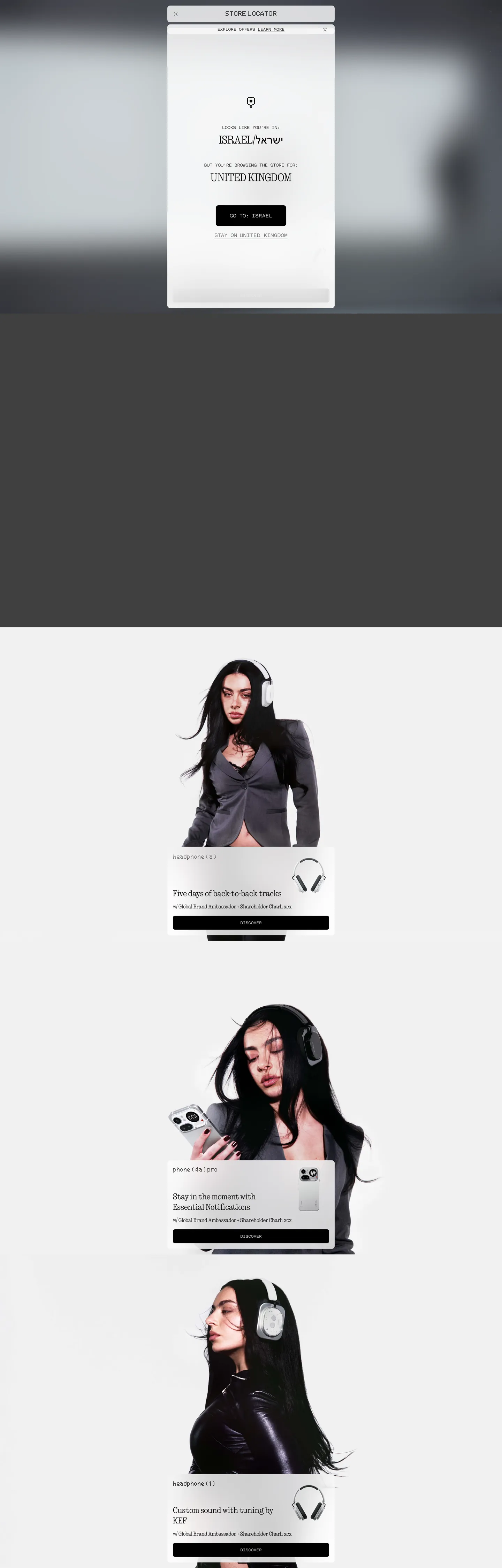
- Fashion-editorial photographyeach product section pairs a close-up device shot with a model wearing or holding it, cropped dramatically with high contrast
- Uppercase mono as the only label voiceLatteraMonoLL in 11-14px uppercase carries every button, nav link, product tag, and CTA; there are no mixed-case labels
nothing.tech
Live at nothing.tech
A snapshot of the brand in production. Scroll the frame to see the whole page.
Colors
4 colors
Nothing's system runs on #000000 as its primary voltage, used in 11 of 14 components. Type is set in LatteraMonoLL across 11 tokens from 11px to 40px, weights 55–400. Shape language is mixed across 14 components, blending pills, soft rounds, and squarer corners.
Surface
Page and card backgrounds · 1
Text
Headlines, body, captions · 2
Borders & Hairlines
Dividers, outlines, rules · 1
Typography
11 type tokens
Set in LatteraMonoLL across 11 tokens, from 11px to 40px, weights 55–400. Shown in its own stack: where the font isn't installed, the fallback the file names stands in.
- display-lg40px · weight 400 · lh 40pxThe quick brown fox jumps over the lazy dog
- display-md20px · weight 55 · lh 20pxThe quick brown fox jumps over the lazy dog
- heading-lg32px · weight 100 · lh 35pxThe quick brown fox jumps over the lazy dog
- heading-md24px · weight 100 · lh 30pxThe quick brown fox jumps over the lazy dog
- body-lg24px · weight 400 · lh 32pxThe quick brown fox jumps over the lazy dog
- body-md16px · weight 400 · lh 22pxThe quick brown fox jumps over the lazy dog
- label-md14px · weight 400 · lh 20pxThe quick brown fox jumps over the lazy dog
- label-sm11px · weight 400 · lh 12pxThe quick brown fox jumps over the lazy dog
- caption12px · weight 400 · lh 16px · tracking -0.48pxThe quick brown fox jumps over the lazy dog
- button-md11px · weight 400 · lh 12pxThe quick brown fox jumps over the lazy dog
- nav-link11px · weight 400 · lh 12pxThe quick brown fox jumps over the lazy dog
Layout
Radii and spacing
3 corner radii and 7 spacing values. Shape language: mixed.
Radii
- none0px
- sm6px
- md8px
Spacing
- xs2px
- sm8px
- md12px
- base16px
- lg32px
- xl40px
- 2xl56px
Components
14 components
Each rendered from its tokens (color, type, radius, padding) on Nothing's own canvas.
- Button Primarybutton-primaryButton Primary
- Button Secondarybutton-secondaryButton Secondary
- Top Navtop-navTop Nav
- Nav Linknav-linkNav Link
- Hero Headinghero-headingHero Heading
- Product Labelproduct-labelProduct Label
- Body Paragraphbody-paragraphBody Paragraph
- Body Paragraph Mutedbody-paragraph-mutedBody Paragraph Muted
- CardcardCard
- Product Sectionproduct-sectionProduct Section
- Type here…text-inputText Input
- Category Tagcategory-tagCategory Tag
- FooterfooterFooter
- Locator Dialoglocator-dialogLocator Dialog
In use
The system, in use
Nothing's tokens on the kind of product it builds.
Build something people actually use.
A short paragraph of marketing copy that previews how the brand's display tier and body tier read together. Two sentences is usually enough.
FAQ
Nothing design system FAQ
Common questions about Nothing's tokens, components, and how to use this DESIGN.md in your project.
Read next
Related reading
Specs, directories, and component libraries that pair with this design system.
- Browse all design systemsThe full directory of DESIGN.md files on shadcn.io, with live mockups for each.shadcn.io
- Nothing — official siteNothing's public marketing site — the source of truth for the live tokens captured in this file.nothing.tech (opens in a new tab)
- The DESIGN.md specificationGoogle Labs' open spec for machine-readable design system files — the format this page is built on.github.com (opens in a new tab)
Use it
Use Nothing in your project
One machine-readable file. Drop it into Claude, Cursor, or any AI tool that reads DESIGN.md.
Download the DESIGN.md
One machine-readable file: every color, type, radius, spacing, and component token of Nothing.
Feed it to your AI tool
Drop it into Claude, Cursor, or GitHub Copilot. The agent writes React components and Tailwind classes that match Nothing's visual language.
Reference the tokens directly
Or paste the values into your Tailwind config, CSS variables, or component library: every color, size and radius is a quoted, ready-to-copy value.
Read the full DESIGN.md: overview, rationale, do’s and don’ts
Overview
Nothing's marketing site is the most typographically distinct consumer electronics brand in the directory. Dot-Matrix as Identity. Every product name — phone(2a), phone(4s) pro, headphone(1), ear(open) — renders in Ndot, a proprietary custom font where each character is constructed from a grid of circular dots resembling a transit departure board or a pocket calculator display. The parenthetical model numbers are intentional naming convention, not afterthought punctuation. This single typographic move makes Nothing's hardware look more "considered" than any color palette or illustration could — Samsung and Apple use bespoke display sans-serifs optimized for marketing legibility, and Nothing uses a dot-matrix display font optimized for industrial readability.
The chromatic system is the most restrained in the directory: pure black, pure white, a mid-gray for secondary text, and a light-gray hairline. No accent, no brand voltage, no interactive highlight color. The only CSS custom properties declared are --color-dark (#000000) and --color-light (#ffffff). Where OnePlus (Nothing's spiritual predecessor) leans on a red voltage and Samsung leans on a gradient mesh, Nothing gives the hardware photography the entire chromatic job. Editorial fashion-style product photography — close-cropped, high-contrast, often with model wearing the product — carries all the visual energy the palette deliberately withholds.
Key Characteristics:
- Zero brand color — ink (
{colors.ink}) and canvas ({colors.canvas}) are the only fill colors in the system;{colors.ink-muted}and{colors.hairline}add two structural neutrals. - Ndot dot-matrix product names at 20-40px uppercase — the single most distinctive typographic element, appearing wherever a product model is identified.
- NType82 ultra-light (weight 100) at 24-32px for editorial headlines — one of the lowest display weights in the consumer electronics category.
- LatteraMonoLL uppercase monospace at 11-14px for every button, label, nav link, and CTA — no mixed-case utility text anywhere.
- Fashion-editorial product photography: model + device, dramatically cropped, high contrast, gray/dark backgrounds.
- 6px contained rounding on buttons; 8px on cards — no pill treatment, no sharp zero-radius flat surfaces.
- Store-locator dialog visible in the screenshot: a white floating card with the same ink/canvas palette, Ndot for the destination label, LatteraMonoLL for actions.
Colors
Text
- Ink (
{colors.ink}— #000000): frequency 236 — 228 as text, 8 as background fill. The dominant text color and the primary button fill. Wired in CSS as --color-dark. Used for every heading, label, body text instance, and the primary CTA button background. - Ink Muted (
{colors.ink-muted}— #585a5a): frequency 4 — used as secondary text, specifically the product-description sub-paragraphs below editorial headlines. Not wired as a CSS variable on the captured surface; appears as a computed value.
Surface
- Canvas (
{colors.canvas}— #ffffff): frequency 78 — 58 as text, 20 as background. The page background for below-hero content sections and the secondary button fill. Wired as --color-light and --tw-ring-offset-color. Also used as white text on dark photography panels.
Hairline
- Hairline (
{colors.hairline}— #e5e7eb): frequency 287 as border — the dominant border tone, used on every card outline, dialog border, input border, and structural divider. This is the system's single-hairline approach: one neutral gray handles all border work.
Typography
Font Families
The system runs three distinct proprietary typefaces with zero overlap in their roles:
- Ndot — a dot-matrix display font for product names and model identifiers. Appears at 20-40px in uppercase. No other brand in the electronics category uses a dot-matrix font for product naming.
- NType82 — an ultra-light editorial sans (weight 100 for headlines, weight 400 for body paragraphs) used for section editorial framing. Not for labels or buttons.
- LatteraMonoLL — an uppercase monospace for every label, button, CTA, nav link, product tag, and caption. Always rendered in uppercase via CSS text-transform.
The fallback for all three is sans-serif — there is no system-ui safety stack, suggesting the fonts are loaded as custom web fonts and the brand is willing to have a degraded fallback on miss.
Hierarchy
| Token | Size | Weight | Line Height | Use |
|---|---|---|---|---|
{typography.display-lg} | 40px | 400 | 40px | Large product category navigation labels in Ndot |
{typography.display-md} | 20px | 55 | 20px | Product name labels — phone(2a), headphone(1) |
{typography.heading-lg} | 32px | 100 | 35px | Section editorial headlines, uppercase product category announcements in NType82 |
{typography.heading-md} | 24px | 100 | 30px | Standard section headlines, product sub-headings |
{typography.body-lg} | 24px | 400 | 32px | Large editorial body paragraphs on photography panels |
{typography.body-md} | 16px | 400 | 22px | Standard body copy, product description text |
{typography.label-md} | 14px | 400 | 20px | Larger product tags, section category chips |
{typography.label-sm} | 11px | 400 | 12px | Nav links, button labels, footer text |
{typography.caption} | 12px | 400 | 16px | Footnote captions with -0.48px tracking |
{typography.button-md} | 11px | 400 | 12px | All CTA buttons ("Discover", "Learn more") |
{typography.nav-link} | 11px | 400 | 12px | Top-nav and footer navigation links |
Principles
The display weight in NType82 (weight 100) is among the lowest in any consumer brand system. Ultra-light type at 24-32px recedes visually — it frames the photography without competing. Every label and button is uppercase mono at 11px. The dot-matrix product name is the single bold typographic moment, which is also the product name. The system is saying: the product is the headline; the editorial text is the caption; the labels are the utility.
Note on Font Substitutes
Ndot is proprietary with no direct open-source equivalent. Silkscreen or Press Start 2P approximate the dot-matrix aesthetic at display sizes. NType82 (ultra-light editorial sans) substitutes with Helvetica Neue Thin (weight 100) or Aktiv Grotesk Thin. LatteraMonoLL (uppercase mono utility) substitutes cleanly with Space Mono, IBM Plex Mono, or JetBrains Mono at the same sizes, rendered uppercase via text-transform: uppercase.
Layout
Spacing System
- Base unit: 8px.
- Tokens:
{spacing.xs}2px ·{spacing.sm}8px ·{spacing.md}12px ·{spacing.base}16px ·{spacing.lg}32px ·{spacing.xl}40px ·{spacing.2xl}56px. - Product section internal: 16px horizontal padding; the device photograph bleeds edge-to-edge above the text row.
- Nav height: 64px (captured as --header-height CSS variable).
- Grid cell width: 355px (captured as --grid-item-width); the product grid uses this fixed-width cell for each product card.
Grid & Container
- Max content width: full-bleed — each product section runs edge-to-edge at the viewport width.
- Product grid: fixed-width 355px cells (--grid-item-width), variable number of columns by viewport. Each cell holds one product photograph and its label stack.
- Hero: full-bleed photography (store locator dialog appears as a centered overlay panel on first visit).
- Below-fold product sections: alternating full-bleed photography bands, one per product line (headphone, phone, ear).
Rhythm
The page scrolls through a sequence of product photography bands — one per product — with no interstitial content sections. Each band is full-viewport height with the product photograph as the surface and a text label stack at the bottom. There are no editorial content sections between products.
Elevation
The system has one documented elevation tier — the store-locator dialog. The floating white dialog card with a {colors.hairline} border appears centered over the photography as a modal-style panel. No shadow is visible; the border alone provides the boundary. All other surfaces are flat with hairline borders.
- Flat (no shadow): all product photography panels, the nav, the footer.
- Dialog elevation: the store-locator card uses a hairline border only — no shadow, no backdrop.
Shapes
The radius scale is minimal contained:
{rounded.none}0px — photography panels; all full-bleed images are square-edged.{rounded.sm}6px — primary and secondary buttons, the "Discover" CTA, and most interactive surfaces.{rounded.md}8px — product cards, the store-locator dialog, input fields.
There is no pill treatment. Nothing's buttons are slightly rounded rectangles — 6px — rather than the full-pill CTAs used by community and social products. The minimal rounding is consistent with the industrial precision of the brand's hardware aesthetic.
Components
button-primary — Ink {colors.ink} fill, white text, {rounded.sm} 6px radius, 16px padding, 40px height. LatteraMonoLL 11px uppercase. "Discover" is the canonical instance on every product section. No border.
button-secondary — White {colors.canvas} fill, ink text, 1px ink border, {rounded.sm} 6px radius, 16px padding. Used for "Stay on United Kingdom" in the store-locator dialog.
top-nav — White {colors.canvas} surface, 64px height. "Nothing" wordmark flush left, product navigation links in LatteraMonoLL 11px uppercase, right-aligned shopping/account icons.
nav-link — Transparent background, white text (on dark photography hero) in {typography.nav-link} (11px uppercase mono), 8px top padding, right padding. No hover fill captured.
hero-heading — Ink text, NType82 24px / weight 100. The product section caption headline (e.g., "Our new campaign for Headphone (a)").
product-label — Transparent background, ink text, Ndot 20px / weight 55. The product model identifier (e.g., "headphone(1)", "phone(4s)pro"). Always uppercase, always Ndot.
body-paragraph — White text on photography panels, NType82 24px / 400. The editorial copy below the product label.
body-paragraph-muted — Ink-muted {colors.ink-muted} text, NType82 16px / 400. Product description sub-copy at the bottom of each section.
card — White fill, {rounded.md} 8px radius, 16px padding, 1px hairline border. The default container for product listing items.
product-section — Full-bleed photography panel, no border-radius, 0 padding. Each product occupies one of these bands. Text overlays position at the bottom of the panel.
text-input — White fill, ink text, {rounded.sm} 6px radius, 12×16px padding, 40px height, hairline border.
category-tag — Transparent fill, ink text, LatteraMonoLL 14px uppercase, {rounded.sm} 6px radius, 8×16px padding, hairline border. Used for product category chips above product headlines.
footer — Ink {colors.ink} fill, white text, LatteraMonoLL 11px uppercase, 32×16px padding. Monochrome reversal from the canvas body.
locator-dialog — White fill, {rounded.md} 8px radius, 16px padding, hairline border. The store-selection modal overlay showing destination country in Ndot with LatteraMonoLL action buttons.
Do's and Don'ts
Do use Ndot exclusively for product model labels. The dot-matrix font is the single most recognizable element in the Nothing system; applying it to section headings, CTA buttons, or body copy would collapse the signal into noise.
Do render all labels, buttons, nav links, and captions in uppercase. LatteraMonoLL lowercase is not used anywhere on the captured surface — text-transform: uppercase is structural, not decorative.
Do let the photography carry all chromatic work. The page has no color in its UI layer; the photography provides the only warm tones, skin tones, and material textures. Replacing full-bleed product photography with illustrations or gradients would expose the palette's deliberate emptiness as a deficit rather than a statement.
Do hold the button radius at {rounded.sm} (6px). The slightly-rounded rectangle is the shape language; introducing pill buttons would borrow from a social or lifestyle brand register and conflict with the industrial hardware positioning.
Don't use NType82 (the editorial ultra-light sans) for labels, buttons, or navigation. It is strictly the editorial voice — section headings and product editorial paragraphs only. Utility text belongs to LatteraMonoLL.
Don't introduce any color to the UI layer, even as a hover state or focus ring. The Nothing system declares only --color-dark and --color-light. Adding even a subtle blue focus ring or green hover tint would be the loudest chromatic element on the page and would break the monochrome discipline.
Don't use LatteraMonoLL at mixed case. The font appears in uppercase across all 30 captured instances. Setting it to sentence case or title case reads as a system error rather than a typographic choice.
Don't apply {rounded.md} (8px) to buttons. Cards and dialogs use 8px; buttons use 6px. The differentiation is subtle but consistent and distinguishes the "interactive" tier from the "container" tier.
Known Gaps
- Hover and active states: only resting states are captured. Nothing's site appears to use subtle scale transforms on product photography on hover, but these are not reflected in the token spec.
- Cart and checkout surfaces: the --aside-width (400px) and --cart-aside-summary-height (250px / 300px) CSS variables are captured but the cart panel itself is not visible in the marketing screenshot.
- Color product variants: some Nothing devices come in colored variants (the dot-matrix display on the phone glows yellow/amber). These product-specific accent colors do not appear in the marketing token set.
- Mobile layout: the screenshot captures a desktop breakpoint. The 355px fixed grid cell and the 400px aside panel suggest careful mobile breakpoints that are not reflected here.
- Dark mode: the page does not appear to have a declared dark mode; the footer reversal (ink fill, white text) is the only dark-surface moment.
- Animation: Nothing's marketing site is known for subtle animated reveals on scroll. End-state values only are captured here.
Consumer Electronics
More systems like this
More DESIGN.md files in Consumer Electronics.
Pricing
Build it with Pro
The DESIGN.md files are free. Pro adds 6,000+ blocks, premium templates and the MCP server, so your AI editor builds in your system for you.
4.9/5 out of 5 · 150+ reviewsfrom 150+ founders and developers.
Billing
Billed once a year in USD. Cancel anytime.
- How many people can use the license.
- Client work, SaaS products and anything you charge for.
- Production-ready React sections: hero, pricing, features, dashboards and more.
- Complete multi-page sites you can ship as they are.
- React icons from every major library, installable with one command.
- Presets that restyle every block, in light and dark.
- Lets your AI editor search, preview and install blocks for you.
- Priority requests are answered first.
Individual
For personal projects & open source
$32instead of $49/mo
$389 billed yearly
- Seats: 1 seat
- Commercial use: Personal & open source only
- Pro blocks: 6,000+ blocks
- Templates: All 14 templates
- React icons: 294k+ icons
- Themes: All 59 themes
- MCP server: Basic usage
- Support: Standard
Team
Most popularFor freelancers, agencies & startups
$66instead of $99/mo
$789 billed yearly · ≈ $13/dev/mo
- Seats: Up to 5 seats
- Commercial use: Included
- Pro blocks: 6,000+ blocks
- Templates: All 14 templates
- React icons: 294k+ icons
- Themes: All 59 themes
- MCP server: High usage
- Support: Priority
Organization
For companies with larger teams
$132instead of $199/mo
$1,589 billed yearly
- Seats: Unlimited seats
- Commercial use: Included
- Pro blocks: 6,000+ blocks
- Templates: All 14 templates
- React icons: 294k+ icons
- Themes: All 59 themes
- MCP server: Unlimited usage
- Support: Priority
Billed once a year in USD. Cancel anytime.
Individual
For personal projects & open source
$32instead of $49/mo
$389 billed yearly
- How many people can use the license.Seats: 1 seat
- Client work, SaaS products and anything you charge for.Commercial use: Personal & open source only
- Production-ready React sections: hero, pricing, features, dashboards and more.Pro blocks: 6,000+ blocks
- Complete multi-page sites you can ship as they are.Templates: All 14 templates
- React icons from every major library, installable with one command.React icons: 294k+ icons
- Presets that restyle every block, in light and dark.Themes: All 59 themes
- Lets your AI editor search, preview and install blocks for you.MCP server: Basic usage
- Priority requests are answered first.Support: Standard
Team
Most popularFor freelancers, agencies & startups
$66instead of $99/mo
$789 billed yearly · ≈ $13/dev/mo
Everything in Individual, plus
- How many people can use the license.Seats: Up to 5 seats
- Client work, SaaS products and anything you charge for.Commercial use: Included
- Lets your AI editor search, preview and install blocks for you.MCP server: High usage
- Priority requests are answered first.Support: Priority
Organization
For companies with larger teams
$132instead of $199/mo
$1,589 billed yearly
Everything in Team, plus
- How many people can use the license.Seats: Unlimited seats
- Lets your AI editor search, preview and install blocks for you.MCP server: Unlimited usage
- Secure checkout via Stripe
- Code lives in your repo
- Keep what you've shipped if you cancel
- License terms
Your system, built for you
Every block, template and icon, installed by your AI agent in your design system. The DESIGN.md files stay free.