Nordstrom Design System
Nordstrom's marketing system as a DESIGN.md file. Editorial fashion photography over a white canvas, Brandon Text 60/700 displays, near-black ink chrome, and a single critical-red accent. For React, Next.js, and AI tools.
Add shadcn.io to your AI agent. · Pro It installs blocks, icons and templates in your design system from a prompt, with Pro.
Set up MCP- Primary
- #000000
- Typeface
- Brandon Text
- Shape
- Soft
- Base radius
- 8px
- Colors
- 13
- Type tokens
- 11
- Components
- 18
- Spacing values
- 8
About
About Nordstrom DESIGN.md
Curated by Dov Azencot · Updated May 19, 2026 · Source nordstrom.com (opens in a new tab)
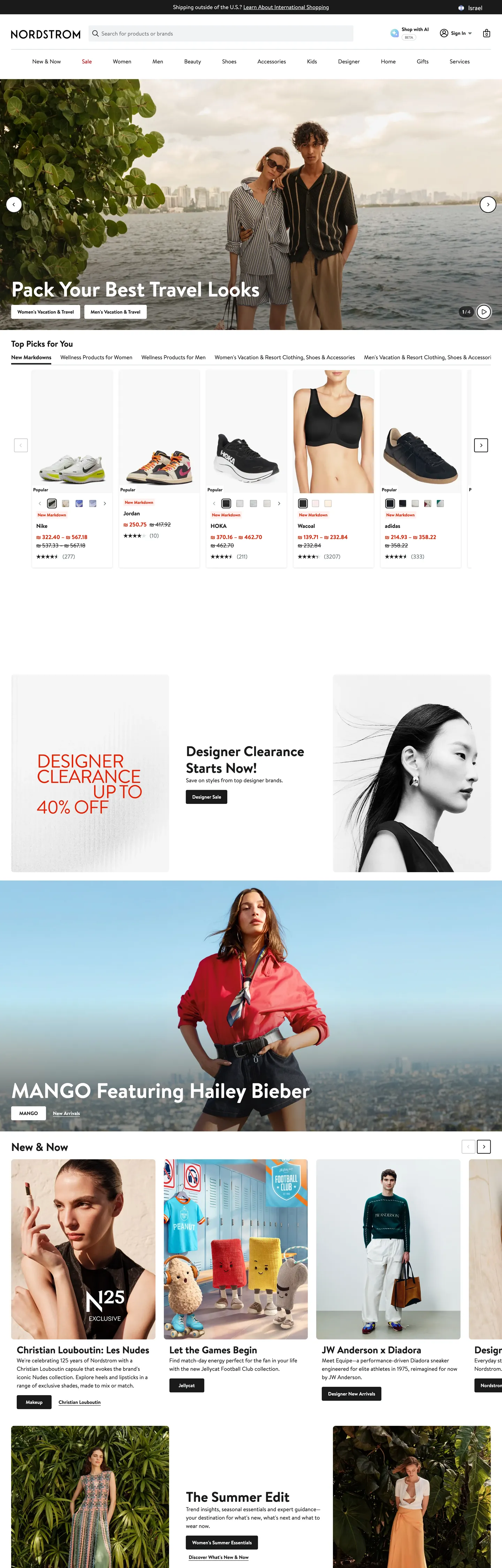
Nordstrom's homepage is the closest thing in mass-market American retail to a print-magazine cover. A single 1376px-wide fashion photograph — currently a couple shot against a foggy harbor skyline — fills the above-fold band, and on top of it sits a 60px Brandon Text headline ("Pack Your Best Travel Looks") in pure white. There is no overlay panel, no scrim gradient, no soft-fade behind the text. The image carries the typography directly, and a small white-outline pill CTA sits beneath. Where Target and Walmart paint the hero with a saturated brand color and stack offer tiles into a grid, Nordstrom treats the hero as one editorial photograph and lets the merchandise speak for itself.
The DESIGN.md file packages the system into a machine-readable spec for React and AI coding tools. Inside: 13 colors tokens drawn from the 105 CSS custom properties Nordstrom exposes on `:root` (under the `--ndls-` prefix — the Nordstrom Design Language System), organized into a near-black ink core, a small structural neutral ladder, and a single critical-red token reserved for sale prices and form errors. Brandon Text is the only typeface family — 11 sizes from 12px caption to 60px hero display, weighted at 400 for body and 700 for display, nav, and small labels. The system declares no secondary serif, no monospace voice, and no display family beyond Brandon Text itself. 18 components cover the editorial hero, the black pill CTA, the product-grid plate, the disclosure-only secondary button, the search input, and the bottom-rule nav.
Feed this file to Claude or Cursor and it will reproduce Nordstrom's specific moves: editorial photography under display type with no overlay chrome, near-black ink (`#191a1b`) instead of pure black, zero-radius product tiles in a 4-up grid, and a strict separation between brand-red (absent) and critical-red (sale price + error). The token references resolve cleanly without invention — `{colors.ink}` for the workhorse text, `{colors.critical}` for sale-price red, `{typography.display-xl}` for the hero. Treat it as a reference: the move worth borrowing is the discipline of letting the photograph do the chromatic work, which only holds when the photography budget is in place.
What makes it distinct
5
- Editorial photography over chromethe hero is a city-skyline travel shoot at 60/700 with the call-to-action sitting on the image itself, no overlay panel, no gradient scrim
- Near-black ink, never pure blackthe entire chrome runs on Nordstrom Gray scale-90 #191a1b at frequency 4541, with #000000 reserved for the brand wordmark fill
- Critical red as semantic, not brand#d82508 appears only on price reductions and form-error states, never as a CTA fill or brand accent
- Brandon Text monocultureone Mark Simonson grotesk does display, body, button, nav, and label across 11 size steps with no second family
- Zero-radius product cardsthe four-up product grid uses 0px corners on every tile so the merchandise photography reads as catalog plates rather than rounded chips
nordstrom.com
Live at nordstrom.com
A snapshot of the brand in production. Scroll the frame to see the whole page.
Colors
13 colors
Nordstrom's system anchors on #000000 (brand) as its primary color. Type is set in Brandon Text across 11 tokens from 12px to 60px, weights 400–700. Shape language is soft — components average 150px corner radius, with no sharp interactive edges.
Brand & Accent
Sparing, CTA-only voltage · 2
Surface
Page and card backgrounds · 2
Text
Headlines, body, captions · 2
Borders & Hairlines
Dividers, outlines, rules · 3
Other
Specialty colors · 4
Typography
11 type tokens
Set in Brandon Text across 11 tokens, from 12px to 60px, weights 400–700. Shown in its own stack: where the font isn't installed, the fallback the file names stands in.
- display-xl60px · weight 700 · lh 68pxThe quick brown fox jumps over the lazy dog
- display-md32px · weight 700 · lh 40pxThe quick brown fox jumps over the lazy dog
- heading-lg28px · weight 700 · lh 36pxThe quick brown fox jumps over the lazy dog
- heading-md24px · weight 700 · lh 31.92pxThe quick brown fox jumps over the lazy dog
- body-lg16px · weight 400 · lh 24pxThe quick brown fox jumps over the lazy dog
- body-bold16px · weight 700 · lh 24pxThe quick brown fox jumps over the lazy dog
- body-sm14px · weight 400 · lh 20pxThe quick brown fox jumps over the lazy dog
- label-sm14px · weight 700 · lh 20pxThe quick brown fox jumps over the lazy dog
- caption-md13px · weight 700 · lh 18.2pxThe quick brown fox jumps over the lazy dog
- caption-sm12px · weight 700 · lh 18pxThe quick brown fox jumps over the lazy dog
- input-md14px · weight 400 · lh 16.1pxThe quick brown fox jumps over the lazy dog
Layout
Radii and spacing
6 corner radii and 8 spacing values. Shape language: soft.
Radii
- none0px
- xs2px
- sm4px
- md8px
- pill500px
- full9999px
Spacing
- xs4px
- sm8px
- md12px
- base16px
- lg24px
- xl32px
- 2xl48px
- 3xl64px
Components
18 components
Each rendered from its tokens (color, type, radius, padding) on Nordstrom's own canvas.
- Hero Sectionhero-sectionHero Section
- Hero Headinghero-headingHero Heading
- Section Headingsection-headingSection Heading
- Body Paragraphbody-paragraphBody Paragraph
- Body Paragraph Mutedbody-paragraph-mutedBody Paragraph Muted
- Button Primarybutton-primaryButton Primary
- Button Secondarybutton-secondaryButton Secondary
- Top Navtop-navTop Nav
- Nav Linknav-linkNav Link
- Card Productcard-productCard Product
- Card Editorialcard-editorialCard Editorial
- Badge Clearancebadge-clearanceBadge Clearance
- Price Originalprice-originalPrice Original
- Price Saleprice-salePrice Sale
- Type here…text-inputText Input
- Search Inputsearch-inputSearch Input
- Link Inlinelink-inlineLink Inline
- FooterfooterFooter
In use
The system, in use
Nordstrom's tokens on the kind of product it builds.
Build something people actually use.
A short paragraph of marketing copy that previews how the brand's display tier and body tier read together. Two sentences is usually enough.
FAQ
Nordstrom design system FAQ
Common questions about Nordstrom's tokens, components, and how to use this DESIGN.md in your project.
Read next
Related reading
Specs, directories, and component libraries that pair with this design system.
- Browse all design systemsThe full directory of DESIGN.md files on shadcn.io, with live mockups for each.shadcn.io
- Nordstrom — official siteNordstrom's public marketing site — the source of truth for the live tokens captured in this file.nordstrom.com (opens in a new tab)
- The DESIGN.md specificationGoogle Labs' open spec for machine-readable design system files — the format this page is built on.github.com (opens in a new tab)
Use it
Use Nordstrom in your project
One machine-readable file. Drop it into Claude, Cursor, or any AI tool that reads DESIGN.md.
Download the DESIGN.md
One machine-readable file: every color, type, radius, spacing, and component token of Nordstrom.
Feed it to your AI tool
Drop it into Claude, Cursor, or GitHub Copilot. The agent writes React components and Tailwind classes that match Nordstrom's visual language.
Reference the tokens directly
Or paste the values into your Tailwind config, CSS variables, or component library: every color, size and radius is a quoted, ready-to-copy value.
Read the full DESIGN.md: overview, rationale, do’s and don’ts
Overview
Nordstrom's marketing site does something almost no other large department-store brand attempts. Photograph as chrome. The above-fold hero is a single 1376px-wide editorial fashion photograph — currently a couple shot against a foggy harbor skyline — with a 60px Brandon Text headline sitting directly on the image in pure white, no scrim, no overlay panel. Where Macy's paints a red header band and overlays a sale-pricing tile, where Saks adds a black-on-cream brand bar, and where Target and Walmart construct grids of saturated offer chips, Nordstrom commits to one photograph as the entire above-fold experience and lets the typography rest on the image directly.
The chromatic restraint reinforces the move. The system has no brand voltage at all — the chrome runs on near-black ink ({colors.ink} — #191a1b) wired into CSS as --ndls-color-scale-gray-alpha-90 and used 4541 times across the captured page (2140 as text, 2153 as border). The only saturated color is critical red ({colors.critical} — #d82508), and the captured render uses it exclusively for clearance-pricing badges and form-error states. Pure #000000 is reserved for the Nordstrom wordmark fill itself, not for body chrome. The system's only other chromatic surface is a small "Designer Clearance Up to 40% Off" editorial card — and even that pulls its color from a grayscale photograph, not from a brand palette. This is the inverse of the saturated-canvas strategy at Target (a single bullseye red throughout) or the navy-and-yellow voltage at Walmart: Nordstrom holds the chrome silent so the merchandise photography can do the chromatic work.
Typography is Brandon Text monoculture — a Mark Simonson grotesk shipped via custom WOFF with Arial as the fallback. Display sits at 60px / 700; section headings at 28px / 700; body at 16px / 400; small labels at 12-14px / 700. The system declares no secondary serif, no monospace voice, and no second display family. The Nordstrom wordmark itself is set in a separate condensed serif but that face is not used anywhere else in the page chrome. Display weight is consistent at 700 across every tier above 16px — the brand commits to bold display authority where Cloudflare and Stripe lean on a lighter editorial 500.
Key Characteristics:
- Near-black ink (
{colors.ink}— #191a1b) carries the entire chrome at 4541 occurrences; pure#000000is reserved for the wordmark fill only. - No brand voltage. The only saturated tone is
{colors.critical}(#d82508) at frequency 166, used as text and border only — never as a CTA fill. - Brandon Text monoculture across 11 size steps from 12px caption to 60px display, with weight 400 for body and 700 for everything else.
- Zero-radius product cards (
{rounded.none}) in the 4-up product grid — Nordstrom refuses the rounded-chip convention that Target and Walmart both apply. - Black pill CTA —
{component.button-primary}is{colors.ink}fill with{rounded.pill}(500px) corners; the secondary variant inverts to white-with-ink-outline at the same pill geometry. - Editorial photography in every band: hero couple shot, MANGO x Hailey Bieber feature, designer-card row, summer-edit campaign — the page reads as a magazine layout rather than a category landing page.
- Surface palette of two:
{colors.canvas}(#ffffff) for the body floor and{colors.surface-subtle}(#efefef) for the editorial-card backgrounds. There is no third elevated tone. - Hairlines do the elevation work:
{colors.hairline}(#dce3e6) at frequency 106 and{colors.border-default}(#838d91) carry every card boundary; the system has essentially no shadow tier.
Colors
Ink
- Nordstrom Ink (
{colors.ink}— #191a1b): frequency 4541. Used as text (2140), border (2153), background (82). The workhorse chrome color — nav labels, body text, button fills, footer text, hairlines. Wired as--ndls-color-scale-gray-alpha-90,--ndls-color-overlay-product-image, and--ndls-color-scale-gray-alpha-60. Slightly warm — the 1-point shift toward green/yellow keeps it from reading as digital black. - Brand Primary (
{colors.brand}— #000000): frequency 20 — used as background (14), text (2), border (2). Reserved for the Nordstrom wordmark fill and a small handful of brand-primary surface treatments. Wired as--ndls-color-brand-primaryand--ndls-color-brand-nordstrom-primary. Distinct from the{colors.ink}chrome tone above.
Canvas
- Canvas (
{colors.canvas}— #ffffff): frequency 209. The body floor and the dominant background for cards, hero text fills, button-secondary fills. Pure white — Nordstrom does not soften it to a warm cream the way Cloudflare or Aesop do. - Surface Subtle (
{colors.surface-subtle}— #efefef): frequency 151, all as background. The grey card surface used for editorial inserts ("Designer Clearance Starts Now"), summary chips, and the footer band sections. Wired as--ndls-color-background-subtle.
Critical
- Critical (
{colors.critical}— #d82508): frequency 166. Used as text (83) and border (83), zero as background. The strictly-semantic red — clearance-pricing badges, form-error outlines, "Final Sale" tags. Wired as--ndls-color-foreground-criticaland--ndls-color-scale-red-60. Notable for its absence as a background fill — Nordstrom does not paint with red. - Critical Dark (
{colors.critical-dark}— #b80009): frequency 2. The pressed/hover variant on critical states, wired as--ndls-color-brand-holiday-red. Reserved for seasonal holiday treatments not currently rendered.
Neutrals
- Subtle (
{colors.subtle}— #647175): frequency 134. Used as text (67) and border (67). Secondary metadata, "View All" disclosure links, original-price strikethroughs, product-card subtitles. Wired as--ndls-color-scale-gray-60and--ndls-color-foreground-subtle. - Hairline (
{colors.hairline}— #dce3e6): frequency 106. Used as text (53) and border (53). The default card-divider tone — between product tiles, around editorial cards, beneath the nav. Wired as--ndls-color-border-disabledand--ndls-color-scale-gray-20. - Border Default (
{colors.border-default}— #838d91): frequency 1. The input-field outline. Wired as--ndls-color-border-default. Heavier than the hairline so the form field reads as tappable. - Border Disabled (
{colors.border-disabled}— #c1c1c1): frequency 3. Used on disabled-control outlines and the carousel track rail.
Accent
- Selected (
{colors.selected}— #157e64): frequency 4. The selected-state foreground — checkbox active, filter selected, accent dot. Wired as--ndls-color-foreground-selected. The only green in the system. - Link (
{colors.link}— #0000ee): frequency 2. The default browser link color, surfaced for the legacy "Customer Service" inline link in the international-shipping band. Not a brand token — a fallback. - Accent Lime (
{colors.accent-lime}— #b2d494): frequency 1. A small pastel inserted as a category-chip background in the editorial inventory; reserved use only.
Typography
Font Family
The system runs Brandon Text for every typographic surface — a Mark Simonson grotesk shipped as a custom WOFF with the fallback stack walking to Arial, sans-serif. There is no secondary serif, no monospace voice, and no separate display family. The Nordstrom wordmark itself uses a separate condensed serif that is held outside the marketing token system.
Hierarchy
| Token | Size | Weight | Line Height | Use |
|---|---|---|---|---|
{typography.display-xl} | 60px | 700 | 68px | Hero h3 ("Pack Your Best Travel Looks"), editorial-campaign display |
{typography.display-md} | 32px | 700 | 40px | Smaller editorial display, "Designer Clearance Starts Now" header |
{typography.heading-lg} | 28px | 700 | 36px | Section title ("MANGO Featuring Hailey Bieber") |
{typography.heading-md} | 24px | 700 | 31.92px | h2 ("Top Picks for You", "The Summer Edit") |
{typography.body-lg} | 16px | 400 | 24px | Default running text, body paragraphs, longform copy |
{typography.body-bold} | 16px | 700 | 24px | Nav links, button labels, "View All" actions |
{typography.body-sm} | 14px | 400 | 20px | Secondary metadata, product subtitles |
{typography.label-sm} | 14px | 700 | 20px | Filter chips, category tabs, footer headings |
{typography.caption-md} | 13px | 700 | 18.2px | Product titles, price strings, clearance badges |
{typography.caption-sm} | 12px | 700 | 18px | Product brand label above title, fine print |
{typography.input-md} | 14px | 400 | 16.1px | Search input, address-search, form field text |
Principles
Display tops at 700 across every tier. The hero at 60/700 is the loudest typographic moment in the system, but every section heading from 24px upward also sits at 700 — there is no lighter editorial moment in the manner of Cloudflare's weight-500 display. Body and form input run at 400; everything else (nav, buttons, captions, labels, small product titles) sits at 700. The weight contrast is binary: 400 for read-it-once prose, 700 for everything tappable or scannable. No 500/600 middle tier exists.
Note on Font Substitutes
Brandon Text is licensed. The closest open-source substitute is Source Sans 3 at the same weights — the x-height and counter widths transfer cleanly at 16-24px. For the 60px display tier where Brandon Text's tighter cap height matters more, Mukta at weight 700 with a -0.01em letter-spacing match comes closer. The Nordstrom wordmark serif has no easy match; if you need a condensed serif for a marketing wordmark, Playfair Display Condensed is the safer reference.
Layout
Spacing System
- Base unit: 4px. Frequency 167 in the captured page.
- Tokens:
{spacing.xs}4px ·{spacing.sm}8px ·{spacing.md}12px ·{spacing.base}16px ·{spacing.lg}24px ·{spacing.xl}32px ·{spacing.2xl}48px ·{spacing.3xl}64px. - Hero padding:
0— the editorial photograph extends full-bleed to the viewport edge, with the headline floating in the centered safe zone. - Card internal padding:
{spacing.xs}(4px) on product tiles,{spacing.xl}(32px) on editorial cards. - Section vertical rhythm: ~64px between major bands. Tighter than Target (~96px) or Cloudflare (~96px) — the page packs more inventory above the fold.
Grid & Container
- Max content width: ~1376px on the hero photograph, ~1280px on the product grids.
- Hero block: full-bleed editorial photograph with the centered headline + CTA stack.
- Product grid: 4-column at desktop with 4px gaps between tiles ("Top Picks for You" runs 4 across).
- Editorial inserts: 1- and 2-column campaign cards with a 50/50 split panel for the MANGO x Hailey Bieber feature.
- "New & Now" band: 4-up grid of designer-feature cards with text-over-color treatments below the imagery.
Rhythm
The page alternates between editorial photograph bands and catalog inventory bands. The hero is one photograph; the next band is a 4-up product grid; the third is another editorial card ("Designer Clearance Starts Now"); the fourth is a full-bleed campaign photograph (MANGO); the fifth returns to a 4-up tile grid. The cadence mirrors a print magazine — photograph, inventory, photograph, inventory — rather than the offer-stacked grid that mass-market retailers favor.
Elevation
The system has essentially no shadow tier. The captured page renders elevation through hairline borders and tonal contrast: {colors.hairline} (#dce3e6) carries 106 occurrences as dividers and card outlines, {colors.border-default} (#838d91) carries the heavier form-input outline.
- Flat (no shadow): body, hero, product grid, editorial cards, footer — 99% of surfaces.
- Hairline outlines:
{colors.hairline}on product-card boundaries,{colors.border-default}on text inputs; the form field outlines are thicker than the card outlines so they read as tappable. - Tonal lift:
{colors.surface-subtle}(#efefef) cards on the{colors.canvas}(#ffffff) body — the 5-point lightness gap reads as a soft elevation without requiring a drawn shadow.
Shapes
The radius scale is mixed-step plus pill, but the dominant move is {rounded.none} on the product grid:
{rounded.none}0px — every product card in the 4-up grid; every editorial-card surface; the hero photograph; the section dividers. The dominant catalog-plate treatment.{rounded.xs}2px (frequency 161) — small chips, badges, the inline clearance flag.{rounded.sm}4px (frequency 104) — secondary surfaces, dropdown popovers, filter chip surrounds.{rounded.md}8px (frequency 41) — larger card surfaces, modal corners.{rounded.pill}500px /{rounded.full}9999px — the primary CTA, the secondary CTA, and the search-input field. The only fully-rounded surfaces in the system.
The decision to keep product cards at 0px is the system's most distinctive shape move. Target uses 8px on every offer chip; Walmart uses 8px on its tile grid; Nordstrom commits to catalog-plate geometry and lets the photographs read as printed rectangles.
Components
hero-section — Full-bleed editorial photograph, 0px padding, no border-radius. Holds a 60px Brandon Text headline in {colors.canvas} directly over the image and a white-outline pill CTA centered beneath.
hero-heading — White text on the photograph background, Brandon Text 60px / 700, 68px line height. The display tier — direct over the photograph with no scrim or overlay panel.
section-heading — Ink {colors.ink} text at {typography.heading-md} (24px / 700). Used for "Top Picks for You", "The Summer Edit", "Now Trending" — the standard catalog-shelf title.
body-paragraph — Default ink running-text at {typography.body-lg} — the workhorse paragraph.
body-paragraph-muted — {colors.subtle} variant at {typography.body-sm} for secondary metadata under product cards.
button-primary — The signature CTA. Ink {colors.ink} fill on white, white text, {rounded.pill} 500px corners, 12×24px padding, 40px height. The "Shop Now" pill that sits on the hero photograph and at the bottom of editorial cards.
button-secondary — White {colors.canvas} fill, ink text, 1px ink outline, same pill geometry as the primary. The "Learn More" disclosure on editorial cards.
top-nav — White {colors.canvas} surface, 64px height, 1px {colors.hairline} bottom rule. Houses the Nordstrom wordmark flush left, the category bar (Designer / What's New / Women / Men / Kids / Home / Beauty / Sale), and the right-aligned utility cluster (sign-in, wishlist, bag).
nav-link — Ink text at {typography.body-bold} (16px / 700), 0px 0px 3px padding, 25px height. No hover background visible; the hover treatment is a 3px ink underline beneath the label.
card-product — White {colors.canvas} surface, 0px radius, 4px internal padding. The product tile in the 4-up grid — a full-bleed merchandise photograph above the brand label, product title, price line, and color-swatch row. The 0-radius treatment is the system's most distinctive shape decision.
card-editorial — {colors.surface-subtle} (#efefef) surface, 0px radius, 32px internal padding. The grey editorial-inset card ("Designer Clearance Starts Now / Up to 40% Off") that breaks up the product grids.
badge-clearance — Critical-red {colors.critical} text and 1px critical-red border on a transparent fill, {rounded.xs} 2px corners, 2×4px padding. The only place red appears in the system outside of price strings.
price-original — Subtle {colors.subtle} strikethrough text at {typography.caption-md} (13px / 700). The original price beside the sale price.
price-sale — Critical {colors.critical} text at {typography.caption-md}. The reduced price — never a fill, always text only.
text-input — White surface, ink text, 1px {colors.border-default} outline, 0px radius (square corners), 0×10×1px padding, 40px height. The default form field — square, not rounded.
search-input — White surface, ink text, 1px {colors.border-default} outline, {rounded.pill} 500px corners, 0×16px padding, 40px height. The header search bar — pill, not square. The contrast between the square form input and the pill search input is intentional: search invites tap, forms invite typing.
link-inline — Browser-default {colors.link} (#0000ee) text at {typography.body-lg}. Surfaced for the international-shipping disclosure link only — Nordstrom does not use this color anywhere else.
footer — White surface, ink text, 48×32px padding, 1px hairline top rule. The standard mega-footer with category columns, customer-service links, and the social-icon row. No surface contrast against the body floor.
Do's and Don'ts
Do put the typography directly on the editorial photograph with no scrim or overlay panel. The hero's discipline is the entire above-fold experience — adding a gradient scrim breaks the print-magazine reference and tips the page back into the SaaS-hero category.
Do use {colors.ink} (#191a1b) — never pure #000000 — for chrome, text, and button fills. The 1-point warm shift from true black is consistent across 4541 occurrences in the system; mixing in pure black destroys the cohesion.
Do keep product cards at {rounded.none} (0px). The catalog-plate geometry is the move that separates Nordstrom from every rounded-chip retailer; rounding the tiles even to 4px shifts the page into Target territory.
Do let critical-red ({colors.critical} — #d82508) be a strictly-semantic color: clearance pricing, error outlines, "Final Sale" tags. Use it as a CTA fill and it becomes a brand voltage Nordstrom deliberately does not have.
Don't introduce a saturated brand color for the chrome. The system's identity comes from the absence of one — putting a red header band or a navy accent strip on the nav would re-categorize the brand as mass-market.
Don't use {colors.brand} (#000000) for body text or button fills. It is reserved for the Nordstrom wordmark fill at 20 captured occurrences only; the chrome runs on {colors.ink} (#191a1b) instead.
Don't introduce a second display family or a serif for editorial moments. Brandon Text at 700 carries every display tier; reaching for Playfair or Optima for an editorial callout breaks the typeface monoculture that defines the brand.
Don't soften the canvas from pure {colors.canvas} (#ffffff) to a warm cream. The brightness contrast against the dark editorial photography is the move; warming the canvas tips the page toward Aesop or Aritzia editorial territory and loses the catalog clarity.
Known Gaps
- Hover and focus states: the captured render shows resting states only. Button hover, focus rings, and active press states live in the
--ndls-color-action-*token family but are not exercised on the homepage. - Form input error states:
{component.text-input}carries the resting state; the critical-red error treatment lives in the checkout and account-management flows, not on the marketing surface. - Dark mode: the captured marketing surface is light-only. Nordstrom has no dark variant in the Nordstrom Design Language System (NDLS) tokens.
- Motion: the hero carousel auto-advances and the product-card hover swaps to a second photograph; the spec captures end-state values only. Easing curves and stagger timing live in the live React components.
- Product surfaces: this DESIGN.md captures the homepage only. The category landing pages, product-detail pages, and checkout flow carry richer token sets (filter chips, variant selectors, size grids) that are not represented here.
- Subbrand systems: Nordstrom Rack (
nordstromrack.com), Trunk Club, and Treasure & Bond run separate marketing chrome with their own color and typography systems — not captured here. - Wordmark face: the Nordstrom wordmark is set in a custom condensed serif that is not included in the typography tokens above; it lives only inside the brand-asset SVG.
E-commerce & Retail
More systems like this
More DESIGN.md files in E-commerce & Retail.
Pricing
Build it with Pro
The DESIGN.md files are free. Pro adds 6,000+ blocks, premium templates and the MCP server, so your AI editor builds in your system for you.
4.9/5 out of 5 · 150+ reviewsfrom 150+ founders and developers.
Billing
Billed once a year in USD. Cancel anytime.
- How many people can use the license.
- Client work, SaaS products and anything you charge for.
- Production-ready React sections: hero, pricing, features, dashboards and more.
- Complete multi-page sites you can ship as they are.
- React icons from every major library, installable with one command.
- Presets that restyle every block, in light and dark.
- Lets your AI editor search, preview and install blocks for you.
- Priority requests are answered first.
Individual
For personal projects & open source
$32instead of $49/mo
$389 billed yearly
- Seats: 1 seat
- Commercial use: Personal & open source only
- Pro blocks: 6,000+ blocks
- Templates: All 14 templates
- React icons: 294k+ icons
- Themes: All 59 themes
- MCP server: Basic usage
- Support: Standard
Team
Most popularFor freelancers, agencies & startups
$66instead of $99/mo
$789 billed yearly · ≈ $13/dev/mo
- Seats: Up to 5 seats
- Commercial use: Included
- Pro blocks: 6,000+ blocks
- Templates: All 14 templates
- React icons: 294k+ icons
- Themes: All 59 themes
- MCP server: High usage
- Support: Priority
Organization
For companies with larger teams
$132instead of $199/mo
$1,589 billed yearly
- Seats: Unlimited seats
- Commercial use: Included
- Pro blocks: 6,000+ blocks
- Templates: All 14 templates
- React icons: 294k+ icons
- Themes: All 59 themes
- MCP server: Unlimited usage
- Support: Priority
Billed once a year in USD. Cancel anytime.
Individual
For personal projects & open source
$32instead of $49/mo
$389 billed yearly
- How many people can use the license.Seats: 1 seat
- Client work, SaaS products and anything you charge for.Commercial use: Personal & open source only
- Production-ready React sections: hero, pricing, features, dashboards and more.Pro blocks: 6,000+ blocks
- Complete multi-page sites you can ship as they are.Templates: All 14 templates
- React icons from every major library, installable with one command.React icons: 294k+ icons
- Presets that restyle every block, in light and dark.Themes: All 59 themes
- Lets your AI editor search, preview and install blocks for you.MCP server: Basic usage
- Priority requests are answered first.Support: Standard
Team
Most popularFor freelancers, agencies & startups
$66instead of $99/mo
$789 billed yearly · ≈ $13/dev/mo
Everything in Individual, plus
- How many people can use the license.Seats: Up to 5 seats
- Client work, SaaS products and anything you charge for.Commercial use: Included
- Lets your AI editor search, preview and install blocks for you.MCP server: High usage
- Priority requests are answered first.Support: Priority
Organization
For companies with larger teams
$132instead of $199/mo
$1,589 billed yearly
Everything in Team, plus
- How many people can use the license.Seats: Unlimited seats
- Lets your AI editor search, preview and install blocks for you.MCP server: Unlimited usage
- Secure checkout via Stripe
- Code lives in your repo
- Keep what you've shipped if you cancel
- License terms
Your system, built for you
Every block, template and icon, installed by your AI agent in your design system. The DESIGN.md files stay free.