Nike Design System
Nike's design system as a DESIGN.md file. Ink #111111, Futura ND 96px, 23 colors, 24 components. For React, Next.js, and AI tools.
Add shadcn.io to your AI agent. · Pro It installs blocks, icons and templates in your design system from a prompt, with Pro.
Set up MCP- Primary
- #111111
- Typeface
- Helvetica Now Text Medium
- Shape
- Pill
- Base radius
- 24px
- Colors
- 23
- Type tokens
- 13
- Components
- 24
- Spacing values
- 8
About
About Nike DESIGN.md
Curated by Dov Azencot · Updated May 12, 2026 · Source nike.com (opens in a new tab)
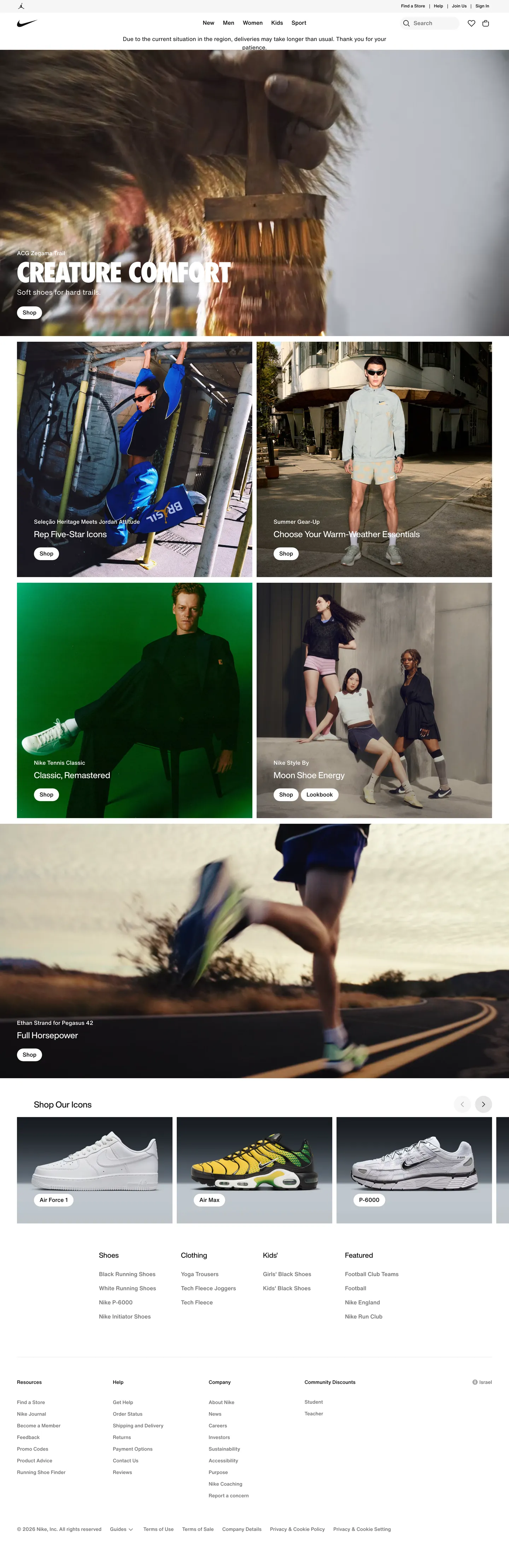
Nike's commerce system reads like a printed athletic catalog rendered for the browser. The chrome is almost violently restrained — pure ink `#111111`, pure canvas `#ffffff`, and a single soft cloud gray `#f5f5f5` carry roughly 95% of the surface area across `/men`, the PLP listings, the PDP, and `/membership`. Every chromatic moment in the page is reserved for the product photograph or a pricing signal. There is no decorative gradient, no soft shadow, no accent color used for tone. The brand's voice is loud, kinetic, and absolute, and the system earns that loudness by withholding color everywhere except where it has to scream.
This page packages Nike's commerce surface into a single DESIGN.md file built on the Google Labs spec. Inside: 23 colors tokens (one ink, one canvas, one soft cloud, five text grays, four semantic, six category accents), 13 type styles topped by a 96px Nike Futura ND campaign tier at line-height 0.9, 5 corner radii, 8 spacing values from 2px to 48px, and 24 components — pill CTAs, search pills, filter chips, swatch dots, badge promos, the campaign tile, the PDP disclosure row, the four-column footer. Every value is quoted and machine-readable.
Feed the file to Claude, Cursor, or GitHub Copilot and the agent will produce React components that look like Nike: pill-shaped `#111111` buttons, square product cards on `#f5f5f5` swatches, sale prices in `#d30005`, an 8px grid that locks PLP and PDP to the same vertical rhythm. Or read it as a discipline study — the system's strength is that almost every component reuses the same pill plus flat card plus photography-on-cloud vocabulary, which is why Nike never has to introduce a new token to ship a new page.
What makes it distinct
5
- Photography-first chrome95% of the surface is `#111111`, `#ffffff`, and `#f5f5f5`; color lives only in the imagery
- Single typographic mountain96px uppercase Futura ND at line-height 0.9, then a hard cliff to 16px Helvetica Now
- Pill geometry everywhereevery CTA, chip, and badge uses `{rounded.lg}` 30px or `{rounded.full}`; sharp corners are reserved for cards
- Sale is the only color in chrome`#d30005` price text with strike-through original, no badge background, never elsewhere
- Zero drop shadowsdepth comes from photography and a single 1px inset hairline on sticky bars
nike.com
Live at nike.com
A snapshot of the brand in production. Scroll the frame to see the whole page.
Colors
23 colors
Nike's system anchors on #111111 (primary) as its primary color. Type is set in Helvetica Now Text Medium across 13 tokens from 9px to 96px, weights 400–500. Shape language leans on pill geometry — fully rounded surfaces dominate the component library.
Brand & Accent
Sparing, CTA-only voltage · 7
Surface
Page and card backgrounds · 1
Text
Headlines, body, captions · 2
Borders & Hairlines
Dividers, outlines, rules · 2
Semantic
Status, errors, success, links · 4
Other
Specialty colors · 7
Typography
13 type tokens
Set in Helvetica Now Text Medium across 13 tokens, from 9px to 96px, weights 400–500. Shown in its own stack: where the font isn't installed, the fallback the file names stands in.
- display-campaign96px · weight 500 · lh 0.9The quick brown fox jumps over the lazy dog
- heading-xl32px · weight 500 · lh 1.2The quick brown fox jumps over the lazy dog
- heading-lg24px · weight 500 · lh 1.2The quick brown fox jumps over the lazy dog
- heading-md16px · weight 500 · lh 1.75The quick brown fox jumps over the lazy dog
- body-md16px · weight 400 · lh 1.5The quick brown fox jumps over the lazy dog
- body-strong16px · weight 500 · lh 1.5The quick brown fox jumps over the lazy dog
- button-lg24px · weight 500 · lh 1.2The quick brown fox jumps over the lazy dog
- button-md16px · weight 500 · lh 1.5The quick brown fox jumps over the lazy dog
- button-sm14px · weight 500 · lh 1.5The quick brown fox jumps over the lazy dog
- link-md16px · weight 500 · lh 1.75The quick brown fox jumps over the lazy dog
- caption-md14px · weight 500 · lh 1.5The quick brown fox jumps over the lazy dog
- caption-sm12px · weight 500 · lh 1.5The quick brown fox jumps over the lazy dog
- utility-xs9px · weight 500 · lh 1.75The quick brown fox jumps over the lazy dog
Layout
Radii and spacing
5 corner radii and 8 spacing values. Shape language: pill.
Radii
- none0px
- sm18px
- md24px
- lg30px
- full9999px
Spacing
- xxs2px
- xs4px
- sm8px
- md12px
- lg18px
- xl24px
- xxl30px
- section48px
Components
24 components
Each rendered from its tokens (color, type, radius, padding) on Nike's own canvas.
- Button Primarybutton-primaryButton Primary
- Button Primary Activebutton-primary-activeButton Primary Active
- Button Secondarybutton-secondaryButton Secondary
- Button Outline On Imagebutton-outline-on-imageButton Outline On Image
- button-icon-circularButton Icon Circular
- Search Pillsearch-pillSearch Pill
- Search Pill Focusedsearch-pill-focusedSearch Pill Focused
- Filter Chipfilter-chipFilter Chip
- Filter Chip Activefilter-chip-activeFilter Chip Active
- Badge Promobadge-promoBadge Promo
- Badge Sale Textbadge-sale-textBadge Sale Text
- Product Cardproduct-cardProduct Card
- Product Card Imageproduct-card-imageProduct Card Image
- Swatch Dotswatch-dotSwatch Dot
- Swatch Dot Activeswatch-dot-activeSwatch Dot Active
- Campaign Tilecampaign-tileCampaign Tile
- Category Icon Cardcategory-icon-cardCategory Icon Card
- Member Benefit Cardmember-benefit-cardMember Benefit Card
- Faq Rowfaq-rowFaq Row
- Pdp Disclosure Rowpdp-disclosure-rowPdp Disclosure Row
- Utility Barutility-barUtility Bar
- Primary Navprimary-navPrimary Nav
- Filter Sidebarfilter-sidebarFilter Sidebar
- FooterfooterFooter
In use
The system, in use
Nike's tokens on the kind of product it builds.
Build something people actually use.
A short paragraph of marketing copy that previews how the brand's display tier and body tier read together. Two sentences is usually enough.
FAQ
Nike design system FAQ
Common questions about Nike's tokens, components, and how to use this DESIGN.md in your project.
Read next
Related reading
Specs, directories, and component libraries that pair with this design system.
Use it
Use Nike in your project
One machine-readable file. Drop it into Claude, Cursor, or any AI tool that reads DESIGN.md.
Download the DESIGN.md
One machine-readable file: every color, type, radius, spacing, and component token of Nike.
Feed it to your AI tool
Drop it into Claude, Cursor, or GitHub Copilot. The agent writes React components and Tailwind classes that match Nike's visual language.
Reference the tokens directly
Or paste the values into your Tailwind config, CSS variables, or component library: every color, size and radius is a quoted, ready-to-copy value.
Read the full DESIGN.md: overview, rationale, do’s and don’ts
Overview
Nike's commerce system is built on a single, almost violently simple idea: photography speaks, the chrome doesn't. Every page reads as an athletic editorial — towering uppercase Futura display lockups ({typography.display-campaign}) burned into full-bleed campaign imagery, with everything else (nav, filters, buttons, cards, footer) reduced to neutral typography and pill geometry on {colors.canvas} and {colors.soft-cloud}. There is no decorative gradient, no soft shadow nostalgia, no accent color used for "tone" — the system saves all chromatic energy for product photography and the small handful of moments that actually need to signal (sale price {colors.sale}, success {colors.success}, swatch dots).
The result is a layout that feels physical — campaign hero, product grid, sport tile, footer — stacked like a printed catalog rather than animated like a typical SaaS landing page. Density is high but never crowded, because the system relies on three relentless devices: square or near-square 1:1 product imagery on {colors.soft-cloud}, pill-shaped black CTAs ({rounded.full}) anchoring every actionable surface, and a tight 8px-base spacing scale that keeps cards and filters mathematically aligned across PLP, PDP, and editorial pages.
Across /men, the trail-running listing, the Zegama PDP, /membership, and Jordan Golf, the same chrome appears in identical proportions — only the photography and copy change. That is the system's signature: maximum editorial expression in the imagery, maximum mechanical restraint everywhere else.
Known Gaps
- Mobile screenshots not captured — responsive behavior described above synthesizes Nike's known mobile pattern (hamburger drawer, 1-up grid, headline downscale) from desktop evidence and the breakpoint list extracted from tokens.
- Hover states not documented by system policy — Nike's CSS uses
--pds-color-element-hoverand--pds-color-text-hovertokens but these are not included here. - Dialog / modal styling beyond the geo-selector and the country-confirmation pill pair could not be confirmed from the captured surfaces; bag, wishlist, and login overlays are not documented.
- Form field styling for checkout, sign-up, and address forms is not present in the captured surfaces — only the search pill is documented.
- Bag and wishlist icon-state variants (filled count badges) not visible in the captured pages.
E-commerce & Retail
More systems like this
More DESIGN.md files in E-commerce & Retail.
Pricing
Build it with Pro
The DESIGN.md files are free. Pro adds 6,000+ blocks, premium templates and the MCP server, so your AI editor builds in your system for you.
4.9/5 out of 5 · 150+ reviewsfrom 150+ founders and developers.
Billing
Billed once a year in USD. Cancel anytime.
- How many people can use the license.
- Client work, SaaS products and anything you charge for.
- Production-ready React sections: hero, pricing, features, dashboards and more.
- Complete multi-page sites you can ship as they are.
- React icons from every major library, installable with one command.
- Presets that restyle every block, in light and dark.
- Lets your AI editor search, preview and install blocks for you.
- Priority requests are answered first.
Individual
For personal projects & open source
$32instead of $49/mo
$389 billed yearly
- Seats: 1 seat
- Commercial use: Personal & open source only
- Pro blocks: 6,000+ blocks
- Templates: All 14 templates
- React icons: 294k+ icons
- Themes: All 59 themes
- MCP server: Basic usage
- Support: Standard
Team
Most popularFor freelancers, agencies & startups
$66instead of $99/mo
$789 billed yearly · ≈ $13/dev/mo
- Seats: Up to 5 seats
- Commercial use: Included
- Pro blocks: 6,000+ blocks
- Templates: All 14 templates
- React icons: 294k+ icons
- Themes: All 59 themes
- MCP server: High usage
- Support: Priority
Organization
For companies with larger teams
$132instead of $199/mo
$1,589 billed yearly
- Seats: Unlimited seats
- Commercial use: Included
- Pro blocks: 6,000+ blocks
- Templates: All 14 templates
- React icons: 294k+ icons
- Themes: All 59 themes
- MCP server: Unlimited usage
- Support: Priority
Billed once a year in USD. Cancel anytime.
Individual
For personal projects & open source
$32instead of $49/mo
$389 billed yearly
- How many people can use the license.Seats: 1 seat
- Client work, SaaS products and anything you charge for.Commercial use: Personal & open source only
- Production-ready React sections: hero, pricing, features, dashboards and more.Pro blocks: 6,000+ blocks
- Complete multi-page sites you can ship as they are.Templates: All 14 templates
- React icons from every major library, installable with one command.React icons: 294k+ icons
- Presets that restyle every block, in light and dark.Themes: All 59 themes
- Lets your AI editor search, preview and install blocks for you.MCP server: Basic usage
- Priority requests are answered first.Support: Standard
Team
Most popularFor freelancers, agencies & startups
$66instead of $99/mo
$789 billed yearly · ≈ $13/dev/mo
Everything in Individual, plus
- How many people can use the license.Seats: Up to 5 seats
- Client work, SaaS products and anything you charge for.Commercial use: Included
- Lets your AI editor search, preview and install blocks for you.MCP server: High usage
- Priority requests are answered first.Support: Priority
Organization
For companies with larger teams
$132instead of $199/mo
$1,589 billed yearly
Everything in Team, plus
- How many people can use the license.Seats: Unlimited seats
- Lets your AI editor search, preview and install blocks for you.MCP server: Unlimited usage
- Secure checkout via Stripe
- Code lives in your repo
- Keep what you've shipped if you cancel
- License terms
Your system, built for you
Every block, template and icon, installed by your AI agent in your design system. The DESIGN.md files stay free.