Skip to content

The New Yorker Design System

The New Yorker's marketing system as a DESIGN.md file. Adobe Caslon Pro body at 21px, Irvin display, single editorial red for breaking news, 7 colors, 19 components. For React, Next.js, and AI tools.

Add shadcn.io to your AI agent. · Pro It installs blocks, icons and templates in your design system from a prompt, with Pro.

Set up MCP
Primary
#a2a2a2
Typeface
Graphik
Shape
Sharp
Base radius
8px
Colors
7
Type tokens
12
Components
19
Spacing values
7

About

About The New Yorker DESIGN.md

Curated by Dov Azencot · Updated May 18, 2026 · Source newyorker.com (opens in a new tab)

The New Yorker's website does something almost no contemporary news brand does: it sets its body copy in a true Old Style serif at 21px with a 31.5px line height, and trusts the reader to settle into a print cadence on a backlit screen. The Adobe Caslon Pro that runs every story dek and pull quote is the same family the magazine has used in print for decades; the in-house Irvin face that titles every section is cut from Rea Irvin's 1925 lettering for the masthead. Where The Atlantic moved to a custom geometric sans and The New York Times softened its serif into a screen-tuned variant, The New Yorker held the line — the body face is Caslon, period, and the size is editorial, not utility.

The DESIGN.md file packages the system into a machine-readable spec for React tooling. Inside: 7 colors tokens drawn from a near-monochrome palette — ink black, soft gray text, hairline divider gray, a single editorial red lit at one breaking-news strip, white canvas, and the muted body gray for secondary text. 12 typography tokens cover the three proprietary serif and serif-display families (Caslon, Irvin, Neutraface) plus Graphik for utility chrome. 4 corner-radius tokens centered on 0px — every editorial surface is square; the only rounding belongs to the cookie banner overlay at 4px. 19 components definitions cover the masthead lockup, the bordered top-nav, the editorial article tile, the small-caps category eyebrow, the named-author byline, the photograph plate (always 0 radius, no shadow), and the single accent breaking-news strip.

Feed this file to an AI coding tool and it reproduces the moves that distinguish a magazine-on-screen from a news blog: serif body type at print size, three-tier display hierarchy rather than two, hairline-only dividers in place of cards, square corners on every editorial surface, and a single accent color reserved for genuinely urgent moments. The one move worth borrowing only if you have a 99-year typographic identity to draw from: the willingness to set a 21px serif as your default running text. Most teams need the 16px sans because their content is read rather than savored.

What makes it distinct

5

  1. Caslon body at 21pxthe running text is a serif at print magazine size, not the 16px sans every news site uses; reading rhythm matches the print edition
  2. Three proprietary faces, one workhorseAdobe Caslon Pro, Irvin, and Neutraface New Yorker each own a tier; Graphik handles only nav, captions, and footer
  3. Editorial red used once#db3334 lights a single breaking-news strip; the rest of the page is ink-on-cream with no chromatic competition
  4. Hairline-only dividerssection breaks come from 1px #e5e5e5 rules rather than card surfaces; the page reads as a continuous broadsheet
  5. Square corners across the systembuttons sit at 4px max, photographs at 0px; rounded radii belong to the cookie banner overlay, not the editorial chrome

newyorker.com

Live at newyorker.com

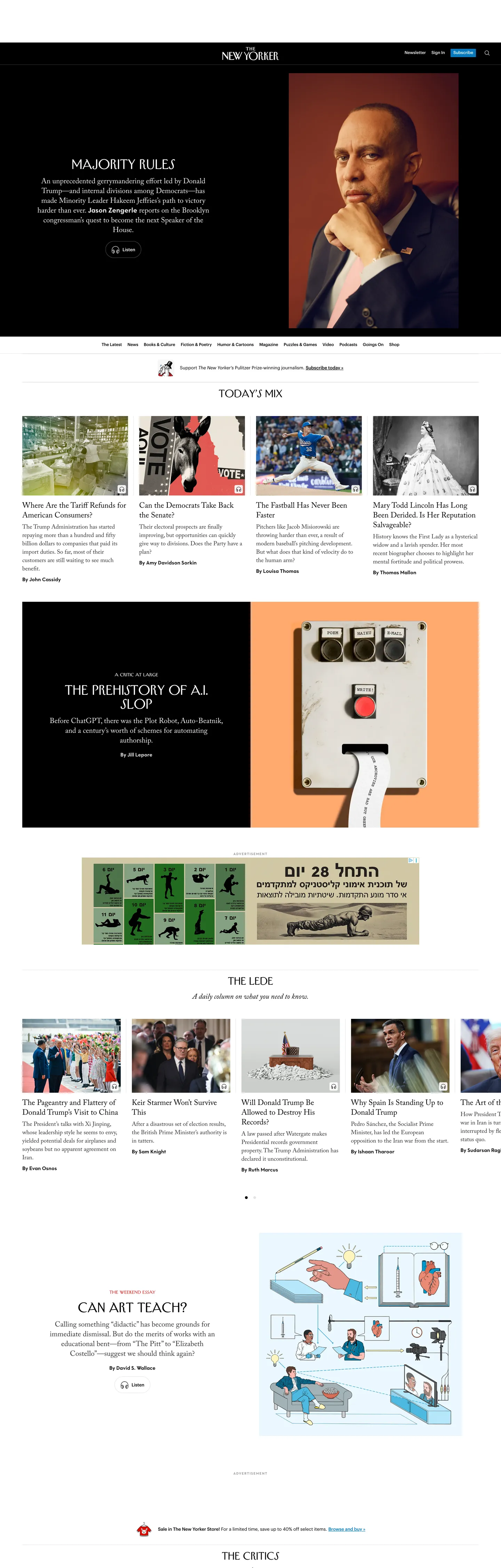
A snapshot of the brand in production. Scroll the frame to see the whole page.

The New Yorker's website at newyorker.com

Colors

7 colors

The New Yorker's system anchors on #a2a2a2 (ink-subtle) as its primary color. Type is set in Graphik across 12 tokens from 10px to 36px, weights 400–600. Shape language is sharp — components average 2px corner radius, favoring crisp rectangles.

Brand & Accent

Sparing, CTA-only voltage · 1

Surface

Page and card backgrounds · 1

Text

Headlines, body, captions · 4

Borders & Hairlines

Dividers, outlines, rules · 1

Typography

12 type tokens

Set in Graphik across 12 tokens, from 10px to 36px, weights 400–600. Shown in its own stack: where the font isn't installed, the fallback the file names stands in.

  • display-xl36px · weight 400 · lh 40pxThe quick brown fox jumps over the lazy dog
  • display-md28px · weight 400 · lh 32pxThe quick brown fox jumps over the lazy dog
  • body-feature21px · weight 400 · lh 31.5pxThe quick brown fox jumps over the lazy dog
  • body-deck22px · weight 400 · lh 28pxThe quick brown fox jumps over the lazy dog
  • body-md17px · weight 400 · lh 24pxThe quick brown fox jumps over the lazy dog
  • eyebrow-lg15px · weight 600 · lh 17.14pxThe quick brown fox jumps over the lazy dog
  • eyebrow-cap10px · weight 400 · lh 10px · tracking 1.5pxThe quick brown fox jumps over the lazy dog
  • section-label12px · weight 400 · lh 16pxThe quick brown fox jumps over the lazy dog
  • utility-link14px · weight 500 · lh 23.94px · tracking -0.175pxThe quick brown fox jumps over the lazy dog
  • utility-meta13px · weight 500 · lh 16px · tracking -0.1625pxThe quick brown fox jumps over the lazy dog
  • nav-link12px · weight 500 · lh 15.24px · tracking -0.15pxThe quick brown fox jumps over the lazy dog
  • caption10px · weight 500 · lh 12.7px · tracking -0.125pxThe quick brown fox jumps over the lazy dog

Layout

Radii and spacing

5 corner radii and 7 spacing values. Shape language: sharp.

Radii

  • none0px
  • xs1px
  • sm4px
  • md8px
  • lg16px

Spacing

  • xs4px
  • sm8px
  • base16px
  • lg24px
  • xl32px
  • 2xl48px
  • 3xl64px

Components

19 components

Each rendered from its tokens (color, type, radius, padding) on The New Yorker's own canvas.

  • Button Primary
    button-primaryButton Primary
  • Button Secondary
    button-secondaryButton Secondary
  • Top Nav
    top-navTop Nav
  • Nav Link
    nav-linkNav Link
  • Masthead
    mastheadMasthead
  • Hero Heading
    hero-headingHero Heading
  • Section Heading
    section-headingSection Heading
  • Body Paragraph
    body-paragraphBody Paragraph
  • Body Deck
    body-deckBody Deck
  • Article Tile
    article-tileArticle Tile
  • Article Tile Headline
    article-tile-headlineArticle Tile Headline
  • Eyebrow
    eyebrowEyebrow
  • Byline
    bylineByline
  • Divider
    dividerDivider
  • Photo Plate
    photo-platePhoto Plate
  • Breaking News Strip
    breaking-news-stripBreaking News Strip
  • Type here…
    text-inputText Input
  • Card
    cardCard
  • Footer
    footerFooter

In use

The system, in use

The New Yorker's tokens on the kind of product it builds.

Build something people actually use.

A short paragraph of marketing copy that previews how the brand's display tier and body tier read together. Two sentences is usually enough.

Get startedLearn more
Marketing heroHeadline, sub-copy, primary CTA — the universal homepage opener.
Reporting · 14 min read

The quiet collapse of an old idea

For decades the consensus held that the system would correct itself. Then it didn't. This is the inside story of what changed, told by the people who watched it unravel.

"Nobody noticed because the failure was indistinguishable from progress."

By Sam Reporter · Updated 2 hours ago

Editorial articleMagazine-style longform with display headline.

FAQ

The New Yorker design system FAQ

Common questions about The New Yorker's tokens, components, and how to use this DESIGN.md in your project.

Read next

Specs, directories, and component libraries that pair with this design system.

Use it

Use The New Yorker in your project

One machine-readable file. Drop it into Claude, Cursor, or any AI tool that reads DESIGN.md.

Download DESIGN.md
  1. Download the DESIGN.md

    One machine-readable file: every color, type, radius, spacing, and component token of The New Yorker.

  2. Feed it to your AI tool

    Drop it into Claude, Cursor, or GitHub Copilot. The agent writes React components and Tailwind classes that match The New Yorker's visual language.

  3. Reference the tokens directly

    Or paste the values into your Tailwind config, CSS variables, or component library: every color, size and radius is a quoted, ready-to-copy value.

Read the full DESIGN.md: overview, rationale, do’s and don’ts

Overview

The New Yorker's website does something almost no contemporary news brand does. Print cadence on a screen. It sets its body copy in a true Old Style serif at 21px with a 31.5px line height, and trusts the reader to settle into a magazine reading rhythm on a backlit display. Where The Atlantic moved to a custom geometric sans and The New York Times softened its serif into a screen-tuned variant for utility-density reasons, The New Yorker held the line — Adobe Caslon Pro at editorial body size, with three additional proprietary faces stacked above it. Compared to CNN's red-saturated masthead or NPR's NPRSans-only utility system, The New Yorker reads as a broadsheet rendered in pixels rather than a news app borrowing magazine words.

The chromatic system reinforces the restraint. There are five neutral tones — {colors.ink}, {colors.ink-soft}, {colors.ink-muted}, {colors.ink-subtle}, {colors.canvas} — plus the {colors.hairline} divider gray and a single editorial accent red ({colors.accent-red}). The red is wired only to the breaking-news strip and a footer alert overlay; everywhere else the page is ink on white. The accent red appears 64 times as text and 64 as border across the captured page, but those occurrences cluster inside the two narrow strips that carry it. The hairline gray functions as the page's structural mortar, drawing 1px lines between editorial tiles where most contemporary news sites would draw card outlines.

Typography is three proprietary faces and one utility sans. Adobe Caslon Pro (TNYAdobeCaslonPro) sets every article headline, deck, pull quote, and body paragraph. Irvin (IrvinHeadingPro / IrvinText) carries the masthead and section h2 / h3 titles — this is the face cut from Rea Irvin's 1925 lettering. Neutraface New Yorker handles small-caps eyebrows above each article tile. Graphik runs only nav links, captions, and footer chrome. The hierarchy is unmistakable: the serif voices belong to the editorial, the sans belongs to the wayfinding.

Key Characteristics:

  • Adobe Caslon Pro body at 21px / 31.5px line height — about 30% larger than the 16px sans most digital news sites default to, deliberately matching the print magazine's reading rhythm.
  • Three proprietary display / text faces — Caslon for body, Irvin for masthead and section titles, Neutraface for small-caps eyebrows; Graphik handles only utility chrome.
  • Single editorial red ({colors.accent-red}) reserved for the breaking-news strip and one footer alert overlay; the rest of the page is ink on white.
  • Hairline dividers ({colors.hairline} at 1px) carry every structural separation; the page reads as continuous editorial columns rather than as a grid of cards.
  • Square corners on every editorial surface — photographs at 0px, article tiles at 0px, buttons at 4px max. The 8-48px radii in the captured CSS belong to the cookie-consent overlay, not the editorial system.
  • Eyebrow-then-headline lockup: every article tile begins with a Neutraface small-caps category label (8-15px) above a Caslon headline (21-22px), with the byline rendered in Graphik below.
  • Editorial photography sits as full-bleed plates with no border, no rounding, no shadow — the photo IS the visual frame.
  • The masthead lockup at the top of the page renders the New Yorker wordmark in Irvin against pure white, with a black utility bar carrying the section navigation below it.

Colors

  • Ink ({colors.ink} — #000000): frequency 1895. Used as text (972), bg (6), border (917). The dominant text and structural color; every Caslon headline, byline, deck, and body paragraph renders in pure ink.
  • Ink Soft ({colors.ink-soft} — #121212): frequency 468. Used as text (233), bg (2), border (233). A near-black with a 5% lightness lift over pure ink — used on secondary text and the darker editorial divider rules. Most users won't perceive the difference from pure black.
  • Ink Muted ({colors.ink-muted} — #333333): frequency 71. Used as text (35), bg (0), border (36). Reserved for bylines and small-meta labels where the contrast against white needs to soften slightly without losing read-time legibility.
  • Ink Subtle ({colors.ink-subtle} — #a2a2a2): frequency 71. Used as text (35), bg (0), border (36). Tertiary metadata — timestamps under article tiles, secondary footer links, disabled state on Graphik utility links.
  • Canvas ({colors.canvas} — #ffffff): frequency 80. Used as text (36), bg (2), border (42). The page floor. Pure white, not a softened cream — every editorial surface sits on it. The "text" occurrences are for inverted treatments inside the top-nav black bar and the accent-red strip.
  • Hairline ({colors.hairline} — #e5e5e5): frequency 136. Used as text (51), bg (1), border (84). The structural mortar — 1px hairline rules separate article tiles, section bands, and footer columns. This is the only divider tone in the system; the page never escalates to a heavier 2px or 4px border for structural separation.
  • Accent Red ({colors.accent-red} — #db3334): frequency 128. Used as text (64), bg (0), border (64). The single editorial accent. Lit only on the live breaking-news strip and one footer alert overlay; never used on CTAs, links, or section eyebrows. The discipline is the point — if you copy this system, do not light a button in this red.

Typography

Font Family

The system runs four families, three of them proprietary to the magazine. Adobe Caslon Pro (wired as TNYAdobeCaslonPro) is the workhorse — every article headline, deck, pull quote, and body paragraph uses it. Irvin (IrvinHeadingPro and IrvinText) carries the masthead lockup and section h2 / h3 titles, cut from Rea Irvin's 1925 lettering for the original magazine cover. Neutraface New Yorker handles small-caps category eyebrows and small editorial labels. Graphik runs nav links, captions, byline metadata, and footer chrome. The serif voices belong to the editorial layer, the sans belongs to the wayfinding layer.

Hierarchy

TokenFamilySizeWeightLine HeightUse
{typography.display-xl}Irvin Heading Pro36px40040pxHero feature headline ("Majority Rules") on the cover plate
{typography.display-md}Irvin Heading Pro28px40032pxSection h2 ("Today's Mix," "The Lede")
{typography.body-feature}Adobe Caslon Pro21px40031.5pxLong-form article body — the print-cadence default
{typography.body-deck}Adobe Caslon Pro22px40028pxArticle tile decks and headline-tile headings
{typography.body-md}Adobe Caslon Pro17px40024pxSecondary article body and inline editorial links
{typography.eyebrow-lg}Neutraface New Yorker15px60017pxLarger category eyebrow above feature tiles
{typography.eyebrow-cap}Neutraface New Yorker10px40010pxAll-caps category labels with 1.5px tracking
{typography.section-label}Irvin Text12px40016pxSection dividers and small editorial labels
{typography.utility-link}Graphik14px50024pxTop-nav links, utility CTAs
{typography.utility-meta}Graphik13px50016pxBylines, timestamps, tile metadata
{typography.nav-link}Graphik12px50015.24pxSecondary nav row and footer links
{typography.caption}Graphik10px50012.7pxPhoto captions and the smallest metadata labels

Principles

The default running text is 21px Caslon at a 31.5px line height — 30% larger than the 16px sans most digital news sites default to. The choice is deliberate magazine-on-screen behavior: at 21px the Caslon serif renders its Old Style proportions cleanly, and the long-form reading rhythm matches the print edition rather than the news-blog cadence. Display weight tops at 600 only on Neutraface eyebrows; the Caslon and Irvin tiers never escalate above 400. There is no semibold or bold treatment on Caslon at all — emphasis comes from italic, never from weight.

Note on Font Substitutes

All four families are licensed. For Adobe Caslon Pro use Source Serif 4 (Adobe's open-source serif designed by Frank Grießhammer) at the same weights — proportions transfer closely. For Irvin display use ITC Garamond Condensed or the open EB Garamond at the display sizes; neither matches the lettering exactly but both share the high-contrast Old Style feel. For Neutraface small-caps use Futura PT Light Condensed or open Inter with a small-caps OpenType feature enabled. For the Graphik utility tier use Inter at the same weights — the proportions are close enough that most readers won't notice the swap.

Layout

Spacing System

  • Base unit: 8px (the dominant module with 119 occurrences across the captured page).
  • Tokens: {spacing.xs} 4px · {spacing.sm} 8px · {spacing.base} 16px · {spacing.lg} 24px · {spacing.xl} 32px · {spacing.2xl} 48px · {spacing.3xl} 64px.
  • Page padding (horizontal): 0px 64px on the outer container — wider than typical news sites because the long-measure Caslon column needs the breathing room.
  • Section padding (vertical): 64px 48px 24px on major editorial bands; 16px 0px 48px between article tiles.
  • Article tile padding: 0px 0px 16px internal; the photograph sits flush at the top with no inset.

Grid & Container

  • Max content width: ~1280px on the outer container, with the main feature column constrained to ~576px wide so the 21px Caslon body holds at ~65-character measure.
  • Article-tile grid: 3-column at desktop on the "Today's Mix" and "The Lede" bands, collapsing to 1-column on narrow viewports. Tiles separated by 32px gutters; no card borders.
  • Cover plate: full-bleed black-and-white photograph at the top of the page, with the feature headline rendered in white Irvin display over the lower-left quadrant.
  • Masthead lockup: centered Irvin wordmark above the black top-nav bar, with the bar carrying section-nav links in 12px Graphik.

Rhythm

The page alternates between edge-to-edge photographic plates (the cover, the section break image, the cartoon strip) and constrained editorial columns (the article-tile grids). There is no atmospheric gradient between bands — every section terminates on pure white with a 1px hairline rule, and depth comes from photographic plates rather than from background tone shifts. The reading rhythm is broadsheet-on-screen: large plate, dense column, small plate, dense column.

Elevation

The system has essentially no shadow tier. Article tiles, byline blocks, and the masthead all sit flat on the white canvas. Where most contemporary news sites use a 4-8px drop shadow under each tile to suggest tactility, The New Yorker uses a 1px {colors.hairline} rule between rows — the same divider that print uses to separate column-bands on a broadsheet page.

  • Flat (no shadow): every editorial surface — article tiles, byline blocks, photographs, the masthead, the footer.
  • Hairline divider: {colors.hairline} (#e5e5e5) at 1px between rows of article tiles and between section bands.
  • Photographic depth: the only "elevation" on the page is photographic — full-bleed cover images, character portraits, and editorial illustrations. They sit at 0px radius with no border.

Shapes

The radius scale is square-by-default, with rounding reserved for utility chrome:

  • {rounded.none} 0px — every editorial surface. Photographs, article tiles, section dividers, the masthead, the cover plate.
  • {rounded.xs} 1px — text inputs in the newsletter signup form (frequency 1 in the captured CSS).
  • {rounded.sm} 4px — utility buttons in Graphik (subscribe CTA, footer chrome buttons). Frequency 35 in the captured CSS.
  • {rounded.md} 8px — secondary utility chips and the search dropdown surface. Frequency 7.
  • {rounded.lg} 16px — the cookie-consent banner overlay only (a third-party Fides modal). Frequency 6 — not part of the editorial system.

The 48px radius (frequency 45 in the captured CSS) belongs entirely to a single video-player chrome surface (rounded play / pause buttons inside an embedded player) and the 60px belongs to the same player. Within the editorial system itself, square corners reinforce the print-broadsheet metaphor.

Components

button-primary — Ink fill, white text, {rounded.sm} 4px radius, 8x16 padding, 36px height. The "Subscribe" CTA in the masthead and footer. Uses {typography.utility-link} (Graphik 14px / 500). The only filled button in the editorial chrome.

button-secondary — Transparent fill, ink text, 1px ink border, {rounded.sm} 4px radius. The "Sign In" treatment in the top-nav and the "Read more" tertiary CTAs at the foot of article tiles.

top-nav — Ink fill ({colors.ink}), white text, 48px height, 16x32 padding. Sits as a black utility bar beneath the centered masthead. Houses the section-navigation links (News, Books & Culture, Fiction & Poetry, Humor & Cartoons, Magazine, Video, Podcasts, Archive, Goings On) in 12px Graphik.

nav-link — Transparent background, white text on the black nav bar, {typography.nav-link} (Graphik 12px / 500). 8px horizontal padding. No hover background visible in the captured surface.

masthead — White canvas, ink text, centered Irvin wordmark at 28px display-md sizing, with 48px bottom padding before the black top-nav bar begins.

hero-heading — White text on the black-and-white cover plate, {typography.display-xl} (Irvin Heading Pro 36px / 400). 0 padding because the headline floats over the photograph in the lower-left quadrant.

section-heading — Ink text on white, {typography.display-md} (Irvin 28px / 400). Used for "Today's Mix," "The Lede," "The Mail," "The Cycle" — the standing-section labels.

body-paragraph — Default ink text at {typography.body-feature} (Caslon 21px / 31.5px). The long-form article body — 30% larger than the typical 16px news-blog default.

body-deck — Caslon 22px / 28px for the deck (article-tile subhead) that sits below each headline. Slightly tighter leading than the body to keep tile heights compact.

article-tile — White canvas, ink text, square corners, 0 internal padding. The photograph sits flush at the top; the eyebrow, headline, and byline stack below.

article-tile-headline — Ink text, {typography.body-deck} (Caslon 22px / 28px), 8px vertical padding. The Caslon serif headline above each article tile.

eyebrow — Neutraface small-caps at 10px / 400 with 1.5px tracking, ink color, 8px bottom padding. Sits above every article-tile headline as the category label ("THE CURRENT MOMENT," "Q. & A.," "ANNALS OF TECHNOLOGY").

byline — Graphik 13px / 500, ink-muted color, 8px vertical padding. The named-author byline below each headline ("By Susan B. Glasser," "By Atul Gawande"), with the section's "Annals of …" small-caps label trailing as needed.

divider — 1px {colors.hairline} rule between article-tile rows and between section bands. The structural separator throughout the page.

photo-plate — White canvas, 0px radius, 0 padding. Every photograph and illustration renders edge-to-edge on its container with no border, no shadow, no inset.

breaking-news-strip — Accent-red fill ({colors.accent-red}), white text, {typography.eyebrow-lg} (Neutraface 15px / 600), 8x16 padding, 32px height. The single chromatic moment in the editorial chrome — used only on the live breaking-news banner and one footer alert overlay.

text-input — White canvas, ink text, 1px ink border, {rounded.xs} 1px radius, 8x16 padding, 40px height. Used in the newsletter-signup form at the foot of the page. The 1px radius is the only non-zero editorial rounding in the system.

card — White canvas, ink text, square corners, 1px {colors.hairline} border, 16px padding. Used sparingly for utility blocks (newsletter signup callout, cartoon caption-contest tile).

footer — White canvas, ink-muted text, {typography.caption} (Graphik 10px / 500), 48x32 padding. Carries the standing footer columns (News, Books & Culture, Fiction & Poetry, About Us, Contact) in Graphik utility type, with the accent-red alert overlay riding above as needed.

Do's and Don'ts

Do set body type in {typography.body-feature} (Caslon 21px / 31.5px) for long-form features. The print-cadence body size is the system's most distinctive move — dropping to 16px to "match the web" forfeits the entire magazine-on-screen positioning.

Do use {colors.hairline} (1px #e5e5e5 rules) instead of card borders or box-shadows between rows of article tiles. The page should read as continuous editorial columns, not as a grid of containers.

Do stack the eyebrow-headline-byline lockup in that exact order on every article tile — Neutraface small-caps category label first, Caslon headline second, Graphik byline third. Reversing the order or swapping the families breaks the print-derived information hierarchy.

Do render photographs and illustrations at {rounded.none} (0px) with no border, no shadow, no inset. The photographic plate IS the frame; adding rounding turns the editorial page into a Pinterest grid.

Don't light a CTA or a link in {colors.accent-red} (#db3334). The red is reserved for the breaking-news strip and the footer alert overlay; multiplying it into buttons or section accents dilutes the single editorial moment it owns and breaks the chromatic restraint that distinguishes this brand from CNN-style red-saturated news chrome.

Don't introduce a 4px or 8px radius on article tiles, photographs, or the cover plate. The system is square-by-default for everything editorial; the 8-16px radii in the captured CSS belong to the cookie-consent overlay (a third-party Fides modal) and should not propagate into the editorial chrome.

Don't swap Adobe Caslon Pro for a screen-tuned serif (Charter, Source Serif, Georgia) on the body. The Old Style proportions of Caslon are the magazine's print signature; substituting a screen-optimized serif at the same 21px size loses the high-contrast vertical stress that makes the body read as broadsheet rather than blog.

Don't render Graphik in any tier above 14px. Graphik is the utility voice — nav links, captions, bylines, footer chrome. Bumping it to display size shoulders aside the Irvin display face and confuses the wayfinding-vs-editorial hierarchy that the four-family stack is built to enforce.

Known Gaps

  • Hover and focus states: documented only for the {component.button-primary} resting state; the full state matrix (focus rings, disabled tints, error states) is not captured from the marketing surface.
  • Form input validation: the {component.text-input} field carries the newsletter-signup resting state only; success / error / loading variants are not exposed on the captured surface.
  • Dark mode: there is none. The captured surface is light-only, and there is no prefers-color-scheme: dark rule in the page CSS.
  • Long-form article surfaces: this DESIGN.md captures the homepage editorial chrome. The full long-form reading experience (drop-cap treatments, pull-quote framing, illustrated section breaks, footnote styling) lives behind the paywall and is not represented here.
  • Cartoon and caption-contest chrome: the cartoon strip embeds a custom layout (illustration plate plus caption box plus voting tray) that is not tokenized in this file.
  • The third-party cookie-consent overlay: the 4-48px radii, the Inter font family, and the #2b2e35 primary-button color in the captured CSS all belong to a Fides modal that is not part of the editorial system and should be ignored when building from these tokens.
  • Video player chrome: the 48px / 60px rounded play / pause buttons in the captured radii belong to a single embedded player and are not part of the editorial radius scale.

News & Publishing

More systems like this

More DESIGN.md files in News & Publishing.

Pricing

Build it with Pro

The DESIGN.md files are free. Pro adds 6,000+ blocks, premium templates and the MCP server, so your AI editor builds in your system for you.

4.9/5 out of 5 · 150+ reviewsfrom 150+ founders and developers.

Billed once a year in USD. Cancel anytime.

Individual

For personal projects & open source

$32instead of $49/mo

$389 billed yearly

  • How many people can use the license.Seats: 1 seat
  • Client work, SaaS products and anything you charge for.Commercial use: Personal & open source only
  • Production-ready React sections: hero, pricing, features, dashboards and more.Pro blocks: 6,000+ blocks
  • Complete multi-page sites you can ship as they are.Templates: All 14 templates
  • React icons from every major library, installable with one command.React icons: 294k+ icons
  • Presets that restyle every block, in light and dark.Themes: All 59 themes
  • Lets your AI editor search, preview and install blocks for you.MCP server: Basic usage
  • Priority requests are answered first.Support: Standard

Team

Most popular

For freelancers, agencies & startups

$66instead of $99/mo

$789 billed yearly · ≈ $13/dev/mo

Everything in Individual, plus

  • How many people can use the license.Seats: Up to 5 seats
  • Client work, SaaS products and anything you charge for.Commercial use: Included
  • Lets your AI editor search, preview and install blocks for you.MCP server: High usage
  • Priority requests are answered first.Support: Priority

Organization

For companies with larger teams

$132instead of $199/mo

$1,589 billed yearly

Everything in Team, plus

  • How many people can use the license.Seats: Unlimited seats
  • Lets your AI editor search, preview and install blocks for you.MCP server: Unlimited usage
  • Secure checkout via Stripe
  • Code lives in your repo
  • Keep what you've shipped if you cancel
  • License terms

Your system, built for you

Every block, template and icon, installed by your AI agent in your design system. The DESIGN.md files stay free.

Get Pro