MUJI Design System
MUJI's minimal Japanese retail design system as a DESIGN.md file. Helvetica only, red #7f0019 accent, paper-white canvas, 21 colors, 23 components. For React and AI tools.
Add shadcn.io to your AI agent. · Pro It installs blocks, icons and templates in your design system from a prompt, with Pro.
Set up MCP- Primary
- #1d1d1f
- Typeface
- Helvetica
- Shape
- Sharp
- Base radius
- 0px
- Colors
- 21
- Type tokens
- 10
- Components
- 23
- Spacing values
- 7
About
About MUJI DESIGN.md
Curated by Dov Azencot · Updated May 13, 2026 · Source muji.com (opens in a new tab)
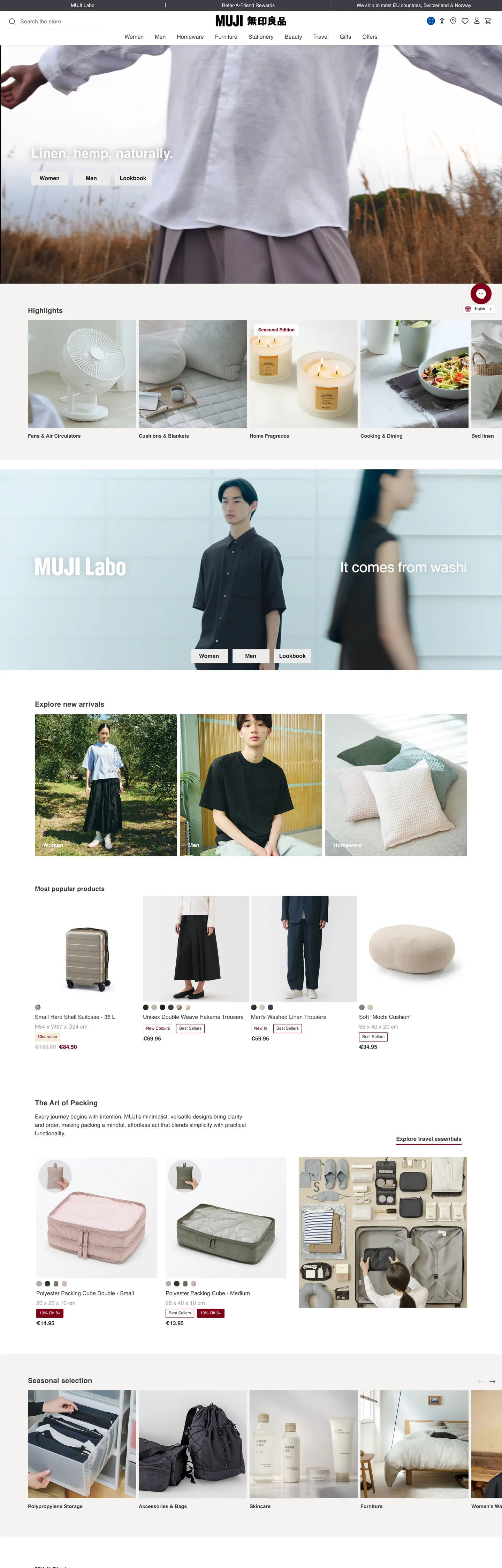
MUJI's online store is what a 40-year-old Japanese no-brand brand looks like when it refuses every Western e-commerce convention. The page paints warm graphite ink (#3c3c43) on a paper-white canvas (#ffffff) and admits one chromatic accent: the trademark red (#7f0019) that lives in the wordmark chip and a handful of seasonal callouts. Where most global retailers paint primary CTAs in a saturated brand voltage, MUJI uses the red 93 times across the entire homepage — mostly in 1px borders and small text labels — and leaves every primary action button in pale neutral chrome (#ebebec) with graphite ink text. The button doesn't shout; the linen photograph does.
This page packages the storefront into a DESIGN.md file. Inside: 21 colors tokens organized into ink, surface, hairline, and a single brand-red layer; 10 typography levels all rendered in Helvetica/Arial at weight 400 and 700 (no medium, no light, no italic); a two-step radius scale that pivots at 2px for cards and 9999px for category chips with nothing in between; an 8px-based spacing rhythm; and 23 components definitions covering the top-nav, primary CTA, product tile, recommendation rail, category chip, hero banner, and packed-cube feature card. The full CSS-variable layer (32 :root tokens including success-mint, danger-rubicund, warning-yellow) is captured even though most of those swatches are dormant on the homepage.
Feed the file to Claude, Cursor, or Copilot and the agent reproduces MUJI's no-brand discipline — Helvetica labels, paper canvas, warm graphite ink, square corners with pill chips, photography-first hero bands — instead of a generic shadcn theme. Every token traces back to the live storefront extraction, every hex sits in the CSS, and the photography-carries-warmth principle is the named constraint a junior agent needs to be told before it starts replacing the red with a brighter pigment.
What makes it distinct
5
- Single-voltage red#7f0019 (the MUJI logo red) appears in 93 occurrences total, 5 as background and 33 as text, never as a primary button fill
- One-typeface systemHelvetica/Arial across every label at weight 400 and 700 only, with the lone h2 reaching 37.44px / 40.32px line-height
- Two-tier radius2px on cards and tiles (84 occurrences), 9999px pill chips for category badges (212 occurrences), and nothing in between
- Warm graphite ink#3c3c43 used 3211 times across text (1744) and borders (1464); the warm tint over pure black is the brand's softness signal
- Photography-led catalogueproduct, linen, and packed-cube hero shots carry every emotional moment while the chrome holds at 8px / 12px breathing units
muji.com
Live at muji.com
A snapshot of the brand in production. Scroll the frame to see the whole page.
Colors
21 colors
MUJI's system runs on #1d1d1f as its primary voltage, used in 5 of 23 components. Type is set in Helvetica across 10 tokens from 9.1px to 37.44px, weights 400–700. Shape language is sharp — components average 1px corner radius, favoring crisp rectangles.
Brand & Accent
Sparing, CTA-only voltage · 2
Surface
Page and card backgrounds · 2
Text
Headlines, body, captions · 8
Borders & Hairlines
Dividers, outlines, rules · 2
Semantic
Status, errors, success, links · 4
Other
Specialty colors · 3
Typography
10 type tokens
Set in Helvetica across 10 tokens, from 9.1px to 37.44px, weights 400–700. Shown in its own stack: where the font isn't installed, the fallback the file names stands in.
- display-md37.44px · weight 700 · lh 1.08 · tracking 0.1pxThe quick brown fox jumps over the lazy dog
- heading-md20px · weight 700 · lh 1.5 · tracking 0.25pxThe quick brown fox jumps over the lazy dog
- heading-sm18px · weight 700 · lh 1.5 · tracking 0.25pxThe quick brown fox jumps over the lazy dog
- body-lg-bold18px · weight 700 · lh 1.55The quick brown fox jumps over the lazy dog
- body-md16px · weight 400 · lh 1.5The quick brown fox jumps over the lazy dog
- body-md-bold16px · weight 700 · lh 1.3The quick brown fox jumps over the lazy dog
- body-sm-bold14.4px · weight 700 · lh 1.4The quick brown fox jumps over the lazy dog
- body-sm14px · weight 400 · lh 1.43The quick brown fox jumps over the lazy dog
- caption12px · weight 400 · lh 1.3The quick brown fox jumps over the lazy dog
- micro9.1px · weight 400 · lh 1.5The quick brown fox jumps over the lazy dog
Layout
Radii and spacing
3 corner radii and 7 spacing values. Shape language: sharp.
Radii
- none0px
- card2px
- full9999px
Spacing
- xxs3px
- xs4px
- sm8px
- md9.6px
- base12px
- lg16px
- xl24px
Components
23 components
Each rendered from its tokens (color, type, radius, padding) on MUJI's own canvas.
- Top Navtop-navTop Nav
- Nav Linknav-linkNav Link
- Logo Chiplogo-chipLogo Chip
- Type here…text-inputText Input
- Button Primarybutton-primaryButton Primary
- Button Primary Hoverbutton-primary-hoverButton Primary Hover
- Button Secondarybutton-secondaryButton Secondary
- Button Text Linkbutton-text-linkButton Text Link
- Category Chipcategory-chipCategory Chip
- Badge Salebadge-saleBadge Sale
- Product Tileproduct-tileProduct Tile
- Product Tile Labelproduct-tile-labelProduct Tile Label
- Product Tile Priceproduct-tile-priceProduct Tile Price
- Recommendation Railrecommendation-railRecommendation Rail
- Hero Bannerhero-bannerHero Banner
- Hero Overlay Cardhero-overlay-cardHero Overlay Card
- Feature Card Splitfeature-card-splitFeature Card Split
- Hairline Rulehairline-ruleHairline Rule
- FooterfooterFooter
- Status Successstatus-successStatus Success
- Status Warningstatus-warningStatus Warning
- Status Dangerstatus-dangerStatus Danger
- Link Emphasislink-emphasisLink Emphasis
In use
The system, in use
MUJI's tokens on the kind of product it builds.
Build something people actually use.
A short paragraph of marketing copy that previews how the brand's display tier and body tier read together. Two sentences is usually enough.
FAQ
MUJI design system FAQ
Common questions about MUJI's tokens, components, and how to use this DESIGN.md in your project.
Read next
Related reading
Specs, directories, and component libraries that pair with this design system.
- Browse all design systemsThe full directory of DESIGN.md files on shadcn.io, with live mockups for each.shadcn.io
- MUJI — official siteThe Japanese no-brand lifestyle retailer's storefront — the source for this design system.muji.com (opens in a new tab)
- The DESIGN.md specificationGoogle Labs' open spec for machine-readable design system files.github.com (opens in a new tab)
Use it
Use MUJI in your project
One machine-readable file. Drop it into Claude, Cursor, or any AI tool that reads DESIGN.md.
Download the DESIGN.md
One machine-readable file: every color, type, radius, spacing, and component token of MUJI.
Feed it to your AI tool
Drop it into Claude, Cursor, or GitHub Copilot. The agent writes React components and Tailwind classes that match MUJI's visual language.
Reference the tokens directly
Or paste the values into your Tailwind config, CSS variables, or component library: every color, size and radius is a quoted, ready-to-copy value.
Read the full DESIGN.md: overview, rationale, do’s and don’ts
Overview
MUJI's storefront is the most pigment-averse interface in global retail — a paper-white canvas ({colors.canvas} — #ffffff) carrying warm graphite ink ({colors.ink} — #3c3c43), with the trademark red ({colors.brand-red} — #7f0019) held in reserve for the wordmark chip and a handful of seasonal callouts. Where most global retailers paint their primary CTA in the brand voltage and saturate the page with seasonal accent pigments, MUJI uses red 93 times in total across the entire homepage and leaves every primary action button in pale neutral chrome ({colors.surface-secondary} — #ebebec) with near-black ink. The button recedes; the linen photograph carries the page.
The type system runs on one typeface, two weights. Helvetica, Arial, sans-serif paints every label from the 37.44px h2 down to the 9.1px footer micro-print. Weight 400 covers body, weight 700 covers labels, navigation, and product titles — and there is no 300, no 500, no 600 intermediate, no italic, no oblique. The h2 carries a 0.1px letter-spacing nudge and the h3/h4 carry 0.25px; everywhere else letter-spacing reads as normal. The decision to refuse a custom typeface is the no-brand position made literal in CSS.
No-brand discipline: MUJI inherits from the 1980 Seiyu store-brand thesis — products labeled by function, not by author. The interface mirrors the philosophy. Where most beauty and homeware brands amplify with seasonal accent pigments and bespoke display faces, MUJI strips identity to a single red mark and the world's most ubiquitous grotesque. Where most e-commerce CTAs shout in saturated brand color, the primary button here wears pale neutral chrome and asks the photograph beside it to do the selling.
Key Characteristics:
- Warm graphite ink (
{colors.ink}— #3c3c43) used 3211 times across text (1744) and borders (1464). Not pure black — a warm graphite tinted toward purple-gray that reads as ink-on-newsprint. - Brand-red (
{colors.brand-red}— #7f0019) appears 93 times total, never as a button fill. Scoped to the wordmark chip and seasonal callouts. - Two-tier radius:
{rounded.card}(2px, 84 occurrences) for cards and tiles;{rounded.full}(9999px, 212 occurrences) for category chips. Nothing in between. - Helvetica/Arial only, weight 400 and 700 — no medium, no light, no italic.
- 8px and 12px dominate the spacing rhythm (131 + 70 occurrences). 16px and 24px handle band-level breathing.
- Asymmetric button padding
9.6px 16px 9.6px 14.4px— the 1.6px lean to the right is a vertical-alignment correction for the optical center of Helvetica caps. - 32 CSS variables on
:rootdeclare a dormant accent palette (success-mint, warning-yellow, danger-red, secondary-beige) that doesn't paint on the homepage — held in reserve for cart, order, and account states. - Photography (linen, ceramics, hemp, packed-cube luggage) carries every emotional moment. The chrome stays out of the way.
Colors
Ink
- Warm Graphite (
{colors.ink}— #3c3c43): frequency 3211. Used as text (1744), border (1464), background (3). The dominant token — every body paragraph, hairline rule, product label, and footer column sits on this exact warm gray. Declared as--color-neutral-grey-70. Not pure black; the warm tint reads as ink-on-newsprint. - Deep Graphite (
{colors.ink-deep}— #1d1d1f): frequency 24. Used as text (12) and border (12). The CTA-button text and border tone — sharper than the body-text gray. Declared as--color-neutral-grey-80. - Soft Graphite (
{colors.ink-soft}— #333333): frequency 20. Used as text (4) and border (16). The top-nav and primary nav-link tone — slightly deeper than the body ink. - Mid Graphite (
{colors.ink-mid}— #666666): frequency 1. Used as input placeholder text. Declared as--color-neutral-grey-60. - Quiet Graphite (
{colors.ink-quiet}— #767676): frequency 1. Used as a single 1px border — declared as--color-neutral-grey-50. - Mist (
{colors.ink-mist}— #8f8f8f): frequency 1. The text-input border tone — declared on the search field at the top of the page. - Faint Graphite (
{colors.ink-faint}— #9d9da0): frequency 51. Used as text (25) and border (26). For secondary labels and sub-rail meta. Declared as--color-neutral-grey-40. - Pure Black (
{colors.ink-pure}— #000000): frequency 8. Used as text (3), border (3), shadow (2). Reserved for SVG icon strokes — MUJI avoids pure black for body text because it breaks the warm-graphite continuity.
Surface
- Canvas (
{colors.canvas}— #ffffff): frequency 262. Used as background (136), text (65 — on dark surfaces), border (61). The default page floor — declared as--color-neutral-whiteand--color-neutral-white-20. Pure white, no warm tint. - Surface Secondary (
{colors.surface-secondary}— #ebebec): frequency 12. Used as background (10) and border (2). The CTA-button fill and the cool-gray hero-banner backdrop. Declared as--color-neutral-grey-10and--color-secondary-beige-10. - Hairline Soft (
{colors.hairline-soft}— #e0e0e0): frequency 1. Used as a single 1px divider — declared as--color-neutral-grey-20.
Hairline
- Hairline (
{colors.hairline}— #c4c4c6): frequency 36. Used as text (2), border (34). The 1px rule under product tiles and category chips. Declared as--color-neutral-grey-30.
Brand
- MUJI Red (
{colors.brand-red}— #7f0019): frequency 93. Used as text (33), background (5), border (55). The single brand-layer color — declared as--color-primary-redand--color-primary-red-20. Reserved for the wordmark chip, seasonal-callout pills, the underline beneath sale labels, and the link-emphasis color. Never a button fill.
Accent (mostly dormant)
- Beige (
{colors.accent-beige}— #e0ceaa): a warm beige declared as--color-secondary-beige-20. Reserved for seasonal hero bands and packaging callouts — does not paint on the catalogue chrome. - Danger Red (
{colors.danger-red}— #dd0c14): declared as--color-secondary-red-10/--color-secondary-red. Reserved for cart errors and out-of-stock badges. - Rubicund (
{colors.danger-rubicund}— #f0857d): declared as--color-danger-rubicund. A soft coral for inline form warnings. - Bright Red (
{colors.danger-bright}— #ff5a4f): declared as--color-danger-red. The hard-error-state red for destructive confirmations. - Success Green (
{colors.success-green}— #009262): declared as--color-success-green. Reserved for order-confirmation and in-stock states. - Success Mint (
{colors.success-mint}— #32c997): declared as--color-success-mint. A softer success tone for non-modal confirmations. - Warning Yellow (
{colors.warning-yellow}— #e48900): declared as--color-warning-yellow. The shipping-delay and back-in-stock notification color. - Warning Lemon (
{colors.warning-lemon}— #ffa826): declared as--color-warning-lemon. The brighter notification variant.
Typography
Font Family
The system runs Helvetica, Arial, sans-serif across every label on the page. No custom typeface, no second family, no italic. The fallback stack stops at Arial — a deliberate refusal to load a brand font in a system whose entire position is to refuse brand affectation.
The weight split is bi-modal:
- 400 → body, captions, prices, footer
- 700 → buttons, nav, h2 / h3 / h4, product titles, label rows
No 300, no 500, no 600, no italic. The h2 is the only entry to carry a letter-spacing nudge (0.1px); the h3 / h4 use 0.25px; everywhere else letter-spacing reads as normal.
Hierarchy
| Token | Size | Weight | Line Height | Letter Spacing | Use |
|---|---|---|---|---|---|
{typography.display-md} | 37.44px | 700 | 1.08 | 0.1px | The single hero h2 — "Linen, hemp, naturally." |
{typography.heading-md} | 20px | 700 | 1.5 | 0.25px | Section h3 heads ("Recommended for you", "Spaces we wear well") |
{typography.heading-sm} | 18px | 700 | 1.5 | 0.25px | h4 sub-heads inside rails and feature cards |
{typography.body-lg-bold} | 18px | 700 | 1.55 | 0 | Lead paragraphs in feature cards |
{typography.body-md} | 16px | 400 | 1.5 | 0 | Default running text (141 occurrences) |
{typography.body-md-bold} | 16px | 700 | 1.3 | 0 | Buttons, nav links, product titles |
{typography.body-sm-bold} | 14.4px | 700 | 1.4 | 0 | Product-tile labels and category sub-rail heads |
{typography.body-sm} | 14px | 400 | 1.43 | 0 | Footer body, fine-print, breadcrumbs |
{typography.caption} | 12px | 400 | 1.3 | 0 | Product prices, meta labels, badges (82 occurrences) |
{typography.micro} | 9.1px | 400 | 1.5 | 0 | Legal text under footer |
Principles
MUJI's type system never enters the 500–600 medium-weight band that most retail brands use to soften emphasis. Weight 400 carries body; weight 700 carries every label; the transition is abrupt and intentional. Letter-spacing stays at zero everywhere except the three heading tiers (0.1px / 0.25px / 0.25px). Line-heights run loose at 1.43–1.55 for body and tight at 1.08 for the lone h2 — the rhythm reads as a printed Japanese catalogue rather than a Western marketing page.
If Helvetica is unavailable on the target platform, Arial substitutes per the declared stack. Inter is an acceptable third fallback that holds the same humanist-grotesque proportions; never substitute a geometric grotesque like Futura or a humanist sans like Source Sans Pro — both would shift the brand from neutral retail to designed-product.
Layout
Spacing System
- Base unit: 4px.
- Tokens:
{spacing.xxs}3px ·{spacing.xs}4px ·{spacing.sm}8px ·{spacing.md}9.6px ·{spacing.base}12px ·{spacing.lg}16px ·{spacing.xl}24px. - Dominant rhythm: 8px (131 occurrences) and 12px (70) — the body breathing units. 16px (25) handles tile-internal padding.
- Asymmetric internal padding:
9.6px 16px 9.6px 14.4pxon the primary button — the 1.6px right-lean is an optical correction for Helvetica caps centering. - Section padding:
24px 0pxbetween major rails — denser than the 64px Western-retail standard, calibrated for browsing 8+ product thumbnails per scroll. - Margin shorthand
0px 8px 0px 0px: the most common spacing string in the extraction (212 occurrences), used for icon-to-label horizontal gaps inside chips and nav items.
Grid & Container
- Max content width: ~1170px centered.
- Product rail: 4-up at desktop, 2-up at tablet, 2-up at mobile (MUJI keeps two columns on phone where most retailers collapse to one).
- Hero banner: centered overlay card over a full-bleed photograph — the card itself sits in
{colors.canvas}over the warm-tinted backdrop. - Recommendation rail: horizontal 4-up grid with 8px gutters; thumbnails are square.
Whitespace Philosophy
The paper canvas + 2px corners + dense product thumbnails create a catalogue pacing — MUJI reads as a printed shop directory rather than a marketing storefront. Section gaps stay narrow (24px) so the eye scans four product rails without leaving the fold; internal tile padding stays generous (16px) so the photography breathes.
Elevation & Depth
| Level | Treatment | Use |
|---|---|---|
| Flat | No shadow, no border | Body sections, top nav, recommendation rails |
| Hairline | 1px {colors.hairline} (#c4c4c6) border | Product tiles, text inputs, footer columns |
| Surface lift | {colors.surface-secondary} (#ebebec) backdrop | CTA buttons, hero-banner cool tinted band |
| Drop shadow | 2 occurrences of #000000 in shadow | Reserved for the hover state of the wordmark chip — outside catalogue chrome |
The elevation philosophy is hairline as separator: a 1px #c4c4c6 rule replaces every drop shadow that another retailer would use to lift a card. No box-shadow on product chrome, no gradients, no faux-3D. The only depth in the system comes from the photograph itself — the linen sheet draped over a wood table, the packed-cube luggage stacked in a corner. Photographic composition is the elevation language; the chrome stays flat against the paper.
Shapes
Border Radius Scale
| Token | Value | Use |
|---|---|---|
{rounded.none} | 0px | Buttons, nav, hero overlay corners, footer rules |
{rounded.card} | 2px | Product tiles, feature cards, hero banner card (84 occurrences) |
{rounded.full} | 9999px | Category chips, sale badges, status pills (212 occurrences) |
The system splits radius into two categorical decisions: a surface is either a near-rectangle (catalogue chrome) or a fully-rounded pill (taxonomic chip). The 2px corner is so small it reads as a square at normal viewing distance — visible only as anti-aliasing softening at the corner pixels. The 9999px pill, by contrast, is fully committed and reserved for chip-like taxonomic elements where the rounded shape signals "this is a tag, not a button". Nothing in the system rounds halfway.
Photography
MUJI's photography is the brand's load-bearing visual asset:
- Linen sheets, hemp fabric, raw-edge cotton draped over warm-wood surfaces
- Ceramic bowls, brass utensils, lacquered trays in product hero shots
- Hand-skin tones and packed-cube luggage in the travel rails — never face crops
- Spatial vignettes of MUJI-furnished rooms (the "Spaces we wear well" rail)
When photography is absent, the system falls back to surface-secondary tinted bands ({colors.surface-secondary}) or pure white canvas. Photography is never decorative — every shot carries a product or a spatial composition.
Components
Top Navigation
top-nav — White nav bar pinned to the top of every page. 56px tall, {colors.canvas} background, no border. Carries the MUJI wordmark chip at left, a primary horizontal menu, and a search input plus account / cart cluster at right. Menu items in {typography.body-md-bold} (Helvetica 16px / 1.3 / weight 700).
nav-link — Individual top-nav item. Transparent background, {colors.ink-soft} text, no padding, {rounded.none} corners. Hover state is undocumented.
logo-chip — The MUJI wordmark. Background {colors.brand-red} (#7f0019), text {colors.canvas} (#ffffff), 4px 8px padding, height 24px, {rounded.none} corners. The only place the red appears as a background fill.
Inputs
text-input — Search field at the top of the nav. Background {colors.canvas}, text {colors.ink-mid} (#666666 placeholder), 1px {colors.ink-mist} (#8f8f8f) border, {rounded.none} corners, padding 6px 12px, height 36px.
Buttons
button-primary — The category-entry CTA ("Women", "Men"). Background {colors.surface-secondary} (#ebebec), text {colors.ink-deep} (#1d1d1f), 1px {colors.ink-deep} border, type {typography.body-md-bold} (Helvetica 16px / weight 700), padding 9.6px 16px 9.6px 14.4px, height 40px, {rounded.none}. Note the asymmetric horizontal padding — a 1.6px right lean for optical centering of Helvetica caps.
button-primary-hover — Hover state lifts to {colors.hairline-soft} (#e0e0e0). The only state-change documented in the system.
button-secondary — Outlined variant. Background {colors.canvas}, same border, same padding, same height as primary.
button-text-link — Inline text button, no background. Text {colors.brand-red} — one of the rare moments the red is used as a foreground color.
Cards & Containers
category-chip — Fully-rounded chip for taxonomic filters. Background {colors.canvas}, text {colors.ink}, 1px {colors.hairline} border, padding 4px 8px, {rounded.full}. 212 occurrences in the extraction — the dominant pill chrome.
badge-sale — Sale callout pill. Same geometry as the category chip but with {colors.brand-red} border and text — the only place red borders surface in the catalogue.
product-tile — The atomic catalogue unit. Background {colors.canvas}, no border, {rounded.card} (2px). Internal padding 8px 0px 0px between image and label. Carries a square product photograph, a 14.4px weight-700 title, and a 12px caption price.
product-tile-label — Title row inside a tile. Type {typography.body-sm-bold} (Helvetica 14.4px / weight 700), {colors.ink} text.
product-tile-price — Price line. Type {typography.caption} (Helvetica 12px), {colors.ink-deep} text, padding 0px 3px.
recommendation-rail — Horizontal 4-up grid of product thumbnails. Background {colors.canvas}, heading in {typography.heading-sm}, 16px section padding, 8px column gutters.
hero-banner — Full-bleed photograph with a centered overlay card. Background {colors.surface-secondary} (the cool-tinted band visible mid-page), padding 8px 0px, {rounded.card} (2px).
hero-overlay-card — Centered card sitting inside the hero band. Background {colors.canvas}, text {colors.ink-deep}, type {typography.heading-md} (Helvetica 20px / weight 700 / 0.25px tracking), 12px padding, {rounded.card} (2px).
feature-card-split — Two-column feature card. White surface, 1px {colors.hairline-soft} border, 16px padding, {rounded.card}. Used for spatial-vignette features ("Spaces we wear well").
Status Pills (dormant on homepage)
status-success — Background {colors.success-mint}, text {colors.canvas}, {rounded.full} chip. Reserved for in-stock and order-confirmation states.
status-warning — Background {colors.warning-yellow}, text {colors.canvas}. Shipping-delay and back-in-stock notifications.
status-danger — Background {colors.danger-red}, text {colors.canvas}. Cart errors and destructive-action confirmations.
Decoration
hairline-rule — 1px horizontal rule in {colors.hairline} (#c4c4c6). Replaces every place a drop shadow would normally separate sections.
link-emphasis — Inline emphasised text link. Color {colors.brand-red}, type {typography.body-md-bold}. One of the few foreground uses of red in the catalogue.
Footer
footer — White-canvas footer with 4-column link list. Background {colors.canvas}, text {colors.ink}, 1px top border in {colors.hairline-soft}, padding 24px 0px. Column heads in {typography.body-md-bold} (Helvetica 16px / weight 700), link rows in {typography.body-sm} (Helvetica 14px / weight 400). The footer never inverts — MUJI refuses the dark-footer convention.
Do's and Don'ts
Do
- Anchor every page on pure white canvas
{colors.canvas}(#ffffff). The paper-white surface is the no-brand position made literal. - Use
{colors.ink}(#3c3c43) for body text and{colors.hairline}(#c4c4c6) for borders — keep the ink and the hairline visually distinct (warm-graphite vs cool light-gray) rather than collapsing them to the same value. - Render every catalogue surface at
{rounded.card}(2px) and every chip at{rounded.full}(9999px). The split is categorical; nothing rounds halfway. - Reserve
{colors.brand-red}(#7f0019) for the wordmark chip, sale-badge borders, and link-emphasis text. Use it 90+ times per page if needed — just never as a primary CTA fill. - Preserve the asymmetric
9.6px 16px 9.6px 14.4pxbutton padding verbatim. The 1.6px right-lean is an optical correction for Helvetica caps centering. - Use Helvetica/Arial only at weights 400 and 700. Skip the 500–600 medium band entirely.
Don't
- Don't paint primary buttons in
{colors.brand-red}. The CTA in this system is{colors.surface-secondary}(#ebebec) with{colors.ink-deep}text. Painting the button red would compete with product photography and break the no-brand position. - Don't substitute a custom typeface for Helvetica/Arial. The decision to refuse a brand font is the system's strongest editorial position — replacing Helvetica with Inter or Söhne shifts MUJI from no-brand-retail to designed-product.
- Don't use the success-mint, warning-yellow, or danger-red swatches on the homepage. They're declared on
:rootfor cart, order, and form-validation states — surfacing them on the catalogue breaks the warm-graphite-on-white discipline. - Don't introduce an 8px or 12px middle radius. The two-tier scale is categorical — 2px for catalogue chrome, 9999px for chips, nothing else.
- Don't apply
box-shadowto product tiles or hero cards. The system uses 1px hairline borders for separation; shadows immediately read as Material-Design. - Don't use medium-weight (500 / 600) Helvetica. The bi-modal 400 / 700 split is the type system's strongest constraint — an intermediate weight softens the emphasis transition and dilutes the catalogue voice.
- Don't invert the footer to dark. MUJI's footer is white-on-white because the brand refuses the e-commerce convention of dark-footer chrome.
Responsive Behavior
Breakpoints
| Name | Width | Key Changes |
|---|---|---|
| Mobile | < 768px | Hamburger nav; hero banner stacks vertically; product rails 2-up; footer 4 cols → 1 |
| Tablet | 768–1024px | Top nav stays horizontal; product rails 2-up; feature cards stack |
| Desktop | 1024–1440px | Full top-nav with all menu items; 4-up product rails; centered hero overlay card |
| Wide | > 1440px | Same as desktop with more outer breathing room; max content width caps at 1170px |
Touch Targets
{component.button-primary}at 40px height — slightly below WCAG 44px but visually anchored by 9.6px vertical padding.{component.text-input}at 36px height — compact, but visually centered with the adjacent nav-link row.{component.category-chip}at ~22px height — well below 44px and used only with parent-level tap regions.{component.product-tile}entire card is tappable; effective tap area >> 44px.
Collapsing Strategy
- Top nav collapses to a hamburger sheet at < 768px; the wordmark chip stays visible.
- Hero banner's overlay card stacks beneath the photograph on mobile.
- Product rails reduce from 4-up to 2-up rather than scaling tiles down — MUJI keeps two columns on phone where most retailers collapse to one.
- Footer columns collapse 4 → 1 on mobile with hairline-rule dividers between groups.
Known Gaps
- Helvetica is widely available as a system font but is licensed for desktop use only on most platforms. Web font substitutes (Inter, Arial) are documented but not pixel-exact.
- MUJI's product photography (linen, ceramics, hemp, packed-cube luggage, MUJI-furnished spatial vignettes) is the brand's load-bearing visual asset — photography direction and styling are out of scope for a token document.
- The full
:rootaccent palette (success-mint, warning-yellow, danger-red, secondary-beige) is captured but mostly dormant on the homepage — those swatches paint on cart, account, order-confirmation, and form-validation states not present in the extraction. - Product detail pages carry size pickers, color-swatch grids, ingredient lists, and review modules with their own component variants.
- Motion behavior (hover-fade product tiles, drawer-slide cart, hero image carousels, recommendation-rail horizontal scroll) is undocumented.
- The MUJI Passport member area, Find a Store map, and recipe / journal editorial templates each carry their own surface treatments outside the catalogue chrome.
- Dark mode is not present on the homepage — MUJI runs a single light theme.
E-commerce & Retail
More systems like this
More DESIGN.md files in E-commerce & Retail.
Pricing
Build it with Pro
The DESIGN.md files are free. Pro adds 6,000+ blocks, premium templates and the MCP server, so your AI editor builds in your system for you.
4.9/5 out of 5 · 150+ reviewsfrom 150+ founders and developers.
Billing
Billed once a year in USD. Cancel anytime.
- How many people can use the license.
- Client work, SaaS products and anything you charge for.
- Production-ready React sections: hero, pricing, features, dashboards and more.
- Complete multi-page sites you can ship as they are.
- React icons from every major library, installable with one command.
- Presets that restyle every block, in light and dark.
- Lets your AI editor search, preview and install blocks for you.
- Priority requests are answered first.
Individual
For personal projects & open source
$32instead of $49/mo
$389 billed yearly
- Seats: 1 seat
- Commercial use: Personal & open source only
- Pro blocks: 6,000+ blocks
- Templates: All 14 templates
- React icons: 294k+ icons
- Themes: All 59 themes
- MCP server: Basic usage
- Support: Standard
Team
Most popularFor freelancers, agencies & startups
$66instead of $99/mo
$789 billed yearly · ≈ $13/dev/mo
- Seats: Up to 5 seats
- Commercial use: Included
- Pro blocks: 6,000+ blocks
- Templates: All 14 templates
- React icons: 294k+ icons
- Themes: All 59 themes
- MCP server: High usage
- Support: Priority
Organization
For companies with larger teams
$132instead of $199/mo
$1,589 billed yearly
- Seats: Unlimited seats
- Commercial use: Included
- Pro blocks: 6,000+ blocks
- Templates: All 14 templates
- React icons: 294k+ icons
- Themes: All 59 themes
- MCP server: Unlimited usage
- Support: Priority
Billed once a year in USD. Cancel anytime.
Individual
For personal projects & open source
$32instead of $49/mo
$389 billed yearly
- How many people can use the license.Seats: 1 seat
- Client work, SaaS products and anything you charge for.Commercial use: Personal & open source only
- Production-ready React sections: hero, pricing, features, dashboards and more.Pro blocks: 6,000+ blocks
- Complete multi-page sites you can ship as they are.Templates: All 14 templates
- React icons from every major library, installable with one command.React icons: 294k+ icons
- Presets that restyle every block, in light and dark.Themes: All 59 themes
- Lets your AI editor search, preview and install blocks for you.MCP server: Basic usage
- Priority requests are answered first.Support: Standard
Team
Most popularFor freelancers, agencies & startups
$66instead of $99/mo
$789 billed yearly · ≈ $13/dev/mo
Everything in Individual, plus
- How many people can use the license.Seats: Up to 5 seats
- Client work, SaaS products and anything you charge for.Commercial use: Included
- Lets your AI editor search, preview and install blocks for you.MCP server: High usage
- Priority requests are answered first.Support: Priority
Organization
For companies with larger teams
$132instead of $199/mo
$1,589 billed yearly
Everything in Team, plus
- How many people can use the license.Seats: Unlimited seats
- Lets your AI editor search, preview and install blocks for you.MCP server: Unlimited usage
- Secure checkout via Stripe
- Code lives in your repo
- Keep what you've shipped if you cancel
- License terms
Your system, built for you
Every block, template and icon, installed by your AI agent in your design system. The DESIGN.md files stay free.