Midjourney Design System
Midjourney's design system as a DESIGN.md file. Midnight #06051d canvas, JetBrains Mono headlines, Splash coral #f2330d, 20 components. For React and AI tools.
Add shadcn.io to your AI agent. · Pro It installs blocks, icons and templates in your design system from a prompt, with Pro.
Set up MCP- Primary
- #06051d
- Typeface
- JetBrains Mono
- Shape
- Mixed
- Base radius
- 0px
- Colors
- 22
- Type tokens
- 8
- Components
- 20
- Spacing values
- 10
About
About Midjourney DESIGN.md
Curated by Dov Azencot · Updated May 13, 2026 · Source midjourney.com (opens in a new tab)
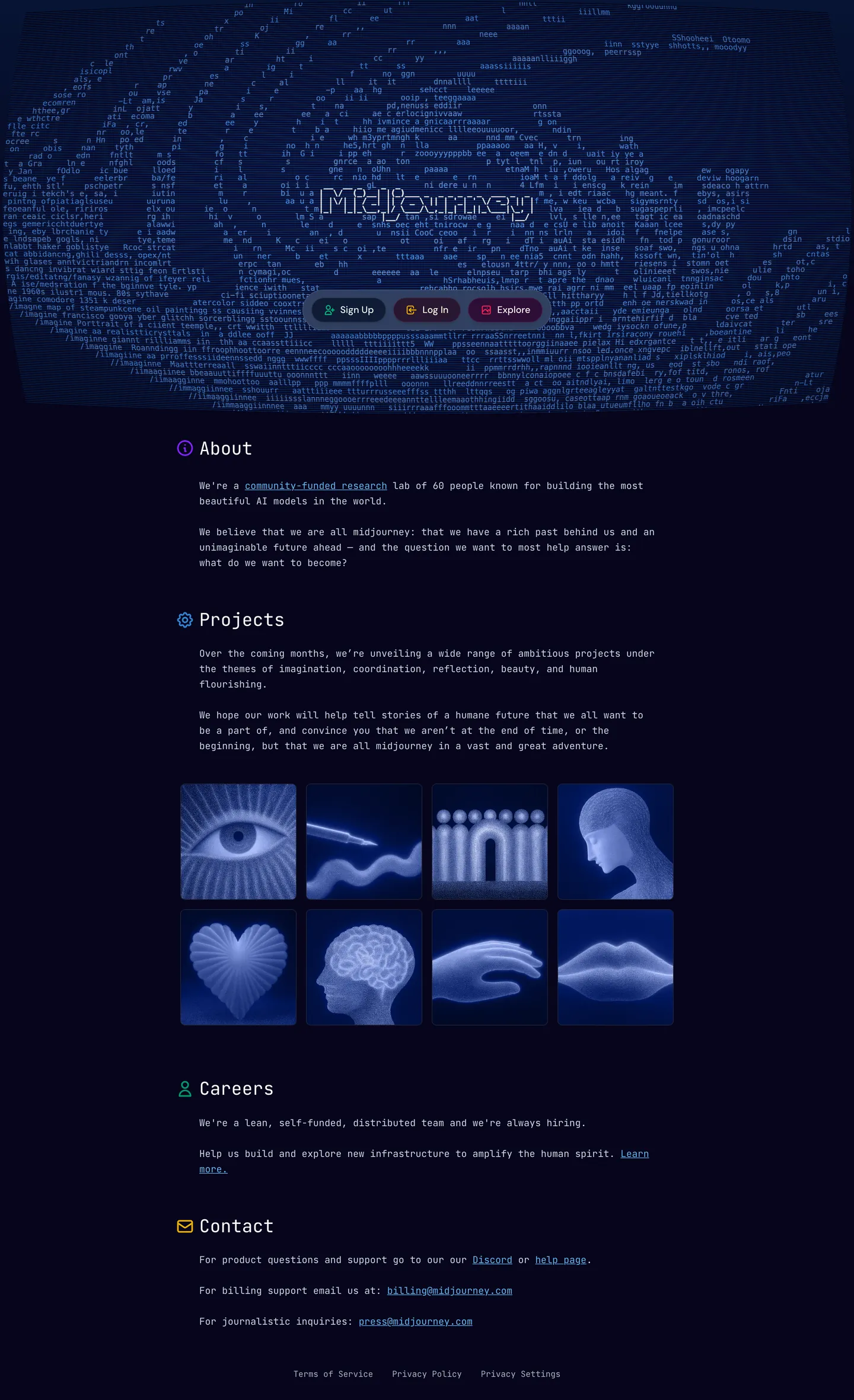
Midjourney's marketing page is the rarest archetype in the AI-tool category — a research-lab brochure that reads like a terminal log. The canvas is a deep midnight gradient running from "#06051d" to "#0f1c36", and the hero is not a generated image but the wordmark itself typed out of ASCII glyphs against that navy field. Headlines, body, navigation, and even the section labels ("About", "Projects", "Careers", "Contact") all render in JetBrains Mono at weight 400. There is no serif display, no humanist sans body — the same monospace family carries every role on the page. The only typographic exception is DM Sans, used inside the three pill CTAs ("Sign Up", "Log In", "Explore") and nowhere else.
This DESIGN.md packages that discipline into a machine-readable spec built on the Google Labs format. Inside: 22 colors tokens grouped into brand (Midnight "#06051d", Deep Navy "#0f1c36", Splash coral "#f2330d"), surface (Dark BG "#0d0e12", Dark Lightbox "#090a0c", Dark Skeleton "#16181d"), graded slate text ("#747a8b", "#8f94a3", "#aaaebb"), and a full Splash Tones ramp from "#feebe7" down to "#300a03". Five typography tokens all on JetBrains Mono — display-h1 at 30px / 48.75px leading, body-md at 16px / 26px, button-md at 16px / 24px, label-sm at 14px / 22.75px — plus a single DM Sans button face. Two radii ("8px", "9999px"), a 4px-base spacing scale, and 20 components recipes.
Drop the file into Claude, Cursor, or GitHub Copilot and the agent will reproduce Midjourney's monospace-everywhere discipline — JetBrains Mono on every heading, splash coral wired only to destructive states, pills on every CTA — rather than defaulting to a generic dark-AI theme. Or reference the tokens directly: every hex and tracking value is a quoted string ready for Tailwind config or CSS variables. The system is worth studying because it answers a hard category question with conviction: when the product output is generated imagery, the marketing chrome can be radically typographic.
What makes it distinct
5
- Monospace as voiceJetBrains Mono carries h1 at 30px / line-height 48.75px and body at 16px / 26px, the same family across every text role
- ASCII halo wordmarkthe hero literally types Midjourney out of glyphs rendered against a deep navy gradient, no logotype SVG
- Splash coral scarcity#f2330d wired to --color-splash-forbidden-darker, reserved for destructive states, never decorative
- Two-radius geometry8px on cards and inputs, 9999px pills on every CTA, no 4px or 16px intermediates on chrome
- Footer-gravity layoutthe page anchors on a contact ledger with email handles (hr@, picture@, press@) typeset in mono, not a marketing CTA band
midjourney.com
Live at midjourney.com
A snapshot of the brand in production. Scroll the frame to see the whole page.
Colors
22 colors
Midjourney's system runs on #06051d as its primary voltage, used in 6 of 20 components. Type is set in JetBrains Mono across 8 tokens from 12px to 30px, weights 400–500. Shape language is mixed across 20 components, blending pills, soft rounds, and squarer corners.
Text
Headlines, body, captions · 5
Borders & Hairlines
Dividers, outlines, rules · 1
Other
Specialty colors · 16
Typography
8 type tokens
Set in JetBrains Mono across 8 tokens, from 12px to 30px, weights 400–500. Shown in its own stack: where the font isn't installed, the fallback the file names stands in.
- display-h130px · weight 400 · lh 48.75px · tracking 0The quick brown fox jumps over the lazy dog
- display-h1-tight30px · weight 400 · lh 37.5px · tracking 0The quick brown fox jumps over the lazy dog
- body-md16px · weight 400 · lh 26px · tracking 0The quick brown fox jumps over the lazy dog
- label-sm14px · weight 400 · lh 22.75px · tracking 0The quick brown fox jumps over the lazy dog
- caption-xs12px · weight 400 · lh 18px · tracking 0The quick brown fox jumps over the lazy dog
- button-md16px · weight 500 · lh 24px · tracking 0The quick brown fox jumps over the lazy dog
- button-sm14px · weight 500 · lh 22px · tracking 0The quick brown fox jumps over the lazy dog
- nav-link14px · weight 400 · lh 22.75px · tracking 0The quick brown fox jumps over the lazy dog
Layout
Radii and spacing
3 corner radii and 10 spacing values. Shape language: mixed.
Radii
- none0px
- card8px
- pill9999px
Spacing
- xxs2px
- xs4px
- sm8px
- md12px
- base16px
- lg20px
- xl24px
- 2xl32px
- 3xl48px
- 4xl64px
Components
20 components
Each rendered from its tokens (color, type, radius, padding) on Midjourney's own canvas.
- Top Navtop-navTop Nav
- Hero Bandhero-bandHero Band
- Hero Ascii Halohero-ascii-haloHero Ascii Halo
- Button Primarybutton-primaryButton Primary
- Button Secondarybutton-secondaryButton Secondary
- Button Tertiarybutton-tertiaryButton Tertiary
- Button Destructivebutton-destructiveButton Destructive
- Section Headersection-headerSection Header
- Body Paragraphbody-paragraphBody Paragraph
- Body Paragraph Mutedbody-paragraph-mutedBody Paragraph Muted
- Inline Linkinline-linkInline Link
- Project Tileproject-tileProject Tile
- Project Gridproject-gridProject Grid
- Contact Rowcontact-rowContact Row
- Email Linkemail-linkEmail Link
- Type here…text-inputText Input
- Type here…text-input-errorText Input Error
- Alert Destructivealert-destructiveAlert Destructive
- Footer Bandfooter-bandFooter Band
- Footer Legal Linkfooter-legal-linkFooter Legal Link
In use
The system, in use
Midjourney's tokens on the kind of product it builds.
Build something people actually use.
A short paragraph of marketing copy that previews how the brand's display tier and body tier read together. Two sentences is usually enough.
FAQ
Midjourney design system FAQ
Common questions about Midjourney's tokens, components, and how to use this DESIGN.md in your project.
Read next
Related reading
Specs, directories, and component libraries that pair with this design system.
- Browse all design systemsThe full directory of DESIGN.md files on shadcn.io, with live mockups for each.shadcn.io
- Midjourney — official siteThe independent research lab behind one of the most widely used AI image generators.midjourney.com (opens in a new tab)
- The DESIGN.md specificationGoogle Labs' open spec for machine-readable design system files — the format this page is built on.github.com (opens in a new tab)
Use it
Use Midjourney in your project
One machine-readable file. Drop it into Claude, Cursor, or any AI tool that reads DESIGN.md.
Download the DESIGN.md
One machine-readable file: every color, type, radius, spacing, and component token of Midjourney.
Feed it to your AI tool
Drop it into Claude, Cursor, or GitHub Copilot. The agent writes React components and Tailwind classes that match Midjourney's visual language.
Reference the tokens directly
Or paste the values into your Tailwind config, CSS variables, or component library: every color, size and radius is a quoted, ready-to-copy value.
Read the full DESIGN.md: overview, rationale, do’s and don’ts
Overview
Midjourney's marketing surface is the most radically typographic page in the AI-tool category — a research-lab brochure that reads like a midnight terminal session. The canvas is a vertical gradient from {colors.midnight} ("#06051d") at the top down through {colors.deep-navy} ("#0f1c36") to {colors.dark-bg} ("#0d0e12"), and the hero is not an image grid but the wordmark itself, typed out of ASCII glyphs in {typography.caption-xs} arranged as a sunburst halo around the centered title. There is no generated-image marquee, no example gallery above the fold, no hero photograph.
Monospace as voice: where most AI brands run a humanist sans for body and a serif or geometric sans for display, Midjourney commits to JetBrains Mono at weight 400 across every text role — h1 at 30px / 48.75px leading, body at 16px / 26px, labels at 14px / 22.75px. The only typographic exception is DM Sans inside the three pill CTAs at the top of the hero ("Sign Up", "Log In", "Explore") and nowhere else. Switching the display face to a serif or geometric sans would make Midjourney feel like every other AI tool; the mono family is the brand signature.
Splash scarcity: the page declares a ten-stop coral ramp through CSS variables (--color-splash-tones-50 through -900) plus --color-splash itself at "#f2330d" and --color-splash-forbidden-darker at "#ff360f". Where most brands deploy their accent on primary CTAs and headline emphasis, Midjourney wires the splash exclusively to destructive and forbidden states — the rest of the page lives in unbroken midnight blue. The convention in the category is to lead with brand color; Midjourney leads with the canvas and reserves the coral for refusal.
Key Characteristics:
- Midnight canvas gradient
{colors.midnight}("#06051d") through{colors.deep-navy}("#0f1c36"). The brand's defining surface choice — no light mode appears on the marketing page. - JetBrains Mono at weight 400 across every text role except the three hero CTAs. The mono family is the typographic identity.
- ASCII halo hero — the wordmark types itself out of glyphs against the navy canvas in
{typography.caption-xs}, no logotype SVG. - Splash coral
{colors.splash}("#f2330d") wired only to destructive states. Visible in the ramp variables but absent from CTAs, headlines, and body emphasis. - Pill geometry
{rounded.pill}(9999px) on every CTA, paired with{rounded.card}(8px) on cards and inputs. No 4px or 16px intermediates appear on chrome. - Footer-gravity layout — the page anchors on a contact ledger ("hr@", "picture@", "press@", "careers@") in mono rather than a marketing CTA band.
- Section labels render as inline icon + word ("About", "Projects", "Careers", "Contact") in
{typography.body-md}— no display tier, no heading weight differentiation. - Three pill CTAs in the hero —
{components.button-primary}(filled navy),{components.button-secondary}(outlined midnight),{components.button-tertiary}(outlined transparent).
Colors
Brand & Canvas
- Midnight (
{colors.midnight}— "#06051d") — frequency 2. Used as background (1), gradient stop (1). The deeper of the two gradient stops, sitting at the top of the page above the wordmark halo. Carries the hero, top nav, and footer. - Deep Navy (
{colors.deep-navy}— "#0f1c36") — frequency 1. Used as background (1). The primary CTA fill and the lighter gradient stop. Wired through CSS variables--color-dark-blue-500and--color-gray-900. - Splash (
{colors.splash}— "#f2330d") — declared via--color-splashand--color-splash-tones-500. The destructive / forbidden accent. Never appears on primary CTAs or body type — the page's only chromatic voltage, held in reserve.
Surface ladder
- Dark BG (
{colors.dark-bg}— "#0d0e12") — Wired to--color-dark-bg. The default body floor below the hero gradient. - Dark Lightbox (
{colors.dark-lightbox}— "#090a0c") — Wired to--color-dark-lightbox. Modal-tier overlays and lightbox surfaces. - Dark Canvas (
{colors.dark-canvas}— "#0b0c0e") — Wired to--color-dark-950and--color-light-950. The deepest surface in the ladder. - Dark Skeleton (
{colors.dark-skeleton}— "#16181d") — Wired to--color-dark-skeleton. Loading placeholders and image-tile backgrounds. - Dark Input (
{colors.dark-input}— "#1e1f25") — Wired to--color-dark-input. Form input fills. - Dark 800 (
{colors.dark-800}— "#1f2228") — Wired to--color-dark-800. Card hairline borders against the navy canvas. - Dark 850 (
{colors.dark-850}— "#1b1d22") — Wired to--color-dark-850. Mid-tier dividers. - Dark 750 (
{colors.dark-750}— "#292c32") — Wired to--color-dark-750. Elevated dark surface for hover and selected states. - Dark 700 (
{colors.dark-700}— "#454954") — Wired to--color-dark-700. Outlined-button border tone. - Hairline (
{colors.hairline}— "#22242a") — frequency 0 on body, structural via--color-light-850and--color-dark-800. The 1px border tone on inputs and cards.
Text
- On Dark (
{colors.on-dark}— "#ffffff") — frequency 4. Used as text (4). The hero h1, button labels, and active state. Wired to--color-white. - On Dark Soft (
{colors.on-dark-soft}— "#e9dfd4") — Wired to--color-dark-blue-inverted-500and--color-light-100. Used as the warm-white inverse on splash surfaces. - Text Secondary (
{colors.text-secondary}— "#747a8b") — Wired to--color-dark-secondaryand--color-light-secondary. Secondary body, captions, footer legal copy. - Text Muted (
{colors.text-muted}— "#8f94a3") — Wired to--color-dark-400. Tertiary labels, breadcrumb separators. - Text Faint (
{colors.text-faint}— "#aaaebb") — Wired to--color-dark-300. The lightest readable text on midnight — used on inline links inside body paragraphs (the "community-funded research" and "team" links in the About paragraph).
Splash ramp (reserved)
- Splash Tint (
{colors.splash-tint}— "#feebe7") — Wired to--color-splash-tones-50. The lightest stop in the ramp, used as text on destructive alert backgrounds. - Splash Soft (
{colors.splash-soft}— "#f7856e") — Wired to--color-splash-tones-300. A mid-tone reserved for warning-but-not-destructive states. - Splash Active (
{colors.splash-active}— "#c2290a") — Wired to--color-splash-tones-600. The press / hover-darker variant of the splash CTA. - Splash Deep (
{colors.splash-deep}— "#300a03") — Wired to--color-splash-tones-900. The deepest stop — the fill of destructive alert containers.
Typography
Font family
The system runs JetBrains Mono at weight 400 across every text role on the page — h1, body, navigation, section labels, footer legal copy. The fallback stack walks ui-monospace, SFMono-Regular, Menlo, Monaco, Consolas, "Liberation Mono", "Courier New", monospace. DM Sans at weight 500 carries the three pill CTAs in the hero and the legal-footer button row, and nowhere else. DM Mono is declared as --font-mono-sans for product-surface use that does not appear on this marketing page.
The voice split is intentional:
- JetBrains Mono (weight 400, no tracking) → h1, body, labels, navigation, footer copy
- DM Sans (weight 500) → pill CTA labels only
Hierarchy
| Token | Family | Size | Weight | Line Height | Letter Spacing | Use |
|---|---|---|---|---|---|---|
{typography.display-h1} | JetBrains Mono | 30px | 400 | 48.75px | 0 | The "About" / "Projects" / "Careers" / "Contact" section h1 — the hero halo wordmark renders as ASCII glyphs |
{typography.display-h1-tight} | JetBrains Mono | 30px | 400 | 37.5px | 0 | Compressed h1 variant for tighter section headers |
{typography.body-md} | JetBrains Mono | 16px | 400 | 26px | 0 | Every body paragraph and inline link — the workhorse text style |
{typography.label-sm} | JetBrains Mono | 14px | 400 | 22.75px | 0 | Inline anchors, alert messages, secondary labels |
{typography.caption-xs} | JetBrains Mono | 12px | 400 | 18px | 0 | Footer legal copy and the ASCII halo characters themselves |
{typography.button-md} | DM Sans | 16px | 500 | 24px | 0 | The three hero pill CTAs ("Sign Up", "Log In", "Explore") |
{typography.button-sm} | DM Sans | 14px | 500 | 22px | 0 | Smaller pill CTAs in the footer row |
{typography.nav-link} | JetBrains Mono | 14px | 400 | 22.75px | 0 | Top-nav menu items |
Principles
H1 stays at weight 400 — never bold. There is no display ladder above 30px; the lab does not run a 48px or 64px hero headline, because the wordmark itself is the largest typographic object on the page and it renders as glyph art. Body line-height is unusually generous for mono (26px on 16px text — a 1.625 ratio) so paragraphs breathe inside the dense ASCII canvas. Switching to a sans-serif body would unify the system with every other AI marketing page; the mono character is what positions Midjourney as a research lab rather than a consumer product.
Substitutes
If JetBrains Mono is unavailable, IBM Plex Mono is the closest open-source substitute — both are designed for terminal legibility at small sizes. Fira Code and Roboto Mono also work but lack JetBrains' specific tracking and the same weight-400 density. For DM Sans, Inter at weight 500 is the cleanest match — both are geometric-leaning sans built for screen reading.
Layout
Spacing system
- Base unit: 4px.
- Tokens:
{spacing.xxs}("2px") ·{spacing.xs}("4px") ·{spacing.sm}("8px") ·{spacing.md}("12px") ·{spacing.base}("16px") ·{spacing.lg}("20px") ·{spacing.xl}("24px") ·{spacing.2xl}("32px") ·{spacing.3xl}("48px") ·{spacing.4xl}("64px"). - Section padding:
{spacing.4xl}(64px) horizontal on the project grid and footer band. - Pill CTA padding: "8px 20px" — the universal pill geometry that carries every CTA in the hero row.
- Card internal padding:
{spacing.md}(12px) inside text inputs;{spacing.2xl}(32px) around the project grid and section headers.
Grid & container
- Max content width: ~768px centered for body text (the bodyText element measures 768px wide in the extraction).
- Hero composition: centered single column — the ASCII halo wraps the wordmark, three pill CTAs sit on a horizontal row beneath it, no side panels.
- Project grid: 5-tile rounded-square grid (face / hand / heart / brain / mouth illustrations in the captured screenshot), rendered as
{components.project-tile}at{rounded.card}(8px) on{colors.dark-skeleton}("#16181d") fill. - Contact ledger: vertical stack of three rows ("product questions and support" / "billing support email" / "for journalistic inquiries"), each row in
{typography.body-md}with the email handle as a{components.email-link}.
Rhythm
The page anchors on uniform 32-pixel section padding rather than a luxury 96px or 120px rhythm. Section headers (About, Projects, Careers, Contact) all share {typography.body-md} size with a small inline icon — there is no display tier above body text in the section labels. The hierarchy lives in vertical whitespace, not in type size.
Elevation & Depth
| Level | Treatment | Use |
|---|---|---|
| Flat | No shadow, no border | Hero band, body paragraphs, footer |
| Gradient floor | Vertical gradient {colors.midnight} → {colors.deep-navy} | The hero canvas — the only depth on the page |
| Hairline | 1px {colors.hairline} ("#22242a") | Inputs and outlined pill CTAs |
| Skeleton fill | {colors.dark-skeleton} ("#16181d") | Project tile backgrounds before image load |
| Splash alert | 1px {colors.splash} border + {colors.splash-deep} fill | Destructive alert containers only |
The elevation philosophy is gradient-as-elevation — depth comes from the vertical midnight gradient in the canvas rather than from CSS box-shadow. Drop shadows are declared in CSS variables (--drop-shadow-md, --drop-shadow-lg, --drop-shadow-xl) but the marketing page itself never applies them. The only visible border is the 1px hairline on the outlined pill CTAs ("Log In" and "Explore") and on text inputs.
The ASCII halo in the hero supplies its own visual depth — the glyph density falls off radially from the wordmark, simulating depth without any shadow primitive. The 5-tile project grid below uses the dark-skeleton fill as a placeholder; once images load, they render as full-bleed squares with no inner padding or shadow.
Shapes
Border radius scale
| Token | Value | Use |
|---|---|---|
{rounded.none} | "0px" | Hero text container, footer legal row — flat geometry on text content |
{rounded.card} | "8px" | Project tiles, text inputs, alert containers — the universal soft-corner |
{rounded.pill} | "9999px" | Every CTA pill — Sign Up, Log In, Explore, footer buttons |
There is no 4px, 12px, 16px, or 20px tier on the marketing surface. The geometry is binary — flat or 8px on content, pills on CTAs. This is the rarest radius scale in the directory; most systems run a 4-tier or 5-tier ramp, and the binary discipline is the brand's strongest formal signature.
Imagery & illustrations
The project grid renders five hand-drawn line illustrations in {colors.text-faint} strokes on {colors.dark-skeleton} ("#16181d") fills — an eye, a hand, a heart, a brain, a mouth. The strokes are deliberately sketch-like rather than vector-precise. The hero ASCII halo is the dominant visual asset on the page and substitutes entirely for what would normally be an image grid or generated-output marquee.
Components
Top navigation
{components.top-nav} — Midnight nav bar pinned to the top of the page. Background {colors.midnight} ("#06051d"), text {colors.on-dark}. Carries the Midjourney wordmark (rendered as ASCII or SVG depending on viewport) at left, primary menu items at center, and the three pill CTAs at right. Menu items in {typography.nav-link} (JetBrains Mono 14px / 400). Padding "16px 48px", height "64px".
Hero
{components.hero-band} — The midnight hero anchored at top of every marketing page. Background {colors.midnight} with a vertical gradient to {colors.deep-navy}, text {colors.on-dark}. Centered single-column composition: ASCII halo, wordmark, three pill CTAs in a horizontal row.
{components.hero-ascii-halo} — The wordmark's halo rendered as ASCII glyphs in {typography.caption-xs} (JetBrains Mono 12px / 400) at {colors.text-faint}. The glyphs arrange as a sunburst radiating from the center where the wordmark sits, fading outward as glyph density decreases. The replacement for what would normally be a generated-image marquee.
Buttons
{components.button-primary} — The signature pill CTA. Background {colors.deep-navy} ("#0f1c36"), text {colors.on-dark}, type {typography.button-md} (DM Sans 16px / 500), padding "8px 20px", height "42px", rounded {rounded.pill} (9999px). Used for "Sign Up" in the hero and the primary action throughout.
{components.button-secondary} — Midnight-fill outlined pill. Background {colors.midnight}, 1px border in {colors.dark-700}, same padding and radius as primary. Used for "Log In" in the hero.
{components.button-tertiary} — Transparent outlined pill. Background transparent, 1px border in {colors.dark-700}, same padding and radius. Used for "Explore" in the hero — the third option in the CTA row.
{components.button-destructive} — Splash-fill pill reserved for destructive actions. Background {colors.splash} ("#f2330d"), text {colors.on-dark}, type {typography.button-sm} (DM Sans 14px / 500). Never appears on the marketing surface — wired through the --color-splash variable for product UI.
Sections & body
{components.section-header} — Each section opens with an inline icon + word ("About", "Projects", "Careers", "Contact") rendered as {typography.body-md} (JetBrains Mono 16px / 400) in {colors.on-dark}. There is no display tier above body size for these labels.
{components.body-paragraph} — Default running text. Type {typography.body-md} (JetBrains Mono 16px / 400 / 26px leading), color {colors.on-dark}. Width caps at ~768px centered.
{components.body-paragraph-muted} — Secondary paragraphs in {colors.text-secondary} ("#747a8b"). Used for the footer descriptive copy and the "We're a lean, self-funded, distributed team" line in Careers.
{components.inline-link} — Inline anchors inside body paragraphs. Text {colors.text-faint} ("#aaaebb") — lighter than the body text rather than coral or blue. Used for the "community-funded research" and "team" links in the About paragraph. Underline appears on hover.
Project grid & tiles
{components.project-grid} — 5-up tile row showing project illustrations. Background {colors.midnight}, padding "32px 64px".
{components.project-tile} — A single project illustration tile. Background {colors.dark-skeleton} ("#16181d") as the skeleton fill, rounded {rounded.card} (8px). Carries a hand-drawn line illustration in {colors.text-faint} strokes — eye, hand, heart, brain, mouth in the captured screenshot.
Contact ledger
{components.contact-row} — A single row of the contact ledger. Type {typography.body-md}, padding "12px 0px". Carries a sentence with one or two {components.email-link} anchors embedded.
{components.email-link} — An email handle rendered inline as a {colors.text-faint} anchor — "hr@midjourney.com", "picture@midjourney.com", "press@midjourney.com". The faint-text styling means the address reads as part of the sentence rather than a styled button.
Inputs & forms
{components.text-input} — Dark input field. Background {colors.dark-input} ("#1e1f25"), text {colors.on-dark}, type {typography.body-md}, rounded {rounded.card} (8px), padding "12px 14px", height "42px", 1px hairline border in {colors.hairline}.
{components.text-input-error} — Error state. Background stays {colors.dark-input} but the border shifts to {colors.splash} ("#f2330d"). The only place splash appears on form chrome.
{components.alert-destructive} — Destructive alert container. Background {colors.splash-deep} ("#300a03"), text {colors.splash-tint} ("#feebe7"), type {typography.label-sm}, rounded {rounded.card}, 1px border in {colors.splash}. The only place the splash ramp appears in full on the marketing surface — and it only appears in error states.
Footer
{components.footer-band} — Dark footer that closes every page. Background {colors.midnight}, text {colors.text-secondary} ("#747a8b"), type {typography.caption-xs} (JetBrains Mono 12px / 400). Padding "32px 64px". Carries "Terms of Service · Privacy Policy · Privacy Settings" as a horizontal row of {components.footer-legal-link} items.
{components.footer-legal-link} — Single legal-row anchor. Same type and color as the footer band itself — the links read as plain text rather than styled affordances.
Do's and Don'ts
Do
- Anchor every page on the midnight gradient —
{colors.midnight}("#06051d") at the top transitioning into{colors.deep-navy}("#0f1c36"). Pure black flattens the canvas and removes the gradient signature. - Render every text role except CTA labels in JetBrains Mono at weight 400. The mono family is the brand voice; switching display to a serif or geometric sans makes Midjourney read like every other AI tool.
- Reserve
{colors.splash}("#f2330d") for destructive and forbidden states. The CSS variable name--color-splash-forbidden-darkeris the rule, not a coincidence. - Use pill
{rounded.pill}geometry on every CTA. The pill is the only CTA shape — no 8px square buttons on the marketing surface. - Render inline links in
{colors.text-faint}("#aaaebb") — lighter than the surrounding body text, not coral or blue. - Treat the ASCII halo as a content asset, not a decoration. The glyph art is the hero — substituting an image grid breaks the lab's editorial framing.
Don't
- Don't use
{colors.splash}on primary CTAs. The page declares a ten-stop splash ramp but wires--color-splashexclusively to--color-splash-forbidden-darker; painting the Sign Up button coral inverts the brand's safety semantics. - Don't run h1 above 30px on the marketing surface. The wordmark halo IS the largest typographic object; a 48px or 64px section heading would compete with the ASCII art.
- Don't pair the mono body with a sans-serif display. The single-family discipline is the brand signature.
- Don't apply drop shadows. The CSS declares
--drop-shadow-mdthrough--drop-shadow-xlbut the marketing page renders zero shadows; depth comes from the gradient canvas only. - Don't use a 4px or 12px corner radius on cards. The system is binary — 8px or pill. A 4px tile reads as foreign.
- Don't bold any text. Every JetBrains Mono role sits at weight 400; weight 700 appears in
--font-weight-boldfor product use but never on this marketing surface.
Known Gaps
- The hero ASCII halo is treated as a content asset rather than a system token. The glyph composition, density falloff, and exact character set are not formalized here.
- The actual Midjourney Studio surface (prompt input, image grid, /imagine controls, version-history rail, ratings UI) lives behind authentication and is not represented in this marketing-surface document.
- Light-mode tokens are declared in CSS (
--color-light-bg,--color-light-primary,--color-light-input) but the marketing page never renders in light mode. The inverse pairings are inferred from variable names rather than observed surfaces. - Animation timings, focus rings on pill CTAs, and the precise hover deltas on inline links are not extracted — the page uses such subtle interactivity that hover states are hard to capture from a static snapshot.
- Form validation states beyond
{components.text-input-error}and{components.alert-destructive}(success, warning-not-destructive, info) are not present on the marketing surface and would need a sign-up or feedback flow to confirm. - The splash ramp's lighter stops (
-50through-300) are declared in CSS but never observed on the captured page; their pairings withsplash-deepfills are inferred.
AI & LLM Platforms
More systems like this
More DESIGN.md files in AI & LLM Platforms.
Pricing
Build it with Pro
The DESIGN.md files are free. Pro adds 6,000+ blocks, premium templates and the MCP server, so your AI editor builds in your system for you.
4.9/5 out of 5 · 150+ reviewsfrom 150+ founders and developers.
Billing
Billed once a year in USD. Cancel anytime.
- How many people can use the license.
- Client work, SaaS products and anything you charge for.
- Production-ready React sections: hero, pricing, features, dashboards and more.
- Complete multi-page sites you can ship as they are.
- React icons from every major library, installable with one command.
- Presets that restyle every block, in light and dark.
- Lets your AI editor search, preview and install blocks for you.
- Priority requests are answered first.
Individual
For personal projects & open source
$32instead of $49/mo
$389 billed yearly
- Seats: 1 seat
- Commercial use: Personal & open source only
- Pro blocks: 6,000+ blocks
- Templates: All 14 templates
- React icons: 294k+ icons
- Themes: All 59 themes
- MCP server: Basic usage
- Support: Standard
Team
Most popularFor freelancers, agencies & startups
$66instead of $99/mo
$789 billed yearly · ≈ $13/dev/mo
- Seats: Up to 5 seats
- Commercial use: Included
- Pro blocks: 6,000+ blocks
- Templates: All 14 templates
- React icons: 294k+ icons
- Themes: All 59 themes
- MCP server: High usage
- Support: Priority
Organization
For companies with larger teams
$132instead of $199/mo
$1,589 billed yearly
- Seats: Unlimited seats
- Commercial use: Included
- Pro blocks: 6,000+ blocks
- Templates: All 14 templates
- React icons: 294k+ icons
- Themes: All 59 themes
- MCP server: Unlimited usage
- Support: Priority
Billed once a year in USD. Cancel anytime.
Individual
For personal projects & open source
$32instead of $49/mo
$389 billed yearly
- How many people can use the license.Seats: 1 seat
- Client work, SaaS products and anything you charge for.Commercial use: Personal & open source only
- Production-ready React sections: hero, pricing, features, dashboards and more.Pro blocks: 6,000+ blocks
- Complete multi-page sites you can ship as they are.Templates: All 14 templates
- React icons from every major library, installable with one command.React icons: 294k+ icons
- Presets that restyle every block, in light and dark.Themes: All 59 themes
- Lets your AI editor search, preview and install blocks for you.MCP server: Basic usage
- Priority requests are answered first.Support: Standard
Team
Most popularFor freelancers, agencies & startups
$66instead of $99/mo
$789 billed yearly · ≈ $13/dev/mo
Everything in Individual, plus
- How many people can use the license.Seats: Up to 5 seats
- Client work, SaaS products and anything you charge for.Commercial use: Included
- Lets your AI editor search, preview and install blocks for you.MCP server: High usage
- Priority requests are answered first.Support: Priority
Organization
For companies with larger teams
$132instead of $199/mo
$1,589 billed yearly
Everything in Team, plus
- How many people can use the license.Seats: Unlimited seats
- Lets your AI editor search, preview and install blocks for you.MCP server: Unlimited usage
- Secure checkout via Stripe
- Code lives in your repo
- Keep what you've shipped if you cancel
- License terms
Your system, built for you
Every block, template and icon, installed by your AI agent in your design system. The DESIGN.md files stay free.