Meta Design System
Meta's hardware commerce design system as a DESIGN.md file. Cobalt #0064e0, Optimistic VF, 27 colors, 38 components. For React, Next.js, and AI tools.
Add shadcn.io to your AI agent. · Pro It installs blocks, icons and templates in your design system from a prompt, with Pro.
Set up MCP- Primary
- #0064e0
- Typeface
- Optimistic VF
- Shape
- Soft
- Base radius
- 6px
- Colors
- 27
- Type tokens
- 15
- Components
- 38
- Spacing values
- 13
About
About Meta DESIGN.md
Curated by Dov Azencot · Updated May 12, 2026 · Source about.meta.com (opens in a new tab)
Meta's design system reads like a hardware merchandiser that learned restraint. Across meta.com, the Quest 3S configurator, the Ray-Ban Meta product detail page, and the prescription-lens upsell, the same playbook holds: a stark white canvas, full-bleed product photography on 32px-rounded cards, and a confident Optimistic VF wordmark anchoring every heading. The brand voice is photography-first — large images take 50 to 70 percent of the viewport height above the fold, and the type tucks underneath at modest weights rather than fighting for attention.
This DESIGN.md captures the spec across 27 colors tokens, 16 typography styles, 10 corner radii, 13 spacing values, and 38 components — every primary surface from `button-buy-cta` to `tech-specs-table`. The most distinctive token is the dual-primary system: a black pill (`#000000`) for marketing CTAs that flips to saturated cobalt (`#0064e0`) the moment the user enters the buy-now flow. The file follows the Google Labs DESIGN.md format, so every value is machine-readable and references the same token names Meta's own engineering teams would use.
Feed this file to Claude, Cursor, or GitHub Copilot and the agent produces React components that look like a Meta commerce surface rather than a generic e-commerce theme. The pill buttons stay at `rounded.full` (100px), the photographic feature cards skip the border-and-shadow chrome, and the 300-weight editorial subheads slot in between the 500-weight displays. The discipline worth studying here is the cobalt-versus-black split — Meta uses color scarcity as a navigational signal, telling the user exactly which surface they're standing on without saying a word.
What makes it distinct
5
- Two-tier primary button systemblack ink pills on marketing, cobalt #0064e0 pills exclusively inside buy-now flows
- Optimistic VF anchors the entire scale64px hero down to 12px caption, with ss01 and ss02 stylistic sets always paired
- Pill-shaped buttons at 100px radius and 32px card rounding form the dominant geometric signature across all surfaces
- Photographic feature cards run zero chromeno border, no shadow; the product imagery itself is the surface treatment
- Editorial subheads at 28px / 300 create a three-tier rhythm against 500-weight displays and 400-weight body copy
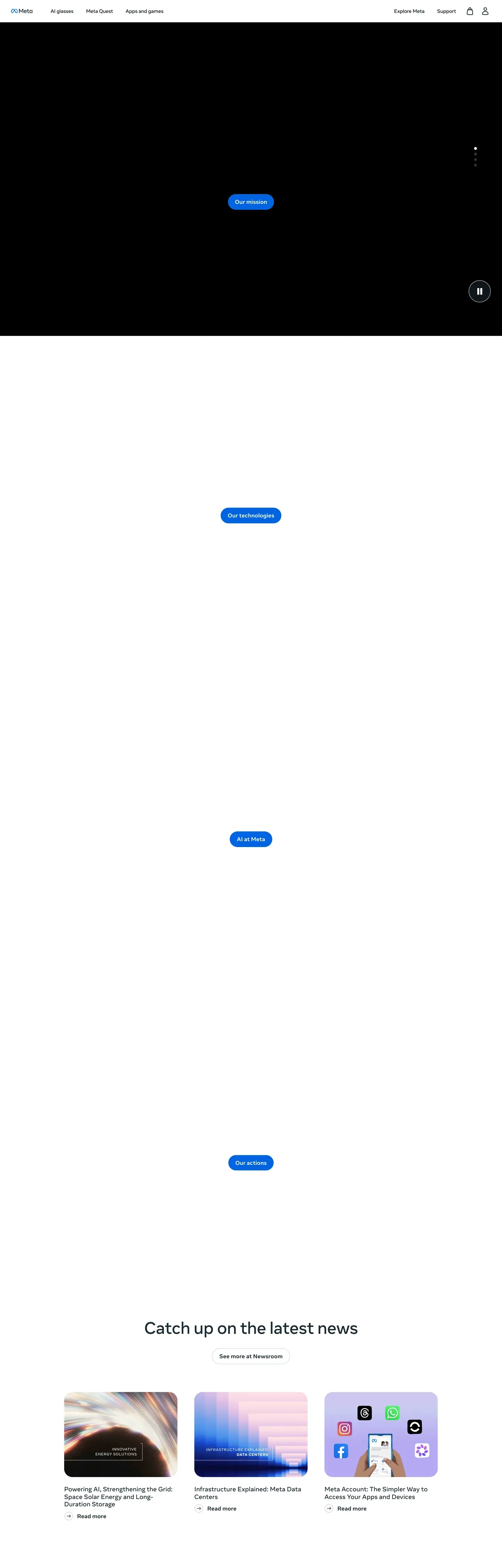
about.meta.com
Live at about.meta.com
A snapshot of the brand in production. Scroll the frame to see the whole page.
Colors
27 colors
Meta's system runs on #0064e0 as its primary voltage, used in 1 of 38 components. Type is set in Optimistic VF across 15 tokens from 12px to 64px, weights 300–700. Shape language is soft — components average 48px corner radius, with no sharp interactive edges.
Brand & Accent
Sparing, CTA-only voltage · 3
Surface
Page and card backgrounds · 2
Text
Headlines, body, captions · 7
Borders & Hairlines
Dividers, outlines, rules · 2
Semantic
Status, errors, success, links · 4
Other
Specialty colors · 9
Typography
15 type tokens
Set in Optimistic VF across 15 tokens, from 12px to 64px, weights 300–700. Shown in its own stack: where the font isn't installed, the fallback the file names stands in.
- hero-display64px · weight 500 · lh 1.16The quick brown fox jumps over the lazy dog
- display-lg48px · weight 500 · lh 1.17The quick brown fox jumps over the lazy dog
- heading-lg36px · weight 500 · lh 1.28The quick brown fox jumps over the lazy dog
- heading-md28px · weight 300 · lh 1.21The quick brown fox jumps over the lazy dog
- heading-sm24px · weight 500 · lh 1.25The quick brown fox jumps over the lazy dog
- subtitle-lg18px · weight 700 · lh 1.44The quick brown fox jumps over the lazy dog
- subtitle-md18px · weight 400 · lh 1.44The quick brown fox jumps over the lazy dog
- body-md-bold16px · weight 700 · lh 1.5 · tracking -0.16pxThe quick brown fox jumps over the lazy dog
- body-md16px · weight 400 · lh 1.5 · tracking -0.16pxThe quick brown fox jumps over the lazy dog
- body-sm-bold14px · weight 700 · lh 1.43 · tracking -0.14pxThe quick brown fox jumps over the lazy dog
- body-sm14px · weight 400 · lh 1.43 · tracking -0.14pxThe quick brown fox jumps over the lazy dog
- caption-bold12px · weight 700 · lh 1.33The quick brown fox jumps over the lazy dog
- caption12px · weight 400 · lh 1.33The quick brown fox jumps over the lazy dog
- button-md14px · weight 700 · lh 1.43 · tracking -0.14pxThe quick brown fox jumps over the lazy dog
- link-md16px · weight 700 · lh 1.5 · tracking -0.16pxThe quick brown fox jumps over the lazy dog
Layout
Radii and spacing
10 corner radii and 13 spacing values. Shape language: soft.
Radii
- xs2px
- sm4px
- md6px
- lg8px
- xl16px
- xxl24px
- xxxl32px
- feature40px
- full100px
- circle9999px
Spacing
- xxs4px
- xs8px
- sm10px
- md12px
- base16px
- lg20px
- xl24px
- xxl32px
- xxxl40px
- section-sm48px
- section64px
- section-lg80px
- hero120px
Components
38 components
Each rendered from its tokens (color, type, radius, padding) on Meta's own canvas.
- Button Primarybutton-primaryButton Primary
- Button Primary Pressedbutton-primary-pressedButton Primary Pressed
- Button Primary Disabledbutton-primary-disabledButton Primary Disabled
- Button Buy Ctabutton-buy-ctaButton Buy Cta
- Button Buy Cta Pressedbutton-buy-cta-pressedButton Buy Cta Pressed
- Button Secondarybutton-secondaryButton Secondary
- Button Ghostbutton-ghostButton Ghost
- Button Pill Tabbutton-pill-tabButton Pill Tab
- Button Pill Tab Activebutton-pill-tab-activeButton Pill Tab Active
- button-icon-circularButton Icon Circular
- Card Product Featurecard-product-featureCard Product Feature
- Card Feature Photocard-feature-photoCard Feature Photo
- Card Promo Stripcard-promo-stripCard Promo Strip
- Card Icon Featurecard-icon-featureCard Icon Feature
- Card Checkout Summarycard-checkout-summaryCard Checkout Summary
- Product Thumbnailproduct-thumbnailProduct Thumbnail
- Type here…text-inputText Input
- Type here…text-input-focusedText Input Focused
- Type here…text-input-errorText Input Error
- Search Pillsearch-pillSearch Pill
- Radio Optionradio-optionRadio Option
- Radio Option Selectedradio-option-selectedRadio Option Selected
- Color Swatch Circlecolor-swatch-circleColor Swatch Circle
- Badge Promo Yellowbadge-promo-yellowBadge Promo Yellow
- Badge Attentionbadge-attentionBadge Attention
- Badge Successbadge-successBadge Success
- Badge Criticalbadge-criticalBadge Critical
- Promo Bannerpromo-bannerPromo Banner
- Faq Accordion Itemfaq-accordion-itemFaq Accordion Item
- Why Buy Tilewhy-buy-tileWhy Buy Tile
- Warranty Cardwarranty-cardWarranty Card
- Footer Regionfooter-regionFooter Region
- Hero Band Marketinghero-band-marketingHero Band Marketing
- Product Gallery Pdpproduct-gallery-pdpProduct Gallery Pdp
- Color Sku Picker Rowcolor-sku-picker-rowColor Sku Picker Row
- Feature Icon Rowfeature-icon-rowFeature Icon Row
- Tech Specs Tabletech-specs-tableTech Specs Table
- Testimonial Customer Cardtestimonial-customer-cardTestimonial Customer Card
In use
The system, in use
Meta's tokens on the kind of product it builds.
Build something people actually use.
A short paragraph of marketing copy that previews how the brand's display tier and body tier read together. Two sentences is usually enough.
FAQ
Meta design system FAQ
Common questions about Meta's tokens, components, and how to use this DESIGN.md in your project.
Read next
Related reading
Specs, directories, and component libraries that pair with this design system.
- Browse all design systemsThe full directory of DESIGN.md files on shadcn.io, with live mockups for each.shadcn.io
- Meta DesignMeta's official design portal, covering brand, product, and the Optimistic typeface.design.meta.com (opens in a new tab)
- The DESIGN.md specificationGoogle Labs' open spec for machine-readable design system files — the format this page is built on.github.com (opens in a new tab)
Use it
Use Meta in your project
One machine-readable file. Drop it into Claude, Cursor, or any AI tool that reads DESIGN.md.
Download the DESIGN.md
One machine-readable file: every color, type, radius, spacing, and component token of Meta.
Feed it to your AI tool
Drop it into Claude, Cursor, or GitHub Copilot. The agent writes React components and Tailwind classes that match Meta's visual language.
Reference the tokens directly
Or paste the values into your Tailwind config, CSS variables, or component library: every color, size and radius is a quoted, ready-to-copy value.
Read the full DESIGN.md: overview, rationale, do’s and don’ts
Overview
Meta's commerce surfaces (homepage, Quest configurator, Ray-Ban product detail, prescription page) read as a confident hardware merchandiser. The brand voice is photography-first: large, full-bleed product imagery dominates above-the-fold real estate, with white space and tight typographic hierarchy carrying the rest. The system has a recognizable dual-CTA pattern — a black pill-shaped primary on marketing surfaces shifting to a saturated cobalt blue ("#0064e0") inside the buy-now flows, paired with an outlined ghost button for secondary navigation.
Optimistic VF — Meta's variable display face — anchors the entire system, ranging from a 64px hero display down to a 12px caption. The face's ss01 and ss02 stylistic sets are switched on across every heading role, contributing to the brand's slightly humanist, friendly geometric character. Below 768px the system collapses cleanly: hero stacks, pill nav becomes a hamburger, three-up feature grids flatten to a single column, and product configurators drop their right-rail summary into a sticky bottom bar.
Key Characteristics:
- Stark white canvas ("#ffffff") carrying full-bleed product photography with 32px corner softening on showcase tiles
- Two-tier primary button system: marketing CTAs use ink black ("#000000") pills; commerce CTAs use cobalt ("#0064e0") pills inside buy-now panels
- Optimistic VF as the universal display + body face with consistent
ss01, ss02OpenType features - Pill-shaped buttons (100px radius) and 32px / 40px cards as the dominant geometric signature
- Saturated promotional banners (yellow "#f7b928", dark "#0a1317") used sparingly above the nav for time-bound offers
- Photographic feature cards with no card chrome (no border, no shadow) — the product imagery IS the surface treatment
Known Gaps
- Selected/checked states for non-button form controls (toggle, multi-select) were not visible on the captured surfaces — implement following the cobalt-on-white pattern from
radio-option-selected. - Animation/transition timings are not extracted; recommend 150–250ms ease-out for primary surface transitions and 300ms ease-in-out for accordion expand/collapse.
- Specific dark-mode token values for canvas, surface, ink, and hairline are not defined; the brand has not surfaced a published dark-mode token set on these commerce pages.
- Pastel decorative tints inside accessory cards (soft pink, ice blue, mint) appear visually but are not formalized — treat them as photographic content, not as system colors.
Consumer Electronics
More systems like this
More DESIGN.md files in Consumer Electronics.
Pricing
Build it with Pro
The DESIGN.md files are free. Pro adds 6,000+ blocks, premium templates and the MCP server, so your AI editor builds in your system for you.
4.9/5 out of 5 · 150+ reviewsfrom 150+ founders and developers.
Billing
Billed once a year in USD. Cancel anytime.
- How many people can use the license.
- Client work, SaaS products and anything you charge for.
- Production-ready React sections: hero, pricing, features, dashboards and more.
- Complete multi-page sites you can ship as they are.
- React icons from every major library, installable with one command.
- Presets that restyle every block, in light and dark.
- Lets your AI editor search, preview and install blocks for you.
- Priority requests are answered first.
Individual
For personal projects & open source
$32instead of $49/mo
$389 billed yearly
- Seats: 1 seat
- Commercial use: Personal & open source only
- Pro blocks: 6,000+ blocks
- Templates: All 14 templates
- React icons: 294k+ icons
- Themes: All 59 themes
- MCP server: Basic usage
- Support: Standard
Team
Most popularFor freelancers, agencies & startups
$66instead of $99/mo
$789 billed yearly · ≈ $13/dev/mo
- Seats: Up to 5 seats
- Commercial use: Included
- Pro blocks: 6,000+ blocks
- Templates: All 14 templates
- React icons: 294k+ icons
- Themes: All 59 themes
- MCP server: High usage
- Support: Priority
Organization
For companies with larger teams
$132instead of $199/mo
$1,589 billed yearly
- Seats: Unlimited seats
- Commercial use: Included
- Pro blocks: 6,000+ blocks
- Templates: All 14 templates
- React icons: 294k+ icons
- Themes: All 59 themes
- MCP server: Unlimited usage
- Support: Priority
Billed once a year in USD. Cancel anytime.
Individual
For personal projects & open source
$32instead of $49/mo
$389 billed yearly
- How many people can use the license.Seats: 1 seat
- Client work, SaaS products and anything you charge for.Commercial use: Personal & open source only
- Production-ready React sections: hero, pricing, features, dashboards and more.Pro blocks: 6,000+ blocks
- Complete multi-page sites you can ship as they are.Templates: All 14 templates
- React icons from every major library, installable with one command.React icons: 294k+ icons
- Presets that restyle every block, in light and dark.Themes: All 59 themes
- Lets your AI editor search, preview and install blocks for you.MCP server: Basic usage
- Priority requests are answered first.Support: Standard
Team
Most popularFor freelancers, agencies & startups
$66instead of $99/mo
$789 billed yearly · ≈ $13/dev/mo
Everything in Individual, plus
- How many people can use the license.Seats: Up to 5 seats
- Client work, SaaS products and anything you charge for.Commercial use: Included
- Lets your AI editor search, preview and install blocks for you.MCP server: High usage
- Priority requests are answered first.Support: Priority
Organization
For companies with larger teams
$132instead of $199/mo
$1,589 billed yearly
Everything in Team, plus
- How many people can use the license.Seats: Unlimited seats
- Lets your AI editor search, preview and install blocks for you.MCP server: Unlimited usage
- Secure checkout via Stripe
- Code lives in your repo
- Keep what you've shipped if you cancel
- License terms
Your system, built for you
Every block, template and icon, installed by your AI agent in your design system. The DESIGN.md files stay free.