Macy's Design System
Macy's marketing chrome packaged as a DESIGN.md file. Star-red #e01a2b voltage, Macy's Sans sans + Ramillas serif pairing, copper-bronze hand-stamp accent, 9 colors, 18 components. For React, Next.js, and AI tools.
Add shadcn.io to your AI agent. · Pro It installs blocks, icons and templates in your design system from a prompt, with Pro.
Set up MCP- Primary
- #e01a2b
- Typeface
- Macys Sans
- Shape
- Soft
- Base radius
- 5px
- Colors
- 9
- Type tokens
- 13
- Components
- 18
- Spacing values
- 8
About
About Macy's DESIGN.md
Curated by Dov Azencot · Updated May 19, 2026 · Source macys.com (opens in a new tab)
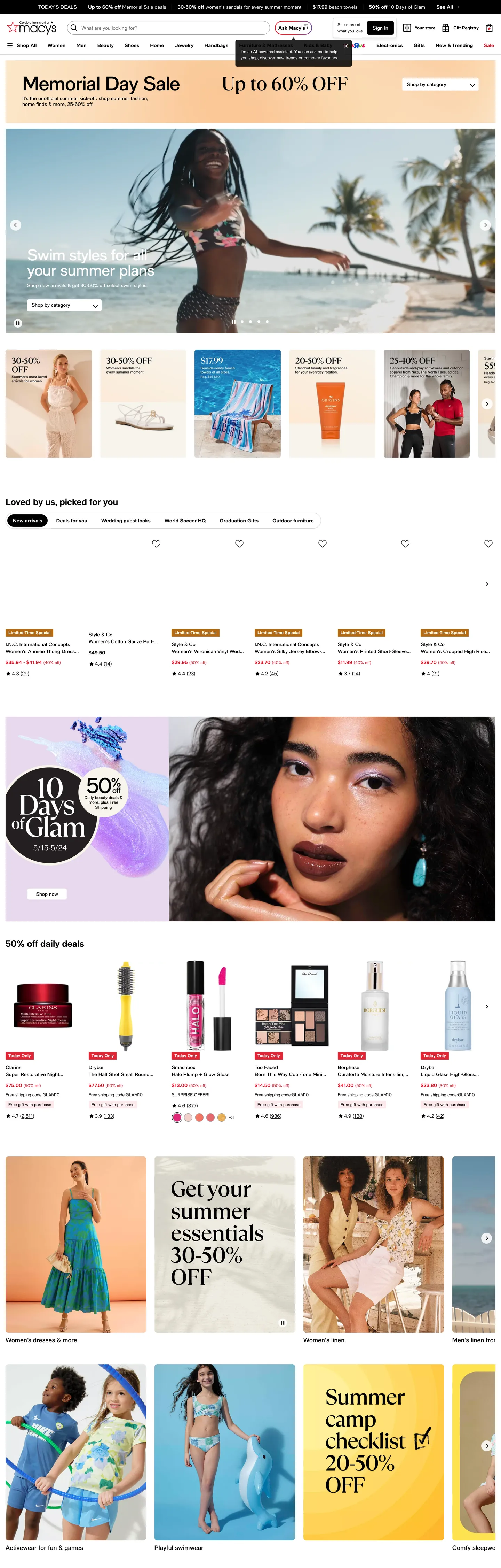
Macy's homepage runs on a single saturated red and a deliberate two-typeface split. The logomark is a five-point star with "macy's" in lower-case sans wordmark beside it, both rendered in star-red (#e01a2b) — and that exact red carries the editorial promo strip above the nav ("Memorial Day Sale · Up to 60% OFF"), the "Ask Macy's" AI pill in the search bar, every price slash on a discounted item, the brand-red sale chip, and the small fixed promo "10 Days of Glam · 50% off" callout block. The red is the most-used non-neutral color on the page: 465 occurrences, 220 as text and 220 as border. Where Nordstrom commits to a serif-and-white luxury aesthetic and Target leans on bulls-eye scarlet over flat white, Macy's runs the brand red as both promotional voltage and structural ink — a 1858-vintage star treated as a recurring system token.
The DESIGN.md file packages the marketing surface into a machine-readable spec. Inside: 9 colors tokens drawn from the structural ink, the star-red brand voltage, a copper-bronze hand-stamp accent for the editorial seal, the body cream and grey neutrals, and a navy accent reserved for the carousel-dot active state; 13 typography tokens running Macy's Sans across every chrome surface with Ramillas Medium serif reserved for the largest editorial sale displays at 44-55px; 5 corner-radius tokens centered on a 5px rectangular card radius and a 20-63px action pill; 8 spacing values on an 8px base; and 18 components definitions covering the red star promo strip, the search-with-Ask-AI pill, the price-slash, the percent-off chip, the carousel rail, the hand-stamped seal, and the standard catalogue inventory.
Feed this file to an AI coding tool and it reproduces Macy's specific moves: star-red as recurring voltage across chrome and inventory, sans-for-chrome plus serif-for-editorial-sale pairing, copper-bronze scoped to the editorial seal only, pill-at-action plus 5px-rectangle-at-content geometry, and the editorial-strip-above-the-nav promotional pattern. The one move worth borrowing only if your retail brand has a historic figurative mark: treating the star as a recurring component rather than a static logo. Most marks recede after the header; Macy's red star reads as a stamp on every page surface that needs to feel branded.
What makes it distinct
5
- Star-red as system voltage#e01a2b carries 465 occurrences as CTA fill, price slash, sale chip, and the editorial strip above the nav
- Sans-plus-serif pairingMacy's Sans for chrome and inventory, Ramillas Medium serif at 44-55px for the largest editorial sale displays
- Hand-stamped seal in copper#b06207 copper-bronze appears 42 times, scoped entirely to the 'Loved by us, picked for you' editorial seal
- Pill geometry at the action layerevery clickable CTA renders as a 20-63px pill, while every content card sits at a 5px rectangular radius
- Editorial promo stripa peach-cream band above the nav carries the 'Memorial Day Sale · Up to 60% OFF' sub-brand surface in the brand red display weight
macys.com
Live at macys.com
A snapshot of the brand in production. Scroll the frame to see the whole page.
Colors
9 colors
Macy's's system runs on #e01a2b as its primary voltage, used in 5 of 18 components. Type is set in Macys Sans across 13 tokens from 12px to 55px, weights 400–700. Shape language is soft — components average 20px corner radius, with no sharp interactive edges.
Brand & Accent
Sparing, CTA-only voltage · 1
Surface
Page and card backgrounds · 2
Text
Headlines, body, captions · 3
Borders & Hairlines
Dividers, outlines, rules · 1
Other
Specialty colors · 2
Typography
13 type tokens
Set in Macys Sans across 13 tokens, from 12px to 55px, weights 400–700. Shown in its own stack: where the font isn't installed, the fallback the file names stands in.
- display-xl55px · weight 500 · lh 55px · tracking -1.485pxThe quick brown fox jumps over the lazy dog
- display-serif55px · weight 400 · lh 55px · tracking -1.485pxThe quick brown fox jumps over the lazy dog
- display-lg43.8px · weight 500 · lh 43.8px · tracking -1.217pxThe quick brown fox jumps over the lazy dog
- display-serif-md43.8px · weight 500 · lh 43.8px · tracking -1.217pxThe quick brown fox jumps over the lazy dog
- heading-md25px · weight 700 · lh 31px · tracking -0.25pxThe quick brown fox jumps over the lazy dog
- heading-sm17.5px · weight 500 · lh 19.5pxThe quick brown fox jumps over the lazy dog
- body-md14px · weight 500 · lh 20pxThe quick brown fox jumps over the lazy dog
- body-md-bold14px · weight 700 · lh 20pxThe quick brown fox jumps over the lazy dog
- body-sm13.6px · weight 500 · lh 15.6pxThe quick brown fox jumps over the lazy dog
- body-xs12px · weight 400 · lh 18pxThe quick brown fox jumps over the lazy dog
- label-bold12px · weight 700 · lh 18pxThe quick brown fox jumps over the lazy dog
- button-md14px · weight 700 · lh 36pxThe quick brown fox jumps over the lazy dog
- nav-link14px · weight 700 · lh 20pxThe quick brown fox jumps over the lazy dog
Layout
Radii and spacing
6 corner radii and 8 spacing values. Shape language: soft.
Radii
- none0px
- sm4px
- md5px
- pill20px
- search-pill63px
- circle50%
Spacing
- xs2px
- sm8px
- base12px
- md16px
- lg24px
- xl32px
- 2xl48px
- 3xl62px
Components
18 components
Each rendered from its tokens (color, type, radius, padding) on Macy's's own canvas.
- Promo Strippromo-stripPromo Strip
- Top Navtop-navTop Nav
- Nav Linknav-linkNav Link
- Search Inputsearch-inputSearch Input
- Ask Ai Buttonask-ai-buttonAsk Ai Button
- Hero Headinghero-headingHero Heading
- Hero Heading Sanshero-heading-sansHero Heading Sans
- Section Headingsection-headingSection Heading
- Body Paragraphbody-paragraphBody Paragraph
- Body Paragraph Mutedbody-paragraph-mutedBody Paragraph Muted
- Button Primarybutton-primaryButton Primary
- Button Secondarybutton-secondaryButton Secondary
- Sale Chipsale-chipSale Chip
- Price Slashprice-slashPrice Slash
- Hand Stamp Sealhand-stamp-sealHand Stamp Seal
- CardcardCard
- Carousel Dotcarousel-dotCarousel Dot
- Type here…text-inputText Input
In use
The system, in use
Macy's's tokens on the kind of product it builds.
Build something people actually use.
A short paragraph of marketing copy that previews how the brand's display tier and body tier read together. Two sentences is usually enough.
FAQ
Macy's design system FAQ
Common questions about Macy's's tokens, components, and how to use this DESIGN.md in your project.
Read next
Related reading
Specs, directories, and component libraries that pair with this design system.
- Browse all design systemsThe full directory of DESIGN.md files on shadcn.io, with live mockups for each.shadcn.io
- Macy's — official siteMacy's public marketing site — the source of truth for the live tokens captured in this file.macys.com (opens in a new tab)
- The DESIGN.md specificationGoogle Labs' open spec for machine-readable design system files — the format this page is built on.github.com (opens in a new tab)
Use it
Use Macy's in your project
One machine-readable file. Drop it into Claude, Cursor, or any AI tool that reads DESIGN.md.
Download the DESIGN.md
One machine-readable file: every color, type, radius, spacing, and component token of Macy's.
Feed it to your AI tool
Drop it into Claude, Cursor, or GitHub Copilot. The agent writes React components and Tailwind classes that match Macy's's visual language.
Reference the tokens directly
Or paste the values into your Tailwind config, CSS variables, or component library: every color, size and radius is a quoted, ready-to-copy value.
Read the full DESIGN.md: overview, rationale, do’s and don’ts
Overview
Macy's homepage runs on a single saturated red and a deliberate two-typeface split. Star-as-system: the brand mark is a five-point star with "macy's" in lower-case sans wordmark beside it, both rendered in star-red {colors.primary} (#e01a2b). The same red carries the editorial promo strip above the nav ("Memorial Day Sale · Up to 60% OFF"), the "Ask Macy's" AI pill embedded in the search bar, every price-slash on a discounted item, the small sale-chip on inventory cards, and the fixed "10 Days of Glam · 50% off" floating callout. Where Nordstrom commits to a serif-and-white luxury aesthetic and Target leans on bulls-eye scarlet over flat white, Macy's runs the brand red as both promotional voltage and structural ink — a 1858-vintage star treated as a recurring system token rather than as a static header logomark.
Sans-and-serif split at the editorial layer: Macy's Sans (a Helvetica-Neue-adjacent proprietary grotesk) carries every chrome surface, every product title, every CTA label, every nav link. Ramillas Medium serif is reserved for the largest editorial sale displays — the "20-60% off furniture, mattresses & rugs" hero block runs Ramillas at 55px / weight 400 in white on a campaign photograph. The two voices never share a surface: sans does the inventory, serif does the editorial campaign. The pairing is the editorial-commerce signature; most department-store retailers commit to a single sans, and the serif-tier reservation is what gives Macy's the catalogue-print feel.
Pill-at-action, rectangle-at-content: the radius scale is binary. Every rectangular content card sits at {rounded.md} (5px) — product tiles, editorial promo blocks, photo cards. Every clickable action renders as a {rounded.pill} (20px) or {rounded.search-pill} (63px) full pill — the search input, the Ask AI button, the carousel category-tab strip. There is no 8 / 12 / 16px middle radius tier; the gap between content rounding and action rounding is deliberately wide. The customer's eye lands on tappable surfaces instantly because they are the only round surfaces on the page.
Key Characteristics:
- Single brand voltage
{colors.primary}(#e01a2b) — 465 occurrences, 220 as text, 220 as border, 25 as background. Carries the logomark star, every CTA, every price-slash, the editorial promo strip, and the small sale chips. - Hand-stamp copper
{colors.hand-stamp}(#b06207) — 42 occurrences, all as background fill on the "Loved by us, picked for you" editorial seal. Absent everywhere else. - Sans-plus-serif typographic split — Macy's Sans across chrome at 12-25px sizes; Ramillas Medium reserved for the largest editorial displays at 44-55px.
- Pill-at-action binary radius —
{rounded.md}(5px) on content surfaces,{rounded.pill}(20px) and{rounded.search-pill}(63px) on action surfaces. - Editorial promo strip above the nav — peach-cream surface
{colors.surface-1}(#eceff1) carrying the brand red as text, separated from the structural nav by a thin hairline. - Carousel navy accent
{colors.carousel-active}(#282e50) — appears once as the active-dot color in the editorial carousel; the only blue moment on a page that is otherwise red-and-neutral. - 8px base spacing unit with major tokens at 12 / 16 / 24 / 32px. The page uses a 2px micro-token on the Ask AI button padding alone.
- White canvas with neutral grey body surfaces —
{colors.canvas}(#ffffff) at 440 occurrences,{colors.surface-1}(#eceff1) at 112; the body never tints toward warm or cool. - Hand-stamped seal as editorial component — the copper "Loved by us" strip is the only place in the system where typography sits in a colored band rather than over a photograph or on white.
Colors
Brand
- Star Red (
{colors.primary}— #e01a2b): frequency 465. Used as text (220), border (220), background fill (25). The single brand voltage — fills the logomark star, every CTA pill, every percent-off sale chip, every price-slash, and the editorial promo strip text above the nav. Slightly warm rather than pure scarlet; the warmth carries the 1858-vintage department-store heritage without tipping into Target's pure bulls-eye.
Editorial Accent
- Hand-Stamp Copper (
{colors.hand-stamp}— #b06207): frequency 42, all as background. Used only as the surface fill of the "Loved by us, picked for you" editorial seal — a horizontal copper strip holding category-tab links in white sans label text. Absent from every other surface on the page; it is a single-purpose component color rather than a system-wide accent.
Carousel
- Carousel Active (
{colors.carousel-active}— #282e50): frequency 1 as background. The active-dot color in the editorial carousel pagination — a deep navy that contrasts the inactive grey dots. The only blue moment in the system; appears as a single 8px circle.
Surface
- Canvas (
{colors.canvas}— #ffffff): frequency 440 — 34 as background, 188 as text (reversed on photograph surfaces), 188 as border, 30 inside gradients. The default body floor and the inverse-text color sitting on photography. A faint near-white variant clusters with it in the extraction. - Surface-1 (
{colors.surface-1}— #eceff1): frequency 112 — 48 as background, 4 as border, 60 inside gradients. The peach-cream of the editorial promo strip above the nav; the neutral cream of campaign-block backgrounds. Several near-cream variants cluster into this representative tone.
Text
- Ink (
{colors.ink}— #000000): frequency 7373 — 3697 as text, 3668 as border, 7 as background. The dominant text color across nav, body, h3 section heads, and inventory titles. Pure black rather than near-black; Macy's holds the maximum-contrast position on white. - Ink Muted (
{colors.ink-muted}— #626369): frequency 2 — secondary metadata text only. - Muted (
{colors.muted}— #959499): frequency 21, all as border. The form-field outline tone — used on the search input outline and email-signup form.
Hairline
- Hairline (
{colors.hairline}— #d6d6d6): frequency 2 as border. The thin rule above the footer and around grouped card sets.
Typography
Font Families
The system runs two voices: Macy's Sans (a proprietary grotesk close to Helvetica Neue, declared with the explicit fallback walk "Helvetica Neue", Helvetica, Arial, sans-serif) for every chrome surface, and Ramillas Medium serif reserved for the largest editorial sale displays. The Macy's Sans family appears 668+ times across the captured surfaces; Ramillas Medium appears 4 times only, all at the 43.8-55px display tier.
The serif-tier reservation is the brand's editorial signature. Most department-store retailers (Kohl's, JCPenney, Bloomingdale's) commit to a single sans across chrome and marketing campaigns. Macy's isolates the serif to the seasonal sale display ("20-60% off furniture, mattresses & rugs") to evoke catalogue print and to read as a separate editorial voice from the dense inventory grid beneath.
Hierarchy
| Token | Size | Weight | Line Height | Use |
|---|---|---|---|---|
{typography.display-xl} | 55px | 500 | 55px | Sans display, campaign hero text — Macy's Sans with -1.485px tracking |
{typography.display-serif} | 55px | 400 | 55px | Serif display, "20-60% off" editorial sale — Ramillas Medium |
{typography.display-lg} | 43.8px | 500 | 43.8px | Sub-hero sans display, campaign block titles |
{typography.display-serif-md} | 43.8px | 500 | 43.8px | Serif sub-hero, second-tier editorial sale text |
{typography.heading-md} | 25px | 700 | 31px | h3 section heads ("Loved by us, picked for you") |
{typography.heading-sm} | 17.5px | 500 | 19.5px | Sub-section titles, promo card lead lines |
{typography.body-md} | 14px | 500 | 20px | Default running text, body paragraphs, link labels |
{typography.body-md-bold} | 14px | 700 | 20px | Bold emphasis text — sale chips, nav links, button labels |
{typography.body-sm} | 13.6px | 500 | 15.6px | Caption rows, secondary metadata, lead paragraphs |
{typography.body-xs} | 12px | 400 | 18px | Fine-print disclaimers, tooltips |
{typography.label-bold} | 12px | 700 | 18px | Bold tiny labels, percent-off chips, status badges |
{typography.button-md} | 14px | 700 | 36px | Primary button labels — note the 36px line-height is the pill height |
{typography.nav-link} | 14px | 700 | 20px | Top-nav category labels |
Principles
Body and nav default to weight 500 (Macy's Sans medium). Emphasis layers — sale chips, nav links, button labels, bold inline runs — step to weight 700. There is no weight 600 tier; the system is binary (500 medium, 700 bold). H3 section heads at 25px / 700 with tight -0.25px tracking are the loudest typographic moment in the chrome; everything larger is editorial display sitting on a campaign photograph.
The serif tier sits exclusively at 43.8-55px. There is no serif body, no serif label, no serif button — the moment Ramillas appears, it is at display scale on a campaign block. The split signals the gear-shift between editorial sale and dense inventory grid without any extra visual decoration.
Note on Font Substitutes
Macy's Sans and Ramillas Medium are licensed proprietary families. The closest open-source substitute for Macy's Sans is Inter at the same weights — Helvetica Neue itself works as a paid alternative since the Macy's Sans fallback already names it. For Ramillas Medium, Cormorant Garamond or Playfair Display at weight 400-500 transfer cleanly to the 44-55px display tier; Source Serif Pro is a third option closer to a contemporary editorial serif feel.
Layout
Spacing System
- Base unit: 8px. The dominant token is 2x8 padding (96 occurrences) — used for tag-shaped chips, AI-button micro-padding, and inline-tag interior.
- Tokens:
{spacing.xs}2px ·{spacing.sm}8px ·{spacing.base}12px ·{spacing.md}16px ·{spacing.lg}24px ·{spacing.xl}32px ·{spacing.2xl}48px ·{spacing.3xl}62px. - Nav padding:
{spacing.md}(16px) vertical,{spacing.lg}(24px) horizontal on the structural nav band. - Promo strip padding:
{spacing.sm}(8px) vertical,{spacing.md}(16px) horizontal on the peach-cream editorial strip above the nav. - Card internal padding:
{spacing.md}(16px) on product cards; the campaign photograph blocks override this and let imagery bleed to the card edge.
Grid & Container
- Page max-width: ~1440px — the page is desktop-first with edge-to-edge campaign photography.
- Promo strip: full-bleed peach-cream band, 36px tall.
- Nav band: full-bleed white surface, 64px tall, holding logomark left, search center, and account/store/wishlist/cart cluster right.
- Category nav row: 9 horizontal items (Women, Men, Kids & Baby, Home, Beauty, Designer, Sale & Discounts, Gift Ideas, Macy's Pre-Owned) in
{typography.nav-link}weight 700 black on white. - Campaign hero block: ~720px-wide editorial photograph with a sans-or-serif display overlay reading "your summer escape" or "20-60% off furniture, mattresses & rugs."
- Inventory grids: 4-up product cards on desktop with thin
{colors.hairline}dividers between groups.
Rhythm
The page alternates between editorial photograph bands (campaign blocks with overlaid serif or sans display) and flat product-card grids (4-column inventory rows with sale chips and price slashes). The promo strip → nav stack accounts for ~100px of vertical chrome; below that the editorial hero, "Loved by us" hand-stamp seal, daily-deals grid, beauty campaign, and seasonal essentials grid all alternate the same editorial-then-inventory rhythm. The hand-stamp seal is the structural divider — it sits between the editorial campaign and the inventory grid, signaling the shift in voice.
Elevation
The system has essentially no shadow tier. The captured page records 1 shadow occurrence in pure black at low opacity, scoped to the floating "10 Days of Glam" callout block. Cards lift from the body surface by {colors.hairline} borders rather than shadow halos; the campaign photograph blocks sit flush against the cream surface with no elevation effect.
- Flat (no shadow): every promo strip, nav, campaign block, inventory card, hand-stamp seal, and footer band — 99% of surfaces.
- Floating callout: the "10 Days of Glam · 50% off" promo block sits fixed-position over the campaign hero with a subtle pure-black shadow at low opacity — the only meaningfully-elevated element on the page.
- Border-as-elevation:
{colors.hairline}(#d6d6d6) carries the divider role between grouped card sets.
Shapes
The radius scale is binary at action vs. content.
{rounded.sm}4px — secondary chips and form-field outlines (3 occurrences).{rounded.md}5px — the dominant content radius (73 occurrences). Product cards, editorial photo blocks, campaign tiles, sale chips.{rounded.pill}20px — primary action pills (2 occurrences). The "Ask Macy's" AI button, the primary CTA.{rounded.search-pill}63px — the search-input pill (1 occurrence). The largest pill radius on the page; the input is the most prominent action surface in the nav.{rounded.circle}50% — the carousel-dot pagination indicators (54 occurrences). The only circular geometry on the page.
There is no 8 / 12 / 16px middle tier. The gap between content rounding (5px) and action rounding (20-63px) is deliberately wide; the binary signals interactivity unambiguously to the customer's eye.
Components
promo-strip — The peach-cream editorial strip above the nav. {colors.surface-1} fill, {colors.primary} text in {typography.body-md-bold}, 36px tall, 8x16 padding. Carries the rotating sale headline ("Memorial Day Sale · Up to 60% OFF") with an arrow caret for the next slide. Not part of the structural nav band; visually separated by 1px of vertical whitespace.
top-nav — White {colors.canvas} surface, 64px tall, 16x24 padding. Holds the logomark left, search center, and account/store/wishlist/cart cluster right. No bottom border; the category links below sit on the same white band.
nav-link — Transparent fill, {colors.ink} text in {typography.nav-link} weight 700. Category labels (Women, Men, etc.) all use this baseline.
search-input — White {colors.canvas} fill with {colors.muted} 1px border, {rounded.search-pill} 63px radius, 10x12x10x40 padding (extra left for the magnifying-glass icon), 40px tall. The most prominent action surface in the nav.
ask-ai-button — The signature embedded AI pill. {colors.primary} fill, white text in {typography.button-md}, {rounded.pill} 20px radius, 2px padding (deliberately tight), 40px tall. Sits inside the search input on the right edge — a pill within a pill, the red CTA against the white search field.
hero-heading — White text on the campaign photograph, {typography.display-serif} (Ramillas Medium 55px / 400). The editorial-sale tier — confidence by serif voice rather than weight.
hero-heading-sans — White text, {typography.display-xl} (Macy's Sans 55px / 500). The sans alternative for campaign headlines where the serif voice would feel mismatched ("your summer escape").
section-heading — Black text, {typography.heading-md} (25px / 700). H3 section heads — "Loved by us, picked for you," "50% off daily deals," "Macy's Pre-Owned."
body-paragraph — Default {colors.ink} running text at {typography.body-md}. The workhorse copy style.
body-paragraph-muted — {colors.ink-muted} variant at {typography.body-sm} for secondary captions.
button-primary — Red {colors.primary} fill, white text, {rounded.pill} 20px radius, 8x16 padding, 40px tall. The standard sale-CTA pill — "Shop now," "Get summer essentials 30-50% off."
button-secondary — White fill, black text, 1px black border, same pill rounding and dimensions. Used for secondary actions when adjacent to a primary CTA.
sale-chip — Red {colors.primary} fill, white text in {typography.label-bold} (12px / 700), {rounded.md} 5px radius, 2x8 padding, 22px tall. The percent-off badge ("50% OFF") that sits on inventory cards — a tiny inline marker of the brand-red voltage at the product layer.
price-slash — Transparent background, {colors.primary} text in {typography.body-md-bold}. The "$59.99" struck-through with a red diagonal line — the brand red carrying the price-emphasis job on every discounted item.
hand-stamp-seal — Copper {colors.hand-stamp} fill, white text in {typography.label-bold}, no border radius, 12x16 padding. The "Loved by us, picked for you" editorial strip holding category-tab labels. The only place in the system where the copper appears.
card — White {colors.canvas} fill, {colors.hairline} 1px border, {rounded.md} 5px radius, 16px padding. The default product-card surface.
carousel-dot — Navy {colors.carousel-active} (#282e50) fill on active, grey on inactive, {rounded.circle} 50% radius, 8px tall. The only circular geometry and the only blue moment on the page.
text-input — White fill, ink text, 1px {colors.muted} border, {rounded.search-pill} 63px radius, 10x12 padding, 40px tall. Used for the email-signup form and the in-page filter inputs.
Do's and Don'ts
Do treat {colors.primary} (#e01a2b) as a structural color rather than a held-in-reserve accent. The red carries the logomark, every CTA, every sale chip, every price-slash, and the editorial promo strip — 465 occurrences across the page. Reserving it for primary CTAs only would break the catalogue-print rhythm the system depends on.
Do use {colors.hand-stamp} (#b06207) only inside the "Loved by us" editorial seal. The copper is a single-component token; using it as a secondary brand accent or a hover state dilutes the seal's distinctive editorial reading.
Do reserve Ramillas Medium for the 43.8-55px display tier. The serif is the editorial-campaign voice; running it at body or h3 sizes turns the chrome into a generic department-store catalogue and loses the gear-shift between editorial and inventory.
Do render every clickable action as a pill — {rounded.pill} 20px or {rounded.search-pill} 63px. The radius binary is what makes tappable surfaces instantly readable on a dense inventory grid.
Don't introduce an 8 / 12 / 16px middle radius tier. The system is deliberately binary — 5px on content, 20-63px on action. Adding a middle radius softens the contrast and makes the page read as a generic SaaS commerce template rather than as Macy's editorial-commerce voice.
Don't use {colors.ink} (#000000) on a red surface. The "Ask Macy's" button uses ink text on red because the button is small (40px height, 14px / 700 label) and the contrast holds; running ink on red at display sizes turns the type into a fashion-magazine masthead rather than a department-store CTA. White on red is the rule everywhere except the small AI pill.
Don't render the editorial promo strip in pure white. The peach-cream {colors.surface-1} (#eceff1) is what separates the rotating sale message from the structural white nav beneath. A pure white promo strip would merge with the nav and lose the editorial-band reading.
Don't stack two {rounded.pill} surfaces vertically with no separator. The Ask-AI pill sits inside the search-input pill specifically because the pill-within-pill geometry is unique to that component. Stacking pill buttons inline turns the page into a SaaS landing page rather than a department-store homepage.
Known Gaps
- Hover and focus states: documented for resting states only. Focus rings, active press tints, disabled fills, and validation glow are not exposed on the captured marketing surface.
- Dark mode: the captured page is light-only. No dark-mode tokens are declared on
:root; a dark theme may exist inside the authenticated account area but is not represented here. - Form input error states: the search and email-signup inputs carry resting states. Error / validation styling lives inside the checkout flow and is not captured.
- Carousel motion: the editorial carousel auto-advances with an arrow control, but the spec captures end-state values only. Easing curves, dwell timing, and auto-advance interval live in the live page runtime.
- Authenticated chrome: the captured surface is unauthenticated. The personalized homepage for signed-in shoppers exposes additional surface tokens — wishlist, order status, loyalty tier badges — that are not represented here.
- Mobile breakpoints: the captured surface is desktop-only at 1440px. The pill-radius scale, the editorial promo strip, and the campaign block layout all collapse differently on mobile; the spec records desktop tokens only.
- Sub-brand chrome: Macy's Pre-Owned, Macy's Backstage, and Bloomingdale's all share the parent design language but expose distinct surface tokens that are not represented in this file.
E-commerce & Retail
More systems like this
More DESIGN.md files in E-commerce & Retail.
Pricing
Build it with Pro
The DESIGN.md files are free. Pro adds 6,000+ blocks, premium templates and the MCP server, so your AI editor builds in your system for you.
4.9/5 out of 5 · 150+ reviewsfrom 150+ founders and developers.
Billing
Billed once a year in USD. Cancel anytime.
- How many people can use the license.
- Client work, SaaS products and anything you charge for.
- Production-ready React sections: hero, pricing, features, dashboards and more.
- Complete multi-page sites you can ship as they are.
- React icons from every major library, installable with one command.
- Presets that restyle every block, in light and dark.
- Lets your AI editor search, preview and install blocks for you.
- Priority requests are answered first.
Individual
For personal projects & open source
$32instead of $49/mo
$389 billed yearly
- Seats: 1 seat
- Commercial use: Personal & open source only
- Pro blocks: 6,000+ blocks
- Templates: All 14 templates
- React icons: 294k+ icons
- Themes: All 59 themes
- MCP server: Basic usage
- Support: Standard
Team
Most popularFor freelancers, agencies & startups
$66instead of $99/mo
$789 billed yearly · ≈ $13/dev/mo
- Seats: Up to 5 seats
- Commercial use: Included
- Pro blocks: 6,000+ blocks
- Templates: All 14 templates
- React icons: 294k+ icons
- Themes: All 59 themes
- MCP server: High usage
- Support: Priority
Organization
For companies with larger teams
$132instead of $199/mo
$1,589 billed yearly
- Seats: Unlimited seats
- Commercial use: Included
- Pro blocks: 6,000+ blocks
- Templates: All 14 templates
- React icons: 294k+ icons
- Themes: All 59 themes
- MCP server: Unlimited usage
- Support: Priority
Billed once a year in USD. Cancel anytime.
Individual
For personal projects & open source
$32instead of $49/mo
$389 billed yearly
- How many people can use the license.Seats: 1 seat
- Client work, SaaS products and anything you charge for.Commercial use: Personal & open source only
- Production-ready React sections: hero, pricing, features, dashboards and more.Pro blocks: 6,000+ blocks
- Complete multi-page sites you can ship as they are.Templates: All 14 templates
- React icons from every major library, installable with one command.React icons: 294k+ icons
- Presets that restyle every block, in light and dark.Themes: All 59 themes
- Lets your AI editor search, preview and install blocks for you.MCP server: Basic usage
- Priority requests are answered first.Support: Standard
Team
Most popularFor freelancers, agencies & startups
$66instead of $99/mo
$789 billed yearly · ≈ $13/dev/mo
Everything in Individual, plus
- How many people can use the license.Seats: Up to 5 seats
- Client work, SaaS products and anything you charge for.Commercial use: Included
- Lets your AI editor search, preview and install blocks for you.MCP server: High usage
- Priority requests are answered first.Support: Priority
Organization
For companies with larger teams
$132instead of $199/mo
$1,589 billed yearly
Everything in Team, plus
- How many people can use the license.Seats: Unlimited seats
- Lets your AI editor search, preview and install blocks for you.MCP server: Unlimited usage
- Secure checkout via Stripe
- Code lives in your repo
- Keep what you've shipped if you cancel
- License terms
Your system, built for you
Every block, template and icon, installed by your AI agent in your design system. The DESIGN.md files stay free.