Lululemon Design System
Lululemon's design system as a DESIGN.md file. Saans variable, ink #140f0f, brand red #c8102e, 27 colors, 25 components. For React, Next.js, and AI tools.
Add shadcn.io to your AI agent. · Pro It installs blocks, icons and templates in your design system from a prompt, with Pro.
Set up MCP- Primary
- #000000
- Typeface
- Saans
- Shape
- Mixed
- Base radius
- 0px
- Colors
- 27
- Type tokens
- 11
- Components
- 25
- Spacing values
- 8
About
About Lululemon DESIGN.md
Curated by Dov Azencot · Updated May 13, 2026 · Source shop.lululemon.com (opens in a new tab)
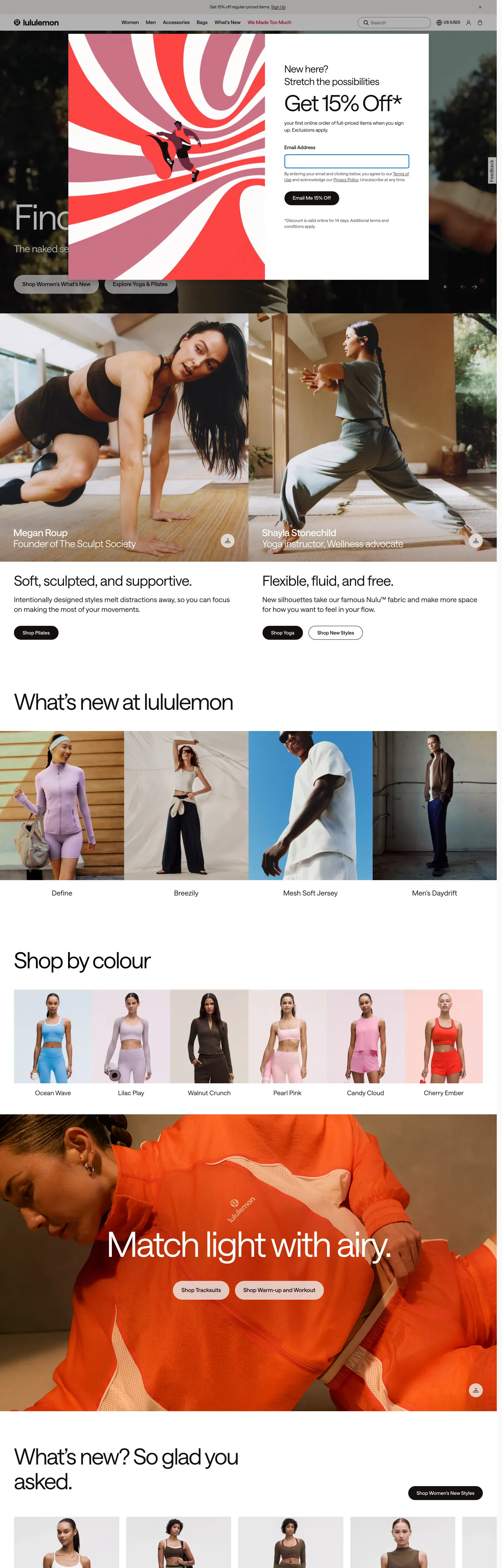
Lululemon's storefront reads like a printed yoga catalog rendered for the browser, with the chrome holding back while the photography carries every chromatic moment. The canvas is pure `#ffffff`, and the workhorse text colour is a warm off-black `#140f0f` rather than the pharmaceutical pure black you'd expect from an athletic brand — the warmer ink holds against skin tones in product imagery without going clinical. Where Nike screams in 96px Futura uppercase and Everlane whispers in 12px Maison Neue caps, Lululemon settles between them at 100px Saans on a single variable-weight axis (380 and 570), confident enough to skip bold weights entirely. The signature Lululemon red (`#c8102e`) is mapped in CSS variables under `--lll-color-border-accent` and `--lll-color-text-error`, but the extracted page renders it only twice — the brand uses it as a semantic accent voltage, not a chrome colour.
This page packages the storefront into a DESIGN.md file written to the Google Labs open specification. Inside: 21 colour tokens grouped into ink, surface, hairline, semantic, and a six-entry secondary palette (sequoia, wilderness, espresso, daydream, mossy, rosewood) reserved for editorial tiles; 11 Saans typography roles ranging from a 100px hero through a 12px utility caption; a 5-step radius vocabulary anchored on 48px pills and 50% circles with a 6px input outlier; an 8-step spacing scale extracted from the `--zest-spacing-*` CSS variable cascade running 2px through 96px; and 25 components entries covering the announcement bar, the primary nav, the welcome modal, the hero overlay, the editorial 2-up, the colour swatch strip, the newsletter capture, the product tile, and the campaign tile. The site exposes 351 `:root` custom properties under twin `--lll-*` and `--zest-*` token cascades, which is how the chrome stays mechanical while the editorial palette stays expressive.
Feed the file to Claude, Cursor, or GitHub Copilot and the agent reproduces Lululemon's specific restraint — the 48px-radius pill CTA at 54px height with weight 570, the warm `#140f0f` ink, the bone-toned `#efeeec` disabled-surface, the Saans-only typographic ladder — rather than a generic activewear template with heavy 700+ display weights and saturated brand fills. Reference tokens directly when you want one specific value: `{colors.ink}` resolves to `#140f0f`, `{rounded.pill}` to 48px, `{typography.display-xl}` to Saans 100px at weight 380, and `{colors.accent-red}` to `#c8102e`. The reason this system rewards study is that most athletic-apparel sites equate brand voltage with chromatic loudness — Lululemon proves the opposite, holding its signature red almost entirely off the chrome and letting weight 380 Saans carry the brand's whole personality.
What makes it distinct
5
- Variable-axis Saans at weights 380 and 570the brand never reaches weight 600+; confidence by typographic moderation
- Brand red as scoped voltage`#c8102e` (`--lll-color-border-accent`) carries only 2 occurrences across the chrome, reserved for error states and accent borders
- Off-black ink, never pure`#140f0f` runs as text and borders 322 times while `#000000` lives mainly in default button fills (text 545, border 544)
- Pill CTA at 48px radiusprimary button measures 54px tall with 24px horizontal padding and weight 570 caps; the only other radius is 50% for icon swatches and circular avatars
- Two coexisting palettesa load-bearing greyscale chrome plus a six-token secondary editorial palette (`sequoia`, `wilderness`, `espresso`, `daydream`, `mossy`, `rosewood`) reserved for campaign tiles, never for buttons
shop.lululemon.com
Live at shop.lululemon.com
A snapshot of the brand in production. Scroll the frame to see the whole page.
Colors
27 colors
Lululemon's system runs on #000000 as its primary voltage, used in 3 of 25 components. Type is set in Saans across 11 tokens from 12px to 100px, weights 380–570. Shape language is mixed across 25 components, blending pills, soft rounds, and squarer corners.
Brand & Accent
Sparing, CTA-only voltage · 2
Surface
Page and card backgrounds · 2
Text
Headlines, body, captions · 6
Borders & Hairlines
Dividers, outlines, rules · 2
Semantic
Status, errors, success, links · 6
Other
Specialty colors · 9
Typography
11 type tokens
Set in Saans across 11 tokens, from 12px to 100px, weights 380–570. Shown in its own stack: where the font isn't installed, the fallback the file names stands in.
- display-xl100px · weight 380 · lh 1.1 · tracking -4pxThe quick brown fox jumps over the lazy dog
- display-lg64px · weight 380 · lh 1.1 · tracking -2.56pxThe quick brown fox jumps over the lazy dog
- display-md40px · weight 380 · lh 1.2 · tracking -0.8pxThe quick brown fox jumps over the lazy dog
- heading-lg28px · weight 380 · lh 1.3 · tracking -0.56pxThe quick brown fox jumps over the lazy dog
- heading-md20px · weight 380 · lh 1.4 · tracking 0.2pxThe quick brown fox jumps over the lazy dog
- body-lg18px · weight 380 · lh 1.4 · tracking 0.18pxThe quick brown fox jumps over the lazy dog
- body-md14px · weight 380 · lh 1.4The quick brown fox jumps over the lazy dog
- body-sm12px · weight 380 · lh 1.4The quick brown fox jumps over the lazy dog
- button-md16px · weight 570 · lh 1.4The quick brown fox jumps over the lazy dog
- link-capitalized18px · weight 570 · lh 1.4 · tracking 0.18pxThe quick brown fox jumps over the lazy dog
- caption-utility14px · weight 570 · lh 1.15 · tracking 1.2pxThe quick brown fox jumps over the lazy dog
Layout
Radii and spacing
7 corner radii and 8 spacing values. Shape language: mixed.
Radii
- none0px
- input6px
- card32px
- pill48px
- stadium100px
- full9999px
- circle50%
Spacing
- xxs2px
- xs8px
- sm10px
- md16px
- base24px
- lg40px
- xl48px
- xxl96px
Components
25 components
Each rendered from its tokens (color, type, radius, padding) on Lululemon's own canvas.
- Announcement Barannouncement-barAnnouncement Bar
- Top Navtop-navTop Nav
- Nav Linknav-linkNav Link
- Button Primarybutton-primaryButton Primary
- Button Primary Hoverbutton-primary-hoverButton Primary Hover
- Button Primary Disabledbutton-primary-disabledButton Primary Disabled
- Button Secondarybutton-secondaryButton Secondary
- Button Tertiarybutton-tertiaryButton Tertiary
- Button On Imagebutton-on-imageButton On Image
- Type here…text-inputText Input
- Type here…text-input-focusText Input Focus
- Welcome Modalwelcome-modalWelcome Modal
- Hero Overlayhero-overlayHero Overlay
- Editorial Tileeditorial-tileEditorial Tile
- Product Cardproduct-cardProduct Card
- Product Card Imageproduct-card-imageProduct Card Image
- Color Swatchcolor-swatchColor Swatch
- Color Swatch Labelcolor-swatch-labelColor Swatch Label
- Category Tilecategory-tileCategory Tile
- Newsletter Capturenewsletter-captureNewsletter Capture
- Link Utilitylink-utilityLink Utility
- Badge Accentbadge-accentBadge Accent
- Status Error Rowstatus-error-rowStatus Error Row
- Campaign Tile Inversecampaign-tile-inverseCampaign Tile Inverse
- FooterfooterFooter
In use
The system, in use
Lululemon's tokens on the kind of product it builds.
Build something people actually use.
A short paragraph of marketing copy that previews how the brand's display tier and body tier read together. Two sentences is usually enough.
FAQ
Lululemon design system FAQ
Common questions about Lululemon's tokens, components, and how to use this DESIGN.md in your project.
Read next
Related reading
Specs, directories, and component libraries that pair with this design system.
- Browse all design systemsThe full directory of DESIGN.md files on shadcn.io, with live mockups for each.shadcn.io
- Lululemon — official siteThe Lululemon storefront this DESIGN.md was extracted from on 2026-05-13.shop.lululemon.com (opens in a new tab)
- The DESIGN.md specificationGoogle Labs' open spec for machine-readable design system files — the format this page is built on.github.com (opens in a new tab)
Use it
Use Lululemon in your project
One machine-readable file. Drop it into Claude, Cursor, or any AI tool that reads DESIGN.md.
Download the DESIGN.md
One machine-readable file: every color, type, radius, spacing, and component token of Lululemon.
Feed it to your AI tool
Drop it into Claude, Cursor, or GitHub Copilot. The agent writes React components and Tailwind classes that match Lululemon's visual language.
Reference the tokens directly
Or paste the values into your Tailwind config, CSS variables, or component library: every color, size and radius is a quoted, ready-to-copy value.
Read the full DESIGN.md: overview, rationale, do’s and don’ts
Overview
Lululemon's storefront is built on a contradiction the brand never resolves out loud: it is an athletic-apparel chrome that withholds nearly every saturated colour, and the signature red #c8102e that the brand is known for in retail signage appears on the homepage only twice. Demoted red: where most activewear systems treat their brand voltage as the primary CTA fill, Lululemon files its red under --lll-color-border-accent and --lll-color-text-error, then uses it almost exclusively for semantic error states. The chrome itself runs on warm off-black ink (#140f0f, text 131 and border 191), pure black for default interactive fills (#000000, text 545 and border 544), pure white canvas (#ffffff), and bone (#efeeec) for disabled and subdued surfaces. The signature is in the absence of brand colour, not its presence.
The typography reinforces the same restraint. Where most athletic and fitness brands lean on weight 700+ display lockups to project intensity, Lululemon holds every tier of Saans on two variable-axis stops only — 380 (book) for displays and body, 570 (medium) for buttons and capitalized links. The hero h2 reaches 100px with letter-spacing -4px at weight 380; the secondary display sits at 64px with -2.56px tracking, also at 380. Weight 380 as confidence signal: Lululemon trusts the negative tracking and the size to do the work that bold weights do in louder systems. The result is a page that reads as quiet and self-assured rather than punchy.
Two palettes coexist deliberately. The structural chrome stays inside its greyscale envelope; the editorial layer carries a six-token secondary palette — sequoia #73273d, wilderness #142a0e, espresso #2b1f1e, daydream #c0ddff, mossy #524a43, rosewood #dc6d85 — reserved for full-bleed campaign tiles behind a single editorial sentence and a pair of inverse-white pill CTAs. Two-palette discipline: chrome does not borrow from editorial, editorial does not infiltrate chrome. Across the homepage hero, the welcome modal, the editorial 2-up, the Shop By Colour strip, the four-up category grid, and the campaign tile, the same chrome appears in identical proportions — only the photography and the campaign palette swap.
Colors
The palette below comes directly from the extraction's clustered top-30 list, with frequency counts and usage breakdowns drawn from the raw JSON.
- Off-black ink (
#140f0f) — frequency 347. Used as text (131), border (191), background (13), gradient (12). The workhorse ink, mapped to--lll-color-text-off-blackand twelve related opacity tokens. Warmer than#000000, holds against skin-tone product photography without going pharmaceutical. - Pure black (
#000000) — frequency 1093. Used as text (545), border (544), background (3), shadow (1). The default interactive fill — primary CTA backgrounds, strong borders, surface-inverse. Mapped to--lll-color-interactive-filled-defaultand--lll-color-border-strong. - Pure white (
#ffffff) — frequency 546. Used as text (262), border (259), background (25). The canvas, the inverse text token, the outlined-default button fill. Clustered with two warmer near-whites as alternative surface tokens. - Bone surface (
#efeeec) — frequency 25. Used as background (25). The disabled and subdued surface —--zest-color-interactive-primary-disabled,--lll-color-background-gray-bone,--lll-color-surface-subdued. Sits one degree warmer than white to signal cotton over screen. - Brand red (
#c8102e) — frequency 2. Used as text (1), border (1). The signature Lululemon voltage, mapped across 13 CSS variables including--zest-color-border-accent,--lll-color-text-error, and--lll-color-icon-accent. Reserved for error states and accent borders — almost entirely absent from chrome. - Brand red deep (
#a00d25) — frequency 0 on-page; declared in--lll-color-interactive-priority-hoverfor the priority-CTA hover state. - Hot-heat secondary (
#de212f) — frequency 12. Used as gradient (12). A warm orange-red mapped to--lll-color-background-hot-heat-secondaryfor heat-tech gradient overlays. - Subdued ink (
#53565a) — frequency 12. Used as text (6), border (6). The hover-state ink for filled buttons and the border for messages. - Disabled ink (
#8d9196) — frequency 8. Used as text (4), border (4). The disabled state for interactive-filled and outlined buttons. - Default link blue (
#0000ee) — frequency 646. Used as text (351), border (295). The unstyled-anchor browser-default that surfaces on a footer-class link cluster; not part of the chrome ladder but extracted in volume. - Focus blue (
#005fcc) — frequency 0 on-page; declared in--lll-color-border-focusfor input focus rings. - Sequoia (
#73273d) — secondary palette,--zest-color-secondary-palette-sequoia. Editorial-tile background. - Wilderness (
#142a0e) — secondary palette,--zest-color-secondary-palette-wilderness. Deep forest editorial-tile background. - Espresso (
#2b1f1e) — secondary palette,--zest-color-secondary-palette-espresso. Warm dark-brown editorial-tile background. - Daydream (
#c0ddff) — secondary palette,--zest-color-secondary-palette-daydream. Pale-blue editorial-tile background. - Mossy (
#524a43) — secondary palette,--zest-color-secondary-palette-mossy. Warm-grey editorial-tile background. - Rosewood (
#dc6d85) — secondary palette,--zest-color-secondary-palette-rosewood. Soft-pink editorial-tile background. - Lemonade (
#f4ff8e) — secondary palette,--zest-color-secondary-palette-lemonade. Yellow-green editorial swipe background.
Typography
The system runs Saans by Displaay Type Foundry across every tier on a single variable axis. Two stops are deployed on the homepage: weight 380 (book) for displays and body, weight 570 (medium) for buttons and capitalized links. The hero h2 reaches 100px at letter-spacing -4px with line-height 1.1, the secondary display sits at 64px with -2.56px tracking, and the 40px display holds -0.8px. Where most athletic brands command attention with weight 700+ display lockups, Lululemon never crosses weight 570 — confidence by typographic moderation rather than typographic muscle. Body copy runs Saans 14–18px at weight 380 with letter-spacing near zero, and button labels carry weight 570 at 16px with line-height 22.4px. The single non-Saans cameo is the nav link, which extracts as Calibre 16px weight 400 on the legacy lululemon athletica corporate anchor — kept here as a documented exception rather than promoted to a token.
Layout
The page locks to a 24–40px outer padding with section blocks at 96px top / 48px bottom (96px 40px 48px repeats as the most common multi-value padding). Cards stack on an 8px / 16px / 24px / 48px rhythm extracted from --zest-spacing-* (the 2/8/12/16/20/24/40/48/96 ladder). Hero blocks span full-bleed at 1440px; editorial 2-up panels split 50/50 with 12px gutter; the Shop By Colour strip and the What's New 4-up both use 12px horizontal gutter between cards. The grid is generous but never sparse — Lululemon trusts photography to fill the frame, so the chrome holds at 24px outer padding rather than pushing to 48 or 64.
Elevation & Depth
Lululemon has effectively zero shadow vocabulary in chrome. The extracted JSON shows one shadow: 1 count across the entire colour ladder (on #000000). Depth comes from three devices instead: the bone-toned surface (#efeeec) sitting one degree below white for disabled and subdued zones, full-bleed campaign tiles in the secondary editorial palette stacking against the white chrome to create vertical depth, and 1px hairlines (#d6d6d6 / #c8c8c8) separating sections. The welcome modal is the one place a box-shadow is implied (via overlay tokens like --zest-color-surface-overlay-50), but no decorative drop-shadow surface is documented anywhere in the homepage chrome.
Shapes
Three radius thresholds carry the entire shape vocabulary. Pill geometry: 48px on every primary CTA, 100px on stadium-shaped utility buttons, 999px on chip-shaped accent badges — these three values collapse visually to the same shape at typical button heights but are declared separately in the source. Circle geometry: 50% (172 occurrences — the most-used radius on the page) carries every colour-swatch dot in Shop By Colour, every category avatar, every icon-button hit target. Right-angle geometry: 0px on every card, every tile, every product image, every hero overlay. The only outliers are the 6px text-input radius and a single 32px card on the welcome-modal frame.
Components
Every component below references the tokens declared above — chrome inherits from the greyscale palette, editorial tiles pull from the secondary palette, the welcome modal sits on canvas with 64px display type.
- announcement-bar — top-of-page utility row at body-sm on
{colors.canvas}with{colors.ink-pure}text, 32px left padding,0pxradius. - top-nav — primary navigation row at 56px height, body-lg type,
{colors.canvas}background,{colors.ink}text. - nav-link — individual nav anchor; same chrome as top-nav with 8px 16px padding.
- button-primary — the pill CTA. 48px radius, 54px height, weight 570 at 16px,
{colors.ink-pure}fill with{colors.canvas}text, 24px horizontal padding. - button-primary-hover / disabled — inherit the base pill geometry; only the fill changes to
{colors.ink-subdued}or{colors.ink-disabled}. - button-secondary — same 48px pill geometry, inverted to
{colors.canvas}fill with{colors.ink}text and a 1px{colors.ink}border. - button-tertiary — bone-surface variant (
{colors.surface-bone}fill) with the same pill geometry; used on subdued sections. - button-on-image — slightly shorter (48px) pill in pure white, designed to overlay photography in the editorial tiles.
- text-input — 40px height, 6px radius, 12px / 50px / 12px / 16px padding (right padding holds the inline submit icon),
{colors.ink}border at rest. - text-input-focus — same geometry, border swaps to
{colors.focus}(#005fcc). - welcome-modal — the 15% Off promo capture; canvas-backed, display-lg type at 64px, 40px outer padding.
- hero-overlay — full-bleed editorial frame with secondary-palette fill, display-xl 100px Saans 380 white text, 96/40/48 padding.
- editorial-tile — campaign tile in any of the six secondary palette tokens with white display-md type at 40px.
- product-card — 0px-radius photograph-first tile; bone-tinted image background, white card surround, body-lg label.
- color-swatch — the 50% circular dot in the Shop By Colour strip; 40px diameter,
{colors.surface-bone}fill,{colors.ink}1px border. - category-tile — 4-up grid card; canvas-backed, heading-md type at 20px, 20/12/0 padding.
- newsletter-capture — capture row at 24/40/12 padding with body-md type.
- link-utility — the
#0000eeunderlined-anchor browser default that appears on legacy corporate links and footer items. - badge-accent — pill-shaped accent badge with
{colors.accent-red}text on{colors.canvas}and a 1px red border; the rare on-chrome appearance of the brand red. - status-error-row — error-state row with
{colors.status-error-surface}fill,{colors.accent-red}text and border, 6px radius. - campaign-tile-inverse —
{colors.ink}full-bleed campaign tile with white display-md type; the inverse of the editorial-tile component for product-focused campaigns. - footer — canvas-backed, body-sm type, 48/24 padding; cluster of utility links and locale picker.
Do's and Don'ts
- Don't reach for
#c8102eas a primary CTA fill — it lives at frequency 2 on the homepage and is mapped to--lll-color-text-error. Use{colors.ink-pure}(#000000) or{colors.ink}(#140f0f) for primary buttons instead, and reserve the accent red for error states and badge moments under 12px. - Don't promote any secondary-palette colour to chrome — sequoia, wilderness, espresso, daydream, mossy, and rosewood are full-bleed editorial swatches. Using one of them as a card background or a button fill collapses the two-palette discipline that lets the secondary palette feel atmospheric.
- Don't raise Saans above weight 570 — the homepage uses only weights 380 and 570 across every tier. Pushing the hero to weight 700 or 800 produces a louder activewear template, not Lululemon.
- Don't soften the
48pxpill to8pxor12px— the radius vocabulary is binary at the interactive layer: 48px / 100px / 999px pills for actions, 50% circles for selection. A 4px or 8px corner radius reads as generic SaaS and breaks the catalog vocabulary. - Don't substitute pure black (
#000000) for the text ink — body text and headlines run on warm off-black#140f0f. Pure black is reserved for the interactive-filled-default token (button fills and strong borders). Mixing them collapses a deliberate two-ink ladder. - Don't add a drop shadow to the product card or the welcome modal — the homepage has zero decorative shadow tokens. Depth comes from the bone surface and the editorial-tile background, not from elevation.
Known Gaps
- PDP and size-selector typography and chrome are not captured — the spec is built from the homepage at
shop.lululemon.com. - Slide-in bag drawer and checkout flow are absent — the spec ends at the newsletter capture and footer.
- Mobile breakpoints are not extracted — capture was taken at 1440px desktop; the responsive ladder declared in
--lll-type-heading-gde-mobile-*is not deployed here. - Hover states are documented for the primary button only (
button-primary-hover); full hover ladder for outlined, tertiary, and on-image variants is not in the spec. - Saans variable axis stops beyond 380 and 570 — the file is declared as variable-weight but the homepage uses only those two values; additional stops exist in the typeface but aren't extracted here.
- Lululemon Studio (mirror) subsystem and member area are separate surfaces with their own chrome — not captured.
E-commerce & Retail
More systems like this
More DESIGN.md files in E-commerce & Retail.
Pricing
Build it with Pro
The DESIGN.md files are free. Pro adds 6,000+ blocks, premium templates and the MCP server, so your AI editor builds in your system for you.
4.9/5 out of 5 · 150+ reviewsfrom 150+ founders and developers.
Billing
Billed once a year in USD. Cancel anytime.
- How many people can use the license.
- Client work, SaaS products and anything you charge for.
- Production-ready React sections: hero, pricing, features, dashboards and more.
- Complete multi-page sites you can ship as they are.
- React icons from every major library, installable with one command.
- Presets that restyle every block, in light and dark.
- Lets your AI editor search, preview and install blocks for you.
- Priority requests are answered first.
Individual
For personal projects & open source
$32instead of $49/mo
$389 billed yearly
- Seats: 1 seat
- Commercial use: Personal & open source only
- Pro blocks: 6,000+ blocks
- Templates: All 14 templates
- React icons: 294k+ icons
- Themes: All 59 themes
- MCP server: Basic usage
- Support: Standard
Team
Most popularFor freelancers, agencies & startups
$66instead of $99/mo
$789 billed yearly · ≈ $13/dev/mo
- Seats: Up to 5 seats
- Commercial use: Included
- Pro blocks: 6,000+ blocks
- Templates: All 14 templates
- React icons: 294k+ icons
- Themes: All 59 themes
- MCP server: High usage
- Support: Priority
Organization
For companies with larger teams
$132instead of $199/mo
$1,589 billed yearly
- Seats: Unlimited seats
- Commercial use: Included
- Pro blocks: 6,000+ blocks
- Templates: All 14 templates
- React icons: 294k+ icons
- Themes: All 59 themes
- MCP server: Unlimited usage
- Support: Priority
Billed once a year in USD. Cancel anytime.
Individual
For personal projects & open source
$32instead of $49/mo
$389 billed yearly
- How many people can use the license.Seats: 1 seat
- Client work, SaaS products and anything you charge for.Commercial use: Personal & open source only
- Production-ready React sections: hero, pricing, features, dashboards and more.Pro blocks: 6,000+ blocks
- Complete multi-page sites you can ship as they are.Templates: All 14 templates
- React icons from every major library, installable with one command.React icons: 294k+ icons
- Presets that restyle every block, in light and dark.Themes: All 59 themes
- Lets your AI editor search, preview and install blocks for you.MCP server: Basic usage
- Priority requests are answered first.Support: Standard
Team
Most popularFor freelancers, agencies & startups
$66instead of $99/mo
$789 billed yearly · ≈ $13/dev/mo
Everything in Individual, plus
- How many people can use the license.Seats: Up to 5 seats
- Client work, SaaS products and anything you charge for.Commercial use: Included
- Lets your AI editor search, preview and install blocks for you.MCP server: High usage
- Priority requests are answered first.Support: Priority
Organization
For companies with larger teams
$132instead of $199/mo
$1,589 billed yearly
Everything in Team, plus
- How many people can use the license.Seats: Unlimited seats
- Lets your AI editor search, preview and install blocks for you.MCP server: Unlimited usage
- Secure checkout via Stripe
- Code lives in your repo
- Keep what you've shipped if you cancel
- License terms
Your system, built for you
Every block, template and icon, installed by your AI agent in your design system. The DESIGN.md files stay free.