Lovable Design System
Lovable's design system as a DESIGN.md file. Cream #f7f4ed, Camera Plain Variable, opacity-based grays. For React, Next.js, and AI tools.
Add shadcn.io to your AI agent. · Pro It installs blocks, icons and templates in your design system from a prompt, with Pro.
Set up MCP- Primary
- #f7f4ed
- Typeface
- Camera Plain Variable
- Shape
- Mixed
- Base radius
- 4px
- Colors
- 16
- Type tokens
- 12
- Components
- 18
- Spacing values
- 14
About
About Lovable DESIGN.md
Curated by Dov Azencot · Updated May 12, 2026 · Source lovable.dev (opens in a new tab)
Lovable's design system is built on warmth through restraint. The page floor is a parchment cream (#f7f4ed) — not white, not beige, a deliberate hand-selected tone that immediately separates the site from the cold-white conventions of developer tools. Text is near-black charcoal (#1c1c1c) rather than pure black. The custom Camera Plain Variable typeface carries humanist warmth: slightly rounded terminals and organic curves that contrast with the geometric sans-serifs most AI builders default to. At display sizes (48–60px), the font compresses headlines with aggressive negative letter-spacing (-0.9px to -1.5px) for editorial confidence. The depth system is intentionally shallow — borders define boundaries, not shadows.
This page packages the full system into a single DESIGN.md file. Inside: a cream-and-charcoal palette where every gray is the same hex (#1c1c1c) at different opacity stops, a 13-step type scale running on Camera Plain Variable at three weights (400, 480, 600), a 6-tier radius scale from 4px micro to 9999px full pill, and a component inventory covering buttons, cards, inputs, navigation, AI chat input, template gallery, and stats bars. The format is the Google Labs DESIGN.md spec — machine-readable tokens alongside human prose.
Feed the file to Claude, Cursor, GitHub Copilot, or any AI tool that reads structured design tokens. The agent will reproduce Lovable's parchment warmth (cream canvas, opacity-based grays, inset-shadowed buttons) instead of a generic shadcn theme. Reference the tokens directly to paste into Tailwind config or CSS variables. The system is worth studying for one discipline alone: deriving an entire neutral palette from a single hue at varied transparency rather than inventing arbitrary gray hexes.
What makes it distinct
5
- Parchment cream canvas (#f7f4ed)deliberate warm cream, not white, not beige; the foundation of every surface
- Opacity-driven graysevery tonal shade derives from #1c1c1c at 3%, 4%, 40%, 82%, or 83% transparency
- Camera Plain Variable at weight 480a variable font lets headlines hit intermediate weights between regular and semibold
- Signature inset shadow on dark buttonsa 0.5px white top-edge highlight over a 0.5px dark ring reads as pressed, not floating
- Borders, not shadows, for containment#eceae4 hairlines define cards; the system caps at one diffused focus glow
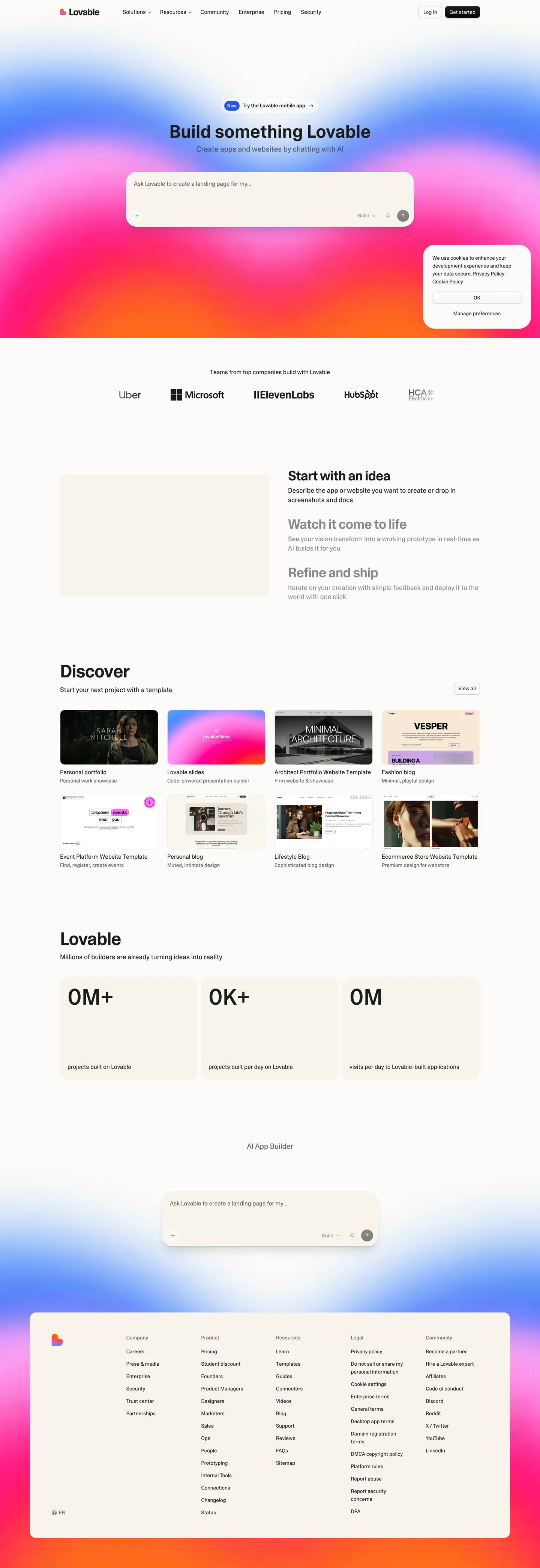
lovable.dev
Live at lovable.dev
A snapshot of the brand in production. Scroll the frame to see the whole page.
Colors
16 colors
Lovable's system runs on #f7f4ed as its primary voltage, used in 12 of 18 components. Type is set in Camera Plain Variable across 12 tokens from 14px to 60px, weights 400–600. Shape language is mixed across 18 components, blending pills, soft rounds, and squarer corners.
Text
Headlines, body, captions · 4
Other
Specialty colors · 12
Typography
12 type tokens
Set in Camera Plain Variable across 12 tokens, from 14px to 60px, weights 400–600. Shown in its own stack: where the font isn't installed, the fallback the file names stands in.
- display-hero60px · weight 600 · lh 1.05 · tracking -1.5pxThe quick brown fox jumps over the lazy dog
- display-alt60px · weight 480 · lh 1 · tracking normalThe quick brown fox jumps over the lazy dog
- section-heading48px · weight 600 · lh 1 · tracking -1.2pxThe quick brown fox jumps over the lazy dog
- sub-heading36px · weight 600 · lh 1.1 · tracking -0.9pxThe quick brown fox jumps over the lazy dog
- card-title20px · weight 400 · lh 1.25 · tracking normalThe quick brown fox jumps over the lazy dog
- body-large18px · weight 400 · lh 1.38 · tracking normalThe quick brown fox jumps over the lazy dog
- body16px · weight 400 · lh 1.5 · tracking normalThe quick brown fox jumps over the lazy dog
- button16px · weight 400 · lh 1.5 · tracking normalThe quick brown fox jumps over the lazy dog
- button-small14px · weight 400 · lh 1.5 · tracking normalThe quick brown fox jumps over the lazy dog
- link16px · weight 400 · lh 1.5 · tracking normalThe quick brown fox jumps over the lazy dog
- link-small14px · weight 400 · lh 1.5 · tracking normalThe quick brown fox jumps over the lazy dog
- caption14px · weight 400 · lh 1.5 · tracking normalThe quick brown fox jumps over the lazy dog
Layout
Radii and spacing
6 corner radii and 14 spacing values. Shape language: mixed.
Radii
- micro4px
- standard6px
- comfortable8px
- card12px
- container16px
- full9999px
Spacing
- xs8px
- sm10px
- md12px
- base16px
- lg24px
- xl32px
- xxl40px
- section-sm56px
- section80px
- section-lg96px
- section-xl128px
- section-xxl176px
- section-3xl192px
- section-4xl208px
Components
18 components
Each rendered from its tokens (color, type, radius, padding) on Lovable's own canvas.
- Button Primary Darkbutton-primary-darkButton Primary Dark
- Button Ghostbutton-ghostButton Ghost
- Button Cream Surfacebutton-cream-surfaceButton Cream Surface
- Button Pill Iconbutton-pill-iconButton Pill Icon
- CardcardCard
- Card Featuredcard-featuredCard Featured
- Card Compactcard-compactCard Compact
- Image Containerimage-containerImage Container
- Type here…text-inputText Input
- Top Navtop-navTop Nav
- Nav Linknav-linkNav Link
- LinklinkLink
- Ai Chat Inputai-chat-inputAi Chat Input
- Suggestion Pillsuggestion-pillSuggestion Pill
- Template Cardtemplate-cardTemplate Card
- Stats Numberstats-numberStats Number
- Stats Labelstats-labelStats Label
- FooterfooterFooter
In use
The system, in use
Lovable's tokens on the kind of product it builds.
Build something people actually use.
A short paragraph of marketing copy that previews how the brand's display tier and body tier read together. Two sentences is usually enough.
FAQ
Lovable design system FAQ
Common questions about Lovable's tokens, components, and how to use this DESIGN.md in your project.
Read next
Related reading
Specs, directories, and component libraries that pair with this design system.
- Browse all design systemsThe full directory of DESIGN.md files on shadcn.io, with live mockups for each.shadcn.io
- Lovable's product siteThe AI app builder whose visual system this DESIGN.md captures.lovable.dev (opens in a new tab)
- The DESIGN.md specificationGoogle Labs' open spec for machine-readable design system files — the format this page is built on.github.com (opens in a new tab)
Use it
Use Lovable in your project
One machine-readable file. Drop it into Claude, Cursor, or any AI tool that reads DESIGN.md.
Download the DESIGN.md
One machine-readable file: every color, type, radius, spacing, and component token of Lovable.
Feed it to your AI tool
Drop it into Claude, Cursor, or GitHub Copilot. The agent writes React components and Tailwind classes that match Lovable's visual language.
Reference the tokens directly
Or paste the values into your Tailwind config, CSS variables, or component library: every color, size and radius is a quoted, ready-to-copy value.
Read the full DESIGN.md: overview, rationale, do’s and don’ts
Overview
Lovable's website radiates warmth through restraint. The entire page sits on a creamy, parchment-toned background ({colors.cream} — #f7f4ed) that immediately separates it from the cold-white conventions of most developer tool sites. This isn't minimalism for minimalism's sake — it's a deliberate choice to feel approachable, almost analog, like a well-crafted notebook. The near-black text ({colors.charcoal} — #1c1c1c) against this warm cream creates a contrast ratio that's easy on the eyes while maintaining sharp readability.
The custom Camera Plain Variable typeface is the system's secret weapon. Unlike geometric sans-serifs that signal "tech company," Camera Plain has a humanist warmth — slightly rounded terminals, organic curves, and a comfortable reading rhythm. At display sizes (48px–60px), weight 600 with aggressive negative letter-spacing (-0.9px to -1.5px) compresses headlines into confident, editorial statements. The font uses ui-sans-serif, system-ui as fallbacks, acknowledging that the custom typeface carries the brand personality.
What makes Lovable's visual system distinctive is its opacity-driven depth model. Rather than using a traditional gray scale, the system modulates {colors.charcoal} at varying opacities (0.03, 0.04, 0.4, 0.82–0.83) to create a unified tonal range. Every shade of gray on the page is technically the same hue — just more or less transparent. This creates a visual coherence that's nearly impossible to achieve with arbitrary hex values. The border system follows suit: 1px solid {colors.light-cream} (#eceae4) for light divisions and 1px solid {colors.charcoal-40} for stronger interactive boundaries.
Key Characteristics:
- Warm parchment background (
{colors.cream}— #f7f4ed) — not white, not beige, a deliberate cream that feels hand-selected - Camera Plain Variable typeface with humanist warmth and editorial letter-spacing at display sizes
- Opacity-driven color system: all grays derived from
{colors.charcoal}at varying transparency levels - Inset shadow technique on buttons:
rgba(255,255,255,0.2) 0px 0.5px 0px 0px inset, rgba(0,0,0,0.2) 0px 0px 0px 0.5px inset - Warm neutral border palette:
{colors.light-cream}for subtle,{colors.charcoal-40}for interactive elements - Full-pill radius (
{rounded.full}— 9999px) used extensively for action buttons and icon containers - Focus state uses
rgba(0,0,0,0.1) 0px 4px 12pxshadow for soft, warm emphasis - shadcn/ui + Radix UI component primitives with Tailwind CSS utility styling
Colors
Primary
- Cream (
{colors.cream}— #f7f4ed): Page background, card surfaces, button surfaces. The foundation — warm, paper-like, human. - Charcoal (
{colors.charcoal}— #1c1c1c): Primary text, headings, dark button backgrounds. Not pure black — organic warmth. - Off-White (
{colors.off-white}— #fcfbf8): Button text on dark backgrounds, subtle highlight. Barely distinguishable from pure white.
Neutral Scale (Opacity-Based)
- Charcoal 100% (
{colors.charcoal}— #1c1c1c): Primary text, headings, dark surfaces. - Charcoal 83% (
{colors.charcoal-83}): Strong secondary text. - Charcoal 82% (
{colors.charcoal-82}): Body copy. - Muted Gray (
{colors.muted-gray}— #5f5f5d): Secondary text, descriptions, captions. - Charcoal 40% (
{colors.charcoal-40}): Interactive borders, button outlines. - Charcoal 4% (
{colors.charcoal-4}): Subtle hover backgrounds, micro-tints. - Charcoal 3% (
{colors.charcoal-3}): Barely-visible overlays, background depth.
Surface & Border
- Light Cream (
{colors.light-cream}— #eceae4): Card borders, dividers, image outlines. The warm divider line. - Cream Surface (
{colors.cream-surface}— #f7f4ed): Card backgrounds, section fills — same as page background for seamless integration.
Interactive
- Ring Blue (
{colors.ring-blue}— rgba(59,130,246,0.5)):--tw-ring-color, Tailwind focus ring. - Focus Shadow (
rgba(0,0,0,0.1) 0px 4px 12px): Focus and active state shadow — soft, warm, diffused.
Inset Shadows
- Button Inset (
rgba(255,255,255,0.2) 0px 0.5px 0px 0px inset, rgba(0,0,0,0.2) 0px 0px 0px 0.5px inset, rgba(0,0,0,0.05) 0px 1px 2px 0px): The signature multi-layer inset shadow on dark buttons.
Typography
Font Family
- Primary:
Camera Plain Variable, with fallbacks:ui-sans-serif, system-ui - Weight range: 400 (body/reading), 480 (special display), 600 (headings/emphasis)
- Feature: Variable font with continuous weight axis — allows fine-tuned intermediary weights like 480.
Hierarchy
| Role | Token | Size | Weight | Line Height | Letter Spacing |
|---|---|---|---|---|---|
| Display Hero | {typography.display-hero} | 60px | 600 | 1.00–1.10 | -1.5px |
| Display Alt | {typography.display-alt} | 60px | 480 | 1.00 | normal |
| Section Heading | {typography.section-heading} | 48px | 600 | 1.00 | -1.2px |
| Sub-heading | {typography.sub-heading} | 36px | 600 | 1.10 | -0.9px |
| Card Title | {typography.card-title} | 20px | 400 | 1.25 | normal |
| Body Large | {typography.body-large} | 18px | 400 | 1.38 | normal |
| Body | {typography.body} | 16px | 400 | 1.50 | normal |
| Button | {typography.button} | 16px | 400 | 1.50 | normal |
| Button Small | {typography.button-small} | 14px | 400 | 1.50 | normal |
| Link | {typography.link} | 16px | 400 | 1.50 | normal |
| Link Small | {typography.link-small} | 14px | 400 | 1.50 | normal |
| Caption | {typography.caption} | 14px | 400 | 1.50 | normal |
Principles
- Warm humanist voice: Camera Plain Variable gives Lovable its approachable personality. The slightly rounded terminals and organic curves contrast with the sharp geometric sans-serifs used by most developer tools.
- Variable weight as design tool: The font supports continuous weight values (e.g., 480), enabling nuanced hierarchy beyond standard weight stops. Weight 480 at 60px creates a display style that feels lighter than semibold but stronger than regular.
- Compression at scale: Headlines use negative letter-spacing (-0.9px to -1.5px) for editorial impact. Body text stays at normal tracking for comfortable reading.
- Two weights, clear roles: 400 (body/UI/links/buttons) and 600 (headings/emphasis). The narrow weight range creates hierarchy through size and spacing, not weight variation.
Layout
Spacing System
- Base unit: 8px
- Scale: 8px, 10px, 12px, 16px, 24px, 32px, 40px, 56px, 80px, 96px, 128px, 176px, 192px, 208px
- The scale expands generously at the top end — sections use 80px–208px vertical spacing for editorial breathing room.
Grid & Container
- Max content width: approximately 1200px (centered)
- Hero: centered single-column with massive vertical padding (96px+)
- Feature sections: 2–3 column grids
- Full-width footer with multi-column link layout
- Showcase sections with centered card grids
Whitespace Philosophy
- Editorial generosity: Lovable's spacing is lavish at section boundaries (80px–208px). The warm cream background makes these expanses feel cozy rather than empty.
- Content-driven rhythm: Tight internal spacing within cards (12–24px) contrasts with wide section gaps, creating a reading rhythm that alternates between focused content and visual rest.
- Section separation: Footer uses
1px solid {colors.light-cream}border and 16px radius container. Sections defined by generous spacing rather than border lines.
Border Radius Scale
- Micro (
{rounded.micro}— 4px): Small buttons, interactive elements - Standard (
{rounded.standard}— 6px): Buttons, inputs, navigation menu - Comfortable (
{rounded.comfortable}— 8px): Compact cards, divs - Card (
{rounded.card}— 12px): Standard cards, image containers, templates - Container (
{rounded.container}— 16px): Large containers, footer sections - Full Pill (
{rounded.full}— 9999px): Action pills, icon buttons, toggles
Elevation
| Level | Treatment | Use |
|---|---|---|
| Flat (Level 0) | No shadow, cream background | Page surface, most content |
| Bordered (Level 1) | 1px solid {colors.light-cream} | Cards, images, dividers |
| Inset (Level 2) | rgba(255,255,255,0.2) 0px 0.5px 0px inset, rgba(0,0,0,0.2) 0px 0px 0px 0.5px inset, rgba(0,0,0,0.05) 0px 1px 2px | Dark buttons, primary actions |
| Focus (Level 3) | rgba(0,0,0,0.1) 0px 4px 12px | Active/focus states |
| Ring (Accessibility) | {colors.ring-blue} 2px ring | Keyboard focus on inputs |
Shadow Philosophy: Lovable's depth system is intentionally shallow. Instead of floating cards with dramatic drop-shadows, the system relies on warm borders ({colors.light-cream}) against the cream surface to create gentle containment. The only notable shadow pattern is the inset shadow on dark buttons — a subtle multi-layer technique where a white highlight line sits at the top edge while a dark ring and soft drop handle the bottom. This creates a tactile, pressed-into-surface feeling rather than a hovering-above-surface feeling. The warm focus shadow (rgba(0,0,0,0.1) 0px 4px 12px) is deliberately diffused and large, creating a soft glow rather than a sharp outline.
Decorative Depth
- Hero: soft, warm multi-color gradient wash (pinks, oranges, blues) behind hero — atmospheric, barely visible.
- Footer: gradient background with warm tones transitioning to the bottom.
- No harsh section dividers — spacing and background warmth handle transitions.
Components
Buttons
button-primary-dark — Charcoal fill, off-white text, 6px radius, 8×16px padding. Carries the signature multi-layer inset shadow: a 0.5px white top-edge highlight, a 0.5px dark ring, and a soft 1px drop. Active state drops opacity to 0.8; focus adds rgba(0,0,0,0.1) 0px 4px 12px. Used for primary CTAs ("Start Building", "Get Started").
button-ghost — Transparent fill, charcoal text, 1px solid {colors.charcoal-40} border, 6px radius. Used for secondary actions ("Log In", "Documentation").
button-cream-surface — Cream fill, charcoal text, no border, 6px radius. Used for tertiary actions and toolbar buttons.
button-pill-icon — Cream fill, charcoal icon, 9999px radius, same inset shadow as primary dark. Default opacity 0.5, active 0.8. Used for additional actions (plan mode toggle, voice recording).
Cards & Containers
- Background:
{colors.cream}(matches page) - Border:
1px solid {colors.light-cream} - Radius: 12px (standard), 16px (featured), 8px (compact)
- No box-shadow by default — borders define boundaries
- Image cards:
1px solid {colors.light-cream}with 12px radius
Inputs & Forms
text-input — Cream background, charcoal text, 1px solid {colors.light-cream} border, 6px radius. Placeholder in muted gray ({colors.muted-gray}). On focus, a ring blue outline ({colors.ring-blue}) appears for accessibility.
Navigation
- Clean horizontal nav on cream background, fixed
- Logo/wordmark left-aligned (128.75 × 22px)
- Links: Camera Plain 14–16px weight 400, charcoal text
- CTA: dark button with inset shadow, 6px radius
- Mobile: hamburger menu with 6px radius button
- Subtle border or no border on scroll
Links
- Color:
{colors.charcoal} - Decoration: underline (default)
- Hover: primary accent (via CSS variable
hsl(var(--primary))) - No color change on hover — decoration carries the interactive signal
Image Treatment
- Showcase/portfolio images with
1px solid {colors.light-cream}border - Consistent 12px border radius on all image containers
- Soft gradient backgrounds behind hero content (warm multi-color wash)
- Gallery-style presentation for template/project showcases
Distinctive Components
ai-chat-input — Large prompt input area with cream background, soft {colors.light-cream} borders, and 12px radius. Suggestion pills sit beneath, each with the same border tone. Voice recording and plan-mode toggle buttons render as pill shapes ({rounded.full}). The input area reads as warm and inviting rather than clinical.
template-card — Card grid showing project templates. Each card holds an image plus title, with 1px solid {colors.light-cream} border and 12px radius. Hover state: subtle shadow or border darkening. Category labels render as text links.
stats-number / stats-label — Large metrics in 48px+ weight 600 charcoal ("0M+" pattern), descriptive text below in muted gray. Horizontal layout with generous spacing.
Responsive Behavior
| Name | Width | Key Changes |
|---|---|---|
| Mobile Small | <600px | Tight single column, reduced padding |
| Mobile | 600–640px | Standard mobile layout |
| Tablet Small | 640–700px | 2-column grids begin |
| Tablet | 700–768px | Card grids expand |
| Desktop Small | 768–1024px | Multi-column layouts |
| Desktop | 1024–1280px | Full feature layout |
| Large Desktop | 1280–1536px | Maximum content width, generous margins |
Touch Targets
- Buttons: 8×16px padding (comfortable touch)
- Navigation: adequate spacing between items
- Pill buttons: 9999px radius creates large tap-friendly targets
- Menu toggle: 6px radius button with adequate sizing
Collapsing Strategy
- Hero: 60px → 48px → 36px headline scaling with proportional letter-spacing
- Navigation: horizontal links → hamburger menu at 768px
- Feature cards: 3-column → 2-column → single column stacked
- Template gallery: grid → stacked vertical cards
- Stats bar: horizontal → stacked vertical
- Footer: multi-column → stacked single column
- Section spacing: 128px+ → 64px on mobile
Image Behavior
- Template screenshots maintain
1px solid {colors.light-cream}border at all sizes - 12px border radius preserved across breakpoints
- Gallery images responsive with consistent aspect ratios
- Hero gradient softens/simplifies on mobile
Known Gaps
- Hover state colors: hover specifics are described in qualitative terms (subtle shadow or border darkening) but exact transition tokens were not extracted.
- Loading states / skeleton screens: not visible on the extracted surfaces.
- Dark mode: the system as captured is light-only; no dark variant tokens are documented.
- Form input error states: focus-ring tokens are documented, but error outline + helper-text combinations on validation failure were not visible in the captured surfaces.
- Decorative gradients: the hero and footer gradients are described qualitatively (pinks, oranges, blues / warm transitioning tones) but no exact stop colors are captured.
AI & LLM Platforms
More systems like this
More DESIGN.md files in AI & LLM Platforms.
Pricing
Build it with Pro
The DESIGN.md files are free. Pro adds 6,000+ blocks, premium templates and the MCP server, so your AI editor builds in your system for you.
4.9/5 out of 5 · 150+ reviewsfrom 150+ founders and developers.
Billing
Billed once a year in USD. Cancel anytime.
- How many people can use the license.
- Client work, SaaS products and anything you charge for.
- Production-ready React sections: hero, pricing, features, dashboards and more.
- Complete multi-page sites you can ship as they are.
- React icons from every major library, installable with one command.
- Presets that restyle every block, in light and dark.
- Lets your AI editor search, preview and install blocks for you.
- Priority requests are answered first.
Individual
For personal projects & open source
$32instead of $49/mo
$389 billed yearly
- Seats: 1 seat
- Commercial use: Personal & open source only
- Pro blocks: 6,000+ blocks
- Templates: All 14 templates
- React icons: 294k+ icons
- Themes: All 59 themes
- MCP server: Basic usage
- Support: Standard
Team
Most popularFor freelancers, agencies & startups
$66instead of $99/mo
$789 billed yearly · ≈ $13/dev/mo
- Seats: Up to 5 seats
- Commercial use: Included
- Pro blocks: 6,000+ blocks
- Templates: All 14 templates
- React icons: 294k+ icons
- Themes: All 59 themes
- MCP server: High usage
- Support: Priority
Organization
For companies with larger teams
$132instead of $199/mo
$1,589 billed yearly
- Seats: Unlimited seats
- Commercial use: Included
- Pro blocks: 6,000+ blocks
- Templates: All 14 templates
- React icons: 294k+ icons
- Themes: All 59 themes
- MCP server: Unlimited usage
- Support: Priority
Billed once a year in USD. Cancel anytime.
Individual
For personal projects & open source
$32instead of $49/mo
$389 billed yearly
- How many people can use the license.Seats: 1 seat
- Client work, SaaS products and anything you charge for.Commercial use: Personal & open source only
- Production-ready React sections: hero, pricing, features, dashboards and more.Pro blocks: 6,000+ blocks
- Complete multi-page sites you can ship as they are.Templates: All 14 templates
- React icons from every major library, installable with one command.React icons: 294k+ icons
- Presets that restyle every block, in light and dark.Themes: All 59 themes
- Lets your AI editor search, preview and install blocks for you.MCP server: Basic usage
- Priority requests are answered first.Support: Standard
Team
Most popularFor freelancers, agencies & startups
$66instead of $99/mo
$789 billed yearly · ≈ $13/dev/mo
Everything in Individual, plus
- How many people can use the license.Seats: Up to 5 seats
- Client work, SaaS products and anything you charge for.Commercial use: Included
- Lets your AI editor search, preview and install blocks for you.MCP server: High usage
- Priority requests are answered first.Support: Priority
Organization
For companies with larger teams
$132instead of $199/mo
$1,589 billed yearly
Everything in Team, plus
- How many people can use the license.Seats: Unlimited seats
- Lets your AI editor search, preview and install blocks for you.MCP server: Unlimited usage
- Secure checkout via Stripe
- Code lives in your repo
- Keep what you've shipped if you cancel
- License terms
Your system, built for you
Every block, template and icon, installed by your AI agent in your design system. The DESIGN.md files stay free.