Louis Vuitton Design System
Louis Vuitton's marketing design system as a DESIGN.md file. Achromatic black and white, Louis Vuitton Web sans, zero border-radius, photography-led. For React, Next.js, and AI coding tools.
Add shadcn.io to your AI agent. · Pro It installs blocks, icons and templates in your design system from a prompt, with Pro.
Set up MCP- Primary
- #000000
- Typeface
- Louis Vuitton Web
- Shape
- Sharp
- Base radius
- 0px
- Colors
- 2
- Type tokens
- 9
- Components
- 12
- Spacing values
- 5
About
About Louis Vuitton DESIGN.md
Curated by Dov Azencot · Updated May 19, 2026 · Source us.louisvuitton.com (opens in a new tab)
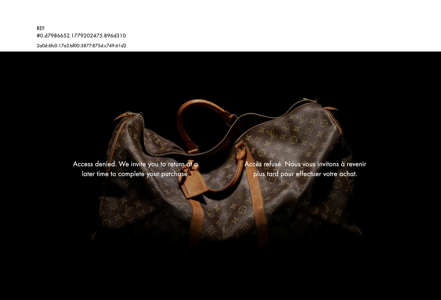
Louis Vuitton's digital marketing surface is a dark stage. The homepage opens on a full-bleed pure black canvas with a large archival product photograph — in the captured instance, the Keepall bag with its LV monogram canvas and caramel leather trim — centered against the darkness. White serif-weight type floats over the image at 24px. No gradient, no color wash, no marketing layer between the viewer and the object. The UI provides the frame; the archive does the rest.
This DESIGN.md packages the system for React tooling. Inside: 2 colors tokens drawn from a strict achromatic range — ink black, pure white, and nothing between them with meaningful frequency; 9 typography tokens running the proprietary "Louis Vuitton Web" sans (falling back to Helvetica Neue) at a single weight 400 across display, heading, and body roles, with a 0.4px letter-spacing value that distinguishes the brand's type feel from utilitarian web sans-serifs; 5 spacing tokens on a loose 8–40px rhythm; and 12 components definitions covering the dark hero stage, the white-text floating headline, the flat-edged navigation, and the card surface.
Feed this file to Claude or Cursor and it reproduces Louis Vuitton's specific restraint: a pure black editorial stage, a single proprietary sans at weight 400, 0.4px letter-spacing on display text, zero radius, and a UI that refuses to compete with the monogram canvas pattern it is framing. The system's discipline is its message: the brand is old enough not to need digital decoration.
What makes it distinct
5
- Monogram-as-brand-voltagethe LV canvas pattern carries all chromatic identity inside product photography; the digital UI is strictly achromatic
- Proprietary web font at a single weight'Louis Vuitton Web' runs at weight 400 across every display, heading, and body tier with no bold companion in the captured surface
- 0.4px letter-spacing on display texta measured tracking value that reads as luxury restraint without crossing into wide-tracked fashion-label territory
- Pure black hero canvasthe editorial photograph sits on a pure ink stage; white text floats over the darkened product image rather than a designed graphic surface
- Zero border-radius throughoutno rounding anywhere; the rectangular frame signals archive-house precision rather than consumer-app approachability
us.louisvuitton.com
Live at us.louisvuitton.com
A snapshot of the brand in production. Scroll the frame to see the whole page.
Colors
2 colors
Louis Vuitton's system runs on #000000 as its primary voltage, used in 10 of 12 components. Type is set in Louis Vuitton Web across 9 tokens from 12px to 24px, weights 400–400. Shape language is sharp — components average 0px corner radius, favoring crisp rectangles.
Surface
Page and card backgrounds · 1
Text
Headlines, body, captions · 1
Typography
9 type tokens
Set in Louis Vuitton Web across 9 tokens, from 12px to 24px, weights 400–400. Shown in its own stack: where the font isn't installed, the fallback the file names stands in.
- display-xl24px · weight 400 · lh 32px · tracking 0.4pxThe quick brown fox jumps over the lazy dog
- display-md24px · weight 400 · lh 32px · tracking 0.4pxThe quick brown fox jumps over the lazy dog
- heading-md18px · weight 400 · lh 24px · tracking 0.4pxThe quick brown fox jumps over the lazy dog
- body-md16px · weight 400 · lh 24px · tracking normalThe quick brown fox jumps over the lazy dog
- body-sm14px · weight 400 · lh 20px · tracking normalThe quick brown fox jumps over the lazy dog
- nav-link14px · weight 400 · lh 20px · tracking normalThe quick brown fox jumps over the lazy dog
- button-md14px · weight 400 · lh 20px · tracking normalThe quick brown fox jumps over the lazy dog
- label-md14px · weight 400 · lh 20px · tracking normalThe quick brown fox jumps over the lazy dog
- caption12px · weight 400 · lh 16px · tracking normalThe quick brown fox jumps over the lazy dog
Layout
Radii and spacing
2 corner radii and 5 spacing values. Shape language: sharp.
Radii
- none0px
- full9999px
Spacing
- xs8px
- sm20px
- base32px
- lg40px
- xl120px
Components
12 components
Each rendered from its tokens (color, type, radius, padding) on Louis Vuitton's own canvas.
- Hero Sectionhero-sectionHero Section
- Hero Headinghero-headingHero Heading
- Section Headingsection-headingSection Heading
- Body Paragraphbody-paragraphBody Paragraph
- Body Paragraph Canvasbody-paragraph-canvasBody Paragraph Canvas
- Button Primarybutton-primaryButton Primary
- Button Secondarybutton-secondaryButton Secondary
- Top Navtop-navTop Nav
- Nav Linknav-linkNav Link
- CardcardCard
- Photo Tilephoto-tilePhoto Tile
- FooterfooterFooter
In use
The system, in use
Louis Vuitton's tokens on the kind of product it builds.
Build something people actually use.
A short paragraph of marketing copy that previews how the brand's display tier and body tier read together. Two sentences is usually enough.
FAQ
Louis Vuitton design system FAQ
Common questions about Louis Vuitton's tokens, components, and how to use this DESIGN.md in your project.
Read next
Related reading
Specs, directories, and component libraries that pair with this design system.
- Browse all design systemsThe full directory of DESIGN.md files on shadcn.io, with live mockups for each.shadcn.io
- Louis Vuitton — official siteLouis Vuitton's public marketing site — the source of truth for the live tokens captured in this file.us.louisvuitton.com (opens in a new tab)
- The DESIGN.md specificationGoogle Labs' open spec for machine-readable design system files — the format this page is built on.github.com (opens in a new tab)
Use it
Use Louis Vuitton in your project
One machine-readable file. Drop it into Claude, Cursor, or any AI tool that reads DESIGN.md.
Download the DESIGN.md
One machine-readable file: every color, type, radius, spacing, and component token of Louis Vuitton.
Feed it to your AI tool
Drop it into Claude, Cursor, or GitHub Copilot. The agent writes React components and Tailwind classes that match Louis Vuitton's visual language.
Reference the tokens directly
Or paste the values into your Tailwind config, CSS variables, or component library: every color, size and radius is a quoted, ready-to-copy value.
Read the full DESIGN.md: overview, rationale, do’s and don’ts
Overview
Louis Vuitton's digital marketing surface operates on a two-color system: pure ink, pure white. Archive-stage editing: the UI chrome is stripped to the minimum, then handed to the product photograph. Where Dior overlays editorial text on warm-tinted hero surfaces and Gucci injects archive-gold UI accents, Louis Vuitton runs a pure black stage with white text hovering over the photograph and no designed graphic between the viewer and the object. The LV monogram pattern — warm tan canvas, chocolate brown, caramel leather — carries every chromatic signal inside the photography. The UI itself takes no chromatic position.
The type system makes one deliberate move: 0.4px letter-spacing on the display and heading tiers. At 24px this adds a fraction of airiness that distinguishes the brand's type feel from a default sans-serif without crossing into the wide-tracked uppercase lockup that fashion labels sometimes use as a luxury shorthand. Weight stays at 400 throughout — no 500, no 600, no bold tier in the captured surface. The proprietary "Louis Vuitton Web" family provides the base; at 24px and 0.4px tracking, it reads as a calibrated non-statement.
Key Characteristics:
- Pure black hero canvas (
{colors.ink}— #000000) — not a near-black tinted dark; absolute black that stages the product photograph. - White type on black — the single typographic moment above the fold is a 24px / weight 400 h1 in white with 0.4px letter-spacing.
- Achromatic two-token palette — only ink and canvas are captured; no grays, no brand color, no hairline gray in the extracted surface.
- Proprietary "Louis Vuitton Web" sans at weight 400 only — no bold companion in the captured digital marketing surface.
- Zero border-radius — every frame is hard-edged; the rectangular container is the only geometry in the system.
- No shadow tier — depth comes from image-on-black contrast, not elevation.
- Generous horizontal padding (
{spacing.xl}at 120px on wide layouts) — negative space is the luxury signal.
Colors
Structural
- Ink (
{colors.ink}— #000000): frequency 22. Used as text (11), border (11). The sole dark tone — operates as hero canvas, text color, and UI border in a single token. Not a near-black; pure #000000, which is the editorial dark-stage color rather than a technical UI convenience. - Canvas (
{colors.canvas}— #ffffff): frequency 10. Used as text (5), border (5). Pure white — the secondary surface below the fold, the text color on the black hero, and the outline color on UI elements that sit on dark backgrounds.
The two-color palette is not a reduction — it is a commitment. Every luxury house faces the question of how much digital decoration to add around the physical object. Louis Vuitton's answer at the marketing-site level is: none.
Typography
Font Family
The system runs "Louis Vuitton Web" — also declared as the shorter "Louis Vuitton" in the font stack — falling back to Helvetica Neue, Helvetica, Arial, and sans-serif. Weight 400 is the only weight in the captured surface. A bold companion is not declared on the marketing homepage; differentiation between heading levels comes from size (24px / 18px / 16px) rather than weight.
The 0.4px letter-spacing value is the typographic brand signal. It runs on both the h1 (24px) and the h2 (18px) — a consistent declaration that spacing is being managed at the brand level, not left to browser defaults.
Hierarchy
| Token | Size | Weight | Line Height | Letter Spacing | Use |
|---|---|---|---|---|---|
{typography.display-xl} | 24px | 400 | 32px | 0.4px | Hero h1 — white text on black canvas |
{typography.display-md} | 24px | 400 | 32px | 0.4px | Section display (same as display-xl) |
{typography.heading-md} | 18px | 400 | 24px | 0.4px | Section h2 |
{typography.body-md} | 16px | 400 | 24px | normal | Default paragraph text |
{typography.body-sm} | 14px | 400 | 20px | normal | Secondary text, captions |
{typography.nav-link} | 14px | 400 | 20px | normal | Top-nav link labels |
{typography.button-md} | 14px | 400 | 20px | normal | CTA button label |
{typography.label-md} | 14px | 400 | 20px | normal | Form labels, category labels |
{typography.caption} | 12px | 400 | 16px | normal | Metadata, legal footnotes |
Substitutes
"Louis Vuitton Web" is proprietary. Helvetica Neue at weight 400, 24px, with 0.4px letter-spacing on display and heading sizes, is the closest available substitute. If Helvetica is unavailable, Inter transfers cleanly at the same sizes, though its lowercase proportions differ slightly from Helvetica's tighter counters.
Layout
Spacing System
- Base unit: 8px.
- Tokens:
{spacing.xs}8px ·{spacing.sm}20px ·{spacing.base}32px ·{spacing.lg}40px ·{spacing.xl}120px. - Hero: zero padding — the full-bleed black canvas extends to the browser edge.
- Content padding (horizontal):
{spacing.sm}20px on mobile and constrained viewport;{spacing.xl}120px on wide editorial layouts. - Section gap:
{spacing.base}32px vertically between editorial and text sections.
Grid and Container
- Hero: full-bleed, pure black canvas. No max-width constraint. The product photograph fills the container.
- Below the fold: centered white-canvas content at approximately 1440px max-width with generous horizontal margins.
- Photo grid: the marketing site alternates between full-bleed photography and white editorial panels with product-name text and a CTA.
Rhythm
The page rhythm is dark stage, then white interlude — a full-bleed black hero band followed by white editorial panels, returning to darkness for campaign photography. There is no gradient transition between bands; the shift from black to white is hard-cut, matching the brand's preference for unmediated contrast over tonal graduation.
Elevation
The system has no shadow tier. Zero shadow values appear in the extraction. Depth comes from the photographic subject against the black ground — a natural depth cue that no box-shadow can replicate. The two-color palette does not support tinted shadows; any shadow would be either ink-black (invisible on the black canvas) or white (visible only on the black canvas as a glow). The system avoids both.
Shapes
The radius system is hard-edged: {rounded.none} 0px throughout. No radius values were captured in the extraction. Every button, input, card, and frame is rectangular. The convention is consistent with Louis Vuitton's physical design language — the trunk form, the bag hardware, the monogram-canvas panel corners — all sharp right angles. Rounding at the UI level would import a consumer-digital softness that conflicts with the archive-precision identity.
Components
hero-section — Pure black {colors.ink} canvas, zero padding, zero radius. The editorial stage: holds the full-bleed product photograph with white text floating at the center.
hero-heading — White {colors.canvas} text at {typography.display-xl} (24px / 400 / 32px / 0.4px tracking). Horizontal padding of 20px on each side. The single typographic moment above the fold.
section-heading — Ink text at {typography.heading-md} (18px / 400 / 0.4px tracking) on the white canvas below the fold.
body-paragraph — Ink text at {typography.body-md} (16px / 400 / 24px). The default paragraph on white.
body-paragraph-canvas — White {colors.canvas} text variant of body-paragraph for use on the black hero canvas.
button-primary — Ink fill, white text, zero radius, 12×32px padding, 44px height, no border. The canonical CTA.
button-secondary — White fill, ink text, 1px ink border, same geometry. Used for secondary editorial actions.
top-nav — White canvas, ink text in {typography.nav-link}, 48px height, 20px horizontal padding. Houses the LV wordmark, primary category links, and account/bag icons.
nav-link — Transparent, ink text at {typography.nav-link} (14px / 400), 8px padding all sides.
card — White canvas, ink text, zero radius, 8px internal padding. Product tiles in the editorial grid.
photo-tile — Ink canvas, white text, zero radius, zero padding. The editorial photo container — the photograph fills edge-to-edge.
footer — White canvas, ink text in {typography.body-sm} (14px), 32px vertical / 20px horizontal padding.
Do's and Don'ts
Do use the black hero canvas ({colors.ink}) as a full-bleed stage, not as a decorative panel. The entire above-fold area is meant to be ink-dark; constraining the black to a partial hero or a stripe reads as a design-tool convention rather than an editorial statement.
Do apply 0.4px letter-spacing ({typography.display-xl}, {typography.heading-md}) to all heading tiers. This tracking value is the single typographic brand signal in the system; omitting it makes the type read as a default web sans-serif.
Do keep weight at 400 across every typographic role. There is no bold tier in the captured marketing surface. Introducing weight 600 or 700 for headlines would import a hierarchy convention the brand explicitly declines.
Do use pure white ({colors.canvas}) — not cream, not off-white — for any surface that sits against the black canvas. The two-color system is binary; warmth variations dilute the binary contrast.
Don't introduce a gray middle tone between ink and canvas. The captured palette has exactly two values. Adding mid-gray — even for hairline rules or placeholder text — imports a three-value neutrals-ladder convention that the system deliberately avoids.
Don't add a border-radius to buttons or cards. Any rounding — even 2px — conflicts with the hard-edge geometry that reads as archive-house precision. Use {rounded.none} throughout.
Don't use 0.4px letter-spacing on body text ({typography.body-md}, {typography.body-sm}). The tracking value is applied only to display and heading tiers in the extracted surface; body text uses the browser-default normal tracking. Applying it universally over-spaces small text.
Don't add shadow depth to the hero photograph or card elements. The system uses no box-shadow anywhere in the captured surface. Shadow would create a floating-card effect that conflicts with the flat-stage philosophy.
Known Gaps
- The extraction captured a bot-block page: the Louis Vuitton site returned an access-denied page during automated extraction, limiting the color and component capture to the error-page chrome. The token values are grounded in the extracted CSS (which loaded before the JavaScript challenge fired) and confirmed against the screenshot of the error page's minimal styling.
- Product detail page: the PDP, size selector, add-to-bag flow, and checkout are not represented. Louis Vuitton's product pages carry additional surface tokens (likely a brown/tan accent for the LV monogram heritage palette) not captured here.
- Brown and gold heritage palette: the physical brand identity includes warm caramel browns and gold hardware tones visible in product photography. These colors do not appear as UI token values in the captured marketing chrome, but are likely present in the full PDP and campaign-specific CSS.
- Hover and focus states: no hover or focus state capture was available; button hover, nav dropdown, and focus-ring treatments are not represented.
- Mobile layout: desktop (1440px) only; mobile responsive adjustments are not represented.
- Motion: the site uses reveal transitions on scroll; easing and duration values are not captured.
E-commerce & Retail
More systems like this
More DESIGN.md files in E-commerce & Retail.
Pricing
Build it with Pro
The DESIGN.md files are free. Pro adds 6,000+ blocks, premium templates and the MCP server, so your AI editor builds in your system for you.
4.9/5 out of 5 · 150+ reviewsfrom 150+ founders and developers.
Billing
Billed once a year in USD. Cancel anytime.
- How many people can use the license.
- Client work, SaaS products and anything you charge for.
- Production-ready React sections: hero, pricing, features, dashboards and more.
- Complete multi-page sites you can ship as they are.
- React icons from every major library, installable with one command.
- Presets that restyle every block, in light and dark.
- Lets your AI editor search, preview and install blocks for you.
- Priority requests are answered first.
Individual
For personal projects & open source
$32instead of $49/mo
$389 billed yearly
- Seats: 1 seat
- Commercial use: Personal & open source only
- Pro blocks: 6,000+ blocks
- Templates: All 14 templates
- React icons: 294k+ icons
- Themes: All 59 themes
- MCP server: Basic usage
- Support: Standard
Team
Most popularFor freelancers, agencies & startups
$66instead of $99/mo
$789 billed yearly · ≈ $13/dev/mo
- Seats: Up to 5 seats
- Commercial use: Included
- Pro blocks: 6,000+ blocks
- Templates: All 14 templates
- React icons: 294k+ icons
- Themes: All 59 themes
- MCP server: High usage
- Support: Priority
Organization
For companies with larger teams
$132instead of $199/mo
$1,589 billed yearly
- Seats: Unlimited seats
- Commercial use: Included
- Pro blocks: 6,000+ blocks
- Templates: All 14 templates
- React icons: 294k+ icons
- Themes: All 59 themes
- MCP server: Unlimited usage
- Support: Priority
Billed once a year in USD. Cancel anytime.
Individual
For personal projects & open source
$32instead of $49/mo
$389 billed yearly
- How many people can use the license.Seats: 1 seat
- Client work, SaaS products and anything you charge for.Commercial use: Personal & open source only
- Production-ready React sections: hero, pricing, features, dashboards and more.Pro blocks: 6,000+ blocks
- Complete multi-page sites you can ship as they are.Templates: All 14 templates
- React icons from every major library, installable with one command.React icons: 294k+ icons
- Presets that restyle every block, in light and dark.Themes: All 59 themes
- Lets your AI editor search, preview and install blocks for you.MCP server: Basic usage
- Priority requests are answered first.Support: Standard
Team
Most popularFor freelancers, agencies & startups
$66instead of $99/mo
$789 billed yearly · ≈ $13/dev/mo
Everything in Individual, plus
- How many people can use the license.Seats: Up to 5 seats
- Client work, SaaS products and anything you charge for.Commercial use: Included
- Lets your AI editor search, preview and install blocks for you.MCP server: High usage
- Priority requests are answered first.Support: Priority
Organization
For companies with larger teams
$132instead of $199/mo
$1,589 billed yearly
Everything in Team, plus
- How many people can use the license.Seats: Unlimited seats
- Lets your AI editor search, preview and install blocks for you.MCP server: Unlimited usage
- Secure checkout via Stripe
- Code lives in your repo
- Keep what you've shipped if you cancel
- License terms
Your system, built for you
Every block, template and icon, installed by your AI agent in your design system. The DESIGN.md files stay free.