LOEWE Design System
LOEWE's marketing design system as a DESIGN.md file: pure-monochrome palette, proprietary Avus typeface at weight 400 only, 0px radius everywhere, full-bleed editorial photography. Tokens for React, Next.js, and AI tools.
Add shadcn.io to your AI agent. · Pro It installs blocks, icons and templates in your design system from a prompt, with Pro.
Set up MCP- Primary
- #f2ca56
- Typeface
- Avus
- Shape
- Sharp
- Base radius
- 0px
- Colors
- 8
- Type tokens
- 10
- Components
- 14
- Spacing values
- 8
About
About LOEWE DESIGN.md
Curated by Dov Azencot · Updated May 19, 2026 · Source loewe.com (opens in a new tab)
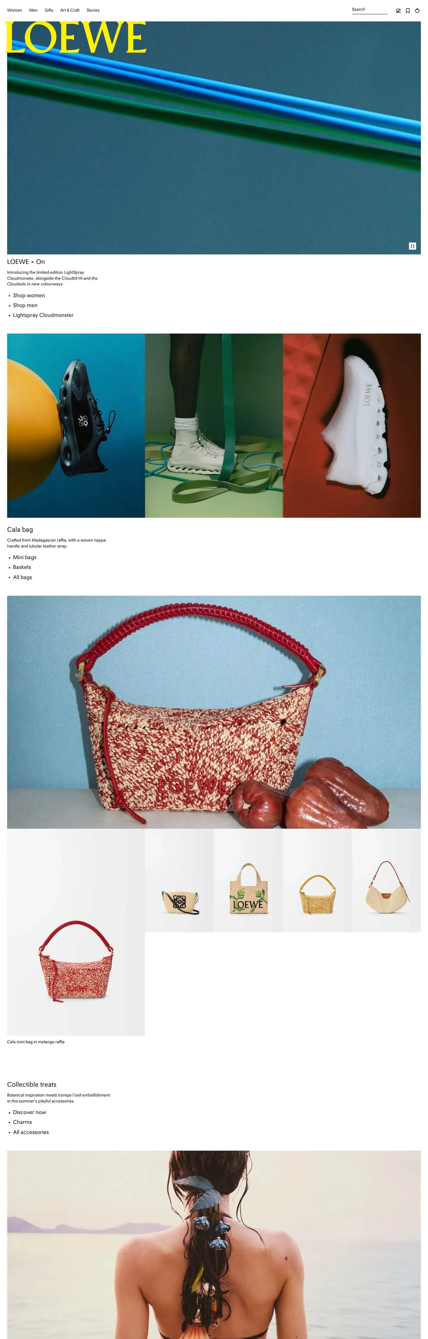
LOEWE's marketing site is an act of deliberate restraint that almost no luxury brand attempts at this scale: the entire interface chrome is two colors — ink black and near-white. No accent. No gold. No brand-voltage CTA. The LOEWE logotype renders in pure black at the top-left of a white canvas; product campaigns occupy full-bleed editorial panels below; the only color on the page comes from photography. Where Gucci saturates its site with dark bottle-green and Prada runs an editorial-red accent, LOEWE withholds entirely — the implication being that the objects themselves carry all the chromatic authority worth claiming.
This DESIGN.md packages the system into a machine-readable spec for React and AI tools. Inside: 8 colors tokens drawn from a monochrome palette of ink black, near-white, and a gradient-grey middle tone; 10 typography tokens running Avus (the house's proprietary geometric sans) at weight 400 across every tier — display at 22px, body at 14px, caption at 12px — with no weight variation for emphasis; a 4-token radius scale that starts and ends at 0px; 8 spacing tokens on a 4px base; and 14 components definitions covering the top-nav, product card, editorial heading, and hairline-divided navigation grid.
Feed this file to Claude or Cursor and it will reproduce LOEWE's specific moves: pure-black type on near-white canvas, Avus at a flat 400 weight, 0px corner radius on every surface, and photography as the sole chromatic voice. The one move worth borrowing only if your brand can sustain it: the refusal to hold a voltage color in reserve. Most brands treat restraint as an accent strategy — LOEWE treats it as a total system property, which reads as categorical confidence rather than minimal branding.
What makes it distinct
5
- Monochrome disciplinethe entire chrome runs on two tones: ink black and near-white grey; no brand color ever appears in the UI layer
- Single weight across all tiersAvus runs at 400 for display (22px), body (14px), navigation, and caption; weight is not used as a hierarchy signal
- Zero radius everywhere0px border-radius on every element including buttons, cards, and images; the square edge is the identity
- Photography as decorationall chromatic expression lives in the campaign imagery, never in the system chrome
- Hairline economyborders render at 1px black with low opacity, used to subdivide the page rather than to indicate elevation
loewe.com
Live at loewe.com
A snapshot of the brand in production. Scroll the frame to see the whole page.
Colors
8 colors
LOEWE's system anchors on #f2ca56 (accent-yellow) as its primary color. Type is set in Avus across 10 tokens from 12px to 22px, weights 400–400. Shape language is sharp — components average 0px corner radius, favoring crisp rectangles.
Brand & Accent
Sparing, CTA-only voltage · 1
Surface
Page and card backgrounds · 2
Text
Headlines, body, captions · 1
Borders & Hairlines
Dividers, outlines, rules · 1
Semantic
Status, errors, success, links · 3
Typography
10 type tokens
Set in Avus across 10 tokens, from 12px to 22px, weights 400–400. Shown in its own stack: where the font isn't installed, the fallback the file names stands in.
- display-xl22px · weight 400 · lh 20pxThe quick brown fox jumps over the lazy dog
- display-md18px · weight 400 · lh 25.2pxThe quick brown fox jumps over the lazy dog
- body-lg18px · weight 400 · lh 18pxThe quick brown fox jumps over the lazy dog
- body-md14px · weight 400 · lh 19.6pxThe quick brown fox jumps over the lazy dog
- body-sm12px · weight 400 · lh 16.8pxThe quick brown fox jumps over the lazy dog
- label-md14px · weight 400 · lh 19.6pxThe quick brown fox jumps over the lazy dog
- button-md14px · weight 400 · lh 19.6pxThe quick brown fox jumps over the lazy dog
- nav-link14px · weight 400 · lh 19.6pxThe quick brown fox jumps over the lazy dog
- caption12px · weight 400 · lh 16.8pxThe quick brown fox jumps over the lazy dog
- hero-heading22px · weight 400 · lh 20pxThe quick brown fox jumps over the lazy dog
Layout
Radii and spacing
1 corner radii and 8 spacing values. Shape language: sharp.
Radii
- none0px
Spacing
- xs4px
- sm8px
- md12px
- base16px
- lg24px
- xl32px
- 2xl48px
- 3xl80px
Components
14 components
Each rendered from its tokens (color, type, radius, padding) on LOEWE's own canvas.
- Button Primarybutton-primaryButton Primary
- Button Secondarybutton-secondaryButton Secondary
- Top Navtop-navTop Nav
- Nav Linknav-linkNav Link
- Hero Headinghero-headingHero Heading
- Section Headingsection-headingSection Heading
- Body Paragraphbody-paragraphBody Paragraph
- Body Paragraph Mutedbody-paragraph-mutedBody Paragraph Muted
- CardcardCard
- Product Image Bgproduct-image-bgProduct Image Bg
- Product Labelproduct-labelProduct Label
- Type here…text-inputText Input
- FooterfooterFooter
- CaptioncaptionCaption
In use
The system, in use
LOEWE's tokens on the kind of product it builds.
Build something people actually use.
A short paragraph of marketing copy that previews how the brand's display tier and body tier read together. Two sentences is usually enough.
FAQ
LOEWE design system FAQ
Common questions about LOEWE's tokens, components, and how to use this DESIGN.md in your project.
Read next
Related reading
Specs, directories, and component libraries that pair with this design system.
- Browse all design systemsThe full directory of DESIGN.md files on shadcn.io, with live mockups for each.shadcn.io
- LOEWE — official siteLOEWE's public marketing site — the source of truth for the live tokens captured in this file.loewe.com (opens in a new tab)
- The DESIGN.md specificationGoogle Labs' open spec for machine-readable design system files — the format this page is built on.github.com (opens in a new tab)
Use it
Use LOEWE in your project
One machine-readable file. Drop it into Claude, Cursor, or any AI tool that reads DESIGN.md.
Download the DESIGN.md
One machine-readable file: every color, type, radius, spacing, and component token of LOEWE.
Feed it to your AI tool
Drop it into Claude, Cursor, or GitHub Copilot. The agent writes React components and Tailwind classes that match LOEWE's visual language.
Reference the tokens directly
Or paste the values into your Tailwind config, CSS variables, or component library: every color, size and radius is a quoted, ready-to-copy value.
Read the full DESIGN.md: overview, rationale, do’s and don’ts
Overview
LOEWE's marketing site is defined by a single disciplined absence. Colorless authority. The entire UI chrome runs on ink black and near-white with no accent, no CTA voltage, no chromatic badge to signal the brand's LVMH prestige. Where Gucci's site leans on deep bottle-green, Prada deploys editorial red, and Burberry holds a beige palette as its identity signal, LOEWE withholds every non-photographic color from the interface — the implication being that the objects themselves carry all the chromatic authority worth claiming. The logotype sits at the top-left of a bare canvas in plain black ink, and the site's role is to get out of the way of the campaign imagery.
The typographic system reinforces the withholding. Avus, a proprietary geometric sans built exclusively for the house, runs at weight 400 across every tier — 22px display, 14px body, 12px caption — with zero weight variation for emphasis. Scale and position carry the hierarchy; weight does not. A 22px/400 headline and a 14px/400 product label are distinguished only by their size and vertical position, never by stroke thickness. The border-radius property is 0px everywhere in the system, without exception.
Key Characteristics:
- Pure ink black (
{colors.ink}) carries 466 text occurrences and 466 border occurrences — every typographic and structural chrome element in the system. - Near-white canvas (
{colors.canvas}) and mid-grey surface ({colors.surface-1}) function together as a product-image gradient background. - Avus at weight 400 across all tiers — display (22px), body (14px), caption (12px) — the only family and the only weight.
- 0px border-radius on every element: buttons, cards, input fields, navigation dropdowns, image frames.
- Full-bleed editorial photography carries all chromatic expression; the system chrome is deliberately colorless.
- Hairlines render at multiple opacities of black — 10%, 30%, 45% — to produce a range of visual weight from ghost dividers to structural borders without introducing any color.
- 4px base spacing unit with dominant tokens at 8px (metadata), 24px (section spacing), and 80px (major vertical rhythm).
Colors
Canvas
- Canvas (
{colors.canvas}— #f6f6f6): frequency 79 (gradient fill on product-image backgrounds, page background). The warm near-white that underlies all product photography panels. Not pure white — the slight grey warmth keeps the product imagery from reading against an overexposed field. - Surface-1 (
{colors.surface-1}— #ebebeb): frequency 46, all inside CSS gradients. Paired with the canvas as the dark end-stop of the product-image gradient (canvas to surface-1). Not used as a standalone fill.
Ink
- Ink (
{colors.ink}— #000000): frequency 933. Used as text (466), border (466), background (1). The sole text and border color in the system — all type, all hairlines, all UI borders in pure black. Wired into--lw-color-text-primary,--lw-color-border-primary, and--lw-color-black. At various alpha levels (58%, 45%, 30%, 10%) this single black produces the full range of secondary icon tints, structural separators, overlay tones, and ghost dividers — the CSS exposes these as opacity variants rather than distinct color values.
Utility (non-decorative)
- Accent Yellow (
{colors.accent-yellow}— #f2ca56): frequency 1, background only — the video-player accent bar wired as--lw-color-background-accentand--lw-color-yellow. Not a brand color; functional to the embedded video player only. - Error (
{colors.error}— #ae3433): frequency 0 in captured render. Declared for form validation states as--lw-color-utility-negativeand--lw-color-border-error. - Success (
{colors.success}— #56923b): declared as--lw-color-green. Not rendered on the captured marketing surface. - Warning (
{colors.warning}— #d87d41): declared as--lw-color-orangeand--lw-color-utility-warning. Not rendered.
Typography
Font Family
The system runs a single proprietary family: Avus, a geometric sans built for LOEWE. The declared stack includes CJK fallbacks ("Yu Gothic", "Hiragino Kaku Gothic Pro", Meiryo) for Japanese character support — a signal of the brand's significant presence in the Asia-Pacific luxury market. There is no secondary typeface, no serif tier, no italic variant in the captured surfaces.
Hierarchy
| Token | Size | Weight | Line Height | Use |
|---|---|---|---|---|
{typography.display-xl} | 22px | 400 | 20px | Collection headings, editorial panel titles |
{typography.display-md} | 18px | 400 | 25.2px | Sub-section headings |
{typography.body-lg} | 18px | 400 | 18px | Navigation labels, single-line section headers |
{typography.body-md} | 14px | 400 | 19.6px | Product descriptions, primary body copy |
{typography.body-sm} | 12px | 400 | 16.8px | Caption rows, product metadata |
{typography.nav-link} | 14px | 400 | normal | Navigation link labels |
{typography.button-md} | 14px | 400 | 19.6px | CTA labels |
{typography.caption} | 12px | 400 | 16.8px | Footer text, image credits |
Principles
Weight 400 is the only weight in the system. Hierarchy is communicated exclusively through scale — a 22px headline reads above a 14px product label not because of stroke weight but because of size ratio. This is a deliberate departure from nearly every other luxury e-commerce system: Gucci runs semibold editorial headers, Burberry uses weight 500 for section titles. LOEWE holds flat. The result is a typographic voice that reads as spoken at the same volume throughout, with the photography providing the emphasis.
Note on Font Substitutes
Avus is proprietary and not available to license. Futura PT at weight 400 is the closest open-source-adjacent substitute — same geometric construction, similar cap height. For a free alternative, Jost (Google Fonts) comes close at the 14px body tier. Avoid Inter — its rounded counters read too humanist compared with Avus's mechanical geometry.
Layout
Spacing System
- Base unit: 4px — with 8px as the dominant module.
- Tokens:
{spacing.xs}4px ·{spacing.sm}8px ·{spacing.md}12px ·{spacing.base}16px ·{spacing.lg}24px ·{spacing.xl}32px ·{spacing.2xl}48px ·{spacing.3xl}80px. - Dominant spacing values: 8px appears 26 times (product metadata gaps, icon margins), 4px appears 24 times (tight internal padding on nav items).
- Section horizontal padding: 24px (
{spacing.lg}) on content columns within editorial panels.
Grid & Container
- Full-bleed editorial panels: campaign photography fills the full viewport width with no horizontal gutter. Each panel is an independent full-bleed image frame.
- Product grid: appears to use a 3-column layout within constrained container (~1200px max-width), with products subdivided by 1px hairline rules rather than gutters.
- Navigation strip: horizontal scrolling category navigation with items separated by hairlines and right-padded at 24px.
Rhythm
The page alternates between full-bleed campaign imagery and constrained product navigation text. There is no atmospheric gradient between sections — each editorial panel butts directly against the next. Depth is absent; the layout reads as a sequence of framed photographs with text captions, not as a layered digital interface.
Elevation
The system carries no shadows and no elevation. Depth is absent as a design property. The 24 shadow-related CSS variables in the custom property set are all wired to the Flowplayer video player library — not to any LOEWE UI element. The marketing chrome never lifts a surface above another; hairline rules at various opacities of black do the entire work of spatial separation. This is consistent with the brand's gallery-mode presentation — luxury retail display cases do not cast shadows on each other.
Shapes
LOEWE runs an absolute zero-radius policy. The extracted radius data shows 0px (--lw-border-radius-0) as the sole declared value — no occurrences of any non-zero border-radius across 1,514 scanned elements. Buttons, product cards, image frames, navigation dropdowns, and form inputs all present as hard right-angle rectangles. This is not a minimalist approximation of rounding — it is a categorical statement. Where Jacquemus uses soft organic curves and most luxury e-commerce platforms at least apply a 2–4px card radius, LOEWE holds the 0px line as an architectural identity decision. The square corner is the brand's graphic signature in interface form.
Components
button-primary — Ink-black fill with near-white text, 0px radius, 8×24px padding, 36px height. LOEWE's primary CTAs render as square black rectangles — no radius, no shadow, no hover-state gradient. The form matches the brand's graphic identity rather than any convention for "clickable affordance."
button-secondary — Transparent fill with ink text and a 1px black border, same 0px radius and sizing. Used for secondary navigation actions like "Shop all" and category filters.
top-nav — Near-white canvas surface with the LOEWE logotype flush left, category navigation center, and account/bag icons right. 48px height, 24px horizontal padding, 0px radius. A hairline rule at the nav bottom separates it from page content at near-zero opacity.
nav-link — Transparent background, ink text in {typography.nav-link} (14px / 400), 8px top/bottom padding. No hover state visible on the captured surface. Links read as pure typography, not as interactive affordances.
hero-heading — Ink text on a transparent background, {typography.display-xl} (22px / 400). Campaign panel titles name the collection (e.g., "LOEWE × On") — deliberately short, never descriptive.
body-paragraph — Ink text at {typography.body-md} (14px / 400, 19.6px line-height), 16px bottom padding. Product descriptions and editorial sub-copy.
card — Near-white canvas fill, 0px radius, no shadow, no padding on the image frame itself. Product cards carry the photography edge-to-edge with text metadata beneath in {typography.body-sm}.
product-image-bg — The linear gradient background (linear-gradient(to right, {colors.canvas}, {colors.surface-1})) used behind product photography as a neutral display field — both values are near-neutral greys without true color.
product-label — Transparent background, ink text in {typography.body-sm} (12px / 400), 8px top/bottom padding. Product name, price, and category metadata beneath each product card.
text-input — Transparent fill, ink text at {typography.body-md}, 1px bottom-only black border (no full border box), 8px vertical padding, 36px height. Inputs are underline-style — consistent with the brand's avoidance of enclosed rectangular form elements with rounded corners.
footer — Near-white canvas, muted-ink text, 24px padding. Navigation links mirror the top-nav category structure. Carries legal text in {typography.caption} (12px / 400).
caption — Transparent background, muted-ink text at {typography.caption}. Used for image credits, collection footnotes, and product metadata sub-labels.
Do's and Don'ts
Do use ink black ({colors.ink}) for all text and borders — every typographic and structural element in this system runs on a single color. Introducing a grey text tone — even a dark neutral like 60% black — would break the binary discipline and add a hierarchy signal the system deliberately withholds.
Do hold border-radius at {rounded.none} (0px) on every surface. The square corner is an identity-level commitment, not a default that can be overridden for friendlier interactive affordances. Rounding a button to even 2px changes the brand reading.
Do use full-bleed photography as the sole chromatic element. The system is intentionally colorless so that campaign imagery has no competition from the chrome. Decorative colored backgrounds or brand-accented section dividers would break the gallery-mode presentation logic.
Do let size alone carry hierarchy. Avus at 400 weight runs from 22px display to 12px caption — the entire visual hierarchy is a scale ratio, not a weight or color shift.
Don't use {colors.accent-yellow} outside the video-player context — it is wired to --lw-color-background-accent and belongs to the Flowplayer embed, not to LOEWE's brand identity. Using it as a highlight or CTA accent would introduce the only non-photographic color into the chrome.
Don't render text at weights above 400. The Avus typeface was built for a single weight at varying scales; no bold or semibold variant is deployed anywhere in the system, and none is needed to achieve readability at the captured sizes.
Don't introduce box shadows or elevation effects. The system has zero shadow declarations on any LOEWE-owned element. Cards and panels sit flat on the canvas; any visible layering is a product of the photography's own depth.
Don't use {colors.error} outside form validation states. It is a utility token declared for error messages and input borders only — not a secondary brand accent.
Known Gaps
- Interactive states: no hover, focus, or active states are captured on any element. The marketing site's primary interaction is photography-first navigation; LOEWE does not expose interactive affordances like hover highlights or focus rings on the captured surfaces.
- Dark mode: the marketing site is light-mode only. There is no dark-canvas variant, unlike LVMH peers such as Dior who run a dark editorial mode.
- Product-page surfaces: this DESIGN.md captures the homepage and collection landing pages. The product detail page (size selector, add-to-bag, color swatch) likely carries additional component tokens not visible on the captured surface.
- Motion and animation: the system uses motion transitions for category navigation and product reveals but the spec captures end-state values only. Easing curves and timing are not exposed in the static extraction.
- Checkout and account surfaces: the authenticated purchase flow and account management pages operate on a separate surface layer that was not captured.
- Mobile breakpoints: the extraction ran at 1440px desktop width. The brand's mobile layout (hamburger navigation, stacked product columns) is not represented here.
- Typography weights in editorial content: LOEWE's editorial magazine-style sub-pages and campaign features may deploy additional typographic treatments not visible on the main marketing site.
E-commerce & Retail
More systems like this
More DESIGN.md files in E-commerce & Retail.
Pricing
Build it with Pro
The DESIGN.md files are free. Pro adds 6,000+ blocks, premium templates and the MCP server, so your AI editor builds in your system for you.
4.9/5 out of 5 · 150+ reviewsfrom 150+ founders and developers.
Billing
Billed once a year in USD. Cancel anytime.
- How many people can use the license.
- Client work, SaaS products and anything you charge for.
- Production-ready React sections: hero, pricing, features, dashboards and more.
- Complete multi-page sites you can ship as they are.
- React icons from every major library, installable with one command.
- Presets that restyle every block, in light and dark.
- Lets your AI editor search, preview and install blocks for you.
- Priority requests are answered first.
Individual
For personal projects & open source
$32instead of $49/mo
$389 billed yearly
- Seats: 1 seat
- Commercial use: Personal & open source only
- Pro blocks: 6,000+ blocks
- Templates: All 14 templates
- React icons: 294k+ icons
- Themes: All 59 themes
- MCP server: Basic usage
- Support: Standard
Team
Most popularFor freelancers, agencies & startups
$66instead of $99/mo
$789 billed yearly · ≈ $13/dev/mo
- Seats: Up to 5 seats
- Commercial use: Included
- Pro blocks: 6,000+ blocks
- Templates: All 14 templates
- React icons: 294k+ icons
- Themes: All 59 themes
- MCP server: High usage
- Support: Priority
Organization
For companies with larger teams
$132instead of $199/mo
$1,589 billed yearly
- Seats: Unlimited seats
- Commercial use: Included
- Pro blocks: 6,000+ blocks
- Templates: All 14 templates
- React icons: 294k+ icons
- Themes: All 59 themes
- MCP server: Unlimited usage
- Support: Priority
Billed once a year in USD. Cancel anytime.
Individual
For personal projects & open source
$32instead of $49/mo
$389 billed yearly
- How many people can use the license.Seats: 1 seat
- Client work, SaaS products and anything you charge for.Commercial use: Personal & open source only
- Production-ready React sections: hero, pricing, features, dashboards and more.Pro blocks: 6,000+ blocks
- Complete multi-page sites you can ship as they are.Templates: All 14 templates
- React icons from every major library, installable with one command.React icons: 294k+ icons
- Presets that restyle every block, in light and dark.Themes: All 59 themes
- Lets your AI editor search, preview and install blocks for you.MCP server: Basic usage
- Priority requests are answered first.Support: Standard
Team
Most popularFor freelancers, agencies & startups
$66instead of $99/mo
$789 billed yearly · ≈ $13/dev/mo
Everything in Individual, plus
- How many people can use the license.Seats: Up to 5 seats
- Client work, SaaS products and anything you charge for.Commercial use: Included
- Lets your AI editor search, preview and install blocks for you.MCP server: High usage
- Priority requests are answered first.Support: Priority
Organization
For companies with larger teams
$132instead of $199/mo
$1,589 billed yearly
Everything in Team, plus
- How many people can use the license.Seats: Unlimited seats
- Lets your AI editor search, preview and install blocks for you.MCP server: Unlimited usage
- Secure checkout via Stripe
- Code lives in your repo
- Keep what you've shipped if you cancel
- License terms
Your system, built for you
Every block, template and icon, installed by your AI agent in your design system. The DESIGN.md files stay free.