LG Design System
LG's marketing-site design system as DESIGN.md. Crimson-red #a50034 brand voltage, LG Smart proprietary sans at six weight/size tiers, binary 3px/50% radius system, 11 colors tokens, 16 components. For React, Next.js, and AI tools.
Add shadcn.io to your AI agent. · Pro It installs blocks, icons and templates in your design system from a prompt, with Pro.
Set up MCP- Primary
- #a50034
- Typeface
- LG Smart
- Shape
- Sharp
- Base radius
- 10px
- Colors
- 11
- Type tokens
- 12
- Components
- 16
- Spacing values
- 8
About
About LG DESIGN.md
Curated by Dov Azencot · Updated May 19, 2026 · Source lg.com (opens in a new tab)
LG's marketing site is a product-catalog system built around a single crimson red and a proprietary display sans. The page carries a five-tone grey ladder for structural chrome, a white canvas, and the brand's LG Smart typeface at six distinct size-and-weight combinations covering everything from 14px nav labels at weight 700 uppercase to 60px hero display at weight 600. The crimson (#a50034) appears at boundary positions — button fills, active badge borders, category-tab accents — but never as a page background or as a decorative fill behind product photography. Where Samsung uses a warmer, more saturated brand blue and Sony uses a near-neutral system with minimal voltage, LG holds its crimson as a navigational marker: it tells you what is active, what is purchasable, and what is the primary CTA, then recedes entirely from the editorial surface.
The DESIGN.md file packages the system into machine-readable tokens for React and AI tools. Inside: 11 colors tokens organized into the five-tone structural grey ladder, the white canvas cluster, and the crimson voltage plus Bootstrap-derived semantic tokens declared in :root variables. Twelve typography tokens cover LG Smart at the six size-and-weight pairings the page actually deploys, with no secondary typeface. 16 components cover the crimson-fill primary button, the uppercase weight-700 nav, the 3px-radius product card, the full-circle icon button, and the hero display heading at 60px / weight 600.
Feed this file to Claude or Cursor and it reproduces LG's specific moves: five-tone structural grey, crimson voltage at navigational boundaries only, LG Smart in six weight/size steps from display to caption, and a binary 3px / circle radius system with no intermediate softening. The token system is closer to a Bootstrap-derived component library than to a custom design system — the :root CSS variables include Bootstrap naming conventions (`--primary`, `--gray`, `--dark`) alongside LG-specific tokens, which means the underlying framework leaks through at the token level.
What makes it distinct
5
- Crimson voltage at boundary positions#a50034 appears 38 times as button fill, badge border, and active-tab accent, never as body text or page canvas
- LG Smart at weight 600the proprietary display sans holds headlines at 36–60px in semibold, contrasting with Samsung's thin-weight display treatment
- Binary radius system3px on functional surfaces (18 occurrences) and 50% circles on icon/avatar elements (35 occurrences); no intermediate 8–16px tier
- Five-tone grey ladderink tones at #212529, #000000, #333333, #6b6b6b, #767676 create a compressed structural palette beside the single brand red
- Uppercase nav labels at weight 700category navigation runs in 14px uppercase bold with no color accent, distinguishing active sections by weight alone
lg.com
Live at lg.com
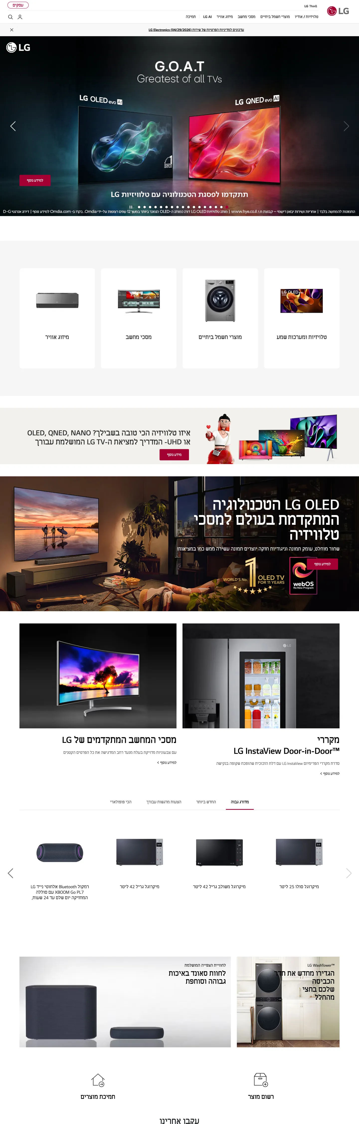
A snapshot of the brand in production. Scroll the frame to see the whole page.
Colors
11 colors
LG's system runs on #a50034 as its primary voltage, used in 4 of 16 components. Type is set in LG Smart across 12 tokens from 14px to 60px, weights 400–700. Shape language is sharp — components average 2px corner radius, favoring crisp rectangles.
Brand & Accent
Sparing, CTA-only voltage · 1
Surface
Page and card backgrounds · 2
Text
Headlines, body, captions · 7
Borders & Hairlines
Dividers, outlines, rules · 1
Typography
12 type tokens
Set in LG Smart across 12 tokens, from 14px to 60px, weights 400–700. Shown in its own stack: where the font isn't installed, the fallback the file names stands in.
- display-xl60px · weight 600 · lh 60pxThe quick brown fox jumps over the lazy dog
- display-lg36px · weight 600 · lh 44pxThe quick brown fox jumps over the lazy dog
- display-md30px · weight 600 · lh 36pxThe quick brown fox jumps over the lazy dog
- heading-md24px · weight 600 · lh 32pxThe quick brown fox jumps over the lazy dog
- heading-sm22px · weight 700 · lh 26pxThe quick brown fox jumps over the lazy dog
- body-lg18px · weight 400 · lh 22pxThe quick brown fox jumps over the lazy dog
- body-md16px · weight 400 · lh 24pxThe quick brown fox jumps over the lazy dog
- body-sm14px · weight 400 · lh 20pxThe quick brown fox jumps over the lazy dog
- label-md15px · weight 600 · lh 19pxThe quick brown fox jumps over the lazy dog
- nav-link14px · weight 700 · lh 16pxThe quick brown fox jumps over the lazy dog
- caption14px · weight 400 · lh 24px · tracking 0.5pxThe quick brown fox jumps over the lazy dog
- button-md15px · weight 700 · lh 16pxThe quick brown fox jumps over the lazy dog
Layout
Radii and spacing
6 corner radii and 8 spacing values. Shape language: sharp.
Radii
- none0px
- sm3px
- md10px
- lg19px
- full9999px
- circle50%
Spacing
- xs4px
- sm8px
- base10px
- md15px
- lg20px
- xl30px
- 2xl50px
- 3xl70px
Components
16 components
Each rendered from its tokens (color, type, radius, padding) on LG's own canvas.
- Button Primarybutton-primaryButton Primary
- Button Secondarybutton-secondaryButton Secondary
- Top Navtop-navTop Nav
- Nav Linknav-linkNav Link
- Hero Headinghero-headingHero Heading
- Section Headingsection-headingSection Heading
- Body Paragraphbody-paragraphBody Paragraph
- Body Paragraph Mutedbody-paragraph-mutedBody Paragraph Muted
- Card Productcard-productCard Product
- Card Featurecard-featureCard Feature
- Badge Primarybadge-primaryBadge Primary
- Badge Outlinebadge-outlineBadge Outline
- icon-buttonIcon Button
- Label Mdlabel-mdLabel Md
- Tab Activetab-activeTab Active
- FooterfooterFooter
In use
The system, in use
LG's tokens on the kind of product it builds.
Build something people actually use.
A short paragraph of marketing copy that previews how the brand's display tier and body tier read together. Two sentences is usually enough.
FAQ
LG design system FAQ
Common questions about LG's tokens, components, and how to use this DESIGN.md in your project.
Read next
Related reading
Specs, directories, and component libraries that pair with this design system.
- Browse all design systemsThe full directory of DESIGN.md files on shadcn.io, with live mockups for each.shadcn.io
- LG — official siteLG's public marketing site — the source of truth for the live tokens captured in this file.lg.com (opens in a new tab)
- The DESIGN.md specificationGoogle Labs' open spec for machine-readable design system files — the format this page is built on.github.com (opens in a new tab)
Use it
Use LG in your project
One machine-readable file. Drop it into Claude, Cursor, or any AI tool that reads DESIGN.md.
Download the DESIGN.md
One machine-readable file: every color, type, radius, spacing, and component token of LG.
Feed it to your AI tool
Drop it into Claude, Cursor, or GitHub Copilot. The agent writes React components and Tailwind classes that match LG's visual language.
Reference the tokens directly
Or paste the values into your Tailwind config, CSS variables, or component library: every color, size and radius is a quoted, ready-to-copy value.
Read the full DESIGN.md: overview, rationale, do’s and don’ts
Overview
LG's marketing site treats crimson-red as a navigational signal, not a decorative voltage. Boundary marker red. Where Samsung deploys its brand blue across hero backgrounds and promotional banners, LG holds #a50034 exclusively at decision points — the primary CTA button, active category-tab underlines, and product badge borders. Between those 38 crimson occurrences, the page runs entirely on a five-tone grey ladder and a white canvas. This restraint makes the crimson meaningful: when it appears, it marks something the user can act on.
LG Smart — the brand's proprietary custom sans — carries the typographic system in six distinct configurations from 14px weight-700 uppercase nav labels to 60px weight-600 hero display. Unlike Sony (which runs a minimal single-weight sans) and Samsung (which uses thin-weight display type for an aspirational feeling), LG holds display at weight 600 (semibold) — confident and product-catalog direct. The font is a single family at all sizes; weight and size create all the hierarchy.
The radius vocabulary is binary: 3px on nearly every functional surface (buttons, cards, form elements) and 50% circles on icon and avatar elements. There is no graduated middle tier at 8 / 12 / 16px. Product cards are nearly-sharp; the icon button controls are perfectly round. This geometry matches the catalog-clarity reading of the system — categories are precise, not soft.
Key Characteristics:
- Crimson voltage #a50034 at 38 occurrences — 18 as background, 19 as border — held exclusively for CTAs, active states, and product badges.
- Five-tone structural grey ladder: #212529 (697 occurrences), #000000 (214), #333333 (180), #6b6b6b (81), #767676 (31) — the most graduated structural palette in this directory.
- LG Smart at six size/weight tiers from 60px / weight 600 display to 14px / weight 700 uppercase nav.
- Binary radius system: 3px functional chrome, 50% circle for UI controls.
- Bootstrap-derived CSS variable foundation (
--primary,--gray,--dark) beneath LG-specific overrides. - Uppercase nav labels at 14px / weight 700 — active sections distinguished by bottom-border crimson, not by weight change.
- Product photography fills every hero band; text and CTAs are overlaid or follow below the photography in product-specific card grids.
Colors
Brand
- Primary (
{colors.primary}— #a50034): frequency 38. Used as background (18), border (19), text (1). The crimson-red brand voltage — wired as the HTML themeColor. Appears on primary button fills, active category-tab bottom borders, product badge borders, and the LG logo on the canonical LG red. Absent from page canvas, body text, and card backgrounds.
Structural
- Ink (
{colors.ink}— #212529): frequency 697. Used as text (367), border (330). The dominant structural color — near-black with a very slight cool-blue undertone (c:0.009 in OKLCH, h:248). Carries every paragraph, heading, and hairline in the above-fold and editorial sections. - Ink Black (
{colors.ink-black}— #000000): frequency 214. Used as text (99), border (115). Pure black — appearing on the most authoritative headings and select structural borders. - Ink Dark (
{colors.ink-dark}— #333333): frequency 180. Used as text (90), border (90). Wired as--gray-darkand--dark. The secondary structural tone for nav labels and body text in quieter sections. - Ink Mid (
{colors.ink-mid}— #6b6b6b): frequency 81. Used as text (39), border (39), background (3). Clustered from two near-identical mid-grey hex values in the extraction. Secondary body text and caption labels. - Ink Muted (
{colors.ink-muted}— #767676): frequency 31. Used as text (8), background (15), border (8). Wired as--grayand--secondary. Background fill on a small number of card-background placeholder tiles; the page's lightest text tier. - Ink Light (
{colors.ink-light}— #cccccc): frequency 8. Used as text (4), border (4). Light grey for hairlines and disabled-state borders. - Ink Faint (
{colors.ink-faint}— #b2b2b2): frequency 4. Used as text (2), border (2). Near-disabled tone for footnote-level elements.
Canvas
- Canvas (
{colors.canvas}— #ffffff): frequency 381. Used as text (175), background (38), border (168). Clustered from three near-white hex values in the extraction. Wired as--lightand--white. The page floor and text-on-crimson color. - Surface 1 (
{colors.surface-1}— #e5e5e5): frequency 1. A light grey surface used for background on a single promotional placeholder element.
Typography
Font Family
The system runs LG Smart — a proprietary custom sans-serif — across every typographic tier. Fallbacks declare "Segoe UI" and "Microsoft Sans Serif", placing the font stack squarely in the Windows-ecosystem heritage. There is no secondary typeface; a single family in six configurations does all display, heading, body, label, nav, and caption work. LG Smart's design sits between the mechanical precision of Helvetica and the slightly warmer geometric treatment of Futura — a technically neutral sans that lets product photography dominate.
Hierarchy
| Token | Size | Weight | Line Height | Use |
|---|---|---|---|---|
{typography.display-xl} | 60px | 600 | 60px | Hero h3 display headline |
{typography.display-lg} | 36px | 600 | 44px | Section h2 ("LG InstaView Door-in-Door") |
{typography.display-md} | 30px | 600 | 36px | Sub-section display blocks |
{typography.heading-md} | 24px | 600 | 32px | Product category sub-headlines |
{typography.heading-sm} | 22px | 700 | 26px | Strong emphasis / price display |
{typography.body-lg} | 18px | 400 | 22px | Primary body text paragraphs |
{typography.body-md} | 16px | 400 | 24px | Secondary body copy and link text |
{typography.body-sm} | 14px | 400 | 20px | Caption text, card metadata |
{typography.label-md} | 15px | 600 | 19px | Nav links, product feature labels |
{typography.nav-link} | 14px | 700 | 16px | Top-nav category labels (uppercase) |
{typography.caption} | 14px | 400 | 24px | Footnote text (0.5px tracking) |
{typography.button-md} | 15px | 700 | 16px | Button labels (uppercase) |
Principles
Weight 600 dominates display and heading tiers — not the 300-400 restraint of Stripe or Spline, not the 700+ command of a Bootstrap-defaults site. At 60px / weight 600, the hero headline reads as product-catalog confident: present without shouting. The nav runs at 14px / weight 700 uppercase, the single heaviest weight in the system — the navigation band is the single most typographically assertive surface.
Note on Font Substitutes
LG Smart is proprietary. Inter at the same weights (600 for display, 400 for body, 700 for nav) is the closest open-source substitute and covers the full size range cleanly. Pretendard is a Korean-language compatible alternative that more closely approximates LG Smart's optical weight ratios.
Layout
Spacing System
- Base unit: 10px, appearing 54 times as padding — the dominant spacing token.
- Tokens:
{spacing.xs}4px ·{spacing.sm}8px ·{spacing.base}10px ·{spacing.md}15px ·{spacing.lg}20px ·{spacing.xl}30px ·{spacing.2xl}50px ·{spacing.3xl}70px. - Section padding: 50px vertical between major product showcase bands.
- Card internal padding: 15px on product cards; 40×15×24px on feature cells.
- Hero padding: 0px horizontal — product photography bleeds to viewport edges.
Grid & Container
- Nav bar: full-width white surface, 55px height, product-category top navigation with crimson active-tab bottom border.
- Hero carousel: full-bleed product photography with text and CTA overlaid center-left.
- Product category strip: 4–5 column thumbnail grid of product silhouette images with category labels beneath.
- Feature band: full-bleed split panels (product image left, text + CTA right) for hero products.
- Product card grid: 3–4 column grid of product photography cards with product name, short spec line, and "Buy Now" CTA.
Rhythm
The page alternates between full-bleed product photography (no padding) and constrained grid sections (10–15px card internal padding, 50px inter-section gap). The rhythm is denser than luxury peers — more product per vertical pixel — consistent with a product-catalog reading frame rather than an editorial one.
Elevation
The captured surface has no shadow tier. Zero shadow occurrences in the extraction. Cards separate from the canvas floor by hairline borders ({colors.ink-light} — #cccccc) on 3px-radius product card containers. The hero band switches canvas color from white to a full-bleed product image; no shadow marks the transition. The system is structurally flat — depth comes from the product photography layers rather than from UI elevation.
Shapes
The radius system is binary with a near-zero default. The 3px value (18 occurrences) appears on product cards, CTA buttons, and badge chips — small enough to read as nearly-sharp but softened at close inspection. The 50% circle (35 occurrences) renders avatar slots and icon buttons as full circles. A 10px tile radius (4 occurrences) appears on promotional showcase carousel tiles. The 100px and 19px values (1 occurrence each) cover edge-case promotional badges.
The absence of an 8 / 12 / 16px middle tier is the key geometric discipline. Functional chrome is sharp (3px), control surfaces are round (50%), and the two never blur together.
Components
button-primary — Crimson {colors.primary} fill, white text at {typography.button-md} (15px / 700), 3px radius, 13×29×14px padding, 44px height. The canonical "Buy Now" and "Shop Now" CTA.
button-secondary — Transparent fill, dark-ink text, 1px dark-ink border, 3px radius. Used for secondary actions on product detail panels.
top-nav — White canvas, dark-ink text at {typography.nav-link} (14px / 700), 55px height. Product category tabs with a crimson bottom-border on the active tab.
nav-link — Transparent background, dark-ink text, uppercase 14px bold. 12×10px padding (top-heavy for the tab underline treatment).
hero-heading — Pure-black text on transparent background at {typography.display-xl} (60px / 600). The largest typographic moment in the system — hero product headlines like the webOS TV showcase.
section-heading — Black text at {typography.display-lg} (36px / 600). Used for product-category section titles like "LG InstaView Door-in-Door™ Refrigerators."
body-paragraph — Dark-ink text at {typography.body-lg} (18px / 400 / 22px leading). The running product-description paragraphs below hero moments.
body-paragraph-muted — Mid-ink {colors.ink-mid} text at {typography.body-sm} for product spec lines and secondary descriptions.
card-product — White canvas, hairline border in {colors.ink-light}, 3px radius, 15px padding. The standard product-card container: product photography top, model name and short spec below.
card-feature — White canvas, no radius, 40×15×24px padding. The feature-band format: single product image left or right, heading + spec + CTA in the opposing column.
badge-primary — Crimson {colors.primary} fill, white text, 3px radius, 4×8px padding. Used for promotional tags ("G.O.A.T", award badges) on hero carousel items.
badge-outline — Transparent fill, crimson {colors.primary} border and text, 3px radius. Outlined badge variant for product-tier markers on cards.
icon-button — Dark-ink fill, white icon, 50% circle radius, 40px × 40px. Navigation arrows, scroll controls, and carousel controls — the full-circle geometry distinguishes control surfaces from product surfaces.
label-md — Transparent, ink text at {typography.label-md} (15px / 600). Product feature labels and category annotation chips.
tab-active — Transparent background, crimson text and bottom border at {colors.primary}. The active category-tab state — the crimson border is the sole state indicator; no fill, no background.
footer — Dark ink canvas, white text at {typography.body-sm}. 40×30px padding. Links to product categories, legal, and social channels.
Do's and Don'ts
Do limit {colors.primary} (#a50034) to interactive boundary markers — primary CTA buttons, active tab states, and product badges. The system's 38-occurrence scarcity is the precision that gives the crimson meaning. Using it as a section background or a decorative border would dilute it to a generic red accent.
Do use weight 600 (not 700) for display headlines. The system's semibold display treatment at 60px reads as product-catalog assertive — direct and clear without the aggressive force of weight 700. Bumping to 700 at display sizes would push the tone from catalog confidence toward promotional urgency.
Do hold the nav at 14px / weight 700 uppercase with a crimson bottom-border for the active tab. The active state is purely typographic and boundary-colored — no background fill, no pill treatment. Adding a crimson background to the active tab would conflict with the {component.button-primary} fill and create two competing crimson surfaces.
Do keep the functional radius at 3px for all product cards, buttons, and form chips. The near-sharp geometry is the visual signature of the catalog-efficiency reading. Rounding to 8px or 12px would shift product cards toward the softer consumer-app register of iOS or Material Design.
Don't use the Bootstrap-default tokens (--primary: #007bff, --gray: #6c757d) that appear in the :root variables — none of them render on the captured page surface. These are Bootstrap scaffold tokens that LG has not purged; using them would produce blue CTAs and Bootstrap-grey navigation instead of LG's actual crimson and five-tone grey system.
Don't use {colors.ink-muted} (#767676) for headline or subheading text. Its 8 text occurrences are all on metadata-level captions and secondary spec lines. At heading sizes, the mid-grey reads as placeholder text rather than as deliberate secondary hierarchy.
Don't introduce a middle-tier radius between 3px and 50%. The binary system is the geometric discipline — 3px for functional surfaces, circle for controls. Adding a 12px or 16px "rounded card" variant disrupts the clarity between the two surface types.
Don't render crimson product badges inside a product card that also has a crimson CTA button. The badge ({component.badge-primary}) and the button ({component.button-primary}) share the same fill; placing them adjacent creates two crimson elements with different semantic roles and no visual separation between them.
Known Gaps
- Extracted locale is LG Israel: the extraction URL is
https://www.lg.com/il— the Hebrew-language Israeli regional site. Typography and layout may vary on the global English site (https://www.lg.com/us); the Hebrew RTL layout in the screenshot shows content in a right-to-left reading direction. - Bootstrap token remnants: the :root CSS variables include unused Bootstrap v4 semantic tokens that add noise to the color and typography extraction without appearing in the rendered surface.
- Product detail and configurator pages: this DESIGN.md covers the marketing homepage only. LG's product comparison tools, specification tables, and checkout flows likely expose additional component tokens and interaction states.
- Dark-mode and OLED display surfaces: LG's TV-focused promotional pages sometimes use near-black or OLED-black canvas to showcase display quality; these dark-canvas editorial moments are not captured in the home page extraction.
- Animation and carousel states: the hero carousel, product category scroll strip, and feature band transitions are animated on the live site; timing, easing, and transition states are not represented in this static extraction.
Consumer Electronics
More systems like this
More DESIGN.md files in Consumer Electronics.
Pricing
Build it with Pro
The DESIGN.md files are free. Pro adds 6,000+ blocks, premium templates and the MCP server, so your AI editor builds in your system for you.
4.9/5 out of 5 · 150+ reviewsfrom 150+ founders and developers.
Billing
Billed once a year in USD. Cancel anytime.
- How many people can use the license.
- Client work, SaaS products and anything you charge for.
- Production-ready React sections: hero, pricing, features, dashboards and more.
- Complete multi-page sites you can ship as they are.
- React icons from every major library, installable with one command.
- Presets that restyle every block, in light and dark.
- Lets your AI editor search, preview and install blocks for you.
- Priority requests are answered first.
Individual
For personal projects & open source
$32instead of $49/mo
$389 billed yearly
- Seats: 1 seat
- Commercial use: Personal & open source only
- Pro blocks: 6,000+ blocks
- Templates: All 14 templates
- React icons: 294k+ icons
- Themes: All 59 themes
- MCP server: Basic usage
- Support: Standard
Team
Most popularFor freelancers, agencies & startups
$66instead of $99/mo
$789 billed yearly · ≈ $13/dev/mo
- Seats: Up to 5 seats
- Commercial use: Included
- Pro blocks: 6,000+ blocks
- Templates: All 14 templates
- React icons: 294k+ icons
- Themes: All 59 themes
- MCP server: High usage
- Support: Priority
Organization
For companies with larger teams
$132instead of $199/mo
$1,589 billed yearly
- Seats: Unlimited seats
- Commercial use: Included
- Pro blocks: 6,000+ blocks
- Templates: All 14 templates
- React icons: 294k+ icons
- Themes: All 59 themes
- MCP server: Unlimited usage
- Support: Priority
Billed once a year in USD. Cancel anytime.
Individual
For personal projects & open source
$32instead of $49/mo
$389 billed yearly
- How many people can use the license.Seats: 1 seat
- Client work, SaaS products and anything you charge for.Commercial use: Personal & open source only
- Production-ready React sections: hero, pricing, features, dashboards and more.Pro blocks: 6,000+ blocks
- Complete multi-page sites you can ship as they are.Templates: All 14 templates
- React icons from every major library, installable with one command.React icons: 294k+ icons
- Presets that restyle every block, in light and dark.Themes: All 59 themes
- Lets your AI editor search, preview and install blocks for you.MCP server: Basic usage
- Priority requests are answered first.Support: Standard
Team
Most popularFor freelancers, agencies & startups
$66instead of $99/mo
$789 billed yearly · ≈ $13/dev/mo
Everything in Individual, plus
- How many people can use the license.Seats: Up to 5 seats
- Client work, SaaS products and anything you charge for.Commercial use: Included
- Lets your AI editor search, preview and install blocks for you.MCP server: High usage
- Priority requests are answered first.Support: Priority
Organization
For companies with larger teams
$132instead of $199/mo
$1,589 billed yearly
Everything in Team, plus
- How many people can use the license.Seats: Unlimited seats
- Lets your AI editor search, preview and install blocks for you.MCP server: Unlimited usage
- Secure checkout via Stripe
- Code lives in your repo
- Keep what you've shipped if you cancel
- License terms
Your system, built for you
Every block, template and icon, installed by your AI agent in your design system. The DESIGN.md files stay free.