LaunchDarkly Design System
LaunchDarkly's marketing design system as a DESIGN.md file — electric blue primary on near-black hero, lime-green capability accents, 18 colors tokens, 19 components for React and AI tools.
Add shadcn.io to your AI agent. · Pro It installs blocks, icons and templates in your design system from a prompt, with Pro.
Set up MCP- Primary
- #405bff
- Typeface
- system-ui
- Shape
- Mixed
- Base radius
- 8px
- Colors
- 18
- Type tokens
- 11
- Components
- 19
- Spacing values
- 8
About
About LaunchDarkly DESIGN.md
Curated by Dov Azencot · Updated May 19, 2026 · Source launchdarkly.com (opens in a new tab)
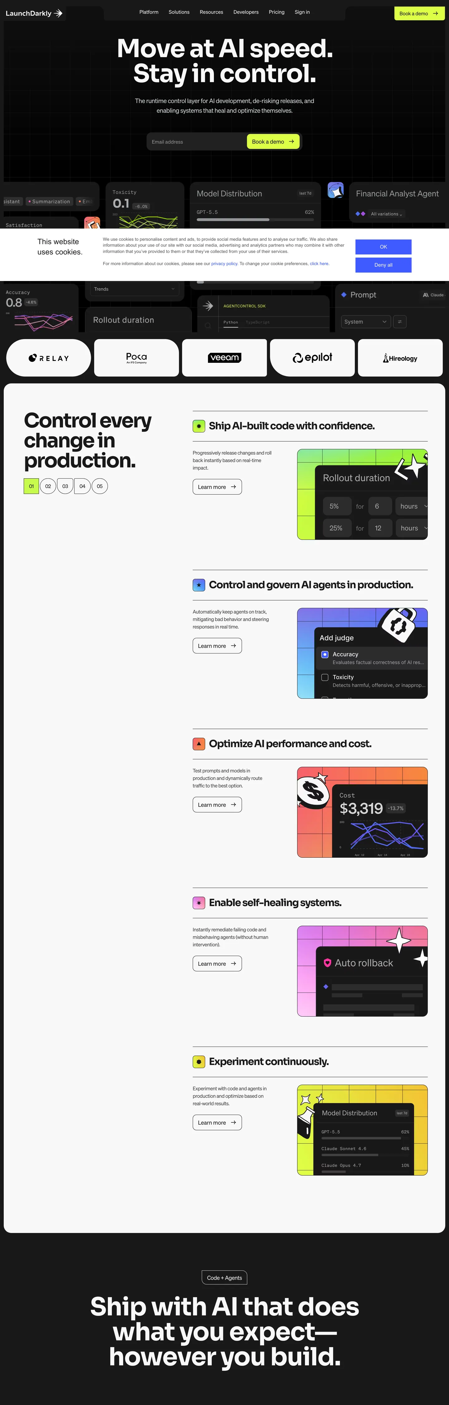
LaunchDarkly's marketing site runs a dual-canvas strategy that most feature-flag platforms don't attempt: the hero section is a near-black field (#191919) with a pure-white display headline at weight 800, and the blue CTA button sits below an email capture field. Below the fold, the page inverts to pure white with a five-section capability list where each AI-control domain carries its own illustration color — orange for "Ship AI-built code," blue-purple for "Control and govern AI agents," magenta-pink for "Optimize AI performance," purple for "Enable self-healing systems," lime-green for "Experiment continuously." The capability colors are not interchangeable; each maps to a named product capability, functioning more like a product taxonomy than a brand palette.
The DESIGN.md file packages the system into a machine-readable spec for React and AI tools. Inside: 18 colors tokens drawn from the near-black canvas, the electric-blue brand primary, the lime-green secondary accent, a 5-tier gray scale, and the capability-specific accent palette; 11 typography tokens using a geometric sans at weights from 400 through 800; 5 radius tokens from 4px to pill; 8 spacing values on a 16-48px scale; and 19 components definitions covering the dark-canvas hero, the electric-blue pill CTA, the email-capture input row, the white-canvas feature capability cards, and the accent-chip taxonomy.
Feed this file to Claude or Cursor and it reproduces LaunchDarkly's specific moves: near-black above-fold hero with pure white display text at weight 800, electric blue reserved for the primary CTA, capability accent colors that self-describe domain rather than decorate, a pill-radius CTA (9999px) on an otherwise moderate-radius system, and the white below-fold layout where AI-feature chips carry color rather than the structural chrome. The dual-canvas pattern is worth borrowing when the product operates in two modes — "trust and buy" (dark canvas, bold headline) and "understand and evaluate" (white canvas, feature list).
What makes it distinct
5
- Dual-canvas splitnear-black #191919 above the fold for brand presence, pure white below for capability details; both regions share the same type scale
- Electric blue CTA#405bff (--blue / --primary) fills the hero 'Book a demo' button, wired as the system's single brand primary across text, bg, and border
- Capability-color taxonomyorange, purple, cyan, lime each map to a specific AI-control domain (Ship code, Control agents, Optimize, Enable self-healing) rather than serving as general accents
- Lime-green feature chips#ddff46 appears 5 times as background fill in illustrated capability thumbnails; never as a button fill
- Weight-800 display on darkthe hero headline runs at the highest weight in the analytics peer group, contrasting with Statsig's 500 and Heap's 400 display weight
launchdarkly.com
Live at launchdarkly.com
A snapshot of the brand in production. Scroll the frame to see the whole page.
Colors
18 colors
LaunchDarkly's system runs on #405bff as its primary voltage, used in 2 of 19 components. Type is set in system-ui across 11 tokens from 12px to 80px, weights 400–800. Shape language is mixed across 19 components, blending pills, soft rounds, and squarer corners.
Brand & Accent
Sparing, CTA-only voltage · 3
Surface
Page and card backgrounds · 4
Text
Headlines, body, captions · 2
Borders & Hairlines
Dividers, outlines, rules · 1
Other
Specialty colors · 8
Typography
11 type tokens
Set in system-ui across 11 tokens, from 12px to 80px, weights 400–800. Shown in its own stack: where the font isn't installed, the fallback the file names stands in.
- display-xl80px · weight 800 · lh 84px · tracking -1pxThe quick brown fox jumps over the lazy dog
- display-md56px · weight 700 · lh 62px · tracking -0.5pxThe quick brown fox jumps over the lazy dog
- heading-lg40px · weight 700 · lh 46pxThe quick brown fox jumps over the lazy dog
- heading-md32px · weight 600 · lh 38pxThe quick brown fox jumps over the lazy dog
- heading-sm24px · weight 600 · lh 30pxThe quick brown fox jumps over the lazy dog
- body-lg18px · weight 400 · lh 28pxThe quick brown fox jumps over the lazy dog
- body-md16px · weight 400 · lh 24pxThe quick brown fox jumps over the lazy dog
- body-sm14px · weight 400 · lh 20pxThe quick brown fox jumps over the lazy dog
- label-md16px · weight 600 · lh 22pxThe quick brown fox jumps over the lazy dog
- nav-link14px · weight 400 · lh 20pxThe quick brown fox jumps over the lazy dog
- caption12px · weight 400 · lh 16pxThe quick brown fox jumps over the lazy dog
Layout
Radii and spacing
5 corner radii and 8 spacing values. Shape language: mixed.
Radii
- none0px
- sm4px
- md8px
- lg16px
- pill9999px
Spacing
- xs8px
- sm12px
- md16px
- base24px
- lg32px
- xl40px
- 2xl48px
- 3xl64px
Components
19 components
Each rendered from its tokens (color, type, radius, padding) on LaunchDarkly's own canvas.
- Button Primarybutton-primaryButton Primary
- Button Primary Hoverbutton-primary-hoverButton Primary Hover
- Button Secondarybutton-secondaryButton Secondary
- Button Secondary Darkbutton-secondary-darkButton Secondary Dark
- Top Navtop-navTop Nav
- Nav Linknav-linkNav Link
- Hero Headinghero-headingHero Heading
- Hero Subtexthero-subtextHero Subtext
- Section Heading Darksection-heading-darkSection Heading Dark
- Section Heading Lightsection-heading-lightSection Heading Light
- Body Paragraphbody-paragraphBody Paragraph
- CardcardCard
- Capability Rowcapability-rowCapability Row
- Capability Chipcapability-chipCapability Chip
- Type here…text-inputText Input
- Logo Chiplogo-chipLogo Chip
- Dark Sectiondark-sectionDark Section
- Illustration Thumbnailillustration-thumbnailIllustration Thumbnail
- FooterfooterFooter
In use
The system, in use
LaunchDarkly's tokens on the kind of product it builds.
Build something people actually use.
A short paragraph of marketing copy that previews how the brand's display tier and body tier read together. Two sentences is usually enough.
FAQ
LaunchDarkly design system FAQ
Common questions about LaunchDarkly's tokens, components, and how to use this DESIGN.md in your project.
Read next
Related reading
Specs, directories, and component libraries that pair with this design system.
- Browse all design systemsThe full directory of DESIGN.md files on shadcn.io, with live mockups for each.shadcn.io
- LaunchDarkly — official siteLaunchDarkly's public marketing site — the source of truth for the live tokens captured in this file.launchdarkly.com (opens in a new tab)
- The DESIGN.md specificationGoogle Labs' open spec for machine-readable design system files — the format this page is built on.github.com (opens in a new tab)
Use it
Use LaunchDarkly in your project
One machine-readable file. Drop it into Claude, Cursor, or any AI tool that reads DESIGN.md.
Download the DESIGN.md
One machine-readable file: every color, type, radius, spacing, and component token of LaunchDarkly.
Feed it to your AI tool
Drop it into Claude, Cursor, or GitHub Copilot. The agent writes React components and Tailwind classes that match LaunchDarkly's visual language.
Reference the tokens directly
Or paste the values into your Tailwind config, CSS variables, or component library: every color, size and radius is a quoted, ready-to-copy value.
Read the full DESIGN.md: overview, rationale, do’s and don’ts
Overview
LaunchDarkly's marketing page resolves a design problem specific to AI-era developer tools: how do you give visual identity to five distinct AI-control capabilities without creating an incoherent rainbow? Capability-as-color taxonomy. Each of the five AI use cases in the feature list (ship code, govern agents, optimize performance, self-healing, experiment) receives a distinct illustration color — orange, periwinkle-blue, pink-magenta, purple, and lime-green. These colors appear exclusively in illustrated UI thumbnails beside each capability section. The structural chrome — nav, section headings, body text, CTAs — stays rigidly within the electric-blue-on-dark-neutral system. Where competitors like Flagsmith or Split.io use a single accent across all feature sections, LaunchDarkly lets the capability palette do taxonomic work that would otherwise require icon systems or labeled badges.
The page's above-fold design is one of the boldest in the feature-flag category: a near-black canvas (#191919) carrying a pure-white display headline at the maximum extracted font weight. Where Statsig runs Geist at 500 and Heap runs Circular Standard at 400, LaunchDarkly pushes to weight 800 — the headline "Move at AI speed. Stay in control." reads as an imperative, not an editorial statement. The electric-blue pill CTA sits below an email input in the hero; the email/button pairing is an enterprise capture pattern that assumes user intent before they click.
Key Characteristics:
- Near-black canvas (
{colors.canvas}— #191919) hero with pure-white display text at weight 800 — the highest display weight in the feature-flag peer group. - Electric blue (
{colors.primary}— #405bff) fills the single CTA button above the fold; wired as--primaryand--blue. - Lime-green (
{colors.lime}— #ddff46) as the hero "secondary" accent, appearing on illustrated capability chips and toggle UI — never as a button fill. - Dual-canvas page: dark above-fold for authority, white below-fold for evaluation; the transition is hard-cut with no gradient fade.
- Five capability accent colors (orange, blue, pink, purple, lime) each mapping to a named AI-control product domain.
- Five-step gray scale from #939598 to #2c2c2c provides nav muting, sub-text tiers, and dark-surface card borders.
Colors
Brand Blues
- Primary (
{colors.primary}— #405bff): frequency 9. Used as text (3), bg (3), border (3). The sole CTA fill color, wired as--blue,--primary,--blue-500. The most restrained chromatic deployment in the system — three background uses for the hero CTA, three text uses for inline links, three border uses for interactive states. - Primary Light (
{colors.primary-light}— #7084ff): frequency 10. Used as text (5), border (5). The gradient start and text-link accent (--blue-400,--text-gradient-a). More frequent than the primary fill — appears in link text and interactive borders throughout the white-canvas sections. - Primary Hover (
{colors.primary-hover}— #4e6cee): frequency 4. Used as text (1), bg (2), border (1). The hover state for primary blue elements (--refresh-blue-500).
Capability Accents
- Lime (
{colors.lime}— #ddff46): frequency 5. Used as background (5). Appears exclusively as the fill for illustrated UI elements in the "Experiment continuously" capability section. Wired as--lime,--yellow,--yellow-500. - Lime Light (
{colors.lime-light}— #eafca1): frequency 1. Gradient use in the lime capability section only (--yellow-300,--lime-light). - Orange (
{colors.orange}— #ff9d29): frequency 7. Used as text (2), bg (3), border (2). The "Ship AI-built code" capability color. Wired as--orange,--refresh-orange-500. Appears in rollout-duration chart illustrations. - Purple (
{colors.purple}— #a34fde): frequency 2. Used as background (2). The "Enable self-healing systems" capability color. Wired as--purple-500,--purple. - Cyan (
{colors.cyan}— #3dd6f5): frequency 1. Used as background (1). The "Optimize AI performance" capability illustration color. Wired as--refresh-cyan-500,--cyan.
Structural
- Ink (
{colors.ink}— #ffffff): frequency 654. Used as text (334), bg (52), border (268). The dominant above-fold text color — pure white on near-black. The extraction merged a near-white variant into this cluster token. - Canvas (
{colors.canvas}— #191919): frequency 306. Used as text (133), bg (41), border (132). The above-fold dark floor and footer background. Wired as--refresh-grey-900,--black-03. - Canvas Light (
{colors.canvas-light}— #212121): frequency 11. Used as background (9). Slightly lighter dark tier for sub-sections within the dark canvas (--refresh-grey-800). - Canvas Mid (
{colors.canvas-mid}— #2c2c2c): frequency 54. Used as bg (15), border (38). Card surfaces within the dark hero region (--black-00,--refresh-grey-700). - Surface White (
{colors.surface-white}— #ffffff): the white canvas for below-fold feature sections — the same hex as{colors.ink}but used as background. - Ink Dark (
{colors.ink-dark}— #000000): frequency 28. Used as text (12), bg (2), border (13). Pure black for the white-canvas sections.
Gray Scale
- Gray 1 (
{colors.gray-1}— #939598): frequency 152. Used as text (74), border (74). The sub-heading and nav-muted text color in the dark canvas (--refresh-grey-400). - Gray 2 (
{colors.gray-2}— #abadb0): frequency 132. Used as text (67), border (65). The secondary muted text tier (--refresh-white-300). - Gray 3 (
{colors.gray-3}— #414042): frequency 99. Used as text (49), border (50). The mid-dark tier for card borders in the dark canvas (--refresh-grey-600). - Hairline (
{colors.hairline}— #d1d6d9): frequency 28. Used as text (13), bg (1), border (14). The card border for white-canvas sections.
Typography
Font Family
The system runs a geometric sans across all tiers. The extracted CSS does not reveal a named proprietary typeface — the font stack resolves to system-ui, -apple-system, "Segoe UI", Roboto, sans-serif, suggesting LaunchDarkly either uses a custom webfont loaded externally or relies on the system geometric. The weight range is 400 through 800, spanning more of the weight axis than most analytics peers.
Hierarchy
| Token | Size | Weight | Line Height | Use |
|---|---|---|---|---|
{typography.display-xl} | ~80px | 800 | 84px | Hero h1 ("Move at AI speed.") |
{typography.display-md} | 56px | 700 | 62px | Dark-canvas section heads |
{typography.heading-lg} | 40px | 700 | 46px | White-canvas section openers |
{typography.heading-md} | 32px | 600 | 38px | Capability row headers |
{typography.heading-sm} | 24px | 600 | 30px | Card titles |
{typography.body-lg} | 18px | 400 | 28px | Hero sub-paragraph |
{typography.body-md} | 16px | 400 | 24px | Body prose in white sections |
{typography.body-sm} | 14px | 400 | 20px | Secondary captions |
{typography.label-md} | 16px | 600 | 22px | CTA button labels |
{typography.nav-link} | 14px | 400 | 20px | Top-nav link labels |
{typography.caption} | 12px | 400 | 16px | Metadata and chip labels |
Principles
The weight axis is the hierarchy signal above the fold: weight 800 for the hero, 700 for dark section heads, 600 for the white-canvas feature titles. No italic or letter-spacing extremes — hierarchy comes from weight steps alone, not spacing-based differentiation. The body weight never changes from 400 regardless of canvas (dark or light).
Note on Font Substitutes
If the system loads a custom webfont not detected by the extractor, Inter at the same weights is the most accurate open-source substitute given the geometric sans proportions visible in the screenshot. Plus Jakarta Sans is an alternative with slightly more personality at the heavy weights.
Layout
Spacing System
- Base unit: 8px, with 24px and 48px as the dominant module values.
- Tokens:
{spacing.xs}8px ·{spacing.sm}12px ·{spacing.md}16px ·{spacing.base}24px ·{spacing.lg}32px ·{spacing.xl}40px ·{spacing.2xl}48px ·{spacing.3xl}64px. - Hero padding (vertical): ~80px above the headline, creating a visually spacious dark frame around the bold text.
- Capability row padding: 32px vertical, hairline-bordered — each AI-capability section separated by a thin line.
- Section padding: 64px horizontal on the dark canvas sections.
Grid & Container
- Max content width: ~1280px for the feature sections.
- Hero: two-panel layout — left: display headline + email input + CTA; right: animated UI mock (rollout slider, model distribution chart).
- Capability list: single-column list of 5 rows, each with a left text panel and a right illustration thumbnail.
- Footer: multi-column link grid on the dark canvas.
Rhythm
The page has two distinct rhythm zones. The dark hero zone runs large type with maximum vertical whitespace — emphasis through emptiness. The white-canvas zone runs 5 tight capability rows separated by hairline borders — emphasis through density and repetition. The transition between zones is a hard cut rather than a gradient: one row ends on dark canvas, the next begins on white.
Elevation
The dark-canvas zone has no shadow system — the near-black floor is too dark for shadows to read, and elevation comes from tonal contrast alone:
- Tonal lift (dark):
{colors.canvas-mid}(#2c2c2c) cards sit on{colors.canvas}(#191919) — a ~7% lightness delta creates visible hierarchy. - Border lift (white):
{colors.hairline}(#d1d6d9) 1px borders on the white-canvas capability cards. No shadow needed when the canvas is white and the card is white — the hairline is the separator. - No blur shadows: the system has zero recorded shadow usage in the extracted data.
Shapes
The radius scale is moderate with a pill jump:
{rounded.none}0px — section dividers and illustration-region edges.{rounded.sm}4px — small capability chips and status indicators.{rounded.md}8px — text inputs, code snippets, illustration thumbnails.{rounded.lg}16px — feature cards and partner logo chips.{rounded.pill}9999px — the primary CTA button and the hero email input row.
The gap from 16px (card) to 9999px (button) is deliberate: interactive elements declare themselves through radical rounding while containers use moderate rounding. This is the same binary shape vocabulary as Statsig (10px container / 30px pill), executed at a larger scale.
Components
button-primary — Electric blue {colors.primary} fill, white text, {rounded.pill} 9999px, 12x24 padding, 48px height. "Book a demo" in the hero is the canonical instance. The single chromatic button above the fold.
button-primary-hover — Hover shifts to {colors.primary-hover} (#4e6cee), a slightly muted blue. Text and radius stay constant.
button-secondary — Transparent fill, white text, gray-2 border, {rounded.pill} radius. Used for secondary CTAs in the white-canvas sections.
button-secondary-dark — Transparent fill, white text, 1px {colors.primary} border, pill radius. Used within the dark canvas for "Learn more" type actions beside capability rows.
top-nav — Dark canvas {colors.canvas} background, 56px height. White text at {typography.nav-link}, pill-shaped primary CTA at right.
hero-heading — Transparent background on dark canvas, pure-white text, {typography.display-xl} (weight 800). The heaviest typographic moment in the system by a significant margin.
hero-subtext — Gray-2 {colors.gray-2} text, {typography.body-lg} (18px / 400). The subheadline beneath the hero h1 uses the muted gray tier rather than full white, creating a two-level white hierarchy within the dark canvas.
section-heading-dark — Pure white text on dark canvas, {typography.display-md} (56px / 700). Used for the "Ship with AI that does what you expect — however you build." dark closing section.
section-heading-light — Ink-dark text on white canvas, {typography.heading-lg} (40px / 700). Used for the "Control every change in production." headline in the white capability section.
capability-row — White surface, ink-dark text, {rounded.none}, 32px vertical padding, 1px {colors.hairline} bottom border. The five AI-capability rows share this exact structure; only the illustration thumbnail changes per row.
capability-chip — Lime-green {colors.lime} fill, ink-dark text, {rounded.sm} 4px, 4x8 padding. The illustrated feature-domain identifier inside capability thumbnails.
text-input — Dark-mid {colors.canvas-mid} fill, white text, {rounded.md} 8px, 12x16 padding, 48px height. The hero email capture input; dark fill matches the hero canvas.
illustration-thumbnail — Dark-mid {colors.canvas-mid} fill, {rounded.lg} 16px. The right-side capability illustration panel — each uses a different accent color internally (orange, blue, pink, purple, lime) while the container is uniformly dark.
dark-section — Dark canvas {colors.canvas} background, white text, 64x40 padding. The closing hero-style call-to-action section at the bottom.
footer — Dark canvas background, gray-1 text, 48x40 padding. Matches the hero canvas — the page begins and ends on the same dark surface.
Do's and Don'ts
Do keep the electric blue ({colors.primary} — #405bff) as the exclusive CTA fill. It appears 3 times as a background in the captured page — once on the hero button and twice in secondary interactive contexts. Each additional blue fill dilutes the signal. Use {colors.primary-light} (#7084ff) for text links and focus states instead.
Do assign the capability accent colors to illustration content only. Orange, purple, cyan, and lime each map to a specific AI-control domain. Using them on nav items, section headings, or card borders repurposes them as general accents and breaks the taxonomic system.
Do use weight 800 for the dark-canvas hero h1 and step down to 700 for dark-canvas section headings. The weight ladder (800 → 700 → 600 → 400) is the hierarchy signal on a canvas with no color differentiation.
Do make the dual-canvas transition a hard cut. The page goes from {colors.canvas} (#191919) dark to {colors.surface-white} white with no intermediate gray, no gradient, no shadow separator. A soft transition (gradient or 50% gray) diminishes the authority signal of the dark-canvas hero.
Don't use {colors.lime} (#ddff46) as a button fill or section background. It is wired as a feature-illustration color for the "Experiment continuously" domain. As a button fill it would read like an error or warning state — the OKLCH chroma is high enough that it dominates any element it fills.
Don't use the gray scale ({colors.gray-1} #939598, {colors.gray-2} #abadb0) as text on white canvas. Both grays are calibrated for dark-canvas legibility where white #ffffff is the primary text and these are the secondary tiers. On a white background, #939598 fails WCAG AA at any size below 18px. Use {colors.ink-dark} (#000000) for primary and {colors.gray-3} (#414042) for secondary on white.
Don't add border radius larger than 16px to feature cards. The capability rows use {rounded.none} (bordered by hairlines only); the illustration thumbnails use {rounded.lg} 16px. Larger radii (24px, 32px) would make the data-precision layout feel like a consumer-app card grid.
Don't apply {colors.primary-light} (#7084ff) as a background fill. It appears 10 times in the capture as text and border only — its perceptual lightness makes it too pale for fills at this chroma level, where it would read as a soft lavender rather than as brand blue.
Known Gaps
- Font family identity: the extractor did not identify a named proprietary webfont; the system may load a custom face via a CDN not captured in the CSS snapshot. Visual analysis suggests a geometric sans near Inter or DM Sans at the displayed weights.
- Hover state matrix: captured for the primary blue CTA only; the full state matrix for secondary buttons, nav links, and capability rows is not extracted.
- Mobile hero layout: the two-panel hero (headline left, animated mock right) collapses on mobile; the responsive layout is not captured.
- Animation: the hero UI mock (rollout slider, model distribution chart) is animated; easing curves and keyframe values are not in the extracted CSS.
- Product dashboard tokens: the capability illustration thumbnails show product UI with their own internal token system; only the outer container values are captured here.
- Dark mode toggle: the above-fold dark canvas is not a system dark-mode preference — it is always dark regardless of OS setting. A true dark mode for the below-fold white sections is not documented.
Developer Tools & IDEs
More systems like this
More DESIGN.md files in Developer Tools & IDEs.
Pricing
Build it with Pro
The DESIGN.md files are free. Pro adds 6,000+ blocks, premium templates and the MCP server, so your AI editor builds in your system for you.
4.9/5 out of 5 · 150+ reviewsfrom 150+ founders and developers.
Billing
Billed once a year in USD. Cancel anytime.
- How many people can use the license.
- Client work, SaaS products and anything you charge for.
- Production-ready React sections: hero, pricing, features, dashboards and more.
- Complete multi-page sites you can ship as they are.
- React icons from every major library, installable with one command.
- Presets that restyle every block, in light and dark.
- Lets your AI editor search, preview and install blocks for you.
- Priority requests are answered first.
Individual
For personal projects & open source
$32instead of $49/mo
$389 billed yearly
- Seats: 1 seat
- Commercial use: Personal & open source only
- Pro blocks: 6,000+ blocks
- Templates: All 14 templates
- React icons: 294k+ icons
- Themes: All 59 themes
- MCP server: Basic usage
- Support: Standard
Team
Most popularFor freelancers, agencies & startups
$66instead of $99/mo
$789 billed yearly · ≈ $13/dev/mo
- Seats: Up to 5 seats
- Commercial use: Included
- Pro blocks: 6,000+ blocks
- Templates: All 14 templates
- React icons: 294k+ icons
- Themes: All 59 themes
- MCP server: High usage
- Support: Priority
Organization
For companies with larger teams
$132instead of $199/mo
$1,589 billed yearly
- Seats: Unlimited seats
- Commercial use: Included
- Pro blocks: 6,000+ blocks
- Templates: All 14 templates
- React icons: 294k+ icons
- Themes: All 59 themes
- MCP server: Unlimited usage
- Support: Priority
Billed once a year in USD. Cancel anytime.
Individual
For personal projects & open source
$32instead of $49/mo
$389 billed yearly
- How many people can use the license.Seats: 1 seat
- Client work, SaaS products and anything you charge for.Commercial use: Personal & open source only
- Production-ready React sections: hero, pricing, features, dashboards and more.Pro blocks: 6,000+ blocks
- Complete multi-page sites you can ship as they are.Templates: All 14 templates
- React icons from every major library, installable with one command.React icons: 294k+ icons
- Presets that restyle every block, in light and dark.Themes: All 59 themes
- Lets your AI editor search, preview and install blocks for you.MCP server: Basic usage
- Priority requests are answered first.Support: Standard
Team
Most popularFor freelancers, agencies & startups
$66instead of $99/mo
$789 billed yearly · ≈ $13/dev/mo
Everything in Individual, plus
- How many people can use the license.Seats: Up to 5 seats
- Client work, SaaS products and anything you charge for.Commercial use: Included
- Lets your AI editor search, preview and install blocks for you.MCP server: High usage
- Priority requests are answered first.Support: Priority
Organization
For companies with larger teams
$132instead of $199/mo
$1,589 billed yearly
Everything in Team, plus
- How many people can use the license.Seats: Unlimited seats
- Lets your AI editor search, preview and install blocks for you.MCP server: Unlimited usage
- Secure checkout via Stripe
- Code lives in your repo
- Keep what you've shipped if you cancel
- License terms
Your system, built for you
Every block, template and icon, installed by your AI agent in your design system. The DESIGN.md files stay free.