LangChain Design System
LangChain's design system as a DESIGN.md file. Navy #030710 canvas, Twklausanne weight 300, 23 colors, 17 components. For React, Next.js, and AI tools.
Add shadcn.io to your AI agent. · Pro It installs blocks, icons and templates in your design system from a prompt, with Pro.
Set up MCP- Primary
- #cce9ff
- Typeface
- Twklausanne
- Shape
- Mixed
- Base radius
- 6px
- Colors
- 23
- Type tokens
- 11
- Components
- 17
- Spacing values
- 9
About
About LangChain DESIGN.md
Curated by Dov Azencot · Updated May 13, 2026 · Source langchain.com (opens in a new tab)
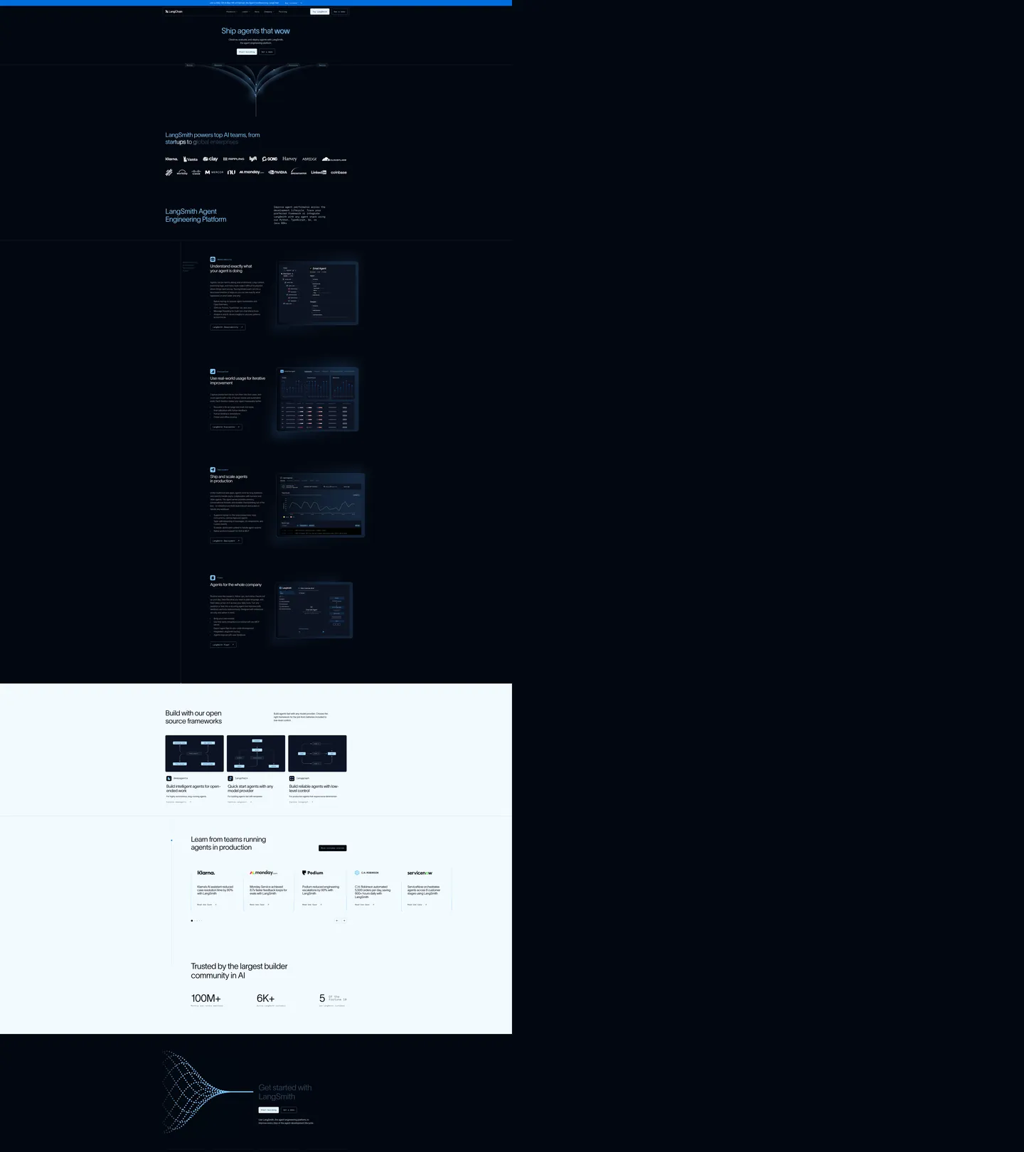
LangChain's home page opens on a near-black navy field ("#030710") with the headline "Ship agents that wow" set in Twklausanne at 80px / weight 300 / -2.4px tracking. The hero illustration below it is a particle-tree — fine pale-blue dots converging into a vertical glyph rather than a photograph or a product mockup. Where most agent-platform brands reach for a saturated voltage hex on a white canvas, LangChain inverts the entire model: the canvas IS the brand voltage, and the text floats over it in a pale cyan-blue ladder ("#cce9ff" for body, "#7fc8ff" for sub-headers, "#99d3ff" reserved for the gradient particles). The page breaks this inversion exactly once — a single off-white band ("#e5f4ff") for the open-source frameworks rail — then snaps back to navy for the footer's CTA module.
This DESIGN.md packages the system into 23 colors tokens, 11 typography styles, 5 corner radii, 9 spacing values, and 17 components built against Google Labs' open DESIGN.md specification. Inside: the navy canvas hex, the three light-blue text tiers, the off-white interlude surface, the deep-blue gradient stop "#006ddd", a Twklausanne weight-300 ladder from 80px display down to 16px body, the Aeonik 14px / weight 400 nav-and-form sub-family, the 6px button radius, the 16px card radius, the 12px-by-18px input padding pattern, and the dark agent-console card with its "#cce9ff" border-light hairline. Every hex quoted, every value traced to a node on the live page.
Feed the file to Claude, Cursor, or Copilot and the agent will produce React surfaces that reproduce LangChain's inversion discipline — navy canvas with weight-300 cyan-blue ink, particle illustrations instead of dashboard photography, 6px button radii, the single mid-page off-white interlude — rather than a default dark-mode AI theme with bold weights and pill CTAs. The discipline worth studying here is the weight-300 holdout across every display tier: where Vercel, Replit, and Anthropic all reach for weight 500-700 at 60px+, LangChain holds the line at 300 and lets the navy field do the contrast work.
What makes it distinct
5
- Inverted canvas#030710 navy carries the hero, capability ladder, and footer; one mid-page band of #e5f4ff hosts the open-source rail
- Weight 300 across every display tierTwklausanne at 80px / 60.8px / 56px / 32px / 24px holds the page at thin geometry, never bold
- Dual-family laneTwklausanne carries every headline and body paragraph; Aeonik scopes down to 14px nav links, button labels, and the newsletter input
- Light-blue text voltage#cce9ff (frequency 400, text 205) is the dominant ink on dark, not a fill — Stripe-style chromatic depth in reverse
- 6px buttons and 16px cardsa two-stop radius scale held across 17 components, no pill CTAs anywhere on the marketing surface
langchain.com
Live at langchain.com
A snapshot of the brand in production. Scroll the frame to see the whole page.
Colors
23 colors
LangChain's system runs on #cce9ff as its primary voltage, used in 10 of 17 components. Type is set in Twklausanne across 11 tokens from 14px to 80px, weights 300–400. Shape language is mixed across 17 components, blending pills, soft rounds, and squarer corners.
Brand & Accent
Sparing, CTA-only voltage · 1
Surface
Page and card backgrounds · 4
Text
Headlines, body, captions · 8
Borders & Hairlines
Dividers, outlines, rules · 4
Semantic
Status, errors, success, links · 4
Other
Specialty colors · 2
Typography
11 type tokens
Set in Twklausanne across 11 tokens, from 14px to 80px, weights 300–400. Shown in its own stack: where the font isn't installed, the fallback the file names stands in.
- hero-display80px · weight 300 · lh 1.1 · tracking -2.4pxThe quick brown fox jumps over the lazy dog
- display-lg64px · weight 300 · lh 1.1 · tracking -1.92pxThe quick brown fox jumps over the lazy dog
- display-md60.8px · weight 300 · lh 1.1 · tracking -1.824pxThe quick brown fox jumps over the lazy dog
- section-heading56px · weight 300 · lh 1.1 · tracking -1.68pxThe quick brown fox jumps over the lazy dog
- heading-md32px · weight 300 · lh 1.1 · tracking -0.96pxThe quick brown fox jumps over the lazy dog
- heading-sm24px · weight 300 · lh 1.1 · tracking -0.72pxThe quick brown fox jumps over the lazy dog
- body-lg18px · weight 300 · lh 1.4 · tracking 0pxThe quick brown fox jumps over the lazy dog
- body-md16px · weight 300 · lh 1.6 · tracking 0pxThe quick brown fox jumps over the lazy dog
- body-aeonik16px · weight 400 · lh 1.5 · tracking 0pxThe quick brown fox jumps over the lazy dog
- nav-link14px · weight 400 · lh 1 · tracking 0pxThe quick brown fox jumps over the lazy dog
- button-md14px · weight 400 · lh 1 · tracking 0pxThe quick brown fox jumps over the lazy dog
Layout
Radii and spacing
5 corner radii and 9 spacing values. Shape language: mixed.
Radii
- none0px
- hairline1.25px
- sm6px
- lg16px
- xxl80px
Spacing
- xxs1px
- xs4px
- sm8px
- md16px
- lg20px
- xl24px
- xxl48px
- section56px
- hero80px
Components
17 components
Each rendered from its tokens (color, type, radius, padding) on LangChain's own canvas.
- Button Primarybutton-primaryButton Primary
- Button Primary Hoverbutton-primary-hoverButton Primary Hover
- Button Secondarybutton-secondaryButton Secondary
- Button Accentbutton-accentButton Accent
- Top Navtop-navTop Nav
- Nav Linknav-linkNav Link
- Announcement Barannouncement-barAnnouncement Bar
- Card Darkcard-darkCard Dark
- Card Lightcard-lightCard Light
- Agent Console Cardagent-console-cardAgent Console Card
- Framework Tileframework-tileFramework Tile
- Interlude Bandinterlude-bandInterlude Band
- Hero Bandhero-bandHero Band
- Cta Modulecta-moduleCta Module
- Type here…text-inputText Input
- Newsletter Inputnewsletter-inputNewsletter Input
- Footer Regionfooter-regionFooter Region
In use
The system, in use
LangChain's tokens on the kind of product it builds.
Build something people actually use.
A short paragraph of marketing copy that previews how the brand's display tier and body tier read together. Two sentences is usually enough.
FAQ
LangChain design system FAQ
Common questions about LangChain's tokens, components, and how to use this DESIGN.md in your project.
Read next
Related reading
Specs, directories, and component libraries that pair with this design system.
- Browse all design systemsThe full directory of DESIGN.md files on shadcn.io, with live mockups for each.shadcn.io
- LangChain homepageThe live brand surface — navy canvas, weight-300 Twklausanne, particle-tree hero, open-source frameworks band.langchain.com (opens in a new tab)
- The DESIGN.md specificationGoogle Labs' open spec for machine-readable design system files — the format this page is built on.github.com (opens in a new tab)
Use it
Use LangChain in your project
One machine-readable file. Drop it into Claude, Cursor, or any AI tool that reads DESIGN.md.
Download the DESIGN.md
One machine-readable file: every color, type, radius, spacing, and component token of LangChain.
Feed it to your AI tool
Drop it into Claude, Cursor, or GitHub Copilot. The agent writes React components and Tailwind classes that match LangChain's visual language.
Reference the tokens directly
Or paste the values into your Tailwind config, CSS variables, or component library: every color, size and radius is a quoted, ready-to-copy value.
Read the full DESIGN.md: overview, rationale, do’s and don’ts
Overview
LangChain's marketing surface is held together by a single load-bearing decision — the navy field ("#030710") is the canvas, not an accent, and every other token in the system exists in relation to it. The page opens on that navy, runs four capability cards down a particle-anchored ladder still on navy, breaks exactly once into an off-white "#e5f4ff" band for the open-source frameworks rail, then snaps back to navy for the closing CTA module and footer. Chromatic energy arrives through text — "#cce9ff" carries body copy, "#7fc8ff" lifts sub-headers, "#99d3ff" handles the gradient stops in the particle-tree hero illustration — rather than through fills, badges, or bold accents.
Inverted-voltage canvas: where most agent-platform brands burn a saturated hex into a white field for the CTA stamp, LangChain inverts the entire stack and lets the dark navy field do the brand work, with light-blue text providing the only chromatic energy on the page. The system's restraint is enforced by typography: Twklausanne holds weight 300 across every display tier from 80px hero through 16px body — eleven distinct sizes, one weight value. Aeonik takes over only below 16px for nav links, button labels, and the newsletter input.
Key Characteristics:
- Navy canvas "#030710" as the primary surface, not an accent — frequency 276, dominant on the page
- One off-white interlude "#e5f4ff" for the open-source frameworks band — the single inversion
- Twklausanne weight 300 across every display tier; Aeonik weight 400 only at 14-16px
- Three-tier light-blue text ladder ("#cce9ff" body, "#7fc8ff" sub-header, "#99d3ff" gradient)
- Two-stop radius scale: 6px for interactive surfaces, 16px for cards — no pill CTAs
- Particle-tree hero illustration replaces photography; dotted vertical glyph anchors the brand mark
Colors
Brand & Voltage
- Navy Canvas (
"#030710") — frequency 276. Used as text (133), border (131), gradient (5). The load-bearing brand surface; carries hero, capability ladder, CTA module, and footer. - Light-Blue Body (
"#cce9ff") — frequency 400. Used as text (205), border (195). The dominant ink token, scoped to body copy and link text on the navy canvas. - Light-Blue Strong (
"#7fc8ff") — frequency 218. Used as text (111), border (107). Sub-headers, quiet emphasis, h2 type, and component hairlines inside dark cards. - Particle Gradient (
"#99d3ff") — frequency 10. Used as gradient (10). Reserved for the hero particle-tree illustration and the radial glow at the foot CTA; never a fill. - Accent Deep Blue (
"#006ddd") — frequency 1. Used as background (1). The one saturated blue stamp, scoped to the announcement bar and the single accent CTA.
Surface & Background
- Interlude Light (
"#e5f4ff") — frequency 21. Used as text (8), background (4), border (9). The single off-white band hosting the open-source frameworks rail mid-page. - Card White (
"#ffffff") — frequency 79. Used as text (32), background (11), border (36). Framework tile and primary button surface inside the interlude band.
Text & Rules (Dark)
- Blue Darker (
"#2f4b68") — frequency 9. Used as border (9). Secondary text on dark surfaces and panel rules inside agent-console cards. - Blue Mid (
"#40668d") — extracted as--_v-2-colors---c-blue-dark--500. Tertiary metadata color, footer micro-copy. - Blue Deeper (
"#0d1322") — extracted as--_v-2-colors---c-blue-dark--800. Agent-console card background, one tone above the canvas. - Hairline Dark (
"#161f34") — extracted as--_v-2-colors---c-blue-dark--700. Card borders inside dark surfaces.
Semantic
- Success Green (
"#027a48") — system token, success text on light. - Success Bg (
"#ecfdf3") — pale wash behind success messaging. - Error Red (
"#b42318") — system token, error text on light. - Error Bg (
"#fef3f2") — pale wash behind error messaging.
LangChain does not use gradients as decorative fills. The only gradient on the page is the particle-tree hero illustration, where "#99d3ff" stops fade into "#030710" canvas as dots rather than a continuous surface. Keep gradient richness scoped to that one illustration moment.
Typography
Font Family
- Display & Body:
Twklausanne, falling back toTahoma, thensans-serif. Carries every headline and paragraph from 80px hero down to 16px body, always at weight 300. - UI Sub-family:
Aeonik, falling back toTahoma, thensans-serif. Scoped to 14-16px nav links, button labels, form fields, and announcement-bar microcopy at weight 400.
Hierarchy
| Role | Font | Size | Weight | Line Height | Letter Spacing |
|---|---|---|---|---|---|
| Hero Display | Twklausanne | 80px | 300 | 1.10 | -2.4px |
| Display LG | Twklausanne | 64px | 300 | 1.10 | -1.92px |
| Display MD | Twklausanne | 60.8px | 300 | 1.10 | -1.824px |
| Section Heading | Twklausanne | 56px | 300 | 1.10 | -1.68px |
| Heading MD | Twklausanne | 32px | 300 | 1.10 | -0.96px |
| Heading SM | Twklausanne | 24px | 300 | 1.10 | -0.72px |
| Body LG | Twklausanne | 18px | 300 | 1.40 | 0 |
| Body MD | Twklausanne | 16px | 300 | 1.60 | 0 |
| Body Aeonik | Aeonik | 16px | 400 | 1.50 | 0 |
| Nav Link | Aeonik | 14px | 400 | 1.00 | 0 |
| Button MD | Aeonik | 14px | 400 | 1.00 | 0 |
Principles
Weight as signature: hold every Twklausanne tier at weight 300. The visual identity collapses the moment a display headline goes to weight 500 or higher — the brand's confidence signal is the thin geometry, not size or color. Unlike the convention of pairing display weight 700 with body weight 400, LangChain pairs display weight 300 with body weight 300 and lets the navy canvas carry the contrast.
Use Aeonik only below 16px for chrome: nav links, button labels, form fields, announcement-bar microcopy. Any text inside a paragraph, heading, or display block stays in Twklausanne.
Layout
Spacing System
LangChain's spacing reads as a 4px base scale with strategic large stops: 4px, 8px, 16px, 20px, 24px, 40px, 48px, 56px, 80px, and a wide 120px horizontal section padding. The extractor's most-frequent values are 4px (19 occurrences), 16px (18), and the 12px 18px button padding pair (12 occurrences).
Grid & Container
- Three-zone top nav: logo left, primary menu center, "Try LangSmith" + "Get a demo" pair right.
- Hero block centers headline + dek + button pair over the particle-tree illustration.
- LangSmith capability ladder uses left-text / right-mockup pairs stacked vertically, each card padded
24pxon16pxcorner radius. - Open-source band uses a 3-column tile grid on light surface — the one mid-page inversion.
- Customer-quote carousel renders five 5-column logo cards with case-study text below.
- Closing CTA module centers headline + form pair on navy.
Whitespace Philosophy
The page uses tall vertical gaps as a structural marker rather than a stylistic flourish. Between the hero illustration and the trust-logo strip sits empty navy — no fill, no shape, no rule. The same gap pattern repeats between each capability card on the LangSmith ladder and again before the open-source band. Reading whitespace as part of the system rather than padding is what keeps the page from feeling busy at the long-page scroll.
Elevation & Depth
LangChain is structurally flat. Depth arrives from canvas inversion (navy → light → navy) and the particle-tree illustration's atmospheric gradient. No drop shadows on the marketing surface; no surface-elevation ladder beyond the canvas / card / light-interlude alternation.
| Level | Treatment | Use |
|---|---|---|
| Flat Dark | "#030710" canvas, no shadow | Hero, capability ladder, CTA module, footer |
| Card on Dark | "#0d1322" surface with "#161f34" hairline | Agent-console mockups, dashboard screenshots inside capability cards |
| Light Interlude | "#e5f4ff" full-bleed band | Open-source frameworks rail |
| Card on Light | "#ffffff" surface with "#e5f4ff" hairline | Framework tiles inside the interlude band |
Shapes
Radius Scale
| Token | Value | Role |
|---|---|---|
none | "0px" | Full-bleed bands, hero, CTA module, footer |
hairline | "1.25px" | Particle-tree illustration stroke detail |
sm | "6px" | Buttons, inputs, nav pills, agent-console chips |
lg | "16px" | Cards, framework tiles, dashboard mockup frames |
xxl | "80px" | Hero illustration container (single occurrence) |
The two-stop interactive scale (6px buttons / 16px cards) is held without exception across all 17 components. Where Replicate uses fully-rounded 9999px pills and Cohere lands at 32px pill CTAs, LangChain commits to angular geometry — the contrast is part of the brand voice.
Components
button-primary
White surface ("#ffffff") with navy ink, weight-400 Aeonik 14px label, 12px 18px padding, and 6px corner radius. The primary action on the navy canvas. Hover lifts the surface toward the "#99d3ff" particle-gradient stop.
button-secondary
Transparent fill with 1px solid "#cce9ff" hairline, light-blue text, identical 6px radius and 12px 18px padding. Used for "Get a demo" pair-actions next to the primary CTA.
button-accent
The one saturated blue button — "#006ddd" background, white text. Scoped to the announcement bar's "Learn more" trigger and the closing newsletter submit. Treat as a stamp; one per viewport at most.
top-nav
Full-width navy bar with light-blue link labels in Aeonik 14px, three-zone layout, no border at the foot. 16px 24px padding.
nav-link
Transparent background, "#cce9ff" text, 10px hit-area padding, no underline or pill background — the link IS the typography.
announcement-bar
Full-width "#006ddd" deep-blue strip above the nav, white microcopy, 0px corner radius. Hosts the recurring launch announcements ("Join us May 13-15 at Interrupt...").
card-dark
Navy "#030710" surface with 1px solid "#161f34" hairline, 16px corner radius, 24px padding. Used for the four LangSmith capability cards stacked down the page.
card-light
White "#ffffff" surface with 1px solid "#e5f4ff" hairline, 16px corner radius, 24px padding. Appears inside the interlude band only.
agent-console-card
Slightly-elevated "#0d1322" surface with "#161f34" hairline, 16px corner radius, 20px padding. The mockup frame for "Email Agent" / "Trace Tree" / "Run Detail" screenshots inside each LangSmith capability card.
framework-tile
Three-column tile inside the interlude band, white surface, "#e5f4ff" hairline, "LangSmith Agents" / "LangGraph" / "LangGraph Studio" content with chart thumbnails.
interlude-band
The single off-white "#e5f4ff" full-width band hosting the open-source frameworks rail. 80px 120px padding, 0px radius. The one inversion on the marketing surface.
hero-band
Full-width "#030710" navy band with 80px 120px padding. Hosts the "Ship agents that wow" headline and particle-tree illustration.
cta-module
Closing navy band before the footer, headline + newsletter pair centered, 80px 120px padding.
text-input
Navy "#030710" surface, "#cce9ff" placeholder, 1px solid "#cce9ff" hairline, 6px corner radius, 8px 18px padding, Aeonik 14px weight 400. The newsletter and contact fields use this style without variant.
newsletter-input
Identical structure to text-input, used in the closing CTA module. Submit pairs with button-accent.
footer-region
Bottom navy band, "#cce9ff" link text, Twklausanne 16px body, 48px 120px padding.
Do's and Don'ts
Do
- Treat the navy canvas "#030710" as the primary surface, not an accent — every other token exists in relation to it.
- Hold every Twklausanne tier at weight 300. Hero through body, no exceptions.
- Use the three-tier light-blue text ladder ("#cce9ff" body, "#7fc8ff" sub-header, "#99d3ff" gradient).
- Break the inversion exactly once per page with an "#e5f4ff" band — never twice.
- Scope Aeonik to 14-16px chrome only (nav, buttons, form fields, microcopy).
- Use
6pxfor interactive surfaces and16pxfor cards. Hold the two-stop scale. - Anchor the hero with the particle-tree illustration rather than photography or a dashboard mockup.
Don't
- Don't render hero or display type at weight 500 or above — the weight-300 ladder is the brand voice; substituting weight 500 at 60px collapses the identity faster than any color change.
- Don't use
"#cce9ff"as a background fill — its 400 occurrences are text (205) and border (195) only, with zerobgcount. Treating it as a card background inverts its semantic role and reads as alien to the system. - Don't add a second off-white interlude band — the inversion is one moment in the page, not a rhythm. Two breaks dissolve the navy-as-canvas identity.
- Don't use pill (9999px) radii on buttons — every interactive surface on the marketing page is 6px. Pill CTAs read as a different system.
- Don't substitute Aeonik for Twklausanne on any text 16px or larger — Aeonik's geometry breaks the display ladder.
- Don't use
"#006ddd"as a body link color or hover state — it's scoped to one stamp per viewport (announcement bar + accent button). - Don't drop shadows onto cards — depth on this system comes from canvas inversion, not elevation. A shadow under
card-darkreads as a stylesheet leak from a different brand.
Known Gaps
- LangSmith dashboard surfaces (authenticated traces, evaluation runs, billing) sit behind sign-in and are not captured here — those use a distinct light-canvas system out of scope for this DESIGN.md.
- Animation and transition timings are not extracted; recommend 150-200ms ease for hover and focus transitions to match the marketing surface's restraint.
- Proprietary font files (Twklausanne, Aeonik) are not bundled — external implementations should fall back to Tahoma then a geometric sans, and clamp display tracking to match the original -2.4px / -1.92px values, which most fallback fonts will render looser by default.
- The particle-tree hero illustration is treated as decorative artwork, not a system component — replicating it requires bespoke generative art rather than tokens.
- Mobile screenshots were not captured in this pass; responsive collapse behavior is inferred from desktop layout and standard breakpoints.
AI & LLM Platforms
More systems like this
More DESIGN.md files in AI & LLM Platforms.
Pricing
Build it with Pro
The DESIGN.md files are free. Pro adds 6,000+ blocks, premium templates and the MCP server, so your AI editor builds in your system for you.
4.9/5 out of 5 · 150+ reviewsfrom 150+ founders and developers.
Billing
Billed once a year in USD. Cancel anytime.
- How many people can use the license.
- Client work, SaaS products and anything you charge for.
- Production-ready React sections: hero, pricing, features, dashboards and more.
- Complete multi-page sites you can ship as they are.
- React icons from every major library, installable with one command.
- Presets that restyle every block, in light and dark.
- Lets your AI editor search, preview and install blocks for you.
- Priority requests are answered first.
Individual
For personal projects & open source
$32instead of $49/mo
$389 billed yearly
- Seats: 1 seat
- Commercial use: Personal & open source only
- Pro blocks: 6,000+ blocks
- Templates: All 14 templates
- React icons: 294k+ icons
- Themes: All 59 themes
- MCP server: Basic usage
- Support: Standard
Team
Most popularFor freelancers, agencies & startups
$66instead of $99/mo
$789 billed yearly · ≈ $13/dev/mo
- Seats: Up to 5 seats
- Commercial use: Included
- Pro blocks: 6,000+ blocks
- Templates: All 14 templates
- React icons: 294k+ icons
- Themes: All 59 themes
- MCP server: High usage
- Support: Priority
Organization
For companies with larger teams
$132instead of $199/mo
$1,589 billed yearly
- Seats: Unlimited seats
- Commercial use: Included
- Pro blocks: 6,000+ blocks
- Templates: All 14 templates
- React icons: 294k+ icons
- Themes: All 59 themes
- MCP server: Unlimited usage
- Support: Priority
Billed once a year in USD. Cancel anytime.
Individual
For personal projects & open source
$32instead of $49/mo
$389 billed yearly
- How many people can use the license.Seats: 1 seat
- Client work, SaaS products and anything you charge for.Commercial use: Personal & open source only
- Production-ready React sections: hero, pricing, features, dashboards and more.Pro blocks: 6,000+ blocks
- Complete multi-page sites you can ship as they are.Templates: All 14 templates
- React icons from every major library, installable with one command.React icons: 294k+ icons
- Presets that restyle every block, in light and dark.Themes: All 59 themes
- Lets your AI editor search, preview and install blocks for you.MCP server: Basic usage
- Priority requests are answered first.Support: Standard
Team
Most popularFor freelancers, agencies & startups
$66instead of $99/mo
$789 billed yearly · ≈ $13/dev/mo
Everything in Individual, plus
- How many people can use the license.Seats: Up to 5 seats
- Client work, SaaS products and anything you charge for.Commercial use: Included
- Lets your AI editor search, preview and install blocks for you.MCP server: High usage
- Priority requests are answered first.Support: Priority
Organization
For companies with larger teams
$132instead of $199/mo
$1,589 billed yearly
Everything in Team, plus
- How many people can use the license.Seats: Unlimited seats
- Lets your AI editor search, preview and install blocks for you.MCP server: Unlimited usage
- Secure checkout via Stripe
- Code lives in your repo
- Keep what you've shipped if you cancel
- License terms
Your system, built for you
Every block, template and icon, installed by your AI agent in your design system. The DESIGN.md files stay free.