Krea Design System
Krea.ai's design system as a DESIGN.md file. Pure-white pill CTA, Suisse Intl 72px display, 19 colors tokens, 16 components. For React and AI tools.
Add shadcn.io to your AI agent. · Pro It installs blocks, icons and templates in your design system from a prompt, with Pro.
Set up MCP- Primary
- #000000
- Typeface
- Suisse Intl
- Shape
- Mixed
- Base radius
- 0px
- Colors
- 19
- Type tokens
- 12
- Components
- 16
- Spacing values
- 9
About
About Krea DESIGN.md
Curated by Dov Azencot · Updated May 13, 2026 · Source krea.ai (opens in a new tab)
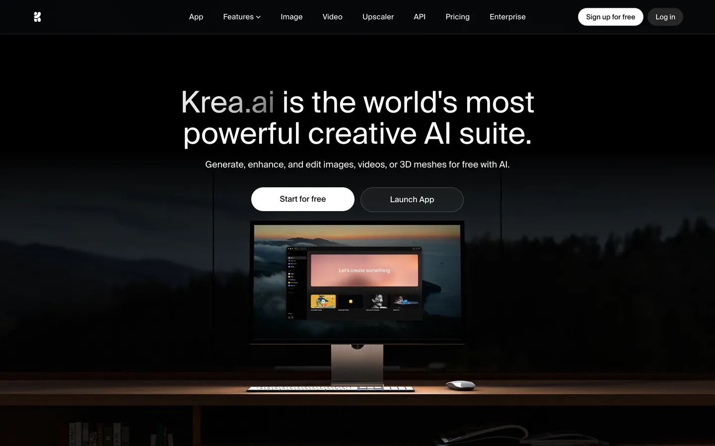
Krea is the generative-AI creative suite for images, video, and 3D meshes, and its marketing surface answers the dark-AI category question with an inverted move — the brightest pixel on the page is the primary CTA, not a saturated brand voltage. The canvas runs near-black "#0b0f15" with a true-black "#000000" header band; the "Start for free" pill fills pure "#ffffff" against that floor, and the secondary "Launch App" pill stays transparent with a hairline border. Where most AI-tool home pages stack a generated-output grid or a video reel above the fold, Krea drops a photographed iMac sitting on a wooden desk under a forest ridge at dusk — the actual product runs inside the screen, but the marketing chrome stays a quiet desk-still-life.
This DESIGN.md packages that discipline into a machine-readable spec built on the Google Labs format. Inside: 19 colors tokens grouped into canvas ("#0b0f15", "#000000", "#171717"), surface ("#262626", "#404040"), graded neutral text ("#737373", "#a3a3a3", "#d4d4d5", "#e5e5e5", "#ffffff"), and four frozen brand variables ("#62a2ff", "#65f223", "#762fad", "#55227d") that ship in CSS but never paint a pixel on the home page. Ten typography tokens all on Suisse Intl — display-xl at 72px / 86.4px / -1.8px tracking, heading-md at 30px / 36px, body-md at 14px / 20px, button-md at 14px / weight 450, label-uppercase at 12px / 1.2px tracking — plus a Suisse Intl Mono fallback declared in --font-mono. Four radii ("8px", "14px", "24px", "9999px"), a 4px-base spacing scale, and 16 components recipes covering pill CTAs, nav chips, hero band, and the dark card.
Drop the file into Claude, Cursor, or GitHub Copilot and the agent will reproduce Krea's inversion — white pill as the accent, black canvas, pill-or-8px geometry, weight 450 on buttons — rather than defaulting to a generic dark-AI theme with a violet brand voltage and a generated-image grid. Or reference the tokens directly: every hex, weight, and tracking value is a quoted string ready for Tailwind config or CSS variables. The system is worth studying because it answers the AI-tool category from the opposite direction — the brand voltage is the absence of voltage, and the brightest surface is the call to action itself.
What makes it distinct
5
- Inverted-accent CTAthe primary button fills "#ffffff" against a "#0b0f15" canvas, not a saturated brand voltage; the brightest pixel on the page IS the affordance
- Pill-or-nothing geometryevery CTA radius resolves to 33554432px (effectively 9999px), while nav chips and inputs use a strict 8px, with no 4px or 12px intermediates
- Weight 450 on button labelsan uncommon intermediate between 400 and 500 that distinguishes Krea's CTA face from its 400 body and 500 display
- Hero-as-photographthe canvas swaps illustration and generated grids for a real desk photo (iMac at dusk, forest behind), letting the marketing surface stay quiet while the product page sells the output
- Frozen brand voltage"#62a2ff" lives in --color-k-primary-outline and "#65f223" in --color-action-green, but neither paints a single rendered pixel on the home page; the brand voltage is reserved, not deployed
krea.ai
Live at krea.ai
A snapshot of the brand in production. Scroll the frame to see the whole page.
Colors
19 colors
Krea's system runs on #000000 as its primary voltage, used in 3 of 16 components. Type is set in Suisse Intl across 12 tokens from 12px to 72px, weights 400–600. Shape language is mixed across 16 components, blending pills, soft rounds, and squarer corners.
Surface
Page and card backgrounds · 5
Text
Headlines, body, captions · 5
Borders & Hairlines
Dividers, outlines, rules · 2
Other
Specialty colors · 7
Typography
12 type tokens
Set in Suisse Intl across 12 tokens, from 12px to 72px, weights 400–600. Shown in its own stack: where the font isn't installed, the fallback the file names stands in.
- display-xl72px · weight 600 · lh 86.4px · tracking -1.8pxThe quick brown fox jumps over the lazy dog
- display-tight72px · weight 600 · lh 75.6px · tracking -1.8pxThe quick brown fox jumps over the lazy dog
- heading-md30px · weight 600 · lh 36px · tracking -0.45pxThe quick brown fox jumps over the lazy dog
- heading-sm24px · weight 600 · lh 32px · tracking 0The quick brown fox jumps over the lazy dog
- body-lg20px · weight 450 · lh 28px · tracking 0The quick brown fox jumps over the lazy dog
- body-md16px · weight 400 · lh 24px · tracking 0The quick brown fox jumps over the lazy dog
- body-sm14px · weight 400 · lh 20px · tracking 0The quick brown fox jumps over the lazy dog
- nav-link15px · weight 400 · lh 22.5px · tracking 0.15pxThe quick brown fox jumps over the lazy dog
- button-md14px · weight 450 · lh 20px · tracking 0The quick brown fox jumps over the lazy dog
- label-uppercase12px · weight 500 · lh 16px · tracking 1.2pxThe quick brown fox jumps over the lazy dog
- caption13px · weight 400 · lh 13px · tracking 0The quick brown fox jumps over the lazy dog
- code-md14px · weight 400 · lh 20px · tracking 0The quick brown fox jumps over the lazy dog
Layout
Radii and spacing
5 corner radii and 9 spacing values. Shape language: mixed.
Radii
- none0px
- chrome8px
- card14px
- generous24px
- pill9999px
Spacing
- xxs4px
- xs8px
- sm10px
- md12px
- base16px
- lg20px
- xl24px
- 2xl48px
- 3xl96px
Components
16 components
Each rendered from its tokens (color, type, radius, padding) on Krea's own canvas.
- Top Navtop-navTop Nav
- Nav Linknav-linkNav Link
- Nav Link Hovernav-link-hoverNav Link Hover
- Button Primarybutton-primaryButton Primary
- Button Primary Hoverbutton-primary-hoverButton Primary Hover
- Button Secondarybutton-secondaryButton Secondary
- Button Secondary Hoverbutton-secondary-hoverButton Secondary Hover
- Hero Bandhero-bandHero Band
- Hero Subtexthero-subtextHero Subtext
- Hero Mockup Framehero-mockup-frameHero Mockup Frame
- Card Darkcard-darkCard Dark
- Panel Darkpanel-darkPanel Dark
- Type here…text-inputText Input
- Label Eyebrowlabel-eyebrowLabel Eyebrow
- Body Paragraphbody-paragraphBody Paragraph
- Footer Linkfooter-linkFooter Link
In use
The system, in use
Krea's tokens on the kind of product it builds.
Build something people actually use.
A short paragraph of marketing copy that previews how the brand's display tier and body tier read together. Two sentences is usually enough.
FAQ
Krea design system FAQ
Common questions about Krea's tokens, components, and how to use this DESIGN.md in your project.
Read next
Related reading
Specs, directories, and component libraries that pair with this design system.
- Browse all design systemsThe full directory of DESIGN.md files on shadcn.io, with live mockups for each.shadcn.io
- Krea — official siteThe generative-AI creative suite for images, video, and 3D meshes — free tier with real-time tools.krea.ai (opens in a new tab)
- The DESIGN.md specificationGoogle Labs' open spec for machine-readable design system files — the format this page is built on.github.com (opens in a new tab)
Use it
Use Krea in your project
One machine-readable file. Drop it into Claude, Cursor, or any AI tool that reads DESIGN.md.
Download the DESIGN.md
One machine-readable file: every color, type, radius, spacing, and component token of Krea.
Feed it to your AI tool
Drop it into Claude, Cursor, or GitHub Copilot. The agent writes React components and Tailwind classes that match Krea's visual language.
Reference the tokens directly
Or paste the values into your Tailwind config, CSS variables, or component library: every color, size and radius is a quoted, ready-to-copy value.
Read the full DESIGN.md: overview, rationale, do’s and don’ts
Overview
Krea's marketing surface is the rarest move in the dark-AI category — inverted-accent contrast, where the primary CTA is a pure-white pill against a near-black "#0b0f15" canvas and the brand has no painted voltage at all. The header band runs true "#000000", the body floor steps up to "#0b0f15", and the only chromatic activity comes from a photographed iMac sitting on a wooden desk under a forest ridge at dusk. Where most AI-tool home pages compete with a generated-output grid or a marquee video reel, Krea drops a real desk still-life and lets the product run inside the screen. The marketing chrome stays a quiet observer.
Type runs Suisse Intl across every role at modest weights — 400, 450, 500, 600 — with the display headline at 72px / line-height 86.4px / -1.8px tracking. There is no serif display face, no humanist body fallback, no second family on CTAs; Suisse Intl carries everything from 72px hero down to 12px uppercase eyebrow. The button label sits at the unusual weight 450, a variable-axis intermediate between regular and medium that distinguishes the CTA face from both body (400) and display (500-600). It's a precision detail signaling typographic craft — most marketing pages round to 400 or 500 and skip the 450 step entirely.
The shape language is pill-or-eight, not a graded radius scale. Every CTA — Sign up for free, Log in, Start for free, Launch App — resolves to an effectively infinite radius (the inspector reports 33554432px, which clamps to 9999px in practice). Every chrome element below CTA — nav chips at 12px 20px padding, text inputs, dark cards — uses a strict 8px. There are no 4px, 6px, or 12px intermediates on rendered chrome; the system reads as a binary choice between full pill and 8px square-corner, with 14px and 24px reserved for one-off elevation containers.
Frozen brand voltage: four chromatic tokens ship in CSS — k-primary-outline "#62a2ff", action-green "#65f223", purple-rain "#762fad", deep-purple "#55227d" — and none of them paint a single rendered pixel on the home page. Unlike the convention of dark-AI tools wiring a saturated violet or electric-cyan into the primary CTA, Krea reserves its brand voltage for product UI behind authentication. The brightest surface on the marketing page IS the call to action, and the call to action is white.
Key Characteristics:
- Inverted accent: primary CTA fills "{colors.ink}" ("#ffffff") against "{colors.canvas}" ("#0b0f15"). The brightest pixel IS the affordance.
- Pill-or-eight geometry: 9999px on every CTA, 8px on every chrome element, no intermediates rendered on the marketing surface.
- Suisse Intl everywhere: 72px display through 12px eyebrow, no font-family switch. Weight 450 reserved for button labels.
- Frozen brand tokens: "#62a2ff", "#65f223", "#762fad", "#55227d" ship in CSS but paint zero rendered pixels on the home page.
- Photographed hero: a wooden desk with an iMac at dusk replaces the conventional generated-image grid.
- Modest display weight (500-600), not the 700+ that fintech and consumer SaaS use.
Colors
Canvas
- Canvas (
{colors.canvas}— "#0b0f15") — frequency 1. Used as bg (1). The body floor — a near-black with a 258-degree blue cast that reads slightly cooler than the true-black header. Anchored to --background and --color-background. - Canvas Header (
{colors.canvas-header}— "#000000") — frequency 387. Used as text (323), bg (9), shadow (22), gradient (33). The header band fill, gradient stops, and the maximum-emphasis text role. Carries the page.
Surface
- Surface (
{colors.surface}— "#171717") — frequency 22. Used as text (20), bg (2). Card and popover background, wired to --card and --popover. The mid-step between canvas and elevated surface. - Surface Elevated (
{colors.surface-elevated}— "#262626") — frequency 12. Used as bg (11), border (1). The accent / muted / secondary fill — every elevated chip, hover-state surface, and sidebar accent lands here. - Surface Panel (
{colors.surface-panel}— "#404040") — frequency 156. Used as text (150), gradient (6). The Tailwind neutral-700 anchor, wired to --color-k-panel-bg. A workhorse text and gradient stop.
Ink (text)
- Ink (
{colors.ink}— "#ffffff") — frequency 228. Used as text (154), bg (63), shadow (2), gradient (9). Primary text on the dark canvas AND the fill of the primary CTA pill. The same hex carries both roles. - Ink Muted (
{colors.ink-muted}— "#a3a3a3") — frequency 115. Used as text (107), bg (8). The workhorse secondary text — paragraph body, label eyebrows, footer links. Wired to --muted-foreground. - Ink Faint (
{colors.ink-faint}— "#737373") — frequency 15. Used as text (15). Tertiary text and disabled labels. The --ring color also lives here. - Ink Soft (
{colors.ink-soft}— "#525252") — frequency 12. Used as text (12). Quietest legible text role.
Hairline & Divider
- Hairline (
{colors.hairline}— "#e5e5e5") — frequency 21. Used as bg (13), border (8). Light-surface fill and hairline border. Wired to --color-zinc-200 and friends. - Divider (
{colors.divider}— "#d4d4d5") — frequency 12. Used as text (9), bg (1), border (2). Light-mode divider with a faint 286-degree tint. - Light 50 (
{colors.light-50}— "#f1f1f1") — frequency 0 rendered. Wired to --color-primary-150 and the lightest neutral 50 stops; reserved for in-app light surfaces.
Shadow Step
- Shadow Step (
{colors.shadow-step}— "#646464") — frequency 6. Used as gradient (6). A mid-gray gradient stop used in subtle shadow gradients. No CSS variable name.
Frozen Brand (reserved, zero rendered pixels)
- K Primary Outline (
{colors.k-primary-outline}— "#62a2ff") — frequency 0. Wired to --color-k-primary-outline. A 257-degree sky-blue at OKLCH chroma 0.15. Reserved for primary outline states in the editor; absent from the marketing surface. - Action Green (
{colors.action-green}— "#65f223") — frequency 0. Wired to --color-action-green. A saturated 138-degree green at OKLCH chroma 0.26. Reserved for in-app action confirmations. - Purple Rain (
{colors.purple-rain}— "#762fad") — frequency 0. Wired to --color-purple-rain. A 305-degree violet for product chrome behind authentication. - Deep Purple (
{colors.deep-purple}— "#55227d") — frequency 0. Wired to --color-deep-purple and --color-purple-900. The darker purple anchor.
Off-Brand (utility)
- Disappointing Blue (
{colors.disappointing-blue}— "#1e3b68") — frequency 0. Wired to --color-disappointing-blue, named in CSS exactly that way. Reserved for warning or error tone variants. - Discord Purple (
{colors.discord-purple}— "#5865f2") — frequency 0. Wired to --color-discord-purple. The Discord brand match for community CTAs.
Typography
Font Family
The system runs Suisse Intl as the primary family across every text role from 72px display down to 12px uppercase eyebrow. Suisse Intl Mono is declared in --font-mono for code surfaces. There is no separate display family and no humanist body fallback. Suisse Intl is a commercial face from Swiss Typefaces; Inter at the matching weights is the closest open-source substitute, with Geist Sans as the second choice. Both transfer the geometry cleanly; weight 450 must be set explicitly via the variable-font axis.
Hierarchy
| Token | Size | Weight | Line Height | Letter Spacing | Use |
|---|---|---|---|---|---|
{typography.display-xl} | 72px | 600 | 86.4px | -1.8px | Hero headline |
{typography.display-tight} | 72px | 600 | 75.6px | -1.8px | Tighter hero variant |
{typography.heading-md} | 30px | 600 | 36px | -0.45px | Section headings |
{typography.heading-sm} | 24px | 600 | 32px | 0 | h3 / card titles |
{typography.body-lg} | 20px | 450 | 28px | 0 | Hero subtext |
{typography.body-md} | 16px | 400 | 24px | 0 | Standard paragraph |
{typography.body-sm} | 14px | 400 | 20px | 0 | Compact text, form fields |
{typography.nav-link} | 15px | 400 | 22.5px | 0.15px | Top navigation links |
{typography.button-md} | 14px | 450 | 20px | 0 | All CTA labels |
{typography.label-uppercase} | 12px | 500 | 16px | 1.2px (uppercase) | Eyebrow labels |
{typography.caption} | 13px | 400 | 13px | 0 | Small links, footer |
{typography.code-md} | 14px | 400 | 20px | 0 | Code, mono surfaces |
Principles
- One family, four weights. Suisse Intl handles every role; variety comes from size, weight, and tracking rather than family contrast.
- Weight 450 as the button signature. The CTA label sits between regular and medium — a precision detail most marketing surfaces skip.
- Modest display weight. Display sits at 500-600, not the 700+ that fintech and enterprise systems use. The brand trusts photography and pure-white pill geometry over typographic muscle.
- Negative tracking only on display. Headlines at 72px and 30px use -1.8px and -0.45px respectively. Body, buttons, and labels keep tracking at 0 or +0.15px.
- Uppercase only at 12px. A single uppercase tier with 1.2px positive tracking — the rest of the system is sentence case.
Layout
Spacing System
- Base unit: 4px (with 10px and 12px as the workhorse step sizes).
- Tokens:
{spacing.xxs}4px ·{spacing.xs}8px ·{spacing.sm}10px ·{spacing.md}12px ·{spacing.base}16px ·{spacing.lg}20px ·{spacing.xl}24px ·{spacing.2xl}48px ·{spacing.3xl}96px. - Dominant rhythm: 10px (frequency 66), 12px (56), and 8px (51) are the three workhorse step sizes — the spacing is dense at the chip level, with 48px and 96px reserved for section vertical padding.
- Nav-chip padding: the signature 12px 20px combination (frequency 31) lives on every nav link.
Grid & Container
- Max content width: wide-bleed on hero, with the desk photograph centered against the dark canvas.
- Header: full-width "#000000" band at 64px tall with logo-left, links-center, CTA-pair-right.
- Hero: centered headline at 72px display, 20px subtext at weight 450, then the pill pair, then the desk photograph.
- Footer: beneath the captured viewport; not fully observed on the captured surface.
Whitespace Philosophy
Krea uses 96px vertical section gaps and tight 8-12px component interiors — generous breathing room between sections paired with dense chip and button geometry inside them. The contrast between section-scale 96px gaps and chip-scale 10px paddings is the page's rhythm.
Elevation
The system uses almost no box-shadow on the marketing surface. Two shadow tokens ship in CSS — --shadow-xl with a 20px-25px stacked black tint and --drop-shadow-xl with a 9px-7px black tint — but neither is observed on the captured hero. Depth comes from surface tinting, not from shadow.
| Level | Treatment | Use |
|---|---|---|
| Flat (Level 0) | No shadow, no border | Everything on the marketing surface — the dominant state |
| Tinted Surface (Level 1) | {colors.surface} ("#171717") with optional 1px {colors.surface-elevated} border | Cards, popovers |
| Elevated Tinted (Level 2) | {colors.surface-elevated} ("#262626") fill | Hover states, secondary buttons, chips |
| Pill Affordance (Level 3) | {colors.ink} ("#ffffff") fill, pill radius | Primary CTAs only |
The pure-white pill on dark canvas IS the elevation system. There is no progressive shadow ladder; the CTA reads as elevated because it inverts the canvas, not because it casts a shadow.
Shapes
Krea operates on pill-or-eight geometry, the binary radius rule. Every CTA — Sign up for free, Log in, Start for free, Launch App — resolves to an effectively infinite radius (the inspector reports 33554432px, the JavaScript Number.MAX_SAFE_INTEGER-adjacent value that browsers clamp to 9999px). Every chrome element below CTA — nav chips, text inputs, dark cards — uses a strict 8px. There are two intermediate radii in the system — 14px for one-off card containers and 24px for the larger surface frames — but they appear rarely on the marketing surface, and 4px / 6px / 16px do not render on rendered chrome at all.
| Token | Value | Use |
|---|---|---|
{rounded.none} | "0px" | Hero text, dividers, raw images |
{rounded.chrome} | "8px" | Nav chips, cards, panels, inputs — the dominant chrome radius |
{rounded.card} | "14px" | Reserved card surfaces |
{rounded.generous} | "24px" | Hero mockup frame, larger elevation containers |
{rounded.pill} | "9999px" | Every CTA in the system, no exceptions |
Components
Header
top-nav — A 64px-tall "#000000" header band with the logo wordmark at left, six nav links centered ("App", "Features", "Image", "Video", "Upscaler", "API", "Pricing", "Enterprise"), and the Sign-up / Log-in pill pair at right. No border, no shadow — the band is a flat fill against the slightly lighter "#0b0f15" body canvas.
nav-link — Suisse Intl 15px / weight 400 / line-height 22.5px / 0.15px tracking, white text on transparent background, 8px radius, 12px 20px padding. The 47px tap height is generous for a marketing nav.
nav-link-hover — Background lifts to "#262626" ({colors.surface-elevated}) on hover; everything else stays.
Pill CTAs
button-primary — The signature surface. Pure-white "#ffffff" fill against the dark canvas, "#000000" text, Suisse Intl 14px / weight 450 / line-height 20px, 9999px radius, 8px 16px padding, 36px height, no border. The button is the brightest pixel on the page — the affordance IS the accent.
button-primary-hover — Background dims to "#e5e5e5" ({colors.hairline}) on hover, text stays "#000000". A subtle 8% luminance step.
button-secondary — Same pill geometry, transparent fill, white text, 1px "#262626" border. Used for "Log in" and "Launch App" — every secondary CTA stays a transparent pill.
button-secondary-hover — Background fills to "#262626" on hover, text stays white.
Hero
hero-band — Centered 96px-padded section with the 72px headline (the Krea.ai creative-AI-suite tagline) in {typography.display-xl}, the subtext in {typography.body-lg} at weight 450, then the pill pair, then the desk photograph. Background is the canvas "#0b0f15".
hero-subtext — Suisse Intl 20px / weight 450 / line-height 28px. Sits below the headline at single-line length: "Generate, enhance, and edit images, videos, or 3D meshes for free with AI."
hero-mockup-frame — The wooden-desk photograph with an iMac at dusk centered below the CTA pair. No frame, no shadow, no border — the photograph is bled onto the canvas. 24px radius is available for the rare framed mockup.
Cards & Panels
card-dark — "#171717" fill, white text, 8px radius, 1px "#262626" border, 20px interior padding. The default dark card surface.
panel-dark — "#262626" fill, white text, 8px radius, 12px 20px padding. Used inside nav chips and elevated chips.
Forms
text-input — "#171717" fill, white text, Suisse Intl 14px body-sm, 8px radius, 8px 12px padding, 36px height, 1px "#262626" border. Form inputs are not rendered on the captured hero; this is the inferred treatment from the in-app shell wired to --color-input.
Labels & Text
label-eyebrow — Suisse Intl 12px / weight 500 / line-height 16px / 1.2px tracking, uppercase, {colors.ink-muted} "#a3a3a3" text. The only uppercase role in the system. Used for section labels above headings.
body-paragraph — Suisse Intl 16px / weight 400 / line-height 24px, {colors.ink-muted} "#a3a3a3" text. The standard paragraph color is muted, not white — white is reserved for headlines and CTA labels.
footer-link — Suisse Intl 13px / weight 400 / line-height 13px, {colors.ink-muted} "#a3a3a3" text. Tight 13/13 leading is unusual — most footer links use 13/18 or 13/20 — and it compresses the footer rail into a dense ledger.
Do's and Don'ts
Do fill primary CTAs with {colors.ink} ("#ffffff") on the dark canvas. The pure-white pill on near-black is the system's signature — it inverts the dark-AI convention of a saturated brand voltage. Hover dims to {colors.hairline} ("#e5e5e5"), an 8% luminance step.
Do set button labels to weight 450 explicitly. Suisse Intl variable supports the intermediate axis natively, and the difference from body weight 400 and display weight 500-600 is the system's quietest typographic signal.
Do keep secondary CTAs transparent with a 1px {colors.surface-elevated} ("#262626") border on dark canvas. Filling the secondary pill with a tinted dark surface collapses the visual hierarchy with cards and panels, which share the same fill.
Don't use {colors.k-primary-outline} ("#62a2ff"), {colors.action-green} ("#65f223"), {colors.purple-rain} ("#762fad"), or {colors.deep-purple} ("#55227d") on marketing surfaces. These four hex codes ship in CSS variables (--color-k-primary-outline, --color-action-green, --color-purple-rain, --color-deep-purple) but paint zero rendered pixels on the home page. They are reserved for in-app product UI behind authentication; painting them on a hero pill or background band immediately breaks the brand discipline.
Don't use 4px, 6px, 12px, or 16px radii on chrome. The system is pill-or-eight: 9999px on CTAs, 8px on every chrome element. 14px and 24px exist for rare elevation containers, but adding a 12px badge or a 6px input destroys the binary rule.
Don't set display headlines to weight 700 or above. Krea's hero sits at weight 500-600 with -1.8px tracking. Weight 700 reads as heavy fintech display, not the modest, photography-trusting voice the system commits to.
Don't add box-shadow to cards or buttons. The captured marketing surface uses zero rendered shadows; depth comes from surface tinting ("#0b0f15" canvas → "#171717" card → "#262626" elevated → "#ffffff" pill). A drop-shadow on a card breaks the surface ladder.
Don't start paragraph text at white. The body paragraph color is {colors.ink-muted} ("#a3a3a3"), not {colors.ink} ("#ffffff"). White is reserved for the hero headline, nav links, and CTA labels — using it on body paragraphs flattens the hierarchy.
Known Gaps
- Below-the-fold sections: the captured surface is a single-viewport hero. Pricing, feature deep-dives (Image, Video, Upscaler, API, Enterprise), and the in-app editor (canvas, layer rail, prompt input, generation queue) are not represented.
- Hover and active states: the white-pill hover dim and the secondary-pill fill-on-hover are inferred from CSS variable wiring rather than observed motion on the captured surface.
- Form validation: input error states, focus rings, and the four reserved brand tokens as deployed for action confirmations or destructive states are not observable on the home page.
- Light mode: light-surface CSS variables (--color-primary-0 = "#ffffff", --color-primary-50, --color-primary-100) ship in the stylesheet but the marketing surface never renders in light mode.
- Discord-integrated community surfaces: --color-discord-purple "#5865f2" is wired in CSS for community CTAs but not exercised on the captured hero.
- Animation and transition timing: easing curves and durations between section reveals, pill hover dims, and image lazy-loads are not documented.
AI & LLM Platforms
More systems like this
More DESIGN.md files in AI & LLM Platforms.
Pricing
Build it with Pro
The DESIGN.md files are free. Pro adds 6,000+ blocks, premium templates and the MCP server, so your AI editor builds in your system for you.
4.9/5 out of 5 · 150+ reviewsfrom 150+ founders and developers.
Billing
Billed once a year in USD. Cancel anytime.
- How many people can use the license.
- Client work, SaaS products and anything you charge for.
- Production-ready React sections: hero, pricing, features, dashboards and more.
- Complete multi-page sites you can ship as they are.
- React icons from every major library, installable with one command.
- Presets that restyle every block, in light and dark.
- Lets your AI editor search, preview and install blocks for you.
- Priority requests are answered first.
Individual
For personal projects & open source
$32instead of $49/mo
$389 billed yearly
- Seats: 1 seat
- Commercial use: Personal & open source only
- Pro blocks: 6,000+ blocks
- Templates: All 14 templates
- React icons: 294k+ icons
- Themes: All 59 themes
- MCP server: Basic usage
- Support: Standard
Team
Most popularFor freelancers, agencies & startups
$66instead of $99/mo
$789 billed yearly · ≈ $13/dev/mo
- Seats: Up to 5 seats
- Commercial use: Included
- Pro blocks: 6,000+ blocks
- Templates: All 14 templates
- React icons: 294k+ icons
- Themes: All 59 themes
- MCP server: High usage
- Support: Priority
Organization
For companies with larger teams
$132instead of $199/mo
$1,589 billed yearly
- Seats: Unlimited seats
- Commercial use: Included
- Pro blocks: 6,000+ blocks
- Templates: All 14 templates
- React icons: 294k+ icons
- Themes: All 59 themes
- MCP server: Unlimited usage
- Support: Priority
Billed once a year in USD. Cancel anytime.
Individual
For personal projects & open source
$32instead of $49/mo
$389 billed yearly
- How many people can use the license.Seats: 1 seat
- Client work, SaaS products and anything you charge for.Commercial use: Personal & open source only
- Production-ready React sections: hero, pricing, features, dashboards and more.Pro blocks: 6,000+ blocks
- Complete multi-page sites you can ship as they are.Templates: All 14 templates
- React icons from every major library, installable with one command.React icons: 294k+ icons
- Presets that restyle every block, in light and dark.Themes: All 59 themes
- Lets your AI editor search, preview and install blocks for you.MCP server: Basic usage
- Priority requests are answered first.Support: Standard
Team
Most popularFor freelancers, agencies & startups
$66instead of $99/mo
$789 billed yearly · ≈ $13/dev/mo
Everything in Individual, plus
- How many people can use the license.Seats: Up to 5 seats
- Client work, SaaS products and anything you charge for.Commercial use: Included
- Lets your AI editor search, preview and install blocks for you.MCP server: High usage
- Priority requests are answered first.Support: Priority
Organization
For companies with larger teams
$132instead of $199/mo
$1,589 billed yearly
Everything in Team, plus
- How many people can use the license.Seats: Unlimited seats
- Lets your AI editor search, preview and install blocks for you.MCP server: Unlimited usage
- Secure checkout via Stripe
- Code lives in your repo
- Keep what you've shipped if you cancel
- License terms
Your system, built for you
Every block, template and icon, installed by your AI agent in your design system. The DESIGN.md files stay free.