Skip to content

JACQUEMUS Design System

JACQUEMUS's design system as a DESIGN.md file: binary black-on-white palette, Futura PTT geometric sans at 18px with wide letter-spacing, zero decoration. Tokens for React, Next.js, and AI tools.

Add shadcn.io to your AI agent. · Pro It installs blocks, icons and templates in your design system from a prompt, with Pro.

Set up MCP
Primary
#000000
Typeface
Futura PTT
Shape
Sharp
Base radius
0px
Colors
3
Type tokens
8
Components
12
Spacing values
7

About

About JACQUEMUS DESIGN.md

Curated by Dov Azencot · Updated May 19, 2026 · Source jacquemus.com (opens in a new tab)

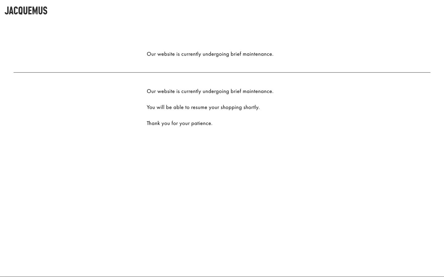
JACQUEMUS's marketing site, captured during a brief maintenance window, reveals the typographic skeleton that holds the brand together when photography is stripped away. The page is two colors — black and white — and one typeface: Futura PTT, a geometric sans at weight 400 with 0.56px letter-spacing rendered at 18px. The all-caps wordmark "JACQUEMUS" at the top-left is the single most dominant element on the screen; beneath it, a full-width 1px hairline rule, then centered body text announcing the maintenance. Where other fashion brands deploy photography-first or gradient-rich pages, JACQUEMUS's skeleton reads as the brand's own kind of confidence — the typeface alone is expected to carry the weight.

The DESIGN.md file packages what can be machine-read from the captured surface into a spec for React and AI tools. Inside: 3 colors tokens across a pure black-and-white binary palette; 8 typography tokens all running Futura PTT at a single weight and size with variations mapped to semantic roles; a flat 0px radius on every element; 7 spacing tokens on a standard scale; and 12 components definitions covering the wordmark, hairline rule, body paragraph, and maintenance-state layout. The extraction ran against a maintenance page — a condition that exposes the design's bones with unusual clarity.

Feed this file to Claude or Cursor and it will reproduce JACQUEMUS's typographic register: Futura PTT in all-caps at the wordmark tier, tracking-widened at 0.56px for body text, black on white without exception. The system's value as a reference is the clarity of its restraint — one typeface, one weight, two colors, one structural rule. For a development team building a fashion-adjacent landing page that needs typographic authority without photography, this skeleton is the starting point.

What makes it distinct

5

  1. Binary palettepure ink black on white, no accent, no grey tier, no color of any kind in the chrome
  2. Futura PTT at a single size18px / 400 with 0.56px tracking carries the wordmark, body, and navigation; the typeface is the entire system
  3. Wordmark as primary UI elementJACQUEMUS in all-caps Futura PTT renders larger and bolder than any other screen element, acting as both logo and page anchor
  4. Hairline rule as sole spatial devicea full-width 1px black line is the only structural divider in the system
  5. Typography-first identityJacquemus relies on Futura PTT's geometric authority to hold the page when photography is absent

jacquemus.com

Live at jacquemus.com

A snapshot of the brand in production. Scroll the frame to see the whole page.

JACQUEMUS's website at jacquemus.com

Colors

3 colors

JACQUEMUS's system runs on #000000 as its primary voltage, used in 12 of 12 components. Type is set in Futura PTT across 8 tokens from 14px to 24px, weights 400–700. Shape language is sharp — components average 0px corner radius, favoring crisp rectangles.

Surface

Page and card backgrounds · 1

Text

Headlines, body, captions · 1

Borders & Hairlines

Dividers, outlines, rules · 1

Typography

8 type tokens

Set in Futura PTT across 8 tokens, from 14px to 24px, weights 400–700. Shown in its own stack: where the font isn't installed, the fallback the file names stands in.

  • display-xl24px · weight 700 · lh 28px · tracking 1pxThe quick brown fox jumps over the lazy dog
  • body-md18px · weight 400 · lh 20px · tracking 0.56pxThe quick brown fox jumps over the lazy dog
  • body-sm16px · weight 400 · lh 20px · tracking 0.56pxThe quick brown fox jumps over the lazy dog
  • label-md18px · weight 400 · lh 20px · tracking 0.56pxThe quick brown fox jumps over the lazy dog
  • button-md18px · weight 400 · lh 20px · tracking 0.56pxThe quick brown fox jumps over the lazy dog
  • nav-link18px · weight 400 · lh 20px · tracking 0.56pxThe quick brown fox jumps over the lazy dog
  • caption14px · weight 400 · lh 18px · tracking 0.4pxThe quick brown fox jumps over the lazy dog
  • wordmark18px · weight 700 · lh 20px · tracking 1pxThe quick brown fox jumps over the lazy dog

Layout

Radii and spacing

1 corner radii and 7 spacing values. Shape language: sharp.

Radii

  • none0px

Spacing

  • xs8px
  • sm15px
  • md20px
  • base32px
  • lg50px
  • xl115px
  • 2xl200px

Components

12 components

Each rendered from its tokens (color, type, radius, padding) on JACQUEMUS's own canvas.

  • Wordmark
    wordmarkWordmark
  • Button Primary
    button-primaryButton Primary
  • Button Secondary
    button-secondaryButton Secondary
  • Top Nav
    top-navTop Nav
  • Nav Link
    nav-linkNav Link
  • Hairline Rule
    hairline-ruleHairline Rule
  • Hero Heading
    hero-headingHero Heading
  • Body Paragraph
    body-paragraphBody Paragraph
  • Section
    sectionSection
  • Card
    cardCard
  • Type here…
    text-inputText Input
  • Footer
    footerFooter

In use

The system, in use

JACQUEMUS's tokens on the kind of product it builds.

Build something people actually use.

A short paragraph of marketing copy that previews how the brand's display tier and body tier read together. Two sentences is usually enough.

Get startedLearn more
Marketing heroHeadline, sub-copy, primary CTA — the universal homepage opener.
Reporting · 14 min read

The quiet collapse of an old idea

For decades the consensus held that the system would correct itself. Then it didn't. This is the inside story of what changed, told by the people who watched it unravel.

"Nobody noticed because the failure was indistinguishable from progress."

By Sam Reporter · Updated 2 hours ago

Editorial articleMagazine-style longform with display headline.

FAQ

JACQUEMUS design system FAQ

Common questions about JACQUEMUS's tokens, components, and how to use this DESIGN.md in your project.

Read next

Specs, directories, and component libraries that pair with this design system.

Use it

Use JACQUEMUS in your project

One machine-readable file. Drop it into Claude, Cursor, or any AI tool that reads DESIGN.md.

Download DESIGN.md
  1. Download the DESIGN.md

    One machine-readable file: every color, type, radius, spacing, and component token of JACQUEMUS.

  2. Feed it to your AI tool

    Drop it into Claude, Cursor, or GitHub Copilot. The agent writes React components and Tailwind classes that match JACQUEMUS's visual language.

  3. Reference the tokens directly

    Or paste the values into your Tailwind config, CSS variables, or component library: every color, size and radius is a quoted, ready-to-copy value.

Read the full DESIGN.md: overview, rationale, do’s and don’ts

Overview

JACQUEMUS's site presents its barest skeleton during the maintenance capture — and the skeleton is the argument. Typeface as brand. The single observable design decision is the choice of Futura PTT: a geometric sans at weight 400, 18px, 0.56px tracking, set in the all-caps wordmark at the page's top-left and again in centered maintenance copy below. Where LOEWE withholds color but speaks through photography, and where most fashion brands layer editorial images over their typographic chassis, JACQUEMUS's maintenance page makes the chassis visible. It reads as a page that would be completely at home printed on a gallery broadsheet.

The system is binary. Ink black on white, one typeface, no radius, one spatial device — the full-width hairline rule that separates wordmark from body. Unlike the dev-infra brands that use hairlines to carry elevation hierarchy, JACQUEMUS's hairline is the only structural element in the system — a single horizontal line doing the work that a gutter, padding, and background-color shift would normally divide between three properties.

Key Characteristics:

  • Binary palette: ink black ({colors.ink}) on white canvas ({colors.canvas}), zero chromatic moves in the chrome.
  • Futura PTT at weight 400, 18px, 0.56px letter-spacing as the sole typographic voice.
  • The JACQUEMUS wordmark in all-caps bold Futura PTT is the primary UI element on every page.
  • A single full-width 1px {colors.hairline} rule as the only structural separator.
  • 0px border-radius on every element: buttons, inputs, cards, navigation.
  • Generous vertical spacing — 50px section padding — as a spaciousness signal borrowed from editorial print layout.
  • CSS variable declarations include Bootstrap utility colors (indigo, amber, teal, pink) as structural scaffolding — these never appear in the rendered brand chrome.

Colors

System

  • Ink ({colors.ink} — #000000): frequency 34. Used as text (17) and border (17). The sole color in the system. Every typographic element, every structural border, every hairline rule renders in pure black. There is no secondary text tone, no muted ink.
  • Canvas ({colors.canvas} — #ffffff): frequency 2, background only. The page floor. Pure white — not the warm off-white that Cloudflare or Airbnb reach for; pure white is the fashion-brand convention for presenting photography against a neutral ground.

Structural Scaffolding (not brand colors)

The site's CSS variable declarations include Bootstrap-style utility tokens — amber, green, pink, teal, and indigo — wired as Bootstrap's default variable names (--yellow, --green, --pink, --teal, --indigo). None of these appear on the rendered page. They are Bootstrap scaffolding, not brand colors; treat them as the utility layer they are.

Typography

Font Family

The system runs a single voice: Futura PTT (Paul Renner's geometric sans as digitized by ParaType), falling back to "Helvetica Neue", Arial, and sans-serif. The wordmark renders in all-caps bold; all other text renders at weight 400. There is no second family, no mono tier, no italic treatment.

Futura PTT's wide letter-spacing (0.56px at 18px body) is the defining typographic move — it stretches the geometric forms horizontally, giving the typeface more air than standard Futura releases. The spacing is declared in the CSS at 0.56px and applies to every instance of Futura PTT on the page.

Hierarchy

TokenSizeWeightLine HeightLetter SpacingUse
{typography.wordmark}18px70020px1pxJACQUEMUS all-caps masthead wordmark
{typography.display-xl}24px70028px1pxCampaign-era section display headings
{typography.body-md}18px40020px0.56pxPrimary body text, maintenance copy
{typography.body-sm}16px40020px0.56pxSecondary body / sub-paragraph text
{typography.label-md}18px40020px0.56pxCategory and navigation labels
{typography.button-md}18px40020px0.56pxCTA button labels
{typography.nav-link}18px40020px0.56pxNavigation link labels
{typography.caption}14px40018px0.4pxFooter text, product metadata

Principles

The system deploys one weight-size pair for essentially everything: Futura PTT 400 at 18px. The wordmark breaks the pattern only at weight — it goes bold, not larger, to assert hierarchy while maintaining the same cap height. The 0.56px tracking is the voice; without it, Futura PTT reads as tighter than intended. For the display tier, wider tracking (1px) opens the caps further into a high-fashion register.

Note on Font Substitutes

Futura PTT is a licensed family via ParaType. Futura PT (Adobe Fonts) is the nearest equivalent. For open-source alternatives, Jost (Google Fonts) is the closest in geometric construction; Nunito Sans approximates the counter shapes at body size but reads slightly rounder. When substituting, preserve the 0.56px letter-spacing — it is the system's typographic signature, not a generic spacing value.

Layout

Spacing System

  • Base unit: no strict module is evident from the sparse data, but values cluster around 15–20px for horizontal margins and 50px for vertical section padding.
  • Tokens: {spacing.xs} 8px · {spacing.sm} 15px · {spacing.md} 20px · {spacing.base} 32px · {spacing.lg} 50px · {spacing.xl} 115px (top padding on content below header) · {spacing.2xl} 200px.
  • Dominant values: 50px (section top/bottom padding), 20px (container horizontal margin), 115px (large above-fold top margin).

Grid & Container

  • Page layout: single-column centered layout on the maintenance page. A full-width header strip at the top, then a centered text column below.
  • Content column: approximately 411px wide based on the body paragraph render — a narrow column that forces the body text to wrap at a measured line length.
  • Header: full-width, with the wordmark flush left within the container and the navigation flush right.

Rhythm

The page uses a magazine broadsheet rhythm — generous top margins, sparse text, and the hairline rule as the only spatial divider. The 115px top padding on the main content area creates a visual silence between the masthead and the first word of copy. This is consistent with high-fashion print conventions where breathing room signals status.

Elevation

No shadows and no elevation. Not a single shadow declaration in the captured CSS (the Bootstrap utility reset does not add shadows). All surface depth comes from the hairline rule — a 1px black line that separates the wordmark zone from the body zone. The system treats depth simulation as unnecessary: on pure white, layering would require a surface color shift that would break the binary palette.

Shapes

Pure 0px radius throughout. Every element — buttons, inputs, navigation items — presents as a square-cornered rectangle. This is the default state for the system rather than an intentional departure; the maintenance page does not expose enough component surface to confirm the policy across all UI states, but the absence of any border-radius declaration in the captured CSS is conclusive for the rendered elements.

Components

wordmark — The JACQUEMUS all-caps masthead. Bold Futura PTT with wide tracking (1px), ink black, transparent background, left-aligned within the header. The primary brand element and the typographic anchor of the system.

hairline-rule — A full-width 1px ink-black rule ({colors.hairline}) that separates the masthead zone from the page body. The only structural spatial device in the system.

button-primary — Ink-black fill with white text, Futura PTT at {typography.button-md}, 0px radius, 12×24px padding, 44px height. No border; the fill is the affordance.

button-secondary — Transparent fill with ink text and a 1px black border, same Futura PTT size and spacing, 0px radius. Used for secondary navigation actions.

top-nav — White canvas, 60px height, 20×15px padding. Wordmark flush left, navigation links flush right. A 1px hairline rule marks the nav bottom.

nav-link — Transparent background, ink text at {typography.nav-link} (18px / 400 / 0.56px tracking). No hover state on the captured surface.

hero-heading — Ink text, {typography.display-xl} (24px / 700). Campaign panel display headings — short, declarative, never descriptive.

body-paragraph — Ink text at {typography.body-md} (18px / 400 / 0.56px tracking), 50px vertical padding. The measured line of body copy reads like editorial prose even when it's maintenance-page copy.

section — White canvas, 50px top/bottom padding. The basic page section container — no fill, no border, no radius.

card — White canvas, 20×15px padding, 0px radius, ink border. The basic content card for the full site — product, editorial, editorial-grid.

text-input — White fill, ink text at {typography.body-md}, 12px vertical padding, 44px height, 1px bottom-only ink border. Underline-style form field consistent with the no-enclosed-box policy.

footer — White canvas, ink text at {typography.caption} (14px / 400 / 0.4px tracking), 50×15px padding. Footer links mirror the navigation structure.

Do's and Don'ts

Do treat the wordmark as the first visual element — left-aligned, bold Futura PTT, separated from body content by the hairline rule. Every page in this system is anchored by the masthead-first layout, and the wordmark carries more visual weight than any headline below it.

Do preserve the 0.56px letter-spacing on all Futura PTT body text. The tracking is the voice — at 18px without it, the typeface reads significantly tighter and loses the airy fashion-editorial register.

Do use the full-width hairline rule as the primary spatial separator. The system has one structural device; use it to divide zones rather than reaching for background color shifts or shadow layers.

Do keep the palette binary. Adding a warm grey as a secondary text tone would introduce three ink values where the system has one. All secondary hierarchy is a size reduction, not a color shift.

Don't use the Bootstrap utility colors declared in the CSS — amber (--yellow), pink (--pink), indigo (--indigo) — as brand accents. They are Bootstrap scaffolding tokens that serve the framework's reset, not JACQUEMUS's design language. None appear on the rendered marketing surface.

Don't round corners. Not to 2px for softness, not to 4px for cards — the system is a square-corner policy and any radius introduces a design language borrowed from a different brand category.

Don't introduce a muted grey text tone. The system has one text color — ink black — and uses spacing rather than tone to create secondary hierarchy. A second text color would break the binary.

Don't shrink body text below 18px for primary content. The system's body type at 18px reads as unusually large for an e-commerce environment — this is a deliberate editorial choice, not an accessibility floor. Reducing to the 14–15px convention would shift the register from fashion editorial to retail utility.

Known Gaps

  • Full marketing site: this DESIGN.md was extracted from a maintenance page, not the live marketing site. The full component set — product grids, campaign photography panels, bag-detail component, size-selector, color-swatch, checkout flow — is not captured here. Re-run extraction against the live site once maintenance concludes.
  • Campaign photography layer: JACQUEMUS is known for distinctive editorial photography (provençal pastels, overexposed sunlight, playful editorial compositions). The color palette this photography introduces — the warm pinks, lavenders, and creams of the brand's campaigns — does not appear in the chrome and is not represented in this spec.
  • Mobile layout: the extraction ran against a desktop maintenance page. The mobile layout (likely stacked, hamburger-nav, card-based product grid) is not represented.
  • Interactive and hover states: no hover, focus, or active states are captured. The live site's navigation dropdowns and product-hover overlays are not visible in the maintenance surface.
  • Dark mode: the brand does not appear to run a dark-canvas variant, but this cannot be confirmed from the maintenance extraction alone.
  • Animation: JACQUEMUS is known for distinctive product-photography animation (slow zooms, parallax product reveals) on the live site. The spec captures no easing curves or timing values.
  • Provençal palette: the brand's sub-seasonal color palettes — dusty rose, Mediterranean blue, soft lavender — appear in campaign photography and likely in limited-edition surface color treatments not visible on the maintenance page.

E-commerce & Retail

More systems like this

More DESIGN.md files in E-commerce & Retail.

Pricing

Build it with Pro

The DESIGN.md files are free. Pro adds 6,000+ blocks, premium templates and the MCP server, so your AI editor builds in your system for you.

4.9/5 out of 5 · 150+ reviewsfrom 150+ founders and developers.

Billed once a year in USD. Cancel anytime.

Individual

For personal projects & open source

$32instead of $49/mo

$389 billed yearly

  • How many people can use the license.Seats: 1 seat
  • Client work, SaaS products and anything you charge for.Commercial use: Personal & open source only
  • Production-ready React sections: hero, pricing, features, dashboards and more.Pro blocks: 6,000+ blocks
  • Complete multi-page sites you can ship as they are.Templates: All 14 templates
  • React icons from every major library, installable with one command.React icons: 294k+ icons
  • Presets that restyle every block, in light and dark.Themes: All 59 themes
  • Lets your AI editor search, preview and install blocks for you.MCP server: Basic usage
  • Priority requests are answered first.Support: Standard

Team

Most popular

For freelancers, agencies & startups

$66instead of $99/mo

$789 billed yearly · ≈ $13/dev/mo

Everything in Individual, plus

  • How many people can use the license.Seats: Up to 5 seats
  • Client work, SaaS products and anything you charge for.Commercial use: Included
  • Lets your AI editor search, preview and install blocks for you.MCP server: High usage
  • Priority requests are answered first.Support: Priority

Organization

For companies with larger teams

$132instead of $199/mo

$1,589 billed yearly

Everything in Team, plus

  • How many people can use the license.Seats: Unlimited seats
  • Lets your AI editor search, preview and install blocks for you.MCP server: Unlimited usage
  • Secure checkout via Stripe
  • Code lives in your repo
  • Keep what you've shipped if you cancel
  • License terms

Your system, built for you

Every block, template and icon, installed by your AI agent in your design system. The DESIGN.md files stay free.

Get Pro