Ideogram Design System
Ideogram's design system as a DESIGN.md file. Manrope 600 across every role, graphite #0e0e10 CTA, cyan #48bdff accent, 18 components. For React and AI tools.
Add shadcn.io to your AI agent. · Pro It installs blocks, icons and templates in your design system from a prompt, with Pro.
Set up MCP- Primary
- #0e0e10
- Typeface
- Manrope
- Shape
- Mixed
- Base radius
- 8px
- Colors
- 18
- Type tokens
- 8
- Components
- 18
- Spacing values
- 8
About
About Ideogram DESIGN.md
Curated by Dov Azencot · Updated May 13, 2026 · Source ideogram.ai (opens in a new tab)
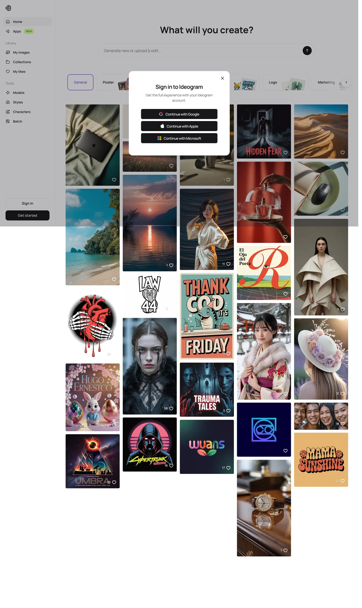
Ideogram is the image-and-typography generation studio behind one of the most legible AI image models, and its marketing surface is built so the gallery does the talking. The canvas is a near-white floor — "#ffffff" with a slightly cooler "#f6f6f7" beneath the sign-in modal — and the only chromatic accents are a cyan "#48bdff" and a violet "#7e4dda" that surface inside small gradient marks (the brand glyph, an avatar dot, the violet borrow on a hover state). The hero is the explore grid itself: irregular tile heights, full-bleed thumbnails, no captions on the tiles. Where most AI generators lead with a "What will you create?" headline at 60px or 72px, Ideogram renders the same prompt at 36px in Manrope 700 and lets the wall of generated images carry the page beneath it.
This DESIGN.md packages that restraint into a machine-readable spec built on the Google Labs format. Inside: 18 colors tokens grouped into graphite text and surface ("#0e0e10", "#18181b", "#27272a"), near-white canvas ("#ffffff", "#f6f6f7"), the hairline lattice "#e5e7eb" (615 occurrences, 581 of them as 1px borders), and a small voltage pair of cyan "#48bdff" plus violet "#7e4dda" used only inside gradient marks. Eight Manrope tokens — display-hero at 36px / 700, h2 at 22px / 700 with -0.88px tracking, body-md at 13px / 600, label-uppercase at 10px / 700 / 0.2px tracking — plus six radii (4px, 6px, 8px, 10px, 12px, full) and seventeen component recipes.
Drop the file into Claude, Cursor, or GitHub Copilot and the agent will reproduce Ideogram's gallery-first discipline — graphite CTA on near-white, 4px corners everywhere except the 10px CTA, single-weight Manrope across roles — rather than defaulting to a generic AI-product theme with cyan brand buttons and oversized hero type. Or reference the tokens directly: every hex, padding shorthand, and tracking value is a quoted string ready for Tailwind config or CSS variables. The system is worth studying because it answers a hard category question by inversion: when the model is the product, the marketing chrome can disappear into hairlines.
What makes it distinct
5
- Gallery-as-canvasgenerated tiles fill the viewport while the chrome shrinks to 13px Manrope labels and 1px hairlines in #e5e7eb
- Single-weight disciplineManrope at weight 600 carries h1, body, nav, and CTA labels; no weight-400 body and no weight-700 display
- Graphite voltagethe primary CTA is filled with #0e0e10 graphite black at a 10px corner, not the cyan or violet that appear elsewhere
- 4px corner workhorse140 of 209 measured radii sit at 4px, with 8px reserved for the input field and 10px for the CTA only
- Hairline-heavy chrome581 of 615 occurrences of #e5e7eb are border strokes, the lattice the gallery floats on top of
ideogram.ai
Live at ideogram.ai
A snapshot of the brand in production. Scroll the frame to see the whole page.
Colors
18 colors
Ideogram's system runs on #0e0e10 as its primary voltage, used in 13 of 18 components. Type is set in Manrope across 8 tokens from 10px to 36px, weights 400–700. Shape language is mixed across 18 components, blending pills, soft rounds, and squarer corners.
Surface
Page and card backgrounds · 3
Text
Headlines, body, captions · 3
Borders & Hairlines
Dividers, outlines, rules · 3
Other
Specialty colors · 9
Typography
8 type tokens
Set in Manrope across 8 tokens, from 10px to 36px, weights 400–700. Shown in its own stack: where the font isn't installed, the fallback the file names stands in.
- display-hero36px · weight 700 · lh 45px · tracking 0The quick brown fox jumps over the lazy dog
- display-h222px · weight 700 · lh 28px · tracking -0.88pxThe quick brown fox jumps over the lazy dog
- heading-sm14px · weight 600 · lh 21px · tracking -0.56pxThe quick brown fox jumps over the lazy dog
- body-md14px · weight 600 · lh 18px · tracking 0The quick brown fox jumps over the lazy dog
- body-sm13px · weight 600 · lh 16px · tracking 0The quick brown fox jumps over the lazy dog
- body-read14px · weight 400 · lh 21px · tracking -0.14pxThe quick brown fox jumps over the lazy dog
- label-uppercase10px · weight 700 · lh 14px · tracking 0.2pxThe quick brown fox jumps over the lazy dog
- button-md16px · weight 400 · lh 24px · tracking 0The quick brown fox jumps over the lazy dog
Layout
Radii and spacing
7 corner radii and 8 spacing values. Shape language: mixed.
Radii
- none0px
- xs4px
- sm6px
- md8px
- lg10px
- xl12px
- full9999px
Spacing
- xxs2px
- xs4px
- sm8px
- md12px
- base16px
- lg24px
- xl32px
- 2xl48px
Components
18 components
Each rendered from its tokens (color, type, radius, padding) on Ideogram's own canvas.
- Top Navtop-navTop Nav
- Sidebar Railsidebar-railSidebar Rail
- Sidebar Linksidebar-linkSidebar Link
- Sidebar Link Activesidebar-link-activeSidebar Link Active
- Sidebar Section Labelsidebar-section-labelSidebar Section Label
- Hero Prompthero-promptHero Prompt
- Prompt Inputprompt-inputPrompt Input
- Prompt Submitprompt-submitPrompt Submit
- Button Primarybutton-primaryButton Primary
- Button Primary Hoverbutton-primary-hoverButton Primary Hover
- Button Secondarybutton-secondaryButton Secondary
- Filter Chipfilter-chipFilter Chip
- Filter Chip Activefilter-chip-activeFilter Chip Active
- Gallery Tilegallery-tileGallery Tile
- Gallery Gridgallery-gridGallery Grid
- Sign In Modalsign-in-modalSign In Modal
- Oauth Buttonoauth-buttonOauth Button
- Brand Glyphbrand-glyphBrand Glyph
In use
The system, in use
Ideogram's tokens on the kind of product it builds.
Build something people actually use.
A short paragraph of marketing copy that previews how the brand's display tier and body tier read together. Two sentences is usually enough.
FAQ
Ideogram design system FAQ
Common questions about Ideogram's tokens, components, and how to use this DESIGN.md in your project.
Read next
Related reading
Specs, directories, and component libraries that pair with this design system.
- Browse all design systemsThe full directory of DESIGN.md files on shadcn.io, with live mockups for each.shadcn.io
- Ideogram — official siteThe image-and-typography generation studio behind the Ideogram model family.ideogram.ai (opens in a new tab)
- The DESIGN.md specificationGoogle Labs' open spec for machine-readable design system files — the format this page is built on.github.com (opens in a new tab)
Use it
Use Ideogram in your project
One machine-readable file. Drop it into Claude, Cursor, or any AI tool that reads DESIGN.md.
Download the DESIGN.md
One machine-readable file: every color, type, radius, spacing, and component token of Ideogram.
Feed it to your AI tool
Drop it into Claude, Cursor, or GitHub Copilot. The agent writes React components and Tailwind classes that match Ideogram's visual language.
Reference the tokens directly
Or paste the values into your Tailwind config, CSS variables, or component library: every color, size and radius is a quoted, ready-to-copy value.
Read the full DESIGN.md: overview, rationale, do’s and don’ts
Overview
Ideogram's marketing surface is the gallery-first archetype in the AI image-generation category — a near-white explore wall where the chrome shrinks to hairlines and the generated tiles do the talking. The canvas is {colors.canvas} ("#ffffff") with a slightly cooler {colors.canvas-cool} ("#f6f6f7") underneath the sign-in modal, and the page renders as a vertical stack of irregular thumbnails with no captions, no overlay metadata, no decorative chrome between rows. The brand wordmark, "What will you create?" prompt at 36px, and the input bar all sit in a thin band at the top; everything beneath is image.
Hairline-as-elevation: where most AI surfaces lean on shadow tiers to separate cards from canvas, Ideogram draws 581 of its 615 {colors.hairline} ("#e5e7eb") occurrences as 1px border strokes, not fills. The sidebar divider, the modal frame, every gallery-tile edge, the prompt input outline, and the avatar ring are all the same hairline. There is one stroke weight in the entire system, and depth is the lattice that 1px stroke draws. Drop shadows are absent — --tw-shadow is declared as a zero-alpha string in the page's :root.
Graphite voltage scarcity: the page declares a cyan {colors.cyan-accent} ("#48bdff") and a violet {colors.violet-accent} ("#7e4dda") in gradient marks (the brand glyph, an avatar dot, a hover-borrow), but the primary CTA is {colors.graphite} ("#0e0e10") — the same graphite that carries the page's text at 521 occurrences. Where the category convention is to spend brand color on the Get Started button, Ideogram refuses: the chromatic tints are reserved for tiny decorative marks, and the load-bearing CTA reads as authoritative graphite against the gallery's saturation. The model output is allowed to be the only thing on the page that's chromatic.
Single-weight body: Manrope runs at weight 600 across body-md (14px / 18px), body-sm (13px / 16px), heading-sm (14px / 21px / -0.56px tracking), and every sidebar link. There is no weight-400 body and no weight-500 step. The only weight-400 face on the page is the CTA label itself at 16px / 24px, and the only weight-700 faces are the 36px display, the 22px h2, and the 10px uppercase micro label. The hierarchy is built from size, not weight.
Key Characteristics:
- Near-white canvas
{colors.canvas}("#ffffff") paired with{colors.canvas-cool}("#f6f6f7") underneath modal scrims. The defining surface choice — no dark mode on the marketing surface. - Manrope at weight 600 across body, sidebar, chips, and headings. The single-weight discipline is the typographic identity.
- Hairline
{colors.hairline}("#e5e7eb") drawn as 1px stroke 581 of 615 times. The entire elevation system. - Graphite
{colors.graphite}("#0e0e10") as both ink and primary CTA fill. Brand color hides inside text, not behind buttons. - 4px corner
{rounded.xs}("4px") on 140 of the page's measured radii. The gallery-tile geometry. - Cyan
{colors.cyan-accent}("#48bdff") and violet{colors.violet-accent}("#7e4dda") only appear inside small gradient marks. Visible in the brand glyph, absent from CTAs and body emphasis. - Section labels in
{typography.label-uppercase}(10px / 700 / 0.2px tracking, uppercase). Used only on sidebar group headers — the page's lone tracking signal. - Three CTA shapes —
{components.button-primary}(graphite-filled, 10px corner),{components.button-secondary}(white-on-hairline, 10px corner),{components.filter-chip}(4px corner with hairline border).
Colors
Ink & graphite
- Graphite (
{colors.graphite}— "#0e0e10") — frequency 538. Used as text (521), shadow (14), background (2), border (1). The page's load-bearing ink and the primary CTA fill. Wired across nav links, sidebar text, body copy, and the Get Started button face. Reads as graphite-black, never pure void. - Graphite Soft (
{colors.graphite-soft}— "#18181b") — frequency 4. Used as background (4). The hover-darker shade behind the primary CTA and the inline avatar circle in the top nav. - Graphite Elevated (
{colors.graphite-elev}— "#27272a") — frequency 9. Used as text (5), border (4). The single-tone-up graphite for hover affordances on outlined chips. - Ink Muted (
{colors.ink-muted}— "#585964") — frequency 1. Used as text (1). The section-label color in the sidebar — the one tone between graphite text and the lighter hairline tier. - Ink Faint (
{colors.ink-faint}— "#9b9ba1") — frequency 2. Used as text (2). Tertiary captions inside the modal and below dropdown labels. - Silver (
{colors.silver}— "#ccccce") — frequency 28. Used as gradient (28). The gradient stop that defines the soft-fade behind the brand glyph and avatar marks.
Canvas
- Canvas (
{colors.canvas}— "#ffffff") — frequency 191. Used as background (45), text (81), gradient (35), border (30). The dominant surface plus the inverse text color on graphite CTAs. Wired to--tw-ring-offset-color. - Canvas Cool (
{colors.canvas-cool}— "#f6f6f7") — folded into the canvas cluster. The slightly-cooler floor beneath modal scrims and the sidebar rail. - Canvas Mist (
{colors.canvas-mist}— "#f7f7f8") — the third stop in the white cluster, used as the rest state for sidebar links. - Void (
{colors.void}— "#000000") — frequency 10. Used as text (6), shadow (4). The pure-black drop-shadow stop on dropdown popovers (rare — drop shadows are otherwise absent).
Hairline lattice
- Hairline (
{colors.hairline}— "#e5e7eb") — frequency 615. Used as border (581), background (28), gradient (6). The structural workhorse — every 1px stroke on the page is this tone. Not used as a fill or a text color. - Hairline Soft (
{colors.hairline-soft}— "#ececee") — clustered into the hairline group. The hover/selected fill on sidebar links — the only place the lattice tone appears as a background plane. - Hairline Faint (
{colors.hairline-faint}— "#eeebfc") — the violet-tinted hairline that surfaces inside the sign-in modal frame border.
Voltage (reserved)
- Cyan Accent (
{colors.cyan-accent}— "#48bdff") — frequency 6. Used as gradient (6). Surfaces only inside the brand glyph mark — never on CTAs, never on body emphasis, never on links. The chromatic identity held in reserve. - Cyan Tint (
{colors.cyan-tint}— "#d6efff") — frequency 6. Used as gradient (6). The lighter stop in the brand glyph gradient. - Violet Accent (
{colors.violet-accent}— "#7e4dda") — frequency 1. Used as text (1). The borrowed accent that appears on a single inline link inside the modal copy ("by continuing you agree…"). - Violet Mid (
{colors.violet-mid}— "#8864e4") — frequency 1. Used as border (1). The 1px ring on the avatar pip when hovered.
Typography
Font family
The system runs Manrope across every text role on the marketing surface — display, h2, body, sidebar, chips, the lone uppercase label. The fallback stack walks system-ui, -apple-system, sans-serif. Manrope is the only family declared on the page; there is no monospace, no serif, no secondary sans. The brand wordmark itself is set in Manrope.
Hierarchy
| Token | Family | Size | Weight | Line Height | Letter Spacing | Use |
|---|---|---|---|---|---|---|
{typography.display-hero} | Manrope | 36px | 700 | 45px | 0 | The "What will you create?" prompt above the input — the only display-tier face on the page |
{typography.display-h2} | Manrope | 22px | 700 | 28px | -0.88px | Section headings inside the gallery and the sign-in modal title |
{typography.heading-sm} | Manrope | 14px | 600 | 21px | -0.56px | Card titles inside the gallery overlays and inline section headers |
{typography.body-md} | Manrope | 14px | 600 | 18px | 0 | Modal copy, dropdown items, and the secondary nav row |
{typography.body-sm} | Manrope | 13px | 600 | 16px | 0 | The workhorse — sidebar links, top-nav items, chip labels, breadcrumb tokens |
{typography.body-read} | Manrope | 14px | 400 | 21px | -0.14px | The only weight-400 reading face — used inside the modal's terms-and-privacy line |
{typography.label-uppercase} | Manrope | 10px | 700 | 14px | 0.2px | Sidebar group labels ("EXPLORE", "TOOLS") — the page's lone uppercase tier |
{typography.button-md} | Manrope | 16px | 400 | 24px | 0 | The primary CTA label — Manrope weight 400 at a larger size than the body |
Principles
The body sits at weight 600 by default — not 500, not 400. Where most product surfaces ladder weight 400 body / 600 strong / 700 display, Ideogram skips the 400 step entirely on chrome and reserves 700 for the 36px hero, the 22px h2, and the 10px uppercase label. The CTA label inverts the convention by dropping to weight 400 at 16px — the lighter weight reads as confident against the graphite fill rather than shouting. There is no italics, no underline-on-default, and no all-caps below 10px.
Substitutes
If Manrope is unavailable, Plus Jakarta Sans is the closest open-source substitute — both share a slightly geometric, slightly humanist set of curves at the 13-14px body sizes Ideogram leans on. Inter at weight 600 is the next-closest match but reads a hair more neutral than Manrope's character. Avoid SF Pro and Roboto — they collapse the wordmark's specific shoulder.
Layout
Spacing system
- Base unit: 4px.
- Tokens:
{spacing.xxs}("2px") ·{spacing.xs}("4px") ·{spacing.sm}("8px") ·{spacing.md}("12px") ·{spacing.base}("16px") ·{spacing.lg}("24px") ·{spacing.xl}("32px") ·{spacing.2xl}("48px"). - Gallery padding:
4px 4px 48px(28 occurrences) — the dominant grid padding shorthand, tight on three sides and generous at the bottom. - Pill chip padding:
6px 10px(9 occurrences) — the universal filter-chip geometry that carries every sidebar action button. - Prompt-input padding:
0px 124px 0px 24px(6 occurrences) — asymmetric to make room for the submit pip on the right.
Grid & container
- Gallery composition: vertical masonry — irregular tile heights (square, tall portrait, short landscape) packed at 4px gutters in a 3-up to 5-up grid depending on viewport. No captions on the tiles themselves.
- Sidebar rail: fixed left rail with
{components.sidebar-link}items at 32px row height. Carries top-level nav ("Home", "My Images", "Collections", "My Boards") and a label-uppercase divider ("CREATE", "TOOLS") between sections. - Hero band: centered single column above the gallery with the 36px display prompt and the
{components.prompt-input}(~56px height) directly beneath. - Sign-in modal: centered overlay at
{rounded.xl}(12px) corner, ~360px wide, padded 24px on all sides, hairline border on the canvas-cool scrim.
Rhythm
The page anchors on a 12px vertical rhythm inside the sidebar rail and a 4px gutter inside the gallery. There is no luxury 64px or 96px section spacing — the gallery starts ~16px below the prompt input and runs full-bleed to the footer. The hierarchy lives in tile saturation, not in vertical whitespace.
Elevation & Depth
| Level | Treatment | Use |
|---|---|---|
| Flat | No shadow, no border | The canvas itself, the gallery floor |
| Hairline | 1px {colors.hairline} ("#e5e7eb") stroke | Sidebar divider, modal frame, every tile, inputs, chips |
| Soft fill | {colors.hairline-soft} ("#ececee") plane | Hover/active state on sidebar links |
| Modal scrim | {colors.canvas-cool} ("#f6f6f7") plane | The sign-in overlay backdrop |
| Drop shadow | Single shadow on dropdown popover, otherwise absent | Reserved for one transient surface |
The elevation philosophy is hairline-as-elevation — depth comes from a 1px stroke in {colors.hairline} rather than from CSS box-shadow. The page's :root declares --tw-shadow as a zero-alpha rest state, and most surfaces honor it. The single observed shadow lives on dropdown popovers (graphite at 8% alpha, 0px 0px 8px) and is the only depth primitive that lifts above the lattice.
The gallery tiles supply their own visual depth through image saturation — generated thumbnails carry every chromatic range the chrome refuses to render. The wall reads as a contact-sheet floating on the lattice rather than a stack of cards casting shadows.
Shapes
Border radius scale
| Token | Value | Use |
|---|---|---|
{rounded.none} | "0px" | Text containers, the wordmark — flat geometry on type |
{rounded.xs} | "4px" | Gallery tiles, sidebar links, chips, inline actions — the 140-count workhorse |
{rounded.sm} | "6px" | Chip-tier elements with subtle softening (19 occurrences) |
{rounded.md} | "8px" | Prompt-input field, OAuth buttons (28 occurrences) |
{rounded.lg} | "10px" | The primary CTA pill — Get Started and Sign In (11 occurrences) |
{rounded.xl} | "12px" | The sign-in modal corner and a small set of larger cards |
{rounded.full} | "9999px" | Avatar circles, the prompt-submit pip |
The radius ladder is unusually granular — 4px, 6px, 8px, 10px, 12px — but each tier is wired to a specific role, not interchangeable. A gallery tile is always 4px; an input is always 8px; the primary CTA is always 10px. Where most current-generation systems collapse to a 3-tier scale (sm / md / full), Ideogram keeps five interior tiers so the chrome reads as graded rather than uniform.
Imagery & illustrations
The gallery is the page's dominant visual asset — irregular generated thumbnails covering photography, typography, posters, character studies, illustrations. The brand glyph (the only place the cyan-and-silver gradient appears) is a small circular mark in the top-left of the sidebar. There is no decorative illustration, no hand-drawn line work, no marketing photography — only model output and the wordmark.
Components
Top navigation
{components.top-nav} — Light nav bar pinned to the top of the page. Background {colors.canvas} ("#ffffff"), text {colors.graphite}, 1px bottom border in {colors.hairline}. Carries the brand glyph at left, the search field at center, and the avatar pip at right. Padding "12px 16px", height "56px".
Sidebar
{components.sidebar-rail} — Fixed-left navigation rail. Background {colors.canvas}, 1px right border in {colors.hairline}, padding "12px". Stacks {components.sidebar-link} rows and section labels.
{components.sidebar-link} — Default rail row. Background transparent, text {colors.graphite}, type {typography.body-sm} (Manrope 13px / 600), rounded {rounded.xs} (4px), padding "6px 10px", height "32px".
{components.sidebar-link-active} — Hover/selected rail row. Background {colors.hairline-soft} ("#ececee"), same type and geometry. The only place the lattice tone appears as a fill rather than a stroke.
{components.sidebar-section-label} — Uppercase group label. Text {colors.ink-muted} ("#585964"), type {typography.label-uppercase} (Manrope 10px / 700 / 0.2px tracking). Padding "8px 12px 4px".
Hero & prompt
{components.hero-prompt} — The 36px "What will you create?" display headline. Type {typography.display-hero} (Manrope 36px / 700 / 45px leading), text {colors.graphite}, padding "0". The only display-tier face on the page.
{components.prompt-input} — The wide prompt field beneath the hero headline. Background {colors.canvas}, type {typography.body-md}, rounded {rounded.md} (8px), padding "0px 124px 0px 24px" (asymmetric to clear the submit pip), height "56px", 1px hairline border in {colors.hairline}.
{components.prompt-submit} — Circular submit pip anchored inside the prompt input. Background {colors.graphite}, text {colors.on-graphite}, rounded {rounded.full} (9999px), height "32px". The only graphite mark inside the input.
Buttons
{components.button-primary} — The signature CTA. Background {colors.graphite} ("#0e0e10"), text {colors.on-graphite}, type {typography.button-md} (Manrope 16px / 400 — the only weight-400 face on the page), rounded {rounded.lg} (10px), padding "0px 12px", height "40px". Used for "Get started" in the top nav and the primary action throughout.
{components.button-primary-hover} — Hover variant. Background shifts to {colors.graphite-soft} ("#18181b") — a single tone-up rather than a shadow lift.
{components.button-secondary} — Outlined light pill. Background {colors.canvas}, text {colors.graphite}, type {typography.body-md} (Manrope 14px / 600), rounded {rounded.lg} (10px), padding "6px 10px", height "32px", 1px border in {colors.hairline}. Used for "Sign in" affordances and secondary actions.
Filter chips
{components.filter-chip} — Rest-state filter pill in the explore toolbar. Background {colors.canvas}, text {colors.graphite}, type {typography.body-sm} (Manrope 13px / 600), rounded {rounded.xs} (4px — not pill-shaped), padding "6px 10px", height "28px", 1px border in {colors.hairline}.
{components.filter-chip-active} — Selected filter chip. Background {colors.graphite}, text {colors.on-graphite}, same geometry. The graphite fill is the only selection indicator — no border lift, no shadow.
Gallery
{components.gallery-grid} — The dominant page surface. Background {colors.canvas}, padding "4px 4px 48px" (the 28-count grid padding). Stacks {components.gallery-tile} items in a masonry layout.
{components.gallery-tile} — A single generated-image tile. Background {colors.hairline-soft} ("#ececee") as the skeleton fill before the image loads, rounded {rounded.xs} (4px), 1px border in {colors.hairline}. Carries no caption overlay at rest.
Sign-in modal
{components.sign-in-modal} — Centered overlay. Background {colors.canvas}, text {colors.graphite}, type {typography.body-md}, rounded {rounded.xl} (12px), padding "24px", 1px border in {colors.hairline}. Stacks the title, three OAuth buttons, and the terms line in a vertical column.
{components.oauth-button} — A single sign-in option (Google, Apple, Microsoft). Background {colors.graphite}, text {colors.on-graphite}, type {typography.body-md}, rounded {rounded.md} (8px), padding "12px", height "44px". Three stack vertically inside the modal.
Brand mark
{components.brand-glyph} — The wordmark's cyan glyph. Background {colors.cyan-accent} ("#48bdff") gradient-blending to {colors.silver} ("#ccccce"), rounded {rounded.full} (9999px). The only place the cyan voltage surfaces on the page.
Do's and Don'ts
Do
- Anchor every page on the near-white canvas —
{colors.canvas}("#ffffff") paired with{colors.canvas-cool}("#f6f6f7") for modal scrims. Inverting to dark on the marketing surface breaks the gallery's contact-sheet read. - Render every text role in Manrope at weight 600 unless it's the 36px display (700), the 22px h2 (700), the 10px uppercase label (700), or the CTA label (400). The single-weight discipline is the typographic identity.
- Reserve
{colors.cyan-accent}("#48bdff") and{colors.violet-accent}("#7e4dda") for gradient marks only. Painting a CTA cyan puts brand voltage on the same plane as the generated tiles. - Use 4px corners on gallery tiles, sidebar links, and chips. Pulling tiles to 8px makes the wall read as cards rather than a contact-sheet.
- Use the graphite-soft hover (
{colors.graphite-soft}— "#18181b") on the primary CTA — a single tone-up, not a shadow lift. - Treat
{colors.hairline}("#e5e7eb") as the entire elevation system. Add a shadow tier and the lattice's structural role collapses.
Don't
- Don't use
{colors.cyan-accent}("#48bdff") on text or CTA fills — it appears only as a gradient stop (6 occurrences, all gradient), never as a flat fill on chrome. For a chromatic accent on type, use{colors.violet-accent}("#7e4dda") on a single inline link rather than spreading either tone across links. - Don't pull the primary CTA to a 4px or 6px corner. The 10px radius is wired to one component — the
{components.button-primary}— and dropping it makes the button read as a chip. - Don't run body type at weight 400. The page's only weight-400 face is the CTA label at 16px; switching
{typography.body-md}to 400 collapses the single-weight discipline. - Don't apply drop shadows below the dropdown tier. The page declares
--tw-shadowas a zero-alpha rest state and renders zero shadows on cards, inputs, or the modal. The lattice is the depth system. - Don't use a 4px radius on the prompt input. The 8px corner is the one tier that separates the input from the chip row — drop it to 4px and the input reads as a chip-of-chips.
- Don't pair Manrope with a serif display. The single-family discipline is the brand signature — switching the 36px hero to a serif inverts the gallery-first framing.
Known Gaps
- The model-selection chips, prompt-editor toolbar, and aspect-ratio picker live behind the sign-in wall on the captured surface. Their tokens are inferred from the visible sidebar rail and the prompt input rather than the authenticated studio.
- The hero heading and h2 extractor entries returned
nullon this run (the sign-in modal occluded the underlying text). The display-hero token is composed from the 36px / 700 row in the typography table; the display-h2 from the 22px / 700 / -0.88px row. - Dark-mode tokens are not declared in the captured
:root— the explore page never inverts on the marketing surface, and any in-app dark mode would need a separate extraction. - Animation timings, focus rings on the prompt input, and the exact hover deltas on gallery tiles are not captured. The page's interactivity is too subtle to read from a static snapshot.
- Form-validation states beyond the rest input (error, success, warning) are not represented — the prompt input never errored on the captured surface.
- The cyan and violet gradient marks (brand glyph, avatar pip) are treated as content assets rather than system tokens. Their exact gradient stops and angles are not formalized here.
AI & LLM Platforms
More systems like this
More DESIGN.md files in AI & LLM Platforms.
Pricing
Build it with Pro
The DESIGN.md files are free. Pro adds 6,000+ blocks, premium templates and the MCP server, so your AI editor builds in your system for you.
4.9/5 out of 5 · 150+ reviewsfrom 150+ founders and developers.
Billing
Billed once a year in USD. Cancel anytime.
- How many people can use the license.
- Client work, SaaS products and anything you charge for.
- Production-ready React sections: hero, pricing, features, dashboards and more.
- Complete multi-page sites you can ship as they are.
- React icons from every major library, installable with one command.
- Presets that restyle every block, in light and dark.
- Lets your AI editor search, preview and install blocks for you.
- Priority requests are answered first.
Individual
For personal projects & open source
$32instead of $49/mo
$389 billed yearly
- Seats: 1 seat
- Commercial use: Personal & open source only
- Pro blocks: 6,000+ blocks
- Templates: All 14 templates
- React icons: 294k+ icons
- Themes: All 59 themes
- MCP server: Basic usage
- Support: Standard
Team
Most popularFor freelancers, agencies & startups
$66instead of $99/mo
$789 billed yearly · ≈ $13/dev/mo
- Seats: Up to 5 seats
- Commercial use: Included
- Pro blocks: 6,000+ blocks
- Templates: All 14 templates
- React icons: 294k+ icons
- Themes: All 59 themes
- MCP server: High usage
- Support: Priority
Organization
For companies with larger teams
$132instead of $199/mo
$1,589 billed yearly
- Seats: Unlimited seats
- Commercial use: Included
- Pro blocks: 6,000+ blocks
- Templates: All 14 templates
- React icons: 294k+ icons
- Themes: All 59 themes
- MCP server: Unlimited usage
- Support: Priority
Billed once a year in USD. Cancel anytime.
Individual
For personal projects & open source
$32instead of $49/mo
$389 billed yearly
- How many people can use the license.Seats: 1 seat
- Client work, SaaS products and anything you charge for.Commercial use: Personal & open source only
- Production-ready React sections: hero, pricing, features, dashboards and more.Pro blocks: 6,000+ blocks
- Complete multi-page sites you can ship as they are.Templates: All 14 templates
- React icons from every major library, installable with one command.React icons: 294k+ icons
- Presets that restyle every block, in light and dark.Themes: All 59 themes
- Lets your AI editor search, preview and install blocks for you.MCP server: Basic usage
- Priority requests are answered first.Support: Standard
Team
Most popularFor freelancers, agencies & startups
$66instead of $99/mo
$789 billed yearly · ≈ $13/dev/mo
Everything in Individual, plus
- How many people can use the license.Seats: Up to 5 seats
- Client work, SaaS products and anything you charge for.Commercial use: Included
- Lets your AI editor search, preview and install blocks for you.MCP server: High usage
- Priority requests are answered first.Support: Priority
Organization
For companies with larger teams
$132instead of $199/mo
$1,589 billed yearly
Everything in Team, plus
- How many people can use the license.Seats: Unlimited seats
- Lets your AI editor search, preview and install blocks for you.MCP server: Unlimited usage
- Secure checkout via Stripe
- Code lives in your repo
- Keep what you've shipped if you cancel
- License terms
Your system, built for you
Every block, template and icon, installed by your AI agent in your design system. The DESIGN.md files stay free.