IBM Design System
IBM's Carbon Design System as a DESIGN.md file. IBM Blue #0f62fe, Plex Sans weight 300, 22 components, square corners. For React, Next.js, and AI tools.
Add shadcn.io to your AI agent. · Pro It installs blocks, icons and templates in your design system from a prompt, with Pro.
Set up MCP- Primary
- #0f62fe
- Typeface
- IBM Plex Sans
- Shape
- Sharp
- Base radius
- 6px
- Colors
- 21
- Type tokens
- 13
- Components
- 22
- Spacing values
- 8
About
About IBM DESIGN.md
Curated by Dov Azencot · Updated May 12, 2026 · Source ibm.com (opens in a new tab)
IBM's marketing chrome is a direct application of Carbon Design System, the company's open-source enterprise design language now in its tenth year of public iteration. The system commits to one idea above all others: restraint through engineering rigor. Surfaces are pure white #ffffff or a single step of light gray #f4f4f4. Type is charcoal #161616. The only chromatic accent is IBM Blue #0f62fe, used for links, primary CTAs, focus underlines, and the rare full-bleed CTA banner. Every corner sits at 0px. There are no soft shadows, no gradient panels, no pill-shaped buttons. The result reads as old-world enterprise gravitas reframed for the cloud era — careful, technical, trustworthy.
This page packages Carbon's marketing extraction into a single DESIGN.md file written to the Google Labs spec. Inside: 21 colors tokens grouped into brand, surface, text, and semantic; 13 type styles built on IBM Plex Sans at three weights (300 for display, 400 for body, 600 for emphasis); 7 radius tokens led by 0px; 8 spacing tokens on a 4-pixel grid; and 22 components definitions covering buttons, cards, inputs, tabs, navigation, and the inverted charcoal footer. Every token is quoted and machine-readable.
Feed the file to Claude, Cursor, or GitHub Copilot and the agent produces React components with Plex Sans weight 300 headlines, square-cornered buttons in IBM Blue, and Carbon's signature 0.16px body tracking — not a generic shadcn theme. Or reference the tokens directly in Tailwind config and CSS variables. The discipline of holding to one accent color and one type family while still reading as authoritative is the lesson worth studying — most enterprise sites cannot resist a second blue or a heavier display weight.
What makes it distinct
5
- Flat-square geometryevery button, card, and input sits at 0px radius; 4px rounding would already feel off-brand
- Light-weight display typePlex Sans at weight 300 for 76px headlines is the brand's typographic signature
- Single accentIBM Blue (#0f62fe) carries every link, primary CTA, and CTA banner; no second brand color exists
- Carbon precision tracking0.16px letter-spacing on 16px body is a deliberate Carbon detail, not a drift
- Hairline depth1px borders and surface change replace drop shadows across 28 documented components
ibm.com
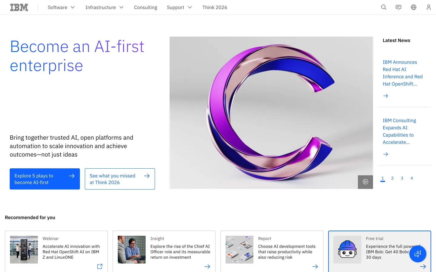
Live at ibm.com
A snapshot of the brand in production. Scroll the frame to see the whole page.
Colors
21 colors
IBM's system runs on #0f62fe as its primary voltage, used in 4 of 22 components. Type is set in IBM Plex Sans across 13 tokens from 12px to 76px, weights 300–600. Shape language is sharp — components average 0px corner radius, favoring crisp rectangles.
Brand & Accent
Sparing, CTA-only voltage · 1
Surface
Page and card backgrounds · 3
Text
Headlines, body, captions · 6
Borders & Hairlines
Dividers, outlines, rules · 2
Semantic
Status, errors, success, links · 4
Other
Specialty colors · 5
Typography
13 type tokens
Set in IBM Plex Sans across 13 tokens, from 12px to 76px, weights 300–600. Shown in its own stack: where the font isn't installed, the fallback the file names stands in.
- display-xl76px · weight 300 · lh 1.17 · tracking -0.5pxThe quick brown fox jumps over the lazy dog
- display-lg60px · weight 300 · lh 1.17 · tracking -0.4pxThe quick brown fox jumps over the lazy dog
- display-md42px · weight 300 · lh 1.2The quick brown fox jumps over the lazy dog
- headline32px · weight 400 · lh 1.25The quick brown fox jumps over the lazy dog
- card-title24px · weight 400 · lh 1.33The quick brown fox jumps over the lazy dog
- subhead20px · weight 400 · lh 1.4The quick brown fox jumps over the lazy dog
- body-lg18px · weight 400 · lh 1.5The quick brown fox jumps over the lazy dog
- body16px · weight 400 · lh 1.5 · tracking 0.16pxThe quick brown fox jumps over the lazy dog
- body-sm14px · weight 400 · lh 1.29 · tracking 0.16pxThe quick brown fox jumps over the lazy dog
- body-emphasis14px · weight 600 · lh 1.29 · tracking 0.16pxThe quick brown fox jumps over the lazy dog
- caption12px · weight 400 · lh 1.33 · tracking 0.32pxThe quick brown fox jumps over the lazy dog
- button14px · weight 400 · lh 1.29 · tracking 0.16pxThe quick brown fox jumps over the lazy dog
- eyebrow14px · weight 400 · lh 1.29 · tracking 0.16pxThe quick brown fox jumps over the lazy dog
Layout
Radii and spacing
7 corner radii and 8 spacing values. Shape language: sharp.
Radii
- none0px
- xs2px
- sm4px
- md6px
- lg8px
- pill9999px
- full9999px
Spacing
- xxs4px
- xs8px
- sm12px
- md16px
- lg24px
- xl32px
- xxl48px
- section96px
Components
22 components
Each rendered from its tokens (color, type, radius, padding) on IBM's own canvas.
- Button Primarybutton-primaryButton Primary
- Button Primary Pressedbutton-primary-pressedButton Primary Pressed
- Button Secondarybutton-secondaryButton Secondary
- Button Tertiarybutton-tertiaryButton Tertiary
- Button Ghostbutton-ghostButton Ghost
- Button Dangerbutton-dangerButton Danger
- Feature Cardfeature-cardFeature Card
- Feature Card Elevatedfeature-card-elevatedFeature Card Elevated
- Product Cardproduct-cardProduct Card
- Hero Cardhero-cardHero Card
- Cta Bannercta-bannerCta Banner
- Type here…text-inputText Input
- Type here…text-input-focusedText Input Focused
- Type here…text-input-errorText Input Error
- Newsletter Inputnewsletter-inputNewsletter Input
- Product Tabproduct-tabProduct Tab
- Product Tab Selectedproduct-tab-selectedProduct Tab Selected
- Resource Tileresource-tileResource Tile
- Customer Logo Tilecustomer-logo-tileCustomer Logo Tile
- Top Navtop-navTop Nav
- Utility Barutility-barUtility Bar
- FooterfooterFooter
In use
The system, in use
IBM's tokens on the kind of product it builds.
Build something people actually use.
A short paragraph of marketing copy that previews how the brand's display tier and body tier read together. Two sentences is usually enough.
FAQ
IBM design system FAQ
Common questions about IBM's tokens, components, and how to use this DESIGN.md in your project.
Read next
Related reading
Specs, directories, and component libraries that pair with this design system.
- Browse all design systemsThe full directory of DESIGN.md files on shadcn.io, with live mockups for each.shadcn.io
- Carbon Design SystemIBM's open-source enterprise design system — the authoritative source for the tokens documented here.carbondesignsystem.com (opens in a new tab)
- The DESIGN.md specificationGoogle Labs' open spec for machine-readable design system files — the format this page is built on.github.com (opens in a new tab)
Use it
Use IBM in your project
One machine-readable file. Drop it into Claude, Cursor, or any AI tool that reads DESIGN.md.
Download the DESIGN.md
One machine-readable file: every color, type, radius, spacing, and component token of IBM.
Feed it to your AI tool
Drop it into Claude, Cursor, or GitHub Copilot. The agent writes React components and Tailwind classes that match IBM's visual language.
Reference the tokens directly
Or paste the values into your Tailwind config, CSS variables, or component library: every color, size and radius is a quoted, ready-to-copy value.
Read the full DESIGN.md: overview, rationale, do’s and don’ts
Overview
IBM's marketing system is a faithful application of Carbon Design System — IBM's open-source enterprise design system. The dominant surface is {colors.canvas} pure white with {colors.surface-1} light gray for elevation, charcoal {colors.ink} (#161616) for text, and IBM Blue {colors.primary} (#0f62fe) as the single brand accent.
The defining choice is flat geometry: every CTA, every card, every input, every container uses square corners ({rounded.none} 0px) with thin 1px borders. There are no rounded pills, no soft shadows, no atmospheric gradients. The system is engineered, not stylized.
IBM Plex Sans carries the entire type hierarchy. Display sizes (76 / 60 / 42px) run at weight 300 — IBM's signature light display treatment that makes 76px feel calmer than competing brands' 700-weight display. Body type sits at weight 400 with letter-spacing: 0.16px (a Carbon precision detail) and line-height 1.50. The voice reads as careful, technical, and trustworthy.
The system reaches for color rarely — IBM Blue marks links, primary CTAs, and the rare full-bleed CTA banner. Charcoal carries every other surface that isn't white. The result is enterprise gravitas without the enterprise stiffness: rigorous, light-weighted, and intentionally restrained.
Key Characteristics:
- Carbon Design System — IBM's marketing chrome IS Carbon. Buttons are square, inputs are square-with-bottom-rule, corners stay at 0px.
- Light-weight display type: Plex Sans at weight 300 for 42–76px headlines is the brand's typographic signature.
- One accent color:
{colors.primary}IBM Blue carries every link, primary CTA, and CTA banner. There is no second brand color. - White canvas + light gray (
{colors.surface-1}) + charcoal ({colors.ink}) cover 95% of surfaces. - Footer inverts to charcoal (
{colors.inverse-canvas}#161616) — the only dark surface above the page break. - Card hierarchy is carried by 1px hairlines and surface change, never by drop shadow.
letter-spacing: 0.16pxon body is a Carbon precision detail — the small positive tracking is part of the brand voice.- Page rhythm: utility bar → top nav → hero with light-weight headline → feature card grid → customer logo marquee → enterprise feature row → training section → newsletter / sign-in CTA → dark footer.
Colors
Source pages: ibm.com (home), /software/ai-productivity, /consulting, /products/cloud-pak-for-aiops, /products/bare-metal-servers, community.ibm.com.
Brand & Accent
- IBM Blue ({colors.primary}): The single brand accent. Links, primary CTAs, CTA banner backgrounds, focus rings.
- Blue 60 ({colors.blue-60}): Hovered link state.
- Blue 80 ({colors.blue-80}): Pressed primary button.
- Blue Hover ({colors.blue-hover}): Hover state for primary buttons.
Surface
- Canvas ({colors.canvas}): Default page background.
- Surface 1 ({colors.surface-1}): Light gray (#f4f4f4) — input fields, alternate-row stripes, subtle section bands.
- Surface 2 ({colors.surface-2}): Slightly darker gray (#e0e0e0) — disabled fields, hairline-as-fill for separators.
- Hairline ({colors.hairline}): 1px borders on cards, inputs, dividers.
- Hairline Strong ({colors.hairline-strong}): 1px charcoal underline on focused inputs (Carbon's signature focus treatment).
- Inverse Canvas ({colors.inverse-canvas}): Charcoal #161616 — footer surface.
- Inverse Surface 1 ({colors.inverse-surface-1}): One step lighter than inverse canvas — footer column dividers, hovered footer items.
Text
- Ink ({colors.ink}): All headlines and emphasized body type — charcoal #161616.
- Ink Muted ({colors.ink-muted}): Secondary type at #525252 — meta, sub-headlines, footer body.
- Ink Subtle ({colors.ink-subtle}): Tertiary type at #8c8c8c — disabled, helper text, captions.
- Inverse Ink ({colors.inverse-ink}): White on charcoal — footer headings.
- Inverse Ink Muted ({colors.inverse-ink-muted}): Light gray on charcoal — footer body.
Semantic
- Success Green ({colors.semantic-success}): Carbon green-50 — success states.
- Warning Yellow ({colors.semantic-warning}): Carbon yellow-30 — warning states.
- Error Red ({colors.semantic-error}): Carbon red-60 — error states; danger button background.
- Info Blue ({colors.semantic-info}): Identical to primary — informational badges.
Typography
Font Family
- IBM Plex Sans — IBM's open-source proprietary typeface (free for any use). Geometric, slightly humanist, designed specifically for enterprise UI. Fallback:
Helvetica Neue, Arial, sans-serif.
The same family carries display, body, and caption — there is no display + body pairing. Hierarchy is carried by size + weight rather than by family change. Plex Sans is also free / open-source under the SIL Open Font License — making it the easiest custom face on this list to substitute for in implementation.
Hierarchy
| Token | Size | Weight | Line Height | Letter Spacing | Use |
|---|---|---|---|---|---|
{typography.display-xl} | 76px | 300 | 1.17 | -0.5px | Largest hero headline |
{typography.display-lg} | 60px | 300 | 1.17 | -0.4px | Section opener headlines |
{typography.display-md} | 42px | 300 | 1.20 | 0 | Sub-section headlines, hero card title |
{typography.headline} | 32px | 400 | 1.25 | 0 | Card collection heading, FAQ category |
{typography.card-title} | 24px | 400 | 1.33 | 0 | Feature card title |
{typography.subhead} | 20px | 400 | 1.40 | 0 | Lead body next to display headlines |
{typography.body-lg} | 18px | 400 | 1.50 | 0 | Hero subhead, lead paragraphs |
{typography.body} | 16px | 400 | 1.50 | 0.16px | Default body |
{typography.body-sm} | 14px | 400 | 1.29 | 0.16px | Card body, footer columns |
{typography.body-emphasis} | 14px | 600 | 1.29 | 0.16px | Selected tab label, emphasized body line |
{typography.caption} | 12px | 400 | 1.33 | 0.32px | Captions, meta, utility bar |
{typography.button} | 14px | 400 | 1.29 | 0.16px | All button labels |
{typography.eyebrow} | 14px | 400 | 1.29 | 0.16px | Section eyebrows (Carbon avoids strong eyebrows; uses sentence case 14px) |
Principles
- Light-weight display is the brand voice. Plex Sans at weight 300 for 76px headlines reads as quietly authoritative — switching to 700 would make it look like every other enterprise site.
- Carbon's
letter-spacing: 0.16pxon body sizes is a precision detail. Don't remove it. - No mono on marketing surfaces (Plex Mono exists but lives in product surfaces only).
- Eyebrow typography uses sentence case 14px — Carbon resists the all-caps tracked eyebrow common to other enterprise brands.
- Line-heights tighten on display, relax on body: 1.17 at display-xl, 1.50 at body — proportional to size.
Note on Font Substitutes
IBM Plex Sans is free and open-source (SIL OFL license) and available on Google Fonts. It is the recommended implementation. The Plex family also includes Plex Mono and Plex Serif if expanded typographic needs arise.
Layout
Spacing System
- Base unit: 4px (Carbon's signature 4-pixel grid).
- Tokens (front matter):
{spacing.xxs}4px ·{spacing.xs}8px ·{spacing.sm}12px ·{spacing.md}16px ·{spacing.lg}24px ·{spacing.xl}32px ·{spacing.xxl}48px ·{spacing.section}96px. - Card interior padding:
{spacing.lg}24px on feature cards;{spacing.xl}32px on product cards;{spacing.xxl}48px on hero cards and CTA banners. - Button padding: 12px vertical · 16px horizontal — Carbon spec.
- Form input padding: 11px vertical · 16px horizontal.
Grid & Container
- Carbon's 16-column grid at desktop, scaling to 8 / 4 columns at tablet / mobile.
- Max content width sits around 1584px (Carbon's max-grid breakpoint).
- Card grids are 4-up at desktop, 2-up at tablet, 1-up at mobile.
- The customer logo marquee uses fixed-width tiles in a flex row, scrolling horizontally on smaller viewports.
Whitespace Philosophy
Carbon uses precise alignment to a 4-pixel grid as its whitespace system. Sections separate via thin gray rows ({colors.surface-1}) rather than via large vertical gaps. Content is dense by design — IBM's customers expect to see a lot on a page, not a lot of air.
Elevation & Depth
| Level | Treatment | Use |
|---|---|---|
| 0 (flat) | No shadow, no border | Default for body type, hero text, footer body |
| 1 (hairline) | 1px {colors.hairline} border on canvas | Feature cards, inputs, list items |
| 2 (surface lift) | {colors.surface-1} background on canvas | Alternate-row banners, hovered cards |
| 3 (focus ring) | 2px {colors.primary} outline + 1px {colors.hairline-strong} underline | Focused input, focused button |
Carbon resists drop shadows on marketing — depth is carried by surface change and 1px hairlines. The exception is product / app surfaces (Carbon documents shadow tokens for elevated panels), but the marketing site barely uses them.
Decorative Depth
- Soft blue gradient backdrops appear behind some hero illustrations — a faint blue-to-white wash that warms the canvas without competing with the headline.
- No atmospheric depth. No spotlight cards, no pastel section blocks, no gradient panels.
Shapes
Border Radius Scale
| Token | Value | Use |
|---|---|---|
{rounded.none} | 0px | Default — every button, card, input, container |
{rounded.xs} | 2px | Small badges (rare exception) |
{rounded.sm} | 4px | Avatar circles squared, dropdown menus |
{rounded.md} | 6px | (Used rarely; documented for completeness) |
{rounded.lg} | 8px | (Used rarely; documented for completeness) |
{rounded.pill} | 9999px | Status pills, badges in product UI (rare on marketing) |
The brand commits to flat 0px corners. The other tokens exist for product / mobile surfaces but rarely surface on marketing.
Photography & Illustration Geometry
- IBM uses photography (people, hardware, sports cars) and abstract illustration (geometric mesh, dotted patterns) interchangeably.
- Image frames are flat — no rounded corners.
- Customer logo tiles sit on
{rounded.none}0px tiles with thin 1px borders.
Components
Buttons
button-primary — Blue solid CTA. The default primary across all pages.
- Background
{colors.primary}, text{colors.on-primary}, type{typography.button}, padding 12px 16px, rounded{rounded.none}. - Pressed state lives in
button-primary-pressed(background shifts to{colors.blue-80}).
button-secondary — Charcoal solid button — Carbon's "secondary" treatment.
- Background
{colors.ink}, text{colors.inverse-ink}, type{typography.button}, padding 12px 16px, rounded{rounded.none}.
button-tertiary — White button with blue 1px border + blue text. Used for tertiary CTAs.
- Background
{colors.canvas}, text{colors.primary}, type{typography.button}, rounded{rounded.none}, padding 12px 16px. (Border in implementation: 1px{colors.primary}.)
button-ghost — Plain text + chevron, no background until hover.
- Background
{colors.canvas}, text{colors.primary}, type{typography.button}, rounded{rounded.none}, padding 12px 16px.
button-danger — Carbon's destructive variant.
- Background
{colors.semantic-error}, text{colors.on-primary}, type{typography.button}, rounded{rounded.none}, padding 12px 16px.
Cards & Containers
feature-card — Default feature highlight tile on the home and product pages.
- Background
{colors.canvas}, text{colors.ink}, type{typography.body}, rounded{rounded.none}, padding 24px. Stroked with 1px{colors.hairline}.
feature-card-elevated — Same shape on {colors.surface-1} ground — used for "Recommended" cards in the latest-content carousel.
- Background
{colors.surface-1}, otherwise identical structure.
product-card — Larger product showcase tile.
- Background
{colors.canvas}, text{colors.ink}, type{typography.body}, rounded{rounded.none}, padding 32px.
hero-card — Hero composition card with light-weight title, body, and CTA.
- Background
{colors.canvas}, text{colors.ink}, type{typography.display-md}, rounded{rounded.none}, padding 48px.
cta-banner — Full-width blue CTA panel near the bottom of the page.
- Background
{colors.primary}, text{colors.on-primary}, type{typography.headline}, rounded{rounded.none}, padding 48px.
resource-tile — Smaller article / case-study tile.
- Background
{colors.canvas}, text{colors.ink}, type{typography.body-sm}, rounded{rounded.none}, padding 16px.
customer-logo-tile — Single tile in the customer marquee on the home page (Ferrari, Pfizer, etc.).
- Background
{colors.canvas}, text{colors.ink-muted}, type{typography.caption}, rounded{rounded.none}, padding 24px. 1px hairline border.
Inputs & Forms
text-input + text-input-focused + text-input-error — Carbon's input chrome.
- Background
{colors.surface-1}, text{colors.ink}, type{typography.body}, rounded{rounded.none}, padding 11px 16px. - Focus state replaces the bottom 1px hairline with a 2px
{colors.primary}underline (Carbon's signature focus treatment). - Error state adds 2px
{colors.semantic-error}bottom underline.
newsletter-input — The "Stay connected" newsletter capture on the home page.
- Background
{colors.surface-1}, text{colors.ink}, type{typography.body}, rounded{rounded.none}, padding 11px 16px. Adjacent submit isbutton-primary.
Tabs
product-tab + product-tab-selected — The horizontal tab strip on product pages and the home "Recommended" carousel.
- Default:
{colors.canvas}background,{colors.ink-muted}text, rounded{rounded.none}, padding 16px 20px. Bottom 1px hairline. - Selected:
{colors.canvas}background,{colors.ink}text,{typography.body-emphasis}weight, bottom 2px{colors.primary}underline. Same padding / rounding.
Navigation
top-nav — Sticky white bar with the IBM logomark left, nav categories center, and search / sign-in icons right.
- Background
{colors.canvas}, text{colors.ink}, type{typography.body-sm}, height 48px. 1px bottom hairline.
utility-bar — Slim gray ribbon above the top nav with location switch, contact, search shortcuts.
- Background
{colors.surface-1}, text{colors.ink-muted}, type{typography.caption}, height 32px.
Footer
footer — Charcoal footer ({colors.inverse-canvas}) with the IBM wordmark left and 5–6 columns of caption-sized links. The only inverted surface above the page break.
- Background
{colors.inverse-canvas}, text{colors.inverse-ink-muted}, type{typography.body-sm}, padding 64px 32px.
Do's and Don'ts
Do
- Use
{rounded.none}0px on every CTA, card, input, and container. The flat-square aesthetic is the brand. - Pair Plex Sans weight 300 for display sizes (42px+) with weight 400 for body. Resist the urge to bold the headline.
- Reserve
{colors.primary}IBM Blue for primary CTAs, links, focused-input underlines, and CTA banner. Do not use it as a card background or eyebrow color. - Apply
letter-spacing: 0.16pxto body sizes. It's a Carbon precision detail and part of the typographic voice. - Use surface change (
canvas→surface-1) and 1px hairlines for card hierarchy. Skip drop shadows. - Stick to sentence case for eyebrows and section labels — Carbon resists all-caps tracking.
- Invert to
{colors.inverse-canvas}only at the footer; the rest of the page stays light.
Don't
- Don't round corners on buttons, cards, or inputs. Even 4px rounded corners break the Carbon look.
- Don't bold display headlines. Plex Sans at weight 300 is the brand voice; weight 700 makes it look generic.
- Don't add atmospheric depth (gradient backdrops, drop shadows, atmospheric overlays) outside the documented soft-blue hero gradient.
- Don't introduce a second brand color. IBM Blue is the only chromatic accent; status semantics use the documented green / yellow / red.
- Don't replace IBM Plex Sans with Inter or Helvetica without preserving the
letter-spacing: 0.16pxand weight-300 display treatment. - Don't use pill-shaped buttons. Carbon uses square corners; pills read as a different brand.
- Don't write all-caps tracked eyebrows. Carbon's eyebrows are sentence case at 14px.
Responsive Behavior
Breakpoints
| Name | Width | Key Changes |
|---|---|---|
| Max | 1584px | Carbon max grid; gutters expand |
| Desktop-XL | 1312px | Default desktop layout |
| Desktop | 1056px | Card grid 4-up maintained |
| Tablet | 672px | Card grid 4-up → 2-up; nav becomes hamburger |
| Mobile | 320px | Single-column; display-xl scales 76px → ~32px |
Touch Targets
- Carbon spec: 48px minimum tap target. Buttons and inputs hold 48px on touch viewports.
- Top-nav links grow from 36px to 48px tap height on touch.
- Tab strip rows hold 48px tap height.
Collapsing Strategy
- Top nav: links collapse to a hamburger overlay below 672px. Logomark and search icon stay on the bar.
- Utility bar: hides below 672px to reclaim vertical space.
- Card grid: 4-up → 2-up at 1056px → 1-up below 672px.
- Display type:
{typography.display-xl}76px scales toward 42px on mobile while preserving the weight-300 treatment. - Footer: 6-column link grid → 3-column at tablet → 1-column at mobile.
Image Behavior
- Customer logos in the marquee maintain aspect ratio and may collapse to 2-row scroll below 672px.
- Hero illustrations scale proportionally; below 672px they may stack above the headline rather than sit beside it.
Iteration Guide
- Focus on ONE component at a time and reference it by its
components:token name. - Default body to
{typography.body}at weight 400 withletter-spacing: 0.16px. Don't remove the tracking. - When introducing a new section, decide whether it sits on
{colors.canvas}(default) or on{colors.surface-1}(alternate band). The two-surface rhythm is the rhythm. - Run
npx @google/design.md lint DESIGN.mdafter edits. - Add new variants as separate component entries (
button-primary-pressed,text-input-error,text-input-focused). - Treat IBM Blue as scarce: links, primary CTA, CTA banner, focus underline. Anything beyond that is drift.
- Resist rounded corners. If a designer pushes for 4px rounding, the brand is shifting away from Carbon.
Known Gaps
- IBM's product surfaces (cloud-pak, watson, datacap) have richer Carbon component usage (data tables, graph cells, breadcrumbs, contextual menus) that aren't present on the marketing pages inspected — those components live in Carbon's documentation rather than in the marketing extraction.
- Form-field error and validation styling is documented in Carbon docs; the inspected pages didn't render error states.
- Dark mode is documented in Carbon as Gray-100 theme but isn't exposed on these marketing pages — only the footer inverts. The full dark theme is a separate Carbon palette not extracted here.
- The community.ibm.com sub-domain uses a different chrome (community-platform white-label) that approximates Carbon but isn't strict — the documented system applies to ibm.com proper.
Developer Tools & IDEs
More systems like this
More DESIGN.md files in Developer Tools & IDEs.
Pricing
Build it with Pro
The DESIGN.md files are free. Pro adds 6,000+ blocks, premium templates and the MCP server, so your AI editor builds in your system for you.
4.9/5 out of 5 · 150+ reviewsfrom 150+ founders and developers.
Billing
Billed once a year in USD. Cancel anytime.
- How many people can use the license.
- Client work, SaaS products and anything you charge for.
- Production-ready React sections: hero, pricing, features, dashboards and more.
- Complete multi-page sites you can ship as they are.
- React icons from every major library, installable with one command.
- Presets that restyle every block, in light and dark.
- Lets your AI editor search, preview and install blocks for you.
- Priority requests are answered first.
Individual
For personal projects & open source
$32instead of $49/mo
$389 billed yearly
- Seats: 1 seat
- Commercial use: Personal & open source only
- Pro blocks: 6,000+ blocks
- Templates: All 14 templates
- React icons: 294k+ icons
- Themes: All 59 themes
- MCP server: Basic usage
- Support: Standard
Team
Most popularFor freelancers, agencies & startups
$66instead of $99/mo
$789 billed yearly · ≈ $13/dev/mo
- Seats: Up to 5 seats
- Commercial use: Included
- Pro blocks: 6,000+ blocks
- Templates: All 14 templates
- React icons: 294k+ icons
- Themes: All 59 themes
- MCP server: High usage
- Support: Priority
Organization
For companies with larger teams
$132instead of $199/mo
$1,589 billed yearly
- Seats: Unlimited seats
- Commercial use: Included
- Pro blocks: 6,000+ blocks
- Templates: All 14 templates
- React icons: 294k+ icons
- Themes: All 59 themes
- MCP server: Unlimited usage
- Support: Priority
Billed once a year in USD. Cancel anytime.
Individual
For personal projects & open source
$32instead of $49/mo
$389 billed yearly
- How many people can use the license.Seats: 1 seat
- Client work, SaaS products and anything you charge for.Commercial use: Personal & open source only
- Production-ready React sections: hero, pricing, features, dashboards and more.Pro blocks: 6,000+ blocks
- Complete multi-page sites you can ship as they are.Templates: All 14 templates
- React icons from every major library, installable with one command.React icons: 294k+ icons
- Presets that restyle every block, in light and dark.Themes: All 59 themes
- Lets your AI editor search, preview and install blocks for you.MCP server: Basic usage
- Priority requests are answered first.Support: Standard
Team
Most popularFor freelancers, agencies & startups
$66instead of $99/mo
$789 billed yearly · ≈ $13/dev/mo
Everything in Individual, plus
- How many people can use the license.Seats: Up to 5 seats
- Client work, SaaS products and anything you charge for.Commercial use: Included
- Lets your AI editor search, preview and install blocks for you.MCP server: High usage
- Priority requests are answered first.Support: Priority
Organization
For companies with larger teams
$132instead of $199/mo
$1,589 billed yearly
Everything in Team, plus
- How many people can use the license.Seats: Unlimited seats
- Lets your AI editor search, preview and install blocks for you.MCP server: Unlimited usage
- Secure checkout via Stripe
- Code lives in your repo
- Keep what you've shipped if you cancel
- License terms
Your system, built for you
Every block, template and icon, installed by your AI agent in your design system. The DESIGN.md files stay free.