Hugging Face Design System
Hugging Face's design system as a DESIGN.md file. Dark hero #0b0f19, white workspace #ffffff, Source Sans Pro + IBM Plex Mono, 17 components. For React, Next.js, and AI tooling.
Add shadcn.io to your AI agent. · Pro It installs blocks, icons and templates in your design system from a prompt, with Pro.
Set up MCP- Primary
- #0b0f19
- Typeface
- Source Sans Pro
- Shape
- Soft
- Base radius
- 8px
- Colors
- 24
- Type tokens
- 12
- Components
- 17
- Spacing values
- 8
About
About Hugging Face DESIGN.md
Curated by Dov Azencot · Updated May 13, 2026 · Source huggingface.co (opens in a new tab)
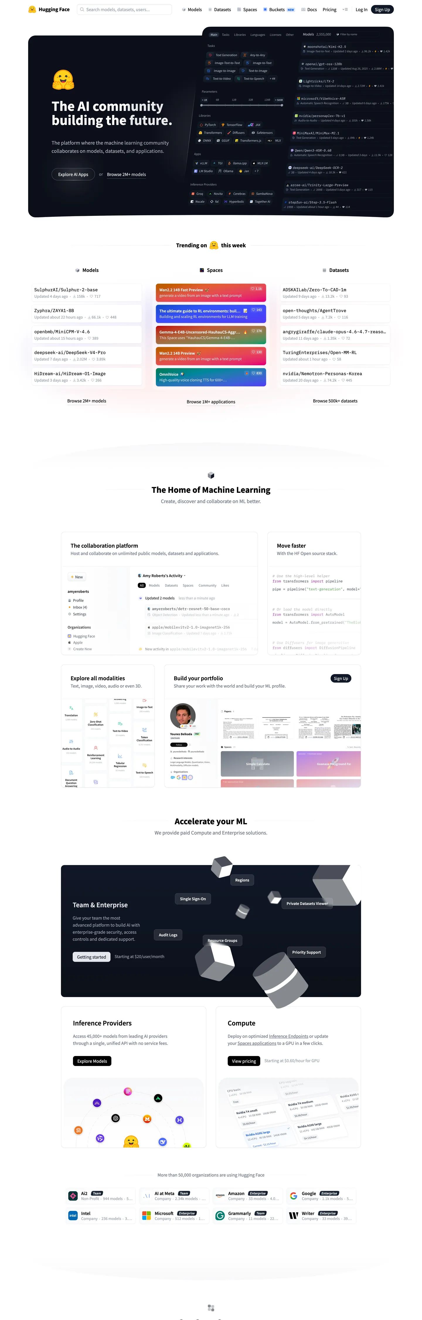
Hugging Face's homepage is a research dashboard that pretends to be a marketing page. The fold opens on a near-black canvas ("#0b0f19") with a single 48px Source Sans Pro wordmark headline — "The AI community building the future." — over a wall of IBM Plex Mono code samples showing actual `transformers` API calls. There is no hero illustration, no gradient mesh, no product mockup card. The page leans on the type and the code, and that is the entire brand voice. The dark band only runs for one viewport; below the fold the canvas inverts to pure white ("#ffffff") and stays there for the remainder of the page, populated with model cards, dataset rows, and Spaces grids that read like a notebook index rather than a SaaS landing template.
This DESIGN.md packages the whole surface into one machine-readable file. Inside: 24 colors tokens grouped into hero-dark, workspace-light, and category-signal layers, 12 typography roles split between Source Sans Pro (display through caption) and IBM Plex Mono (repo IDs and code), 7 radii anchored at 8px, 8 spacing values pivoting on 8px and 16px, and 17 components covering the dark hero band, white workspace cards, category pills, repo rows, and the model carousel. The schema follows the Google Labs DESIGN.md specification — every token quotes its hex and every numeric component value is a string.
Pipe the file into Claude, Cursor, or Copilot when you need a build that looks like Hugging Face rather than a generic AI startup. The agent reproduces the dark-to-white surface flip, the wordmark-headline-over-code-block hero, the multi-hue repo pills used only as signal, and the 8px card rhythm — without inventing gradient washes or oversized hero illustrations. Or treat it as an audit reference: any drift from the two-surface rule or the Source-Sans-only display ladder shows up immediately against the token list.
What makes it distinct
5
- Two-surface alternationa near-black hero ('#0b0f19') flips to a pure white workspace ('#ffffff') the moment the page enters the content tier, no transitional gray
- Source Sans Pro carries the entire chrome48px/700 hero down to 12px/600 micro-labels — paired with IBM Plex Mono ('15.04px') for inline repo IDs and code
- Repo category pills run four hues against whiteblue '#388bfd', green '#3fb950', amber '#d29922', red '#f85149' — used as signal-only, never decorative
- Card radii sit at 8px with 25.6px pill radii reserved for tag chips and the 17px-tracking 'huge-radius' badge that wraps avatars
- 8px is both the dominant spacing increment (59 hits) and the dominant card radius (41 hits)one number governs the rhythm at two scales
huggingface.co
Live at huggingface.co
A snapshot of the brand in production. Scroll the frame to see the whole page.
Colors
24 colors
Hugging Face's system runs on #0b0f19 as its primary voltage, used in 7 of 17 components. Type is set in Source Sans Pro across 12 tokens from 12px to 48px, weights 400–700. Shape language is soft — components average 16px corner radius, with no sharp interactive edges.
Surface
Page and card backgrounds · 1
Text
Headlines, body, captions · 6
Borders & Hairlines
Dividers, outlines, rules · 1
Other
Specialty colors · 16
Typography
12 type tokens
Set in Source Sans Pro across 12 tokens, from 12px to 48px, weights 400–700. Shown in its own stack: where the font isn't installed, the fallback the file names stands in.
- display-xl48px · weight 700 · lh 1The quick brown fox jumps over the lazy dog
- heading-lg30px · weight 700 · lh 1.2The quick brown fox jumps over the lazy dog
- heading-md24px · weight 600 · lh 1.33The quick brown fox jumps over the lazy dog
- heading-sm20px · weight 600 · lh 1.4The quick brown fox jumps over the lazy dog
- heading-xs18px · weight 600 · lh 1.55The quick brown fox jumps over the lazy dog
- body-lg18px · weight 400 · lh 1.55The quick brown fox jumps over the lazy dog
- body-md16px · weight 400 · lh 1.5The quick brown fox jumps over the lazy dog
- body-sm14px · weight 400 · lh 1.25The quick brown fox jumps over the lazy dog
- label-md14px · weight 600 · lh 1.43The quick brown fox jumps over the lazy dog
- caption12px · weight 600 · lh 1The quick brown fox jumps over the lazy dog
- code-md15.04px · weight 400 · lh 1.6The quick brown fox jumps over the lazy dog
- nav-link16px · weight 400 · lh 1.5The quick brown fox jumps over the lazy dog
Layout
Radii and spacing
7 corner radii and 8 spacing values. Shape language: soft.
Radii
- none0px
- xs4px
- sm6px
- md8px
- lg12px
- pill25.6px
- full9999px
Spacing
- xxs2px
- xs6px
- sm8px
- md12px
- base16px
- lg24px
- xl28px
- 2xl32px
Components
17 components
Each rendered from its tokens (color, type, radius, padding) on Hugging Face's own canvas.
- Top Navtop-navTop Nav
- Hero Bandhero-bandHero Band
- Hero Wordmark Headinghero-wordmark-headingHero Wordmark Heading
- Hero Code Samplehero-code-sampleHero Code Sample
- Button Primarybutton-primaryButton Primary
- Button Secondarybutton-secondaryButton Secondary
- Workspace Bandworkspace-bandWorkspace Band
- Repo Rowrepo-rowRepo Row
- Category Pill Modelscategory-pill-modelsCategory Pill Models
- Category Pill Datasetscategory-pill-datasetsCategory Pill Datasets
- Category Pill Spacescategory-pill-spacesCategory Pill Spaces
- Category Pill Warningcategory-pill-warningCategory Pill Warning
- Badge Uppercasebadge-uppercaseBadge Uppercase
- Enterprise Cta Bandenterprise-cta-bandEnterprise Cta Band
- Type here…text-inputText Input
- Nav Linknav-linkNav Link
- FooterfooterFooter
In use
The system, in use
Hugging Face's tokens on the kind of product it builds.
Build something people actually use.
A short paragraph of marketing copy that previews how the brand's display tier and body tier read together. Two sentences is usually enough.
FAQ
Hugging Face design system FAQ
Common questions about Hugging Face's tokens, components, and how to use this DESIGN.md in your project.
Read next
Related reading
Specs, directories, and component libraries that pair with this design system.
- Browse all design systemsThe full directory of DESIGN.md files on shadcn.io, with live mockups for each.shadcn.io
- Hugging Face — official siteThe platform where the machine learning community collaborates on models, datasets, and applications.huggingface.co (opens in a new tab)
- The DESIGN.md specificationGoogle Labs' open spec for machine-readable design system files — the format this page is built on.github.com (opens in a new tab)
Use it
Use Hugging Face in your project
One machine-readable file. Drop it into Claude, Cursor, or any AI tool that reads DESIGN.md.
Download the DESIGN.md
One machine-readable file: every color, type, radius, spacing, and component token of Hugging Face.
Feed it to your AI tool
Drop it into Claude, Cursor, or GitHub Copilot. The agent writes React components and Tailwind classes that match Hugging Face's visual language.
Reference the tokens directly
Or paste the values into your Tailwind config, CSS variables, or component library: every color, size and radius is a quoted, ready-to-copy value.
Read the full DESIGN.md: overview, rationale, do’s and don’ts
Overview
Hugging Face's homepage is two-surface architecture: a near-black hero band ({colors.hero-canvas} — #0b0f19) running exactly one viewport tall, then a hard flip to pure white ({colors.workspace-canvas} — #ffffff) for the remaining ~3500px of scroll. There is no transitional gray, no shadow seam, no gradient mesh between them. The dark band carries the 48px Source Sans Pro wordmark headline and a wall of IBM Plex Mono code samples showing actual transformers and datasets API calls. The white band carries every interactive surface — model cards, dataset rows, Spaces tiles, the enterprise CTA.
Where most AI marketing pages anchor on a single saturated brand voltage and decorate the rest with neutrals, Hugging Face inverts the convention: the brand voltage IS the dark-to-white surface flip, and saturation is reserved for four signal-only repo category pills — blue #388bfd for Models, green #3fb950 for Datasets, amber #d29922 for changed-file labels, red #f85149 for warnings. The signature yellow emoji-face logo sits only at the top-left wordmark; it never colors a button or a band.
Signal-only saturation: the four pill hues are lifted straight from the GitHub Primer diff palette (the extracted CSS variables include --d2h-dark-ins-label-color: #3fb950, --d2h-dark-del-label-color: #f85149, --d2h-dark-change-label-color: #d29922). The system reads this way to every developer who has seen a unified-diff before — color carries semantic meaning about content type, not visual emphasis.
Key Characteristics:
- Two-surface architecture: hero-dark
{colors.hero-canvas}(#0b0f19) flipping to workspace-white{colors.workspace-canvas}(#ffffff) with no transitional gray. - Source Sans Pro carries the entire chrome — every heading, body, label, and button across the marketing surface uses the same family.
- IBM Plex Mono at
15.04pxweight 400 with a 24px line-height handles inline repo IDs and code samples in the hero band. - Four-hue repo category pill system: blue
#388bfd, green#3fb950, amber#d29922, red#f85149— signal-only, never decorative. - 8px is the dominant card radius (41 hits in extraction) AND the dominant spacing increment (59 hits) — one number drives both rhythms.
- 48px Source Sans Pro weight-700 hero wordmark — the page's only display-tier headline, never repeated below the fold.
Colors
Surface
- Hero Canvas (
{colors.hero-canvas}—#0b0f19) — frequency 2. Used as bg (1), gradient (1). The dark hero band that runs from the top of the page through the first content row. Carries the wordmark headline and code samples. Single-CSS-variable provenance (--d2h-dark-bg-color). - Workspace Canvas (
{colors.workspace-canvas}—#ffffff) — frequency 133. Used as text (71), bg (10), gradient (52). The white surface that carries every interactive element below the hero. Wired through 13 CSS variables including--color-white,--color-gray-50,--color-sky-50,--color-emerald-50— every "50" Tailwind scale collapses to pure white.
Text
- Ink (
{colors.ink}—#000000) — frequency 364. Used as text (300), bg (2), shadow (62). The dominant text color across the workspace tier. Headings, body paragraphs, and nav labels on white all sit at pure black. - Ink Soft (
{colors.ink-soft}—#161b22) — borderline-black tone wired through--color-slate-900and--color-gray-900. Reserved for very dark surfaces and elevated dark cards. - Ink Elevated (
{colors.ink-elevated}—#21262d) — slightly lighter than ink-soft, wired through--color-gray-800. Used for dark-mode line borders and elevated dark surfaces in the diff renderer. - Ink Border (
{colors.ink-border}—#30363d) — the dark-tier border tone (--d2h-dark-border-color,--d2h-dark-empty-placeholder-border-color). - Muted (
{colors.muted}—#6e7681) — wired through--color-gray-500and--color-neutral-500. The mid-gray for captions, secondary labels, code-sample comment text in the hero.
Hairlines
- Surface Light (
{colors.surface-light}—#e6edf3) — wired through 13 CSS variables including--color-gray-100,--color-blue-100,--color-sky-100. The lightest cool-gray, used for surface-elevated badges on the white tier. - Hairline Light (
{colors.hairline-light}—#e1e1e1) — the 1px border tone used in card rows and table dividers (--d2h-empty-placeholder-border-color,--d2h-file-header-border-color).
Category signal
- Category Blue (
{colors.category-blue}—#388bfd) — frequency 0 raw, but anchored through--d2h-dark-selected-color,--d2h-dark-info-border-color,--d2h-dark-info-bg-color. Reserved for Model repo pills and informational labels. - Category Green (
{colors.category-green}—#3fb950) — Datasets repo pill, "Insertion" label in the diff renderer (--d2h-dark-ins-label-color). - Category Amber (
{colors.category-amber}—#d29922) — Changed-file label in diffs, used for Spaces-tier badges (--d2h-dark-change-del-color,--d2h-dark-change-label-color). - Category Red (
{colors.category-red}—#f85149) — Deletion label and warning badges (--d2h-dark-del-border-color,--d2h-dark-del-label-color).
Diff palette (legacy GitHub Primer)
- Ins Label (
{colors.ins-label}—#399839) — light-mode insertion label. - Ins Soft (
{colors.ins-soft}—#b4e2b4) — insertion border tone. - Ins Highlight (
{colors.ins-highlight}—#97f295) — insertion highlight background. - Del Soft (
{colors.del-soft}—#e9aeae) — deletion border tone. - Del Highlight (
{colors.del-highlight}—#ffb6ba) — deletion highlight background. - Del Bg (
{colors.del-bg}—#fee8e9) — wired through--color-red-50,--color-red-100. The error-tier surface fill. - Change Soft (
{colors.change-soft}—#d0b44c) — change-marker label. - Change Bg (
{colors.change-bg}—#fdf2d0) — change-marker surface fill. - Selected Bg (
{colors.selected-bg}—#c8e1ff) — wired through--color-blue-200. Light-mode selected-line background. - Moved Label (
{colors.moved-label}—#3572b0) — moved-file marker.
Typography
The system runs Source Sans Pro across every text role — display, headings, body, labels, captions, buttons, navigation. There is no display-family / body-family split. The variation comes from weight (400 / 600 / 700) and size (12px → 48px) rather than from a second typeface. Code switches to IBM Plex Mono at 15.04px with a 24px line-height for repo IDs and inline command samples. Both faces appear with letterSpacing: normal — no negative tracking on display, no widened tracking on uppercase caption.
The hero h1 is {typography.display-xl} (48px / 700 / line-height 1) — the only display-tier headline on the page. Below the fold, headings ladder from {typography.heading-lg} (30px / 700) for section heads down to {typography.heading-xs} (18px / 600) for card titles. Body paragraphs sit at {typography.body-md} (16px / 400) with a 24px line-height, and labels drop to {typography.label-md} (14px / 600). The 12px caption ({typography.caption}) is used for repo metadata — star counts, model size, last-modified timestamps.
Where most AI brands run a weight-300 display headline for restraint (Stripe, Mistral), Hugging Face runs weight 700 — the hero wordmark carries actual visual weight, no soft elegance.
Hierarchy
| Token | Size | Weight | Line Height | Use |
|---|---|---|---|---|
{typography.display-xl} | 48px | 700 | 1 | Hero h1 ("The AI community building the future.") |
{typography.heading-lg} | 30px | 700 | 1.2 | "The Home of Machine Learning" section heads |
{typography.heading-md} | 24px | 600 | 1.33 | Enterprise CTA headline |
{typography.heading-sm} | 20px | 600 | 1.4 | "Trending on Hub" sub-section heads |
{typography.heading-xs} | 18px | 600 | 1.55 | Repo card titles |
{typography.body-lg} | 18px | 400 | 1.55 | Hero sub-paragraph, intro body |
{typography.body-md} | 16px | 400 | 1.5 | Default running-text, nav menu items |
{typography.body-sm} | 14px | 400 | 1.25 | Repo metadata, secondary text |
{typography.label-md} | 14px | 600 | 1.43 | Button labels, pill labels |
{typography.caption} | 12px | 600 | 1 | Uppercase badges, micro-labels |
{typography.code-md} | 15.04px | 400 | 1.6 | IBM Plex Mono — code samples, repo IDs |
Layout
Spacing System
The system has an 8px base. {spacing.sm} (8px) is the dominant increment — 59 occurrences in the extraction, more than every other value combined. {spacing.base} (16px) and {spacing.md} (12px) follow at 17 hits each. The unusual {spacing.xs} (6px) appears in 2px 6px and 0px 6px pill padding pairs — small horizontal offset for inline badges.
{spacing.xxs} (2px) is the vertical padding inside category pills (padding: 2px 8px — 2px 6px — 2px 12px 0px). {spacing.lg} (24px) and {spacing.2xl} (32px) drive section padding and card internal padding respectively.
Grid & Container
The hero band is centered and bounded by Tailwind's standard container scale (--container-7xl: 80rem is wired in :root). The workspace tier uses an asymmetric 3-up grid for trending repos: Models column / Datasets column / Spaces column, each carrying ~5 repo rows. Below that, a 2-up grid pairs the "Open Source community" pitch with code samples, and a logo carousel at the footer runs at 6-up.
Whitespace
8px is both the radius and the spacing increment, so cards, gaps, and corners all snap to the same 8px lattice. Cards sit on the white tier with 8px rounded corners, separated by 8px and 16px gutters. Section padding is 32px.
Elevation & Depth
The system uses flat-on-flat elevation. Cards on the white workspace tier have no shadow; depth comes from the 1px {colors.hairline-light} border (#e1e1e1) and from contrast against the white canvas itself. The extracted shadow hits at the #000000 token (62 shadow occurrences) are mostly inline-shadow Tailwind defaults rather than authored card shadows.
| Level | Treatment | Use |
|---|---|---|
| Flat | No shadow, no border | Body sections, hero band, top nav |
| Hairline | 1px {colors.hairline-light} border | Repo rows, model cards, dataset rows |
| Dark inversion | {colors.hero-canvas} background on white tier | Enterprise CTA card, code-window mockups |
| Highlight | {colors.selected-bg} background | Selected diff line, focused list row |
The dominant depth move on the page is dark-card-on-white-tier: the enterprise CTA band in the lower third of the page inverts to {colors.hero-canvas} (#0b0f19) as a standalone rounded card inside the white workspace, which creates a much stronger elevation read than a shadow would.
Shapes
Border Radius Scale
| Token | Value | Use |
|---|---|---|
{rounded.none} | 0px | Hero band edges, full-bleed sections |
{rounded.xs} | 4px | Tiny inline accents, micro-tags |
{rounded.sm} | 6px | Compact dropdown items, small buttons |
{rounded.md} | 8px | The dominant card radius (41 hits in extraction) — repo rows, buttons, text inputs |
{rounded.lg} | 12px | Larger content cards, code-sample containers |
{rounded.pill} | 25.6px | Repo category pills, badge pills (17 hits) |
{rounded.full} | 9999px | Avatar circles, the huge 3.35544e+07px value reduces to pill at any scale |
The 25.6px pill radius is unusual — most systems use either 9999px or a small explicit value like 16px for pills. Hugging Face's 25.6px reads as a deliberate "fat pill" — large enough to wrap multi-word labels comfortably without going fully circular.
Components
top-nav
The pinned 56px nav bar sitting against the hero canvas {colors.hero-canvas}. Carries the yellow emoji-face mark + "Hugging Face" wordmark at left, then a horizontal menu (Models / Datasets / Spaces / Posts / Docs / Pricing) in {typography.nav-link} (16px / 400). Right cluster has a search input and the "Sign Up" {component.button-primary}.
hero-band
The dark hero band running one viewport tall. Background {colors.hero-canvas}, padding 32px, carrying the wordmark headline {component.hero-wordmark-heading} at left and a code-sample stack at right. No CTA inside — the hero relies on the wordmark headline alone.
hero-wordmark-heading
The 48px Source Sans Pro weight-700 headline on the dark canvas. {typography.display-xl} with letterSpacing: normal (no negative tracking). The page's only display-tier headline.
hero-code-sample
Inline IBM Plex Mono code window inside the hero band. Background {colors.hero-canvas} (same as the band — no contrasting fill), text {colors.muted} (#6e7681), padding 16px, rounded {rounded.md}. The code reads as part of the dark canvas, not as a separate card — pulled out only by its monospace face.
Buttons
button-primary — White button on the dark hero canvas. Background {colors.workspace-canvas} (#ffffff), text {colors.ink} (#000000), {typography.label-md} (14px / 600), padding 8px 16px, rounded {rounded.md} (8px), height 36px. The primary CTA inverts the page's surface contrast — white on dark.
button-secondary — Dark button used on the white workspace tier as the inverse. Background {colors.hero-canvas}, text {colors.on-hero} (#ffffff). Same dimensions and radius as primary.
Workspace cards
workspace-band — The white workspace tier itself. Background {colors.workspace-canvas}, padding 32px. Carries every interactive component below the hero.
repo-row — Single-line model/dataset/space row used in the trending grids. Background {colors.workspace-canvas}, hairline border, padding 12px, rounded {rounded.md}. Carries an avatar at left, repo name + author in {typography.body-md}, metadata in {typography.body-sm} (size, downloads, likes), and a {component.category-pill-models} indicating category.
Category pills
category-pill-models — Blue-text pill for Model repos. Background {colors.workspace-canvas}, text {colors.category-blue} (#388bfd), {typography.label-md}, padding 2px 8px, rounded {rounded.pill} (25.6px).
category-pill-datasets — Green-text pill for Dataset repos. Same geometry, text {colors.category-green} (#3fb950).
category-pill-spaces — Amber-text pill for Spaces. Same geometry, text {colors.category-amber} (#d29922).
category-pill-warning — Red-text pill for deprecated or warning labels. Background flips to {colors.del-bg} (#fee8e9), text {colors.category-red} (#f85149).
Badges
badge-uppercase — Small uppercase-tracked tag. Background {colors.surface-light}, text {colors.ink}, {typography.caption} (12px / 600), rounded {rounded.pill}, padding 2px 6px, letterSpacing 0.05em. Used for "NEW", "PRO", trending markers.
Enterprise CTA
enterprise-cta-band — Dark inverted card sitting inside the white workspace. Background {colors.hero-canvas}, text {colors.on-hero}, {typography.heading-md}, rounded {rounded.md}, padding 32px. The page's strongest visual elevation through surface inversion rather than shadow.
Inputs
text-input — Standard search/text input. Background {colors.workspace-canvas}, text {colors.ink}, {typography.body-md}, rounded {rounded.md}, padding 8px 12px 8px 32px (asymmetric left padding for the search icon), height 36px.
Footer
footer — Bottom footer on the white workspace tier. Background {colors.workspace-canvas}, text {colors.muted}, {typography.body-sm}, padding 32px. Carries a logo carousel at top and a multi-column link list below.
Do's and Don'ts
Do
- Anchor the hero on
{colors.hero-canvas}(#0b0f19) for exactly one viewport, then flip to{colors.workspace-canvas}(#ffffff) for the rest of the page. The two-surface architecture is the brand. - Run Source Sans Pro across every text role. Weight (400 / 600 / 700) and size carry the hierarchy — never reach for a second display family.
- Use IBM Plex Mono only for code, repo IDs, and command samples. Never use it for body or labels.
- Reserve the four category-pill hues for repo-type signal: blue Models, green Datasets, amber Spaces/changed, red warnings. Map them one-to-one to content category.
- Snap card radii to
{rounded.md}(8px) and gutters to{spacing.sm}(8px) or{spacing.base}(16px) — the 8px lattice is the rhythm. - Use surface inversion (
{component.enterprise-cta-band}) rather than shadows for major card elevation on the white tier.
Don't
- Don't put a transitional gray band between the hero and the workspace. The flip from
#0b0f19to#ffffffis hard — adding a#161b22or#21262dinterstitial breaks the two-surface rule. - Don't color CTA buttons with the category pill hues.
#388bfdblue is a Models signal, not a primary-action color — using it on a button confuses the semantics. - Don't add negative letter-spacing to display headlines. Source Sans Pro at 48px weight 700 is designed for
letterSpacing: normal— the extracted value is exactlynormal, and tracking it tighter reads as off-brand. - Don't use the dark hero canvas as a card background on the white tier without a
{rounded.md}corner — full-bleed dark on white reads as a layout error, not as the enterprise CTA. - Don't reach for
#000000as a surface fill. The token has 364 occurrences but only 2 are bg uses — it's a text-and-shadow color, and filling a card with it breaks the workspace tier. - Don't introduce a fifth category pill hue. The four-hue set (blue / green / amber / red) is closed — adding purple or teal pills dilutes the signal-only semantics.
- Don't use the 25.6px
{rounded.pill}radius on rectangular buttons. It's reserved for pill-shaped category tags; on rectangular buttons it reads as bloated.
Known Gaps
- The actual product surface (model pages, the dataset viewer, Spaces, the Inference API console, discussion threads, Gradio embeds) adds many components beyond this marketing surface — repo file trees, commit graphs, model-card markdown renderers — that are out of scope here.
- The yellow emoji-face glyph at the top-left wordmark is treated as a logo asset rather than a system token. No yellow tone is surfaced as a color token because it never appears on a CTA or band.
- The GitHub Primer diff palette (
--d2h-dark-*CSS variables) is fully present in the extracted CSS but only the category-signal subset is surfaced as a system token here. The full dark-mode workspace tier would need a second pass. - Animation timings on the hero code-sample carousel and on the trending-repo refresh transitions are not extracted.
- Form validation states beyond the default text input are not extracted — error and success states would need a sign-up or feedback flow to confirm.
- The
3.35544e+07pxradius value (17 hits in extraction) is the JavaScript-overflow representation of9999pxafter a computed-style round-trip — it reduces to{rounded.full}at any rendered scale.
AI & LLM Platforms
More systems like this
More DESIGN.md files in AI & LLM Platforms.
Pricing
Build it with Pro
The DESIGN.md files are free. Pro adds 6,000+ blocks, premium templates and the MCP server, so your AI editor builds in your system for you.
4.9/5 out of 5 · 150+ reviewsfrom 150+ founders and developers.
Billing
Billed once a year in USD. Cancel anytime.
- How many people can use the license.
- Client work, SaaS products and anything you charge for.
- Production-ready React sections: hero, pricing, features, dashboards and more.
- Complete multi-page sites you can ship as they are.
- React icons from every major library, installable with one command.
- Presets that restyle every block, in light and dark.
- Lets your AI editor search, preview and install blocks for you.
- Priority requests are answered first.
Individual
For personal projects & open source
$32instead of $49/mo
$389 billed yearly
- Seats: 1 seat
- Commercial use: Personal & open source only
- Pro blocks: 6,000+ blocks
- Templates: All 14 templates
- React icons: 294k+ icons
- Themes: All 59 themes
- MCP server: Basic usage
- Support: Standard
Team
Most popularFor freelancers, agencies & startups
$66instead of $99/mo
$789 billed yearly · ≈ $13/dev/mo
- Seats: Up to 5 seats
- Commercial use: Included
- Pro blocks: 6,000+ blocks
- Templates: All 14 templates
- React icons: 294k+ icons
- Themes: All 59 themes
- MCP server: High usage
- Support: Priority
Organization
For companies with larger teams
$132instead of $199/mo
$1,589 billed yearly
- Seats: Unlimited seats
- Commercial use: Included
- Pro blocks: 6,000+ blocks
- Templates: All 14 templates
- React icons: 294k+ icons
- Themes: All 59 themes
- MCP server: Unlimited usage
- Support: Priority
Billed once a year in USD. Cancel anytime.
Individual
For personal projects & open source
$32instead of $49/mo
$389 billed yearly
- How many people can use the license.Seats: 1 seat
- Client work, SaaS products and anything you charge for.Commercial use: Personal & open source only
- Production-ready React sections: hero, pricing, features, dashboards and more.Pro blocks: 6,000+ blocks
- Complete multi-page sites you can ship as they are.Templates: All 14 templates
- React icons from every major library, installable with one command.React icons: 294k+ icons
- Presets that restyle every block, in light and dark.Themes: All 59 themes
- Lets your AI editor search, preview and install blocks for you.MCP server: Basic usage
- Priority requests are answered first.Support: Standard
Team
Most popularFor freelancers, agencies & startups
$66instead of $99/mo
$789 billed yearly · ≈ $13/dev/mo
Everything in Individual, plus
- How many people can use the license.Seats: Up to 5 seats
- Client work, SaaS products and anything you charge for.Commercial use: Included
- Lets your AI editor search, preview and install blocks for you.MCP server: High usage
- Priority requests are answered first.Support: Priority
Organization
For companies with larger teams
$132instead of $199/mo
$1,589 billed yearly
Everything in Team, plus
- How many people can use the license.Seats: Unlimited seats
- Lets your AI editor search, preview and install blocks for you.MCP server: Unlimited usage
- Secure checkout via Stripe
- Code lives in your repo
- Keep what you've shipped if you cancel
- License terms
Your system, built for you
Every block, template and icon, installed by your AI agent in your design system. The DESIGN.md files stay free.