H&M Design System
H&M's marketing chrome captured as a DESIGN.md spec. Pure monochrome above the fold, HM Sans Regular/Semi Bold across every tier, red #e50010 held for the logo and the sale palette only. Tokens for React, Next.js, and AI coding tools.
Add shadcn.io to your AI agent. · Pro It installs blocks, icons and templates in your design system from a prompt, with Pro.
Set up MCP- Primary
- #737373
- Typeface
- HM Sans Regular
- Shape
- Sharp
- Base radius
- 0px
- Colors
- 13
- Type tokens
- 10
- Components
- 15
- Spacing values
- 7
About
About H&M DESIGN.md
Curated by Dov Azencot · Updated May 19, 2026 · Source www2.hm.com (opens in a new tab)
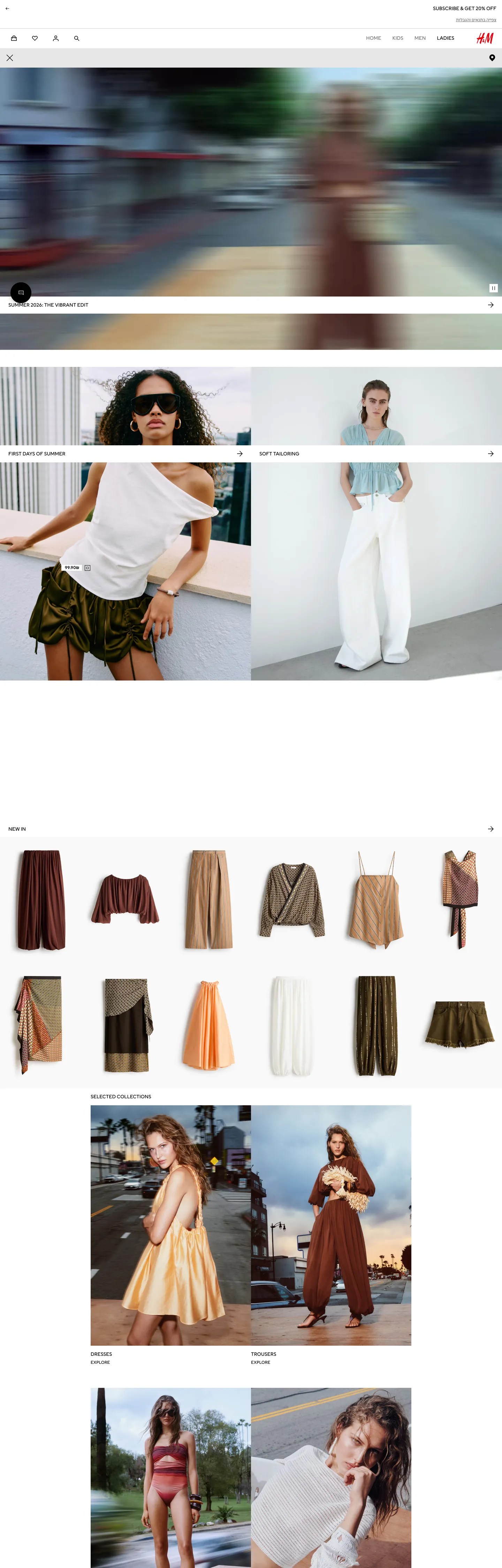
H&M's marketing chrome does something its Inditex rival ZARA also does, but with a single critical difference: it gives the entire above-fold chrome to black-and-white, then holds one held-in-reserve red voltage in a single wired CSS variable that lights up only the logo and the sale-price palette. The hero is a full-bleed runway-photography moment — a fashion editor's blurred-motion campaign shot, then a tiled grid of model close-ups in white-on-cream styling, then a product-card grid of cardigans, jackets, dresses, and skirts laid out flat against the canvas. The single chromatic moment in the page chrome is the red H&M wordmark in the top-right of the nav, sitting at native brand weight against the white canvas. Where ZARA holds zero voltage above the fold and lets the runway photography do every chromatic job, and where Uniqlo paints its hero red as a constant marketing fill, H&M splits the difference: zero accent in the body chrome, one held-in-reserve red on the logo and the sale chip.
The DESIGN.md file packages the system into a machine-readable spec for React tooling. Inside: 13 colors tokens drawn from a near-monochrome palette (pure #ffffff at frequency 14 as bg, pure #000000 at frequency 612 as text / border / icon — the dominant load-bearing structural color), three near-black variants for chat-widget overrides and pressed states, a 5-occurrence mid-grey #737373 for placeholder text, plus the H&M red #e50010 reserved for the brand logo and the sale palette. Twelve typography tokens span HM Sans Regular (weight 400) and HM Sans Semi Bold (weight 500) from 12px caption up to 14px uppercase nav-link; the Hebrew variant HMSansHebrew-Regular handles RTL locales like the Israeli site captured here. The radius scale is zero — only one 50% radius for the cart-count badge across 802 scanned elements.
Feed this file to Claude or Cursor and it reproduces H&M's specific moves: monochrome chrome carrying every CTA / nav / label surface, red held in reserve for the logo and the sale chip only, HM Sans at weight 400 across body and nav with weight 500 reserved for the rare emphasis moment, 0px corners universally on every CTA / card / tile, and uppercase tracking-normal nav-links at 14px as the dominant typographic tier. The token references resolve cleanly — `{colors.canvas}` for the white floor, `{colors.ink}` for the black ink, `{colors.brand-red}` for the held-in-reserve logo color — so the AI never has to invent a value. The disciplined move worth borrowing is the held-in-reserve red pattern: a single chromatic voltage wired into 28 semantic CSS vars (`--base-brand-logo`, `--product-sale`, `--fds-color-fill-logo`, `--base-favourite`, `--base-notification`) but never used as a CTA background or as body chrome.
What makes it distinct
5
- Held-in-reserve red voltageH&M red #e50010 is wired into 28 CSS vars (`--base-brand-logo`, `--base-favourite`, `--product-sale`, `--fds-color-fill-logo`) but never renders as a CTA fill or as body chrome above the fold
- HM Sans across every tierthe proprietary humanist sans runs 14px / 400 nav links (uppercase) and 12px / 400 body, with HM Sans Semi Bold at weight 500 for the rare emphasis moment; the Hebrew variant HMSansHebrew-Regular handles RTL locales
- Zero-corner geometryonly one borderRadius declared across 802 scanned elements (50% on the cart-count badge); every CTA, card, tile, and modal renders as a pure-rectangle
- Single saturated redthe brand red #e50010 is the only chromatic moment in the structural palette; the secondary brand-Friday navy #374894, sustainability green, and cyber-Monday accents are scoped to seasonal-campaign tokens and don't share the page
- Two-typeface systemHM Sans Regular at weight 400 for body / nav / labels, HM Sans Semi Bold at weight 500 for emphasis; no weight 700+ tier anywhere on the captured page
www2.hm.com
Live at www2.hm.com
A snapshot of the brand in production. Scroll the frame to see the whole page.
Colors
13 colors
H&M's system anchors on #737373 (ink-mid) as its primary color. Type is set in HM Sans Regular across 10 tokens from 12px to 14px, weights 400–500. Shape language is sharp — components average 0px corner radius, favoring crisp rectangles.
Brand & Accent
Sparing, CTA-only voltage · 2
Surface
Page and card backgrounds · 2
Text
Headlines, body, captions · 3
Borders & Hairlines
Dividers, outlines, rules · 2
Semantic
Status, errors, success, links · 1
Other
Specialty colors · 3
Typography
10 type tokens
Set in HM Sans Regular across 10 tokens, from 12px to 14px, weights 400–500. Shown in its own stack: where the font isn't installed, the fallback the file names stands in.
- display-md14px · weight 400 · lh 17pxThe quick brown fox jumps over the lazy dog
- heading-md14px · weight 500 · lh 17pxThe quick brown fox jumps over the lazy dog
- body-md14px · weight 400 · lh 20pxThe quick brown fox jumps over the lazy dog
- body-sm12px · weight 400 · lh 16pxThe quick brown fox jumps over the lazy dog
- caption12px · weight 400 · lh 14.28pxThe quick brown fox jumps over the lazy dog
- nav-link14px · weight 400 · lh 17pxThe quick brown fox jumps over the lazy dog
- uppercase-md14px · weight 400 · lh 17pxThe quick brown fox jumps over the lazy dog
- uppercase-sm12px · weight 400 · lh 14.28pxThe quick brown fox jumps over the lazy dog
- emphasis-md12px · weight 500 · lh 16pxThe quick brown fox jumps over the lazy dog
- button-md14px · weight 400 · lh 16pxThe quick brown fox jumps over the lazy dog
Layout
Radii and spacing
2 corner radii and 7 spacing values. Shape language: sharp.
Radii
- none0px
- full9999px
Spacing
- xs4px
- sm8px
- base16px
- lg24px
- xl32px
- 2xl48px
- 3xl64px
Components
15 components
Each rendered from its tokens (color, type, radius, padding) on H&M's own canvas.
- Button Primarybutton-primaryButton Primary
- Button Secondarybutton-secondaryButton Secondary
- Top Navtop-navTop Nav
- Nav Linknav-linkNav Link
- Brand Wordmarkbrand-wordmarkBrand Wordmark
- Hero Headinghero-headingHero Heading
- Section Headingsection-headingSection Heading
- Body Paragraphbody-paragraphBody Paragraph
- Small Caps Labelsmall-caps-labelSmall Caps Label
- Product Tileproduct-tileProduct Tile
- Sale Chipsale-chipSale Chip
- Cart Count Badgecart-count-badgeCart Count Badge
- Favourite Iconfavourite-iconFavourite Icon
- FooterfooterFooter
- Category Tilecategory-tileCategory Tile
In use
The system, in use
H&M's tokens on the kind of product it builds.
Build something people actually use.
A short paragraph of marketing copy that previews how the brand's display tier and body tier read together. Two sentences is usually enough.
FAQ
H&M design system FAQ
Common questions about H&M's tokens, components, and how to use this DESIGN.md in your project.
Read next
Related reading
Specs, directories, and component libraries that pair with this design system.
- Browse all design systemsThe full directory of DESIGN.md files on shadcn.io, with live mockups for each.shadcn.io
- H&M — official siteH&M's public marketing site — the source of truth for the live tokens captured in this file.www2.hm.com (opens in a new tab)
- The DESIGN.md specificationGoogle Labs' open spec for machine-readable design system files — the format this page is built on.github.com (opens in a new tab)
Use it
Use H&M in your project
One machine-readable file. Drop it into Claude, Cursor, or any AI tool that reads DESIGN.md.
Download the DESIGN.md
One machine-readable file: every color, type, radius, spacing, and component token of H&M.
Feed it to your AI tool
Drop it into Claude, Cursor, or GitHub Copilot. The agent writes React components and Tailwind classes that match H&M's visual language.
Reference the tokens directly
Or paste the values into your Tailwind config, CSS variables, or component library: every color, size and radius is a quoted, ready-to-copy value.
Read the full DESIGN.md: overview, rationale, do’s and don’ts
Overview
H&M's marketing chrome does something its Inditex rival ZARA also does, but with a single critical difference. Held-in-reserve red. The above-fold chrome runs on pure black-and-white — every CTA, every nav-link, every body paragraph, every product-tile caption — and the single chromatic moment in the page chrome is the H&M red wordmark in the top-right of the nav. The red {colors.brand-red} (#e50010) is wired into 28 semantic CSS variables (--base-brand-logo, --base-favourite, --base-notification, --product-sale, --product-scarcity, --fds-color-fill-logo, --fds-sale-palette-icon, --fds-color-text-discount, plus 19 more), but it renders as a background fill exactly zero times in the captured marketing chrome above the fold. Where Uniqlo paints its entire hero red as a constant brand fill, and where ZARA holds zero voltage and lets the runway photography do every chromatic job, H&M splits the difference: black-on-white chrome with one chromatic voltage held in reserve for the logo, the heart-favourite icon, and the sale-price chip.
The system's CSS variable density is the strongest signal that H&M treats its design system as a load-bearing engineering artifact. The captured page exposes over 350 --fds-* and --base-* custom properties (the FDS — Fashion Design System — prefix is internal H&M Group nomenclature shared with sister brands COS, &OtherStories, Arket, Monki, and Weekday). Each palette is declared as a complete sub-theme: --black-friday-palette-* for the Black Friday surface, --cyber-monday-palette-* for the navy-blue Cyber Monday surface, --gift-giving-palette-* for the gift-card pages, --member-palette-* for the loyalty-tier chrome, --sale-palette-* and --deals-palette-* for the sale-price layouts. The base chrome remains pure black-on-white; the seasonal-campaign chrome is what introduces the chromatic shifts.
Typography is HM Sans across every tier — a two-family system. HM Sans Regular at weight 400 carries body, nav links, button labels, and h2 headings (frequency 36, the dominant typographic moment across the captured page). HM Sans Semi Bold at weight 500 carries the rare emphasis treatments — section heading h2s and strong-emphasis spans. The Hebrew variants HMSansHebrew-Regular and HMSansHebrew-SemiBold handle RTL locales (the captured page is the Israeli site, so Hebrew renders natively). There is no weight 700+ tier on the page; even hero headings render at 14px / weight 400.
Key Characteristics:
- Zero brand voltage above the fold in body chrome —
{colors.canvas}#ffffff and{colors.ink}#000000 carry every CTA, nav, and label surface. - Held-in-reserve red
{colors.brand-red}(#e50010) wired into 28 semantic CSS vars (--base-brand-logo,--product-sale,--fds-color-fill-logo,--base-favourite,--base-notification) but used only on the logo wordmark, the heart-favourite icon, the sale-chip overlays, and the cart-count badge. - Two-family HM Sans system — HM Sans Regular at weight 400 for body / nav / labels, HM Sans Semi Bold at weight 500 for the rare emphasis moment; no weight 700+ tier on the captured page.
- 0px corners universally — only one borderRadius declared across 802 scanned elements (50% on the cart-count badge); every CTA, card, tile, modal sits at flush-corner.
- Multi-locale typography — HMSansHebrew-Regular for RTL locales plus a Japanese-fallback stack (ヒラギノ角ゴ Pro W3 / Hiragino Kaku Gothic Pro / Osaka / メイリオ / MS Pゴシック / MS PGothic) wired into every font-family declaration.
- Seasonal-campaign palettes — Black Friday, Cyber Monday (
{colors.brand-friday-navy}#374894 as primary), Sale, Deals, Gift-Giving, Member each declared as a complete sub-theme; outside the seasonal surface, none share the chrome. - Pure black
{colors.ink}at frequency 612 — the dominant load-bearing structural color (305 as text, 305 as border, 2 as bg).
Colors
Structural (carries the chrome)
- Ink (
{colors.ink}— #000000): frequency 612. Used as text (305), border (305), bg (2). Wired as--base-text,--base-primary-interactive,--high-contrast-dark,--fds-color-text-default,--default-palette-text,--inverted-palette-background, plus 90+ other semantic locations. The dominant load-bearing structural color across the page — the body-text default on white surfaces and the border-default on every input and card edge. - Canvas (
{colors.canvas}— #ffffff): frequency 14. Used as text (1), bg (12), border (1). Wired as--base-background-default,--default-palette-background,--fds-color-background-default,--base-background-card,--fds-color-fill-secondary, plus 50+ other locations. The page floor and the dominant card surface. - Ink Mid (
{colors.ink-mid}— #737373): frequency 10. Used as text (5), border (5). Wired as--base-text-placeholder,--base-secondary-interactive,--fds-color-text-subtle,--fds-color-icon-subtle,--base-tertiary-interactive-disabled. The placeholder-text and de-emphasized secondary tier. - Ink Soft (
{colors.ink-soft}— #323232): frequency 1. Used as shadow (1). Wired as--fds-color-fill-primary-pressed,--fds-on-dark-image-palette-primary-pressed, plus 7 pressed-state variants. The pressed-state fill for primary CTAs and the lone shadow color on the page.
Hairlines
- Hairline (
{colors.hairline}— #e6e6e6): frequency 1. Used as bg (1). Wired as--fds-color-fill-disabled,--fds-color-fill-info,--fds-color-fill-primary-inverse-pressed,--base-interactive-disabled,--fds-color-utility-skeleton-gradient-stop. The skeleton-loader fill and the disabled-state surface tone. - Hairline Soft (
{colors.hairline-soft}— #d9d9d9): wired as--base-decoration-secondary,--fds-color-border-inverse-subtle,--base-background-row-alternate,--base-tertiary-interactive,--product-membership. The alternate-row background for tables and the secondary-tier interactive surface. - Surface Low (
{colors.surface-low}— #f2f2f2): wired as--fds-color-fill-secondary-hover,--fds-color-background-sunken,--fds-color-fill-primary-inverse-hover,--fds-color-utility-skeleton-background,--fds-color-icon-inverse-subtle. The hover-fill for secondary surfaces and the skeleton-background tone.
Brand (held in reserve)
- Brand Red (
{colors.brand-red}— #e50010): frequency 0 in captured body chrome. Wired as--base-brand-logo,--base-favourite,--base-notification,--product-sale,--product-scarcity,--fds-color-fill-logo,--fds-sale-palette-icon,--fds-color-text-discount,--fds-color-icon-discount,--sale-palette-headline,--sale-palette-text,--sale-palette-logo,--deals-palette-logo, plus 15 more — 28 declared semantic locations in total. The brand voltage, held entirely in reserve for the logo wordmark, the heart-favourite icon, the sale-price chip overlays, the cart-count badge, and the inline notification dots.
Seasonal-campaign (scoped to sub-themes)
- Brand-Friday Navy (
{colors.brand-friday-navy}— #374894): wired as--cyber-monday-palette-interactive,--cyber-monday-palette-logo,--cyber-monday-palette-headline,--cyber-monday-palette-interactive-active. The Cyber Monday sub-theme primary color; never appears in base chrome. - Warning Bronze (
{colors.warning-bronze}— #cc7d00): wired as--fds-color-icon-warning,--fds-color-border-warning,--fds-color-text-warning,--fds-global-color-swatch-bronze,--tag-swatch-bronze. The inline-warning tone and the bronze color-swatch tag for products. - Energy Yellow (
{colors.energy-yellow}— #ffed42): wired as--energy-class-b(an EU energy-rating label color),--color-kakao-yellow,--fds-global-color-vendors-kakao-default. Reserved for the EU energy-rating sticker on appliances and for the Kakao social-login button. - Sale Orange (
{colors.sale-orange}— #de6637): wired as--deals-palette-primary(in some markets) and the Sale-Banner accent. The secondary sale-palette color when the brand red is too saturated for a campaign. - Swatch Yellow (
{colors.swatch-yellow}— #f0d700): wired as--color-kakao-yellow-active,--fds-global-color-swatch-yellow,--tag-swatch-yellow,--fds-global-color-vendors-kakao-active. The product color-swatch tag for yellow garments.
Typography
Font Family
The system runs HM Sans for every body, nav, label, button, and heading surface — a two-weight proprietary humanist sans wired into the CSS. The full font stack walks "HM Sans Regular", HMSansHebrew-Regular, "ヒラギノ角ゴ Pro W3", "Hiragino Kaku Gothic Pro", Osaka, メイリオ, Meiryo, "MS Pゴシック", "MS PGothic", sans-serif. The Hebrew variant HMSansHebrew-Regular handles RTL locales; the Japanese-fallback stack handles CJK locales; the rest of the world falls through to HM Sans Regular.
HM Sans is a two-family system: HM Sans Regular at weight 400 carries body, nav, button labels, and h2 headings (frequency 36 — the dominant tier). HM Sans Semi Bold at weight 500 carries the rare emphasis treatments — section heading h2s and strong-emphasis spans. There is no weight 700+ tier rendered on the page.
The system also declares HM Slussen in --fds-text-nav-xl-* vars for the extra-large navigation tier (when the system needs a heavier display weight on specific locales like ro-RO Romanian); the captured page does not render this tier.
Hierarchy
| Token | Size | Weight | Line Height | Use |
|---|---|---|---|---|
{typography.display-md} | 14px | 400 | 17px | Hero heading ("Summer 2026: The vibrant edit"), h2 section titles |
{typography.heading-md} | 14px | 500 | 17px | Section heading emphasis tier (HM Sans Semi Bold) |
{typography.body-md} | 14px | 400 | 20px | Default running text, button labels, primary CTA copy |
{typography.body-sm} | 12px | 400 | 16px | Footer copy, product-tile metadata, body paragraphs |
{typography.caption} | 12px | 400 | 14.28px | Micro-metadata, sub-labels, dates |
{typography.nav-link} | 14px | 400 | 17px | Top-nav links — uppercase, frequency 36 (the dominant tier) |
{typography.uppercase-md} | 14px | 400 | 17px | h2 / h3 small-caps labels, category-tile headings — uppercase |
{typography.uppercase-sm} | 12px | 400 | 14.28px | Small-caps labels, sale-chip text — uppercase |
{typography.emphasis-md} | 12px | 500 | 16px | Emphasized labels (HM Sans Semi Bold) |
{typography.button-md} | 14px | 400 | 16px | Primary CTA label |
Principles
Body weight is uniformly 400. Emphasis flips to weight 500 via the HM Sans Semi Bold family — never via a font-weight override on HM Sans Regular. There is no weight 700+ tier on the page; even the hero heading ("Summer 2026: The vibrant edit") renders at 14px / weight 400, deliberately quiet so the runway photography carries the visual weight.
Tracking is uniformly normal across every tier. Text-transform flips to uppercase on the nav-link, the small-caps label, the category-tile heading, and the sale-chip — those four roles carry the bulk of the page's typographic chrome at 14px / weight 400 / uppercase.
Note on Font Substitutes
HM Sans is proprietary. Inter at weight 400 / 500 is the closest open-source substitute; the metrics transfer cleanly and the humanist proportions read close to HM Sans at the 12-14px body sizes. For the Hebrew RTL locale, Heebo is the closest open-source substitute for HMSansHebrew-Regular. The Japanese-fallback stack (Hiragino Kaku Gothic Pro / Osaka / Meiryo / MS PGothic) is what H&M ships, so no substitution is required for CJK locales.
Layout
Spacing System
- Base unit: 8px (with 16px as the dominant module).
- Tokens:
{spacing.xs}4px ·{spacing.sm}8px ·{spacing.base}16px ·{spacing.lg}24px ·{spacing.xl}32px ·{spacing.2xl}48px ·{spacing.3xl}64px. - Section padding (vertical): 8px is the dominant module (frequency 40 in the captured page), with 16px as the secondary step (10 occurrences). Larger section breaks step to 48-64px.
- Card internal padding: 0px on product tiles (the photography fills the tile edge-to-edge); 16px on the cookie banner and inline marketing tiles.
- Nav padding: 0x16 horizontal on the link items, with a 48-56px overall nav height.
Grid & Container
- Top nav: white surface with the H&M red wordmark at the top-right, the hamburger menu icon at the left, and SHOPPING BAG / WISHLIST / LOG IN / HELP as right-aligned uppercase links.
- Hero: edge-to-edge runway-photography video with no overlay copy — the brand recognition carries entirely through the photography.
- Editorial grid: 2-column model close-ups in the upper editorial band, followed by a 6-column product-tile grid showing cardigans, jackets, dresses, skirts laid flat against the canvas, then a 2-column editorial band of styled-model shots.
- Product-tile grid: flush-corner tiles at 0px corner, with a small-caps caption beneath each product photo at 12px / weight 400 / uppercase.
Rhythm
The page alternates between edge-to-edge runway photography (the hero), constrained product grids (the 6-column tile gallery), and editorial styled-model bands (the 2-column campaign moments). There is no atmospheric gradient between bands; every section terminates on the same pure-white canvas, and depth comes from the photography itself rather than from any background-color shift. The H&M red wordmark sits in the top-right of the nav as the single chromatic anchor for the entire page.
Elevation
The system declares a --base-z-axis-shadow token mapped to pure white (#ffffff) — an explicit declaration that shadows do not exist on this surface, since the shadow tone matches the canvas. The captured page renders zero drop shadows on any surface: every CTA, every product tile, every modal sits flush on the canvas without any elevation cue beyond a hairline border or a tonal lift.
- Flat (no shadow): every above-fold surface — nav, hero, product tiles, editorial bands, footer. The shadow tone is declared as pure white explicitly, which mathematically eliminates the possibility of a visible shadow.
- Hairline outlines:
{colors.ink}(#000000) at low opacity marks the CTA-secondary border and the input-field edge. Pure black is the only border tone in the chrome. - Tonal lift:
{colors.surface-low}(#f2f2f2) is the slightly-cool surface tone for the cookie banner and the chat-widget hover-fill, lifted off the pure-white canvas by ~3% lightness contrast.
Shapes
The radius scale is essentially zero:
{rounded.none}0px — the universal corner treatment. Every CTA, every product tile, every input, every modal, every card sits at 0px. The only borderRadius value rendered on the captured page is the 50% radius for the cart-count badge.{rounded.full}9999px — used only on the cart-count badge and the heart-favourite icon hit area, rendered as a full circle via 50% radius rather than a declared token.
There is no 2px / 4px / 8px / 12px / 16px middle tier. The system is deliberately rectilinear — a runway-magazine convention rather than a retail-tile convention. The H&M wordmark itself is set in a custom geometric serif (the historical Mårten Andersson lockup) and renders without any radius treatment at all.
Components
button-primary — The signature CTA. Pure-black {colors.ink} fill, white text, {rounded.none} 0px corners, 0x24 padding, 56px height. The "ADD TO BAG" and "SHOP NOW" copy are the canonical instances — uppercase, 14px HM Sans Regular at weight 400.
button-secondary — White fill with black text and a 1px black border, {rounded.none} 0px corners. Used for "Sign in" and tertiary "Learn more" CTAs in the marketing tiles.
top-nav — White {colors.canvas} surface, 48px height, 0x16 padding, {typography.nav-link} link labels. The H&M red wordmark sits at the top-right; the hamburger menu icon sits at the left.
nav-link — Transparent background, ink text in {typography.nav-link} (14px / 400 / uppercase / 17px line-height), 0x16 padding, 48px height. SHOPPING BAG (with cart-count appended), WISHLIST, LOG IN, HELP, and the category-bar items (WOMEN, MEN, DIVIDED, BABY, KIDS, HOME, BEAUTY).
brand-wordmark — Transparent background, {colors.brand-red} (#e50010) text in a custom geometric serif. The single chromatic moment in the page chrome — sits in the top-right of the nav.
hero-heading — Ink text on transparent, {typography.display-md} (14px / 400 / 17px line-height). The "Summer 2026: The vibrant edit" copy and other hero h2 labels — deliberately quiet so the runway photography carries the visual weight.
section-heading — Ink text, {typography.heading-md} (14px / 500 / HM Sans Semi Bold / 17px line-height). The emphasis tier for section h2s.
body-paragraph — Default ink text at {typography.body-sm} (12px / 400 / 16px line-height). Footer copy, modal body text, product-tile metadata.
small-caps-label — Ink text, {typography.uppercase-sm} (12px / 400 / uppercase). The dominant section-label treatment in the editorial grids and the product-tile captions.
product-tile — White {colors.canvas} fill, ink text, {rounded.none} 0px corners, 0px padding (the photography fills the tile edge-to-edge). The 6-column product-tile grid below the editorial bands.
sale-chip — {colors.brand-red} (#e50010) fill, white text, {rounded.none} 0px corners, 2x6 padding, 18px height. The "SALE" / "-30%" overlays on product tiles — one of only three places the brand red renders on the page.
cart-count-badge — {colors.brand-red} fill, white text in {typography.caption}, {rounded.full} 50% radius (the only non-zero radius in the system), 16px height. The numeric pill that shows how many items are in your bag.
favourite-icon — Transparent background, {colors.brand-red} heart icon. Wired as --base-favourite — the third chromatic moment on the page besides the wordmark and the sale chip.
footer — White {colors.canvas} floor, ink text at {typography.body-sm} (12px / 400), 48x24 padding. The link grid columns sit on the white floor with 12px / 400 / sentence-case copy. No contrast band against the canvas — the footer continues the page floor.
category-tile — White fill, ink text in {typography.uppercase-sm} (12px / 400 / uppercase), {rounded.none} 0px corners, 16x0 padding. The category-bar items housed inside the top-nav.
Do's and Don'ts
Do hold the brand red {colors.brand-red} (#e50010) for the logo, the heart-favourite icon, the sale chip, and the cart-count badge only. The 28 semantic CSS vars wire the red into more locations than the chrome actually uses; the discipline is in keeping the red rare so the wordmark recognition stays singular.
Do render every CTA as a pure-rectangle 0px-corner block. The "ADD TO BAG" / "SHOP NOW" buttons at 56px height with 0px corners are the canonical instances; adding even a 4px corner would shift the chrome toward retail-tile and away from runway-editorial.
Do use HM Sans Regular at weight 400 across body and nav, and reserve HM Sans Semi Bold at weight 500 for the rare emphasis moment. Switching to a font-weight override on HM Sans Regular (e.g. font-weight 700 on the Regular family) would skip the proprietary Semi Bold metrics and render in synthetic-bold, which the system explicitly avoids.
Do declare the full multi-locale font stack ("HM Sans Regular", HMSansHebrew-Regular, ヒラギノ角ゴ Pro W3, …) on every font-family rule. The system supports Latin, Hebrew, and Japanese natively in a single stack; truncating to just HM Sans Regular, sans-serif would break the RTL and CJK locales.
Don't apply {colors.brand-red} (#e50010) as a CTA background or as body text. It is wired into 28 semantic vars but renders as a background fill exactly zero times in the captured chrome above the fold; a red primary CTA would dilute the brand-wordmark voltage.
Don't introduce a 4px or 8px corner radius tier. The system renders at 0px universally (only one 50% radius occurrence on the cart-count badge across 802 scanned elements). Adding rounded corners to CTAs or cards would feel borrowed from a retail-tile aesthetic (Amazon, Wayfair) rather than from H&M's runway-editorial chrome.
Don't mix Cyber Monday navy {colors.brand-friday-navy} (#374894), sale-orange {colors.sale-orange} (#de6637), or the warning-bronze {colors.warning-bronze} (#cc7d00) into the base chrome. Each is scoped to a specific seasonal-campaign palette (--cyber-monday-palette-*, --deals-palette-*, warning states); rendering them outside their sub-theme breaks the palette-recognition convention.
Don't use the energy-yellow {colors.energy-yellow} (#ffed42) as a brand accent. It is wired as --energy-class-b (an EU energy-rating label color) and --color-kakao-yellow (the Kakao social-login button); using it on a chip or a CTA would falsely suggest a regulatory or third-party authentication context.
Known Gaps
- Hover and focus states: the captured surface is the Israeli (Hebrew RTL) homepage. Hover treatments for the nav-link / CTA / product-tile are not exposed; the CSS declares
--fds-color-fill-secondary-hoverand--fds-color-fill-primary-inverse-hoveron the muted-grey surface tone, but those are subordinate UI overrides only. - Product-detail-page (PDP) chrome: the captured DESIGN.md covers the homepage entry state only. The PDP renders price-strikethrough red, fit-finder dropdowns, color-swatch tags, and size-selector chips that carry additional component-specific tokens not represented here.
- Seasonal-campaign palettes: Black Friday, Cyber Monday (
{colors.brand-friday-navy}#374894), Sale, Deals, Gift-Giving, and Member each have their own complete sub-theme palette in CSS — primary, headline, interactive, logo, background — but the captured marketing chrome does not render any seasonal sub-theme. Those surfaces ship for limited windows (Black Friday week, Cyber Monday, sale events). - Sub-brand palettes: the H&M Group ships under multiple labels (H&M, COS, & Other Stories, Arket, Monki, Weekday, Afound, Sellpy) and the FDS (Fashion Design System) declarations include shared and label-specific overrides; this spec captures the H&M-brand layer only.
- Locale typography overrides: the system declares per-locale font-family and font-size overrides (e.g.
--fds-text-nav-xl-locale-ja-jp-default-size-font-size-pt: 28.5,--fds-text-nav-m-locale-ko-kr-default-size-font-size-rem: 1.25rem,--fds-text-nav-xl-locale-ro-ro-font-family: HM Slussen). The captured surface is the Israeli (he-IL) locale; the Korean, Japanese, Romanian, and Greek locale overrides are not represented here. - Motion: the runway-hero auto-plays at full bleed; transitions on the hover-zoom of product tiles and on the modal entry/exit carry timing curves declared in JS rather than CSS. The spec captures end-state values only.
- Dark mode: H&M declares a partial
*-darkand*-inversetoken tier (--fds-on-dark-image-palette-*,--inverted-palette-*,--high-contrast-dark), suggesting an internal dark-image overlay treatment for product photography, but the marketing chrome itself does not flip to dark mode.
E-commerce & Retail
More systems like this
More DESIGN.md files in E-commerce & Retail.
Pricing
Build it with Pro
The DESIGN.md files are free. Pro adds 6,000+ blocks, premium templates and the MCP server, so your AI editor builds in your system for you.
4.9/5 out of 5 · 150+ reviewsfrom 150+ founders and developers.
Billing
Billed once a year in USD. Cancel anytime.
- How many people can use the license.
- Client work, SaaS products and anything you charge for.
- Production-ready React sections: hero, pricing, features, dashboards and more.
- Complete multi-page sites you can ship as they are.
- React icons from every major library, installable with one command.
- Presets that restyle every block, in light and dark.
- Lets your AI editor search, preview and install blocks for you.
- Priority requests are answered first.
Individual
For personal projects & open source
$32instead of $49/mo
$389 billed yearly
- Seats: 1 seat
- Commercial use: Personal & open source only
- Pro blocks: 6,000+ blocks
- Templates: All 14 templates
- React icons: 294k+ icons
- Themes: All 59 themes
- MCP server: Basic usage
- Support: Standard
Team
Most popularFor freelancers, agencies & startups
$66instead of $99/mo
$789 billed yearly · ≈ $13/dev/mo
- Seats: Up to 5 seats
- Commercial use: Included
- Pro blocks: 6,000+ blocks
- Templates: All 14 templates
- React icons: 294k+ icons
- Themes: All 59 themes
- MCP server: High usage
- Support: Priority
Organization
For companies with larger teams
$132instead of $199/mo
$1,589 billed yearly
- Seats: Unlimited seats
- Commercial use: Included
- Pro blocks: 6,000+ blocks
- Templates: All 14 templates
- React icons: 294k+ icons
- Themes: All 59 themes
- MCP server: Unlimited usage
- Support: Priority
Billed once a year in USD. Cancel anytime.
Individual
For personal projects & open source
$32instead of $49/mo
$389 billed yearly
- How many people can use the license.Seats: 1 seat
- Client work, SaaS products and anything you charge for.Commercial use: Personal & open source only
- Production-ready React sections: hero, pricing, features, dashboards and more.Pro blocks: 6,000+ blocks
- Complete multi-page sites you can ship as they are.Templates: All 14 templates
- React icons from every major library, installable with one command.React icons: 294k+ icons
- Presets that restyle every block, in light and dark.Themes: All 59 themes
- Lets your AI editor search, preview and install blocks for you.MCP server: Basic usage
- Priority requests are answered first.Support: Standard
Team
Most popularFor freelancers, agencies & startups
$66instead of $99/mo
$789 billed yearly · ≈ $13/dev/mo
Everything in Individual, plus
- How many people can use the license.Seats: Up to 5 seats
- Client work, SaaS products and anything you charge for.Commercial use: Included
- Lets your AI editor search, preview and install blocks for you.MCP server: High usage
- Priority requests are answered first.Support: Priority
Organization
For companies with larger teams
$132instead of $199/mo
$1,589 billed yearly
Everything in Team, plus
- How many people can use the license.Seats: Unlimited seats
- Lets your AI editor search, preview and install blocks for you.MCP server: Unlimited usage
- Secure checkout via Stripe
- Code lives in your repo
- Keep what you've shipped if you cancel
- License terms
Your system, built for you
Every block, template and icon, installed by your AI agent in your design system. The DESIGN.md files stay free.