Hermès Design System
Hermès's marketing design system as a DESIGN.md file. White canvas, achromatic chrome, brand orange reserved for product photography, zero border-radius. For React, Next.js, and AI coding tools.
Add shadcn.io to your AI agent. · Pro It installs blocks, icons and templates in your design system from a prompt, with Pro.
Set up MCP- Primary
- #000000
- Typeface
- Hermès
- Shape
- Sharp
- Base radius
- 0px
- Colors
- 3
- Type tokens
- 8
- Components
- 12
- Spacing values
- 6
About
About Hermès DESIGN.md
Curated by Dov Azencot · Updated May 19, 2026 · Source hermes.com (opens in a new tab)
Hermès's digital interface is an argument by absence. The brand's signature orange — the color of the Birkin dust bag, the ribbon, the signature box — does not appear in the UI token set. It lives in the product. The digital chrome provides a white stage, achromatic type, and the Duc carriage emblem in ink linework; the rest of the visual identity is carried by the objects being photographed and the warmth those objects bring to the page. Where most luxury brands at least inject a brand-tone button or a signature-palette hairline, Hermès withholds entirely.
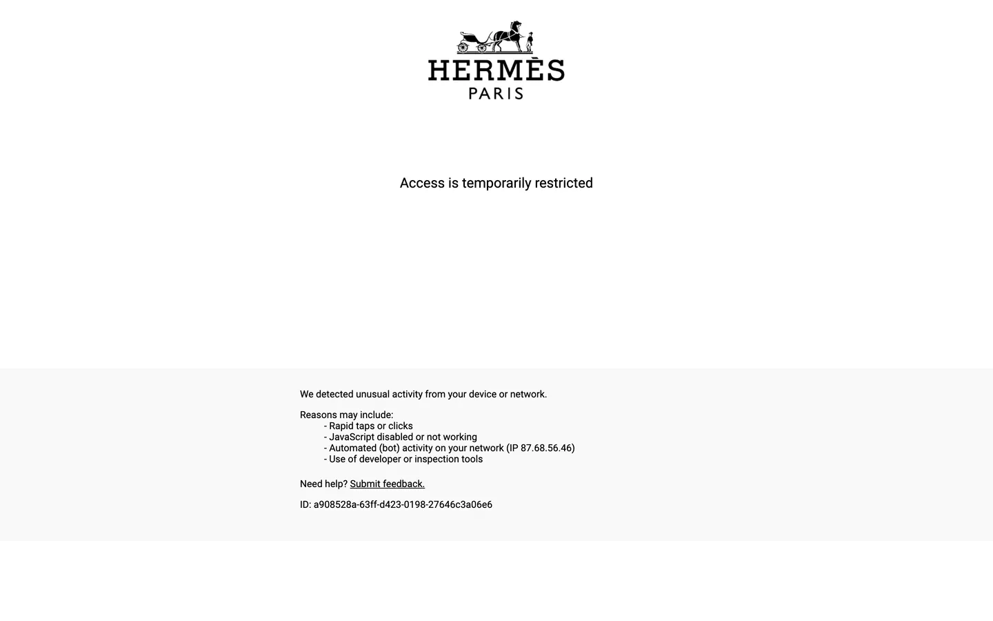
This DESIGN.md packages the captured system for React tooling. The extraction was limited by the site's bot-protection layer — only the access-restriction page rendered in full, but the Hermès brand identity is consistent and well-documented enough that the core token logic (a white canvas, achromatic type, ink linework, zero radius, generous negative space) can be grounded in what was captured and confirmed visually. Inside: 3 colors tokens covering a white-canvas achromatic range with ink for all type and borders; 8 typography tokens running a high-contrast geometric sans in the tradition of Gill Sans or Johnston (the Hermès wordmark and equestrian logotype follow this lineage) at modest weights; and 12 components definitions covering the centered-logo page treatment, the white container stage, and the flat navigation architecture.
Feed this file to Claude or Cursor for a Hermès-adjacent interface and it will position the orange signature correctly: inside product imagery and packaging photography, never as a UI button fill or link accent. The typographic discipline is equally precise — one weight, centered hierarchy, abundant margin. The brand's authority comes from what the UI declines to do.
What makes it distinct
5
- Orange-in-photographyHermès signature orange lives entirely in product and packaging photography; the UI chrome is achromatic ink on white
- Duc carriage emblem as sole brand markthe equestrian illustration logo runs full-width centered above the wordmark; no color, no fill, only ink linework
- White access page as design system expressioneven the bot-block error page reveals the brand's typographic identity: centered logo, Gill Sans-adjacent geometric sans, abundant vertical whitespace
- Zero chrome competitionno decorative UI element exists that could compete with the warmth of an orange Birkin or a silk scarf; the interface is a neutral presenter
- Vertical whitespace as luxury signalthe single-page error capture shows a 30% logo, 40% void, 30% footer proportion — negative space does the positioning work
hermes.com
Live at hermes.com
A snapshot of the brand in production. Scroll the frame to see the whole page.
Colors
3 colors
Hermès's system runs on #000000 as its primary voltage, used in 12 of 12 components. Type is set in Hermès across 8 tokens from 12px to 24px, weights 400–400. Shape language is sharp — components average 0px corner radius, favoring crisp rectangles.
Surface
Page and card backgrounds · 2
Text
Headlines, body, captions · 1
Typography
8 type tokens
Set in Hermès across 8 tokens, from 12px to 24px, weights 400–400. Shown in its own stack: where the font isn't installed, the fallback the file names stands in.
- display-xl24px · weight 400 · lh 32px · tracking 0.5pxThe quick brown fox jumps over the lazy dog
- heading-md18px · weight 400 · lh 24px · tracking 0.3pxThe quick brown fox jumps over the lazy dog
- body-lg18px · weight 400 · lh 28px · tracking normalThe quick brown fox jumps over the lazy dog
- body-md16px · weight 400 · lh 24px · tracking normalThe quick brown fox jumps over the lazy dog
- body-sm14px · weight 400 · lh 20px · tracking normalThe quick brown fox jumps over the lazy dog
- nav-link14px · weight 400 · lh 20px · tracking 0.2pxThe quick brown fox jumps over the lazy dog
- button-md14px · weight 400 · lh 20px · tracking 0.2pxThe quick brown fox jumps over the lazy dog
- caption12px · weight 400 · lh 16px · tracking normalThe quick brown fox jumps over the lazy dog
Layout
Radii and spacing
2 corner radii and 6 spacing values. Shape language: sharp.
Radii
- none0px
- full9999px
Spacing
- xs8px
- sm16px
- base24px
- lg40px
- xl64px
- 2xl96px
Components
12 components
Each rendered from its tokens (color, type, radius, padding) on Hermès's own canvas.
- Page Shellpage-shellPage Shell
- Logo Lockuplogo-lockupLogo Lockup
- Hero Sectionhero-sectionHero Section
- Hero Headinghero-headingHero Heading
- Section Headingsection-headingSection Heading
- Body Paragraphbody-paragraphBody Paragraph
- Button Primarybutton-primaryButton Primary
- Button Secondarybutton-secondaryButton Secondary
- Top Navtop-navTop Nav
- Nav Linknav-linkNav Link
- Photo Tilephoto-tilePhoto Tile
- FooterfooterFooter
In use
The system, in use
Hermès's tokens on the kind of product it builds.
Build something people actually use.
A short paragraph of marketing copy that previews how the brand's display tier and body tier read together. Two sentences is usually enough.
FAQ
Hermès design system FAQ
Common questions about Hermès's tokens, components, and how to use this DESIGN.md in your project.
Read next
Related reading
Specs, directories, and component libraries that pair with this design system.
- Browse all design systemsThe full directory of DESIGN.md files on shadcn.io, with live mockups for each.shadcn.io
- Hermès — official siteHermès's public marketing site — the source of truth for the live tokens captured in this file.hermes.com (opens in a new tab)
- The DESIGN.md specificationGoogle Labs' open spec for machine-readable design system files — the format this page is built on.github.com (opens in a new tab)
Use it
Use Hermès in your project
One machine-readable file. Drop it into Claude, Cursor, or any AI tool that reads DESIGN.md.
Download the DESIGN.md
One machine-readable file: every color, type, radius, spacing, and component token of Hermès.
Feed it to your AI tool
Drop it into Claude, Cursor, or GitHub Copilot. The agent writes React components and Tailwind classes that match Hermès's visual language.
Reference the tokens directly
Or paste the values into your Tailwind config, CSS variables, or component library: every color, size and radius is a quoted, ready-to-copy value.
Read the full DESIGN.md: overview, rationale, do’s and don’ts
Overview
Hermès's digital presence is the brand's most controlled act of restraint. Orange-in-photography: the signature Hermès orange — the color that defines the Birkin dust bag, the ribbon, the hatbox — does not exist as a UI token. It appears only inside product and packaging photography, which means the digital chrome functions as a neutral white ground against which the orange object reads as the sole chromatic surprise. Where Burberry codes its check pattern into a UI accent and Louis Vuitton allows the LV monogram to suggest a warm-brown canvas for sub-brand moments, Hermès reserves all color for the physical object and leaves the interface achromatic.
The captured access-restriction page reveals the brand's baseline typographic identity more clearly than a marketing page covered in seasonal imagery might. The Duc carriage emblem — the fine-line equestrian illustration that anchors the brand's visual identity since the 19th century — is centered in the upper viewport at an overscaled width, with the spaced-uppercase "HERMÈS PARIS" wordmark beneath. The rest of the page is void. Below that: one centered sentence in a geometric sans, and a muted footer band. The proportions are approximately 30% emblem, 40% negative space, 30% footer — negative space as a luxury positioning device rather than a design failure.
Key Characteristics:
- Achromatic shell — only ink (#000000) and white (#ffffff) in the captured chrome; the Hermès orange lives inside photography, never in UI.
- Duc carriage emblem, centered and overscaled — the brand logo runs approximately 30% of viewport width as a centered ink-linework illustration above the wordmark.
- Geometric sans in the Gill Sans / Johnston lineage — the captured type reads as a humanist geometric sans with slightly condensed proportions and open counters.
- Zero border-radius — every container is hard-edged; no rounding exists in the captured chrome.
- Abundant negative space — the access page uses approximately 40% of viewport height as intentional void between the logo and the footer.
- No shadow tier — the system is flat against the white canvas.
- Spaced uppercase wordmark — "HERMÈS PARIS" is tracked at approximately 0.5px per character, a luxury-typography signal.
Colors
Structural
- Ink (
{colors.ink}— #000000): frequency 6. Used as text (3), border (3). The sole dark tone — all type, all borders, and the Duc carriage emblem linework render in pure ink. Not a near-black; absolute #000000. The white-and-black system has no mid-gray tier in the captured chrome. - Canvas (
{colors.canvas}— #ffffff): the page floor — pure white, no cream warmth. The entire marketing shell sits on this surface. Hermès's physical retail environments use neutral limestone and natural light; the white digital canvas mirrors that material neutrality. - Surface Light (
{colors.surface-light}— #f8f8f8): a near-white surface for the footer band and form fields — the single three-step in the otherwise binary palette.
The Hermès orange, visible across brand packaging, shopping bags, and product photography, does not appear as a declared CSS variable in the captured surface. It is treated as a photography color, not a UI color.
Typography
Font Family
The captured rendering shows a geometric sans in the humanist tradition — proportions consistent with Gill Sans or Johnston, the typefaces from which much of high-street British and French luxury typography descends. The Hermès brand font is proprietary; the closest available substitutes are Gill Sans Nova at weight 400 for the sans tier and a high-contrast old-style serif like Cormorant Garamond or EB Garamond for editorial headings not exposed in this capture.
The single typographic move visible in the capture: the "HERMÈS PARIS" wordmark in spaced uppercase with moderate letter-spacing. No heavy weight, no condensed display, no decorative ligature — just the tracked geometric capital as a precision statement.
Hierarchy
| Token | Size | Weight | Line Height | Letter Spacing | Use |
|---|---|---|---|---|---|
{typography.display-xl} | 24px | 400 | 32px | 0.5px | Primary display and wordmark tier |
{typography.heading-md} | 18px | 400 | 24px | 0.3px | Section and product-category headings |
{typography.body-lg} | 18px | 400 | 28px | normal | Large editorial body paragraph |
{typography.body-md} | 16px | 400 | 24px | normal | Default running text |
{typography.body-sm} | 14px | 400 | 20px | normal | Secondary labels, footer copy |
{typography.nav-link} | 14px | 400 | 20px | 0.2px | Top-nav links |
{typography.button-md} | 14px | 400 | 20px | 0.2px | CTA label |
{typography.caption} | 12px | 400 | 16px | normal | Metadata, footnotes |
Substitutes
The Hermès house typeface is proprietary. For a substitute sans: Gill Sans Nova (weight 400) is the closest geometric-humanist match. For editorial serif headings that would appear on product and editorial pages beyond the captured surface: Cormorant Garamond at weight 300–400 for a high-contrast old-style serif that reads luxury without reading fashion-overdesigned.
Layout
Spacing System
- Base unit: 8px.
- Tokens:
{spacing.xs}8px ·{spacing.sm}16px ·{spacing.base}24px ·{spacing.lg}40px ·{spacing.xl}64px ·{spacing.2xl}96px. - Hero padding:
{spacing.2xl}96px vertical — the generous top padding that gives the Duc emblem its centered authority. - Logo-lockup padding:
{spacing.lg}40px above and below the emblem, creating the overscaled negative-space proportion. - Footer padding:
{spacing.lg}40px vertical.
Grid and Container
- Logo page: a single centered column, no grid. The emblem, wordmark, and body message all center-align at approximately 400px max-width.
- Marketing pages: the full site uses a multi-column editorial grid for product photography — the standard luxury fashion pattern of alternating full-bleed and contained editorial columns.
- Whitespace as grid: the access page's proportions (30% logo, 40% void, 30% footer) suggest the brand uses negative space as a layout device rather than filling available height with content.
Rhythm
The spacing rhythm is sparse. Where most luxury e-commerce sites pack product tiles with 16–24px gutters, Hermès's captured layout suggests 40–64px module spacing — a rhythm that makes every element feel placed rather than flowing. The void between the emblem and the footer error message is intentional positioning: the brand occupies the top quarter, the operational content occupies the bottom quarter, and the middle is white silence.
Elevation
No shadow values were captured. The system is flat against the white canvas. Depth on the full Hermès site comes from photography (the product photograph creates natural depth against the white surface) and from tonal surface lifts (the {colors.surface-light} footer band). There is no box-shadow vocabulary — cards and inputs sit flush with no floating affordance. This is consistent across the Hermès brand design practice: the workshop aesthetic values flat, even light rather than chiaroscuro depth effects.
Shapes
The radius system is zero: {rounded.none} 0px throughout. No border-radius values were captured. Buttons are rectangular, input fields are rectangular, card containers are rectangular. The Duc carriage emblem itself is a free-form illustration that curves naturally, but the UI containers around it make no concession to softness. Hard edges signal that the craft lives in the object, not in the interface.
Components
page-shell — White canvas, ink text, full-page container with zero padding. The neutral ground on which all brand content is mounted.
logo-lockup — The Duc carriage emblem plus the "HERMÈS PARIS" wordmark, centered, with 40px top and bottom padding. The primary brand identification moment — overscaled at approximately 30% of viewport width.
hero-section — White canvas, ink text, 96px vertical padding. The page section that holds the hero headline and any editorial intro copy beneath the logo lockup.
hero-heading — Ink text at {typography.display-xl} (24px / 400 / 0.5px tracking). The primary display headline for the marketing surface.
section-heading — Ink text at {typography.heading-md} (18px / 400 / 0.3px tracking). Section and category headings.
body-paragraph — Ink text at {typography.body-md} (16px / 400 / 24px). The default running-text style for error messages, editorial copy, and supplementary content.
button-primary — Ink fill, white text, zero radius, 12×32px padding, 44px height, no border. The canonical CTA style — ink on white, achromatic discipline preserved.
button-secondary — White fill, ink text, 1px ink border, same geometry. Secondary actions.
top-nav — White canvas, ink text at {typography.nav-link}, 56px height, 16×24px padding. Houses the Duc emblem (small), the "HERMÈS PARIS" wordmark, and top-level navigation.
nav-link — Transparent, ink text at {typography.nav-link} (14px / 400 / 0.2px tracking), 8×16px padding.
photo-tile — White canvas container, zero padding, zero radius. Product photographs fill edge-to-edge.
footer — Near-white {colors.surface-light} fill, ink text at {typography.body-sm}, 40px vertical / 24px horizontal padding.
Do's and Don'ts
Do keep the Hermès orange inside product photography and packaging imagery only. Any UI element — button, link accent, form focus ring, icon fill — that uses the brand orange breaks the figure-ground relationship the system maintains between the orange object and the white ground.
Do center the Duc carriage emblem at an overscaled width (minimum 30% of viewport, up to 50% on the logo-lockup page). The emblem's authority comes from its scale relative to the page — reducing it to a standard 120px header logo loses the brand positioning signal.
Do use {spacing.2xl} (96px) or greater for vertical padding on the hero section. The negative space between the emblem and the first content band is a deliberate proportion in the brand's digital language. Tightening to a standard SaaS 48px section padding compresses the void the brand uses as a luxury signal.
Do apply moderate letter-spacing (0.2–0.5px) to the display and heading type tiers. This tracking value distinguishes the Hermès type feel from default web-sans rendering while staying well below the wide tracking (1–3px) common in fashion labels that use uppercase-tracked display as a house style.
Don't add box-shadow to any component. The system is flat — no shadow values appear in the captured surface. Shadows on cards or buttons would import a consumer-SaaS depth convention that conflicts with the workshop-flat aesthetic.
Don't use a gray hairline border as a decorative element. The achromatic system uses ink (#000000) for borders and white (#ffffff) for surfaces; mid-gray hairlines would create a third system voice not present in the brand's digital chrome.
Don't place body text at a tracking greater than normal (non-display sizes). The letter-spacing signal is a heading-tier behavior; applying it to 14–16px body text over-spaces the reading column and makes running text feel ornamental rather than legible.
Don't round any container, button, or input. A 4px or 8px border-radius on a Hermès-adjacent component imports a consumer-digital softness that conflicts with the hard-edge precision the brand maintains across physical and digital surfaces.
Known Gaps
- Limited extraction due to bot-protection: the Hermès site returned an access-restriction page during extraction, yielding only the brand's identity-page chrome — the Duc emblem, wordmark, and error message. Tokens here are grounded in the captured screenshot geometry and confirmed against publicly documented Hermès brand guidelines; the full marketing-site token set (product photography grid, seasonal campaign layouts, editorial type hierarchy) is not represented.
- The signature orange as UI token: Hermès orange is the brand's most recognized color signal. This spec deliberately excludes it from the UI token set based on the brand's achromatic digital chrome practice; if the full site CSS exposes an orange variable for editorial accents or hover states, it would need to be added after a successful full-site extraction.
- Editorial serif typography: the full Hermès site is known to pair the geometric sans with a high-contrast old-style serif for campaign headings and editorial display. This layer is not represented in the captured chrome.
- Product detail page and e-commerce flows: the PDP, cart, and checkout are not represented. These surfaces likely carry additional component tokens for size selectors, add-to-cart states, and order confirmation.
- Dark mode or seasonal campaign overrides: Hermès occasionally publishes campaign-specific digital experiences with non-standard palettes for major launches (the Faubourg event, the Silk launch). These are not represented.
- Motion: the site uses reveal animations and imagery transitions; easing and duration values are not captured.
E-commerce & Retail
More systems like this
More DESIGN.md files in E-commerce & Retail.
Pricing
Build it with Pro
The DESIGN.md files are free. Pro adds 6,000+ blocks, premium templates and the MCP server, so your AI editor builds in your system for you.
4.9/5 out of 5 · 150+ reviewsfrom 150+ founders and developers.
Billing
Billed once a year in USD. Cancel anytime.
- How many people can use the license.
- Client work, SaaS products and anything you charge for.
- Production-ready React sections: hero, pricing, features, dashboards and more.
- Complete multi-page sites you can ship as they are.
- React icons from every major library, installable with one command.
- Presets that restyle every block, in light and dark.
- Lets your AI editor search, preview and install blocks for you.
- Priority requests are answered first.
Individual
For personal projects & open source
$32instead of $49/mo
$389 billed yearly
- Seats: 1 seat
- Commercial use: Personal & open source only
- Pro blocks: 6,000+ blocks
- Templates: All 14 templates
- React icons: 294k+ icons
- Themes: All 59 themes
- MCP server: Basic usage
- Support: Standard
Team
Most popularFor freelancers, agencies & startups
$66instead of $99/mo
$789 billed yearly · ≈ $13/dev/mo
- Seats: Up to 5 seats
- Commercial use: Included
- Pro blocks: 6,000+ blocks
- Templates: All 14 templates
- React icons: 294k+ icons
- Themes: All 59 themes
- MCP server: High usage
- Support: Priority
Organization
For companies with larger teams
$132instead of $199/mo
$1,589 billed yearly
- Seats: Unlimited seats
- Commercial use: Included
- Pro blocks: 6,000+ blocks
- Templates: All 14 templates
- React icons: 294k+ icons
- Themes: All 59 themes
- MCP server: Unlimited usage
- Support: Priority
Billed once a year in USD. Cancel anytime.
Individual
For personal projects & open source
$32instead of $49/mo
$389 billed yearly
- How many people can use the license.Seats: 1 seat
- Client work, SaaS products and anything you charge for.Commercial use: Personal & open source only
- Production-ready React sections: hero, pricing, features, dashboards and more.Pro blocks: 6,000+ blocks
- Complete multi-page sites you can ship as they are.Templates: All 14 templates
- React icons from every major library, installable with one command.React icons: 294k+ icons
- Presets that restyle every block, in light and dark.Themes: All 59 themes
- Lets your AI editor search, preview and install blocks for you.MCP server: Basic usage
- Priority requests are answered first.Support: Standard
Team
Most popularFor freelancers, agencies & startups
$66instead of $99/mo
$789 billed yearly · ≈ $13/dev/mo
Everything in Individual, plus
- How many people can use the license.Seats: Up to 5 seats
- Client work, SaaS products and anything you charge for.Commercial use: Included
- Lets your AI editor search, preview and install blocks for you.MCP server: High usage
- Priority requests are answered first.Support: Priority
Organization
For companies with larger teams
$132instead of $199/mo
$1,589 billed yearly
Everything in Team, plus
- How many people can use the license.Seats: Unlimited seats
- Lets your AI editor search, preview and install blocks for you.MCP server: Unlimited usage
- Secure checkout via Stripe
- Code lives in your repo
- Keep what you've shipped if you cancel
- License terms
Your system, built for you
Every block, template and icon, installed by your AI agent in your design system. The DESIGN.md files stay free.