Gymshark Design System
Gymshark's marketing site is gym-photography first, with Montserrat hero displays scaling to 180px. Black ink chrome, pill CTAs, Roboto body. Tokens for React, Next.js, and AI coding tools.
Add shadcn.io to your AI agent. · Pro It installs blocks, icons and templates in your design system from a prompt, with Pro.
Set up MCP- Primary
- #1b1b1b
- Typeface
- Montserrat
- Shape
- Soft
- Base radius
- 8px
- Colors
- 14
- Type tokens
- 13
- Components
- 17
- Spacing values
- 10
About
About Gymshark DESIGN.md
Curated by Dov Azencot · Updated May 18, 2026 · Source gymshark.com (opens in a new tab)
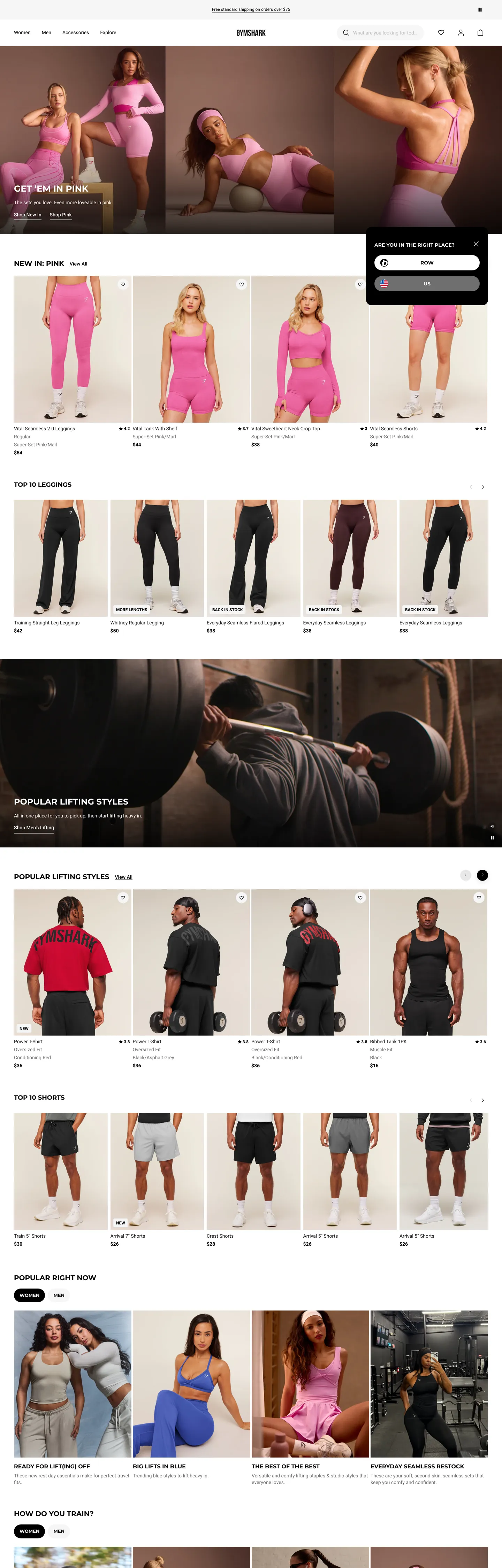
Gymshark's marketing site does what fitness DTC brands typically only attempt in print: it scales display typography to billboard sizes inside a browser viewport. The CSS exposes `--hero-title-font-size-h1: 18rem` — a 180px Montserrat hero at weight 700 uppercase, sitting against a full-bleed photograph of an athlete mid-lift. The rest of the chrome retreats: Roboto at 14px for every running paragraph, a black ink color used 2365 times across text and border, and a white canvas that lets the photography carry the brand voice. Where Lululemon paints soft gradient overlays on its hero imagery and where Alo Yoga uses a perfectly rectangular black CTA, Gymshark commits to a fully-rounded pill — `--rounded-corners-button: 5rem` renders every primary CTA as a 40-50px capsule — and lets the display typography do the dramatic work the chrome would otherwise carry.
The DESIGN.md file packages the system into a machine-readable spec for React tooling. Inside: 14 colors tokens drawn from the 40 distinct values the page renders — almost all of them either pure black ink (the dominant text and border at 2365 occurrences), pure white canvas, or a six-step grey scale wired through `--particles-color-grey-{50,100,200,300,500,600,700,800,900,950}`, plus one sale-red #bf2e35 used for discount prices and validation errors. 12 typography tokens running Montserrat at the display tier (180px / 128px / 96px / 80px / 64px / 32px headlines), Roboto at the body tier (14px workhorse running text), with Bebas Neue and Druk Condensed Super declared as condensed promotional voices for sale-band callouts. 6 corner-radius tokens spanning a binary scale: 2-8px for cards and 50px for pill CTAs and category chips, with 50% for circular brand-dot icons. 17 components definitions covering the pill CTA, the pill search input, hero photography panels, the 4-up athlete product grid, sale-price strips, and the persistent free-shipping promo banner.
Feed this file to Claude or Cursor and it will reproduce Gymshark's specific moves: full-bleed athlete photography per band, billboard-scale Montserrat displays, monochrome chrome with one sale-red voltage, pill CTAs over photography, and the discipline of keeping every color choice inside a `--particles-*` token family. Treat it as a reference rather than a clone target. The one move worth borrowing only if your category is athletic or fashion is the billboard-display rule — 180px headlines need photography behind them strong enough to anchor the type, otherwise the size reads as gratuitous. For most SaaS, holding display at 56-72px is safer; for performance apparel, this is the move.
What makes it distinct
5
- Display tier to 180pxMontserrat weight 700 uppercase at the --hero-title-font-size-h1 token reaches 18rem, the largest display step in the directory
- Pill CTA over photography--rounded-corners-button: 5rem renders every primary CTA as a 40-50px fully-rounded capsule that sits white-on-black or black-on-white
- Four display familiesMontserrat for body display, Bebas Neue and Druk Condensed Super and Anton declared as condensed promotional voices, Roboto for every running-text job
- Monochrome chrome plus one sale-red#bf2e35 wired as --color-text-sale and --color-foreground-error is the single non-grey brand voltage in the captured page
- Particles design tokensevery color, spacing, and typography value flows through a --particles-* CSS-custom-property family, exposing the same design tokens at runtime
gymshark.com
Live at gymshark.com
A snapshot of the brand in production. Scroll the frame to see the whole page.
Colors
14 colors
Gymshark's system anchors on #1b1b1b (ink-hovered) as its primary color. Type is set in Montserrat across 13 tokens from 12px to 180px, weights 400–700. Shape language is soft — components average 29px corner radius, with no sharp interactive edges.
Brand & Accent
Sparing, CTA-only voltage · 1
Surface
Page and card backgrounds · 1
Text
Headlines, body, captions · 7
Borders & Hairlines
Dividers, outlines, rules · 2
Other
Specialty colors · 3
Typography
13 type tokens
Set in Montserrat across 13 tokens, from 12px to 180px, weights 400–700. Shown in its own stack: where the font isn't installed, the fallback the file names stands in.
- display-billboard180px · weight 700 · lh 162pxThe quick brown fox jumps over the lazy dog
- display-xxl128px · weight 700 · lh 115pxThe quick brown fox jumps over the lazy dog
- display-xl96px · weight 700 · lh 86pxThe quick brown fox jumps over the lazy dog
- display-lg64px · weight 700 · lh 58pxThe quick brown fox jumps over the lazy dog
- display-md32px · weight 700 · lh 40pxThe quick brown fox jumps over the lazy dog
- heading-lg25px · weight 700 · lh 30pxThe quick brown fox jumps over the lazy dog
- heading-md20px · weight 700 · lh 24pxThe quick brown fox jumps over the lazy dog
- heading-sm16px · weight 700 · lh 19.2pxThe quick brown fox jumps over the lazy dog
- body-md14px · weight 400 · lh 21pxThe quick brown fox jumps over the lazy dog
- body-md-bold14px · weight 700 · lh 19pxThe quick brown fox jumps over the lazy dog
- body-sm12px · weight 700 · lh 18pxThe quick brown fox jumps over the lazy dog
- button-md13px · weight 700 · lh 15.6pxThe quick brown fox jumps over the lazy dog
- nav-link14px · weight 500 · lh 21pxThe quick brown fox jumps over the lazy dog
Layout
Radii and spacing
6 corner radii and 10 spacing values. Shape language: soft.
Radii
- none0px
- xs2px
- sm4px
- md8px
- pill50px
- full9999px
Spacing
- xxs2px
- xs4px
- sm6px
- base8px
- md16px
- lg24px
- xl32px
- 2xl40px
- 3xl64px
- 4xl80px
Components
17 components
Each rendered from its tokens (color, type, radius, padding) on Gymshark's own canvas.
- Button Primarybutton-primaryButton Primary
- Button Primary Inversebutton-primary-inverseButton Primary Inverse
- Button Secondarybutton-secondaryButton Secondary
- Search Pillsearch-pillSearch Pill
- Top Navtop-navTop Nav
- Nav Linknav-linkNav Link
- Promo Bannerpromo-bannerPromo Banner
- Hero Bandhero-bandHero Band
- Hero Headinghero-headingHero Heading
- Hero Heading Mdhero-heading-mdHero Heading Md
- Section Headingsection-headingSection Heading
- Product Tileproduct-tileProduct Tile
- Product Titleproduct-titleProduct Title
- Price Stripprice-stripPrice Strip
- Sale Pricesale-priceSale Price
- Category Cardcategory-cardCategory Card
- Filter Chipfilter-chipFilter Chip
In use
The system, in use
Gymshark's tokens on the kind of product it builds.
Build something people actually use.
A short paragraph of marketing copy that previews how the brand's display tier and body tier read together. Two sentences is usually enough.
FAQ
Gymshark design system FAQ
Common questions about Gymshark's tokens, components, and how to use this DESIGN.md in your project.
Read next
Related reading
Specs, directories, and component libraries that pair with this design system.
- Browse all design systemsThe full directory of DESIGN.md files on shadcn.io, with live mockups for each.shadcn.io
- Gymshark — official siteGymshark's public marketing site — the source of truth for the live tokens captured in this file.gymshark.com (opens in a new tab)
- The DESIGN.md specificationGoogle Labs' open spec for machine-readable design system files — the format this page is built on.github.com (opens in a new tab)
Use it
Use Gymshark in your project
One machine-readable file. Drop it into Claude, Cursor, or any AI tool that reads DESIGN.md.
Download the DESIGN.md
One machine-readable file: every color, type, radius, spacing, and component token of Gymshark.
Feed it to your AI tool
Drop it into Claude, Cursor, or GitHub Copilot. The agent writes React components and Tailwind classes that match Gymshark's visual language.
Reference the tokens directly
Or paste the values into your Tailwind config, CSS variables, or component library: every color, size and radius is a quoted, ready-to-copy value.
Read the full DESIGN.md: overview, rationale, do’s and don’ts
Overview
Gymshark's marketing site commits to a single typographic move that no other apparel brand in the directory attempts. Billboard display: the CSS exposes --hero-title-font-size-h1: 18rem — a 180px Montserrat hero at weight 700 uppercase — and 128 / 96 / 80 / 64 / 32px steps beneath it. The rest of the chrome retreats around this scale. Body text runs at 14px Roboto / 400, the canvas is pure white ({colors.canvas} — #ffffff), and the only color voltage in the entire chrome is black ink ({colors.ink} — #000000) carrying 2365 occurrences across text and border. Where Lululemon overlays gradient washes on its photography and where Alo Yoga uses a perfectly rectangular black CTA to anchor its editorial composition, Gymshark trusts the billboard-scale type to do the dramatic work the chrome would normally carry — and softens the tactile target with a fully-rounded pill CTA underneath.
The shape language is binary: card-square or button-pill. Cards use {rounded.xs} 2px (60 occurrences), {rounded.sm} 4px (18 occurrences) for product tiles and filter outlines, {rounded.md} 8px (1 occurrence) for category cards. CTAs and search inputs use {rounded.pill} 50px — wired in CSS as --rounded-corners-button: 5rem — for a fully-rounded capsule treatment at 40-50px height. The 56px outliers in the radius extraction are larger pill variants for hero-band CTAs. There is no 12 / 16 / 20 / 24px middle tier; the system holds the line between near-square card chrome and fully-rounded tap surfaces.
Typography runs four display families and one body family. Montserrat at weight 700 uppercase carries every hero, section heading, and product-section title from 25px up to 180px. Bebas Neue, Druk Condensed Super, and Anton are declared in --font-family-bebas-neue, --font-family-druk-condensed-super, --font-family-anton as condensed-display voices for sale-band promotional callouts. Roboto at 14px / 400 carries every running paragraph (76 captured occurrences), every product description, every nav link, every caption. The system runs a strict typographic split: condensed display families speak in headlines, Roboto handles every paragraph job. There is no serif tier, no monospace voice.
Key Characteristics:
- Billboard display scale —
--hero-title-font-size-h1: 18rem(180px) at Montserrat weight 700 uppercase, the largest display step in the 198-entry directory. - Monochrome chrome plus one sale-red —
{colors.ink}(#000000) at 2365 occurrences;{colors.sale-red}(#bf2e35) reserved for discount prices and form-validation errors. - Pill CTA discipline —
{rounded.pill}50px renders every primary CTA as a 40-50px fully-rounded capsule, regardless of whether it sits over photography (white-on-black) or beside it (black-on-white). - Four display families + Roboto body — Montserrat for the main display tier, Bebas Neue / Druk Condensed Super / Anton as supporting condensed voices, Roboto for every running-text job at 14px / 400.
- Particles design-token family — every color, spacing, and typography value carries a
--particles-*CSS-custom-property alias, exposing the same design tokens at runtime alongside semantic aliases. - 10-step grey scale —
{colors.ink}(#000000) through{colors.canvas}(#ffffff) with named stops at 100/200/300/350/400/500/600/700/800/850/900/950, giving precise control over text contrast against photography. - Photography-anchored bands — full-bleed athlete imagery carries every hero and category section; the chrome is the white canvas between bands plus the display type sitting on the photography.
- Persistent black promo banner —
{component.promo-banner}at the top of every page in{typography.body-sm}(12px / 700 uppercase), carrying free-shipping and student-discount callouts.
Colors
Ink
- Ink (
{colors.ink}— #000000): frequency 2365. Used as text (1183), border (1168), background (8), shadow (4), gradient (2). The dominant tone in the system — every body paragraph, product title, nav link, hairline divider, and the fill on primary CTAs. Wired as--particles-color-brand-black,--color-foreground-first,--color-text-primary,--color-icon-default,--color-border-active. There is no near-black variant in active use; the system uses #000000 directly. - Ink Hovered (
{colors.ink-hovered}— #1b1b1b): frequency 80. Used as text (40) and border (40). Wired as--particles-color-grey-900,--color-foreground-hovered. The hover-state text and border tone, one step lighter than ink. - Ink Deep (
{colors.ink-deep}— #111111): frequency 8, split text and border. Wired as--particles-color-grey-950. The deepest grey in the scale, used for emphasized headings and active-press borders. - Ink Soft (
{colors.ink-soft}— #3a3a3c): frequency 0 in the captured render but declared as--particles-color-grey-800. Reserved for dark-mode contexts not visible on the marketing chrome.
Text
- Ink Grey (
{colors.ink-grey}— #444444): frequency 137. Used as text (69) and border (68). Wired as--color-text-secondary,--particles-color-grey-700. The secondary text tone — product descriptions, "View all" links, footer copy. - Ink Muted (
{colors.ink-muted}— #53565a): frequency 64. Used as text (32) and border (32). Wired as--particles-color-grey-600,--color-foreground-second. The tertiary text tone for inactive nav links and metadata strips. - Muted (
{colors.muted}— #6e6e6e): frequency 95. Used as text (47), border (47), background (1). Wired as--color-text-tertiary,--particles-color-grey-500,--color-collection_swatches-grey,--color-foreground-third. The lightest readable text tone — disclaimer rows, sale-period sublabels, footnote text.
Hairline and disabled
- Hairline (
{colors.hairline}— #e7e7e7): frequency 60, all as background. Wired as--color-foreground-fifth,--particles-color-grey-200,--color-border-secondary. The off-white divider tone for card outlines and product-tile separators. Also the search-pill fill. - Hairline Strong (
{colors.hairline-strong}— #cfcfcf): frequency 8, split text and border. Wired as--particles-color-grey-350. A slightly darker hairline used on focused inputs and emphasized dividers. - Disabled (
{colors.disabled}— #bbbcbc): frequency 2. Used as text and border. Wired as--color-border-primary,--particles-color-grey-300,--color-icon-disabled,--color-text-disabled. The disabled-state surface and text tone.
Canvas
- Canvas (
{colors.canvas}— #ffffff): frequency 137. Used as background (51), border (43), text (43). Wired as--color-page-primary,--particles-color-brand-white,--particles-color-grey-50,--color-text-inverse. The page floor, the inverse text color on photography overlays, and the secondary-page background.
Brand voltage
- Sale Red (
{colors.sale-red}— #bf2e35): frequency 2, split text and border. Wired as--particles-color-red-400,--color-foreground-error,--color-icon-error,--color-text-error,--color-text-sale. The single non-monochrome color in the chrome — used exclusively for discount prices ("Was $50, Now $35") and form-validation errors. The semantic overlap (error tone = sale tone) is deliberate: both signal urgency. - Accent Blue (
{colors.accent-blue}— #007db5): frequency 0 in the captured chrome but declared as--color-icon-accent,--color-border-accent,--color-text-accent,--particles-color-blue-400,--color-foreground-accent. Reserved for status-information icons and link-accent surfaces; not visible on the captured marketing page. - Staff Gold (
{colors.staff-gold}— #ba935f): frequency 0 in the captured chrome but declared as--color-icon-staff,--color-border-staff. The badge color for staff and Black Friday partner accounts.
Typography
Font Families
The system runs Montserrat for every display surface (hero, section heading, product-section title, button label, h1-h5), with Roboto for every body surface (paragraph, caption, nav link, product description, price strip). Three additional condensed-display families are declared in CSS — --font-family-bebas-neue: Bebas Neue, Helvetica, Arial, sans-serif, --font-family-druk-condensed-super: Druk Condensed Super, Helvetica, Arial, sans-serif, --font-family-anton: Anton, Montserrat, Helvetica, Arial, sans-serif — but their captured render frequency is 0; they appear to be reserved for sale-band campaign typography that activates on promotional events rather than steady-state marketing chrome.
The pairing of geometric-sans display + neutral-grotesque body is closer to a sportswear flagship store catalog than a typical e-commerce site. Where Stripe runs Sohne-var for everything and where Spline runs Spline Sans across every tier, Gymshark splits clearly between the display family (Montserrat, always weight 700 uppercase) and the body family (Roboto, always weight 400-500 sentence-case).
Hierarchy
| Token | Size | Weight | Line Height | Use |
|---|---|---|---|---|
{typography.display-billboard} | 180px | 700 | 162px | Hero h1 on lookbook bands (--hero-title-font-size-h1: 18rem) |
{typography.display-xxl} | 128px | 700 | 115px | Hero h2 on campaign bands (--hero-title-font-size-h2: 12.8rem) |
{typography.display-xl} | 96px | 700 | 86px | Hero h3 (--hero-title-font-size-h3: 9.6rem) |
{typography.display-lg} | 64px | 700 | 58px | Hero h5 (--hero-title-font-size-h5: 6.4rem) |
{typography.display-md} | 32px | 700 | 40px | Standard h1 outside the hero (--heading-font-size-h1: 3.2rem) |
{typography.heading-lg} | 25px | 700 | 30px | Section h2 ("POPULAR LIFTING STYLES") |
{typography.heading-md} | 20px | 700 | 24px | h5 product-section titles ("WORK FOR THE FAMOUS HER") |
{typography.heading-sm} | 16px | 700 | 19.2px | h3 category-card titles ("LEGGINGS", "JOGGERS") |
{typography.body-md} | 14px | 400 | 21px | Default running text, product descriptions |
{typography.body-md-bold} | 14px | 700 | 19px | Product titles, emphasized labels, price strips |
{typography.body-sm} | 12px | 700 | 18px | Persistent black promo-banner copy (uppercase) |
{typography.button-md} | 13px | 700 | 15.6px | Pill CTA labels (uppercase) |
{typography.nav-link} | 14px | 500 | 21px | Top-nav link labels (sentence case) |
Principles
Display weight is always 700. Where Spline holds display at weight 500 and Stripe at weight 300 as a confidence move, Gymshark commits to weight 700 across every display tier — confidence by mass, not by restraint. Combined with the billboard scale, this creates the system's most distinctive characteristic: a single hero band can carry typography that is roughly 14x larger than the body text beneath it (180px display over 14px body). The aspect ratio is the message: this is performance apparel, sold at billboard scale.
Body text holds at 14px / 400 across nearly every running paragraph. The 14px choice (rather than 16px) makes the display tier feel larger by comparison and signals catalog-density: product descriptions, filter labels, and disclaimer rows all sit at the same reading size, making the page scan as a dense product catalog rather than a thin marketing landing.
Note on Font Substitutes
Montserrat, Bebas Neue, Roboto, and Anton are all free Google Fonts and can be used directly. Druk Condensed Super is a Commercial Type license; the closest open-source substitute is Bebas Neue at the same weight (Bebas is already declared as the second condensed family in Gymshark's CSS), or Big Shoulders Display for a slightly wider condensed grotesque.
Layout
Spacing System
- Base unit: 8px — the dominant gap value, appearing 34 times in the captured page (with 6px and 16px at 40 and 42 occurrences respectively, used at finer and coarser modules).
- Tokens:
{spacing.xxs}2px ·{spacing.xs}4px ·{spacing.sm}6px ·{spacing.base}8px ·{spacing.md}16px ·{spacing.lg}24px ·{spacing.xl}32px ·{spacing.2xl}40px ·{spacing.3xl}64px ·{spacing.4xl}80px. - Section padding (vertical): ~64-80px between major bands, with
--spacing-100(100px) and--spacing-120(120px) declared for hero bands. - Top-nav padding: ~64px horizontal (
--base-page-margin: 4rem), with 105px total nav-and-menu height (--nav-and-menu-height-desktop: 10.5rem). - Card internal padding: 16-24px on category cards; 0 on product tiles (the photograph fills edge-to-edge).
Grid & Container
- Max content width:
--content-max-width: 3000px— wider than typical SaaS sites, designed to host billboard-scale display type and large 4-up product grids on ultrawide displays. - Hero bands: full-bleed photography, edge-to-edge.
- Product grid: 4-up at desktop showing athlete-photographed product tiles, with model imagery cropped to a tall portrait ratio. Each tile carries the product title, price strip, and a small swatch row beneath.
- Category strip: 5-up grid of cropped athlete shots in category-card containers, with a small section title above each.
Rhythm
The page alternates between immersive hero and catalog grid bands. A 180px-display hero band sits above a 4-up product grid, which sits above another 5-up category strip, which sits above another full-bleed hero. The hero bands carry the typographic and atmospheric weight; the product grids are dense, photo-anchored, and rhythmic — every product tile is the same width and shares the same caption format. There are no atmospheric gradients between bands; transitions are sharp.
Elevation
The system declares three shadow levels in CSS — --box-shadow-small: 0 4px 15px 0 rgba(0,0,0,0.1), --box-shadow-large: 0 4px 60px 0 rgba(0,0,0,0.1), --box-shadow-top: 0 -4px 15px 0 rgba(0,0,0,0.1) — but the captured page renders almost entirely without shadow. The 4 captured #000000 shadow occurrences are reserved for the dropdown menus and the sticky add-to-cart bar.
- Flat (no shadow): hero bands, product tiles, category strips, footer — 99% of surfaces.
- Card lift:
{component.category-card}carries a 1px{colors.hairline}border with no shadow; depth comes from the hairline outline alone. - Top-nav: flat against the page top, with a 1px
{colors.hairline}bottom rule rather than a drop shadow. - Dropdown elevation: account / cart / search dropdowns use
--box-shadow-smallfor a soft 4px shadow with 15px blur.
Shapes
The radius scale is binary: small-card or full-pill:
- Card tier:
{rounded.xs}2px (--rounded-corners-small),{rounded.sm}4px (--rounded-corners-standard, 18 captured occurrences),{rounded.md}8px (--rounded-corners-large, 1 occurrence). Used on product tiles, filter outlines, category cards, dropdown surfaces. - Pill tier:
{rounded.pill}50px (--rounded-corners-button: 5rem, 8 captured occurrences) — every primary CTA, every search input, every category filter chip. The 56px outliers in the radius extraction (4 occurrences) are larger pill variants for hero-band CTAs. - Circular:
{rounded.full}50% — 48 captured occurrences, used on social-share icons, account avatars, and brand-dot indicators. - No middle tier: the system skips 12 / 16 / 20 / 24px entirely. Either a surface is nearly square (2-8px) or it is fully pill (40-56px); there is no rounded-but-not-pill option.
The pill treatment is the warmest surface in the system. On a page dominated by billboard-scale display type and photography, the rounded-bubble CTA reads as the most approachable, most tappable element — the single moment of softness against an otherwise editorial-flat composition.
Components
button-primary — The signature CTA. Black {colors.ink} fill, white text, {rounded.pill} 50px radius, 12x24 padding, 48px height. 13px / weight 700 uppercase Montserrat. "ADD TO BAG" and "SHOP NOW" are canonical instances; sits over photography or beside product tiles.
button-primary-inverse — White {colors.canvas} fill, black text, same pill radius and dimensions. Used over dark photography where the black-fill primary would disappear into the background.
button-secondary — Transparent fill, black text, 1px {colors.ink} border, {rounded.pill} pill, 48px height. Used for "FIND OUT MORE" and tertiary actions on category bands.
search-pill — {colors.hairline} (#e7e7e7) fill, black text in {typography.body-md}, {rounded.pill} 50px radius, 11x16 padding, 44px height. The persistent "What are you looking for today?" search bar in the top nav.
top-nav — White {colors.canvas} surface, 105px total height (--nav-and-menu-height-desktop), 16x64 padding. Gymshark wordmark center-left, the search-pill center-right, account / wishlist / cart icons flush right. A 1px {colors.hairline} bottom rule separates the nav from the photography band below.
nav-link — Transparent background, {colors.ink-muted} (#53565a) text at {typography.nav-link} (14px / 500). 12px horizontal padding. Sentence-case (unlike the uppercase display tier) — the only visible nav-label treatment in the captured page.
promo-banner — Black {colors.ink} fill, white text at {typography.body-sm} (12px / 700 uppercase). 8x16 padding. The persistent top strip carrying free-shipping callouts and student-discount messaging.
hero-band — White {colors.canvas} background that hosts full-bleed photography. 0 padding, 0 border-radius. Carries the billboard-scale display type over the imagery.
hero-heading — White text on photography overlay at {typography.display-billboard} (180px / 700 / 162px line-height). 0 padding. The largest typographic moment in the directory.
hero-heading-md — Black {colors.ink} text at {typography.display-md} (32px / 700). Used for the standard h1 outside hero bands ("Workout Clothes & Gym Clothes").
section-heading — Black text at {typography.heading-md} (20px / 700 uppercase). Used for "NEW IN", "POPULAR WITH NEW ARRIVALS", "GIRL MATH" — every product-section title between bands.
product-tile — White {colors.canvas} background, 0 padding, {rounded.none} 0px radius. The athlete photograph fills the tile edge-to-edge at a tall portrait ratio (typically 4:5), with a thin caption row below carrying product title and price strip.
product-title — Black {typography.body-md} (14px / 400 capitalize) text. 8px vertical padding. Sits beneath the product imagery as a 1-2 line caption.
price-strip — Black {typography.body-md-bold} (14px / 700) text. Carries the active price; when on sale, runs adjacent to a {component.sale-price} strikethrough in {colors.sale-red}.
sale-price — Red {colors.sale-red} (#bf2e35) text at {typography.body-md-bold}. The single non-monochrome typographic moment on the page — used exclusively for discount prices.
category-card — White {colors.canvas} surface, 1px {colors.hairline} border, {rounded.md} 8px radius, 16px internal padding. Houses a small heading and an athlete-photo thumbnail. The single non-pill, non-rectangle component in the system.
filter-chip — White {colors.canvas} fill, black text in {typography.body-md}, 1px {colors.hairline} border, {rounded.pill} 50px radius, 5x8 padding, 32px height. The persistent collection-filter strip ("Sort by", "Size", "Color", "Price") on category pages.
Do's and Don'ts
Do scale the hero display to billboard sizes — {typography.display-billboard} (180px / 700) over full-bleed photography is the canonical hero treatment. The 180px choice requires imagery strong enough to anchor the type; without photography behind it, the size reads as gratuitous.
Do keep every CTA as a fully-rounded pill at {rounded.pill} 50px. The system is binary — card chrome stays near-square (2-8px), tappable surfaces go to full pill. Adding a 12 / 16 / 20px middle radius softens the contrast between the two tiers and weakens the tactile distinction.
Do reserve {colors.sale-red} (#bf2e35) exclusively for discount pricing and form-validation errors. The semantic overlap (error tone = sale tone) is intentional — both signal urgency, and using the red for any decorative or accent purpose dilutes the urgency signal.
Do route every color reference through the --particles-color-* token family in production CSS. Hard-coded hex values bypass the design-token system; using --particles-color-brand-black instead of #000000 keeps the token surface ready for theme variation and design-system evolution.
Don't use Montserrat for body text or running paragraphs. The display tier is Montserrat at weight 700 uppercase; the body tier is Roboto at weight 400 sentence-case. Mixing the families breaks the typographic split that carries the entire hierarchy.
Don't soften the pill CTAs to a 16 or 24px radius. The 50px (--rounded-corners-button: 5rem) pill is the canonical tap target — a softer rounding reads as a generic SaaS button and loses the catalog-flagship voice.
Don't use {colors.hairline} (#e7e7e7) as a text color or large background fill — it is a border-and-divider token (60 captured occurrences, all backgrounds-as-dividers and outlines). For body text use {colors.ink-grey} or {colors.muted}; for surfaces use {colors.canvas} white.
Don't introduce atmospheric gradients between bands. Every section terminates on {colors.canvas} white; depth comes from photography contrast and from the 1px {colors.hairline} divider rules between cells, not from background-color shifts.
Known Gaps
- Hover and focus states: the captured marketing chrome documents resting states only. Hover fills, focus rings, active-press tints, and disabled treatments for
{component.button-primary},{component.filter-chip}, and{component.nav-link}are not captured. - Form input error states: the captured page exposes no dedicated form input. Search uses the pill-input pattern; the checkout, address, and account forms with full validation chrome live inside the purchase flow.
- Dark mode: the captured surfaces are light-only. CSS declares
--system-dark-color-whiteand other dark-mode token aliases, but the dark variant is not rendered in the captured marketing page. - Motion: the homepage hosts horizontal-scroll product carousels and parallax photography bands; the spec captures end-state values only. Easing curves, scroll-snap behavior, and autoplay timing live in the live page runtime.
- Condensed display families: Bebas Neue, Druk Condensed Super, and Anton are declared in CSS but their captured render frequency is 0. They appear to be reserved for sale-band promotional campaigns (Black Friday, Cyber Monday) rather than steady-state marketing chrome.
- Product surfaces: this DESIGN.md captures the marketing site only. The PDP (product-detail page), checkout, account, wishlist, and Girl Math sub-brand surfaces carry richer state matrices, size-selector chrome, and form-validation styles that are not represented here.
- Sale-band typography: sale and campaign bands ship with a different display family stack (likely Druk Condensed Super or Anton at billboard sizes) that activates only during promotional events; the captured page does not render these variants.
E-commerce & Retail
More systems like this
More DESIGN.md files in E-commerce & Retail.
Pricing
Build it with Pro
The DESIGN.md files are free. Pro adds 6,000+ blocks, premium templates and the MCP server, so your AI editor builds in your system for you.
4.9/5 out of 5 · 150+ reviewsfrom 150+ founders and developers.
Billing
Billed once a year in USD. Cancel anytime.
- How many people can use the license.
- Client work, SaaS products and anything you charge for.
- Production-ready React sections: hero, pricing, features, dashboards and more.
- Complete multi-page sites you can ship as they are.
- React icons from every major library, installable with one command.
- Presets that restyle every block, in light and dark.
- Lets your AI editor search, preview and install blocks for you.
- Priority requests are answered first.
Individual
For personal projects & open source
$32instead of $49/mo
$389 billed yearly
- Seats: 1 seat
- Commercial use: Personal & open source only
- Pro blocks: 6,000+ blocks
- Templates: All 14 templates
- React icons: 294k+ icons
- Themes: All 59 themes
- MCP server: Basic usage
- Support: Standard
Team
Most popularFor freelancers, agencies & startups
$66instead of $99/mo
$789 billed yearly · ≈ $13/dev/mo
- Seats: Up to 5 seats
- Commercial use: Included
- Pro blocks: 6,000+ blocks
- Templates: All 14 templates
- React icons: 294k+ icons
- Themes: All 59 themes
- MCP server: High usage
- Support: Priority
Organization
For companies with larger teams
$132instead of $199/mo
$1,589 billed yearly
- Seats: Unlimited seats
- Commercial use: Included
- Pro blocks: 6,000+ blocks
- Templates: All 14 templates
- React icons: 294k+ icons
- Themes: All 59 themes
- MCP server: Unlimited usage
- Support: Priority
Billed once a year in USD. Cancel anytime.
Individual
For personal projects & open source
$32instead of $49/mo
$389 billed yearly
- How many people can use the license.Seats: 1 seat
- Client work, SaaS products and anything you charge for.Commercial use: Personal & open source only
- Production-ready React sections: hero, pricing, features, dashboards and more.Pro blocks: 6,000+ blocks
- Complete multi-page sites you can ship as they are.Templates: All 14 templates
- React icons from every major library, installable with one command.React icons: 294k+ icons
- Presets that restyle every block, in light and dark.Themes: All 59 themes
- Lets your AI editor search, preview and install blocks for you.MCP server: Basic usage
- Priority requests are answered first.Support: Standard
Team
Most popularFor freelancers, agencies & startups
$66instead of $99/mo
$789 billed yearly · ≈ $13/dev/mo
Everything in Individual, plus
- How many people can use the license.Seats: Up to 5 seats
- Client work, SaaS products and anything you charge for.Commercial use: Included
- Lets your AI editor search, preview and install blocks for you.MCP server: High usage
- Priority requests are answered first.Support: Priority
Organization
For companies with larger teams
$132instead of $199/mo
$1,589 billed yearly
Everything in Team, plus
- How many people can use the license.Seats: Unlimited seats
- Lets your AI editor search, preview and install blocks for you.MCP server: Unlimited usage
- Secure checkout via Stripe
- Code lives in your repo
- Keep what you've shipped if you cancel
- License terms
Your system, built for you
Every block, template and icon, installed by your AI agent in your design system. The DESIGN.md files stay free.