Granola Design System
Granola's marketing system pairs Quadrant serif display with Melange Grotesk body, an olive-oat-green primary CTA, and a yellow-highlighter inline accent on a warm cream canvas. Tokens for React, Next.js, and AI coding tools.
Add shadcn.io to your AI agent. · Pro It installs blocks, icons and templates in your design system from a prompt, with Pro.
Set up MCP- Primary
- #5b6f00
- Typeface
- KMR Melange Grotesk
- Shape
- Mixed
- Base radius
- 6px
- Colors
- 20
- Type tokens
- 12
- Components
- 17
- Spacing values
- 8
About
About Granola DESIGN.md
Curated by Dov Azencot · Updated May 18, 2026 · Source granola.ai (opens in a new tab)
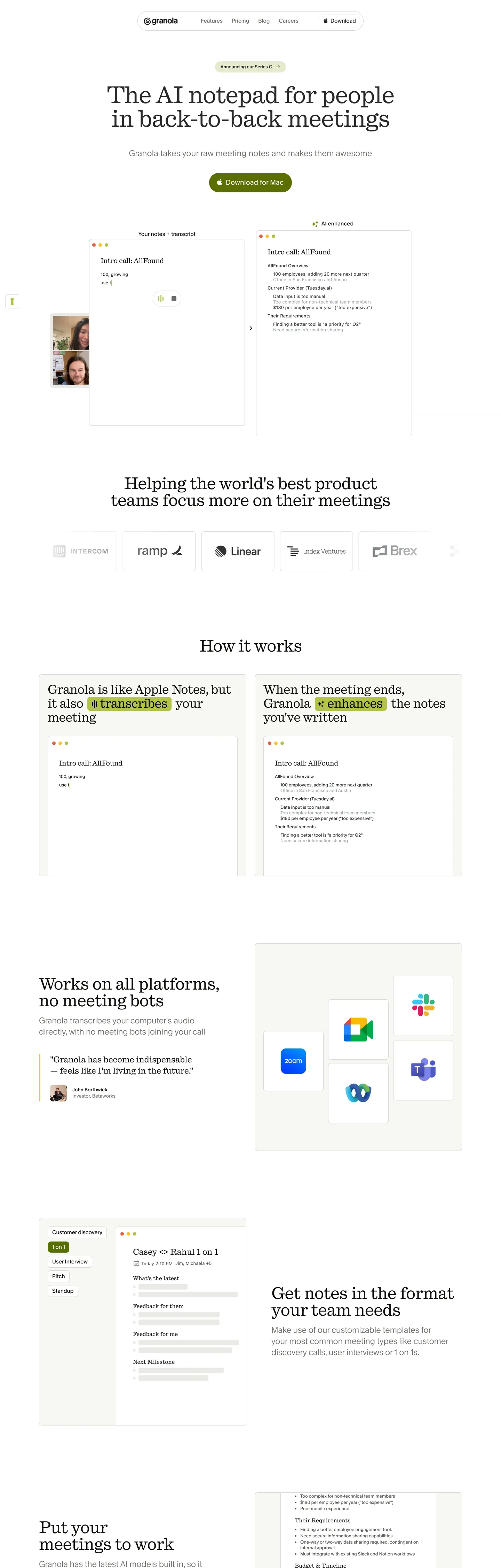
Granola's marketing page is the only entry in the AI productivity category that commits to a warm-indie aesthetic instead of the standard dark-mode dev-tool look. The hero centers a 68px Quadrant serif-flavored display headline ("The AI notepad for people in back-to-back meetings") in near-black on a warm cream canvas, with a single olive-green pill CTA ("Download for Mac") beneath. To the sides of the heading, cropped photographs of meeting participants sit flush against the page edges, as if the visitor is already inside the call. Verbs in the body copy ("transcribes", "enhances") are wrapped in a yellow highlighter mark, like text marked in a paper notepad.
The DESIGN.md file captures the system as a token spec for React tooling. Inside: 20 colors tokens drawn from the oats-named palette — Granola wires every neutral and accent as --color-oats-* (oat-green-300 through oat-green-500, oat-yellow-200/300, oat-pink-100/200, oat-purple-100/200, oat-neutral-50 through 900) — organized into a warm cream surface ladder, an olive-oat-green brand voltage, and a yellow-highlighter inline accent. 12 typography tokens span Quadrant serif at 48-68px for display and Melange Grotesk at 13-24px for body, plus a system-ui fallback layer for nested-tweet quotes. 17 components cover the olive CTA pill, the cream pill-rounded note tile, the yellow-highlight inline accent, the warm hairline card, and the standard top nav.
Feed this file to an AI coding tool and it reproduces the specific moves: warm cream canvas instead of pure white, olive-oat-green CTA instead of cobalt or violet, Quadrant + Melange pairing instead of a single sans, yellow highlighter inline accent on action verbs, and pill-rounded note tiles with cropped human photographs. The most distinctive token group is the oats namespace itself — every neutral is named with a food metaphor, including the typescale custom-property prefix --oats- for fill, ink, surface, and stroke roles. Borrow it freely; the only move to think twice about is the cropped-photograph hero, which depends on the brand having access to staged meeting imagery.
What makes it distinct
5
- Oats-named paletteGranola wires every neutral and accent as --color-oats-* including oat-green, oat-yellow, oat-pink, oat-purple, and oat-neutral-50 to 900
- Yellow highlighter inline accentverbs like transcribes and enhances are wrapped in an oat-yellow #febe29 highlight strip, like marked text in a notepad
- Quadrant serif for display, Melange Grotesk for bodytwo KMR foundry faces, a serif-sans pairing rather than the single-sans dev-tools convention
- Olive-oat-green CTAthe Download for Mac primary pill sits at #5b6f00, a saturated olive that reads warm-natural rather than corporate green
- Warm cream surface laddercanvas #f7f7f2 with oat-neutral-100 #f7f7f2 and oat-neutral-200 #eaebe5 cards; pure white is reserved for raised tile surfaces only
granola.ai
Live at granola.ai
A snapshot of the brand in production. Scroll the frame to see the whole page.
Colors
20 colors
Granola's system runs on #5b6f00 as its primary voltage, used in 1 of 17 components. Type is set in KMR Melange Grotesk across 12 tokens from 13px to 68px, weights 300–500. Shape language is mixed across 17 components, blending pills, soft rounds, and squarer corners.
Brand & Accent
Sparing, CTA-only voltage · 7
Surface
Page and card backgrounds · 4
Text
Headlines, body, captions · 5
Borders & Hairlines
Dividers, outlines, rules · 2
Other
Specialty colors · 2
Typography
12 type tokens
Set in KMR Melange Grotesk across 12 tokens, from 13px to 68px, weights 300–500. Shown in its own stack: where the font isn't installed, the fallback the file names stands in.
- display-xl68px · weight 400 · lh 68px · tracking -1.02pxThe quick brown fox jumps over the lazy dog
- display-lg48px · weight 400 · lh 48px · tracking -0.72pxThe quick brown fox jumps over the lazy dog
- display-md36px · weight 400 · lh 40px · tracking -0.54pxThe quick brown fox jumps over the lazy dog
- heading-md24px · weight 400 · lh 32pxThe quick brown fox jumps over the lazy dog
- heading-sm20px · weight 400 · lh 28px · tracking -0.3pxThe quick brown fox jumps over the lazy dog
- sub-heading24px · weight 300 · lh 32pxThe quick brown fox jumps over the lazy dog
- body-lg20px · weight 500 · lh 28px · tracking 0.2pxThe quick brown fox jumps over the lazy dog
- body-md16px · weight 400 · lh 20px · tracking 0.16pxThe quick brown fox jumps over the lazy dog
- body-sm14px · weight 400 · lh 18px · tracking 0.14pxThe quick brown fox jumps over the lazy dog
- caption13px · weight 400 · lh 16px · tracking 0.13pxThe quick brown fox jumps over the lazy dog
- button-md13px · weight 500 · lh 16px · tracking 0.13pxThe quick brown fox jumps over the lazy dog
- quote-sans15px · weight 400 · lh 20pxThe quick brown fox jumps over the lazy dog
Layout
Radii and spacing
6 corner radii and 8 spacing values. Shape language: mixed.
Radii
- none0px
- sm4px
- md6px
- lg8px
- xl12px
- pill9999px
Spacing
- xxs2px
- xs4px
- sm6px
- base8px
- md12px
- lg16px
- xl24px
- 2xl32px
Components
17 components
Each rendered from its tokens (color, type, radius, padding) on Granola's own canvas.
- Button Primarybutton-primaryButton Primary
- Button Primary Hoverbutton-primary-hoverButton Primary Hover
- Button Secondarybutton-secondaryButton Secondary
- Announcement Pillannouncement-pillAnnouncement Pill
- Top Navtop-navTop Nav
- Nav Linknav-linkNav Link
- Hero Headinghero-headingHero Heading
- Section Headingsection-headingSection Heading
- Sub Heading Linesub-heading-lineSub Heading Line
- Body Paragraphbody-paragraphBody Paragraph
- Body Paragraph Mutedbody-paragraph-mutedBody Paragraph Muted
- Highlight Markhighlight-markHighlight Mark
- Note Tilenote-tileNote Tile
- CardcardCard
- Type here…text-inputText Input
- Testimonial Cardtestimonial-cardTestimonial Card
- Badge Softbadge-softBadge Soft
In use
The system, in use
Granola's tokens on the kind of product it builds.
Build something people actually use.
A short paragraph of marketing copy that previews how the brand's display tier and body tier read together. Two sentences is usually enough.
FAQ
Granola design system FAQ
Common questions about Granola's tokens, components, and how to use this DESIGN.md in your project.
Read next
Related reading
Specs, directories, and component libraries that pair with this design system.
- Browse all design systemsThe full directory of DESIGN.md files on shadcn.io, with live mockups for each.shadcn.io
- Granola — official siteGranola's public marketing site — the source of truth for the live tokens captured in this file.granola.ai (opens in a new tab)
- The DESIGN.md specificationGoogle Labs' open spec for machine-readable design system files — the format this page is built on.github.com (opens in a new tab)
Use it
Use Granola in your project
One machine-readable file. Drop it into Claude, Cursor, or any AI tool that reads DESIGN.md.
Download the DESIGN.md
One machine-readable file: every color, type, radius, spacing, and component token of Granola.
Feed it to your AI tool
Drop it into Claude, Cursor, or GitHub Copilot. The agent writes React components and Tailwind classes that match Granola's visual language.
Reference the tokens directly
Or paste the values into your Tailwind config, CSS variables, or component library: every color, size and radius is a quoted, ready-to-copy value.
Read the full DESIGN.md: overview, rationale, do’s and don’ts
Overview
Granola's marketing page is the only entry in the AI productivity category that commits to a warm-indie aesthetic. Warm-cream surface ladder. The page floor is {colors.canvas} (#f7f7f2), a warm off-white cream, not pure #ffffff. Cards lift off this canvas using {colors.surface-raised} (#ffffff) — pure white reserved for the raised tile surfaces — and the result is a paper-on-paper depth where the elevation comes from the warmth difference between the cream floor and the white tile, not from a drop shadow. Where Notion's white-on-white pages lean industrial and Reflect's dark-mode canvas leans nocturnal, Granola sits in a third position: warm, papery, indie.
The chromatic system is built around two voltages, both named after grain. Olive-oat-green ({colors.primary} — #5b6f00) carries the single primary CTA pill ("Download for Mac") and surfaces in product chrome accents. Oat-yellow ({colors.accent-yellow} — #febe29) is the yellow-highlighter inline accent that wraps action verbs in the body copy ("transcribes", "enhances") — a horizontal yellow strip with rounded ends that reads as marker stroke from a paper notepad. Both voltages are warm-natural rather than corporate; together they form the brand's two-tone identity. The supporting tones — {colors.accent-pink} (#ff91e0), {colors.accent-purple} (#cebef8) — live almost exclusively inside the colorful gradient stops on the in-product feature mockups.
Typography splits the work across two KMR foundry typefaces. Quadrant — a serif-flavored display with subtle calligraphic motion — carries the hero headline (68px), section headings (48px), and sub-section headings (36px), all at weight 400. Melange Grotesk — a neutral grotesk sans — carries body copy, captions, and button labels, all at weight 400 or 500. Where Stripe runs Sohne across every tier and Vercel runs Geist across every tier, Granola runs the serif-sans pairing — a print-media move that gives the editorial sections their literary warmth without breaking the digital chrome.
Key Characteristics:
- Two-voltage palette — olive-oat-green (
{colors.primary}) for CTAs and yellow-highlighter{colors.accent-yellow}for inline verb accents; both warm-natural rather than corporate. - Oats namespace — every neutral and accent wired as
--color-oats-*and--oats-*in CSS (oat-green, oat-yellow, oat-pink, oat-purple, oat-neutral-50 through 900); a food metaphor surfaced inside the build system itself. - Quadrant serif + Melange Grotesk pairing — print-media display-and-body split rather than the single-sans dev-tools convention.
- Warm cream floor —
{colors.canvas}(#f7f7f2) is the page tone; pure white is reserved for raised tile surfaces. - Yellow-highlighter mark —
{colors.accent-yellow}background with rounded-corner end strips wrapped around action verbs only (six occurrences on the captured page). - Pill-rounded buttons at
{rounded.pill}(9999px) for every CTA and chip; rectangular cards at{rounded.xl}(12px) for note tiles; small-step radii (4-8px) for chrome. - Cropped meeting-participant photographs flush against the hero edges — the brand is selling a presence-not-bots positioning, and the human imagery makes that explicit.
- Section sub-heading uses Melange Grotesk weight 300 at 24px — the single weight-300 instance in the system, reserved for the tagline beneath the hero.
Colors
Brand
- Olive-Oat Green (
{colors.primary}— #5b6f00): frequency 4. Used as bg (4). Wired as--oats-fill-accent,--color-oats-green-500,--color-fill-accent. The primary CTA fill — saturated olive that reads warm-natural rather than corporate green. Carries the Download for Mac pill in the hero. - Oat-Green Mid (
{colors.primary-mid}— #788c15): frequency 7. Used as bg (1), border (6). Wired as--oats-ink-accent,--color-oats-green-400. The hover state for the primary CTA and the accent-text color used on badges. - Oat-Green Soft (
{colors.primary-soft}— #b2c248): frequency 81. Used as bg (81). Wired as--color-oats-green-300,--oats-border-focus. The soft accent background — appears as the focus-ring color on form fields and as a soft surface tint on accent badges. - Oat-Green Bright (
{colors.primary-bright}— #d1e043): frequency 20, all inside gradient stops. Wired as--color-oats-green-200. The brightest oat-green variant — appears exclusively in gradient stops on the in-product feature mockups.
Accent
- Oat-Yellow (
{colors.accent-yellow}— #febe29): frequency 26. Used as bg (6), gradient (20). Wired as--color-oats-yellow-200. The yellow-highlighter inline accent — wrapped around action verbs in the body copy like a marker stroke from a paper notepad. - Oat-Pink (
{colors.accent-pink}— #ff91e0): frequency 20, all inside gradient stops. The pink end-stop on multi-color feature illustrations. - Oat-Purple (
{colors.accent-purple}— #cebef8): frequency 20, all inside gradient stops. Wired as--color-oats-purple-200. The purple end-stop on multi-color feature illustrations.
Text
- Ink (
{colors.ink}— #292929): frequency 78. Used as text (50), gradient (28). Wired as--oats-ink-primary,--color-content-primary,--color-ink-primary. The dominant heading and nav text tone. - Ink Soft (
{colors.ink-soft}— #454745): frequency 58. Used as text (58). Wired as--color-secondary,--oats-ink-secondary-strong. The secondary running-text tone. - Ink Muted (
{colors.ink-muted}— #72726e): frequency 30. Used as text (30). Wired as--oats-ink-secondary,--color-tertiary. The tertiary text tone — caption rows, sub-headings, footer metadata. - Ink Quiet (
{colors.ink-quiet}— #818179): frequency 25. Used as text (25). Wired as--color-oats-neutral-500,--oats-surface-overlay. The quietest text tone, reserved for muted metadata. - Ink Strong (
{colors.ink-strong}— #0e0f0c): frequency 580. Used as text (580). Wired as--color-primary. The dominant body-text tone — runs every paragraph in the captured body sections.
Surface
- Canvas (
{colors.canvas}— #f7f7f2): the page floor. Wired as--color-surface,--color-oats-neutral-100,--oats-fill-input-disabled. A warm cream — not pure white — that gives the system its paper-on-paper depth. - Surface-1 (
{colors.surface-1}— #eaebe5): frequency 1042. Used as bg (19), border (1023). Wired as--oats-fill-soft-opaque,--color-oats-neutral-200,--color-input. The soft accent surface and the dominant hairline tone. - Surface Raised (
{colors.surface-raised}— #ffffff): frequency 88. Used as bg (76), text (10), gradient (2). Pure white reserved for the raised note tiles and elevated cards. - Surface Tint (
{colors.surface-tint}— #e5eacd): frequency 2. Used as bg (2). Wired as--color-oats-green-100,--oats-surface-tint-accent. The pale oat-green tint used on accent badges and the announcement pill.
Hairline
- Hairline (
{colors.hairline}— #d5d5d2): frequency 105. Used as border (105). Wired as--color-gray-300,--oats-fill-soft-opaque-hover,--color-stroke. The default card-outline tone. - Hairline Soft (
{colors.hairline-soft}— #e3e3e3): frequency 1042. The lightest hairline tier — used on the note-tile borders and the page-section dividers.
Semantic
- Danger (
{colors.danger}— #e95d3d): frequency 6. Used as bg (6). Wired as--oats-fill-danger,--color-oats-red-300. The warm-red destructive-action tone. - Danger Strong (
{colors.danger-strong}— #bd4a30): frequency 6. Used as border (6). Wired as--oats-fill-danger-hover,--oats-ink-danger. The hover state for the danger action.
Typography
Font Families
The system runs two KMR foundry typefaces. Quadrant carries every display tier — the 68px hero headline, the 48px section headings, the 36px sub-section headings, and the 24-20px in-card serif accents. Quadrant is a serif-flavored display with subtle calligraphic motion; the calligraphic edges are most visible at the 68px hero size where the terminals and stress angles read clearly.
Melange Grotesk carries every body tier — body copy at 14-16px, sub-headings at 24px, button labels at 13-14px, caption rows at 13px. It is a neutral grotesk sans with a slightly humanist x-height and small 0.01em letter-spacing applied at body sizes.
A third nested layer of system-ui sans (referenced as -apple-system, system-ui, "Segoe UI", Roboto, Helvetica, Arial, sans-serif) appears inside nested tweet-quote testimonials — the only place where the system surrenders typographic control to the platform default.
Hierarchy
| Token | Size | Weight | Line Height | Letter Spacing | Use |
|---|---|---|---|---|---|
{typography.display-xl} | 68px | 400 | 68px | -1.02px | Hero h1 ("The AI notepad for people in back-to-back meetings") |
{typography.display-lg} | 48px | 400 | 48px | -0.72px | Section h2 |
{typography.display-md} | 36px | 400 | 40px | -0.54px | Section sub-heading serif |
{typography.heading-md} | 24px | 400 | 32px | 0 | In-card serif accents |
{typography.heading-sm} | 20px | 400 | 28px | -0.3px | Sub-section h3 |
{typography.sub-heading} | 24px | 300 | 32px | 0 | Hero tagline (weight-300 instance) |
{typography.body-lg} | 20px | 500 | 28px | 0.2px | Pull-quote body and lead-paragraph emphasis |
{typography.body-md} | 16px | 400 | 20px | 0.16px | Default body running text |
{typography.body-sm} | 14px | 400 | 18px | 0.14px | Secondary body and form labels |
{typography.caption} | 13px | 400 | 16px | 0.13px | Caption rows, footer metadata, in-note labels |
{typography.button-md} | 13px | 500 | 16px | 0.13px | Primary CTA and secondary button labels |
{typography.quote-sans} | 15px | 400 | 20px | 0 | Nested tweet-quote testimonials only |
Principles
The serif-sans split is the typographic signature. Display tiers run on Quadrant with tight negative tracking (-1.02px at 68px); body tiers run on Melange Grotesk with small positive tracking (0.13-0.16px at 13-16px). The single weight-300 instance is the hero tagline — Melange at 24px / 300 — that mediates between the heavy Quadrant headline and the body. Button labels sit at 13px / 500 — the smallest, most-emphatic typographic unit in the system, deliberately compressed because the olive-green CTA does the work of visibility through color rather than size.
Note on Font Substitutes
Quadrant and Melange Grotesk are licensed from KMR's foundry. The closest open-source substitute for Quadrant is Fraunces (variable serif with similar calligraphic motion) or PP Editorial Old if you can license it; for Melange Grotesk, Geist or Inter at the same weights transfer cleanly. To preserve the warm-indie feel, the serif display is the move worth keeping — substituting Quadrant with a sans-serif (even Inter) collapses the print-media identity.
Layout
Spacing System
- Base unit: 8px — the dominant gap (78 occurrences), with 16px (48), 12px (38), and 4px (15) filling the smaller increments.
- Tokens:
{spacing.xxs}2px ·{spacing.xs}4px ·{spacing.sm}6px ·{spacing.base}8px ·{spacing.md}12px ·{spacing.lg}16px ·{spacing.xl}24px ·{spacing.2xl}32px. - Section padding (vertical): ~64-80px between major editorial sections.
- Card internal padding:
{spacing.lg}16px and{spacing.xl}20px on note tiles;{spacing.md}12px on smaller chrome. - Top-nav padding: 12px vertical, 16px horizontal, 64px total height.
Grid & Container
- Max content width: ~1326px on the hero, ~1084px on the section-heading bands.
- Hero: centered single-column with cropped photographs flush against the page edges.
- 2-up rows: the "How it works" and "Get notes in the format your team needs" sections use even 2-column layouts with a note-tile on one side and editorial copy on the other.
- Logo wall: the customer-mark strip (Intercom, Ramp, Linear, Index Ventures, Brex) runs as a single horizontal row at the page's mid-section.
Rhythm
The page alternates between editorial declaration and product mockup. The hero is a declaration; the next section is a 2-up product mockup (Granola is like Apple Notes...); the next is editorial again (Helping the world's best product teams...); the next is a 2-up mockup. The rhythm gives the page a textbook-spread cadence where every editorial moment is followed by a visual proof, never two declarations in a row.
Elevation
The system has a minimal shadow tier. Note tiles use a 13-occurrence shadow at rgba(0, 0, 0, *) with low opacity — a subtle lift just enough to separate the white tile from the cream canvas. Most other surfaces rely on the warm-cream-to-white surface contrast or a 1px hairline border to do depth work.
- Flat (no shadow): hero, body bands, footer — most surfaces.
- Note-tile elevation:
rgba(0, 0, 0, ~0.05)2-pixel shadow on the pill-rounded note tiles in the hero — readable as a paper-on-paper lift. - Hairline cards:
{colors.hairline-soft}(#e3e3e3) 1px borders on card-tiles below the fold — frequency 1023, the workhorse border tone. - Tonal lift:
{colors.surface-raised}(#ffffff) cards on{colors.canvas}(#f7f7f2) — the warm-to-white contrast does as much elevation work as the shadow.
Shapes
The radius scale is two-tier: small-step body chrome at 4-12px plus a full pill at 9999px:
{rounded.none}0px — section dividers, editorial body.{rounded.sm}4px — 11 occurrences. Highlight-mark inline accent and small chips.{rounded.md}6px — 4 occurrences. Small icon buttons.{rounded.lg}8px — 99 occurrences. Default card and input outline.{rounded.xl}12px — 12 occurrences. Note tiles in the hero.{rounded.pill}9999px — 77 occurrences. Every CTA pill, announcement chip, and badge.
The dominant radii are 8px on body cards and pill on every actionable surface. There is no 16-24px middle tier; the system jumps from 12px on note tiles to full pill on actions.
Components
button-primary — The signature CTA. Olive-oat {colors.primary} fill, white text, full pill {rounded.pill} radius, 8x16 padding, 32px height. The Download for Mac pill in the hero — the only saturated above-fold action.
button-primary-hover — Background flips to {colors.primary-mid} (#788c15) on hover, a slightly lighter oat-green.
button-secondary — Pale oat-green {colors.surface-tint} fill, near-black text, full pill radius, 8x16 padding, 32px height. Used for the Announcing our Series C accent pill at the top of the hero.
announcement-pill — Same dimensions as button-secondary but with an inline arrow icon — the page-top announcement strip.
top-nav — Warm cream {colors.canvas} surface, no border, 64px height, 12x16 padding. Granola wordmark flush left, product links (Features / Pricing / Blog / Careers) centered, Download cluster flush right.
nav-link — Transparent background, ink text at {typography.body-md} (16px / 400), 0x4 padding, 28px height. No hover background.
hero-heading — Ink text on the cream canvas, {typography.display-xl} (68px / 400, -1.02px tracking, Quadrant serif). 0 padding; centered single column.
section-heading — Ink text, {typography.display-lg} (48px / 400, -0.72px tracking).
sub-heading-line — {colors.ink-muted} text at {typography.sub-heading} (Melange 24px / 300) — the single weight-300 instance in the system. Used for the hero tagline ("Granola takes your raw meeting notes and makes them awesome") with 56px horizontal padding.
body-paragraph — {colors.ink-strong} (#0e0f0c) text at {typography.body-lg} (Melange 20px / 500). The default running text below the fold.
body-paragraph-muted — {colors.ink-muted} text at {typography.body-md} (16px / 400). Secondary copy and form labels.
highlight-mark — {colors.accent-yellow} (#febe29) fill, near-black text, {rounded.sm} 4px radius, 2x4 padding. The yellow-highlighter inline accent — wraps action verbs in the body copy like marker stroke from a paper notepad. Reserved for verbs only; never appears on more than one verb per sentence.
note-tile — Pure white {colors.surface-raised} fill, near-black text, 1px {colors.hairline-soft} border, {rounded.xl} 12px radius, 16x20 padding. The pill-rounded note-mockup tiles in the hero — paper-on-paper depth from the white-on-cream contrast.
card — Pure white {colors.surface-raised} fill, ink text, 1px {colors.hairline-soft} border, {rounded.lg} 8px radius, 16x20 padding. The default editorial card below the fold.
text-input — Pure white {colors.surface-raised} fill, ink text, 1px {colors.hairline} border, {rounded.lg} 8px radius, 12x16 padding, 44px height.
testimonial-card — Cream {colors.canvas} fill, near-black text, 1px {colors.primary-soft} left-border accent, no radius, 16x20 padding. The Granola has become indispensable tweet-quote — uses the system-ui {typography.quote-sans} font to preserve the nested-tweet feel.
badge-soft — Pale oat-green {colors.surface-tint} fill, {colors.primary-mid} text, full pill radius, 4x12 padding, 24px height. Used for the inline status badges and category chips.
Do's and Don'ts
Do reserve the yellow-highlighter mark ({colors.accent-yellow} — #febe29) for action verbs only. The page never highlights a noun, an adjective, or two verbs in the same sentence. The accent works because it is rare and grammatically consistent; expanding it to any word category dissolves the paper-notepad metaphor.
Do use {colors.canvas} (#f7f7f2) as the page floor — never pure #ffffff. The warm-cream-to-white surface contrast is what gives the note tiles their paper-on-paper lift; flattening the canvas to white collapses the entire elevation system.
Do pair Quadrant serif on display tiers with Melange Grotesk on body tiers. The serif-sans split is the typographic signature; running a single sans across every tier (even at the same sizes) loses the print-media warmth that defines the brand.
Do keep the primary CTA at the saturated olive-oat-green {colors.primary} (#5b6f00). The warm-natural olive is what gives the action surface its indie feel; swapping to a cobalt or violet voltage turns the page into a generic SaaS landing.
Don't use {colors.surface-1} (#eaebe5) as a text or fill color outside of accent surfaces — 1023 of its 1042 occurrences are borders. It is a hairline-and-soft-fill token, and rendering body text in it produces near-invisible text on the cream canvas.
Don't introduce a heavier weight (700+) on the Quadrant display tier. The hero at 68px / 400 with -1.02px tracking is the loudest typographic moment; bumping to 700 erases the calligraphic motion of the Quadrant terminals and turns the editorial display into a generic SaaS shout.
Don't apply the {colors.accent-yellow} highlighter as a full-bleed background fill. It is wired as --color-oats-yellow-200 and reserved for the 2x4-padded inline mark; using it as a section background reads as a warning state rather than as a typographic accent.
Don't use the gradient stops ({colors.accent-pink}, {colors.accent-purple}, {colors.primary-bright}) as standalone flat fills. Each of these colors only appears inside gradient stops on the in-product feature mockups; using them as flat surface fills produces a candy-pastel palette that conflicts with the warm-indie identity.
Known Gaps
- Hover and focus states: the captured marketing surface only renders resting states for most components; the full hover / press / focus matrix lives inside the product UI and is not fully documented here. Only the primary CTA hover (
{component.button-primary-hover}) is captured. - Form input error states: the
{component.text-input}carries only the resting state; error and validation styling is not exposed on the marketing surface. - Dark mode: the captured marketing surface is light-only. The Granola app exposes a dark variant, but the marketing chrome is light-only.
- Motion: the note tiles in the hero animate on scroll-into-view with a soft fade-in-up, but the spec captures end-state values only. Easing curves, duration, and stagger live in the live Granola runtime.
- Product surfaces: this DESIGN.md captures the marketing site only. The Granola desktop app — note editor, meeting transcript view, AI-suggested cards, calendar integration — carries a much richer token system that is not represented here.
- Gradient definitions: the colorful gradient stops (
{colors.accent-pink},{colors.accent-purple},{colors.primary-bright}) appear inside multi-color illustrations but the gradient angles, stop positions, and blend modes are not captured here. - Oats-namespace mapping: the system exposes ~80
--oats-*and--color-oats-*custom properties; only the 20 most-frequent values are surfaced as tokens above. The full mapping (oats-red, oats-blue, oats-gold, plus role-specific oats-ink and oats-fill variants) is documented inside the production CSS.
AI & LLM Platforms
More systems like this
More DESIGN.md files in AI & LLM Platforms.
Pricing
Build it with Pro
The DESIGN.md files are free. Pro adds 6,000+ blocks, premium templates and the MCP server, so your AI editor builds in your system for you.
4.9/5 out of 5 · 150+ reviewsfrom 150+ founders and developers.
Billing
Billed once a year in USD. Cancel anytime.
- How many people can use the license.
- Client work, SaaS products and anything you charge for.
- Production-ready React sections: hero, pricing, features, dashboards and more.
- Complete multi-page sites you can ship as they are.
- React icons from every major library, installable with one command.
- Presets that restyle every block, in light and dark.
- Lets your AI editor search, preview and install blocks for you.
- Priority requests are answered first.
Individual
For personal projects & open source
$32instead of $49/mo
$389 billed yearly
- Seats: 1 seat
- Commercial use: Personal & open source only
- Pro blocks: 6,000+ blocks
- Templates: All 14 templates
- React icons: 294k+ icons
- Themes: All 59 themes
- MCP server: Basic usage
- Support: Standard
Team
Most popularFor freelancers, agencies & startups
$66instead of $99/mo
$789 billed yearly · ≈ $13/dev/mo
- Seats: Up to 5 seats
- Commercial use: Included
- Pro blocks: 6,000+ blocks
- Templates: All 14 templates
- React icons: 294k+ icons
- Themes: All 59 themes
- MCP server: High usage
- Support: Priority
Organization
For companies with larger teams
$132instead of $199/mo
$1,589 billed yearly
- Seats: Unlimited seats
- Commercial use: Included
- Pro blocks: 6,000+ blocks
- Templates: All 14 templates
- React icons: 294k+ icons
- Themes: All 59 themes
- MCP server: Unlimited usage
- Support: Priority
Billed once a year in USD. Cancel anytime.
Individual
For personal projects & open source
$32instead of $49/mo
$389 billed yearly
- How many people can use the license.Seats: 1 seat
- Client work, SaaS products and anything you charge for.Commercial use: Personal & open source only
- Production-ready React sections: hero, pricing, features, dashboards and more.Pro blocks: 6,000+ blocks
- Complete multi-page sites you can ship as they are.Templates: All 14 templates
- React icons from every major library, installable with one command.React icons: 294k+ icons
- Presets that restyle every block, in light and dark.Themes: All 59 themes
- Lets your AI editor search, preview and install blocks for you.MCP server: Basic usage
- Priority requests are answered first.Support: Standard
Team
Most popularFor freelancers, agencies & startups
$66instead of $99/mo
$789 billed yearly · ≈ $13/dev/mo
Everything in Individual, plus
- How many people can use the license.Seats: Up to 5 seats
- Client work, SaaS products and anything you charge for.Commercial use: Included
- Lets your AI editor search, preview and install blocks for you.MCP server: High usage
- Priority requests are answered first.Support: Priority
Organization
For companies with larger teams
$132instead of $199/mo
$1,589 billed yearly
Everything in Team, plus
- How many people can use the license.Seats: Unlimited seats
- Lets your AI editor search, preview and install blocks for you.MCP server: Unlimited usage
- Secure checkout via Stripe
- Code lives in your repo
- Keep what you've shipped if you cancel
- License terms
Your system, built for you
Every block, template and icon, installed by your AI agent in your design system. The DESIGN.md files stay free.