GoPro Design System
GoPro's marketing system documented as a DESIGN.md file. GoPro Blue wired into 19 button tokens, SohneBreit at weight 900 all-caps over full-bleed video, 16 colors and 15 components for React, Next.js, and AI tools.
Add shadcn.io to your AI agent. · Pro It installs blocks, icons and templates in your design system from a prompt, with Pro.
Set up MCP- Primary
- #0059c2
- Typeface
- SohneBreit
- Shape
- Mixed
- Base radius
- 8px
- Colors
- 16
- Type tokens
- 11
- Components
- 15
- Spacing values
- 8
About
About GoPro DESIGN.md
Curated by Dov Azencot · Updated May 19, 2026 · Source gopro.com (opens in a new tab)
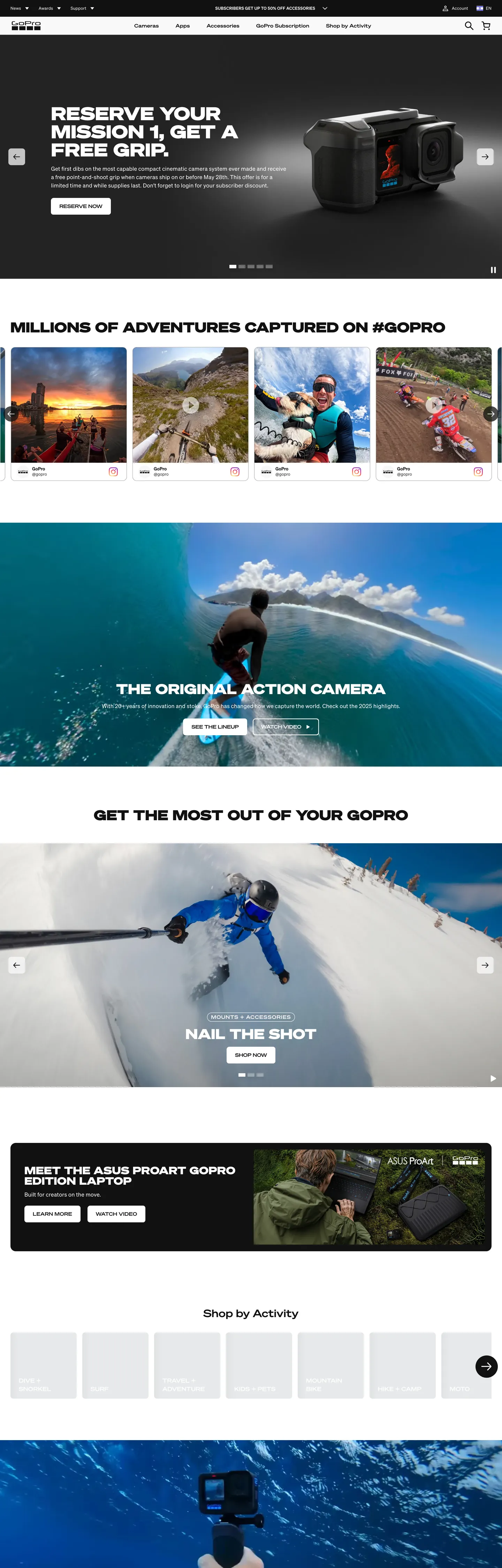
GoPro's home page does the opposite of what most consumer-electronics brands do above the fold. Where Apple frames the device on a quiet white field and Sony hangs a lifestyle photo behind soft display type, GoPro stacks the page as a column of edge-to-edge adventure footage — a snowboarder mid-flip, a surfer dropping into a wave, a freediver under reef — each clip carrying a 40-52px SohneBreit headline in all-caps at weight 900 directly on top. There is no scrim, no card, no underline; the typography sits on the image and trusts the high-contrast subject behind it to do its own backgrounding. The first headline reads "RESERVE YOUR MISSION 1, GET A FREE GRIP." in white over a dark studio shot. The voice is loud the way an action-sports broadcast is loud — uppercase, weight 900, tracked 0.25px, designed to read at 20 feet.
The DESIGN.md file packages the system into a machine-readable spec for React tooling. Inside: 16 colors tokens drawn from 1,029 occurrences of matte ink (text 520, border 498), 525 occurrences of white as the secondary surface and 190 of a residual browser-default cobalt acting as the underlying link color — but the brand voltage is GoPro Blue, wired through 19 different CSS custom-properties on the `--theme-stk2-button-primary-brand-*` family and reserved for buttons that need to read on dark surfaces. Three Sohne cuts (Sohne, SohneBreit, SohneMono) carry every text role across 20 typography tokens. The radius scale stops at 8px for everything tappable and 50% for every circular photo orb; nothing in between. 15 components cover the cobalt-on-dark CTA, the ink-on-white primary, the uppercase nav label, the email-capture row, the bordered secondary, and the Instagram-pink social chip.
Feed this file to Claude or Cursor and it reproduces GoPro's specific moves: black-default chrome with cobalt firing only on dark surfaces, three-cut Sohne typography handling display through monospace without a second family, uppercase tracked headlines at weight 900, and the 8px-or-orb radius binary. The voice it carries is not subtle — borrow it only when your product is itself loud. The full-bleed adventure-footage carousel does not survive being applied to a SaaS dashboard the way Vercel's matte-black canvas does; this is a brand built for content that pulls the eye on its own, and the typographic system was designed to ride it rather than compete with it.
What makes it distinct
5
- Uppercase typographic shouting40-52px SohneBreit at weight 900, all-caps, tracked 0.25px, sits directly over edge-to-edge footage with no card or scrim between
- Black-default, blue-on-demandprimary CTA is matte ink on white; GoPro Blue is wired into 19 button-brand tokens but only fires when the surface is dark and a secondary action needs to read
- Three Sohne cuts as one voiceSohne for body, SohneBreit wide for display and uppercase labels, SohneMono for product-spec strips; no second typeface in the system
- Carousel-first layoutthe home page is six stacked full-bleed adventure carousels rather than feature cells, each with its own caption strip and Shop CTA
- Eight-pixel rounding everywhere except the photo orbsbuttons and inputs sit at 8px, profile and category orbs at 50% (39 occurrences vs. 17 circular), no middle 12-16px tier
gopro.com
Live at gopro.com
A snapshot of the brand in production. Scroll the frame to see the whole page.
Colors
16 colors
GoPro's system runs on #0059c2 as its primary voltage, used in 1 of 15 components. Type is set in SohneBreit across 11 tokens from 12px to 52px, weights 400–900. Shape language is mixed across 15 components, blending pills, soft rounds, and squarer corners.
Brand & Accent
Sparing, CTA-only voltage · 3
Surface
Page and card backgrounds · 2
Text
Headlines, body, captions · 5
Borders & Hairlines
Dividers, outlines, rules · 1
Other
Specialty colors · 5
Typography
11 type tokens
Set in SohneBreit across 11 tokens, from 12px to 52px, weights 400–900. Shown in its own stack: where the font isn't installed, the fallback the file names stands in.
- display-xl52px · weight 900 · lh 52px · tracking 0.25pxThe quick brown fox jumps over the lazy dog
- display-lg40px · weight 900 · lh 40px · tracking 0.25pxThe quick brown fox jumps over the lazy dog
- display-md30px · weight 900 · lh 30px · tracking 0.25pxThe quick brown fox jumps over the lazy dog
- heading-md22px · weight 600 · lh 28px · tracking 0.25pxThe quick brown fox jumps over the lazy dog
- heading-sm16px · weight 600 · lh 24px · tracking 0.25pxThe quick brown fox jumps over the lazy dog
- label-caps14px · weight 600 · lh 18px · tracking 1pxThe quick brown fox jumps over the lazy dog
- button-md14px · weight 600 · lh 14pxThe quick brown fox jumps over the lazy dog
- body-md16px · weight 400 · lh 24px · tracking 0.25pxThe quick brown fox jumps over the lazy dog
- body-sm14px · weight 400 · lh 35px · tracking 0.25pxThe quick brown fox jumps over the lazy dog
- caption12px · weight 400 · lh 18px · tracking 0.25pxThe quick brown fox jumps over the lazy dog
- emphasis16px · weight 900 · lh 24px · tracking 0.25pxThe quick brown fox jumps over the lazy dog
Layout
Radii and spacing
6 corner radii and 8 spacing values. Shape language: mixed.
Radii
- none0px
- sm4px
- md8px
- lg16px
- xl24px
- full9999px
Spacing
- xs6px
- sm8px
- base12px
- md16px
- lg24px
- xl32px
- 2xl48px
- 3xl60px
Components
15 components
Each rendered from its tokens (color, type, radius, padding) on GoPro's own canvas.
- Hero Sectionhero-sectionHero Section
- Hero Headinghero-headingHero Heading
- Section Headingsection-headingSection Heading
- Body Paragraphbody-paragraphBody Paragraph
- Body Paragraph Inkbody-paragraph-inkBody Paragraph Ink
- Label Uppercaselabel-uppercaseLabel Uppercase
- Button Primarybutton-primaryButton Primary
- Button Primary Brandbutton-primary-brandButton Primary Brand
- Button Secondarybutton-secondaryButton Secondary
- Top Navtop-navTop Nav
- Nav Linknav-linkNav Link
- Category Orbcategory-orbCategory Orb
- Product Cardproduct-cardProduct Card
- Type here…text-inputText Input
- FooterfooterFooter
In use
The system, in use
GoPro's tokens on the kind of product it builds.
Build something people actually use.
A short paragraph of marketing copy that previews how the brand's display tier and body tier read together. Two sentences is usually enough.
FAQ
GoPro design system FAQ
Common questions about GoPro's tokens, components, and how to use this DESIGN.md in your project.
Read next
Related reading
Specs, directories, and component libraries that pair with this design system.
- Browse all design systemsThe full directory of DESIGN.md files on shadcn.io, with live mockups for each.shadcn.io
- GoPro — official siteGoPro's public marketing site — the source of truth for the live tokens captured in this file.gopro.com (opens in a new tab)
- The DESIGN.md specificationGoogle Labs' open spec for machine-readable design system files — the format this page is built on.github.com (opens in a new tab)
Use it
Use GoPro in your project
One machine-readable file. Drop it into Claude, Cursor, or any AI tool that reads DESIGN.md.
Download the DESIGN.md
One machine-readable file: every color, type, radius, spacing, and component token of GoPro.
Feed it to your AI tool
Drop it into Claude, Cursor, or GitHub Copilot. The agent writes React components and Tailwind classes that match GoPro's visual language.
Reference the tokens directly
Or paste the values into your Tailwind config, CSS variables, or component library: every color, size and radius is a quoted, ready-to-copy value.
Read the full DESIGN.md: overview, rationale, do’s and don’ts
Overview
GoPro's marketing site inverts the consumer-electronics convention. Broadcast typography. Where Apple frames the device on a quiet white field and Sony hangs a lifestyle photo behind soft display type, GoPro stacks the page as six full-bleed adventure-video carousels and lands 40-52px SohneBreit at weight 900 in all-caps directly on top of them. The first headline — "RESERVE YOUR MISSION 1, GET A FREE GRIP." — sits in white over a dark studio shot of the camera; the second h2 reads "SUPER SMOOTH STABILIZATION + AI TRACKING" over a surfer mid-drop. There is no card, no scrim, no underline. The typography rides the image. The cursor never feels still because the imagery never is.
The brand voltage is GoPro Blue ({colors.primary}), wired into 19 different CSS custom-properties on the --theme-stk2-button-primary-brand-* family. But the page's default primary button is not blue. Where most brands hold one color in reserve as the conversion voltage, GoPro inverts the deployment: the default primary CTA is matte ink ({colors.ink}) on the near-white surface — 520 text occurrences, 498 border occurrences — and GoPro Blue fires only when the action button sits on a dark surface and needs chromatic separation from the surrounding video. The blue is wired and ready; it just rarely fires above the fold.
Typography is three Sohne cuts running as one voice: Sohne for body, SohneBreit for shouting, SohneMono for spec strips. SohneBreit is the unusual member — a wide, semi-condensed-by-aspect grotesk that reads as cinematic when set at 52px / 900 / 0.25px-tracked / uppercase. There is no intermediate display size between 22px heading and 30px display; the system jumps. SohneMono appears in product-spec captions only, never in headings or body. The result is a typographic stack with three voices but no second typeface family — every word on the page belongs to one Sohne sibling.
Key Characteristics:
- Six stacked full-bleed adventure-video carousels carry the page instead of feature cells or static photography.
- All-caps display at weight 900 (
{typography.display-xl}— 52px) tracked 0.25px is the dominant typographic moment; weight 600 ({typography.label-caps}— 14px / 1px tracking) carries the uppercase nav labels and section eyebrows. - Brand voltage is wired but scarce: GoPro Blue (
{colors.primary}) lives in 19 button-brand tokens, but the default primary CTA is matte ink ({colors.ink}) on white. Blue fires only on dark surfaces. - Three-cut Sohne typography handles display, body, and spec strips without a second typeface; SohneMono is reserved for technical captions only.
- Binary radius scale:
{rounded.md}8px on every tappable rectangle (39 occurrences),{rounded.full}on every photo orb (17 occurrences). No middle 12-16px tier. - Hairline-on-white cards lift surfaces with a
{colors.hairline}(#c3c5c6) 1px border rather than a shadow — 188 occurrences as border / gradient combined. - Two residual blues in the page (
{colors.link-default}browser-default anchor and{colors.partner-blue}for social/partner links) that are NOT brand tokens; only{colors.primary}is. - Carousel-arrow chrome uses an idiosyncratic 11.861px radius (12 occurrences) — likely a transform-rounded value, not a token to reuse.
Colors
Brand
- GoPro Blue (
{colors.primary}— #0059c2): rendered count 0 in the captured surface but wired into 19 CSS custom-properties —--theme-stk2-button-primary-brand-background,--theme-stk2-text-brand,--theme-stk2-default-outline-color, plus every hover / focus / pressed / outline / icon-button-brand sibling. The brand voltage held in reserve for dark-surface CTAs and brand-outlined chrome. The lack of rendered occurrences is the design statement: the system has the cobalt voltage available but uses ink-on-white as the default primary instead. - GoPro Blue Soft (
{colors.primary-soft}— #99c8ff): wired into--theme-stk2-button-primary-brand-disabled-backgroundand three other disabled-state sibling tokens. Reserved for disabled brand-button states; never appears as an active fill. - GoPro Blue Dark (
{colors.primary-dark}— #002f66): wired into--theme-stk2-button-secondary-brand-pressed-borderand--theme-stk2-icon-button-brand-disabled-background. The press-state and disabled-icon-background variant.
Ink
- Ink (
{colors.ink}— #111111): frequency 1029. Used as text (520), border (498), background (11). Wired as--theme-stk2-color,--theme-stk2-button-tertiary-default-color,--theme-stk2-button-primary-default-background, and the entire button-secondary-default-* family. This is the load-bearing tone — body text, default primary button fill, secondary button border, top-nav background. Where most light-canvas brands sit at warmer near-blacks, GoPro commits to a deeper matte ink for maximum contrast on white. - Ink Soft (
{colors.ink-soft}— #19191a): wired into--theme-stk2-button-secondary-default-pressed-border. The press-state variant of the secondary button outline. - Ink Tertiary (
{colors.ink-tertiary}— #353535): frequency 15. Wired as--theme-stk2-text-tertiaryand--theme-stk2-button-primary-default-pressed-background. Used for tertiary running text and the pressed state of the default primary button. - Muted (
{colors.muted}— #a0a1a2): frequency 17 — 15 border, 2 text. Wired across five disabled-state tokens including--theme-stk2-text-disabledand--theme-stk2-border-disabled. The disabled-tint applied to text, button borders, and input outlines.
Surface
- Canvas (
{colors.canvas}— #ffffff): frequency 525 — 240 border, 231 text-on-dark, 54 background. Wired as--theme-stk2-background-color,--theme-stk2-button-primary-default-color, and--theme-stk2-button-primary-brand-color. The page floor below the fold and the on-dark text color above it. - Surface Tertiary (
{colors.surface-tertiary}— #e7e9ea): frequency 40, all as gradient stops. Wired as--theme-stk2-surface-tertiaryand--stk2-theme-skeleton-background-color. Used as the skeleton-loader fill and the category-orb resting surface. - Hairline (
{colors.hairline}— #c3c5c6): frequency 188 — 84 border, 84 text-disabled, 20 gradient. Wired as--theme-stk2-icon-button-default-disabled-color,--theme-stk2-border-disabled, and--stk2-theme-skeleton-highlight-color. The hairline border on product cards and the disabled-state icon tint.
Residual / non-brand
- Link Default (
{colors.link-default}— #0000ee): frequency 190 — 95 text, 95 border. The browser default anchor color leaking through on unstyled editorial links. NOT a brand token; absent from the CSS variable map. Should not be reused as a design token. - Partner Blue (
{colors.partner-blue}— #00a6e0): frequency 20. Used on social-partner links and external chips. Not in the GoPro brand-color family. - Partner Blue Alt (
{colors.partner-blue-alt}— #0097d6): frequency 4. A second partner-chip variant. - Social Instagram (
{colors.social-instagram}— #e1306c): frequency 48 — 24 text, 24 border. The Instagram brand pink, used on the @gopro social-link chip — not part of the GoPro palette. - Shadow / Scrim (
{colors.shadow}— #000000): frequency 17 — 8 background, 8 shadow ink. Pure black is the scrim color over video sections and the shadow ink under the secondary button hover state.
Typography
Font Families
The system runs three cuts of one family: Sohne for body, SohneBreit (the wide, semi-condensed-by-aspect cut) for every display and uppercase label, SohneMono for product-spec strips. Fallbacks walk to "Sohne Fallback Helvetica", "Sohne Fallback Arial", sans-serif — a custom fallback stack rather than system-ui, suggesting GoPro ships dedicated metric-matched fallback fonts to keep layout stable while the variable file loads. A fourth declared family, SohneSchmal (a condensed cut), appears in the CSS variable map but is not rendered in the captured page.
Hierarchy
| Token | Family | Size | Weight | Line Height | Tracking | Transform | Use |
|---|---|---|---|---|---|---|---|
{typography.display-xl} | SohneBreit | 52px | 900 | 52px | 0.25px | uppercase | Hero h2 ("RESERVE YOUR MISSION 1, GET A FREE GRIP.") |
{typography.display-lg} | SohneBreit | 40px | 900 | 40px | 0.25px | uppercase | Section h2 ("SUPER SMOOTH STABILIZATION + AI TRACKING") |
{typography.display-md} | SohneBreit | 30px | 900 | 30px | 0.25px | uppercase | Sub-section pullquotes |
{typography.heading-md} | SohneBreit | 22px | 600 | 28px | 0.25px | none | Editorial h6 and explainer-block titles |
{typography.heading-sm} | SohneBreit | 16px | 600 | 24px | 0.25px | none | Card titles and inline strong labels |
{typography.label-caps} | SohneBreit | 14px | 600 | 18px | 1px | uppercase | Section eyebrows and nav-row labels |
{typography.button-md} | SohneBreit | 14px | 600 | 14px | 0 | none | Primary and secondary button labels |
{typography.body-md} | Sohne | 16px | 400 | 24px | 0.25px | none | Default running text under headlines |
{typography.body-sm} | Sohne | 14px | 400 | 35px | 0.25px | none | Top-nav link labels (wide leading deliberate) |
{typography.caption} | Sohne | 12px | 400 | 18px | 0.25px | none | Caption rows, footnotes, spec strips |
{typography.emphasis} | Sohne | 16px | 900 | 24px | 0.25px | none | Inline strong / pricing emphasis within body |
Principles
The display tier sits exclusively at weight 900 with 0.25px tracking and uppercase transformation. There is no weight-700 step in the system — the jump is 600 (heading / button / label) to 900 (display) with nothing in between. Body and caption stay at weight 400. The single "emphasis" treatment within body copy is weight 900 — borrowed straight from the display tier, used for prices and product specs inline. SohneBreit's wider aspect makes the all-caps display read as cinematic rather than as shouted text; substituting a normal-width sans at the same weight loses the broadcast quality.
Note on Font Substitutes
Sohne, SohneBreit, SohneMono, and SohneSchmal are all licensed Klim Type cuts. Open-source substitutes: Inter at weight 400 / 600 covers Sohne for body and headings. Archivo Black or Bebas Neue Pro Extended at the display sizes approximates SohneBreit's wider aspect for the 40-52px all-caps tier — neither matches perfectly but both read as broadcast-cinematic when uppercase. JetBrains Mono or IBM Plex Mono can substitute SohneMono for spec strips.
Layout
Spacing System
- Base unit: 4px, with 16px and 24px as the dominant gap values (22 and 21 occurrences each).
- Tokens:
{spacing.xs}6px ·{spacing.sm}8px ·{spacing.base}12px ·{spacing.md}16px ·{spacing.lg}24px ·{spacing.xl}32px ·{spacing.2xl}48px ·{spacing.3xl}60px. - Section padding (vertical): the dominant vertical block padding is
{spacing.3xl}(60px), captured 6 times on the carousel sections. - Hero padding: 0 horizontal — adventure footage extends edge-to-edge; the headline floats in the centered safe zone with
{spacing.md}(16px) padding on the button row. - Card internal padding:
{spacing.md}(16px) on product cards;{spacing.lg}(24px) on the email-capture row.
Grid & Container
- Max content width: carousels run edge-to-edge (1440px). The "Shop by Activity" orb grid and the product grid below cap at ~1280px.
- Hero block: full-bleed video with text centered at ~700px max-width. The "MISSION 1" headline measures 682px wide at 52px / 156px tall (three lines).
- Carousel layout: six stacked full-bleed video carousels, each with an active slide and pagination dots. Sub-categories rendered as a 4-column orb grid below.
- Footer: ink-canvas dark band with multi-column link list, identical typographic system inverted onto dark.
Rhythm
The page rhythm is video-then-typography-then-video. Every section begins with an edge-to-edge clip, lands the SohneBreit headline as the only text layer over the image, then drops into a single-button CTA strip before transitioning into the next carousel. There is no atmospheric gradient between bands and no decorative chrome between video and headline — the transitions happen as hard cuts, the way an action-sports broadcast cuts between sequences.
Elevation
The system has essentially no shadow tier. The captured page has 17 occurrences of {colors.shadow} (#000000) used as shadow ink, almost all bound to the secondary-button hover state (a translucent black-on-dark overlay) and a thin halo under the email-capture input on focus. Above the fold, depth comes from the video itself — the headline sits on the image without any shadow or blur backing.
- Flat (no shadow): hero, all six carousel sections, the orb grid, the product grid, the footer — 99% of surfaces.
- Input focus halo: the email-capture
{component.text-input}carries a 2px shadow at focus, the only consistently-elevated chrome on the page. - Hairline borders:
{colors.hairline}(#c3c5c6) carries the elevation work that shadows would carry on a SaaS surface — 188 occurrences on cards, dropdowns, and input outlines.
Shapes
The radius scale is binary: 8px tappable rectangle or full-circle photo orb.
{rounded.none}0px — full-bleed carousel surfaces, video tiles, and the top-nav band.{rounded.sm}4px — small chips and price tags (10 occurrences).{rounded.md}8px — the dominant radius (39 occurrences). Primary and secondary buttons, the email input, product cards, dropdowns.{rounded.lg}16px — larger feature cards and modal corners (10 occurrences).{rounded.xl}24px — a handful of promotional banners (5 occurrences).{rounded.full}— circular: profile orbs, category orbs, social-link chips, and icon-button backgrounds (29 occurrences combined between 50% and 100%).
There is no 12-20px middle tier. Surfaces are soft-rectangular at 8px or fully circular as photo orbs; nothing in between. A handful of 11.861px radii appear on legacy carousel-arrow chrome (12 occurrences) — likely a transform-rounded artifact, not a deliberate token.
Components
hero-section — Full-bleed ink {colors.ink} canvas (or video frame), 60×24px padding, no border-radius. Holds the SohneBreit headline at {typography.display-xl} in cream over the adventure footage, with a single ink-on-white CTA centered below.
hero-heading — White text on the dark canvas, SohneBreit 52px / 900 / 0.25px-tracked / uppercase. The broadcast-cinematic display moment.
section-heading — Same family, one step down at 40px / 900. Used for h2s like "SUPER SMOOTH STABILIZATION + AI TRACKING" that ride the carousel below the hero.
body-paragraph — Sohne 16px / 400 white on the dark carousel surface. The sub-headline running text under display.
body-paragraph-ink — Same typography but in ink {colors.ink} on the below-fold white surfaces.
label-uppercase — SohneBreit 14px / 600 / 1px-tracked / uppercase. The eyebrow above sections ("FEATURED", "SHOP BY ACTIVITY") and the top-nav category labels.
button-primary — The default primary CTA. Ink {colors.ink} fill, white text, SohneBreit 14px / 600 button label, {rounded.md} 8px radius, 15×22px padding, 48px height. No border. The dominant conversion button on the page — used for "RESERVE NOW", "SHOP NOW", and "GET YOURS" across the carousels.
button-primary-brand — The cobalt variant: GoPro Blue {colors.primary} fill, white text, same dimensions. Fires only on dark surfaces where the ink button would disappear into the background. Wired through 19 brand-variant CSS custom-properties.
button-secondary — Transparent fill, ink text, 1px ink border {colors.ink}, {rounded.md} 8px radius, 13×20px padding, 44px height. Used for "Learn More" tertiary actions on white surfaces.
top-nav — Ink {colors.ink} band, 56px height, full-width. Wordmark left, category labels center (Cameras / Accessories / Apps / Subscription / Support) in {typography.label-caps}, account + bag right. No bottom border — the band fades into the carousel below.
nav-link — Transparent background, white text in {typography.label-caps} (14px / 600 / 1px tracking / uppercase), 8×0 padding. No hover background captured.
category-orb — Light surface {colors.surface-tertiary} fill, ink label below, full circle ({rounded.full}), 96px diameter. The "Shop by Activity" grid orbs.
product-card — White {colors.canvas} fill, ink text, 1px {colors.hairline} border, {rounded.md} 8px radius, 16px internal padding. Holds the product thumbnail, title in {typography.heading-sm}, and price in {typography.emphasis} (Sohne 16px / 900).
text-input — White fill, ink text, 1px {colors.muted} (#a0a1a2) border, {rounded.md} 8px radius, 13×24px padding, 48px height. The email-capture input — at 451px wide, the dominant form element on the page.
footer — Ink {colors.ink} canvas, white text, 60×24px padding. Multi-column link list at {typography.body-sm}. The system inverted: ink as floor, white as ink.
Do's and Don'ts
Do keep display headlines uppercase, weight 900, and tracked 0.25px. The system has no in-between display weight — bumping down to weight 700 loses the broadcast-cinematic quality that defines the brand voice.
Do use the default {component.button-primary} (ink on white) on light surfaces and reserve {component.button-primary-brand} (GoPro Blue) for dark surfaces only. The blue is wired for contrast against video, not as a chromatic accent on white.
Do let the video do its own backgrounding. The system does not add a scrim, blur, or card behind the headline — the typography rides the image. If your image is too low-contrast to carry white text on its own, replace the image rather than add a scrim.
Do treat SohneBreit, Sohne, and SohneMono as one family with three roles. Adding a fourth typeface (a serif for editorial, an extra display sans) breaks the single-voice typographic discipline.
Don't use the link-default blue ({colors.link-default} — #0000ee) as a brand token. It is the browser default anchor color leaking through on unstyled editorial links — 190 occurrences, but zero CSS custom-property mapping. Use {colors.primary} (#0059c2) for any intentional blue.
Don't introduce a 12-20px middle radius tier. The system is binary: {rounded.md} 8px for tappable rectangles, {rounded.full} for photo orbs. A 16-or-20px corner reads as borrowed from a generic SaaS card library rather than as GoPro's own move.
Don't put a tinted shadow under cards. The system has no decorative shadow tier — {colors.hairline} (#c3c5c6) borders carry the elevation work. Drop shadows feel SaaS-soft; the brand wants the hard cut.
Don't set the social-Instagram pink ({colors.social-instagram} — #e1306c) anywhere outside the @gopro social-link chip. It is the Instagram brand color, not a GoPro accent — using it elsewhere reads as a foreign brand spilling into the design.
Known Gaps
- Dark mode: the system runs dark-by-default above the fold (hero, top-nav, footer) and light-default below it. There is no separate dark-mode CSS variable tier exposed — the same tokens drive both surfaces, with text and background colors swapped manually per section.
- Hover and focus states: the CSS variable map declares
--theme-stk2-*-hover-background,-pressed-background,-focused-background, and-disabled-*tokens across the button-primary-brand, button-secondary-brand, and icon-button-brand families, but the rendered marketing surface only exposes resting and disabled states. The hover state matrix is documented in the CSS but not visible on the captured page. - Motion: the six carousels auto-rotate and the hero clip plays in loop, but the spec captures end-state values only. Easing curves, loop duration, and pagination-dot animation live in the live runtime.
- Form input error states:
{component.text-input}carries the resting state of the email-capture row only; error / validation styling is not exposed on the captured marketing surface. - Product surfaces: this DESIGN.md captures the regional storefront marketing site only. The GoPro Subscription / Quik / app surfaces carry their own component sets that are not represented here. The captured page is the
/en/il/regional variant; the globalgopro.comcanonical may differ on minor chrome. - SohneSchmal use: the CSS declares
--font-sohne-schmal-localreferencing a condensed cut, but no rendered element uses it. Reserved for legal small print or future product surfaces, presumably. - Carousel-arrow radius: the 11.861px values (12 occurrences) appear to be transform-rounded artifacts on rotated carousel-arrow chrome rather than a deliberate radius token; treat as not-to-reuse.
Consumer Electronics
More systems like this
More DESIGN.md files in Consumer Electronics.
Pricing
Build it with Pro
The DESIGN.md files are free. Pro adds 6,000+ blocks, premium templates and the MCP server, so your AI editor builds in your system for you.
4.9/5 out of 5 · 150+ reviewsfrom 150+ founders and developers.
Billing
Billed once a year in USD. Cancel anytime.
- How many people can use the license.
- Client work, SaaS products and anything you charge for.
- Production-ready React sections: hero, pricing, features, dashboards and more.
- Complete multi-page sites you can ship as they are.
- React icons from every major library, installable with one command.
- Presets that restyle every block, in light and dark.
- Lets your AI editor search, preview and install blocks for you.
- Priority requests are answered first.
Individual
For personal projects & open source
$32instead of $49/mo
$389 billed yearly
- Seats: 1 seat
- Commercial use: Personal & open source only
- Pro blocks: 6,000+ blocks
- Templates: All 14 templates
- React icons: 294k+ icons
- Themes: All 59 themes
- MCP server: Basic usage
- Support: Standard
Team
Most popularFor freelancers, agencies & startups
$66instead of $99/mo
$789 billed yearly · ≈ $13/dev/mo
- Seats: Up to 5 seats
- Commercial use: Included
- Pro blocks: 6,000+ blocks
- Templates: All 14 templates
- React icons: 294k+ icons
- Themes: All 59 themes
- MCP server: High usage
- Support: Priority
Organization
For companies with larger teams
$132instead of $199/mo
$1,589 billed yearly
- Seats: Unlimited seats
- Commercial use: Included
- Pro blocks: 6,000+ blocks
- Templates: All 14 templates
- React icons: 294k+ icons
- Themes: All 59 themes
- MCP server: Unlimited usage
- Support: Priority
Billed once a year in USD. Cancel anytime.
Individual
For personal projects & open source
$32instead of $49/mo
$389 billed yearly
- How many people can use the license.Seats: 1 seat
- Client work, SaaS products and anything you charge for.Commercial use: Personal & open source only
- Production-ready React sections: hero, pricing, features, dashboards and more.Pro blocks: 6,000+ blocks
- Complete multi-page sites you can ship as they are.Templates: All 14 templates
- React icons from every major library, installable with one command.React icons: 294k+ icons
- Presets that restyle every block, in light and dark.Themes: All 59 themes
- Lets your AI editor search, preview and install blocks for you.MCP server: Basic usage
- Priority requests are answered first.Support: Standard
Team
Most popularFor freelancers, agencies & startups
$66instead of $99/mo
$789 billed yearly · ≈ $13/dev/mo
Everything in Individual, plus
- How many people can use the license.Seats: Up to 5 seats
- Client work, SaaS products and anything you charge for.Commercial use: Included
- Lets your AI editor search, preview and install blocks for you.MCP server: High usage
- Priority requests are answered first.Support: Priority
Organization
For companies with larger teams
$132instead of $199/mo
$1,589 billed yearly
Everything in Team, plus
- How many people can use the license.Seats: Unlimited seats
- Lets your AI editor search, preview and install blocks for you.MCP server: Unlimited usage
- Secure checkout via Stripe
- Code lives in your repo
- Keep what you've shipped if you cancel
- License terms
Your system, built for you
Every block, template and icon, installed by your AI agent in your design system. The DESIGN.md files stay free.