Glossier Design System
Glossier's design system as a DESIGN.md file. Apercu, electric ultramarine #0600ff, 18 colors, 18 components. For React, Next.js, and AI tools.
Add shadcn.io to your AI agent. · Pro It installs blocks, icons and templates in your design system from a prompt, with Pro.
Set up MCP- Primary
- #0600ff
- Typeface
- Apercu
- Shape
- Sharp
- Base radius
- 0px
- Colors
- 18
- Type tokens
- 11
- Components
- 18
- Spacing values
- 7
About
About Glossier DESIGN.md
Curated by Dov Azencot · Updated May 13, 2026 · Source glossier.com (opens in a new tab)
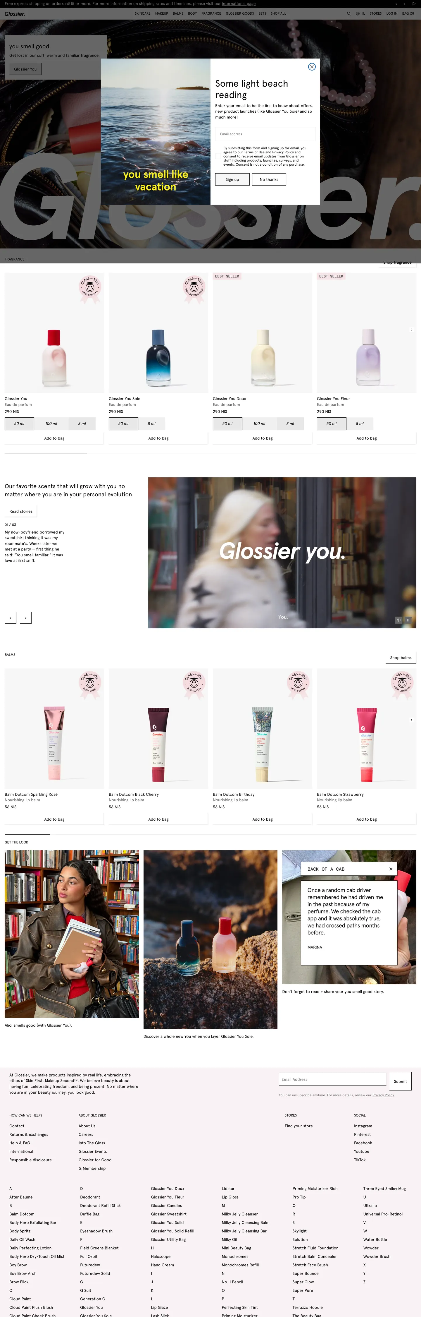
Glossier's site is a near-monochrome beauty store-window. The canvas is pure white (`#ffffff`), the ink is pure black (`#000000`) at a text-count of 951, the dividers are black at a border-count of 938, and the entire homepage carries one chromatic moment: an electric ultramarine pull-tag (`#0600ff`) over a beach photograph that reads `you smell like vacation`. Type runs Apercu at weight 400 across every role — the hero `you smell good.` headline at 20px, body copy at 14px / 19.6px leading, nav links at 14px / 20px with `0.03px` tracking, and category caps in Apercu Mono uppercase at 12px / 16.8px. There is no bold weight anywhere in the chrome. The corner radius vocabulary is one value (`0px`) plus a single `50%` circle for the cart-count dot. Buttons are not pill-shaped, cards are not rounded, photography sits in unsoftened rectangles. The brand looks like a magazine product spread under store-window glass.
This page packages the system into a single DESIGN.md file written to the Google Labs open specification. Inside: 18 colors tokens grouped into surface, ink, hairline, and brand-voltage buckets — every hex extracted from the live site, with the merged-cluster variants (`#f7f7f7`, `#f0f0f0`, `#f6e3e6`, `#e9e9eb`, `#efefef`) preserved as discrete surface roles; 11 Apercu typography tokens covering display, body, navigation, category caps, and the Apercu Mono micro-label; a 7-step rounded vocabulary that's effectively two values (`0px` for everything, `50%` for the cart dot); a 7-step spacing scale anchored on the site's observed `4px`, `8px`, `16px`, `20px`, `60px` rhythm; and 18 components entries covering the `Glossier You` CTA, the floating `you smell like vacation` blue pull-tag, the product tile, the lookbook tile, the email-capture input, the cart icon, the top nav, and the footer link cluster.
Feed the file to Claude, Cursor, or GitHub Copilot and the agent reproduces Glossier's restraint — the 0px corners, the single electric-blue voltage, the 20px display cap, the weight-400-only Apercu chrome — rather than inventing a beauty-category theme with rounded pink CTAs. Reference tokens directly in Tailwind config or CSS variables when you want one specific value; every hex, font, radius, and spacing entry is a quoted literal you can paste into a `theme.extend` block. The reason this system rewards study is the typographic discipline: most direct-to-consumer beauty brands turn the dial up to weight 700 and pink CTAs, and the chrome ends up shouting. Glossier holds Apercu at weight 400, caps display at 20px, and lets the product photography carry every screen.
What makes it distinct
5
- Zero corner radius everywhereevery button, input, card, and tile sits at `0px`, with the only `50%` circle reserved for the cart indicator dot
- Single voltage of electric ultramarine`#0600ff` appears 3 times on the entire homepage, scoped to one hero pull-tag over photography
- Display caps at 20pxthe homepage h2 (`you smell good.`) sits at Apercu 20px / 400, smaller than most SaaS body copy
- Apercu at weight 400 across every roledisplay, body, nav, and CTAs all share the same regular weight, no bold anywhere in the chrome
- Light-gray filled CTAsthe primary `Glossier You` button is `#e8e8e8` with a 1px black border, inverting the convention of a saturated fill
glossier.com
Live at glossier.com
A snapshot of the brand in production. Scroll the frame to see the whole page.
Colors
18 colors
Glossier's system runs on #0600ff as its primary voltage, used in 1 of 18 components. Type is set in Apercu across 11 tokens from 12px to 32px, weights 400–700. Shape language is sharp — components average 0px corner radius, favoring crisp rectangles.
Brand & Accent
Sparing, CTA-only voltage · 1
Surface
Page and card backgrounds · 7
Text
Headlines, body, captions · 7
Borders & Hairlines
Dividers, outlines, rules · 3
Typography
11 type tokens
Set in Apercu across 11 tokens, from 12px to 32px, weights 400–700. Shown in its own stack: where the font isn't installed, the fallback the file names stands in.
- hero-h220px · weight 400 · lh 1.4 · tracking 0The quick brown fox jumps over the lazy dog
- body-md14px · weight 400 · lh 1.4 · tracking 0The quick brown fox jumps over the lazy dog
- nav-link14px · weight 400 · lh 1.43 · tracking 0.03pxThe quick brown fox jumps over the lazy dog
- body-sm14px · weight 400 · lh 1.4 · tracking 0.02625pxThe quick brown fox jumps over the lazy dog
- category-cap12px · weight 400 · lh 1.63 · tracking 0The quick brown fox jumps over the lazy dog
- mono-cap12px · weight 400 · lh 1.4 · tracking 0The quick brown fox jumps over the lazy dog
- caption12px · weight 400 · lh 1.7 · tracking 0.04pxThe quick brown fox jumps over the lazy dog
- micro-label12px · weight 700 · lh 1.17 · tracking 0The quick brown fox jumps over the lazy dog
- button-md14px · weight 400 · lh 1.15 · tracking 0.02625pxThe quick brown fox jumps over the lazy dog
- pro-display32px · weight 400 · lh 1.2 · tracking 0The quick brown fox jumps over the lazy dog
- pro-button14px · weight 400 · lh 1 · tracking 0The quick brown fox jumps over the lazy dog
Layout
Radii and spacing
3 corner radii and 7 spacing values. Shape language: sharp.
Radii
- none0px
- full9999px
- circle50%
Spacing
- xxs1px
- xs4px
- sm8px
- md10px
- base16px
- lg20px
- xl60px
Components
18 components
Each rendered from its tokens (color, type, radius, padding) on Glossier's own canvas.
- Button Primarybutton-primaryButton Primary
- Button Primary Activebutton-primary-activeButton Primary Active
- Button Secondarybutton-secondaryButton Secondary
- Button Textbutton-textButton Text
- Blue Pull Tagblue-pull-tagBlue Pull Tag
- Top Navtop-navTop Nav
- Promo Barpromo-barPromo Bar
- Nav Linknav-linkNav Link
- Category Capcategory-capCategory Cap
- Product Tileproduct-tileProduct Tile
- Product Tile Photoproduct-tile-photoProduct Tile Photo
- Lookbook Tilelookbook-tileLookbook Tile
- Product Metaproduct-metaProduct Meta
- Product Meta Muteproduct-meta-muteProduct Meta Mute
- Type here…text-inputText Input
- Cart Dotcart-dotCart Dot
- Hairline Dividerhairline-dividerHairline Divider
- Footer Linkfooter-linkFooter Link
In use
The system, in use
Glossier's tokens on the kind of product it builds.
Build something people actually use.
A short paragraph of marketing copy that previews how the brand's display tier and body tier read together. Two sentences is usually enough.
FAQ
Glossier design system FAQ
Common questions about Glossier's tokens, components, and how to use this DESIGN.md in your project.
Read next
Related reading
Specs, directories, and component libraries that pair with this design system.
- The DESIGN.md specificationGoogle Labs' open spec for machine-readable design system files — the format this page is built on.github.com (opens in a new tab)
- Browse all design systemsThe full directory of DESIGN.md files on shadcn.io, with live mockups for each.shadcn.io
- Glossier — official siteThe live Glossier storefront that this DESIGN.md was extracted from on 2026-05-13.glossier.com (opens in a new tab)
Use it
Use Glossier in your project
One machine-readable file. Drop it into Claude, Cursor, or any AI tool that reads DESIGN.md.
Download the DESIGN.md
One machine-readable file: every color, type, radius, spacing, and component token of Glossier.
Feed it to your AI tool
Drop it into Claude, Cursor, or GitHub Copilot. The agent writes React components and Tailwind classes that match Glossier's visual language.
Reference the tokens directly
Or paste the values into your Tailwind config, CSS variables, or component library: every color, size and radius is a quoted, ready-to-copy value.
Read the full DESIGN.md: overview, rationale, do’s and don’ts
Overview
Glossier's site is a near-monochrome beauty store-window. The canvas runs pure white ({colors.canvas} — #ffffff), the ink is pure black ({colors.ink} — #000000) at a text-count of 951 and a border-count of 938 across the homepage, and the only chromatic moment in the entire chrome is a single electric-ultramarine pull-tag ({colors.primary} — #0600ff) that appears 3 times — all on the same you smell like vacation floating badge laid over a hero beach photograph. There is no second brand color, no decorative gradient, no atmospheric background.
Electric scarcity: where most direct-to-consumer beauty brands ship a saturated pink or a millennial peach as the primary voltage, Glossier ships none — the saturated tone in the system is an electric blue that appears 3 times total. The voltage works precisely because the surrounding chrome is gray-and-white at 951:127 (text-count of #000000 to bg-count of #ffffff). The moment that ratio softens, the blue stops reading as a magazine cover-line and starts reading as a button.
Type runs Apercu (Colophon Foundry) at weight 400 across every role — the homepage you smell good. h2 at 20px, body copy at 14px / 19.6px leading, nav links at 14px / 20px with 0.03px tracking, category caps in Apercu Mono uppercase at 12px / 16.8px. There is no bold weight anywhere in the chrome. The hero h2 at 20px is smaller than most SaaS body copy — the page leans on product photography and store-window symmetry for visual hierarchy rather than on type. The shape language is the most committed move in the system: one radius value, 0px, on every interactive surface. Buttons, inputs, product tiles, lookbook tiles, nav rectangles, footer cells — all hard-cornered. The only 50% element in the extracted chrome is the small numeric dot on the cart icon.
Key Characteristics:
- Single voltage:
{colors.primary}(#0600ff) electric ultramarine appears exactly 3 times on the homepage, scoped to one floating pull-tag over photography. - Black-and-white chrome:
{colors.ink}(#000000) holds 951 text occurrences and 938 borders;{colors.canvas}(#ffffff) carries 58 backgrounds — the system is a 7:1 ink-to-background ratio. - Zero corner radius: every button (
{component.button-primary}), input ({component.text-input}), product tile ({component.product-tile}), and lookbook tile ({component.lookbook-tile}) sits at{rounded.none}(0px). The only50%element is{component.cart-dot}. - Weight-400-only Apercu: every typography role from
{typography.hero-h2}(20px) down to{typography.caption}(12px) renders at weight 400 — there is no bold tier in the chrome. - Pink-tinted tile washes:
{colors.surface-pink}(#f6e3e6) and{colors.surface-pink-wash}(#faf2f4) back the lookbook tiles and product cells — the only warm tone in an otherwise neutral palette. - Light-gray filled CTA:
{component.button-primary}(Glossier You) uses a#e8e8e8fill with a 1px black border instead of the saturated-fill convention of beauty-category CTAs. - Apercu Mono uppercase caps: category labels render in Apercu Mono 12px / 16.8px uppercase (
{typography.mono-cap}) — the only monospaced role in the system, used as section markers. - Compressed spacing rhythm: the dominant gap values are
4px(count 33),8px 16px(count 29), and16px(count 18); section padding tops out at60px(count 4) — tighter than most marketplace sites.
Colors
Brand Voltage
- Electric Ultramarine (
{colors.primary}— #0600ff): frequency 3. Used as bg (3), text (0), border (0). The single chromatic accent in the entire chrome, scoped to theyou smell like vacationfloating pull-tag overlaid on the hero beach photograph. Treat it as a scoped voltage, not a general-purpose accent.
Ink
- True Black (
{colors.ink}— #000000): frequency 2070. Used as text (952), border (939), gradient (176), bg (3). The dominant token on every page — body text, headlines, nav links, dividers, the promo-bar fill, and the cart dot. Never softened to dark gray. - Rich Black (
{colors.ink-rich}— #040404): frequency 0 (declared in--rc-colorCSS variable). Reserved for the Klaviyo review module's active color — a near-imperceptible deepening from#000000. - Ink Deep (
{colors.ink-deep}— #333333): frequency 1. Used as bg (1). A near-black grade reserved for a single review-card surface; not a general-purpose text color.
Surface
- Canvas (
{colors.canvas}— #ffffff): frequency 127. Used as bg (58), border (39), text (30). The default page floor. Glossier does not ship a dark mode on the public web. - Surface Soft (
{colors.surface-soft}— #f7f7f7): clustered into the canvas family at extraction; used as the slightly-cooler near-white on the homepage product-band background. - Surface Card (
{colors.surface-card}— #e8e8e8): frequency 18. Used as bg (16), border (2). The primary CTA fill (Glossier You) and the default hairline tone — same hex doing double duty as button surface and 1px divider. - Surface Tile (
{colors.surface-tile}— #f0f0f0): clustered into#e8e8e8at extraction; the product-photo plate behind individual SKU shots. - Surface Pink (
{colors.surface-pink}— #f6e3e6): clustered into the warm-gray family; backs the rust-pink lookbook tiles. - Surface Pink Wash (
{colors.surface-pink-wash}— #faf2f4): frequency 1. Used as bg (1). The faintest warm wash in the system — the lightest pink-tinted neutral, applied to a single editorial cell. - Surface Active (
{colors.surface-active}— #efefef): declared in--rc-active-bg. The Klaviyo review-module's active-state surface — a one-grade darker fill than#e8e8e8for pressed-state review chips.
Hairline
- Hairline (
{colors.hairline}— #e8e8e8): same hex assurface-card. The default 1px border tone — input outlines, footer column splitters, product-card edges. - Hairline Soft (
{colors.hairline-soft}— #e9e9eb): declared in--kl-reviews-color-light-gray. The lightest divider in the system, used for editorial body separators. - Border Strong (
{colors.border-strong}— #000000): the 1px black border on the primary CTA — same token asink, narrated separately because the role is a visible chrome line rather than text.
Text
- Body (
{colors.body}— #000000): same hex asink. The dominant running-text color. Glossier doesn't soften body text to dark gray the way most retail systems do; copy sits at pure black. - Muted (
{colors.muted}— #666666): frequency 60. Used as text (29), border (25), bg (6). The placeholder color inside the email-capture input and the secondary-text grade for fine-print footer copy. - Text on Dark (
{colors.text-on-dark}— #ffffff): white text over the promo-bar ({component.promo-bar}) and the cart-dot indicator. - On Primary (
{colors.on-primary}— #ffffff): white text over the electric-blue pull-tag.
Typography
Font Family
The system runs Apercu (Colophon Foundry) for every text role, with Gill Sans as the historic in-house fallback and a system stack underneath. A second face — Apercu Mono — appears only on uppercase category caps ({typography.mono-cap}). A third face — Apercu Pro — appears on a small set of micro-labels and one button.
There is no separate display family. Apercu carries the entire scale at one weight: 400.
Hierarchy
| Token | Size | Weight | Line Height | Letter Spacing | Use |
|---|---|---|---|---|---|
{typography.pro-display} | 32px | 400 | 1.2 | 0 | Single decorative span (Glossier watermark behind hero) |
{typography.hero-h2} | 20px | 400 | 1.4 | 0 | Homepage hero pull-text (you smell good.) |
{typography.body-md} | 14px | 400 | 1.4 | 0 | Default running text (count 96 — the dominant role) |
{typography.nav-link} | 14px | 400 | 1.43 | 0.03px | Top-nav links (count 88 — the workhorse nav role) |
{typography.body-sm} | 14px | 400 | 1.4 | 0.02625px | Anchor links inside body copy (count 20) |
{typography.button-md} | 14px | 400 | 1.15 | 0.02625px | Glossier You CTA label |
{typography.pro-button} | 14px | 400 | 1 | 0 | Single Apercu Pro button label |
{typography.category-cap} | 12px | 400 | 1.63 | 0 | Apercu uppercase section caps (count 10) |
{typography.mono-cap} | 12px | 400 | 1.4 | 0 | Apercu Mono uppercase category caps (count 6) |
{typography.caption} | 12px | 400 | 1.7 | 0.04px | Headings inside review tiles (count 10) |
{typography.micro-label} | 12px | 700 | 1.17 | 0 | Single bold uppercase span — the one bold instance in the chrome |
Principles
Display tops out at 20px. The hero h2 (you smell good.) at 20px / 400 / 1.4 leading is smaller than most SaaS body copy; the page leans on the beach photograph and the floating electric-blue pull-tag for visual hierarchy. Body copy at 14px / 19.6px is the dominant role, appearing 96 times. The single bold occurrence in the entire chrome is one {typography.micro-label} — a 12px / 700 uppercase span. Every other role is weight 400.
Weight as discipline: where most beauty retail brands lean on weight 600–800 to signal upscale positioning, Glossier holds Apercu at weight 400 across every tier. The store-window typography reads as confidence by restraint — the brand trusts product photography to carry the page rather than typographic muscle.
Note on Font Substitutes
If Apercu and Apercu Mono are unavailable, Inter is the closest open-source substitute for the sans-serif family — geometry and x-height match within ~3% at body sizes. JetBrains Mono is the closest pair for the Apercu Mono category-cap role. Preserve letterSpacing: 0.03px on nav links and letterSpacing: 0.02625px on anchor links when substituting; both are signature Apercu metrics.
Layout
Spacing System
- Base unit: 4px (with 1px micro-step on hairlines).
- Tokens:
{spacing.xxs}1px ·{spacing.xs}4px ·{spacing.sm}8px ·{spacing.md}10px ·{spacing.base}16px ·{spacing.lg}20px ·{spacing.xl}60px. - Section padding (vertical):
{spacing.xl}(60px, count 4) for major homepage bands — tighter than typical SaaS marketing (80–96px) because the page is built around image grids rather than text bands. - Button padding:
8px 16px(count 29 — the dominant gap value) on the primary CTA, with a 1px black border absorbing one pixel of internal whitespace. - Gutters:
{spacing.xs}(4px, count 33) between product cells in the homepage grid — extremely tight, so adjacent product tiles effectively touch. - Promo-bar height:
26.59px(declared in--promo-bar-height) — a fixed top-of-viewport announcement strip.
Grid & Container
- Top-nav height:
40px(declared in--header-heightas2.5rem). One of the shortest primary navs on a mainstream retail site. - Product grid: 4-up at desktop with 4px gutters between cells. Each product tile is a hard-cornered rectangle with the product photograph occupying the full cell width and a 3-line meta stack beneath.
- Lookbook grid: alternating 1-up and 2-up rows of photography tiles with no internal padding — the photograph IS the tile.
- Footer: multi-column link list at desktop, dense rows in
{typography.body-sm}ink.
Whitespace Philosophy
The system gives editorial bands a modest 60px of vertical breathing room and compresses product grids to 4px gutters. The contrast is intentional: the page reads as "open editorial above, dense merchandising below," and the photography carries the visual weight rather than the chrome.
Elevation
The system has zero shadow tiers. No card hover float, no dropdown elevation, no modal shadow stack — the entire chrome runs flat.
- Flat (no shadow): body, hero, footer, every editorial band, every product tile, every lookbook tile — 100% of surfaces.
- No card-hover lift: product tiles do not gain a shadow on pointer hover; the underline / underline-thicken pattern handles state instead.
- No modal scrim documented: the cookie/region picker is implemented as a centered card without an extracted scrim color.
Depth comes from photography composition, the black-on-white surface separation, and product-photo cropping rather than from layered shadows. Shadow absence as discipline: the system reads as store-window flat because there is genuinely no elevation in the chrome — not even a 1px ambient shadow under the primary nav.
Shapes
The radius vocabulary is effectively one value.
{rounded.none}(0px) on every interactive surface, every container, every photo plate, every footer cell.{rounded.circle}(50%) on exactly one element: the cart-count dot.{rounded.full}(9999px) is declared as a fallback token for future pill-shaped components but is not used in the captured chrome.
0px as identity: the corner-radius decision is the entire shape language. Where most beauty retail brands soften CTAs to 6–8px corners or pills, Glossier holds every rectangle at 0px. Introducing a single 4px-radius button anywhere on the page would soften the chrome into category default — the store-window flatness depends on the discipline.
Components
Buttons
button-primary — Light-gray fill ({colors.surface-card} — #e8e8e8) with {colors.ink} text and a 1px black border. 0px radius, 8px 16px padding, 40px height. The Glossier You CTA. The chrome's signature button — light-gray instead of a saturated fill, hard-cornered instead of pill.
button-primary-active — The press state. Background flips to {colors.surface-active} (#efefef). No transform, no shadow change.
button-secondary — White fill ({colors.canvas}) with ink text and a 1px ink border. Same 0px radius, 7px 21px padding. Used for inverse CTAs on dark surfaces.
button-text — Plain ink text, no surface, no border. Underlined on hover. Used for editorial "Show more" type links.
Brand Voltage
blue-pull-tag — Electric ultramarine fill ({colors.primary} — #0600ff) with white text in {typography.mono-cap} (Apercu Mono 12px uppercase). 0px radius, 4px 12px padding. The single chromatic moment in the chrome — used exclusively as the floating you smell like vacation badge over the hero photography.
Top Navigation
top-nav — White surface, 40px height (the shortest primary nav in mainstream retail). Glossier wordmark flush left, category nav center, account + cart utilities flush right. No bottom shadow, hairline-only separator.
promo-bar — Black fill ({colors.ink}) with white text in {typography.body-md}. 26.59px height (extracted from --promo-bar-height). Carries shipping-threshold messaging at the top of every page.
nav-link — Ink text, 14px / 20px, 0.03px letter-spacing. No underline at rest, underline on hover.
category-cap — Ink uppercase label in {typography.category-cap} (Apercu 12px / 400 uppercase). Used as section markers above editorial bands.
Product Tiles
product-tile — A pink-wash card ({colors.surface-pink-wash} — #faf2f4) with 0px corners and 0px 0px 8px bottom-only padding. Contains a full-width product photo above a 3-line meta stack (title, regular price, regular-only review count).
product-tile-photo — The photo plate itself ({colors.surface-tile} — #f0f0f0 background visible where product is photographed in studio).
lookbook-tile — A rust-pink editorial card ({colors.surface-pink} — #f6e3e6) holding a photograph and a tile-anchored heading. Same 0px corners, no padding — the photograph fills the tile.
product-meta — Ink body line ({typography.body-md} — Apercu 14px / 400 / 1.4 leading), used for product titles.
product-meta-mute — Muted gray ({colors.muted} — #666666) caption ({typography.caption} — 12px / 1.7 leading), used for "Regular & Refill" descriptors.
Forms
text-input — White surface ({colors.canvas}), 1px {colors.hairline} outline, 0px radius, 46px height, 22px 8px 6px padding (asymmetric to accommodate the floating label above the input value). Placeholder text in {typography.body-md} muted ({colors.muted}).
Cart & Misc
cart-dot — A 14×14px circle ({rounded.circle}) with {colors.ink} fill and white numeric text in {typography.micro-label} (12px / 700 uppercase). The single rounded element in the extracted chrome.
hairline-divider — A 1px line at {colors.hairline-soft} (#e9e9eb) used for editorial body separators. Lighter than the {colors.hairline} token used for input outlines.
Footer
footer-link — Plain ink text in {typography.body-sm} (Apercu 14px / 400 / 1.4 leading with 0.02625px tracking). No underline at rest, underline on hover. Dense rows, tight 4px vertical rhythm between links.
Do's and Don'ts
Do
- Hold every interactive surface at
0pxcorner radius. The store-window flatness is the entire identity move. - Reserve
{colors.primary}(#0600ff) for one floating badge per page, layered over photography. Never use it for a primary CTA fill. - Keep Apercu at weight 400 across every text role. The single bold instance in the captured chrome is one 12px micro-label — there's no weight 700 tier for headlines.
- Use
{colors.surface-card}(#e8e8e8) with a 1px black border for the primary CTA. The light-gray fill is the brand signature. - Lean on product photography for hierarchy. The hero h2 at 20px is deliberately small — the photograph and the floating pull-tag pull the eye, not the type.
Don't
- Don't introduce a 4px or 8px radius anywhere — the chrome is
0pxon every surface, and softening one component breaks the store-window metaphor. The only50%element is the 14px cart-count dot. - Don't use
{colors.primary}(#0600ff) for a CTA fill, a heading color, or a hairline. The voltage works precisely because it appears 3 times total; spreading it to a second component flattens the cover-line effect. - Don't ramp Apercu past weight 400 for headlines. Weight 600+ is the beauty-category default — Glossier's typographic confidence comes from holding 400 across every tier. The one weight-700 occurrence is a 12px uppercase micro-label, not a display weight.
- Don't soften body text from pure
#000000to a dark gray. The 951 text-count of#000000is what gives the chrome its store-window crispness; introducing#333333for body copy lowers contrast and feels like a different brand. - Don't add a shadow under product tiles or the top nav. The system has zero shadow tiers — depth comes from photography and surface separation, not from elevation. A
0 2px 6px rgba(0,0,0,0.04)lift on hover will read as a generic e-commerce theme. - Don't replace Apercu Mono on category caps with a sans-serif. The mono caps are the only place a second typeface enters the system; collapsing them into Apercu sans removes the typographic counterpoint that makes the section markers legible against the body copy.
Known Gaps
- Product detail pages (PDP): the homepage tile is captured, but the full PDP typography hierarchy (variant selector, size stepper, "Add to bag" CTA placement) is out of scope.
- Cart drawer and checkout: the cart-dot indicator is captured, but the slide-in cart drawer and the full checkout flow are not.
- Into The Gloss editorial: Glossier's blog uses a separate type system with serif headlines and editorial photography — not represented in this DESIGN.md.
- Loyalty / rewards member area: out of scope; the system's authenticated chrome isn't captured.
- Hover-state colors: not documented per the global no-hover policy. Glossier's actual
:hoverstyling on product tiles is an underline-thicken on the title; precise color extraction is unreliable. - Form-validation states: the email-capture input is documented at rest; error / success states are not visible in the captured surfaces.
- Full Apercu weight ramp: the spec only documents weight 400, which is the only weight shipped in the chrome. The licensed family includes 100–800 weights but Glossier doesn't use them.
- International currency picker: the localized site shows ₪ (ILS) shipping copy; the full currency-picker dropdown styling is not captured.
E-commerce & Retail
More systems like this
More DESIGN.md files in E-commerce & Retail.
Pricing
Build it with Pro
The DESIGN.md files are free. Pro adds 6,000+ blocks, premium templates and the MCP server, so your AI editor builds in your system for you.
4.9/5 out of 5 · 150+ reviewsfrom 150+ founders and developers.
Billing
Billed once a year in USD. Cancel anytime.
- How many people can use the license.
- Client work, SaaS products and anything you charge for.
- Production-ready React sections: hero, pricing, features, dashboards and more.
- Complete multi-page sites you can ship as they are.
- React icons from every major library, installable with one command.
- Presets that restyle every block, in light and dark.
- Lets your AI editor search, preview and install blocks for you.
- Priority requests are answered first.
Individual
For personal projects & open source
$32instead of $49/mo
$389 billed yearly
- Seats: 1 seat
- Commercial use: Personal & open source only
- Pro blocks: 6,000+ blocks
- Templates: All 14 templates
- React icons: 294k+ icons
- Themes: All 59 themes
- MCP server: Basic usage
- Support: Standard
Team
Most popularFor freelancers, agencies & startups
$66instead of $99/mo
$789 billed yearly · ≈ $13/dev/mo
- Seats: Up to 5 seats
- Commercial use: Included
- Pro blocks: 6,000+ blocks
- Templates: All 14 templates
- React icons: 294k+ icons
- Themes: All 59 themes
- MCP server: High usage
- Support: Priority
Organization
For companies with larger teams
$132instead of $199/mo
$1,589 billed yearly
- Seats: Unlimited seats
- Commercial use: Included
- Pro blocks: 6,000+ blocks
- Templates: All 14 templates
- React icons: 294k+ icons
- Themes: All 59 themes
- MCP server: Unlimited usage
- Support: Priority
Billed once a year in USD. Cancel anytime.
Individual
For personal projects & open source
$32instead of $49/mo
$389 billed yearly
- How many people can use the license.Seats: 1 seat
- Client work, SaaS products and anything you charge for.Commercial use: Personal & open source only
- Production-ready React sections: hero, pricing, features, dashboards and more.Pro blocks: 6,000+ blocks
- Complete multi-page sites you can ship as they are.Templates: All 14 templates
- React icons from every major library, installable with one command.React icons: 294k+ icons
- Presets that restyle every block, in light and dark.Themes: All 59 themes
- Lets your AI editor search, preview and install blocks for you.MCP server: Basic usage
- Priority requests are answered first.Support: Standard
Team
Most popularFor freelancers, agencies & startups
$66instead of $99/mo
$789 billed yearly · ≈ $13/dev/mo
Everything in Individual, plus
- How many people can use the license.Seats: Up to 5 seats
- Client work, SaaS products and anything you charge for.Commercial use: Included
- Lets your AI editor search, preview and install blocks for you.MCP server: High usage
- Priority requests are answered first.Support: Priority
Organization
For companies with larger teams
$132instead of $199/mo
$1,589 billed yearly
Everything in Team, plus
- How many people can use the license.Seats: Unlimited seats
- Lets your AI editor search, preview and install blocks for you.MCP server: Unlimited usage
- Secure checkout via Stripe
- Code lives in your repo
- Keep what you've shipped if you cancel
- License terms
Your system, built for you
Every block, template and icon, installed by your AI agent in your design system. The DESIGN.md files stay free.