Gitpod Design System
Gitpod's marketing site pairs ABC Diatype sans with Martina Plantijn serif on a near-white monochrome canvas. Near-navy ink, forest-green links, 12px default rounding. Tokens for React, Next.js, and AI coding tools.
Add shadcn.io to your AI agent. · Pro It installs blocks, icons and templates in your design system from a prompt, with Pro.
Set up MCP- Primary
- #1f1f1f
- Typeface
- ABC Diatype
- Shape
- Mixed
- Base radius
- 8px
- Colors
- 12
- Type tokens
- 14
- Components
- 14
- Spacing values
- 9
About
About Gitpod DESIGN.md
Curated by Dov Azencot · Updated May 19, 2026 · Source gitpod.io (opens in a new tab)
Gitpod's marketing site does something almost no developer-tools brand attempts: it brings a light-weight humanist serif into the primary display tier. Martina Plantijn at 64px / weight 300 with tight letter-spacing introduces section headings at a register closer to an architecture or fashion magazine than to a CI/CD dashboard. ABC Diatype — a geometric sans with restrained proportions — handles the body and UI chrome. The two families never compete because they each own distinct surface types: Martina Plantijn appears only at display scale in heading positions, ABC Diatype covers everything from navigation to form labels. Where Vercel runs Geist exclusively and Linear runs Inter, Gitpod invests in a typographic voice that signals craft and deliberateness above technical authority.
The DESIGN.md file packages the system into machine-readable tokens for React and AI tools. Inside: 12 colors tokens anchored by a deeply blue-shifted near-navy ink (#0a0e19) at 588 total occurrences, with a single forest-green link tone (#397554) as the sole chromatic element; 14 typography tokens spanning Martina Plantijn at three display sizes and ABC Diatype across body, heading, button, and label tiers; a radius scale centered on 12px; and 9 spacing values on a 4px base. Components cover the editorial section headings, the inline text input (the only captured form element), feature description cards, and the footer.
Feed this spec to an AI coding tool and it reproduces Gitpod's moves: near-navy ink instead of pure black or charcoal, Martina Plantijn for any display-scale heading that needs editorial weight, ABC Diatype for all body and UI, forest green exclusively for links, and 12px default rounding. The typographic pairing is the move worth considering for developer-tools brands that want to distance themselves from the commodity sans-only look — it only succeeds if both families are loaded at quality weights and the serif is confined strictly to display use.
What makes it distinct
5
- Dual-typeface editorial identityABC Diatype (geometric sans) and Martina Plantijn (humanist serif at weight 300) share display duties, a combination not found elsewhere in dev-tools marketing
- Near-navy structural inkthe dominant color (#0a0e19) is a deeply blue-shifted near-black, warmer and more anchored than the pure-black or graphite that Vercel and Linear use
- Forest-green link color#397554 appears 20 times as the sole chromatic element on an otherwise monochrome page, reserved exclusively for inline links and text accents
- Martina Plantijn at weight 300the display serif runs at light weight, a contrast to the heavy serifs used in publications; it reads closer to editorial fashion than to developer documentation
- 12px default roundingthe dominant card shape across 24 occurrences, softer than most dev-tools systems while stopping short of the 16px that CI/CD platforms use
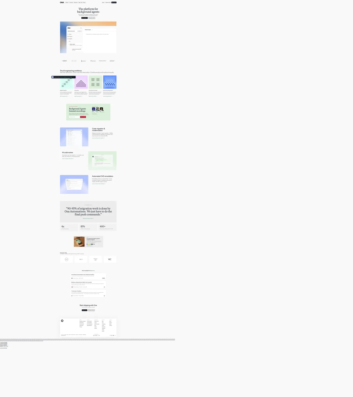
gitpod.io
Live at gitpod.io
A snapshot of the brand in production. Scroll the frame to see the whole page.
Colors
12 colors
Gitpod's system anchors on #1f1f1f (ink-dark) as its primary color. Type is set in ABC Diatype across 14 tokens from 13px to 64px, weights 300–600. Shape language is mixed across 14 components, blending pills, soft rounds, and squarer corners.
Surface
Page and card backgrounds · 5
Text
Headlines, body, captions · 5
Borders & Hairlines
Dividers, outlines, rules · 1
Other
Specialty colors · 1
Typography
14 type tokens
Set in ABC Diatype across 14 tokens, from 13px to 64px, weights 300–600. Shown in its own stack: where the font isn't installed, the fallback the file names stands in.
- display-xl64px · weight 300 · lh 62.72px · tracking -0.36pxThe quick brown fox jumps over the lazy dog
- display-lg56px · weight 300 · lh 54.88px · tracking -1.12pxThe quick brown fox jumps over the lazy dog
- display-md48px · weight 300 · lh 50.4px · tracking -0.96pxThe quick brown fox jumps over the lazy dog
- heading-lg40px · weight 400 · lh 39.2px · tracking -1.16pxThe quick brown fox jumps over the lazy dog
- heading-md24px · weight 400 · lh 31.2px · tracking -0.456pxThe quick brown fox jumps over the lazy dog
- heading-sm22px · weight 400 · lh 24.2px · tracking -0.638pxThe quick brown fox jumps over the lazy dog
- heading-xs18px · weight 500 · lh 17.64px · tracking -0.36pxThe quick brown fox jumps over the lazy dog
- body-lg18px · weight 400 · lh 19.8pxThe quick brown fox jumps over the lazy dog
- body-md17px · weight 400 · lh 22.95px · tracking -0.36pxThe quick brown fox jumps over the lazy dog
- body-sm16px · weight 400 · lh 25.6pxThe quick brown fox jumps over the lazy dog
- label-md13px · weight 600 · lh 16.25pxThe quick brown fox jumps over the lazy dog
- button-md14px · weight 500 · lh 20pxThe quick brown fox jumps over the lazy dog
- nav-link16px · weight 400 · lh 16pxThe quick brown fox jumps over the lazy dog
- caption16px · weight 400 · lh 17.6pxThe quick brown fox jumps over the lazy dog
Layout
Radii and spacing
7 corner radii and 9 spacing values. Shape language: mixed.
Radii
- none0px
- xs4px
- sm6px
- md8px
- lg12px
- xl16px
- full9999px
Spacing
- xs2px
- sm8px
- md16px
- lg24px
- xl28px
- 2xl32px
- 3xl40px
- 4xl43px
- 5xl48px
Components
14 components
Each rendered from its tokens (color, type, radius, padding) on Gitpod's own canvas.
- Button Primarybutton-primaryButton Primary
- Button Secondarybutton-secondaryButton Secondary
- Top Navtop-navTop Nav
- Nav Linknav-linkNav Link
- Hero Headinghero-headingHero Heading
- Display Headingdisplay-headingDisplay Heading
- Body Paragraphbody-paragraphBody Paragraph
- CardcardCard
- Card Greencard-greenCard Green
- Feature Tilefeature-tileFeature Tile
- Type here…text-inputText Input
- Stats Blockstats-blockStats Block
- Testimonial Cardtestimonial-cardTestimonial Card
- FooterfooterFooter
In use
The system, in use
Gitpod's tokens on the kind of product it builds.
Build something people actually use.
A short paragraph of marketing copy that previews how the brand's display tier and body tier read together. Two sentences is usually enough.
FAQ
Gitpod design system FAQ
Common questions about Gitpod's tokens, components, and how to use this DESIGN.md in your project.
Read next
Related reading
Specs, directories, and component libraries that pair with this design system.
- Browse all design systemsThe full directory of DESIGN.md files on shadcn.io, with live mockups for each.shadcn.io
- Gitpod — official siteGitpod's public marketing site — the source of truth for the live tokens captured in this file.gitpod.io (opens in a new tab)
- The DESIGN.md specificationGoogle Labs' open spec for machine-readable design system files — the format this page is built on.github.com (opens in a new tab)
Use it
Use Gitpod in your project
One machine-readable file. Drop it into Claude, Cursor, or any AI tool that reads DESIGN.md.
Download the DESIGN.md
One machine-readable file: every color, type, radius, spacing, and component token of Gitpod.
Feed it to your AI tool
Drop it into Claude, Cursor, or GitHub Copilot. The agent writes React components and Tailwind classes that match Gitpod's visual language.
Reference the tokens directly
Or paste the values into your Tailwind config, CSS variables, or component library: every color, size and radius is a quoted, ready-to-copy value.
Read the full DESIGN.md: overview, rationale, do’s and don’ts
Overview
Gitpod's marketing site challenges the design convention that developer tools must communicate through dark surfaces, gradient heroes, and a sans-only type stack. Editorial Serif Restraint. Where Linear, Vercel, and Warp use a single geometric or humanist sans across every tier, Gitpod introduces Martina Plantijn — a humanist serif at weight 300 — for display headings. The combination with ABC Diatype (geometric sans) produces the most distinct typographic voice in the cloud-dev-environment category. The palette declines to amplify: near-navy ink on a white canvas, forest green for links, and a pistachio-green surface tint for one category of feature card. No brand-voltage accent, no gradient, no dark canvas.
The shape language is mid-soft: 12px as the default card radius, 8px for inner elements, 6px for compact chips, with a full pill for CTA buttons. The system sits warmer than the 4–8px tight radius that terminal-aesthetic tools use, and more reserved than the 16px generous-soft that CircleCI deploys.
Key Characteristics:
- Two-typeface editorial identity: ABC Diatype for all UI, Martina Plantijn at weight 300 for all display headings — a combination not visible in any other dev-tools system in the directory.
- Near-navy structural ink (
{colors.ink}— #0a0e19) — the dominant text and border tone at 588 total occurrences, deeply blue-shifted. - Forest-green link tone (
{colors.link-green}— #397554) as the sole chromatic element — 20 occurrences, all as text and border on inline links. - Tight letter-spacing on the sans display tier: -1.16px at 40px, -0.638px at 22px — approaching magazine-display tracking without the typographic weight.
- Pistachio-green surface (
{colors.surface-green}— #dbefdb) as a single tinted card variant — natural and unsaturated, reinforcing the environmental register. - 12px default card rounding — warmer than Vercel's tight 4–6px, more reserved than CircleCI's 16px.
- Full-pill CTA buttons in near-navy ink with white text — the navigation and hero actions use an ink-fill pill rather than a chromatic CTA.
- No large hero gradient or full-bleed brand-color section — the page opens on a white canvas with a text headline and a product-dashboard illustration.
Colors
Structural Text
- Near-Navy Ink (
{colors.ink}— #0a0e19): frequency 588 (text 296, bg 5, border 287). The dominant system color — wired as--color-onyx-black. Every heading, paragraph, border, and nav element renders in this deeply blue-shifted near-black. The 268° hue angle makes it distinctly cooler and more anchored than pure black or standard charcoal. - Medium Gray (
{colors.ink-muted}— #818181): frequency 20 (text 10, border 10). Wired as--color-grey-700. Secondary body text — used for supporting paragraphs and caption-tier copy where near-navy would feel too heavy. - Gray Soft (
{colors.ink-soft}— #636363): frequency 24 (text 12, border 12). Wired as--color-grey-800. Footer link text and tertiary labels. - Near Black (
{colors.ink-dark}— #1f1f1f): frequency 8 (text 4, border 4). Wired as--color-grey-900. The darkest text tier — used in header elements where maximum contrast is needed.
Surface
- Canvas (
{colors.canvas}— #ffffff): the page floor and all primary card surfaces. Merged from near-identical white values (pure white, off-white, porcelain grey) — wired as--color-white,--color-porcelain-grey,--color-gray-50. The system runs on a white canvas without the gray-floor shift that CircleCI uses. - Surface Light (
{colors.surface-1}— #f2f2f2): frequency 9 (bg 8, border 1). Wired as--color-grey-400. Light background for feature tiles and inner card backgrounds. - Surface Mid (
{colors.surface-2}— #e1e1e1): frequency 7 (bg 3, border 4). Wired as--color-grey-500. Card borders and inner chip fills. - Surface Muted (
{colors.surface-muted}— #cecece): frequency 9 (border 3, gradient 6). Wired as--color-grey-600. Gradient stop for overlaid surface transitions.
Brand Link
- Forest Green (
{colors.link-green}— #397554): frequency 20 (text 10, border 10). Wired as--color-link-green. The sole chromatic element on the page — inline link color and hypertext state border. A naturalistic mid-depth green, not electric. - Pistachio Green (
{colors.surface-green}— #dbefdb): frequency 4 (bg only). Wired as--color-pistachio-green. The tinted card-background variant used for one category of feature card.
Shadow and Border
- Hairline (
{colors.hairline}— #e1e1e1): the primary border tone across cards and input fields — same value as{colors.surface-2}. - Shadow (
{colors.shadow}— #000000): frequency 4 (shadow 2, text 1, border 1). Standard black-with-opacity for small elevation shadows.
Typography
Font Families
The system runs two primary families: ABC Diatype for all UI and prose surfaces, and Martina Plantijn for display-scale headings. ABC Diatype is a geometric sans from ABC Dinamo with slightly narrower proportions than Inter; Martina Plantijn is a humanist serif with low x-height and long ascenders, available from TypeFoundry. A system mono stack (ui-monospace, SFMono-Regular, Menlo, Monaco, Consolas) is declared as --font-mono for code contexts.
The two-family system is the most consequential design decision on the site. In the dev-tools category, almost every brand runs one sans family across all tiers. Gitpod's use of a light-weight humanist serif at display scale positions it closer to editorial design — architecture, interiors, craft — than to developer productivity software.
Hierarchy
| Token | Size | Weight | Line Height | Letter Spacing | Use |
|---|---|---|---|---|---|
{typography.display-xl} | 64px | 300 | 62.72px | -0.36px | Largest display headings (Martina Plantijn serif) |
{typography.display-lg} | 56px | 300 | 54.88px | -1.12px | Section sub-headings (Martina Plantijn) |
{typography.display-md} | 48px | 300 | 50.4px | -0.96px | Tertiary display tier (Martina Plantijn) |
{typography.heading-lg} | 40px | 400 | 39.2px | -1.16px | Above-fold h2 headline (ABC Diatype) |
{typography.heading-md} | 24px | 400 | 31.2px | -0.456px | Sub-section headings |
{typography.heading-sm} | 22px | 400 | 24.2px | -0.638px | Card heading and feature titles |
{typography.heading-xs} | 18px | 500 | 17.64px | -0.36px | Small h3 feature tile headings |
{typography.body-lg} | 18px | 400 | 19.8px | 0 | Hero and lead paragraph |
{typography.body-md} | 17px | 400 | 22.95px | -0.36px | Standard body paragraph |
{typography.body-sm} | 16px | 400 | 25.6px | 0 | Default body — nav and card copy |
{typography.label-md} | 13px | 600 | 16.25px | 0 | Small labels and badge text |
{typography.button-md} | 14px | 500 | 20px | 0 | Button and CTA labels |
{typography.nav-link} | 16px | 400 | 16px | 0 | Navigation link labels |
{typography.caption} | 16px | 400 | 17.6px | 0 | Button-adjacent captions and metadata |
Principles
The Martina Plantijn display tier runs at weight 300 across all three sizes — lighter than body weight. This creates an intentional hierarchy inversion: the larger the heading, the lighter the weight. Body copy at weight 400 (ABC Diatype) renders slightly heavier than the 300-weight display, which reinforces the editorial-magazine register where display type floats and body text grounds. ABC Diatype at the sans-heading tier (40px, -1.16px tracking) uses tight tracking to compensate for the absence of weight — the narrowed character spacing adds density without adding visual mass.
Note on Font Substitutes
ABC Diatype is commercially licensed (ABC Dinamo). The closest open-source substitute is DM Sans at the same weights and a -0.02em letter-spacing adjustment for the display sizes; Plus Jakarta Sans is slightly wider but transfers cleanly at body sizes. Martina Plantijn is licensed from TypeFoundry; for open-source substitute, Cormorant Garamond at weight 300 carries similar proportion and high elegance at display scale. EB Garamond is a wider alternative with similar warmth.
Layout
Spacing System
- Base unit: 4px, with 16px and 24px as the dominant content values.
- Tokens:
{spacing.xs}2px ·{spacing.sm}8px ·{spacing.md}16px ·{spacing.lg}24px ·{spacing.xl}28px ·{spacing.2xl}32px ·{spacing.3xl}40px ·{spacing.4xl}43px ·{spacing.5xl}48px. - Card padding: 24px internal (
{spacing.lg}) for standard cards; 24×40px for testimonial cards. - Nav padding: 11px vertical × 40px horizontal — generous horizontal breathing room.
- Top-of-section padding: 43px vertical in the footer.
Grid and Container
- Max content width: approximately 1360px (declared as
--container-width: 85rem). - Hero layout: left-aligned text stack — product tagline at 40px ABC Diatype, supporting paragraph, dual CTA pills — with a product dashboard illustration below.
- Feature sections: alternating text-and-image rows, each featuring a Martina Plantijn serif heading at one of the three display sizes.
- Feature grid: 4-column tile grid showing use-case illustrations (background agents, code migration, AI code review, CVE remediation).
- Stats row: inline stat blocks ("4x faster," "83% reduction," "400+ customers") in the near-navy ink on white — rendered as display-xl metrics.
- Blog/resource section: vertical list of highlighted posts with inline link-green text accents.
Rhythm
The page reads as a vertical editorial flow rather than sectional bands. Sections do not alternate background colors (with the exception of one pistachio-green card tile and an orange-gradient product illustration panel). The near-navy ink on white canvas remains consistent from top to bottom, creating the sensation of reading a long-form editorial piece rather than scanning a product marketing page. Rhythm is created by the alternation between serif display headings and sans body text, not by surface-color shifts.
Elevation
The system uses hairline borders on white rather than shadow elevation. Cards sit on the white canvas with a 1px {colors.hairline} (#e1e1e1) border. Drop shadows appear in 4 occurrences using black-with-opacity, reserved for small product-mockup frames within feature illustrations. There is no tonal surface lift (no equivalent to Spline's surface-1 / canvas separation). The flat approach is consistent with the editorial register — editorial layouts do not use shadows to lift content; they use whitespace and typographic weight.
Shapes
The radius scale is mid-soft, centered on 12px:
{rounded.none}0px — not explicitly applied; the page has no square-edged surface bands.{rounded.xs}4px — compact UI chips and inner badge elements.{rounded.sm}6px — text input fields; 5 occurrences.{rounded.md}8px — inner card content and nested elements; 11 occurrences.{rounded.lg}12px — the dominant card radius across 24 occurrences.{rounded.xl}16px — larger cards and panel elements; 4 occurrences.{rounded.full}9999px — CTA buttons and navigation pills (rendered as the maximum representable radius at ~6.71×10⁷ px in CSS).
The 12px card default sits between the tight dev-tools tier (4–6px) and the warm SaaS tier (16px+). The full-pill CTA is the warmest shape in the system — the contrast between tight-radius cards and full-pill buttons is deliberate.
Components
button-primary — Near-navy ink {colors.ink} fill, white text, {rounded.full} pill, 7×10px padding, 36px height. "Sign up" and "Start building" are canonical instances. The CTA uses the page's dominant ink color as the fill — no separate accent color is needed.
button-secondary — Transparent fill, near-navy ink text, 1px {colors.hairline} border, {rounded.full} pill. "Talk to us" or "Learn more" secondary instances.
top-nav — White canvas, near-navy ink text and logo, 52px height, 11×40px padding. Gitpod wordmark flush left, navigation links (Docs / Resources / Blog / Pricing) center, "Sign in" + primary button right. No bottom hairline border visible on the captured surface.
nav-link — Transparent background, near-navy ink text in {typography.nav-link} (16px / 400 / 16px line-height). The compressed line-height (1.0) gives nav labels a tight, precise feel.
hero-heading — ABC Diatype at {typography.heading-lg} (40px / 400 / -1.16px tracking), near-navy ink, on transparent white background. The above-fold marketing headline ("The AI engineering workforce. Set the direction. Run the execution. Continuously and autonomously.").
display-heading — Martina Plantijn at {typography.display-xl} (64px / 300 / -0.36px tracking), near-navy ink. The editorial section heading — appears above feature-row sections and the testimonial block.
body-paragraph — Medium-gray {colors.ink-muted} text at {typography.body-sm} (16px / 400). Default paragraph body — the gray tone reduces the contrast with the white canvas and lets headings carry the visual weight.
card — White canvas, 1px {colors.hairline} border, {rounded.lg} 12px radius, 24px padding. The standard feature-description and blog-post card.
card-green — Pistachio-green {colors.surface-green} fill, near-navy ink text, {rounded.lg} 12px radius, 24px padding. Used for one category of feature card — the green tint signals environmental or success-state content.
feature-tile — Light-gray {colors.surface-1} fill, near-navy ink text, {rounded.lg} 12px radius, 0 padding. The 4-column use-case grid tile — holds a product illustration image and a short descriptive heading.
text-input — White canvas, near-navy ink text, 1px {colors.surface-2} border, {rounded.sm} 6px radius, 10×16px padding, 42px height. The email input in the newsletter or waitlist section.
stats-block — Transparent background, near-navy ink text in {typography.display-xl}. Metric pairs ("4x", "83%", "400+") rendered at display-serif scale as social proof.
testimonial-card — White canvas, 1px hairline border, {rounded.lg} 12px radius, 24×40px padding. Holds a quote in body-md, an attribution in label-md, and an avatar.
footer — White canvas, medium-soft gray text ({colors.ink-soft}), 43×28px padding. Multi-column footer with the Gitpod wordmark, navigation links, social icons, and legal text.
Do's and Don'ts
Do reserve Martina Plantijn for display headings only and keep ABC Diatype in all body and UI contexts. The editorial power of the pairing depends on the serif appearing only at large scale — any use of Martina Plantijn below 40px (in body copy, labels, or buttons) would read as a mismatch between display weight and prose rendering.
Do treat forest green ({colors.link-green} — #397554) as a hypertext-only color. The system uses it 20 times, exclusively on inline links. Adding it to buttons, icons, or decorative elements would convert a precise semantic signal into a general accent and erase the restraint that makes it work.
Do use the near-navy ink ({colors.ink} — #0a0e19) for the primary CTA button fill rather than a chromatic accent. The ink-fill pill CTA is the system's answer to "what color is the action?" — the answer is the same as the text, not a separate accent.
Do use tight letter-spacing on the ABC Diatype display tier. The -1.16px tracking on the 40px heading is essential to the density that makes the sans headline read with weight comparable to the light-weight serif. Without the tracking, the 40px ABC Diatype reads as loose and informal.
Don't introduce a chromatic accent color beyond the forest-green link tone. The system runs on near-navy ink and white canvas; any chromatic addition (a brand-color CTA, a section-background accent, icon colors) would break the monochrome editorial register.
Don't render Martina Plantijn above weight 300. The light-weight serif is the move — bumping to 400 or 500 would make the display headings compete with body text rather than float above it, destroying the intended hierarchy inversion.
Don't swap the 12px card radius for a tighter 4–8px tier. The 12px default is the warmth signal that keeps the monochrome system from feeling cold and architectural. Tightening to 4px would shift the page into terminal-tool territory, which contradicts the editorial register.
Don't add shadows to standard cards. The system uses only hairline borders for card separation. The flat editorial approach depends on whitespace and type hierarchy rather than elevation cues; adding shadows would create visual noise without adding clarity.
Known Gaps
- Primary CTA button: no primary button is captured in the render (the form section shows only the text input); the ink-fill pill button spec is inferred from the navigation sign-up button and the smaller inline CTAs visible in the capture.
- Dark mode: the marketing surface is light-only; a dark variant for the product dashboard or documentation may exist but is not represented here.
- Hover and focus states: the full state matrix (link-green hover, button press, input focus ring) is not captured from the static render.
- Motion: the page includes scroll-triggered entrance animations on feature tiles and section headings; easing curves and timing are declared in the CSS but not captured as component values.
- Color palette depth: the CSS declares named pastel-blue, candy-purple, ocean-blue, frosted-mint, and chocolate-brown — all wired as custom properties but none appearing in the captured marketing surface. These may be reserved for product states, agent-type identifiers, or future marketing content.
- Mono type usage: the system mono stack (ui-monospace / SFMono-Regular / Menlo / Monaco / Consolas) is declared as
--font-monobut no code block instance is visible in the marketing capture.
Developer Tools & IDEs
More systems like this
More DESIGN.md files in Developer Tools & IDEs.
Pricing
Build it with Pro
The DESIGN.md files are free. Pro adds 6,000+ blocks, premium templates and the MCP server, so your AI editor builds in your system for you.
4.9/5 out of 5 · 150+ reviewsfrom 150+ founders and developers.
Billing
Billed once a year in USD. Cancel anytime.
- How many people can use the license.
- Client work, SaaS products and anything you charge for.
- Production-ready React sections: hero, pricing, features, dashboards and more.
- Complete multi-page sites you can ship as they are.
- React icons from every major library, installable with one command.
- Presets that restyle every block, in light and dark.
- Lets your AI editor search, preview and install blocks for you.
- Priority requests are answered first.
Individual
For personal projects & open source
$32instead of $49/mo
$389 billed yearly
- Seats: 1 seat
- Commercial use: Personal & open source only
- Pro blocks: 6,000+ blocks
- Templates: All 14 templates
- React icons: 294k+ icons
- Themes: All 59 themes
- MCP server: Basic usage
- Support: Standard
Team
Most popularFor freelancers, agencies & startups
$66instead of $99/mo
$789 billed yearly · ≈ $13/dev/mo
- Seats: Up to 5 seats
- Commercial use: Included
- Pro blocks: 6,000+ blocks
- Templates: All 14 templates
- React icons: 294k+ icons
- Themes: All 59 themes
- MCP server: High usage
- Support: Priority
Organization
For companies with larger teams
$132instead of $199/mo
$1,589 billed yearly
- Seats: Unlimited seats
- Commercial use: Included
- Pro blocks: 6,000+ blocks
- Templates: All 14 templates
- React icons: 294k+ icons
- Themes: All 59 themes
- MCP server: Unlimited usage
- Support: Priority
Billed once a year in USD. Cancel anytime.
Individual
For personal projects & open source
$32instead of $49/mo
$389 billed yearly
- How many people can use the license.Seats: 1 seat
- Client work, SaaS products and anything you charge for.Commercial use: Personal & open source only
- Production-ready React sections: hero, pricing, features, dashboards and more.Pro blocks: 6,000+ blocks
- Complete multi-page sites you can ship as they are.Templates: All 14 templates
- React icons from every major library, installable with one command.React icons: 294k+ icons
- Presets that restyle every block, in light and dark.Themes: All 59 themes
- Lets your AI editor search, preview and install blocks for you.MCP server: Basic usage
- Priority requests are answered first.Support: Standard
Team
Most popularFor freelancers, agencies & startups
$66instead of $99/mo
$789 billed yearly · ≈ $13/dev/mo
Everything in Individual, plus
- How many people can use the license.Seats: Up to 5 seats
- Client work, SaaS products and anything you charge for.Commercial use: Included
- Lets your AI editor search, preview and install blocks for you.MCP server: High usage
- Priority requests are answered first.Support: Priority
Organization
For companies with larger teams
$132instead of $199/mo
$1,589 billed yearly
Everything in Team, plus
- How many people can use the license.Seats: Unlimited seats
- Lets your AI editor search, preview and install blocks for you.MCP server: Unlimited usage
- Secure checkout via Stripe
- Code lives in your repo
- Keep what you've shipped if you cancel
- License terms
Your system, built for you
Every block, template and icon, installed by your AI agent in your design system. The DESIGN.md files stay free.