GitLab Design System
GitLab's design system as a DESIGN.md file. Ink #171321, purple #7759c2, sunrise gradient, GitLab Sans weight 660, 17 components. For React, Next.js, and AI tools.
Add shadcn.io to your AI agent. · Pro It installs blocks, icons and templates in your design system from a prompt, with Pro.
Set up MCP- Primary
- #1f1c2e
- Typeface
- GitLab Sans
- Shape
- Soft
- Base radius
- 4px
- Colors
- 18
- Type tokens
- 11
- Components
- 17
- Spacing values
- 10
About
About GitLab DESIGN.md
Curated by Dov Azencot · Updated May 13, 2026 · Source about.gitlab.com (opens in a new tab)
GitLab's marketing canvas is the courthouse register of DevSecOps — a pure "#ffffff" page floor with near-black "#171321" ink and a structural purple "#7759c2" that runs every hairline border, link rest, and divider rule. Where most developer platforms reach for a saturated brand voltage on the primary CTA, GitLab paints "Get free trial" in white text on the same "#171321" ink that holds the headline, giving the page zero chromatic action surfaces. The single warm atmospheric is a sunrise gradient — "#ffc2a0" through "#ff9a55", "#ff7a2f", and "#c65a2e" — scoped exclusively to the hero orb illustration. Outside that one band the page is monochrome ink-on-paper with purple structural rules, a register closer to a financial-services prospectus than a typical SaaS landing page.
This page packages the surface into one DESIGN.md file written to the Google Labs spec. Inside: 18 colors tokens grouped into canvas, ink, purple structural, the sunrise-gradient stops, plus support tokens for the dark-card surface ("#1f1c2e") and pale lavender wash ("#f6f3fe"); 11 typography tiers covering GitLab Sans from "96px" hero weight 660 with "-2.88px" tracking down to "14px" body weight 400; a five-step radius scale running 4 / 16 / 28 / "999px" pill / 50% circle; an eight-step spacing scale anchored at the 8px base unit (73 occurrences) and topping out at "96px" for section padding; and 17 components definitions covering the top nav, primary and secondary CTAs, feature cards, the dark code surface, customer logo strip, industry chip, and the email-capture text input.
Feed the file to Claude, Cursor, or Copilot and the agent reproduces GitLab's procurement-formal restraint — achromatic CTA, purple-as-hairline, weight-660 display, two-tier radius dialect, single warm atmospheric — rather than a generic SaaS landing with a tangerine fill button and lavender gradient backgrounds. Or reference the tokens directly: every hex, font name, radius, and spacing value is a quoted scalar you can paste into Tailwind config, CSS variables, or a shadcn theme registry. GitLab is worth studying because it threads a narrow needle. The page reads as enterprise-serious without going corporate-gray, with a chromatic budget of one purple structural rule and one warm hero gradient. Nothing else on the surface carries color.
What makes it distinct
5
- Achromatic CTA strategyprimary button paints #171321 on #ffffff at 47px height and 4px radius; the page ships zero chromatic action buttons
- Purple as hairline voltage#7759c2 holds 98 occurrences split evenly across text (49) and border (49), never as a fill
- Single warm atmosphericthe orange-to-coral gradient (#ffc2a0 → #ff9a55 → #ff7a2f → #c65a2e) lives only inside the hero orb illustration
- Weight 660 as display signatureGitLab Sans hits a custom variable cut at 660 across hero, h2, and h3, not the standard 700 semibold
- Two-tier radius dialect4px for buttons and chips (25 occurrences), 16px for feature-cards (20 occurrences)
about.gitlab.com
Live at about.gitlab.com
A snapshot of the brand in production. Scroll the frame to see the whole page.
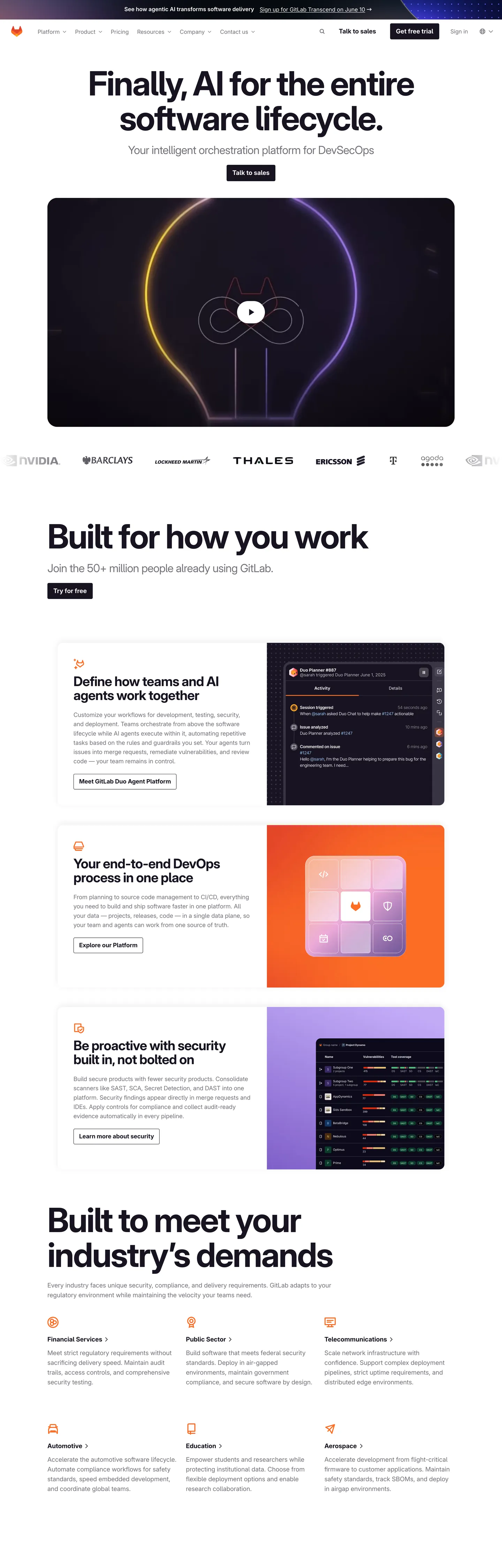
Colors
18 colors
GitLab's system runs on #1f1c2e as its primary voltage, used in 2 of 17 components. Type is set in GitLab Sans across 11 tokens from 14px to 96px, weights 400–660. Shape language is soft — components average 70px corner radius, with no sharp interactive edges.
Surface
Page and card backgrounds · 1
Text
Headlines, body, captions · 9
Borders & Hairlines
Dividers, outlines, rules · 1
Other
Specialty colors · 7
Typography
11 type tokens
Set in GitLab Sans across 11 tokens, from 14px to 96px, weights 400–660. Shown in its own stack: where the font isn't installed, the fallback the file names stands in.
- display-hero96px · weight 660 · lh 1.04 · tracking -2.88pxThe quick brown fox jumps over the lazy dog
- display-h296px · weight 660 · lh 1.04 · tracking -2.88pxThe quick brown fox jumps over the lazy dog
- display-h340px · weight 660 · lh 1.05 · tracking -0.8pxThe quick brown fox jumps over the lazy dog
- sub-display32px · weight 400 · lh 1.12 · tracking -0.64pxThe quick brown fox jumps over the lazy dog
- lead-md24px · weight 400 · lh 1.17 · tracking -0.48pxThe quick brown fox jumps over the lazy dog
- heading-card18px · weight 660 · lh 1.56 · tracking 0pxThe quick brown fox jumps over the lazy dog
- body-lg18px · weight 400 · lh 1.56 · tracking 0pxThe quick brown fox jumps over the lazy dog
- body-md16px · weight 400 · lh 1.5 · tracking 0pxThe quick brown fox jumps over the lazy dog
- nav-link14px · weight 400 · lh 1.57 · tracking 0pxThe quick brown fox jumps over the lazy dog
- button-label18px · weight 660 · lh 1.25 · tracking 0pxThe quick brown fox jumps over the lazy dog
- caption14px · weight 660 · lh 1.5 · tracking 0pxThe quick brown fox jumps over the lazy dog
Layout
Radii and spacing
6 corner radii and 10 spacing values. Shape language: soft.
Radii
- none0px
- sm4px
- lg16px
- xl28px
- pill999px
- circle50%
Spacing
- xxs2px
- xs4px
- sm8px
- md12px
- base16px
- lg24px
- xl32px
- xxl48px
- xxxl64px
- section96px
Components
17 components
Each rendered from its tokens (color, type, radius, padding) on GitLab's own canvas.
- Top Navtop-navTop Nav
- Nav Linknav-linkNav Link
- Button Primarybutton-primaryButton Primary
- Button Primary Hoverbutton-primary-hoverButton Primary Hover
- Button Secondarybutton-secondaryButton Secondary
- Button Tertiarybutton-tertiaryButton Tertiary
- Feature Card Lightfeature-card-lightFeature Card Light
- Feature Card Darkfeature-card-darkFeature Card Dark
- Heading Blockheading-blockHeading Block
- Industry Chipindustry-chipIndustry Chip
- Industry Iconindustry-iconIndustry Icon
- Eyebrow Tageyebrow-tagEyebrow Tag
- Customer Logo Stripcustomer-logo-stripCustomer Logo Strip
- Hero Orbhero-orbHero Orb
- Type here…text-inputText Input
- Divider Ruledivider-ruleDivider Rule
- FooterfooterFooter
In use
The system, in use
GitLab's tokens on the kind of product it builds.
Build something people actually use.
A short paragraph of marketing copy that previews how the brand's display tier and body tier read together. Two sentences is usually enough.
FAQ
GitLab design system FAQ
Common questions about GitLab's tokens, components, and how to use this DESIGN.md in your project.
Read next
Related reading
Specs, directories, and component libraries that pair with this design system.
- Browse all design systemsThe full directory of DESIGN.md files on shadcn.io, with live mockups for each.shadcn.io
- GitLab — official siteThe live source — see the achromatic CTA, the purple hairline rules, and the sunrise hero orb in their native habitat.about.gitlab.com (opens in a new tab)
- The DESIGN.md specificationGoogle Labs' open spec for machine-readable design system files — the format this page is built on.github.com (opens in a new tab)
Use it
Use GitLab in your project
One machine-readable file. Drop it into Claude, Cursor, or any AI tool that reads DESIGN.md.
Download the DESIGN.md
One machine-readable file: every color, type, radius, spacing, and component token of GitLab.
Feed it to your AI tool
Drop it into Claude, Cursor, or GitHub Copilot. The agent writes React components and Tailwind classes that match GitLab's visual language.
Reference the tokens directly
Or paste the values into your Tailwind config, CSS variables, or component library: every color, size and radius is a quoted, ready-to-copy value.
Read the full DESIGN.md: overview, rationale, do’s and don’ts
Overview
GitLab's marketing canvas is the courthouse register of DevSecOps — a pure {colors.canvas} ("#ffffff") page floor with near-black {colors.ink} ("#171321") carrying headlines, body, and the primary CTA fill, plus a structural purple {colors.purple-structural} ("#7759c2") that runs every hairline border and link rest. The single warm atmospheric is a sunrise gradient — {colors.sunrise-peach} through {colors.sunrise-orange}, {colors.sunrise-coral}, and {colors.sunrise-burnt} — scoped exclusively to the hero orb illustration. Where most developer platforms paint the primary CTA in a saturated brand voltage, GitLab paints "Get free trial" in {colors.canvas} text on {colors.ink} ink, giving the page zero chromatic action surfaces.
Achromatic CTA discipline: the page ships no chromatic action buttons. Primary CTA paints near-black on white at 47px height and 4px radius; secondary CTA inverts to white on white with a near-black 1px stroke; tertiary CTA is a borderless ink label on canvas. Where the convention across DevSecOps marketing is a tangerine, indigo, or electric-green primary fill that competes with the headline for attention, GitLab keeps every action surface inside the same #171321 ink ladder. The visual interest is carried by typography weight and the single hero orb atmospheric — not by a fill voltage.
Purple-as-hairline: the structural purple {colors.purple-structural} ("#7759c2") shows frequency 98, split evenly across text (49) and border (49), with zero occurrences as a background fill. It carries link rests and divider rules but never paints a surface. The chromatic budget is one purple structural color for hairlines and one warm gradient for the hero orb. Outside those two events the page is monochrome ink-on-paper.
Display type runs GitLab Sans at weight 660 — a custom variable cut that lands between semibold (600) and bold (700), used across hero, h2, and h3. The hero hits "96px" at weight 660 with "-2.88px" letter-spacing — aggressive negative tracking that gives the headline editorial density rather than tech-bombastic shout. H3 card titles run "40px" at weight 660 with "-0.8px" tracking. Body sits at "18px" weight 400 with "28px" leading. Unlike the convention of cranking display to weight 700, GitLab parks every display tier at 660 — the variable-weight micro-band is the entire display strategy.
Key Characteristics:
- Achromatic CTA — primary button paints
{colors.ink}on{colors.canvas}at "47px" height and "4px" radius; the page ships zero chromatic action buttons. - Purple-as-hairline —
{colors.purple-structural}("#7759c2") at frequency 98, evenly split between text (49) and border (49), never bg. - Single warm atmospheric — the sunrise gradient is scoped to the hero orb only, four stops from peach through burnt sienna.
- Weight 660 across every display tier — GitLab Sans custom semibold, not the standard 700.
- Two-tier radius dialect —
{rounded.sm}"4px" for buttons and chips (25 occurrences) and{rounded.lg}"16px" for feature-cards (20 occurrences). - Canvas inversion at feature-cards —
{colors.ink-card-dark}("#1f1c2e") backgrounds host product-screenshot mockups; the rest of the page is white. - 8px base unit — frequency 73 in spacing, the dominant rhythm anchor; section padding hits "96px".
Colors
The palette reads as a monochrome ink ladder around the white canvas, with one purple structural rule, one warm hero gradient, and one dark-card surface for product mockups.
- Canvas (
#ffffff) — frequency 524. Used as text (261), border (256), bg (7). The dominant page color and the inverse text token on the primary CTA and dark feature-cards. Carries every section that isn't a deliberate inversion. - Ink (
#171321) — frequency 294. Used as text (145), border (142), bg (7). The near-black workhorse that holds headlines, body, hairline rules, and the primary CTA fill. The page's most load-bearing structural token. - Ink card dark (
#1f1c2e) — frequency 17. Used as bg (17). The canvas-inversion surface for feature-cards that host product-screenshot mockups — the "end-to-end DevOps" and the "Be proactive with security" cards. - Ink mid (
#74717a) — frequency 58. Used as text (27), border (27), bg (4). The eyebrow-text and disabled-state gray. Carries customer-logo strip text and secondary captions. - Ink pure (
#000000) — frequency 22. Used as text (10), border (8), shadow (3), bg (1). The deepest black, reserved for pure-black logo strokes and the rare drop-shadow tint. - Ink deep (
#060a0f) — frequency 1. Used as bg (1). A near-pure-black surface for a single product-mockup region; mapped as a one-off rather than a system token. - Hairline (
#d1d0d3) — frequency 2. Used as border (2). The light gray divider rule on the customer-logo backdrop and the text-input stroke. - Purple structural (
#7759c2) — frequency 98. Used as text (49), border (49). The chromatic structural token, split evenly between text and border, with zero occurrences as a background fill. Runs link rests, divider rules, and the industry-icon strokes. - Lavender wash (
#f6f3fe) — frequency 3. Used as gradient (3). The palest lavender tint, scoped to the industry-chip backgrounds in the "Built to meet your industry's demands" section. - Lavender mid (
#eee7fd) — frequency 3. Used as gradient (3). The mid-tone lavender, used inside industry-icon circles behind the{colors.purple-structural}stroke. - Pink blush (
#ffd4d8) — frequency 3. Used as gradient (3). The pale pink edge of a subtle decorative gradient on a marketing region, the only true brand-pink in the system. - Sunrise peach (
#ffc2a0) — frequency 1. Used as gradient (1). The lightest stop in the hero orb gradient — the warm-edge boundary that bleeds into the white canvas. - Sunrise orange (
#ff9a55) — frequency 1. Used as gradient (1). The mid-tone of the hero orb radial, the color that reads as the visual center of the orb. - Sunrise coral (
#ff7a2f) — frequency 1. Used as gradient (1). The saturated coral stop in the orb gradient, where the warmth is most concentrated. - Sunrise burnt (
#c65a2e) — frequency 1. Used as gradient (1). The deepest burnt-sienna stop, anchoring the orb's bottom edge against the canvas. - Link classic (
#0000ee) — frequency 2. Used as text (1), border (1). A default browser-blue link rest that appears on a single legacy anchor — almost certainly an unstyled tag rather than a system token. - Ink on card (
#ffffff) — alias of canvas, scoped to text-on-dark-card surfaces. Used as the text color inside{colors.ink-card-dark}panels. - Ink eyebrow (
#74717a) — alias of ink-mid for semantic clarity on caption and customer-logo text.
Typography
A single sans family does all the lifting — GitLab Sans across every display, body, and caption tier. The mono surface visible inside the dark code-mockup card is rendered as a flat product screenshot rather than live text, so no monospace family is declared as a system token.
GitLab Sans (custom variable) is the single sans family. The hero hits "96px" at weight 660 with "-2.88px" letter-spacing — a custom variable-weight cut that lands between semibold (600) and bold (700), compressed by aggressive negative tracking for editorial headline density. The same display tier serves the h2 at the same "96px" size and weight, used in the "Built for how you work" headline. H3 card titles run "40px" at weight 660 with "-0.8px" tracking. The sub-display at "32px" weight 400 carries hero supporting copy. Lead "24px" weight 400 with "-0.48px" tracking handles introduction paragraphs. Body large is "18px" weight 400 with "28px" leading; body medium is "16px" weight 400 with "24px" leading; nav links sit at "14px" weight 400 with "22px" leading.
GitLab Sans is a custom-licensed family. If substitution is required, Inter at weights 400/600 with "-1.5%" tracking on display is the closest free equivalent. Geist Sans is a reasonable alternative for the same geometric register, though its lowercase descenders sit slightly tighter.
The signature typographic move is weight 660 across every display tier. Where most marketing canvases ladder from weight 700 hero down to weight 600 h2 and weight 500 h3, GitLab parks all three display tiers at the same custom 660 cut, varying only by size and tracking. The 660 micro-band is the entire display strategy.
Layout
The system runs on an 8px base unit — frequency 73 across spacing values, the dominant rhythm anchor. Standard padding values: 8, 12, 16, 24, 32, 48, 64, 96. The "96px" value handles section-top padding (the "96px 0px 0px" tuple appears twice). Card internal padding holds "32px" consistently — frequency 24, the second-most-used spacing value — giving feature-cards room to breathe around their internal heading + body + screenshot composition. Button padding uses the asymmetric "11px 16px" tuple (frequency 8) on horizontal CTAs and "11px 16px 11px 0px" (frequency 7) on text-link CTAs that hug their left edge. The container strategy alternates: hero text caps at a reading column (~640-924px), while the feature-card grid spans wider with two-column splits at the "Built for how you work" section.
Elevation & Depth
Elevation is achieved through canvas inversion at feature-cards — not through shadows. The marketing surface carries near-zero box-shadows on cards or buttons. Hierarchy lifts via the canvas swap from {colors.canvas} ("#ffffff") to {colors.ink-card-dark} ("#1f1c2e") on selected feature-cards that host product-screenshot mockups — the "end-to-end DevOps process in one place" card and the "Be proactive with security" card invert to near-black backgrounds with white text. The hero orb sits on the only true atmospheric — the sunrise gradient composed of {colors.sunrise-peach} through {colors.sunrise-burnt} — scoped to that one circular illustration. No drop-shadow tokens, no elevation tiers, no soft-edge cards floating over canvas. The page reads flat with deliberate ink-density steps rather than layered surface depth.
Shapes
A two-tier radius dialect with three support shapes. Button "4px" (25 occurrences, the page's dominant radius) carries the primary, secondary, and tertiary CTAs, the text-input field, and the industry chips when not pilled. Card "16px" (20 occurrences) covers feature-cards, the customer-logo backdrop, and the dark product-mockup panels. Avatar 50% (5 occurrences) handles industry-icon circles inside the "Built to meet your industry's demands" grid. Pill "999px" (5 occurrences) sits on eyebrow tags and the round industry-chip variants. Outer-card "28px" (1 occurrence) on a single oversized feature-card container — a one-off rather than a system token. Everything else stays at "0px" — full-bleed bands have no rounded corners, the wordmark sits flat, and the customer-logo strip is flush-edged.
Components
The component vocabulary covers the top nav, three button variants plus a tertiary text-link, two feature-card surfaces (light and dark), the heading block, the industry chip and icon, the eyebrow tag, the customer-logo strip, the hero orb container, the email-capture text input, the purple divider rule, and the footer. The top-nav sits on {colors.canvas} at "64px" height with {typography.nav-link} at "14px". The button-primary is the achromatic Get-free-trial CTA: {colors.ink} background, {colors.canvas} label, "4px" radius, "11px 16px" padding, "47px" height — the page's most visually-loaded interactive element, painted entirely in the structural ink ladder. The button-secondary inverts to {colors.canvas} with a 1px {colors.ink} stroke for "Get free trial" duplicates and secondary actions. The feature-card-light holds {rounded.lg} "16px" corners with a {colors.hairline} 1px stroke; the feature-card-dark mirrors the geometry but switches to {colors.ink-card-dark} for product-screenshot regions. The industry-chip runs {rounded.pill} "999px" with {colors.lavender-wash} fill and {colors.ink} label. The industry-icon holds {rounded.circle} 50% with {colors.lavender-mid} fill and {colors.purple-structural} icon stroke. The divider-rule is a 1px {colors.purple-structural} hairline used between sections.
Do's and Don'ts
- Do paint the primary CTA in
{colors.ink}("#171321") on{colors.canvas}("#ffffff") at "47px" height and "4px" radius. The page ships zero chromatic action buttons — painting "Get free trial" in tangerine or purple breaks the achromatic discipline that defines the brand register. - Don't use
{colors.purple-structural}("#7759c2") as a background fill. Its 98 occurrences are split evenly between text (49) and border (49) with zero as bg — it is mapped exclusively as a hairline and link-rest token. For purple-tinted surfaces, use{colors.lavender-wash}("#f6f3fe") instead. - Do reserve the sunrise gradient (
{colors.sunrise-peach}→{colors.sunrise-orange}→{colors.sunrise-coral}→{colors.sunrise-burnt}) for the hero orb illustration only. It is the page's single warm atmospheric. - Don't apply the sunrise gradient to CTA buttons, feature-cards, or section backgrounds. The four orange stops are scoped to the hero orb; using them anywhere else breaks the chromatic budget of "one purple structural rule + one warm hero gradient" that defines the surface.
- Do hold every display tier at GitLab Sans weight 660. The hero at "96px", h2 at "96px", and h3 at "40px" all share the same custom semibold cut — only size and tracking vary.
- Don't crank display to weight 700. GitLab parks all three display tiers at weight 660 — the variable-weight micro-band is the entire display strategy. Bold display breaks the editorial register.
- Do use "4px" radius for buttons and chips, "16px" for feature-cards. The two-tier radius dialect is the page's dominant shape language (25 + 20 occurrences combined).
- Don't use "8px" or "12px" radius on action buttons. Those values do not exist in the page's radius scale — the gap between "4px" buttons and "16px" cards is deliberate and prevents radius creep.
- Do invert canvas at feature-cards to
{colors.ink-card-dark}("#1f1c2e") when the card hosts a product-screenshot mockup. The 17 occurrences of this near-black bg are all scoped to product-mockup panels — using it for non-product cards flattens the canvas-inversion signal that distinguishes "marketing content" from "product surface". - Don't add drop-shadows to cards or buttons. The system uses zero shadow tokens — hierarchy lifts through canvas inversion and hairline rules, not layered depth.
Known Gaps
- Dark mode is not documented because the public marketing surface is light-only. The GitLab product itself ships a dark theme inside the in-app surfaces shown in the dark feature-card mockups; those tokens are not represented here.
- Motion timings (the hero orb animation, the feature-card hover-lift, the customer-logo carousel auto-advance) are out of scope — only static surface tokens captured.
- GitLab Sans is a custom-licensed family — a variable-font runtime is required to reproduce the weight 660 cut accurately. Inter or Geist at weight 600 is the closest substitute.
- Form-field error and validation states beyond the email-capture input are not visible on the inspected marketing surface.
- The single
{colors.link-classic}("#0000ee") occurrence is almost certainly an unstyled<a>rather than a system token — treat it as legacy chrome rather than a design decision. - The hero orb gradient is captured as four discrete stops from the extracted color list; the actual rendered orb uses a continuous radial blend with intermediate hues, which is out of scope for a token spec.
Developer Tools & IDEs
More systems like this
More DESIGN.md files in Developer Tools & IDEs.
Pricing
Build it with Pro
The DESIGN.md files are free. Pro adds 6,000+ blocks, premium templates and the MCP server, so your AI editor builds in your system for you.
4.9/5 out of 5 · 150+ reviewsfrom 150+ founders and developers.
Billing
Billed once a year in USD. Cancel anytime.
- How many people can use the license.
- Client work, SaaS products and anything you charge for.
- Production-ready React sections: hero, pricing, features, dashboards and more.
- Complete multi-page sites you can ship as they are.
- React icons from every major library, installable with one command.
- Presets that restyle every block, in light and dark.
- Lets your AI editor search, preview and install blocks for you.
- Priority requests are answered first.
Individual
For personal projects & open source
$32instead of $49/mo
$389 billed yearly
- Seats: 1 seat
- Commercial use: Personal & open source only
- Pro blocks: 6,000+ blocks
- Templates: All 14 templates
- React icons: 294k+ icons
- Themes: All 59 themes
- MCP server: Basic usage
- Support: Standard
Team
Most popularFor freelancers, agencies & startups
$66instead of $99/mo
$789 billed yearly · ≈ $13/dev/mo
- Seats: Up to 5 seats
- Commercial use: Included
- Pro blocks: 6,000+ blocks
- Templates: All 14 templates
- React icons: 294k+ icons
- Themes: All 59 themes
- MCP server: High usage
- Support: Priority
Organization
For companies with larger teams
$132instead of $199/mo
$1,589 billed yearly
- Seats: Unlimited seats
- Commercial use: Included
- Pro blocks: 6,000+ blocks
- Templates: All 14 templates
- React icons: 294k+ icons
- Themes: All 59 themes
- MCP server: Unlimited usage
- Support: Priority
Billed once a year in USD. Cancel anytime.
Individual
For personal projects & open source
$32instead of $49/mo
$389 billed yearly
- How many people can use the license.Seats: 1 seat
- Client work, SaaS products and anything you charge for.Commercial use: Personal & open source only
- Production-ready React sections: hero, pricing, features, dashboards and more.Pro blocks: 6,000+ blocks
- Complete multi-page sites you can ship as they are.Templates: All 14 templates
- React icons from every major library, installable with one command.React icons: 294k+ icons
- Presets that restyle every block, in light and dark.Themes: All 59 themes
- Lets your AI editor search, preview and install blocks for you.MCP server: Basic usage
- Priority requests are answered first.Support: Standard
Team
Most popularFor freelancers, agencies & startups
$66instead of $99/mo
$789 billed yearly · ≈ $13/dev/mo
Everything in Individual, plus
- How many people can use the license.Seats: Up to 5 seats
- Client work, SaaS products and anything you charge for.Commercial use: Included
- Lets your AI editor search, preview and install blocks for you.MCP server: High usage
- Priority requests are answered first.Support: Priority
Organization
For companies with larger teams
$132instead of $199/mo
$1,589 billed yearly
Everything in Team, plus
- How many people can use the license.Seats: Unlimited seats
- Lets your AI editor search, preview and install blocks for you.MCP server: Unlimited usage
- Secure checkout via Stripe
- Code lives in your repo
- Keep what you've shipped if you cancel
- License terms
Your system, built for you
Every block, template and icon, installed by your AI agent in your design system. The DESIGN.md files stay free.