GitHub Design System
GitHub's design system as a DESIGN.md file. Canvas #0d1117, link blue #8dd6ff, accent green #5fed83, Mona Sans, 19 components. For React, Next.js, and AI tools.
Add shadcn.io to your AI agent. · Pro It installs blocks, icons and templates in your design system from a prompt, with Pro.
Set up MCP- Primary
- #000000
- Typeface
- Mona Sans
- Shape
- Mixed
- Base radius
- 8px
- Colors
- 22
- Type tokens
- 12
- Components
- 19
- Spacing values
- 9
About
About GitHub DESIGN.md
Curated by Dov Azencot · Updated May 13, 2026 · Source github.com (opens in a new tab)
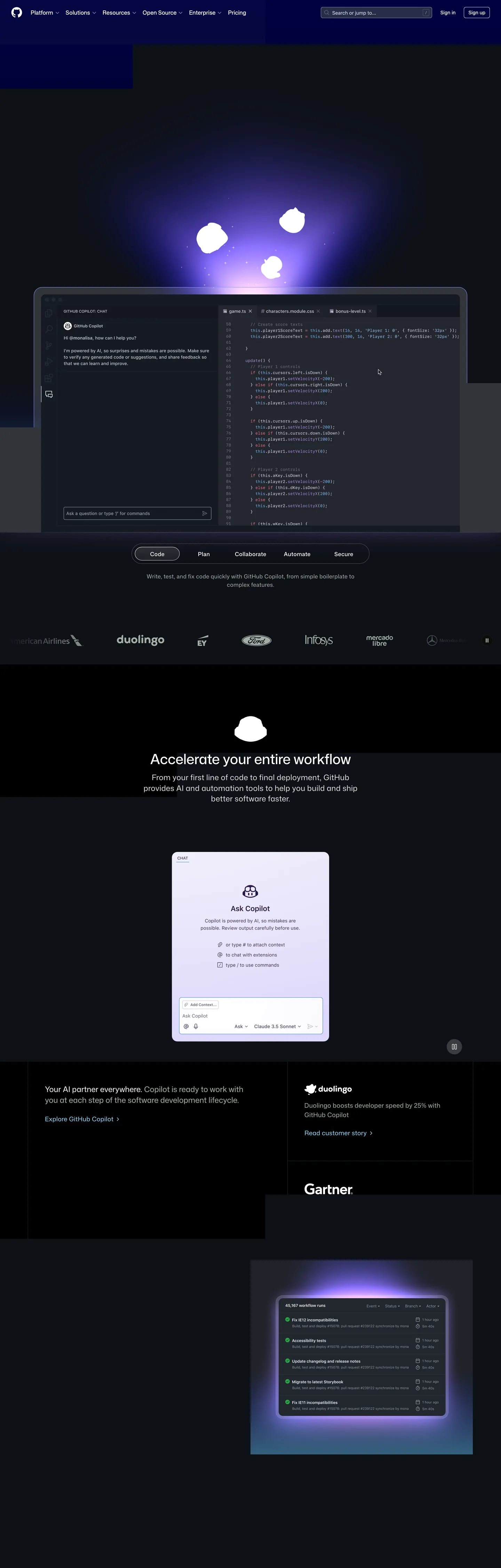
GitHub's marketing canvas is a developer-console aesthetic translated into magazine restraint. The page floor is "#0d1117" — the canonical dark-mode surface that ships inside the product itself — with full-bleed "#000000" bands cutting in for hero openers and the Copilot CTA region. Body and headline ink hold "#ffffff" against the dark; the single load-bearing chromatic token is an arctic pale-blue "#8dd6ff" that lights every link rest, hero pill stroke, and Copilot CTA label across the page. Where most developer platforms reach for a brand purple or electric green as primary voltage, GitHub keeps the link blue dominant and reserves "#5fed83" for activity-glow gradients only — never for buttons. The hero atmosphere is a purple-to-indigo radial ("#9350ff", "#5049c2", "#7873cb", "#0e0aa2") sitting behind the Copilot IDE mockup, a single glow event rather than a system-wide gradient language.
This page packages the surface into one DESIGN.md file written to the Google Labs spec. Inside: 22 colors tokens grouped into canvas, surface ladder, ink, link/accent, success/danger, and the indigo atmospherics; 12 typography levels covering Mona Sans variable-weight display from 64px down to 12px caption plus ui-monospace for code-tab labels; a 7-step rounded scale running 6px / 8px / 12px / 16px / 24px / 48px / 60px-pill / circle; a 9-step spacing scale anchored at the 4px base unit and topping out at the 96px section rhythm; and 19 components definitions covering the dark top-nav, search field, primary and secondary buttons, the pill segmented switcher, code-tab IDE surface, customer-story card, Copilot prompt card, workflow-runs table, and the customer logo strip.
Feed the file to Claude, Cursor, or Copilot and the agent reproduces GitHub's restraint — single arctic-link-blue voltage, dual-canvas band switching, weight-460 h2 instead of bold display, pill-radius segmented controls, two greens with split duty between glow and button — rather than a generic dark-mode dev landing with a glowing brand-purple CTA. Or reference the tokens directly: every hex, font name, radius, and spacing value is a quoted scalar you can paste into Tailwind config, CSS variables, or a shadcn theme registry. GitHub is worth studying because it threads a hard needle: a console-feeling surface that still reads as a magazine page, with no chromatic CTA, no atmospheric gradient outside one Copilot moment, and a display ramp that hovers between weights 425 and 480 — never bold, never timid, always sitting in the variable-axis micro-band that Mona Sans was designed for.
What makes it distinct
5
- Dual-canvas system#0d1117 for product surfaces and #000000 for hero/CTA bands, switched at section boundaries rather than blended
- Arctic-blue link voltage#8dd6ff carries every link rest, hero pill stroke, and Copilot CTA label; count 138 across the page
- Two greens, two jobs#5fed83 for activity-glow gradients and accent dots; #08872b for the success-emphasis primary CTA paint
- Variable-weight Mona Sanshero hits weight 425 at 64px with -2.24px tracking, h2 sits at weight 460, never the bold 700 most dev platforms reach for
- Pill segmented control60px radius on the Code/Plan/Collaborate/Automate/Secure switcher; the page's dominant radius value at 12 occurrences
github.com
Live at github.com
A snapshot of the brand in production. Scroll the frame to see the whole page.
Colors
22 colors
GitHub's system runs on #000000 as its primary voltage, used in 8 of 19 components. Type is set in Mona Sans across 12 tokens from 12px to 64px, weights 400–600. Shape language is mixed across 19 components, blending pills, soft rounds, and squarer corners.
Brand & Accent
Sparing, CTA-only voltage · 1
Surface
Page and card backgrounds · 6
Text
Headlines, body, captions · 7
Borders & Hairlines
Dividers, outlines, rules · 1
Semantic
Status, errors, success, links · 1
Other
Specialty colors · 6
Typography
12 type tokens
Set in Mona Sans across 12 tokens, from 12px to 64px, weights 400–600. Shown in its own stack: where the font isn't installed, the fallback the file names stands in.
- display-hero64px · weight 425 · lh 1.08 · tracking -2.24pxThe quick brown fox jumps over the lazy dog
- display-h240px · weight 460 · lh 1.2 · tracking 0pxThe quick brown fox jumps over the lazy dog
- display-h2-emph40px · weight 500 · lh 1.3 · tracking 0pxThe quick brown fox jumps over the lazy dog
- heading-card22px · weight 480 · lh 1.4 · tracking 0pxThe quick brown fox jumps over the lazy dog
- heading-card-bold22px · weight 600 · lh 1.4 · tracking 0pxThe quick brown fox jumps over the lazy dog
- body-lg18px · weight 400 · lh 1.5 · tracking 0.18pxThe quick brown fox jumps over the lazy dog
- body-md16px · weight 400 · lh 1.5 · tracking 0.24pxThe quick brown fox jumps over the lazy dog
- body-md-medium16px · weight 500 · lh 1.3 · tracking 0.24pxThe quick brown fox jumps over the lazy dog
- body-sm14px · weight 400 · lh 1.25 · tracking 0pxThe quick brown fox jumps over the lazy dog
- caption12px · weight 400 · lh 1.5 · tracking 0pxThe quick brown fox jumps over the lazy dog
- button-md16px · weight 400 · lh 1.5 · tracking 0pxThe quick brown fox jumps over the lazy dog
- code14px · weight 400 · lh 1.5 · tracking 0pxThe quick brown fox jumps over the lazy dog
Layout
Radii and spacing
9 corner radii and 9 spacing values. Shape language: mixed.
Radii
- none0px
- sm6px
- md8px
- lg12px
- xl16px
- xxl24px
- xxxl48px
- pill60px
- circle9999px
Spacing
- xxs2px
- xs4px
- sm8px
- md12px
- base16px
- lg24px
- xl48px
- xxl64px
- section96px
Components
19 components
Each rendered from its tokens (color, type, radius, padding) on GitHub's own canvas.
- Top Navtop-navTop Nav
- Nav Linknav-linkNav Link
- Search Fieldsearch-fieldSearch Field
- Button Primarybutton-primaryButton Primary
- Button Primary Hoverbutton-primary-hoverButton Primary Hover
- Button Successbutton-successButton Success
- Button Secondarybutton-secondaryButton Secondary
- Pill Switchpill-switchPill Switch
- Pill Switch Selectedpill-switch-selectedPill Switch Selected
- Code Tab Panelcode-tab-panelCode Tab Panel
- Copilot Prompt Cardcopilot-prompt-cardCopilot Prompt Card
- Workflow Runs Tableworkflow-runs-tableWorkflow Runs Table
- Customer Story Cardcustomer-story-cardCustomer Story Card
- Customer Logo Stripcustomer-logo-stripCustomer Logo Strip
- Type here…text-inputText Input
- Cta Bannercta-bannerCta Banner
- Accent Dotaccent-dotAccent Dot
- Link Textlink-textLink Text
- FooterfooterFooter
In use
The system, in use
GitHub's tokens on the kind of product it builds.
Build something people actually use.
A short paragraph of marketing copy that previews how the brand's display tier and body tier read together. Two sentences is usually enough.
FAQ
GitHub design system FAQ
Common questions about GitHub's tokens, components, and how to use this DESIGN.md in your project.
Read next
Related reading
Specs, directories, and component libraries that pair with this design system.
- Browse all design systemsThe full directory of DESIGN.md files on shadcn.io, with live mockups for each.shadcn.io
- GitHub — official siteThe live source — see the dual-canvas band switching, the pill segmented switcher, and the Copilot IDE mockup in their native habitat.github.com (opens in a new tab)
- The DESIGN.md specificationGoogle Labs' open spec for machine-readable design system files — the format this page is built on.github.com (opens in a new tab)
Use it
Use GitHub in your project
One machine-readable file. Drop it into Claude, Cursor, or any AI tool that reads DESIGN.md.
Download the DESIGN.md
One machine-readable file: every color, type, radius, spacing, and component token of GitHub.
Feed it to your AI tool
Drop it into Claude, Cursor, or GitHub Copilot. The agent writes React components and Tailwind classes that match GitHub's visual language.
Reference the tokens directly
Or paste the values into your Tailwind config, CSS variables, or component library: every color, size and radius is a quoted, ready-to-copy value.
Read the full DESIGN.md: overview, rationale, do’s and don’ts
Overview
GitHub's marketing canvas is a console-feeling surface wrapped in editorial restraint — {colors.canvas} ("#0d1117") on the product-mirroring sections, with full-bleed {colors.canvas-pure} ("#000000") bands cutting in for hero openers and the Copilot CTA region. Body and headline ink hold "#ffffff" against the dark; the load-bearing chromatic token is an arctic pale-blue {colors.link-blue} ("#8dd6ff") that lights every link rest, hero pill stroke, and Copilot CTA label across the page. Where most developer platforms reach for a saturated brand purple or electric green as primary voltage, GitHub keeps the link blue dominant and reserves {colors.accent-green} ("#5fed83") for activity-glow gradients only.
Two-greens-two-jobs: the system runs two distinct green tokens with non-overlapping roles. Accent green {colors.accent-green} ("#5fed83") lights the workflow-activity glow and the Copilot CTA-banner shadow start — it never fills a button. Success-emphasis green {colors.success-emphasis} ("#08872b") carries the actual primary-action paint via --button-primary-bgColor-rest. This split is the single most distinctive token-architecture move in the system: separating "glow" from "button" prevents the bright lime from leaking into action surfaces where it would read as a status badge.
Display type runs Mona Sans variable at weights that land between regular and medium — never bold. The hero hits weight 425 at 64px with -2.24px letter-spacing for an editorial compression rather than a tech-bombastic shout; h2 sits at weight 460 at 40px with neutral tracking; h3 card titles at weight 480 at 22px. Unlike the convention of cranking dev-platform display to weight 700, GitHub uses weight variation in the 425-480 micro-band as the entire display strategy. The body family is Mona Sans VF at 14-18px; code tabs and lineNumbers run ui-monospace / SF Mono.
Pill-as-segmented-control: the Code/Plan/Collaborate/Automate/Secure switcher rides a 60px pill radius (the page's dominant radius value at 12 occurrences) over a {colors.surface-1} track. Cards land at 16px corners (9 occurrences); CTA buttons hold 8px (6 occurrences) — a developer dialect. Depth comes from the dual-canvas band switch and the purple-to-indigo radial atmospheric behind the Copilot IDE mockup, composed of {colors.glow-violet} ("#9350ff"), {colors.glow-indigo} ("#5049c2"), {colors.glow-lavender} ("#7873cb"), and {colors.glow-deep} ("#0e0aa2"). The glow is the page's only chromatic atmospheric — strictly scoped to one Copilot moment.
Key Characteristics:
- Dual-canvas system —
{colors.canvas}("#0d1117") for product-surface sections and{colors.canvas-pure}("#000000") for hero and CTA bands. - Single chromatic link voltage —
{colors.link-blue}("#8dd6ff"), count 138, mapped to--brand-color-text-link-rest. - Two greens, two jobs —
{colors.accent-green}for activity-glow gradients only;{colors.success-emphasis}for the primary-action paint. - Variable-weight Mona Sans — display runs 425-480, never bold 700.
- 60px pill radius dominates — the Code/Plan/Collaborate/Automate/Secure segmented switcher.
- Single chromatic atmospheric — the purple-to-indigo Copilot glow, scoped to one region.
- Code-tab and IDE mockups in
{colors.surface-1}("#151a22") panels with 16px corners; chrome stays minimal so the product captures carry the page.
Colors
The palette reads as a structural ladder around the dark canvas plus one arctic-blue voltage and two greens with split duty.
- Canvas (
#0d1117) — frequency 6. Used as bg (6). The product-mirroring section floor; mapped as--bgColor-default,--brand-color-canvas-subtle,--codeMirror-bgColor. The single most-named surface variable in the page. - Canvas pure (
#000000) — frequency 18. Used as bg (13), text (2), border (2). Full-bleed hero and CTA bands; mapped as--brand-SubNav-bgColor,--brand-color-canvas-default. The band-switch partner that punches through{colors.canvas}at section boundaries. - Canvas inset (
#010409) — count 0 in the visible viewport, but mapped to--bgColor-black,--overlay-bgColor,--dashboard-bgColor. The deepest dark, reserved for overlays and the dashboard inset. - Surface 1 (
#151a22) — frequency 3. Used as bg (2), border (1). Card and panel surface for code tabs and the Copilot prompt; mapped as--card-bgColor,--header-bgColor,--bgColor-muted. - Surface 2 (
#24292f) — frequency 10. Used as bg (2), text (2), border (6). Button-default rest and hovered control surface; mapped as--button-default-bgColor-rest,--control-bgColor-rest. - Surface 3 (
#2e374a) — frequency 1. Used as bg (1). Active-state lift for default buttons; mapped as--button-default-bgColor-active,--control-bgColor-active. - Ink (
#ffffff) — frequency 677. Used as text (346), border (319), gradient (5), bg (7). The dominant text and hairline token; mapped to over 80 brand and component variables. Carries headlines, body, and the primary-button border-rest stroke. - Ink default (
#f0f6fc) — frequency 135. Used as text (70), border (65). The CodeMirror foreground and diff-addition-line text; mapped as--fgColor-default,--codeMirror-fgColor. - Ink muted (
#9198a1) — frequency 156. Used as text (78), border (78). Caption ink and disabled-control color; mapped as--fgColor-muted,--control-fgColor-placeholder. The workhorse secondary text. - Ink subtle (
#a4aea6) — frequency 96. Used as text (48), border (48). Subheadline and eyebrow ink on dark; mapped as--brand-color-text-muted,--brand-color-text-subtle. - Ink neutral (
#7c8980) — frequency 4. Used as text (2), border (2). The "neutral emphasis" gray; mapped as--brand-color-neutral-emphasis,--brand-color-neutral-muted. - Hairline (
#484f58) — frequency 2. Used as border (2). The strongest hairline rule; mapped as--display-gray-scale-3. Carries form-field and card divider strokes. - Link blue (
#8dd6ff) — frequency 138. Used as text (70), border (68). The page's load-bearing chromatic voltage; mapped as--brand-color-text-link-rest,--brand-InlineLink-color-rest,--brand-Link-color-accent. Reserved for link rests, the primary-button label, and the hero pill stroke. - Link accent (
#4493f8) — count 0 in viewport, mapped to--fgColor-link,--fgColor-accent,--brand-color-focus. The product-surface link blue (vs. the marketing arctic blue) — appears inside the IDE mockups. - Accent green (
#5fed83) — frequency 5. Used as text (2), border (2), gradient (1). The activity-glow voltage; mapped as--brand-color-accent-primary,--brand-CTABanner-shadow-color-start,--brand-tiles-highlightColor. Never fills a button. - Success emphasis (
#08872b) — frequency 2. Used as bg (2). The primary-action paint; mapped as--button-primary-bgColor-rest,--bgColor-success-emphasis. The token that actually carriesbgColoron the green CTA button. - Danger red (
#ff7b72) — count 0 in viewport, mapped to--brand-color-text-danger,--brand-color-text-error,--color-prettylights-syntax-keyword. Error text and syntax-keyword highlighting inside code surfaces. - Glow violet (
#9350ff) — frequency 2. Used as gradient (2). The brightest stop in the Copilot purple atmospheric. - Glow indigo (
#5049c2) — frequency 3. Used as gradient (3). The mid-tone of the Copilot radial. - Glow lavender (
#7873cb) — frequency 2. Used as gradient (2). The transitional lavender between violet and indigo. - Glow deep (
#0e0aa2) — frequency 1. Used as gradient (1). The deep-indigo edge of the Copilot atmospheric; mapped as--base-color-scale-blue-9. - Glow plum (
#e6b7fe) — frequency 3. Used as gradient (3). The pink-violet top edge of the Copilot radial; mapped as--display-plum-scale-9.
Typography
A single sans family plus one mono — Mona Sans variable does all the lifting from 64px hero down to 12px caption, with ui-monospace scoped to code tabs and lineNumbers.
Mona Sans (variable) is the single sans family. The hero hits weight 425 at 64px with -2.24px letter-spacing — a variable-weight cut that lands between regular (400) and medium (500), compressed by aggressive negative tracking for editorial density rather than tech-bombastic shout. H2 sits at weight 460 at 40px with neutral tracking ("Accelerate your entire workflow"). H3 card titles run weight 480 at 22px. Body large is 18px weight 400 with 0.18px positive tracking (paragraph copy under hero). Body medium is 16px weight 400, used on buttons, nav links, and label captions. Mona Sans VF (the variable-only cut) handles 14px nav and link surfaces. Mona Sans ships under the SIL Open Font License, so substitution is rarely necessary — Inter at weights 400/500 with -1.5% tracking on display is the closest free fallback.
ui-monospace / SF Mono runs every code-tab header and CodeMirror line in the IDE mockup at 14px weight 400. The mono is scoped exclusively to code surfaces — it never carries body, nav, or button content. JetBrains Mono or Geist Mono substitute cleanly.
The signature typographic move is weight 425-480 as the entire display range — no weight 700 anywhere on the marketing canvas. Where most dev platforms crank display bold to compete with hero illustrations, GitHub uses Mona Sans's variable-weight cut to land tiny gradations between 400 and 500. The 64px hero at weight 425 reads as a magazine headline rather than a SaaS callout.
Layout
The system runs on a 4px base unit: 2, 4, 8, 12, 16, 24, 48, 64, 96. The 96px value handles vertical section padding — the page rhythm is generous, with section bands switching canvas color rather than just adding more whitespace. Card internal padding holds 24px consistently, giving content room to breathe inside {colors.surface-1} panels. The container strategy alternates: hero text caps at a reading column (~640-924px), while the Copilot IDE mockup spans wider to let the code tabs breathe. Customer logo strips run 48px of vertical padding inside their own canvas band, separating them from adjacent sections through canvas color rather than gap.
Elevation & Depth
Elevation is achieved through canvas band switching and one chromatic atmospheric — not through shadows. The marketing surface carries near-zero box-shadows on cards or buttons. Hierarchy lifts via the dual-canvas swap ({colors.canvas} ↔ {colors.canvas-pure}) at section boundaries, and via the surface ladder running from {colors.canvas} up through {colors.surface-1}, {colors.surface-2}, {colors.surface-3}. The Copilot IDE mockup sits over the page's only true atmospheric — the purple-to-indigo radial composed of {colors.glow-violet} through {colors.glow-deep} with {colors.glow-plum} at the top edge. The workflow-runs region uses {colors.accent-green} as a parallel single-color glow. No drop-shadow tokens, no elevation tiers, no soft-edge cards floating over canvas.
Shapes
A three-tier radius scale. Pill 60px (the page's dominant radius at 12 occurrences) carries the Code/Plan/Collaborate/Automate/Secure segmented switcher and a few wide CTA shapes. Card 16px (9 occurrences) covers the Copilot prompt card, the code-tab IDE panel, and feature surfaces. Button 8px (6 occurrences) holds the primary Copilot CTA at 56px height and most action buttons — a developer dialect rather than the consumer 12-14px feel. The 24px tier (7 occurrences) handles the search-field hairline and a few intermediate surfaces. Full-circle 9999px is reserved for activity dots and avatar masks. Everything else stays at 0px — full-bleed bands have no rounded corners, the wordmark sits flat, and the customer-logo strip is flush-edged.
Components
The component vocabulary covers the dark top-nav, the search field, three button variants, the pill segmented switcher, the code-tab IDE panel, the Copilot prompt card, the workflow-runs table, customer-story and logo strips, the email-capture text input, the CTA banner, and link text. The top-nav sits on {colors.canvas-pure} at 64px height with {typography.body-md} nav links. The button-primary is the headline Copilot CTA: {colors.surface-2} background, {colors.link-blue} label, white 1px stroke, 8px radius, 6px/28px padding, 56px height — the page's most visually-loaded interactive element. The button-success carries {colors.success-emphasis} for the actual primary-action paint elsewhere on product surfaces. The pill-switch runs {rounded.pill} 60px with {colors.surface-1} track and a {colors.surface-2} selected state. The code-tab-panel holds {rounded.xl} 16px corners over {colors.surface-1} with a {colors.surface-2} hairline. The copilot-prompt-card mirrors the panel geometry but for the chat-style mockup. The customer-story-card sits on a full-bleed {colors.canvas-pure} band at 48px padding, no radius — the band itself is the card.
Do's and Don'ts
- Do hold
{colors.link-blue}("#8dd6ff") for every link rest, the primary-button label, and the hero pill stroke. This is the single load-bearing chromatic voltage; count 138 across the page. - Don't use
{colors.accent-green}("#5fed83") as a button background. It is mapped to--brand-color-accent-primaryand the CTA-banner shadow gradient — pure glow duty. For green primary actions, use{colors.success-emphasis}("#08872b") via--button-primary-bgColor-restinstead. - Do switch canvas color at section boundaries between
{colors.canvas}("#0d1117") and{colors.canvas-pure}("#000000"). The dual-canvas band switch is the page's primary hierarchy signal — using a single canvas color flattens every section. - Don't crank display weight to 700. Mona Sans hero sits at weight 425, h2 at weight 460, h3 at weight 480. The variable-weight micro-band is the entire display strategy — bold display breaks the editorial register.
- Do reserve the purple-to-indigo radial (
{colors.glow-violet}→{colors.glow-indigo}→{colors.glow-lavender}→{colors.glow-deep}with{colors.glow-plum}at the top edge) for the Copilot region only. It is the page's single chromatic atmospheric. - Don't apply the Copilot glow to workflow-runs cards or customer-logo strips. The workflow region carries its own activity-green glow via
{colors.accent-green}; mixing glows breaks the single-atmospheric rule. - Do use 60px pill radius for segmented switchers and 8px for action buttons. The pill is the page's dominant radius (12 occurrences); the 8px button corner is the developer-dialect default.
- Don't use 12px or 24px radius on action buttons — those tiers belong to the search field hairline and intermediate card surfaces. Mixing radius tiers across components breaks the three-tier discipline.
- Do use ui-monospace / SF Mono for every code-tab header and CodeMirror lineNumber. The mono is strictly scoped to code surfaces — Mona Sans body in a code tab reads as a marketing label, not a file path.
Known Gaps
- Light mode is not documented because the public marketing surface is dark-only. The product itself ships a light theme inside the in-app surfaces shown in mockups; those tokens are not represented here.
- Motion timings (the Copilot glow pulse, the workflow-runs activity sweep, the carousel auto-advance) are out of scope — only static surface tokens captured.
- The
Mona SansandMona Sans VFfamilies are open-source under SIL OFL — no licensed substitute required, but the variable-axis weight values (425, 460, 480) require a variable-font runtime. - Form-field error and validation states beyond the email-capture input are not visible on the inspected marketing surface.
- The danger red
{colors.danger-red}("#ff7b72") and link accent{colors.link-accent}("#4493f8") are mapped to product variables (--color-prettylights-syntax-keyword,--fgColor-link) but appear inside IDE mockups rather than as marketing-chrome tokens. - The customer-logo strip is captured as a marketing region; the underlying logo SVGs are external brand assets, not GitHub design tokens.
Developer Tools & IDEs
More systems like this
More DESIGN.md files in Developer Tools & IDEs.
Pricing
Build it with Pro
The DESIGN.md files are free. Pro adds 6,000+ blocks, premium templates and the MCP server, so your AI editor builds in your system for you.
4.9/5 out of 5 · 150+ reviewsfrom 150+ founders and developers.
Billing
Billed once a year in USD. Cancel anytime.
- How many people can use the license.
- Client work, SaaS products and anything you charge for.
- Production-ready React sections: hero, pricing, features, dashboards and more.
- Complete multi-page sites you can ship as they are.
- React icons from every major library, installable with one command.
- Presets that restyle every block, in light and dark.
- Lets your AI editor search, preview and install blocks for you.
- Priority requests are answered first.
Individual
For personal projects & open source
$32instead of $49/mo
$389 billed yearly
- Seats: 1 seat
- Commercial use: Personal & open source only
- Pro blocks: 6,000+ blocks
- Templates: All 14 templates
- React icons: 294k+ icons
- Themes: All 59 themes
- MCP server: Basic usage
- Support: Standard
Team
Most popularFor freelancers, agencies & startups
$66instead of $99/mo
$789 billed yearly · ≈ $13/dev/mo
- Seats: Up to 5 seats
- Commercial use: Included
- Pro blocks: 6,000+ blocks
- Templates: All 14 templates
- React icons: 294k+ icons
- Themes: All 59 themes
- MCP server: High usage
- Support: Priority
Organization
For companies with larger teams
$132instead of $199/mo
$1,589 billed yearly
- Seats: Unlimited seats
- Commercial use: Included
- Pro blocks: 6,000+ blocks
- Templates: All 14 templates
- React icons: 294k+ icons
- Themes: All 59 themes
- MCP server: Unlimited usage
- Support: Priority
Billed once a year in USD. Cancel anytime.
Individual
For personal projects & open source
$32instead of $49/mo
$389 billed yearly
- How many people can use the license.Seats: 1 seat
- Client work, SaaS products and anything you charge for.Commercial use: Personal & open source only
- Production-ready React sections: hero, pricing, features, dashboards and more.Pro blocks: 6,000+ blocks
- Complete multi-page sites you can ship as they are.Templates: All 14 templates
- React icons from every major library, installable with one command.React icons: 294k+ icons
- Presets that restyle every block, in light and dark.Themes: All 59 themes
- Lets your AI editor search, preview and install blocks for you.MCP server: Basic usage
- Priority requests are answered first.Support: Standard
Team
Most popularFor freelancers, agencies & startups
$66instead of $99/mo
$789 billed yearly · ≈ $13/dev/mo
Everything in Individual, plus
- How many people can use the license.Seats: Up to 5 seats
- Client work, SaaS products and anything you charge for.Commercial use: Included
- Lets your AI editor search, preview and install blocks for you.MCP server: High usage
- Priority requests are answered first.Support: Priority
Organization
For companies with larger teams
$132instead of $199/mo
$1,589 billed yearly
Everything in Team, plus
- How many people can use the license.Seats: Unlimited seats
- Lets your AI editor search, preview and install blocks for you.MCP server: Unlimited usage
- Secure checkout via Stripe
- Code lives in your repo
- Keep what you've shipped if you cancel
- License terms
Your system, built for you
Every block, template and icon, installed by your AI agent in your design system. The DESIGN.md files stay free.