Gemini Design System
Google Gemini's marketing chrome captured as a DESIGN.md. Google Sans Flex at weight 400, near-empty pale-gray canvas, one Google-blue pill CTA, full-pill geometry across every chip and button. Tokens for React, Next.js, and AI tools.
Add shadcn.io to your AI agent. · Pro It installs blocks, icons and templates in your design system from a prompt, with Pro.
Set up MCP- Primary
- #0b57d0
- Typeface
- Google Sans Flex
- Shape
- Soft
- Base radius
- 0px
- Colors
- 9
- Type tokens
- 8
- Components
- 13
- Spacing values
- 7
About
About Gemini DESIGN.md
Curated by Dov Azencot · Updated May 18, 2026 · Source gemini.google.com (opens in a new tab)
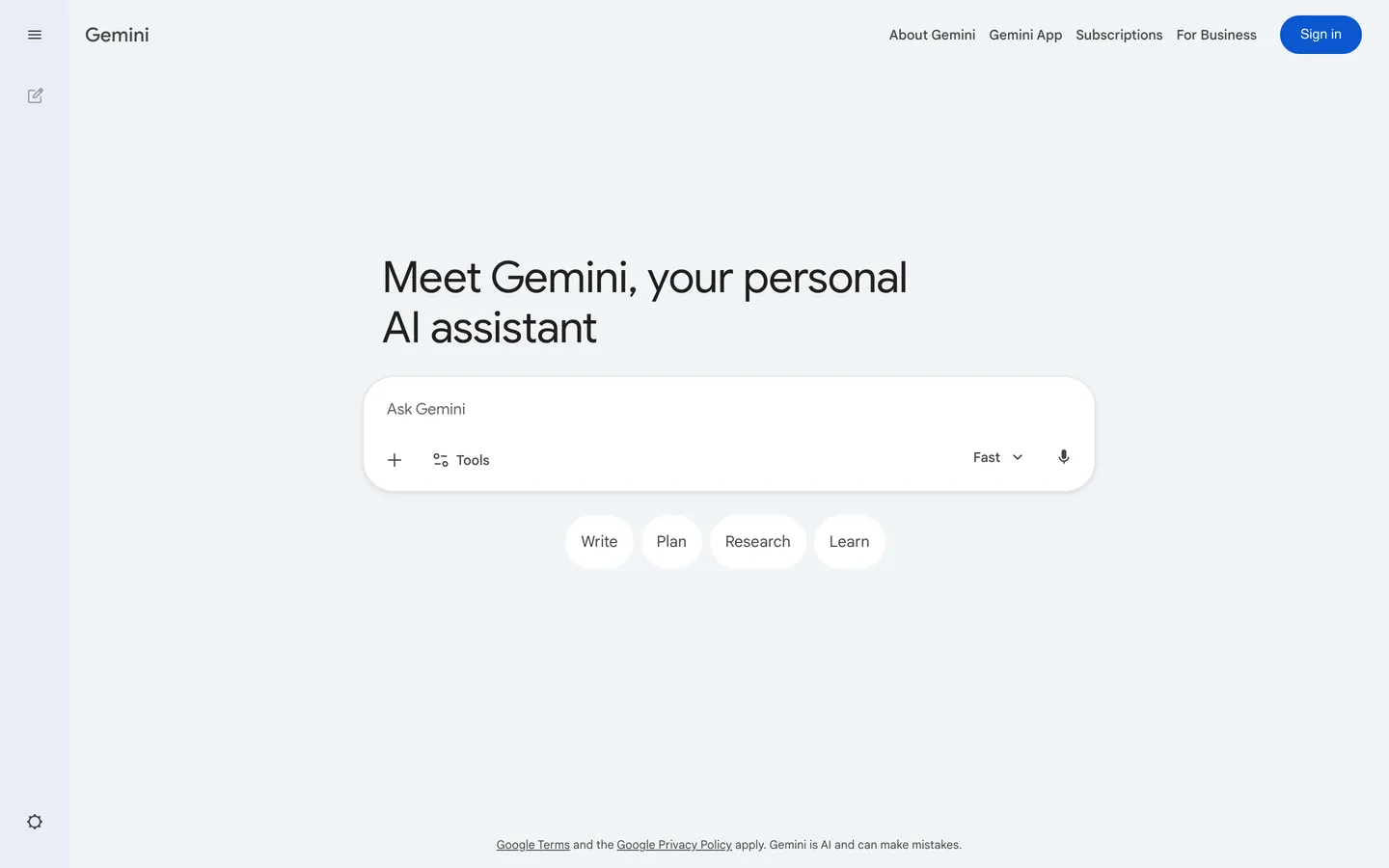
Gemini's marketing surface does what almost no AI brand does at this scale: it shows you the product instead of describing it. There is no editorial hero, no animated mesh gradient, no testimonial wall — just a pale blue-gray canvas, a 45px Google Sans Flex headline in regular weight ("Meet Gemini, your personal AI assistant"), and the actual prompt input rendered as a fully-rounded white field in the middle of the page. Four suggestion chips (Write, Plan, Research, Learn) sit beneath as fully-rounded pills. The only chromatic decoration is a single Google-blue Sign-in pill anchored top-right. Where ChatGPT puts its marketing on a separate landing page and Claude leans on a cream editorial layout with serif headlines, Gemini collapses marketing and product into one surface — the page IS the prompt box.
The DESIGN.md file packages the system into a machine-readable spec for React tooling. Inside: 9 colors tokens drawn from a Material-derived palette dominated by greyscale ink and a single Google Blue 700 accent for the primary CTA pill; 8 typography tokens running Google Sans Flex with a Google Sans Text companion for button labels — display at 45px in weight 400, body at 14-16px in weight 400, the heaviest moment on the page being weight 500 at the smallest sizes; 6 corner-radius tokens dominated by a 9999px pill (26 occurrences in the captured render) with no flat-cornered surface anywhere; 7 spacing values on a 4px base; and 13 components definitions covering the Google-blue Sign-in pill, the white prompt input, the suggestion chip, the top-nav link, and the body-paragraph tier.
Feed this file to an AI coding tool and it reproduces Gemini's specific moves: pale-gray canvas instead of pure white, Google Sans Flex across every tier at weight 400, fully-rounded everything (no rectangular surfaces), and a single Google-blue voltage held for the one Sign-in pill. The one thing worth borrowing only if your product is itself the marketing artifact: the willingness to put NO additional chrome around the prompt input. Gemini gets away with it because the product needs no explanation; most AI tools still need an interstitial sentence.
What makes it distinct
5
- Product-is-the-pagethe marketing surface is the Gemini app itself, no separate hero block, no editorial chrome, just the prompt input and four suggestion chips
- Single Google-blue pillGoogle Blue 700 appears exactly once above the fold as the Sign-in pill, the only chromatic accent on a canvas that is otherwise all greys
- Full-pill geometry9999px radius appears 26 times across input, chips, nav buttons; no flat-cornered surfaces exist anywhere in the captured page
- Google Sans Flex at weight 400display headline sits at 45px in weight 400 with -0.5px tracking, no 500 or 700 anywhere on the hero
- Pale-gray canvas, not whitethe page floor is a soft #f0f4f8 with white only on the input field and chip surfaces, a subtle warmth move against Google's usual pure white
gemini.google.com
Live at gemini.google.com
A snapshot of the brand in production. Scroll the frame to see the whole page.
Colors
9 colors
Gemini's system runs on #0b57d0 as its primary voltage, used in 1 of 13 components. Type is set in Google Sans Flex across 8 tokens from 12px to 45px, weights 400–500. Shape language is soft — components average 66px corner radius, with no sharp interactive edges.
Brand & Accent
Sparing, CTA-only voltage · 1
Surface
Page and card backgrounds · 2
Text
Headlines, body, captions · 4
Borders & Hairlines
Dividers, outlines, rules · 1
Other
Specialty colors · 1
Typography
8 type tokens
Set in Google Sans Flex across 8 tokens, from 12px to 45px, weights 400–500. Shown in its own stack: where the font isn't installed, the fallback the file names stands in.
- display-md45px · weight 400 · lh 52px · tracking -0.5pxThe quick brown fox jumps over the lazy dog
- heading-md20px · weight 500 · lh 28pxThe quick brown fox jumps over the lazy dog
- body-md16px · weight 400 · lh 24pxThe quick brown fox jumps over the lazy dog
- label-md14px · weight 500 · lh 20pxThe quick brown fox jumps over the lazy dog
- label-sm14px · weight 500 · lh 18pxThe quick brown fox jumps over the lazy dog
- caption12px · weight 400 · lh 16px · tracking 0.1pxThe quick brown fox jumps over the lazy dog
- button-md14px · weight 500 · lh 18pxThe quick brown fox jumps over the lazy dog
- nav-link14px · weight 500 · lh 20pxThe quick brown fox jumps over the lazy dog
Layout
Radii and spacing
4 corner radii and 7 spacing values. Shape language: soft.
Radii
- none0px
- lg32px
- xl100px
- full9999px
Spacing
- xs4px
- sm8px
- md12px
- base16px
- lg20px
- xl24px
- 2xl80px
Components
13 components
Each rendered from its tokens (color, type, radius, padding) on Gemini's own canvas.
- Button Primarybutton-primaryButton Primary
- Button Secondarybutton-secondaryButton Secondary
- Top Navtop-navTop Nav
- Nav Linknav-linkNav Link
- Hero Headinghero-headingHero Heading
- Body Paragraphbody-paragraphBody Paragraph
- Body Paragraph Mutedbody-paragraph-mutedBody Paragraph Muted
- Caption Textcaption-textCaption Text
- CardcardCard
- Type here…text-inputText Input
- Suggestion Chipsuggestion-chipSuggestion Chip
- icon-buttonIcon Button
- Footer Linkfooter-linkFooter Link
In use
The system, in use
Gemini's tokens on the kind of product it builds.
Build something people actually use.
A short paragraph of marketing copy that previews how the brand's display tier and body tier read together. Two sentences is usually enough.
FAQ
Gemini design system FAQ
Common questions about Gemini's tokens, components, and how to use this DESIGN.md in your project.
Read next
Related reading
Specs, directories, and component libraries that pair with this design system.
- Browse all design systemsThe full directory of DESIGN.md files on shadcn.io, with live mockups for each.shadcn.io
- Gemini — official siteGoogle Gemini's public marketing site — the source of truth for the live tokens captured in this file.gemini.google.com (opens in a new tab)
- The DESIGN.md specificationGoogle Labs' open spec for machine-readable design system files — the format this page is built on.github.com (opens in a new tab)
Use it
Use Gemini in your project
One machine-readable file. Drop it into Claude, Cursor, or any AI tool that reads DESIGN.md.
Download the DESIGN.md
One machine-readable file: every color, type, radius, spacing, and component token of Gemini.
Feed it to your AI tool
Drop it into Claude, Cursor, or GitHub Copilot. The agent writes React components and Tailwind classes that match Gemini's visual language.
Reference the tokens directly
Or paste the values into your Tailwind config, CSS variables, or component library: every color, size and radius is a quoted, ready-to-copy value.
Read the full DESIGN.md: overview, rationale, do’s and don’ts
Overview
Gemini's marketing surface does what almost no AI brand at this scale attempts. Product-as-page. There is no editorial hero block, no animated gradient, no testimonial wall — the page IS the prompt input. A 45px Google Sans Flex headline in weight 400 sits centered above a fully-rounded white "Ask Gemini" field, with four pill-shaped suggestion chips (Write, Plan, Research, Learn) beneath it. Where ChatGPT keeps its marketing on a separate landing page with feature grids and customer logos, and where Claude leans on a cream editorial layout with serif headlines, Gemini collapses marketing and product into one surface and trusts the input itself to carry every act of persuasion.
The chromatic restraint reinforces the move. The entire page floor is a pale blue-gray ({colors.canvas} — #f0f4f8), with white ({colors.surface-1}) used only on the elevated input field and chip surfaces. There is exactly one brand voltage moment: a Google Blue 700 ({colors.primary} — #0b57d0) pill labelled "Sign in," anchored top-right. The blue appears once on the rendered page, as background fill on one pill, and nowhere else. This is the inverse of single-voltage discipline at Linear or Stripe — instead of holding the brand color for the primary CTA in the hero, Gemini holds it for the smallest pill on the page (the auth affordance), because the primary action is typing in the input, not clicking a CTA.
Typography is Google Sans Flex across the display, body, and label tiers, with Google Sans Text as a companion for button labels. Display sits at 45px in weight 400 with -0.5px tracking; body at 16px in weight 400; labels at 14px in weight 500. The hero h1 at weight 400 — not 500, not 700 — is the loudest typographic moment in the system, deliberately measured so the input field below it reads as the primary affordance.
Key Characteristics:
- Pale blue-gray canvas (
{colors.canvas}— #f0f4f8), not pure white — the surface-ladder move that lets the white input field read as elevated without a drop shadow. - Single Google Blue 700 voltage (
{colors.primary}— #0b57d0) held for the Sign-in pill only. One occurrence on the captured page. - Google Sans Flex across every tier, paired with Google Sans Text for button and nav labels — the same family pairing Google uses across Workspace.
- Full-pill geometry: 9999px radius appears 26 times in the captured render. Every interactive surface — input, chips, Sign-in pill, nav icon buttons — is fully rounded.
- Hero h1 at 45px in weight 400 (not 500 or 700) with -0.5px tracking — Material's modest display tier rather than a marketing-shout treatment.
- No drop shadows, no surface gradients, no decorative illustration — elevation comes entirely from the white-on-pale-gray tonal lift.
- The famous Gemini sparkle gradient does not appear in the marketing chrome; it lives in the app icon and product surfaces only.
Colors
Brand
- Google Blue 700 (
{colors.primary}— #0b57d0): frequency 1. Used as background only — the single fully-rounded Sign-in pill anchored top-right. The lone chromatic moment on the page. Wired in the Google CTA system as the standard primary fill across Workspace and the Material system at large. - Link Blue (
{colors.link-blue}— #0000ee): frequency 6 — used 3 as text, 3 as border. The browser-default link color, rendered on inline links in the footer ("Google Terms," "Google Privacy Policy"). Not a designed brand color — the system trusts the user-agent default for footer hyperlinks rather than restyling them.
Surface
- Canvas (
{colors.canvas}— #f0f4f8): frequency 3 as background — the page floor. A pale blue-gray that clustered with two near-identical variants (#e9eef6, #f0f4f9). Material's surface-container tone; warmer than pure white, cool enough to feel digital rather than paper. - Surface-1 (
{colors.surface-1}— #ffffff): frequency 9 — used as background fill on the prompt input field and the four suggestion chips. Pure white, reserved as the "elevated" tone for tappable surfaces. The contrast against the pale-gray canvas reads as elevation without a shadow.
Text
- Ink (
{colors.ink}— #1f1f1f): frequency 161 — the dominant text color, used 81 as text and 80 as border. Near-black but never pure black. Carries the hero headline, every chip label, and the input placeholder. - Ink Muted (
{colors.ink-muted}— #444746): frequency 118 — 59 as text, 59 as border. The secondary running-text tone, used for footer copy and the "Fast" model-picker label inside the input. - Ink Soft (
{colors.ink-soft}— #5f6368): frequency 6 — Google's signature Material grey-600 used for the smallest metadata and disabled-state text.
Hairline
- Hairline (
{colors.hairline}— #e1e3e1): frequency 1 as border — the single declared border tone, used on the suggestion-chip outline. The system relies on surface-color contrast rather than hairlines to separate elements, so the border tone is essentially absent.
Shadow
- Shadow (
{colors.shadow}— #000000): frequency 3 (1 as text, 1 as border, 1 as shadow). Wired into--mat-focus-indicator-border-colorfor keyboard-focus rings. The page itself has no rendered drop shadows.
Typography
Font Family
The system runs Google Sans Flex across the display, body, and label tiers, with Google Sans Text as a companion family for button labels and footer copy. The pairing is part of the broader Google Workspace typographic system: Google Sans Flex is the variable-width display family used across Search, Drive, and Gmail; Google Sans Text is the optimized text-grade companion for small sizes. Fallbacks walk to Helvetica Neue and Roboto.
Hierarchy
| Token | Size | Weight | Line Height | Letter Spacing | Use |
|---|---|---|---|---|---|
{typography.display-md} | 45px | 400 | 52px | -0.5px | Hero h1 ("Meet Gemini, your personal AI assistant") |
{typography.heading-md} | 20px | 500 | 28px | 0 | Sub-section heading and feature-card titles |
{typography.body-md} | 16px | 400 | 24px | 0 | Default running text, input placeholder, chip labels |
{typography.label-md} | 14px | 500 | 20px | 0 | Top-nav links, model-picker label |
{typography.label-sm} | 14px | 500 | 18px | 0 | Sign-in pill button label |
{typography.caption} | 12px | 400 | 16px | 0.1px | Footer copy, "Gemini is AI and can make mistakes" disclaimer |
{typography.button-md} | 14px | 500 | 18px | 0 | Primary CTA pill label |
{typography.nav-link} | 14px | 500 | 20px | 0 | Top-nav link labels |
Principles
Display weight stays at 400. The hero h1 at 45px / 400 with -0.5px tracking is Material's "Display Small" tier — confidence through restraint, not weight. Weight 500 is reserved for small labels (chips, nav, the Sign-in pill) where the larger metric balances the smaller size. There is no weight 700 or above anywhere on the page; even the heaviest typographic moment is the 45px display at weight 400.
Note on Font Substitutes
Google Sans Flex and Google Sans Text are proprietary Google families. Inter at the same weights is the closest open-source substitute; the variable-axis behavior of Google Sans Flex maps cleanly to Inter's optical sizes. For the display tier, Geist (Vercel's open-source sans) has comparable cap height at 45px. The system stack (-apple-system, BlinkMacSystemFont, "Segoe UI", Roboto) is what the Material fallback ladder walks to when the Google families fail to load.
Layout
Spacing System
- Base unit: 4px (with 8px and 16px as the dominant modules).
- Tokens:
{spacing.xs}4px ·{spacing.sm}8px ·{spacing.md}12px ·{spacing.base}16px ·{spacing.lg}20px ·{spacing.xl}24px ·{spacing.2xl}80px. - Section padding (vertical): the captured page has a single vertical band — ~200px of empty canvas separates the hero headline from the input field, then ~64px to the suggestion-chip row. There is no second section.
- Input padding: 16px vertical, 24px horizontal — generous enough that the placeholder ("Ask Gemini") sits with breathing room above the toolbar row.
- Chip padding: 12px vertical, 20px horizontal — sized so a single word ("Write", "Plan") reads as a hand-sized affordance.
Grid & Container
- Max content width: ~720px on the hero headline, ~760px on the input field. The page is narrower than typical SaaS marketing because the prompt input is the focal element and the headline measures to its width.
- Side rail: a 72px left sidebar carries three icon buttons (menu, new-chat, settings). The icon-button rail is the only structural chrome on the page.
- Hero: centered headline + centered input field + centered chip row, stacked vertically. No two-column split, no decorative half.
- Footer: a single line of caption text centered at the bottom — the only thing beneath the chip row.
Rhythm
The page has essentially one band: hero headline, prompt input, suggestion chips, footer. There is no scroll-revealed content beneath, no feature grid, no logo wall, no testimonial — the entire surface is the chat-entry affordance. Vertical rhythm is generous, with the headline floating in the upper third and the input field anchored at visual center.
Elevation
The system has essentially no shadow tier. The captured page has 1 shadow occurrence — the keyboard-focus indicator on the input — and otherwise relies entirely on surface-color contrast for elevation.
- Flat (no shadow): the entire page except for the focus-state outline.
- Tonal lift: white
{colors.surface-1}surfaces (the input field, the four suggestion chips) sit on the pale-gray{colors.canvas}floor. The contrast reads as elevation without any shadow being drawn — the same surface-ladder discipline Google uses across Workspace. - Focus ring: the input field carries a near-black 1px outline (
{colors.shadow}wired into--mat-focus-indicator-border-color) on keyboard focus.
Shapes
The radius scale is fully-rounded by default.
{rounded.none}0px — not used on any interactive element; appears only on inline text spans.{rounded.lg}32px — used on a single feature card.{rounded.xl}100px — the Sign-in pill (rendered as 100px rather than the canonical 9999px, which produces the same visual result at the pill's height).{rounded.full}9999px — frequency 26. The default radius for every other interactive surface: the input field, the four suggestion chips, the icon buttons in the side rail, the nav buttons.
There is no 4px, 6px, 8px, 12px, or 16px tier in the system. The page does not believe in rounded-but-not-pill geometry — surfaces are either flat (text spans) or fully rounded (every tappable element).
Components
button-primary — The Sign-in pill. Google Blue 700 {colors.primary} fill, white text, {rounded.xl} 100px radius, 10x12 padding, 40px height. The single chromatic moment on the page; sits flush in the top-right corner of the top nav.
button-secondary — White {colors.surface-1} fill, ink text, 1px {colors.hairline} border, {rounded.full} pill radius. Used as the suggestion-chip variant when an action-tier framing is needed.
top-nav — Pale-gray {colors.canvas} continuation of the page floor, 64px height, 0 16 padding. Carries the Gemini wordmark flush-left and the product-nav links (About Gemini, Gemini App, Subscriptions, For Business) center-right, with the Sign-in pill anchored far right. No bottom border — the nav and the page floor share a surface color.
nav-link — Transparent fill, ink text in {typography.nav-link} (14px / 500), 6x8 padding. No hover background visible in the captured surface.
hero-heading — Ink {colors.ink} text on the transparent canvas, {typography.display-md} (45px / 400) with -0.5px tracking. 0 padding — the headline sits centered with no surface chrome around it.
body-paragraph — Default ink running-text at {typography.body-md} (16px / 400). Used inside the input field as the placeholder ("Ask Gemini") and as the chip-label tier.
body-paragraph-muted — {colors.ink-muted} text at the same body size for secondary labels ("Fast" model-picker text inside the input toolbar).
caption-text — {colors.ink-muted} text at {typography.caption} (12px / 400). The footer disclaimer ("Google Terms and the Google Privacy Policy apply. Gemini is AI and can make mistakes.").
card — White {colors.surface-1} fill, ink text, {rounded.lg} 32px radius, 16px internal padding. Used on the model-selection card that appears when the model picker is opened.
text-input — White {colors.surface-1} fill, ink text, {rounded.full} pill radius, 16x24 padding, 112px height (tall enough for a 3-line prompt). The placeholder reads "Ask Gemini" in {typography.body-md}. A toolbar row sits inside the input carrying the "+" attach button, a "Tools" pill, a model-picker dropdown, and a microphone icon — all rendered as flat icons against the white fill.
suggestion-chip — White {colors.surface-1} fill, ink text in {typography.body-md}, 1px {colors.hairline} border, {rounded.full} pill radius, 12x20 padding, 44px height. The Write / Plan / Research / Learn chips sit in a row beneath the input.
icon-button — Transparent fill, {colors.ink-muted} icon, {rounded.full} radius, 8px padding, 40px square. Carries the side-rail icons (menu, new-chat, settings) and the in-input icon affordances.
footer-link — Transparent fill, {colors.ink-muted} text at {typography.caption} with the user-agent underline style retained. The page lets the browser default carry the footer hyperlinks rather than restyling them.
Do's and Don'ts
Do hold the Google Blue 700 voltage for a single pill. The system has exactly one chromatic moment — the Sign-in pill — and multiplying the blue across multiple CTAs would dilute the only brand-coded signal on the page.
Do use {colors.canvas} (#f0f4f8) — NOT pure white — as the page floor. The surface-ladder discipline depends on the pale-gray canvas being meaningfully different from the white input field; flattening both to white destroys the elevation hierarchy.
Do keep the hero headline at weight 400. Material's Display Small tier is deliberately measured; bumping to 500 or 700 turns the entry surface into a generic SaaS shout and undercuts the "product is the page" principle.
Do make every tappable surface a full pill. The 26 occurrences of {rounded.full} are the system's signature — adding a flat-cornered button anywhere on the page would read as a foreign element.
Don't use the browser-default {colors.link-blue} (#0000ee) anywhere except inline footer hyperlinks. It is the user-agent default Google chose not to restyle on the disclaimer line; using it for any designed CTA would clash with the Google Blue 700 brand voltage.
Don't add a drop shadow under the input field or the chips. The system has zero rendered shadows — elevation comes entirely from the tonal contrast between white surfaces and the pale-gray canvas. Adding a shadow would over-elevate the input and break the surface ladder.
Don't render the famous Gemini sparkle gradient in the page chrome. The multicolor sparkle lives in the app icon and inside product surfaces (response message accents, "thinking" indicators); the marketing chrome captured here is greyscale with one blue. Pulling the sparkle gradient into a hero illustration would read as an over-eager rebrand of a deliberately restrained surface.
Don't introduce a 4-12px middle radius tier. The system is binary — flat text spans or full pills. A 12px rounded button would feel borrowed from a Material 3 component library rather than from Gemini's own restraint.
Known Gaps
- Sparkle gradient: the multicolor diamond mark that defines Gemini's brand identity does not appear in the captured marketing chrome; it lives in the app icon, the model-response accent dots, and inside product surfaces (the "thinking" indicator). The marketing surface is greyscale with a single Google Blue pill.
- Dark mode: the captured surface is light-only. A dark variant exists in the app preference panel but is not represented here.
- Hover and focus states: documented for the focus indicator only via
--mat-focus-indicator-border-color; the full state matrix (hover backgrounds, active press, disabled tints, error states) was not visible on the captured surface. - Form input error states:
{component.text-input}carries the resting state; error / validation styling lives inside the in-product chat surface. - Motion: the model-picker dropdown and the in-input toolbar animate on interaction but the spec captures end-state values only. Easing curves, duration, and stagger live in the Material Motion system.
- Product surfaces: this DESIGN.md captures the marketing entry page only. The Gemini app itself (
gemini.google.com/apppast the auth wall) carries a richer token system — chat-message bubbles, model-response accents, file-attachment cards, code-block syntax colors — that is not represented here. - Subscription-tier accents: Gemini Advanced / Gemini for Workspace tiers ship their own pill colors and badge treatments inside the auth-walled product; none appear in the marketing chrome captured here.
AI & LLM Platforms
More systems like this
More DESIGN.md files in AI & LLM Platforms.
Pricing
Build it with Pro
The DESIGN.md files are free. Pro adds 6,000+ blocks, premium templates and the MCP server, so your AI editor builds in your system for you.
4.9/5 out of 5 · 150+ reviewsfrom 150+ founders and developers.
Billing
Billed once a year in USD. Cancel anytime.
- How many people can use the license.
- Client work, SaaS products and anything you charge for.
- Production-ready React sections: hero, pricing, features, dashboards and more.
- Complete multi-page sites you can ship as they are.
- React icons from every major library, installable with one command.
- Presets that restyle every block, in light and dark.
- Lets your AI editor search, preview and install blocks for you.
- Priority requests are answered first.
Individual
For personal projects & open source
$32instead of $49/mo
$389 billed yearly
- Seats: 1 seat
- Commercial use: Personal & open source only
- Pro blocks: 6,000+ blocks
- Templates: All 14 templates
- React icons: 294k+ icons
- Themes: All 59 themes
- MCP server: Basic usage
- Support: Standard
Team
Most popularFor freelancers, agencies & startups
$66instead of $99/mo
$789 billed yearly · ≈ $13/dev/mo
- Seats: Up to 5 seats
- Commercial use: Included
- Pro blocks: 6,000+ blocks
- Templates: All 14 templates
- React icons: 294k+ icons
- Themes: All 59 themes
- MCP server: High usage
- Support: Priority
Organization
For companies with larger teams
$132instead of $199/mo
$1,589 billed yearly
- Seats: Unlimited seats
- Commercial use: Included
- Pro blocks: 6,000+ blocks
- Templates: All 14 templates
- React icons: 294k+ icons
- Themes: All 59 themes
- MCP server: Unlimited usage
- Support: Priority
Billed once a year in USD. Cancel anytime.
Individual
For personal projects & open source
$32instead of $49/mo
$389 billed yearly
- How many people can use the license.Seats: 1 seat
- Client work, SaaS products and anything you charge for.Commercial use: Personal & open source only
- Production-ready React sections: hero, pricing, features, dashboards and more.Pro blocks: 6,000+ blocks
- Complete multi-page sites you can ship as they are.Templates: All 14 templates
- React icons from every major library, installable with one command.React icons: 294k+ icons
- Presets that restyle every block, in light and dark.Themes: All 59 themes
- Lets your AI editor search, preview and install blocks for you.MCP server: Basic usage
- Priority requests are answered first.Support: Standard
Team
Most popularFor freelancers, agencies & startups
$66instead of $99/mo
$789 billed yearly · ≈ $13/dev/mo
Everything in Individual, plus
- How many people can use the license.Seats: Up to 5 seats
- Client work, SaaS products and anything you charge for.Commercial use: Included
- Lets your AI editor search, preview and install blocks for you.MCP server: High usage
- Priority requests are answered first.Support: Priority
Organization
For companies with larger teams
$132instead of $199/mo
$1,589 billed yearly
Everything in Team, plus
- How many people can use the license.Seats: Unlimited seats
- Lets your AI editor search, preview and install blocks for you.MCP server: Unlimited usage
- Secure checkout via Stripe
- Code lives in your repo
- Keep what you've shipped if you cancel
- License terms
Your system, built for you
Every block, template and icon, installed by your AI agent in your design system. The DESIGN.md files stay free.