Gap Design System
Gap's e-commerce homepage runs a monochrome black-on-white system with product photography as the only visual accent. Gap Sans at weight 400 across all tiers, sparse corner rounding, 10 colors, 14 components for React and Next.js.
Add shadcn.io to your AI agent. · Pro It installs blocks, icons and templates in your design system from a prompt, with Pro.
Set up MCP- Primary
- #595959
- Typeface
- Gap Sans v1
- Shape
- Sharp
- Base radius
- 20px
- Colors
- 10
- Type tokens
- 10
- Components
- 14
- Spacing values
- 8
About
About Gap DESIGN.md
Curated by Dov Azencot · Updated May 19, 2026 · Source gap.com (opens in a new tab)
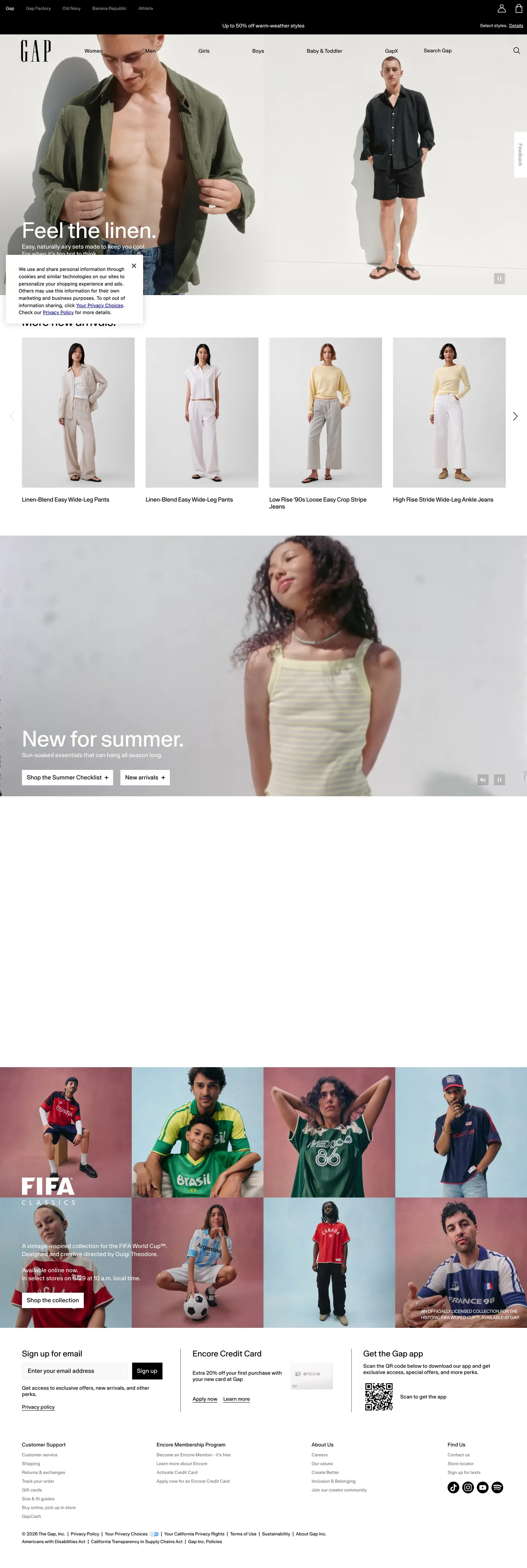
Gap's homepage does something that most e-commerce brands consider too risky: it removes itself. The page is a white canvas carrying black Gap Sans text at weight 400 and product photography — nothing else. No cobalt blue in the nav, no brand-color CTA button, no colored section bands. The top navigation is white with black text links; the "Shop Now" buttons are black rectangles with white text; the editorial headers are large, spare, and weight-400. The blue square logo sits in the top-left, but its brand blue does not appear anywhere else on the page. Where Zara also runs a stripped-down monochrome system, Zara uses editorial photography of models against white; Gap's homepage on the captured surface runs a more editorial magazine mix — linen-textured flat-lays, outdoor lifestyle shots, and a FIFA collaboration panel using full-color editorial photography.
The DESIGN.md packages the system for React and AI tools. Inside: 10 colors tokens where pure black (410 total occurrences) and a border gray (410 occurrences) dominate, with white (48 occurrences) and a muted gray (20 occurrences) filling out the text tier. Typography is a single proprietary family — Gap Sans — running at weight 400 across every tier. Display sits at 60px with no letter-spacing; body at 16px with positive 0.2–0.32px tracking; small caps and links at 12–14px with 0.2–0.32px tracking. Gap's positive tracking at small sizes is unusual for a fashion brand: it creates an airy openness that contrasts with the tight tracking fashion brands typically use.
Feed this spec to an AI tool and it will reproduce Gap's signature restraint: pure black and white chrome, product photography as the only visual element, Gap Sans at weight 400 across all scales, sparse or zero corner rounding, and the editorial editorial layout rhythm of a magazine cover translated to an e-commerce page. The move worth borrowing selectively is zero-brand-color discipline — it only works when the product photography is strong enough to carry 100% of the visual interest. For most brands this is a high-risk position; for a heritage retailer with 50 years of brand equity in its logo, it lands.
What makes it distinct
5
- Monochrome editorialno brand color renders in the marketing chrome; black text on white canvas, with product photography providing all color
- Zero-weight variationGap Sans runs at weight 400 from 60px editorial display down to 12px label; no bold tier exists on the page
- Positive letter-spacingGap Sans uses 0.2–0.32px positive tracking across small and body sizes, giving the type an airy, open register
- Sparse corner roundingalmost no border-radius on the e-commerce surface; most tiles and buttons are sharp-edged or minimal (2–4px)
- Photography as the design systemthe page's visual identity is entirely carried by full-bleed and editorial product photos; the surrounding chrome disappears
gap.com
Live at gap.com
A snapshot of the brand in production. Scroll the frame to see the whole page.
Colors
10 colors
Gap's system anchors on #595959 (ink-medium) as its primary color. Type is set in Gap Sans v1 across 10 tokens from 12px to 60px, weights 400–400. Shape language is sharp — components average 0px corner radius, favoring crisp rectangles.
Brand & Accent
Sparing, CTA-only voltage · 1
Surface
Page and card backgrounds · 1
Text
Headlines, body, captions · 5
Borders & Hairlines
Dividers, outlines, rules · 1
Semantic
Status, errors, success, links · 1
Other
Specialty colors · 1
Typography
10 type tokens
Set in Gap Sans v1 across 10 tokens, from 12px to 60px, weights 400–400. Shown in its own stack: where the font isn't installed, the fallback the file names stands in.
- display-xl60px · weight 400 · lh 55pxThe quick brown fox jumps over the lazy dog
- display-md32px · weight 400 · lh 25.6pxThe quick brown fox jumps over the lazy dog
- heading-sm22px · weight 400 · lh normal · tracking 0.2pxThe quick brown fox jumps over the lazy dog
- body-md16px · weight 400 · lh 19.2pxThe quick brown fox jumps over the lazy dog
- body-sm14px · weight 400 · lh normal · tracking 0.32pxThe quick brown fox jumps over the lazy dog
- label-md14px · weight 400 · lh normal · tracking 0.32pxThe quick brown fox jumps over the lazy dog
- label-sm12px · weight 400 · lh normal · tracking 0.24pxThe quick brown fox jumps over the lazy dog
- caption12px · weight 400 · lh normal · tracking 0.2pxThe quick brown fox jumps over the lazy dog
- button-md16px · weight 400 · lh 16px · tracking 0.32pxThe quick brown fox jumps over the lazy dog
- nav-link12px · weight 400 · lh normal · tracking 0.2pxThe quick brown fox jumps over the lazy dog
Layout
Radii and spacing
4 corner radii and 8 spacing values. Shape language: sharp.
Radii
- none0px
- xs2px
- sm4px
- md20px
Spacing
- xs8px
- sm12px
- base16px
- md24px
- lg30px
- xl32px
- 2xl48px
- section60px
Components
14 components
Each rendered from its tokens (color, type, radius, padding) on Gap's own canvas.
- Button Primarybutton-primaryButton Primary
- Button Secondarybutton-secondaryButton Secondary
- Top Navtop-navTop Nav
- Nav Linknav-linkNav Link
- Hero Headinghero-headingHero Heading
- Section Headingsection-headingSection Heading
- Body Paragraphbody-paragraphBody Paragraph
- Body Paragraph Mutedbody-paragraph-mutedBody Paragraph Muted
- CardcardCard
- Hero Panelhero-panelHero Panel
- Type here…text-inputText Input
- Price Labelprice-labelPrice Label
- Sale Pricesale-priceSale Price
- FooterfooterFooter
In use
The system, in use
Gap's tokens on the kind of product it builds.
Build something people actually use.
A short paragraph of marketing copy that previews how the brand's display tier and body tier read together. Two sentences is usually enough.
FAQ
Gap design system FAQ
Common questions about Gap's tokens, components, and how to use this DESIGN.md in your project.
Read next
Related reading
Specs, directories, and component libraries that pair with this design system.
- Browse all design systemsThe full directory of DESIGN.md files on shadcn.io, with live mockups for each.shadcn.io
- Gap — official siteGap's public marketing site — the source of truth for the live tokens captured in this file.gap.com (opens in a new tab)
- The DESIGN.md specificationGoogle Labs' open spec for machine-readable design system files — the format this page is built on.github.com (opens in a new tab)
Use it
Use Gap in your project
One machine-readable file. Drop it into Claude, Cursor, or any AI tool that reads DESIGN.md.
Download the DESIGN.md
One machine-readable file: every color, type, radius, spacing, and component token of Gap.
Feed it to your AI tool
Drop it into Claude, Cursor, or GitHub Copilot. The agent writes React components and Tailwind classes that match Gap's visual language.
Reference the tokens directly
Or paste the values into your Tailwind config, CSS variables, or component library: every color, size and radius is a quoted, ready-to-copy value.
Read the full DESIGN.md: overview, rationale, do’s and don’ts
Overview
Gap's e-commerce homepage practices the most stripped-down brand chrome in the apparel retail category. Photography as the Design System. The page's visual identity lives entirely in its product and lifestyle photography — full-bleed linen flat-lays, outdoor summer lifestyle shots, a FIFA collaboration editorial panel. The surrounding chrome — nav, typography, buttons, section headers — is monochrome: black text on white canvas. No brand-color accent in any interactive element. Where Zara runs a similar stripped-down approach but maintains tight, heavyweight typography, and H&M uses blue CTAs to reinforce brand identity, Gap's homepage removes all non-photographic color entirely.
The typography mirrors the chromatic restraint. Gap Sans runs at weight 400 from the 60px editorial display down to the 12px navigation labels — the same weight across the entire scale. The positive 0.2–0.32px letter-spacing at small and body sizes creates an airy openness unusual for fashion; most apparel brands use tight or normal tracking to feel more editorial. The radius scale is near-zero: the dominant shapes are hard-edged rectangles, with a single 20px-radius exception on one panel element.
The cobalt brand blue (#031ba1) — the color of the famous blue square logo — is declared as a CSS variable across multiple names but never renders in the marketing chrome. It is reserved for the logo mark and, apparently, for experiences beyond the homepage.
Key Characteristics:
- Pure black text (410 occurrences) on pure white canvas — no brand-color accent visible in any UI chrome element.
- Gap Sans at weight 400 across all tiers; no bold or medium weight appears in the captured marketing surface.
- Positive letter-spacing (0.2–0.32px) at 12–16px sizes — distinctly airy for fashion retail.
- Near-zero corner rounding — sharp-edged product tiles, buttons, and nav elements; a single 20px-radius panel exception.
- Black-fill CTA buttons ("Shop Now", "Shop Women") with white text — the inverse of most retail conventions.
- Top navigation bar is black (not white or brand-colored) with white text links and a white Gap logo.
- Product photography is the sole visual engine; the chrome is entirely subordinate to it.
- Brand blue (#031ba1) declared in CSS but not rendered in the marketing surface.
Colors
Canvas & Surfaces
- Canvas (
{colors.canvas}— #ffffff): frequency 48. Used as text (23), background (15), border (10). The white page floor — pure, no cream or off-white tint. The entire below-nav body surface. - Hairline (
{colors.hairline}— #e5e7eb): frequency 410. Used as border (408), background (2). The dominant border tone — 408 of 410 occurrences are borders. Card outlines, product tile dividers, input borders. Almost certainly the same token as the 410-count black — the two tokens together account for the overwhelming majority of the page's visual decisions.
Text
- Ink (
{colors.ink}— #000000): frequency 410. Used as text (381), background (8), border (20), shadow (1). The dominant text and button-fill color. Pure black for all body copy, headings, and the CTA button background. - Ink Muted (
{colors.ink-muted}— #757575): frequency 20. Used as text only. Secondary body text, muted labels, non-primary UI copy. - Ink Soft (
{colors.ink-soft}— #999999): frequency 8. Used as text only. Tertiary labels, inactive nav states. - Ink Medium (
{colors.ink-medium}— #595959): frequency 4. Used as text (3) and border (1). A mid-gray for less-prominent text tiers. - Muted Background (
{colors.muted-bg}— #a3a3a3): frequency 2. Used as text only — a light-gray text for the lightest visible secondary labels.
Brand (CSS-declared, not rendered on captured surface)
- Brand Blue (
{colors.brand-blue}— #031ba1): frequency 0 (rendered). Declared as --br1, --color-brands-gap-brand, --color-brands-gap-test-brand-1. The cobalt blue of the Gap logo — present in CSS but absent from the marketing-surface render. The page's defining typographic choice is to suppress this color from the chrome entirely.
Semantic
- Error (
{colors.error}— #c82828): declared in CSS as error and sale-price states — not visible in captured marketing render. - Sale (
{colors.sale}— #bc0712): declared as --crossbrand-color-text-sale, --crossbrand-color-text-error — used on price labels in sale contexts (reduced price in dark red). Appears in the product-grid tile price display.
Typography
Font Family
The system runs Gap Sans — a proprietary custom typeface declared as both "Gap Sans v1" (a versioned variant in CSS custom properties) and "Gap Sans" (in the full font stack "Gap Sans", Helvetica, Arial, Roboto, sans-serif). A secondary system font stack (ui-sans-serif, system-ui, sans-serif) appears once in a widget or third-party embed. There is no mono voice, no serif accent, and no second brand family.
The defining characteristic: weight 400 across every tier. No 500, 600, or 700 weight appears on the marketing surface. The hierarchy is driven entirely by size, not weight.
Hierarchy
| Token | Size | Weight | Line Height | Letter Spacing | Use |
|---|---|---|---|---|---|
{typography.display-xl} | 60px | 400 | 55px | 0 | Editorial hero ("Feel the linen", "New for summer") |
{typography.display-md} | 32px | 400 | 25.6px | 0 | Section h2 ("More new arrivals.") |
{typography.heading-sm} | 22px | 400 | normal | 0.2px | Sub-section headings, product category h3 |
{typography.body-md} | 16px | 400 | 19.2px | 0 | Default body text, product descriptions |
{typography.body-sm} | 14px | 400 | normal | 0.32px | Product tile descriptions, card metadata |
{typography.label-md} | 14px | 400 | normal | 0.32px | Nav labels, link text, product metadata |
{typography.label-sm} | 12px | 400 | normal | 0.24px | Footer links, small UI labels |
{typography.caption} | 12px | 400 | normal | 0.2px | Price labels, rating text, chip labels |
{typography.button-md} | 16px | 400 | 16px | 0.32px | CTA button labels ("Shop Women", "Shop Now") |
{typography.nav-link} | 12px | 400 | normal | 0.2px | Top-nav link labels (white on black bar) |
Principles
Weight 400 throughout the scale is the system's typographic statement. The 60px editorial display at weight 400 reads as airy and confident rather than loud. This is the fashion-editorial model: typography recedes, photography leads. The positive letter-spacing (0.2–0.32px) at 12–14px sizes is the most distinctive typographic decision — it opens the text and keeps it readable at small sizes without appearing dense.
There is no bold hierarchy. Size alone separates display from heading from body from label. A 60px headline and a 14px product label both render at weight 400 — the scale difference does all the work.
Note on Font Substitutes
Gap Sans is proprietary. GT America at weight 400 is the closest open-source substitute for the editorial display sizes — similar cap height and neutral warmth. Inter at weight 400 with +0.3px letter-spacing applied at label sizes approximates the airy tracking at small sizes. Do not introduce weight 500 or 600 as a "substitute for boldness" — the weight-400 discipline is not a limitation, it is the identity.
Layout
Spacing System
- Base unit: 8px.
- Tokens:
{spacing.xs}8px ·{spacing.sm}12px ·{spacing.base}16px ·{spacing.md}24px ·{spacing.lg}30px ·{spacing.xl}32px ·{spacing.2xl}48px ·{spacing.section}60px. - Card internal padding: 12px on product tiles; 16px on content panels.
- Section heading padding: 0px top, 30px bottom, 15px left — the left offset gives the editorial heading a deliberate flush-left position against the product-grid margin.
- Nav padding: 0px vertical, 16px horizontal per link; the nav bar itself is 46px height.
Grid & Container
- Max content width: ~1350px at desktop — the captured section heading spans 1350px, the widest content element on the page.
- Hero panels: full-bleed editorial photography panels with text overlaid flush left; no constrained max-width within the hero band.
- Product grid: multi-column grid (4–5 columns at desktop) of product tiles. Each tile is a card with product image, name, price, and rating below.
- Promotional grid: a 3×2 or 4×2 image-mosaic block for campaign/collaboration content (FIFA, category promotions).
- Footer: 5-column link grid at desktop with a centered sign-up and app QR code block.
Rhythm
The page alternates between editorial (full-bleed photography with sparse overlay text) and e-commerce (dense product grids) bands. The editorial bands are generous — large images, small text, no chrome. The e-commerce bands are dense — packed product tiles, category labels, promotional price text. The shared white canvas and weight-400 Gap Sans bind them together; the photography distinguishes them.
Elevation
The system has no visible shadow tier on the captured marketing surface.
- Flat (no shadow): all product tiles, editorial panels, the nav, the footer. Zero shadow occurrences in the captured rendering.
- Hairline separation:
{colors.hairline}(#e5e7eb) carries all card and tile delineation — 408 border occurrences. The product tiles read as separated from each other by a hairline rule, not by any spatial elevation. - Single shadow declaration: one shadow occurrence at
{colors.ink}/rgba(0,0,0,0.3)— likely a dropdown or popover element not prominent in the captured view.
Shapes
The radius scale is near-zero — the most architecturally flat radius system in the design directory:
{rounded.none}0px — the dominant radius for product tiles, CTA buttons, nav elements, the footer.{rounded.xs}2px (1 instance) — minor sub-pixel edge softening on a chip element.{rounded.sm}4px (1 instance) — a single small-radius element.{rounded.md}20px (1 instance) — the single notable rounded element; a promotional panel or modal-adjacent container.
There is no pill (100px) radius. There is no generous (24–32px) radius. The page is architectural and hard-edged throughout.
Components
button-primary — Black {colors.ink} fill, white {colors.canvas} text, 0px radius (square edges), 0×15px padding, 46px height. "Shop Women", "Shop Now" are the canonical instances — black rectangles, no rounding, no brand color.
button-secondary — White {colors.canvas} fill, {colors.ink} text, 1px black border, 0px radius, 0×15px padding, 46px height. Used for secondary CTA actions.
top-nav — Black {colors.ink} fill, white {colors.canvas} text at {typography.nav-link} (12px / 400 / 0.2px tracking), 46px height, 0×16px padding. The full-width black navigation bar is the single continuous black horizontal element on the white page — it grounds the top edge and marks the page as distinct from a standard white-nav fashion retailer.
nav-link — White {colors.canvas} text on the black nav bar, 12px / 400, 0×16px padding. No hover-state decoration captured.
hero-heading — {colors.ink} text at {typography.display-xl} (60px / 400). Editorial heroes like "Feel the linen" and "New for summer" overlay photography flush left with minimal padding.
section-heading — {colors.ink} text at {typography.display-md} (32px / 400), 0×0×30px×15px padding — the deliberate 15px left offset sets it against the page's normal grid margin.
body-paragraph — {colors.ink} text at {typography.body-md} (16px / 400 / 19.2px line-height).
body-paragraph-muted — {colors.ink-muted} (#757575) at {typography.body-sm} (14px / 400 / 0.32px tracking) for secondary descriptions and product metadata.
card — White {colors.canvas} fill, {colors.ink} text, 0px radius, 12px padding, {colors.hairline} border. The product tile — image fills the top, product name + price + rating below. The hairline delineates but does not frame with rounding.
hero-panel — Full-bleed panel with editorial photography as background, {colors.ink} text at {typography.display-xl} overlaid. No background-color fill — the photography IS the background.
text-input — White fill, {colors.ink} text at {typography.body-sm}, 0px radius, 0×0×0×4px padding, 17px height (search-bar style, inline). {colors.hairline} border-bottom only, no border-box surround.
price-label — {colors.ink} at {typography.label-md} (14px / 400 / 0.32px tracking). Default product price display.
sale-price — {colors.sale} (#bc0712) at {typography.label-md}. Discounted price label — the only semantic color visible in the product tile grid.
footer — Black {colors.ink} fill, white text at {typography.label-sm} (12px / 400 / 0.24px tracking), 30×16px padding. The footer mirrors the nav — black band with white text — bookending the white body.
Do's and Don'ts
Do use photography as the page's sole visual accent. The chrome is entirely subordinate to the imagery — every brand-color decision has been removed to let the product photographs carry 100% of visual interest. Adding any brand-colored decorative element directly competes with the photography.
Do preserve weight 400 across all typographic tiers. Gap Sans's editorial authority at 60px comes from being the same weight as the 12px nav label — the uniformity is the system's identity. Introducing weight 600 on display headings converts the editorial register to a commercial one.
Do apply positive letter-spacing (0.2–0.32px) to labels and nav links. The airy tracking is unusual for fashion retail and is Gap's subtle typographic signature at small sizes — it distinguishes the type from competitors who use tight or normal tracking.
Do use the black nav bar and black footer as structural bookends. The top and bottom black bands frame the white body and prevent the page from reading as an endless white scroll. Both are black {colors.ink} fill with white text — mirrors of each other.
Don't use {colors.brand-blue} (#031ba1) in UI chrome elements. The cobalt brand blue is declared in 15 CSS variables but renders on zero elements in the captured surface. Introducing it as a CTA accent would fundamentally change the monochrome-chrome design philosophy; it belongs to the logo mark only.
Don't add corner rounding to product tiles or CTA buttons. The system's near-zero radius is deliberate — even a 4–8px radius on a button reads as a stylistic departure from Gap's architectural flatness. The only allowed rounding (20px) applies to one promotional panel element.
Don't vary font weight for emphasis. The system has no bold tier — emphasis is achieved through size (60px vs 14px), position, and photography contrast, not through weight change. A 600-weight heading breaks the weight-400 discipline.
Don't use the sale color ({colors.sale} — #bc0712) outside price-label contexts. It appears exclusively on discounted price displays in the product grid. Using it for section headers or promotional text converts a semantic color into a brand accent.
Known Gaps
- Brand blue application: the cobalt brand blue (#031ba1) is declared but not visible on the captured marketing surface. Its application on category pages, product-detail pages, or campaign sub-sites is unknown.
- Hover and active states: no interactive-state styling was captured. CTA button hover, nav-link hover, product-tile focus states are not documented.
- Mobile nav pattern: the desktop black nav bar likely collapses to a hamburger menu on mobile; the mobile nav tokens are not captured.
- Animation and transitions: the promotional carousel (FIFA panel, summer campaign) likely has scroll or auto-advance transitions not captured in the static extraction.
- Gap Sans weight variants: whether Gap Sans includes 600 or 700 weight cuts is unknown; the CSS surface shows only weight 400 and 500 on the marketing page. A bold cut may exist for in-store or campaign materials.
- Product-category page tokens: the homepage chrome is sparse; product listing and product detail pages likely expose additional UI components (filter rails, size selectors, color swatches, review modules) not captured here.
- International site variants: gap.com for non-US locales may use different typography or layout treatments to accommodate non-Latin scripts.
E-commerce & Retail
More systems like this
More DESIGN.md files in E-commerce & Retail.
Pricing
Build it with Pro
The DESIGN.md files are free. Pro adds 6,000+ blocks, premium templates and the MCP server, so your AI editor builds in your system for you.
4.9/5 out of 5 · 150+ reviewsfrom 150+ founders and developers.
Billing
Billed once a year in USD. Cancel anytime.
- How many people can use the license.
- Client work, SaaS products and anything you charge for.
- Production-ready React sections: hero, pricing, features, dashboards and more.
- Complete multi-page sites you can ship as they are.
- React icons from every major library, installable with one command.
- Presets that restyle every block, in light and dark.
- Lets your AI editor search, preview and install blocks for you.
- Priority requests are answered first.
Individual
For personal projects & open source
$32instead of $49/mo
$389 billed yearly
- Seats: 1 seat
- Commercial use: Personal & open source only
- Pro blocks: 6,000+ blocks
- Templates: All 14 templates
- React icons: 294k+ icons
- Themes: All 59 themes
- MCP server: Basic usage
- Support: Standard
Team
Most popularFor freelancers, agencies & startups
$66instead of $99/mo
$789 billed yearly · ≈ $13/dev/mo
- Seats: Up to 5 seats
- Commercial use: Included
- Pro blocks: 6,000+ blocks
- Templates: All 14 templates
- React icons: 294k+ icons
- Themes: All 59 themes
- MCP server: High usage
- Support: Priority
Organization
For companies with larger teams
$132instead of $199/mo
$1,589 billed yearly
- Seats: Unlimited seats
- Commercial use: Included
- Pro blocks: 6,000+ blocks
- Templates: All 14 templates
- React icons: 294k+ icons
- Themes: All 59 themes
- MCP server: Unlimited usage
- Support: Priority
Billed once a year in USD. Cancel anytime.
Individual
For personal projects & open source
$32instead of $49/mo
$389 billed yearly
- How many people can use the license.Seats: 1 seat
- Client work, SaaS products and anything you charge for.Commercial use: Personal & open source only
- Production-ready React sections: hero, pricing, features, dashboards and more.Pro blocks: 6,000+ blocks
- Complete multi-page sites you can ship as they are.Templates: All 14 templates
- React icons from every major library, installable with one command.React icons: 294k+ icons
- Presets that restyle every block, in light and dark.Themes: All 59 themes
- Lets your AI editor search, preview and install blocks for you.MCP server: Basic usage
- Priority requests are answered first.Support: Standard
Team
Most popularFor freelancers, agencies & startups
$66instead of $99/mo
$789 billed yearly · ≈ $13/dev/mo
Everything in Individual, plus
- How many people can use the license.Seats: Up to 5 seats
- Client work, SaaS products and anything you charge for.Commercial use: Included
- Lets your AI editor search, preview and install blocks for you.MCP server: High usage
- Priority requests are answered first.Support: Priority
Organization
For companies with larger teams
$132instead of $199/mo
$1,589 billed yearly
Everything in Team, plus
- How many people can use the license.Seats: Unlimited seats
- Lets your AI editor search, preview and install blocks for you.MCP server: Unlimited usage
- Secure checkout via Stripe
- Code lives in your repo
- Keep what you've shipped if you cancel
- License terms
Your system, built for you
Every block, template and icon, installed by your AI agent in your design system. The DESIGN.md files stay free.