Gamma Design System
Gamma's AI-presentation marketing system as a DESIGN.md file. Card-grid scroll, 24px pill CTAs, deep navy ink with deepocean blue voltage, PPMori body and ESBuild display, tokens for React, Next.js, and AI tools.
Add shadcn.io to your AI agent. · Pro It installs blocks, icons and templates in your design system from a prompt, with Pro.
Set up MCP- Primary
- #0540ad
- Typeface
- PPMori
- Shape
- Soft
- Base radius
- 12px
- Colors
- 14
- Type tokens
- 12
- Components
- 17
- Spacing values
- 9
About
About Gamma DESIGN.md
Curated by Dov Azencot · Updated May 19, 2026 · Source gamma.app (opens in a new tab)
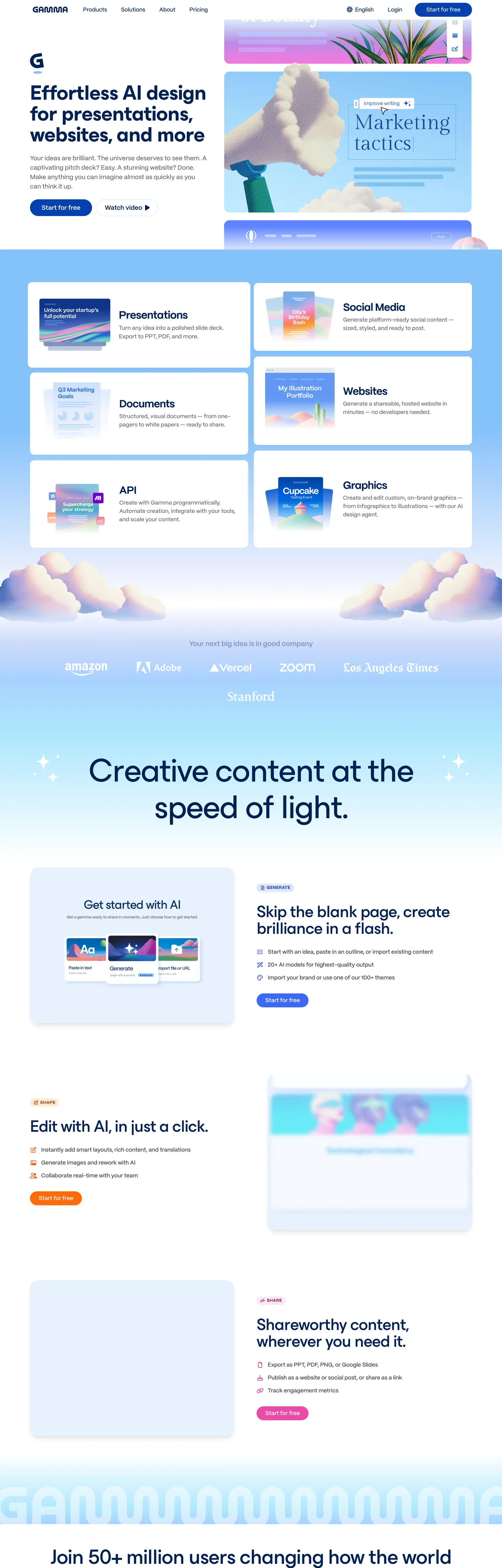
Gamma's marketing page reads as one long card-grid scroll. The top hero is a rounded soft-card holding a 60px ESBuild h1 in deep navy ("Effortless AI design for presentations, websites, and more"), a small product-mode chip row, and a blue 24px-radius pill CTA. Below it, the page commits to its structural device: a 3 x 2 grid of pastel tiles (Presentations, Documents, API, Social Media, Websites, Graphics) drifting against a periwinkle cloud band that runs edge-to-edge. The next band opens with a second hero — a 96px ESBuild line in weight 300 ("Creative content at the speed of light") — and from there the page alternates feature cards each anchored by a small mono-color pictogram and a single ESBuild heading. There is no full-width image hero, no testimonial wall in the conventional sense, no pricing table above the fold; every band is a card or a card grid.
The DESIGN.md file packages the system into a machine-readable spec for React tooling. Inside: 14 colors tokens drawn from Chakra's spacegray, snowcap, deepocean, rocketfire, bordeaux, and periwinkle families — a deepocean blue voltage (#0540ad) for the primary CTA, a deep-navy ink (#002253) for display text, and a set of soft pastel surface tones (sky, snowcap, periwinkle) for the product-mode tiles. 12 typography tokens run PPMori at weights 500-800 for body and label and ESBuild at weights 300-700 for the display tier; the heaviest moment sits at 60px in weight 700, while the largest tier (96px) drops to weight 300. 4 radius tokens cluster on a 24px workhorse, a 12px secondary, a full-pill option, and a 0px flat tier. 17 components tokens cover the card-grid tile, the soft-pill CTA, the cloud-band section, the feature card with pictogram, and the navigation pill rail.
Feed this file to an AI coding tool and it reproduces Gamma's specific moves: card-grid scroll instead of a single-image hero, the 24px-pill primary CTA in deepocean blue, the deep-navy ink over near-white surfaces rather than black on white, and the PPMori-plus-ESBuild type pairing where the larger display sizes deliberately drop weight (96px at 300 weight) to read as airy rather than declarative. One thing to borrow only if your product is genuinely modal: the 3 x 2 product-mode tile grid only works if you actually have six product modes confident enough to each carry a tile — for narrower products it would feel padded.
What makes it distinct
5
- Card-grid scrollsix pastel product-mode tiles (Presentations, Documents, API, Social Media, Websites, Graphics) sit in a 3 x 2 grid drifting on a cloud band, the brand's structural device for the whole page
- Two display familiesPPMori for body and label (weights 500-800), ESBuild for hero h1/h2 (weight 300-700 at 48-96px); the contrast is the typographic signature
- Deep navy ink over creamdisplay sits in deepocean navy on a near-white canvas, never pure black on pure white
- 24px-radius pill workhorseprimary CTAs use a 24px corner pill rather than a 9999px round-pill or a tight 6px corner, plus a 9999px round option for icon-only chips
- Soft chromatic paletteperiwinkle, sky, snowcap, deepspace, and sunrise pinks all wired into Chakra spacegray/snowcap/deepocean families, used as tile fills rather than as accent voltage
gamma.app
Live at gamma.app
A snapshot of the brand in production. Scroll the frame to see the whole page.
Colors
14 colors
Gamma's system runs on #0540ad as its primary voltage, used in 1 of 17 components. Type is set in PPMori across 12 tokens from 12px to 96px, weights 300–800. Shape language is soft — components average 23px corner radius, with no sharp interactive edges.
Brand & Accent
Sparing, CTA-only voltage · 7
Surface
Page and card backgrounds · 3
Text
Headlines, body, captions · 3
Borders & Hairlines
Dividers, outlines, rules · 1
Typography
12 type tokens
Set in PPMori across 12 tokens, from 12px to 96px, weights 300–800. Shown in its own stack: where the font isn't installed, the fallback the file names stands in.
- display-2xl96px · weight 300 · lh 105.6px · tracking -1.92pxThe quick brown fox jumps over the lazy dog
- display-xl60px · weight 700 · lh 60px · tracking -1.2pxThe quick brown fox jumps over the lazy dog
- display-md48px · weight 500 · lh 48px · tracking -0.96pxThe quick brown fox jumps over the lazy dog
- heading-lg30px · weight 800 · lh 33px · tracking -0.6pxThe quick brown fox jumps over the lazy dog
- heading-md20px · weight 700 · lh 22px · tracking -0.4pxThe quick brown fox jumps over the lazy dog
- body-lg18px · weight 500 · lh 27pxThe quick brown fox jumps over the lazy dog
- body-lg-bold18px · weight 700 · lh 27pxThe quick brown fox jumps over the lazy dog
- body-md16px · weight 500 · lh 24pxThe quick brown fox jumps over the lazy dog
- body-md-bold16px · weight 700 · lh 24pxThe quick brown fox jumps over the lazy dog
- body-sm14px · weight 500 · lh 21pxThe quick brown fox jumps over the lazy dog
- button-md16px · weight 500 · lh 19.2pxThe quick brown fox jumps over the lazy dog
- label-caps12px · weight 700 · lh 14.4px · tracking 0.5pxThe quick brown fox jumps over the lazy dog
Layout
Radii and spacing
4 corner radii and 9 spacing values. Shape language: soft.
Radii
- none0px
- md12px
- lg24px
- pill9999px
Spacing
- xs4px
- sm8px
- base12px
- md16px
- lg20px
- xl24px
- 2xl32px
- 3xl48px
- 4xl96px
Components
17 components
Each rendered from its tokens (color, type, radius, padding) on Gamma's own canvas.
- Hero Cardhero-cardHero Card
- Hero Headinghero-headingHero Heading
- Hero Heading Airyhero-heading-airyHero Heading Airy
- Section Headingsection-headingSection Heading
- Body Paragraphbody-paragraphBody Paragraph
- Body Paragraph Mutedbody-paragraph-mutedBody Paragraph Muted
- Button Primarybutton-primaryButton Primary
- Button Secondarybutton-secondaryButton Secondary
- Top Navtop-navTop Nav
- Nav Linknav-linkNav Link
- Product Tileproduct-tileProduct Tile
- Feature Cardfeature-cardFeature Card
- Feature Card Pastelfeature-card-pastelFeature Card Pastel
- Label Chiplabel-chipLabel Chip
- Icon Chipicon-chipIcon Chip
- CardcardCard
- Type here…text-inputText Input
In use
The system, in use
Gamma's tokens on the kind of product it builds.
Build something people actually use.
A short paragraph of marketing copy that previews how the brand's display tier and body tier read together. Two sentences is usually enough.
FAQ
Gamma design system FAQ
Common questions about Gamma's tokens, components, and how to use this DESIGN.md in your project.
Read next
Related reading
Specs, directories, and component libraries that pair with this design system.
- Browse all design systemsThe full directory of DESIGN.md files on shadcn.io, with live mockups for each.shadcn.io
- Gamma — official siteGamma's public marketing site — the source of truth for the live tokens captured in this file.gamma.app (opens in a new tab)
- The DESIGN.md specificationGoogle Labs' open spec for machine-readable design system files — the format this page is built on.github.com (opens in a new tab)
Use it
Use Gamma in your project
One machine-readable file. Drop it into Claude, Cursor, or any AI tool that reads DESIGN.md.
Download the DESIGN.md
One machine-readable file: every color, type, radius, spacing, and component token of Gamma.
Feed it to your AI tool
Drop it into Claude, Cursor, or GitHub Copilot. The agent writes React components and Tailwind classes that match Gamma's visual language.
Reference the tokens directly
Or paste the values into your Tailwind config, CSS variables, or component library: every color, size and radius is a quoted, ready-to-copy value.
Read the full DESIGN.md: overview, rationale, do’s and don’ts
Overview
Gamma's marketing page commits to one structural device. Card-grid scroll. Where Notion paints the page with a single-image hero and Canva opens with a video, Gamma turns the entire scroll into a stack of soft-rounded cards: a hero tile at the top, a 3 x 2 product-mode grid on the cloud band beneath, a second hero band with a 96px display moment, and then a sequence of feature cards each anchored by a small mono-color pictogram and a single ESBuild heading. There is no full-bleed image hero, no testimonial wall in the standard sense, no pricing table above the fold; every band is a card or a card-grid.
The chromatic system is deep-navy ink with one cool voltage. Display text sits in deepocean navy ({colors.ink} — #002253), never pure black on near-white; the primary CTA voltage is a single deepocean blue ({colors.primary} — #0540ad) appearing exactly twice on the captured page, both as button fills. The product-mode tiles are pastel surfaces (sky, snowcap, periwinkle, sunrise pinks) — none of them load-bearing accent voltages, just soft fills for the 3 x 2 grid. Where Cloudflare gives a brand voltage the entire above-fold canvas and Vercel keeps its canvas on matte black, Gamma sits in a third position: cool-pastel surface palette, deep-navy ink, scarce blue voltage. The tonal energy comes from the cloud-band gradient running edge-to-edge behind the product-tile grid, not from a load-bearing CTA color.
Typography is two voices, deliberate weight inversion. PPMori (a Pangram Pangram contemporary geometric sans) carries body, label, button, and small heading work at weights 500-800. ESBuild (a wider Pangram Pangram display cut) carries the 48-96px display tier at weights 300-700. The hero h1 at 60px sits in weight 700; the larger second-hero h2 at 96px drops to weight 300 — the bigger the size, the lighter the weight. This inversion is the move: the airy 96px line reads as a confident understatement, where a 96px / 700 treatment would shout.
Key Characteristics:
- Card-grid scroll as the structural device — six pastel product-mode tiles (Presentations, Documents, API, Social Media, Websites, Graphics) sit in a 3 x 2 grid on a periwinkle cloud band that runs edge-to-edge.
- Single brand voltage (
{colors.primary}— #0540ad), 2 occurrences only, both as primary-CTA fill. The rest of the chromatic palette is pastel surface fills (sky, snowcap, periwinkle, sunrise). - Deep-navy ink (
{colors.ink}— #002253) for display text, 83 occurrences — never pure black on near-white. - Two-voice typography: PPMori for body and label (12-30px, weights 500-800), ESBuild for display (48-96px, weights 300-700).
- Weight inversion on the display tier: 60px hero h1 sits at weight 700, while the larger 96px second-hero h2 drops to weight 300.
- 24px-radius pill workhorse for primary CTAs (40px tall, 24px corner reads as soft pill, not full circle), 9999px round-pill for icon-only chips (37 occurrences across the page).
- Hairline-only cards:
{colors.hairline}(#dfdfe0) carries 414 of the captured border occurrences — the dominant border tone, no second hairline. - 24px workhorse spacing — 28 occurrences as gap, 27 occurrences as padding; the system aligns most card-grid breathing room on this single value.
Colors
Brand
- Deepocean Blue (
{colors.primary}— #0540ad): frequency 2. Used as background only — the primary CTA pill "Start for free" in both the top hero and the second-hero band. Wired in Chakra as--chakra-colors-blue-800,--chakra-colors-sky-800,--chakra-colors-deepocean-800. The single load-bearing brand voltage; layered as the deepest cool blue across three semantic var families.
Surface
- Canvas (
{colors.canvas}— #ffffff): frequency 151 (text 114, background 12, border 17). The page floor and the default card fill. Pure white — the system uses no cream variant. - Surface Tile (Periwinkle) (
{colors.surface-tile}— #e8eefc): frequency 36 (background 1, structural appearances throughout). The default product-mode tile fill in the 3 x 2 grid. Wired as--chakra-colors-deepspace-100,--chakra-colors-ultramarine-100,--chakra-colors-periwinkle-100. - Surface Snowcap (
{colors.surface-snowcap}— #d0e6fe): frequency 5 (background 1, border 4). The secondary product-tile fill — slightly more saturated than periwinkle. Wired as--chakra-colors-snowcap-100,--chakra-colors-sky-100.
Accent (tile surfaces, not voltage)
- Accent Sky (
{colors.accent-sky}— #84c1fa): frequency 2. Used inside product-mode tile illustrations, not as a load-bearing brand color. Wired as--chakra-colors-sky-300,--chakra-colors-deepspace-300. - Accent Puddle (
{colors.accent-puddle}— #a8d1ff): frequency 2. Tile-illustration accent. Wired as--chakra-colors-puddle-200,--chakra-colors-sky-200. - Accent Mist (
{colors.accent-mist}— #afe7fc): frequency 2. Tile-illustration accent — slightly more saturated cyan-blue. - Accent Rocketfire (
{colors.accent-rocketfire}— #ff5000): frequency 3, all as text. A saturated orange used as a "new" badge / inline highlight on feature cards. Wired as--chakra-colors-rocketfire-600,--chakra-colors-orange-600. - Accent Bordeaux (
{colors.accent-bordeaux}— #da2887): frequency 3, all as text. A magenta-pink inline highlight used inside the API/Graphics product tiles. Wired as--chakra-colors-bordeaux-600. - Accent Sunrise (
{colors.accent-sunrise}— #2548eb): frequency 3, all as text. A medium-saturation blue inline highlight — distinct from the deeper deepocean voltage. Wired as--chakra-colors-snowcap-600.
Text
- Ink (
{colors.ink}— #002253): frequency 83 — the dominant display-text color across both heroes and every section heading. Wired as--chakra-colors-trueblue-950,--chakra-colors-snowcap-950,--chakra-colors-deepocean-950. Deep navy in the cool-blue family rather than pure black; the deliberate hue match with the deepocean primary keeps display text and CTA in the same tonal lineage. - Ink Body (
{colors.ink-body}— #38383c): frequency 205 — the workhorse body and nav-link text color. Wired as--chakra-colors-spacegray-950,--chakra-colors-tungsten-500,--chakra-colors-gray-800. Reads as charcoal with a slight cool cast. - Ink Muted (
{colors.ink-muted}— #66666b): frequency 24, all as text. Secondary running-text tone used inside feature-card body and lead paragraphs. Wired as--chakra-colors-spacedust-700,--chakra-colors-spacegray-800,--chakra-colors-gray-600.
Hairlines
- Hairline (
{colors.hairline}— #dfdfe0): frequency 414, all as borders. The dominant border tone — used on every card outline, feature-card divider, dropdown surface, and input edge. Wired as--chakra-colors-gray-200,--chakra-colors-chakra-border-color,--chakra-colors-spacegray-200. The system has no second hairline tone.
Typography
Font Families
The system runs two voices: PPMori (Pangram Pangram, contemporary geometric sans) for every body, label, button, nav-link, and small-heading surface, and ESBuild (Pangram Pangram, wider display cut) for the 48-96px display tier. Fallback for both walks to sans-serif — there is no Inter or system-ui safety stack on the captured surfaces.
The pairing is the typographic signature. PPMori at 500-800 across the small-and-medium tiers handles 90% of the text on the page; ESBuild appears only at three display sizes (48 / 60 / 96px) and carries the brand's display-tier weight inversion (the bigger the size, the lighter the weight).
Hierarchy
| Token | Size | Weight | Line Height | Letter Spacing | Use |
|---|---|---|---|---|---|
{typography.display-2xl} | 96px | 300 | 105.6px | -1.92px | Second-hero h2 ("Creative content at the speed of light") |
{typography.display-xl} | 60px | 700 | 60px | -1.2px | Top hero h1 ("Effortless AI design for presentations…") |
{typography.display-md} | 48px | 500 | 48px | -0.96px | Section h3 ("Get started with AI", "Edit with AI, in just a click") |
{typography.heading-lg} | 30px | 800 | 33px | -0.6px | Sub-hero h2 nav-anchor |
{typography.heading-md} | 20px | 700 | 22px | -0.4px | Product-tile titles ("Presentations", "Websites", "API") |
{typography.body-lg} | 18px | 500 | 27px | 0 | Sub-paragraph beneath display headings |
{typography.body-lg-bold} | 18px | 700 | 27px | 0 | Inline strong emphasis inside body paragraphs |
{typography.body-md} | 16px | 500 | 24px | 0 | Default running text — 44 occurrences |
{typography.body-md-bold} | 16px | 700 | 24px | 0 | Inline bold emphasis |
{typography.body-sm} | 14px | 500 | 21px | 0 | Feature-card body, caption rows |
{typography.button-md} | 16px | 500 | 19.2px | 0 | Primary and secondary button labels |
{typography.label-caps} | 12px | 700 | 14.4px | 0.5px | Uppercase small-caps labels above feature cells |
Principles
The weight ladder is inverse on the display tier: 96px sits at 300, 60px at 700, 48px at 500. The largest display moment is the lightest, and the second-largest is the heaviest — the system gets its display impact from size rather than from weight at the top tier. Body sits at 500 as the standard (not 400), which gives the workhorse text a slight warmth without crossing into semibold territory.
Letter-spacing is consistently negative across PPMori and ESBuild — from -0.4px on the 20px tile titles to -1.92px on the 96px hero — a uniform tightening that reads as a single typographic decision applied across the family. There is no positive-tracked label tier; small-caps labels ({typography.label-caps}) at 12px / 700 carry +0.5px tracking, but they are the only positive-tracked moment in the system.
Note on Font Substitutes
PPMori and ESBuild are commercially licensed Pangram Pangram fonts. Open-source substitutes: Inter at the same weights (500-800) for PPMori — the proportions transfer cleanly at body sizes. For ESBuild, General Sans Display or Söhne Breit Buch at the same weights match the slightly-wider display proportions; Geist is a closer match for the 60px / 700 hero tier but reads narrower than ESBuild at the 96px / 300 tier.
Layout
Spacing System
- Base unit: 4px (with 8px and 24px as the dominant modules).
- Tokens:
{spacing.xs}4px ·{spacing.sm}8px ·{spacing.base}12px ·{spacing.md}16px ·{spacing.lg}20px ·{spacing.xl}24px ·{spacing.2xl}32px ·{spacing.3xl}48px ·{spacing.4xl}96px. - Section padding (vertical): 96px between major bands; the second-hero band uses 96px / 0 / 0 padding to push the 96px display moment into a generous vertical zone.
- Card internal padding: 24px on product-mode tiles, 32px on feature cards, 48px on the hero card.
- Top-nav padding: 0×16px around the pill rail; the nav itself is 56px tall.
Grid & Container
- Max content width: ~1080px on the second-hero display ("Creative content at the speed of light" measures 1020px wide); ~1280px on the product-mode 3 x 2 grid.
- Top hero: 2-column grid — left half holds the wordmark + h1 + chip row + CTA; right half holds a small marketing-tactics card preview.
- Product-mode grid: 3 x 2 of
{component.product-tile}cards on a periwinkle cloud band that runs edge-to-edge — the page's signature structural device. - Feature-card sequence: alternating left-image / right-image cards at ~1080px max-width, each anchored by a small mono-color pictogram top and a single ESBuild heading.
Rhythm
The page alternates between soft-card bands (the workhorse rhythm) and cloud-band hero moments (the product-tile grid and the "Creative content" hero). There is no full-bleed image hero, no testimonial wall. Every section either is a card or contains a card grid; the rhythm comes from card-vs-cloud, not from typographic density.
Elevation
The system uses soft single-layer shadow on feature cards and product tiles, but no multi-tier elevation ladder. The captured page shows 30 occurrences of pure black as shadow ink, most rendered at low opacity — soft halos rather than declarative drop shadows. Card hierarchy is carried primarily by the hairline border ({colors.hairline} — 414 occurrences) plus a single shadow tier.
- Flat (no shadow): hero card, top-nav pill rail, label chips — most surfaces.
- Soft halo: product-mode tiles and feature cards carry a 0-2px low-opacity black shadow — readable as gentle elevation off the page floor.
- Cloud-band gradient: the periwinkle band beneath the product-mode grid is the page's only atmospheric moment — a low-saturation gradient running edge-to-edge.
Shapes
The radius scale is soft-pill-plus-flat, centered on 24px:
{rounded.none}0px — display headings, body paragraphs.{rounded.md}12px — secondary card-corner radius (23 occurrences across the page).{rounded.lg}24px — the workhorse radius. Used on the primary CTA pill (40px-tall, reads as soft pill not full circle), product-mode tiles, feature cards, and the hero card.{rounded.pill}9999px — used on small icon-only chips and the top-nav rail (37 occurrences across the page).
There is no 4px, 6px, 8px, or 16px tier. The system runs only four radii — flat (0), 12px (secondary), 24px (workhorse), and full pill — which is deliberately compressed to keep the soft-card vocabulary tight.
Components
hero-card — The top hero tile. Canvas {colors.canvas} fill, ink text, {rounded.lg} 24px radius, 48×32px padding. Holds the wordmark, the h1 at {typography.display-xl}, a product-mode chip row, and the primary CTA.
hero-heading — Deep-navy {colors.ink} text on the canvas, ESBuild 60px / 700, -1.2px tracking. The top hero h1 — the heaviest display moment on the page.
hero-heading-airy — Same deep navy, ESBuild 96px / 300, -1.92px tracking. The second-hero h2 — the lightest large display moment, demonstrating the weight inversion principle.
section-heading — Deep-navy text, ESBuild 48px / 500, -0.96px tracking. Used for "Get started with AI", "Edit with AI, in just a click", "Shareworthy content, wherever you need it."
body-paragraph — Ink-body {colors.ink-body} (#38383c) at {typography.body-lg} (18px / 500). The default running-text tone — appears 205 times across the captured page.
body-paragraph-muted — Ink-muted {colors.ink-muted} (#66666b) at {typography.body-md} — secondary copy inside feature-card body and lead paragraphs.
button-primary — The signature CTA. Deepocean {colors.primary} fill, white text, {rounded.lg} 24px radius, 0×32px padding, 40px height, weight 500. "Start for free" is the canonical instance — appears exactly twice on the captured page.
button-secondary — Canvas fill, ink text, 1px hairline border, 24px radius, 0×24px padding, 40px height. Used for "Sign in" / "Watch demo" tertiary CTAs below the fold.
top-nav — Canvas surface, ink-body text, {rounded.pill} 9999px rail, 0×16px padding, 56px height. Sits flush at the page top with no bottom hairline — the pill-rail treatment makes the nav read as a single soft surface rather than a divided band.
nav-link — Transparent background, ink-body text in {typography.body-md} (16px / 500), 0×8px padding. No hover background visible in the captured surface.
product-tile — The 3 x 2 grid cell. Periwinkle {colors.surface-tile} (#e8eefc) fill, ink text, {rounded.lg} 24px radius, 24px internal padding. Each tile holds a small monochrome pictogram top-left and a {typography.heading-md} title with one-line description below. The grid is the page's structural device.
feature-card — White {colors.canvas} fill, ink text, 1px hairline border, 24px radius, 32px padding. The alternating left-image / right-image feature-band card — holds a {typography.heading-lg} title, a {typography.body-md} body paragraph, and a small mono-color pictogram top.
feature-card-pastel — Snowcap {colors.surface-snowcap} (#d0e6fe) fill, ink text, 24px radius, 32px padding. Used for the "Skip the blank page" feature card — the only pastel-filled feature card on the page.
label-chip — Canvas fill, ink text, full-pill 9999px radius, 8×16px padding. Used as the "NEW" or "PRO" small-caps labels above feature cards — {typography.label-caps} (12px / 700, +0.5px tracking, uppercase).
icon-chip — Canvas fill, ink text, 9999px round, 8px padding, 32px square. Small icon-only nav and toolbar chips — the dominant 9999px-radius surface on the page (37 occurrences).
card — Canvas fill, ink text, {rounded.md} 12px radius, 24px padding, 1px hairline border. The secondary card tier — used for testimonial-style inline content and the right-hero marketing-tactics preview.
text-input — Canvas fill, ink text, 1px hairline border, {rounded.lg} 24px radius, 12×16px padding, 44px height. Form fields carry the same soft-pill radius as the primary CTA — the soft vocabulary applies to inputs as well as buttons.
Do's and Don'ts
Do apply the weight inversion on the display tier. The system gets its tonal signature from the 96px / 300 second-hero treatment paired with the 60px / 700 top hero. Pushing both to weight 700 turns the page into a generic SaaS marketing surface and destroys the "airy at large size, declarative at medium size" rhythm.
Do keep the deepocean voltage scarce. The brand color appears exactly twice on the captured page, both as primary-CTA fill. Multiplying it into a third or fourth CTA dilutes the single load-bearing brand moment and tips the page into chromatic noise.
Do use the 24px-radius pill on every primary and secondary CTA. The system never uses a fully-rounded 9999px pill for buttons — full-pill is reserved for icon-only chips. The 24px on a 40px-tall button is the visual signature; flipping it to 9999px reads as a different vocabulary.
Do render the product-mode grid as a 3 x 2 on the periwinkle cloud band. The cloud-band-plus-tile-grid is the page's structural device — collapsing to 2 x 3 or 6 x 1 breaks the visual rhythm, and removing the periwinkle band flattens the only atmospheric moment in the system.
Don't use pure black for display text. The system uses deep navy ({colors.ink}) for every display, h2, and section heading — pure black on near-white reads as harsh against the cool pastel surface palette. The navy holds 13:1 contrast on white and keeps display text in the same tonal lineage as the deepocean CTA voltage.
Don't introduce a 4-8px corner radius on cards or buttons. The system runs only four radii (0, 12, 24, 9999) — adding a 6px or 8px tier on a feature card breaks the soft-vocabulary discipline and starts to read as a different design system pasted in.
Don't use the pastel accent colors ({colors.accent-sky}, {colors.accent-puddle}, {colors.accent-mist}) as primary CTA fills. They are tile-illustration accents, not load-bearing brand voltages — applying them to a button creates a competing voltage and destroys the single-CTA discipline.
Don't stack product-mode tiles in a 1 x 6 single-column layout. The 3 x 2 grid is the structural device — a single-column stack loses the visual rhythm of the cloud band and pushes the page into the standard list-of-features pattern that the entire card-grid approach is designed to avoid.
Known Gaps
- Dark mode: the captured marketing surface is light-only. A dark variant exists in the Gamma product editor but is not exposed on the marketing page.
- Hover and focus states: the primary CTA, the secondary button, the product tiles, and the icon chips show only resting state; the full state matrix (hover fill, focus ring, active press, disabled tints) is not visible on the captured surface.
- Form input error states:
{component.text-input}carries the resting state; error / validation styling lives inside the product editor and the sign-up flow. - Motion: the periwinkle cloud band appears to drift on scroll-into-view, and the product-mode tile grid has subtle hover-tilt animations, but the spec captures end-state values only.
- Product surfaces: this DESIGN.md captures the marketing site only. The Gamma editor itself carries a richer token system — slide-layout templates, theme presets, sidebar inspector chrome, generation-loading states — that is not represented here.
- Pricing-page chrome: the captured page does not include the pricing tier surface; tier-specific accent colors and the standard 3-column pricing layout are not exposed here.
- Full chromatic palette: Chakra exposes deeper
--chakra-colors-bordeaux-*,--chakra-colors-rocketfire-*,--chakra-colors-deepspace-*,--chakra-colors-snowcap-*, and--chakra-colors-trueblue-*families with light/dark variants that are not rendered on the captured marketing surface.
AI & LLM Platforms
More systems like this
More DESIGN.md files in AI & LLM Platforms.
Pricing
Build it with Pro
The DESIGN.md files are free. Pro adds 6,000+ blocks, premium templates and the MCP server, so your AI editor builds in your system for you.
4.9/5 out of 5 · 150+ reviewsfrom 150+ founders and developers.
Billing
Billed once a year in USD. Cancel anytime.
- How many people can use the license.
- Client work, SaaS products and anything you charge for.
- Production-ready React sections: hero, pricing, features, dashboards and more.
- Complete multi-page sites you can ship as they are.
- React icons from every major library, installable with one command.
- Presets that restyle every block, in light and dark.
- Lets your AI editor search, preview and install blocks for you.
- Priority requests are answered first.
Individual
For personal projects & open source
$32instead of $49/mo
$389 billed yearly
- Seats: 1 seat
- Commercial use: Personal & open source only
- Pro blocks: 6,000+ blocks
- Templates: All 14 templates
- React icons: 294k+ icons
- Themes: All 59 themes
- MCP server: Basic usage
- Support: Standard
Team
Most popularFor freelancers, agencies & startups
$66instead of $99/mo
$789 billed yearly · ≈ $13/dev/mo
- Seats: Up to 5 seats
- Commercial use: Included
- Pro blocks: 6,000+ blocks
- Templates: All 14 templates
- React icons: 294k+ icons
- Themes: All 59 themes
- MCP server: High usage
- Support: Priority
Organization
For companies with larger teams
$132instead of $199/mo
$1,589 billed yearly
- Seats: Unlimited seats
- Commercial use: Included
- Pro blocks: 6,000+ blocks
- Templates: All 14 templates
- React icons: 294k+ icons
- Themes: All 59 themes
- MCP server: Unlimited usage
- Support: Priority
Billed once a year in USD. Cancel anytime.
Individual
For personal projects & open source
$32instead of $49/mo
$389 billed yearly
- How many people can use the license.Seats: 1 seat
- Client work, SaaS products and anything you charge for.Commercial use: Personal & open source only
- Production-ready React sections: hero, pricing, features, dashboards and more.Pro blocks: 6,000+ blocks
- Complete multi-page sites you can ship as they are.Templates: All 14 templates
- React icons from every major library, installable with one command.React icons: 294k+ icons
- Presets that restyle every block, in light and dark.Themes: All 59 themes
- Lets your AI editor search, preview and install blocks for you.MCP server: Basic usage
- Priority requests are answered first.Support: Standard
Team
Most popularFor freelancers, agencies & startups
$66instead of $99/mo
$789 billed yearly · ≈ $13/dev/mo
Everything in Individual, plus
- How many people can use the license.Seats: Up to 5 seats
- Client work, SaaS products and anything you charge for.Commercial use: Included
- Lets your AI editor search, preview and install blocks for you.MCP server: High usage
- Priority requests are answered first.Support: Priority
Organization
For companies with larger teams
$132instead of $199/mo
$1,589 billed yearly
Everything in Team, plus
- How many people can use the license.Seats: Unlimited seats
- Lets your AI editor search, preview and install blocks for you.MCP server: Unlimited usage
- Secure checkout via Stripe
- Code lives in your repo
- Keep what you've shipped if you cancel
- License terms
Your system, built for you
Every block, template and icon, installed by your AI agent in your design system. The DESIGN.md files stay free.