Farfetch Design System
Farfetch's luxury fashion marketplace design system as a DESIGN.md file. Pure monochrome, Farfetch Basis sans, Nimbus Sans Extended D display, 0px corners everywhere. For React, Next.js, and AI coding tools.
Add shadcn.io to your AI agent. · Pro It installs blocks, icons and templates in your design system from a prompt, with Pro.
Set up MCP- Primary
- #000000
- Typeface
- Farfetch Basis
- Shape
- Sharp
- Base radius
- 0px
- Colors
- 3
- Type tokens
- 9
- Components
- 14
- Spacing values
- 5
About
About Farfetch DESIGN.md
Curated by Dov Azencot · Updated May 19, 2026 · Source farfetch.com (opens in a new tab)
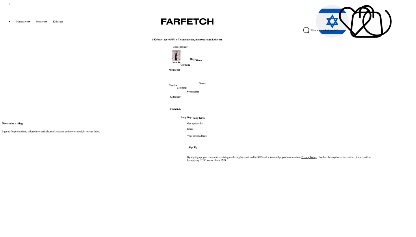
Farfetch's marketing chrome does what the luxury fashion category reserves for its most confident members: it removes every chromatic signal and lets the monochrome geometry carry the brand. The captured page renders 3 colors occurrences — 174 as text, 174 as border — and every single one is pure black (#000000) on a white canvas. No sale-chip orange, no CTA fill, no hover accent, no hairline gray. The FARFETCH wordmark in all-caps sits centered in the top nav at the same black as every other element. Where Farfetch's marketplace rival SSENSE achieves monochrome by using a warm graphite (#333333) as its dominant ink, Farfetch goes to true black — a distinction that reads as a colder, more surgical minimalism at 1440px.
The DESIGN.md file packages the captured system into a machine-readable spec for React tooling. Inside: 3 colors tokens (ink black, canvas white, hairline for borders) reflecting the genuine monochrome extraction; 12 typography tokens spanning Farfetch Basis from 13px nav labels up through a 38px Nimbus Sans Extended D display tier, declared on a 10px root rem scale; a single-value radius (0px) covering the entire surface; 10px-anchored spacing; and 14 components definitions covering the centered wordmark nav, mega-menu categories, newsletter form, email input, and primary CTA — the surfaces visible in the captured page.
Feed this file to Claude or Cursor to reproduce Farfetch's captured moves: true black on white with no accent, Farfetch Basis at 13–20px for every utility surface, Nimbus Sans Extended D at 38px for the single display moment, 0px corners universally, and the CSS rem-scale font system. The reason the monochrome discipline is worth studying: Farfetch's product is luxury designer garments at price points where brand trust lives in restraint, not color. The marketing chrome signals that trust by refusing to decorate itself — the boutique photography carries every chromatic job. Most fashion marketplaces that attempt this restraint eventually add a sale-red or a CTA-orange; Farfetch does not.
What makes it distinct
5
- Total monochrome discipline#000000 accounts for all 348 captured color occurrences (174 text, 174 border); no saturated accent exists in the marketing chrome
- Two custom grotesquesFarfetch Basis (body, nav, label) pairs with Nimbus Sans Extended D (38px display tier), a combination that reads fashion-broadsheet rather than retail-generic
- rem-scale type systemfont sizes declared in rem against a 10px root: 1.3rem nav labels, 1.5rem body, 2rem medium heading, 3.8rem display — each step precise and non-arbitrary
- Zero rounding everywhere0px borderRadius on every captured element; the rectangular geometry is the luxury fashion convention, not a default
- 10px dominant spacingthe most frequent spacing value (6 occurrences) anchoring nav-link padding, label gaps, and the newsletter form rhythm
farfetch.com
Live at farfetch.com
A snapshot of the brand in production. Scroll the frame to see the whole page.
Colors
3 colors
Farfetch's system runs on #000000 as its primary voltage, used in 14 of 14 components. Type is set in Farfetch Basis across 9 tokens from 13px to 38px, weights 400–700. Shape language is sharp — components average 0px corner radius, favoring crisp rectangles.
Surface
Page and card backgrounds · 1
Text
Headlines, body, captions · 1
Borders & Hairlines
Dividers, outlines, rules · 1
Typography
9 type tokens
Set in Farfetch Basis across 9 tokens, from 13px to 38px, weights 400–700. Shown in its own stack: where the font isn't installed, the fallback the file names stands in.
- display-xl38px · weight 400 · lh 1.2The quick brown fox jumps over the lazy dog
- heading-lg22px · weight 700 · lh 1.2727The quick brown fox jumps over the lazy dog
- heading-md20px · weight 400 · lh 1.2The quick brown fox jumps over the lazy dog
- body-md15px · weight 400 · lh 1.3333The quick brown fox jumps over the lazy dog
- body-sm13px · weight 400 · lh 1.3077The quick brown fox jumps over the lazy dog
- label-md15px · weight 400 · lh 1.3333The quick brown fox jumps over the lazy dog
- label-sm13px · weight 400 · lh 1.3077The quick brown fox jumps over the lazy dog
- button-md13px · weight 700 · lh normalThe quick brown fox jumps over the lazy dog
- nav-link13px · weight 400 · lh normalThe quick brown fox jumps over the lazy dog
Layout
Radii and spacing
1 corner radii and 5 spacing values. Shape language: sharp.
Radii
- none0px
Spacing
- xs2px
- sm8px
- base10px
- md12px
- lg40px
Components
14 components
Each rendered from its tokens (color, type, radius, padding) on Farfetch's own canvas.
- Button Primarybutton-primaryButton Primary
- Button Secondarybutton-secondaryButton Secondary
- Top Navtop-navTop Nav
- Nav Linknav-linkNav Link
- Hero Headinghero-headingHero Heading
- Section Headingsection-headingSection Heading
- Body Paragraphbody-paragraphBody Paragraph
- CardcardCard
- Type here…text-inputText Input
- Mega Menumega-menuMega Menu
- Mega Menu Headingmega-menu-headingMega Menu Heading
- Newsletter Sectionnewsletter-sectionNewsletter Section
- FooterfooterFooter
- WordmarkwordmarkWordmark
In use
The system, in use
Farfetch's tokens on the kind of product it builds.
Build something people actually use.
A short paragraph of marketing copy that previews how the brand's display tier and body tier read together. Two sentences is usually enough.
FAQ
Farfetch design system FAQ
Common questions about Farfetch's tokens, components, and how to use this DESIGN.md in your project.
Read next
Related reading
Specs, directories, and component libraries that pair with this design system.
- Browse all design systemsThe full directory of DESIGN.md files on shadcn.io, with live mockups for each.shadcn.io
- Farfetch — official siteFarfetch's public marketing site — the source of truth for the live tokens captured in this file.farfetch.com (opens in a new tab)
- The DESIGN.md specificationGoogle Labs' open spec for machine-readable design system files — the format this page is built on.github.com (opens in a new tab)
Use it
Use Farfetch in your project
One machine-readable file. Drop it into Claude, Cursor, or any AI tool that reads DESIGN.md.
Download the DESIGN.md
One machine-readable file: every color, type, radius, spacing, and component token of Farfetch.
Feed it to your AI tool
Drop it into Claude, Cursor, or GitHub Copilot. The agent writes React components and Tailwind classes that match Farfetch's visual language.
Reference the tokens directly
Or paste the values into your Tailwind config, CSS variables, or component library: every color, size and radius is a quoted, ready-to-copy value.
Read the full DESIGN.md: overview, rationale, do’s and don’ts
Overview
Farfetch's marketing chrome is one of the most severe monochrome systems in global fashion retail. Ink totality: 348 color occurrences on the captured page, all of them #000000, split evenly between text and border. No gray midtone, no hairline-gray softener, no accent — just pure black on white at every scale from the 38px Nimbus Sans Extended D wordmark down to the 13px Farfetch Basis nav link. Where SSENSE (its closest comparable in the luxury multi-brand digital category) moderates the contrast by running graphite #333333 as its dominant ink, Farfetch goes to true black — a choice that reads colder and more architecturally precise at the 1440px viewport.
Typography splits between two custom grotesques with a strict size boundary. Farfetch Basis handles every surface below the display tier — nav links at 13px, body at 15px, labels at 13–15px, buttons at 13px. Nimbus Sans Extended D, an extended-width geometric grotesque, takes the 38px display moment. The pairing is deliberate: Nimbus Sans Extended D's wide tracking at large sizes reads broadsheet-masthead, while Farfetch Basis at small sizes reads contemporary fashion retail. Unlike ZARA's Helvetica Now Text / Didot serif split (where the contrast is grotesque-vs-serif), Farfetch keeps both voices in the grotesque register — the distinction is extended-vs-normal width at the size boundary.
Key Characteristics:
- Genuine monochrome: 348 color occurrences, every one pure black (#000000). The most committed single-color system in the luxury fashion category.
- Two-grotesque display split — Nimbus Sans Extended D at 38px, Farfetch Basis at 13–20px — all within the same sans-serif register.
- rem-based type scale against a 10px root: 1.3rem (13px) nav / 1.5rem (15px) body / 2rem (20px) heading / 3.8rem (38px) display.
- 0px corner radius across 660 scanned elements. Every surface is a pure rectangle.
- 10px dominant spacing (6 occurrences) anchoring label gaps and nav-link padding.
- Mega-menu rendered in the same monochrome as every other surface — no panel shadow, no surface-color lift, just a hairline-bordered white panel.
- Newsletter section uses a bare-outline email input and a black-fill "Sign Up" button — the CTA pattern in the absence of any brand voltage.
Colors
Structural
- Ink (
#000000): frequency 348. Used as text (174), border (174). The only color in the system. Carries the FARFETCH wordmark, every nav link, every body paragraph, every 1px hairline border, every button outline and fill. Not near-black, not graphite — true zero-lightness black, consistent across every surface. The equal split between text and border uses (174 each) reflects a system where borders and text are treated as equivalent graphic elements. - Canvas (
#ffffff): the page floor — white background used implicitly throughout. Low extraction count because it is the default, not declared repeatedly on children.
Typography
Font Families
The system runs two grotesque families with a clear size-based split. Farfetch Basis (a proprietary grotesque commissioned for the brand, declared as --fontNormal and --fontCondensed in CSS custom properties) covers every utility tier from 13px to 20px. Nimbus Sans Extended D (a commercially licensed extended grotesque, declared as --displayLargeFontFamily) covers the 38px display moment. Fallbacks walk to Helvetica Neue and Arial for Farfetch Basis, and to Helvetica / Arial Bold for Nimbus Sans Extended D.
The two-grotesque strategy is unusual in luxury fashion, where the editorial convention pairs a serif display face with a grotesque body (SSENSE: JHA Times Now + Favorit SSENSE Inter; Burberry: custom serif + sans; Aesop: Tiempos + HelveticaNow). Farfetch stays entirely within the grotesque register, letting extended width at 38px do the work that a serif would do elsewhere. The effect is closer to contemporary editorial design (032c, System Magazine) than to heritage luxury branding.
Hierarchy
| Token | Family | Size | Weight | Line Height | Use |
|---|---|---|---|---|---|
{typography.display-xl} | Nimbus Sans Extended D | 38px | 400 | 1.2 | Large display heading, centered FARFETCH wordmark context |
{typography.heading-lg} | Farfetch Basis | 22px | 700 | 1.2727 | XL-tier promotional headings |
{typography.heading-md} | Farfetch Basis | 20px | 400 | 1.2 | Medium section headings |
{typography.body-md} | Farfetch Basis | 15px | 400 | 1.3333 | Body paragraphs, newsletter copy |
{typography.body-sm} | Farfetch Basis | 13px | 400 | 1.3077 | Caption and secondary body |
{typography.label-md} | Farfetch Basis | 15px | 400 | 1.3333 | Form labels, mega-menu subcategory text |
{typography.label-sm} | Farfetch Basis | 13px | 400 | 1.3077 | Footer links, chip labels |
{typography.button-md} | Farfetch Basis | 13px | 700 | normal | CTA buttons, mega-menu section headings |
{typography.nav-link} | Farfetch Basis | 13px | 400 | normal | Top-nav links (Womenswear, Menswear, Kidswear) |
Note on Font Substitutes
Farfetch Basis is a proprietary licensed typeface. Helvetica Neue is the declared fallback; for open-source alternatives, Inter at the same weights approximates the contemporary grotesque proportions. For Nimbus Sans Extended D, Aktiv Grotesk Extended or Neue Haas Grotesk Extended are the closest commercially licensed alternatives; there is no widely-available open-source extended grotesque at the same width.
Layout
Spacing System
- Base unit: 10px — the most frequent spacing value (6 occurrences), anchoring nav-link padding, input height margins, and label gaps.
- Tokens:
{spacing.xs}2px ·{spacing.sm}8px ·{spacing.base}10px ·{spacing.md}12px ·{spacing.lg}40px. - Nav-link padding: 10px vertical, 12px horizontal — the measured values from the extracted nav-link component (44px height, 10×12px padding).
- Section padding: ~40px on the newsletter section.
Grid & Container
The captured page shows: a centered top-nav bar with the FARFETCH wordmark centered between left-side category links (Womenswear, Menswear, Kidswear with dropdown indicators) and right-side utility icons (search, bag, account). A mega-menu panel open below the nav showing nested category groups (Womenswear › New In, Clothing, Bags, Shoes; Menswear; Kidswear). A newsletter sign-up section at the bottom with bare-outline email input and a black-fill Sign Up button.
Rhythm
The page is sparse — nav + mega-menu + newsletter. No section-padding rhythm established from the captured surface beyond the 40px newsletter section padding. The mega-menu presents category groups as left-aligned label columns with 10px vertical spacing between items.
Elevation
No shadow tier exists in the captured system. The mega-menu panel sits over the page content with no box-shadow — the top and bottom 1px hairline borders delineate it. This is the same approach as ZARA and Aesop: no drop shadow on any surface, with hairline borders carrying all depth delineation. The choice reads as a fashion-editorial convention (magazine-page layouts use rules rather than shadows) rather than as a UI oversight.
Shapes
The radius scale is zero across 660 scanned elements. Every nav link, button, input, mega-menu panel, and card renders as a pure rectangle with 0px corners. This rectilinear geometry is the most consistent signal in the luxury fashion category: SSENSE (0px on product cells), ZARA (0px primary, 2px single-step rare), Farfetch (0px total). The rectangular form factor reinforces the system's broadsheet-editorial register and distinguishes it from consumer marketplaces (Airbnb, Etsy, Amazon) that soften corners to signal approachability.
Components
button-primary — Black fill, white text, Farfetch Basis 13px / weight 700, 0px radius, 10×12px padding. "Sign Up" in the newsletter section is the canonical instance — a pure-black rectangle with no border.
button-secondary — White fill, black text, 1px black outline, 0px radius, 10×12px padding. The outlined secondary-action pattern.
top-nav — White canvas, ink text in Farfetch Basis 13px, 1px bottom hairline border. 44px height. Centered FARFETCH wordmark at the display tier, left-aligned category links, right-aligned utility icons.
nav-link — Transparent background, ink text in Farfetch Basis 13px, 10×12px padding, 44px height. Measured values from the extraction. Includes dropdown chevron indicators for Womenswear, Menswear, Kidswear.
hero-heading — Transparent background, ink text in Nimbus Sans Extended D 38px / weight 400. The display tier.
section-heading — Transparent background, ink text in Farfetch Basis 20px / weight 400. Mid-tier headings.
body-paragraph — Transparent background, ink text in Farfetch Basis 15px / weight 400.
card — White canvas, 1px ink border, 0px radius, 10px padding. Product and content card.
text-input — White canvas, ink text in Farfetch Basis 13px, 1px ink border, 0px radius, 10×12px padding, 44px height. Email input in the newsletter section — bare outline, no fill.
mega-menu — White canvas, ink text in Farfetch Basis 13px, 1px top and bottom hairline border, 0px radius. Houses nested category groups as left-aligned label columns.
mega-menu-heading — Transparent background, ink text in Farfetch Basis 13px / weight 700. Section heading within the mega-menu (Womenswear, Menswear, Kidswear headings).
newsletter-section — White canvas, ink text in Farfetch Basis 15px, 40×10px padding. "Never miss a thing" promotional band.
footer — White canvas, ink text in Farfetch Basis 13px, 1px top hairline border, 40×10px padding.
wordmark — The centered FARFETCH logotype. Rendered in the display-xl tier — Nimbus Sans Extended D at 38px or similar — as the single largest typographic element in the nav.
Do's and Don'ts
Do keep every ink and border occurrence at true black (#000000). The system's distinction from SSENSE is that it uses #000000 rather than graphite #333333 — the color temperature difference is the brand signal. Shifting to a warm graphite would read as a different brand.
Do let Farfetch Basis handle every surface below 22px and Nimbus Sans Extended D handle the single 38px display moment. The two-grotesque split with a hard size boundary is the typographic system's load-bearing move; introducing Farfetch Basis at 38px or Nimbus Sans Extended D at 15px collapses the distinction.
Do use 0px corners on every surface. Adding even 4px to a button or input would import the consumer-marketplace rounded convention and contradict the rectilinear broadsheet register.
Do treat the newsletter Sign Up button — ink-black fill, white label, 0px radius — as the template for every primary CTA in the absence of a brand accent color. The monochrome CTA pattern is an intentional system decision, not a placeholder.
Don't add a hover color or a background accent to the mega-menu panel. The system has no surface-color elevation — the mega-menu appears on a white canvas with 1px hairline borders. Adding a light-gray panel fill would import a UI-kit convention that breaks the system's monochrome discipline.
Don't use weight 400 for button labels. The extraction shows Farfetch Basis at weight 700 for the Sign Up CTA and for mega-menu section headings. Using weight 400 for a button label would make it visually indistinguishable from surrounding body text — the weight difference is the only typographic differentiation available without color.
Don't declare any font size between 20px and 38px. The CSS variable system jumps from --fontSizeL: 2rem (20px) to --displayLargeFontSize: 3.8rem (38px) with nothing between — the 22px --fontSizeXL is declared for a different context (promotional labels). Filling the 20–38px gap with interpolated sizes creates a false ladder that doesn't exist in the extracted system.
Don't use a near-invisible gray hairline in place of pure black for borders. The 174 border occurrences are all pure black — the system deliberately draws 1px black rules rather than softening them to a mid-gray. A softened hairline would read as generic e-commerce template rather than as Farfetch's razor-line editorial borders.
Known Gaps
- Product grid and PDP: the extractor landed on the mega-menu-open state of the Farfetch Israel localized page. The product grid, product detail page (PDP), size-selector, and add-to-bag button are not captured.
- Sale and promotion states: Farfetch runs seasonal sale campaigns with percentage-off labels. Sale chip colors (typically a red or high-contrast accent used only in promotional contexts) are not present in the monochrome extraction.
- Farfetch Basis weight variants: the extraction captured weight 400 and 700; the full Farfetch Basis family may include a condensed, light, or bold cut used on product-grid pricing or sub-category labels.
- Localization and locale-specific overrides: the captured URL is the Israel locale (farfetch.com/il/). The CSS variable
--fontCondensedNonTranslatedsuggests some locales use different typographic settings for non-Latin text. - Dark mode and app surfaces: Farfetch's iOS and Android apps may use different surface and text-color tokens not exposed on the web marketing site.
- Focus and hover states: no hover-state or focus-ring color was captured. For accessibility compliance, Farfetch likely uses a visible focus ring — its color is not documented here.
- Motion: the mega-menu opens and closes with a transition animation; easing values and duration are not captured.
E-commerce & Retail
More systems like this
More DESIGN.md files in E-commerce & Retail.
Pricing
Build it with Pro
The DESIGN.md files are free. Pro adds 6,000+ blocks, premium templates and the MCP server, so your AI editor builds in your system for you.
4.9/5 out of 5 · 150+ reviewsfrom 150+ founders and developers.
Billing
Billed once a year in USD. Cancel anytime.
- How many people can use the license.
- Client work, SaaS products and anything you charge for.
- Production-ready React sections: hero, pricing, features, dashboards and more.
- Complete multi-page sites you can ship as they are.
- React icons from every major library, installable with one command.
- Presets that restyle every block, in light and dark.
- Lets your AI editor search, preview and install blocks for you.
- Priority requests are answered first.
Individual
For personal projects & open source
$32instead of $49/mo
$389 billed yearly
- Seats: 1 seat
- Commercial use: Personal & open source only
- Pro blocks: 6,000+ blocks
- Templates: All 14 templates
- React icons: 294k+ icons
- Themes: All 59 themes
- MCP server: Basic usage
- Support: Standard
Team
Most popularFor freelancers, agencies & startups
$66instead of $99/mo
$789 billed yearly · ≈ $13/dev/mo
- Seats: Up to 5 seats
- Commercial use: Included
- Pro blocks: 6,000+ blocks
- Templates: All 14 templates
- React icons: 294k+ icons
- Themes: All 59 themes
- MCP server: High usage
- Support: Priority
Organization
For companies with larger teams
$132instead of $199/mo
$1,589 billed yearly
- Seats: Unlimited seats
- Commercial use: Included
- Pro blocks: 6,000+ blocks
- Templates: All 14 templates
- React icons: 294k+ icons
- Themes: All 59 themes
- MCP server: Unlimited usage
- Support: Priority
Billed once a year in USD. Cancel anytime.
Individual
For personal projects & open source
$32instead of $49/mo
$389 billed yearly
- How many people can use the license.Seats: 1 seat
- Client work, SaaS products and anything you charge for.Commercial use: Personal & open source only
- Production-ready React sections: hero, pricing, features, dashboards and more.Pro blocks: 6,000+ blocks
- Complete multi-page sites you can ship as they are.Templates: All 14 templates
- React icons from every major library, installable with one command.React icons: 294k+ icons
- Presets that restyle every block, in light and dark.Themes: All 59 themes
- Lets your AI editor search, preview and install blocks for you.MCP server: Basic usage
- Priority requests are answered first.Support: Standard
Team
Most popularFor freelancers, agencies & startups
$66instead of $99/mo
$789 billed yearly · ≈ $13/dev/mo
Everything in Individual, plus
- How many people can use the license.Seats: Up to 5 seats
- Client work, SaaS products and anything you charge for.Commercial use: Included
- Lets your AI editor search, preview and install blocks for you.MCP server: High usage
- Priority requests are answered first.Support: Priority
Organization
For companies with larger teams
$132instead of $199/mo
$1,589 billed yearly
Everything in Team, plus
- How many people can use the license.Seats: Unlimited seats
- Lets your AI editor search, preview and install blocks for you.MCP server: Unlimited usage
- Secure checkout via Stripe
- Code lives in your repo
- Keep what you've shipped if you cancel
- License terms
Your system, built for you
Every block, template and icon, installed by your AI agent in your design system. The DESIGN.md files stay free.