Expo Design System
Expo's design system as a DESIGN.md file. Black #000000 CTAs, Inter + JetBrains Mono, 22 components. For React, Next.js, and AI tools.
Add shadcn.io to your AI agent. · Pro It installs blocks, icons and templates in your design system from a prompt, with Pro.
Set up MCP- Primary
- #000000
- Typeface
- Inter
- Shape
- Mixed
- Base radius
- 8px
- Colors
- 28
- Type tokens
- 14
- Components
- 22
- Spacing values
- 9
About
About Expo DESIGN.md
Curated by Dov Azencot · Updated May 12, 2026 · Source expo.dev (opens in a new tab)
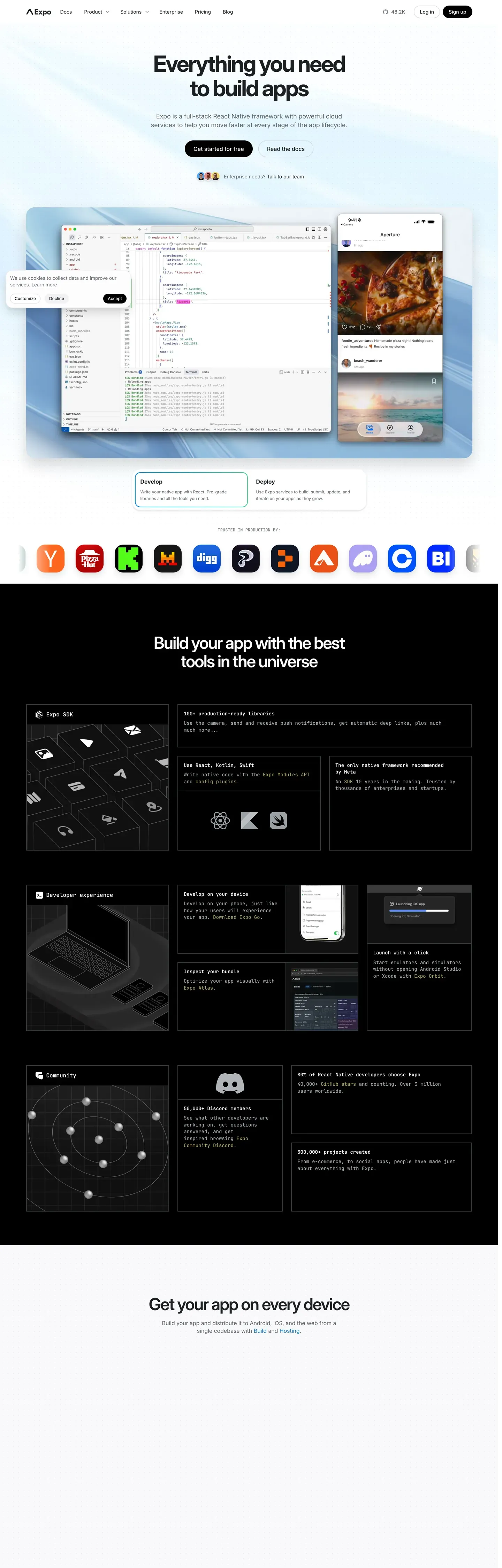
Expo's marketing site reads like a quietly-confident React Native developer platform. The canvas is pure white with a soft sky-blue gradient wash behind the hero band — the only atmospheric decoration on the page. Near-black ink at #171717 carries both display and body, and the single brand voltage is pure black at #000000, reserved for primary CTAs. A small blue text-link accent at #0d74ce shows up inside body copy, never on a button. The brand's strongest signature is the device-mockup hero: a centered MacBook plus iPhone composite showing real Expo dev surfaces — Expo Studio, the EAS Build dashboard, the Expo Go simulator — sitting over the sky gradient. The composite is the page chrome instead of an illustration, and it tells you what the product does without a single bullet point.
This page packages all of that into a single DESIGN.md file using the Google Labs spec format. Inside: 28 colors tokens grouped into brand, surface, atmospheric, hairline, text, and semantic; 15 type styles all running Inter except for the JetBrains Mono code style; 9 corner radii from 4px hairlines to a 9999px pill reserved for badges only; a 4px-based spacing scale that tops out at a 96px section rhythm; and 22 components recipes covering top nav, three button tiers, hero band, device mockup, feature cards in light and dark, workflow steps, code blocks, IDE mockups, two pricing tiers, text input, badge pill, ecosystem tile, CTA band, and footer.
Feed the file to Claude, Cursor, or GitHub Copilot and the agent reproduces Expo's editorial restraint — pure black CTAs at 8px radius, Inter 600 for display, JetBrains Mono on every code surface — instead of inventing a saturated brand color the page doesn't have. Reference the tokens directly inside Tailwind config or CSS variables when you want a developer-tool surface that earns trust through neutrality rather than chrome. The discipline of refusing a saturated action color and trusting Inter at weight 600 is what makes this system worth studying.
What makes it distinct
5
- Single CTA voltagepure black #000000 on every primary button, never the blue inline link color
- Inter at 600 across display, JetBrains Mono on every code surfaceno custom typeface
- Device-mockup hero is the page chromeMacBook plus iPhone composite over a sky-blue gradient wash
- 8px CTA radius, 12px card radiuscompact developer-tool dialect, no pill geometry on actions
- 96px section rhythm with hairline borders and one soft drop shadowatmospheric depth only inside the hero
expo.dev
Live at expo.dev
A snapshot of the brand in production. Scroll the frame to see the whole page.
Colors
28 colors
Expo's system runs on #000000 as its primary voltage, used in 1 of 22 components. Type is set in Inter across 14 tokens from 11px to 64px, weights 400–600. Shape language is mixed across 22 components, blending pills, soft rounds, and squarer corners.
Brand & Accent
Sparing, CTA-only voltage · 5
Surface
Page and card backgrounds · 6
Text
Headlines, body, captions · 10
Borders & Hairlines
Dividers, outlines, rules · 3
Semantic
Status, errors, success, links · 2
Other
Specialty colors · 2
Typography
14 type tokens
Set in Inter across 14 tokens, from 11px to 64px, weights 400–600. Shown in its own stack: where the font isn't installed, the fallback the file names stands in.
- display-mega64px · weight 600 · lh 1.05 · tracking -1.92pxThe quick brown fox jumps over the lazy dog
- display-xl48px · weight 600 · lh 1.1 · tracking -1.44pxThe quick brown fox jumps over the lazy dog
- display-lg36px · weight 600 · lh 1.15 · tracking -1.08pxThe quick brown fox jumps over the lazy dog
- display-md28px · weight 600 · lh 1.2 · tracking -0.84pxThe quick brown fox jumps over the lazy dog
- display-sm22px · weight 600 · lh 1.25 · tracking -0.5pxThe quick brown fox jumps over the lazy dog
- title-md18px · weight 600 · lh 1.4The quick brown fox jumps over the lazy dog
- title-sm16px · weight 600 · lh 1.4The quick brown fox jumps over the lazy dog
- body-md16px · weight 400 · lh 1.5The quick brown fox jumps over the lazy dog
- body-sm14px · weight 400 · lh 1.5The quick brown fox jumps over the lazy dog
- caption13px · weight 400 · lh 1.4The quick brown fox jumps over the lazy dog
- caption-uppercase11px · weight 600 · lh 1.4 · tracking 0.88pxThe quick brown fox jumps over the lazy dog
- code13px · weight 400 · lh 1.5The quick brown fox jumps over the lazy dog
- button14px · weight 500 · lh 1The quick brown fox jumps over the lazy dog
- nav-link14px · weight 500 · lh 1.4The quick brown fox jumps over the lazy dog
Layout
Radii and spacing
9 corner radii and 9 spacing values. Shape language: mixed.
Radii
- none0px
- xs4px
- sm6px
- md8px
- lg12px
- xl16px
- xxl24px
- pill9999px
- full9999px
Spacing
- xxs4px
- xs8px
- sm12px
- base16px
- md20px
- lg24px
- xl32px
- xxl48px
- section96px
Components
22 components
Each rendered from its tokens (color, type, radius, padding) on Expo's own canvas.
- Top Navtop-navTop Nav
- Button Primarybutton-primaryButton Primary
- Button Primary Activebutton-primary-activeButton Primary Active
- Button Secondarybutton-secondaryButton Secondary
- Button Tertiary Textbutton-tertiary-textButton Tertiary Text
- Hero Bandhero-bandHero Band
- Device Mockup Carddevice-mockup-cardDevice Mockup Card
- Feature Cardfeature-cardFeature Card
- Feature Card Darkfeature-card-darkFeature Card Dark
- Workflow Step Cardworkflow-step-cardWorkflow Step Card
- Workflow Step Iconworkflow-step-iconWorkflow Step Icon
- Code Blockcode-blockCode Block
- Ide Mockup Cardide-mockup-cardIde Mockup Card
- Pricing Tier Cardpricing-tier-cardPricing Tier Card
- Pricing Tier Featuredpricing-tier-featuredPricing Tier Featured
- Type here…text-inputText Input
- Badge Pillbadge-pillBadge Pill
- Ecosystem Tileecosystem-tileEcosystem Tile
- Cta Bandcta-bandCta Band
- Testimonial Cardtestimonial-cardTestimonial Card
- Footer Lightfooter-lightFooter Light
- Footer Linkfooter-linkFooter Link
In use
The system, in use
Expo's tokens on the kind of product it builds.
Build something people actually use.
A short paragraph of marketing copy that previews how the brand's display tier and body tier read together. Two sentences is usually enough.
FAQ
Expo design system FAQ
Common questions about Expo's tokens, components, and how to use this DESIGN.md in your project.
Read next
Related reading
Specs, directories, and component libraries that pair with this design system.
- Browse all design systemsThe full directory of DESIGN.md files on shadcn.io, with live mockups for each.shadcn.io
- Expo — the React Native platformExpo's marketing site — the source surface for this DESIGN.md spec, including Expo Studio and EAS.expo.dev (opens in a new tab)
- The DESIGN.md specificationGoogle Labs' open spec for machine-readable design system files — the format this page is built on.github.com (opens in a new tab)
Use it
Use Expo in your project
One machine-readable file. Drop it into Claude, Cursor, or any AI tool that reads DESIGN.md.
Download the DESIGN.md
One machine-readable file: every color, type, radius, spacing, and component token of Expo.
Feed it to your AI tool
Drop it into Claude, Cursor, or GitHub Copilot. The agent writes React components and Tailwind classes that match Expo's visual language.
Reference the tokens directly
Or paste the values into your Tailwind config, CSS variables, or component library: every color, size and radius is a quoted, ready-to-copy value.
Read the full DESIGN.md: overview, rationale, do’s and don’ts
Overview
Expo's marketing site reads like a quietly-confident React-Native developer platform. The base canvas is pure white ({colors.canvas} — #ffffff) with a soft sky-blue gradient atmospheric wash behind the hero band. Near-black ink {colors.ink} (#171717) carries body and display alike. The single brand voltage is pure black ({colors.primary} — #000000) for primary CTAs — minimal and editorial-feeling. A small blue text-link accent ({colors.text-link} — #0d74ce) is reserved for inline body links, never as a CTA.
Type runs Inter as the single sans family at modest weights (display 600, body 400). JetBrains Mono carries every code surface. No custom typeface — the brand trusts Inter's editorial neutrality.
The brand's strongest visual signature is the device-mockup hero — a centered MacBook + iPhone composite showing real Expo dev surfaces (Expo Studio, EAS Build dashboard, the Expo Go simulator) — over a sky-blue gradient atmospheric wash. The composite is the page's chrome instead of an illustration.
Key Characteristics:
- Pure white canvas with sky-blue gradient atmospheric backdrop in hero only.
- Single primary CTA: pure black pill at
{rounded.md}(8px) — compact developer-tool dialect. - Text-link blue (
{colors.text-link}) for inline links only — never on a CTA. - Inter as the single sans family — no custom display typeface.
- JetBrains Mono on every code surface.
- Device-mockup hero with real Expo product surfaces is the brand chrome.
- Hairline + soft drop depth; no atmospheric brand decoration outside the hero.
- 96px section rhythm.
Known Gaps
- Inter and JetBrains Mono are freely available — no licensing concerns.
- Animation timings (device mockup parallax, hero entrance) out of scope.
- In-app surfaces (EAS dashboard interactive, Expo Go simulator) only partially captured via marketing mockups.
- Form validation states beyond focus not visible on captured surfaces.
Developer Tools & IDEs
More systems like this
More DESIGN.md files in Developer Tools & IDEs.
Pricing
Build it with Pro
The DESIGN.md files are free. Pro adds 6,000+ blocks, premium templates and the MCP server, so your AI editor builds in your system for you.
4.9/5 out of 5 · 150+ reviewsfrom 150+ founders and developers.
Billing
Billed once a year in USD. Cancel anytime.
- How many people can use the license.
- Client work, SaaS products and anything you charge for.
- Production-ready React sections: hero, pricing, features, dashboards and more.
- Complete multi-page sites you can ship as they are.
- React icons from every major library, installable with one command.
- Presets that restyle every block, in light and dark.
- Lets your AI editor search, preview and install blocks for you.
- Priority requests are answered first.
Individual
For personal projects & open source
$32instead of $49/mo
$389 billed yearly
- Seats: 1 seat
- Commercial use: Personal & open source only
- Pro blocks: 6,000+ blocks
- Templates: All 14 templates
- React icons: 294k+ icons
- Themes: All 59 themes
- MCP server: Basic usage
- Support: Standard
Team
Most popularFor freelancers, agencies & startups
$66instead of $99/mo
$789 billed yearly · ≈ $13/dev/mo
- Seats: Up to 5 seats
- Commercial use: Included
- Pro blocks: 6,000+ blocks
- Templates: All 14 templates
- React icons: 294k+ icons
- Themes: All 59 themes
- MCP server: High usage
- Support: Priority
Organization
For companies with larger teams
$132instead of $199/mo
$1,589 billed yearly
- Seats: Unlimited seats
- Commercial use: Included
- Pro blocks: 6,000+ blocks
- Templates: All 14 templates
- React icons: 294k+ icons
- Themes: All 59 themes
- MCP server: Unlimited usage
- Support: Priority
Billed once a year in USD. Cancel anytime.
Individual
For personal projects & open source
$32instead of $49/mo
$389 billed yearly
- How many people can use the license.Seats: 1 seat
- Client work, SaaS products and anything you charge for.Commercial use: Personal & open source only
- Production-ready React sections: hero, pricing, features, dashboards and more.Pro blocks: 6,000+ blocks
- Complete multi-page sites you can ship as they are.Templates: All 14 templates
- React icons from every major library, installable with one command.React icons: 294k+ icons
- Presets that restyle every block, in light and dark.Themes: All 59 themes
- Lets your AI editor search, preview and install blocks for you.MCP server: Basic usage
- Priority requests are answered first.Support: Standard
Team
Most popularFor freelancers, agencies & startups
$66instead of $99/mo
$789 billed yearly · ≈ $13/dev/mo
Everything in Individual, plus
- How many people can use the license.Seats: Up to 5 seats
- Client work, SaaS products and anything you charge for.Commercial use: Included
- Lets your AI editor search, preview and install blocks for you.MCP server: High usage
- Priority requests are answered first.Support: Priority
Organization
For companies with larger teams
$132instead of $199/mo
$1,589 billed yearly
Everything in Team, plus
- How many people can use the license.Seats: Unlimited seats
- Lets your AI editor search, preview and install blocks for you.MCP server: Unlimited usage
- Secure checkout via Stripe
- Code lives in your repo
- Keep what you've shipped if you cancel
- License terms
Your system, built for you
Every block, template and icon, installed by your AI agent in your design system. The DESIGN.md files stay free.