Exa Design System
Exa's AI-search-API marketing system as a DESIGN.md file. Arizona-serif display weight 300, electric-blue brand voltage, dark editorial bands, ABCDiatype body, Geist Mono metadata, tokens for React, Next.js, and AI coding tools.
Add shadcn.io to your AI agent. · Pro It installs blocks, icons and templates in your design system from a prompt, with Pro.
Set up MCP- Primary
- #1f40ed
- Typeface
- ABCDiatype
- Shape
- Sharp
- Base radius
- 6px
- Colors
- 14
- Type tokens
- 13
- Components
- 17
- Spacing values
- 9
About
About Exa DESIGN.md
Curated by Dov Azencot · Updated May 19, 2026 · Source exa.ai (opens in a new tab)
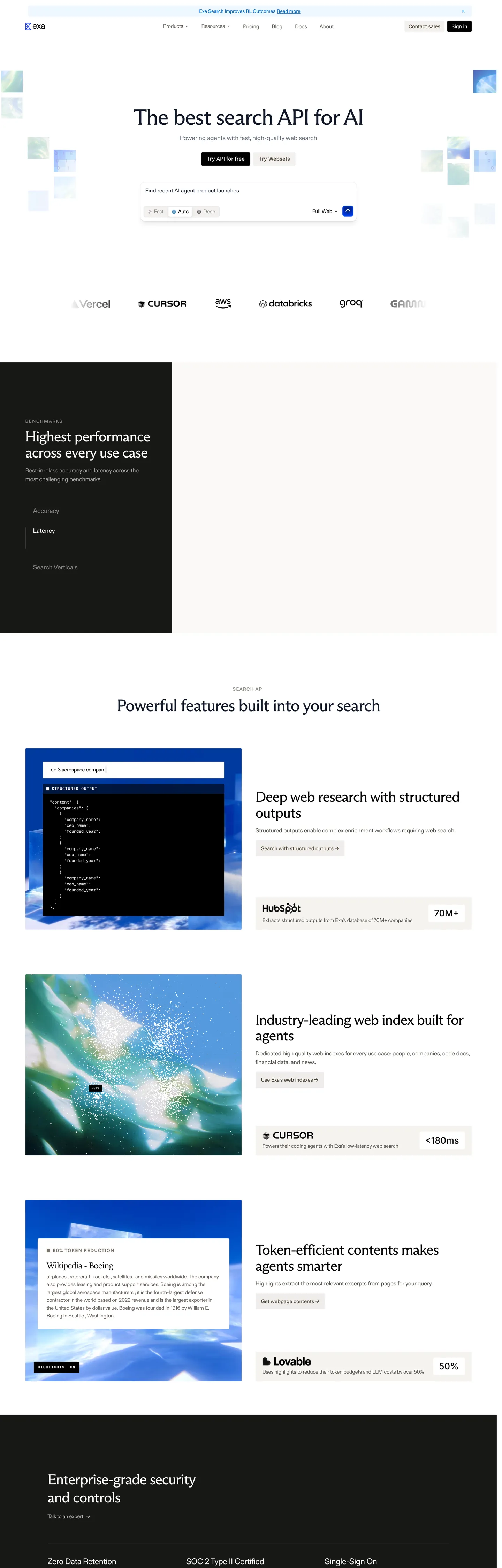
Exa's marketing page does something almost no AI-developer-tool brand attempts: the hero h1 is a 76.8px Arizona serif at weight 300, sitting over a near-white canvas with a small "The best search API for AI" tagline beneath, a centered search-bar mockup, and two muted greige CTAs. Where Linear leans on Inter at weight 500 and Vercel sits at Geist at weight 500-600 with a matte-black hero, Exa picks an editorial Arizona-serif treatment more typical of magazine longform or a literary-product brand than a search-API marketing site. Below the fold the page commits to its other signature — dark editorial bands carrying dashboard screenshots, query result panels, and dev-platform diagrams in near-black, with Arizona display in pure white floating over the imagery.
The DESIGN.md file packages the system into a machine-readable spec for React tooling. Inside: 14 colors tokens drawn from Exa's deep set of CSS custom properties (--brand-default, --accent-background, --text-light-default, --gray-*, --greige-*, --cream, --gold) — a single electric blue voltage (#1f40ed) with just 8 captured occurrences, a near-white canvas, two layered near-blacks for the editorial bands, and a set of greige neutrals for card surfaces. 13 typography tokens cover three voices: Arizona serif at weights 300-400 across display tiers (76.8 / 41.6 / 23.8 / 20.8px), ABCDiatype sans at weights 400-600 for body and label work, and Geist Mono at 12px / weight 400 for code and metadata annotation. 5 radius tokens center on a 2px workhorse and a 4px secondary — the system explicitly skips the soft 12-16px tier. 17 components tokens cover the muted-greige primary CTA, the dark editorial band, the white feature card with logo strip, the Geist Mono performance-stat row, and the search-bar mockup.
Feed this file to an AI coding tool and it reproduces Exa's specific moves: the editorial Arizona-serif display in weight 300 instead of a heavy sans h1, the dark editorial band carrying product screenshots rather than the standard white feature-grid scroll, the scarce electric-blue voltage wired through five CSS var families, and the three-voice typeface split where Geist Mono handles every metadata and performance-stat row. The one move worth borrowing only if your product genuinely earns it: the Arizona-serif weight-300 hero only reads as quiet confidence on a brand that has a research-paper-shaped artifact behind it — for most consumer AI it would feel mannered.
What makes it distinct
5
- Editorial serif displayArizona serif at 76.8px in weight 300 carries the hero h1, where most dev-API brands lean on a heavy sans hero; the lightness reads as quiet confidence
- Two-canvas rhythma near-white above-fold transitions into a near-black editorial band carrying dashboard screenshots, then back to white for the feature grid
- Electric blue voltage held scarce`#1f40ed` wired as `--brand-default`, `--accent-background`, `--accent`, `--text-light-link`, with just 8 captured occurrences across the page
- Three typeface voicesArizona serif for display, ABCDiatype sans for body and label, Geist Mono for metadata and code
- Tight 2px workhorse radiusthe dominant border-radius is 2px (58 occurrences), a 4px secondary (23 occurrences) and only 3 pill instances; the system never reaches a soft 12-16px corner
exa.ai
Live at exa.ai
A snapshot of the brand in production. Scroll the frame to see the whole page.
Colors
14 colors
Exa's system runs on #1f40ed as its primary voltage, used in 1 of 17 components. Type is set in ABCDiatype across 13 tokens from 12px to 76.8px, weights 300–600. Shape language is sharp — components average 2px corner radius, favoring crisp rectangles.
Brand & Accent
Sparing, CTA-only voltage · 3
Surface
Page and card backgrounds · 4
Text
Headlines, body, captions · 4
Other
Specialty colors · 3
Typography
13 type tokens
Set in ABCDiatype across 13 tokens, from 12px to 76.8px, weights 300–600. Shown in its own stack: where the font isn't installed, the fallback the file names stands in.
- display-xl76.8px · weight 300 · lh 76.8px · tracking -2.304pxThe quick brown fox jumps over the lazy dog
- display-md41.6px · weight 400 · lh 45.76px · tracking -1.248pxThe quick brown fox jumps over the lazy dog
- heading-sm23.8px · weight 400 · lh 23.8px · tracking -0.714pxThe quick brown fox jumps over the lazy dog
- heading-xs20.8px · weight 300 · lh 20.8px · tracking -0.32pxThe quick brown fox jumps over the lazy dog
- body-lg19.2px · weight 500 · lh 28.8px · tracking -0.32pxThe quick brown fox jumps over the lazy dog
- body-md17px · weight 400 · lh 24.65px · tracking -0.34pxThe quick brown fox jumps over the lazy dog
- body-sm15px · weight 400 · lh 21px · tracking -0.3pxThe quick brown fox jumps over the lazy dog
- body-xs14px · weight 400 · lh 20pxThe quick brown fox jumps over the lazy dog
- label-md16px · weight 600 · lh 24pxThe quick brown fox jumps over the lazy dog
- nav-link12.8px · weight 400 · lh 19.2pxThe quick brown fox jumps over the lazy dog
- button-md14px · weight 500 · lh 21pxThe quick brown fox jumps over the lazy dog
- mono-sm12px · weight 400 · lh 16.8px · tracking -0.24pxThe quick brown fox jumps over the lazy dog
- mono-bold12px · weight 600 · lh 16pxThe quick brown fox jumps over the lazy dog
Layout
Radii and spacing
6 corner radii and 9 spacing values. Shape language: sharp.
Radii
- none0px
- xs2px
- sm4px
- md6px
- lg8px
- full9999px
Spacing
- xs2px
- sm4px
- base8px
- md12px
- lg16px
- xl24px
- 2xl32px
- 3xl40px
- 4xl64px
Components
17 components
Each rendered from its tokens (color, type, radius, padding) on Exa's own canvas.
- Hero Sectionhero-sectionHero Section
- Hero Headinghero-headingHero Heading
- Hero Heading Darkhero-heading-darkHero Heading Dark
- Section Headingsection-headingSection Heading
- Body Paragraphbody-paragraphBody Paragraph
- Body Paragraph Mutedbody-paragraph-mutedBody Paragraph Muted
- Body Paragraph Greigebody-paragraph-greigeBody Paragraph Greige
- Button Primarybutton-primaryButton Primary
- Button Brandbutton-brandButton Brand
- Button Secondarybutton-secondaryButton Secondary
- Top Navtop-navTop Nav
- Nav Linknav-linkNav Link
- Dark Banddark-bandDark Band
- Feature Cardfeature-cardFeature Card
- Feature Card Blogfeature-card-blogFeature Card Blog
- Mono Statmono-statMono Stat
- Type here…text-inputText Input
In use
The system, in use
Exa's tokens on the kind of product it builds.
Build something people actually use.
A short paragraph of marketing copy that previews how the brand's display tier and body tier read together. Two sentences is usually enough.
import { build } from "./build"

export async function main() {
  const result = await build()
  console.log("done", result)
}
FAQ
Exa design system FAQ
Common questions about Exa's tokens, components, and how to use this DESIGN.md in your project.
Read next
Related reading
Specs, directories, and component libraries that pair with this design system.
- Browse all design systemsThe full directory of DESIGN.md files on shadcn.io, with live mockups for each.shadcn.io
- Exa — official siteExa's public marketing site — the source of truth for the live tokens captured in this file.exa.ai (opens in a new tab)
- The DESIGN.md specificationGoogle Labs' open spec for machine-readable design system files — the format this page is built on.github.com (opens in a new tab)
Use it
Use Exa in your project
One machine-readable file. Drop it into Claude, Cursor, or any AI tool that reads DESIGN.md.
Download the DESIGN.md
One machine-readable file: every color, type, radius, spacing, and component token of Exa.
Feed it to your AI tool
Drop it into Claude, Cursor, or GitHub Copilot. The agent writes React components and Tailwind classes that match Exa's visual language.
Reference the tokens directly
Or paste the values into your Tailwind config, CSS variables, or component library: every color, size and radius is a quoted, ready-to-copy value.
Read the full DESIGN.md: overview, rationale, do’s and don’ts
Overview
Exa's marketing surface inverts the dev-API marketing convention. Editorial serif voltage. Where Vercel runs Geist sans at 500-600 weight, Linear sits at Inter at 500, and Cursor leans on a SF-Mono-adjacent display, Exa picks an Arizona-serif treatment at weight 300 for its hero h1 ("Imagine a world with perfect search") — a soft, literary moment that reads more like a magazine longform feature than a search-API marketing page. The serif sits at 76.8px / 300 with -2.304px tracking; the lightness is doing the work that a heavier sans would do, and the editorial signal positions Exa as a research-and-relevance product rather than as a fast-and-cheap infra play.
Below the fold the page commits to its other signature — two-canvas rhythm. The near-white above-fold transitions into a near-black editorial band ({colors.surface-dark} — #181815) that carries dashboard screenshots, query-result panels, and dev-platform diagrams; the band runs ~700px tall, holds a section h2 in Arizona serif weight 400 / 41.6px in pure white, and returns to white below for the feature card grid. Where Stripe runs a continuous mesh gradient and Bun stays on cream from end to end, Exa uses the dark band to anchor the product-screenshot moment and white everywhere else — the canvas itself does structural work the standard band-by-band feature stack would not.
The chromatic discipline is severe. Outside of pure white, near-black ink ({colors.ink} — #111827), and a small set of greige neutrals, the system has exactly one brand color — electric blue ({colors.primary} — #1f40ed) wired through CSS as --brand-default, --accent-background, --accent, --text-light-link, and --light-shojin-blue. It appears just 8 times across the entire captured page, and none of those occurrences are a primary-CTA fill — the persistent "Contact sales" CTA renders as a muted greige (#f2f0ef on #514837 text). The brand voltage is reserved for inline link text and the secondary brand CTA only.
Key Characteristics:
- Arizona-serif display (
{typography.display-xl}— 76.8px / 300) for the hero h1, with -2.304px tracking; weight 400 at 41.6px for section h2. - Two-canvas rhythm — near-white above-fold, near-black editorial band beneath, white feature grid below.
- Single electric blue voltage (
{colors.primary}— #1f40ed), 8 captured occurrences, wired through 5 CSS custom-property families. - Three typeface voices: Arizona serif for display, ABCDiatype sans for body and label, Geist Mono for metadata and code.
- Muted greige primary CTA (
{colors.surface-greige}on{colors.greige-warm}text) — not the brand voltage; the structural button stays quiet. - Tight 2px workhorse radius — 58 captured occurrences. No 8 / 12 / 16 / 24px tier. The dev-tool corner discipline holds throughout.
- 4px secondary radius — 23 occurrences, used on the primary CTA and on slightly-larger surfaces.
- Geist Mono at 12px / 400 carries every performance-stat row, API-result count, and inline annotation — the technical voice.
- Hairline-only cards:
{colors.surface-greige}(#e5e7eb) carries 632 of the 644 captured border occurrences across the page.
Colors
Brand
- Electric Blue (
{colors.primary}— #1f40ed): frequency 8 (text 5, shadow 2, gradient 1). The single brand voltage — reserved for inline link text and the brand-CTA fill inside the hero search-bar mockup. Wired in CSS as--brand-default,--accent-background,--accent,--text-light-link,--light-shojin-blue. Never fills the persistent primary CTA; the brand voltage carries semantic emphasis only. - Brand Dark (
{colors.brand-dark}— #0d2189): declared as--brand-dark. Reserved for hover / pressed states on the brand CTA — not rendered on the captured surface. - Brand Darker (
{colors.brand-darker}— #000a40): declared as--brand-darker. Reserved for the dark-canvas variant of brand emphasis; not rendered on the captured surface.
Surface
- Canvas (
{colors.canvas}— #ffffff): frequency 488 (text 450, background 30, border 6, gradient 2). The dominant page surface — used as the page floor above the fold and beneath the dark band, the feature-card fill, and the top-nav surface. Wired through 11 CSS variable names including--white,--cream,--background,--secondary-default,--secondary-faint. - Surface Cream (
{colors.surface-cream}— #f5f3ef): frequency 5 (background 5). A warm off-white used inside the blog-card feature surfaces. Wired as--blog-cards-hover. - Surface Greige (
{colors.surface-greige}— #e5e7eb): frequency 644 (border 632, background 12). The dominant border tone and the muted-greige primary-CTA fill. Wired through 10 CSS variables —--paper-white,--gray-200,--secondary-darkest,--secondary-darker,--brand-fainter,--text-light-faint,--cream-darker. - Surface Dark (
{colors.surface-dark}— #181815): frequency 2 (background 2). The dark editorial-band floor — used as the surface for the "Highest performance across every use case" section that carries the dashboard screenshots. Wired as--gray-900,--thamar-black. - Ink Deep (
{colors.ink-deep}— #000000): frequency 52 (text 24, background 8, border 7, shadow 13). Pure black — used as the small product-screenshot card fill inside the dark band and as the shadow-ink tone across the system. Wired as--black.
Text
- Ink (
{colors.ink}— #111827): frequency 16 (text 16). The dominant display-text color on the white canvas. Wired as--text-light-default. A deep blue-charcoal — slightly warmer than pure black, sits in the same blue-hue family as the electric-blue brand voltage. - Ink Body (
{colors.ink-body}— #444444): frequency 14 (text 14). The default body-text and nav-link color. Wired as--gray-700. - Ink Muted (
{colors.ink-muted}— #787572): frequency 28 (text 27, background 1). Secondary running-text and caption color. Wired as--text-light-muted,--lucky-grey,--greige-light,--gray-500. - Greige (
{colors.greige}— #58544e): frequency 6 (text 6). A warmer secondary-text tone used inside feature-card body. Wired as--greige. - Greige Warm (
{colors.greige-warm}— #675e56): frequency 23 (text 23). The primary-CTA text color and warm body-text variant — gives the muted-greige CTA its visual identity. - Gold (
{colors.gold}— #89661a): frequency 24 (shadow 24). Used only as shadow ink — gives card shadows a slight warm cast on the white canvas. Wired as--gold.
Typography
Font Families
The system runs three voices: Arizona (a serif in the Adelle / Domaine family) for the display tier (76.8 / 41.6 / 23.8 / 20.8px at weights 300-400), ABCDiatype (a contemporary geometric sans by Dinamo) for body, label, blockquote, and small heading work (12-19.2px at weights 400-600), and GeistMono for every metadata, code annotation, and performance-stat row (12px at weights 400-600). Fallback for Arizona walks to Georgia, serif; ABCDiatype walks to "Trebuchet MS", sans-serif; GeistMono walks to monospace.
The pairing is the typographic signature. Serif display + sans body + mono metadata is closer to a print-magazine or a documentation site (Stripe Docs, MDN) than to a typical dev-API marketing page where the entire system would lean on a single sans.
Hierarchy
| Token | Size | Weight | Line Height | Letter Spacing | Use |
|---|---|---|---|---|---|
{typography.display-xl} | 76.8px | 300 | 76.8px | -2.304px | Hero h1 ("Imagine a world with perfect search") |
{typography.display-md} | 41.6px | 400 | 45.76px | -1.248px | Dark-band h2 ("Highest performance across every use case"), section h2 |
{typography.heading-sm} | 23.8px | 400 | 23.8px | -0.714px | h6 / sub-heading inside feature cards |
{typography.heading-xs} | 20.8px | 300 | 20.8px | -0.32px | h6 / small section title |
{typography.body-lg} | 19.2px | 500 | 28.8px | -0.32px | Blockquote text inside testimonial section |
{typography.body-md} | 17px | 400 | 24.65px | -0.34px | Default paragraph body |
{typography.body-sm} | 15px | 400 | 21px | -0.3px | Sub-paragraph beneath display |
{typography.body-xs} | 14px | 400 | 20px | 0 | Caption rows, footer text |
{typography.label-md} | 16px | 600 | 24px | 0 | Section labels and sidebar items |
{typography.nav-link} | 12.8px | 400 | 19.2px | 0 | Top-nav link labels (note: Suisse Intl declared first in stack) |
{typography.button-md} | 14px | 500 | 21px | 0 | Primary and secondary button labels |
{typography.mono-sm} | 12px | 400 | 16.8px | -0.24px | Geist Mono metadata, performance-stat rows, API-result counts |
{typography.mono-bold} | 12px | 600 | 16px | 0 | Bold mono variant for emphasis inside stat rows |
Principles
The display tier drops weight as size grows — the 76.8px hero sits at weight 300, the 41.6px section h2 at weight 400, the 23.8px sub-heading at 400, and the 20.8px small heading at 300. The lightest weights are reserved for the loudest sizes, which gives the editorial-serif treatment its airy character. Body sits at 400 / 500 with consistent negative tracking (-0.3 to -0.34px) across sizes; the negative tracking is a single typographic decision applied uniformly.
Geist Mono carries every metadata duty. There is no small-caps tracked-sans label tier in the system — small-caps work belongs entirely to GeistMono at 12px / 400, with bold variants at 12px / 600 for emphasis. The result reads quietly technical: the serif speaks, the sans handles structure, the mono annotates.
Note on Font Substitutes
Arizona is a licensed Klim or Adelle-family serif. Open-source substitutes: PolySans Slim Display, Domaine Display Light, or GT Sectra Display at the same weights for the display tier. For ABCDiatype, Geist Sans or Inter at the same weights transfer cleanly. For GeistMono — Geist Mono is open-source, free to use; JetBrains Mono or IBM Plex Mono are equivalent substitutes.
Layout
Spacing System
- Base unit: 4px (with 8px and 16px as the dominant modules).
- Tokens:
{spacing.xs}2px ·{spacing.sm}4px ·{spacing.base}8px ·{spacing.md}12px ·{spacing.lg}16px ·{spacing.xl}24px ·{spacing.2xl}32px ·{spacing.3xl}40px ·{spacing.4xl}64px. - Section padding (vertical): 64px between major sections; the dark editorial band sits at ~700px tall with 64px top / 32px horizontal padding.
- Card internal padding: 32px on feature cards, 24px on blog cards, 16px on small inline cards.
- Top-nav padding: 12px vertical, 32px horizontal — sits at 55px tall (plus an announcement-banner-height of 48px exposed in CSS but not rendered on capture).
Grid & Container
- Max content widths: 1040px on the home page (
--home-page-container), 1364px on blog (--blog-container), 1100px on pricing (--pricing-page-container), 1400px on websets (--websets-container). - Hero block: centered display at ~1216px max-width, sub-paragraph centered beneath, search-bar mockup at ~720px max-width.
- Dark editorial band: centered h2 at ~360px max-width left, dashboard screenshot at right (2-column 50/50 split).
- Feature-card sequence: alternating left-image / right-text and right-image / left-text rows at ~1080px max-width.
Rhythm
The page alternates between near-white editorial and dark editorial band — not band-by-band gradient shifts but a single dark anchor moment. The hero is generous; the dark band is dense (product screenshots, query results, performance metrics); the feature-card sequence below the band returns to white-canvas editorial. There is no atmospheric gradient between sections — each band terminates on either the white canvas or the dark band floor.
Elevation
The system uses gold-tinted shadow on cards rather than pure-black drop shadows. The captured page shows 24 occurrences of {colors.gold} (#89661a) as shadow ink — giving cards a slight warm cast on the white canvas — plus 13 pure-black shadow occurrences for the dark-band-context cards. The dominant elevation device is the hairline border ({colors.surface-greige} — 632 occurrences) rather than a multi-tier shadow ladder.
- Flat (no shadow): hero, top-nav, body bands, feature cards on the white canvas — most surfaces.
- Gold-tinted shadow: small product cards and the search-bar mockup carry a low-opacity gold-cast shadow.
- Pure-black shadow: the dark-band cards (product screenshots, query-result panels) carry low-opacity pure-black shadow to read on the near-black floor.
- Hairline outlines:
{colors.surface-greige}(#e5e7eb) marks every card outline, input edge, and feature-card divider.
Shapes
The radius scale is tight-only, centered on 2px:
{rounded.none}0px — display headings, body paragraphs.{rounded.xs}2px — the workhorse. Used on the text input, small chips, and the dominant card-corner radius. 58 occurrences across the page.{rounded.sm}4px — used on the primary CTA and on slightly-larger surfaces. 23 occurrences.{rounded.md}6px — used on icon buttons and select chips. 10 occurrences.{rounded.lg}8px — declared as--radiusand--border-radius-8. 2 occurrences on the captured surface.{rounded.full}9999px — used on three small round badges and one logo-chip. 3 occurrences.
The system explicitly skips the 12 / 16 / 24px softer-corner tier. Even the largest feature cards sit at 2px — every interactive surface reads as a dev-tool UI control rather than as decorative chrome, and the contrast with the editorial-serif display is the move: the type is soft, the UI stays tight.
Components
hero-section — Near-white {colors.canvas} fill, ink text, 64×24px padding, no radius. Holds the wordmark, the h1 at {typography.display-xl}, a short tagline, the centered search-bar mockup, and the muted-greige CTA pair.
hero-heading — Ink {colors.ink} (#111827) text on the canvas, Arizona serif 76.8px / 300, -2.304px tracking. The hero h1 — the soft display moment.
hero-heading-dark — Canvas-white text on the dark band, Arizona serif 41.6px / 400, -1.248px tracking. The dark-band h2 — "Highest performance across every use case."
section-heading — Ink text on the white canvas, same Arizona-serif 41.6px / 400. Used for section h2s on the white feature grid.
body-paragraph — Ink-body {colors.ink-body} (#444444) at {typography.body-sm} (15px / 400). The default running text in feature cards and inline copy.
body-paragraph-muted — Ink-muted {colors.ink-muted} (#787572) at {typography.body-sm}. Secondary running-text tone in caption rows.
body-paragraph-greige — Greige-warm {colors.greige-warm} (#675e56) at {typography.body-sm}. Warm body-text variant used inside the dark-band sidebar copy.
button-primary — The signature CTA. Greige {colors.surface-greige} (#e5e7eb) fill, greige-warm text, {rounded.sm} 4px radius, 6×12px padding, 33px height, weight 500. "Contact sales" is the canonical instance — deliberately quiet so the editorial-serif display carries the tonal energy.
button-brand — The brand-CTA variant. Electric-blue {colors.primary} (#1f40ed) fill, canvas-white text, 4px radius. Used inside the search-bar mockup as the "Try Exa" trigger and on any high-intent secondary CTA — the brand voltage when the action is loud.
button-secondary — Canvas fill, ink text, 1px greige border, 4px radius, 6×12px padding, 33px height. Used as the second CTA in the hero pair beside the primary.
top-nav — Canvas surface, ink-body text, 55px height, 12×32px padding, no bottom hairline. Hosts the Exa wordmark flush left, the product-nav links (Search API / Websets / Pricing / Docs / Blog / Customers / Careers) center, the Sign In / Contact sales cluster flush right.
nav-link — Ink-body text in {typography.nav-link} (12.8px / 400 — note: Suisse Intl declared first in the stack but ABCDiatype renders), 0×16px padding. No background fill in resting state.
dark-band — Surface-dark {colors.surface-dark} (#181815) fill, canvas-white text, 64×32px padding, no radius. The full-bleed editorial band anchoring the performance / dashboard section. The single dark canvas moment on the page.
feature-card — Canvas fill, ink text, 1px greige border, {rounded.xs} 2px radius, 32px padding. The default content card — holds feature illustrations, code snippets, and customer-logo strips. Hairline does the elevation work.
feature-card-blog — Cream {colors.surface-cream} (#f5f3ef) fill, ink text, 2px radius, 24px padding. The blog-style card variant used inside the blog rail beneath the main feature grid.
mono-stat — Transparent fill, ink text, {typography.mono-sm} (12px / 400 / -0.24px). The Geist Mono performance-stat row — appears beneath dashboard screenshots inside the dark band carrying API-result counts and latency metrics.
text-input — Canvas fill, ink text, 1px greige border, 2px radius, 12×16px padding, 40px height. The hero search-bar mockup uses this base treatment with the brand-CTA button flush right.
Do's and Don'ts
Do keep the brand voltage scarce. The system uses {colors.primary} (#1f40ed) just 8 times across the entire captured page — and never as a primary-CTA fill. Multiplying the electric blue into multiple CTAs and inline accents dilutes the typographic signal that the brand voltage is for inline link text and high-intent secondary actions, not for structural buttons.
Do use the muted greige {colors.surface-greige} for the persistent primary CTA. The "Contact sales" button is deliberately quiet — that's how the editorial-serif hero gets to carry the tonal energy. Swapping the CTA fill to the electric blue tips the page into standard SaaS marketing and erases the literary signal.
Do keep display weight at 300-400 on the Arizona serif tier. The 76.8px / 300 hero h1 and the 41.6px / 400 section h2 carry the system's editorial voice; bumping to weight 500-600 on Arizona makes the serif read as declarative rather than airy and undercuts the literary positioning.
Do anchor the product-screenshot moment on the dark editorial band. The two-canvas rhythm (white above-fold, dark band, white feature grid) is the page's structural device — pushing the screenshots onto the white canvas removes the contrast that lets the dashboard chrome read as a coherent product surface.
Don't introduce an 8 / 12 / 16 / 24px corner radius on the captured surfaces. The system runs only five radii (0 / 2 / 4 / 6 / pill) with the 2px workhorse carrying 58 of the captured 100 corner occurrences. Adding a soft-rounded tier breaks the dev-tool discipline that pairs with the editorial-serif display.
Don't use the gold {colors.gold} (#89661a) for text or background fills — it is a shadow-only token (24 of 24 occurrences are shadows). Using it as a heading color or chip background creates a competing brand voltage that conflicts with the electric blue.
Don't swap the dark-band floor from {colors.surface-dark} (#181815) to pure black. The deliberate slight lift off pure black leaves headroom for the product screenshots (which themselves use near-black UI chrome) to read as the deepest elements on the band; flattening to pure black collapses the dashboard chrome into the floor.
Don't render the small-caps and metadata work in tracked sans. The system has no sans-label tier — every metadata duty belongs to GeistMono at 12px. Substituting an ABCDiatype tracked uppercase erases the three-voice typeface split that gives Exa its technical signal.
Known Gaps
- Hover and focus states: the primary CTA, the brand CTA, the input, and the nav-link show only resting state; the full state matrix (hover fill, focus ring, active press, disabled tints) is not captured from the marketing surface.
- Dark-mode CSS variables: Exa exposes a complete dark-canvas token set (
--text-dark-default,--text-dark-link,--text-dark-muted,--text-dark-faint,--dark-accent-*families) that is not rendered on the captured marketing surface; the dark band is light-content-on-dark rather than a full dark-mode variant. - Accent palette: the CSS exposes a rich set of
--accent-pink-*,--accent-yellow-*,--accent-green-*,--accent-skyblue-*,--accent-darkgreen-*,--accent-maroon-*,--accent-purple-*families (light/dark variants) — none rendered on the captured surface; reserved for the deeper product editor and the websets / agents surfaces. - Form input error states:
{component.text-input}carries the resting state; error / validation styling lives in the API-key entry and the websets-builder forms not exposed on the marketing surface. - Motion: the dark-band dashboard screenshots animate on scroll-into-view, and the hero search-bar mockup shows result-streaming animations; the spec captures end-state values only.
- Product surfaces: this DESIGN.md captures the marketing site only. The Exa dashboard, websets builder, API playground, and docs surfaces carry richer token systems — sidebar chrome, code-editor syntax themes, result-card layouts — that are not represented here.
- Pricing surface: the captured page does not include the pricing tier table; tier-specific accent colors and the standard 3-column pricing layout are not exposed here.
AI & LLM Platforms
More systems like this
More DESIGN.md files in AI & LLM Platforms.
Pricing
Build it with Pro
The DESIGN.md files are free. Pro adds 6,000+ blocks, premium templates and the MCP server, so your AI editor builds in your system for you.
4.9/5 out of 5 · 150+ reviewsfrom 150+ founders and developers.
Billing
Billed once a year in USD. Cancel anytime.
- How many people can use the license.
- Client work, SaaS products and anything you charge for.
- Production-ready React sections: hero, pricing, features, dashboards and more.
- Complete multi-page sites you can ship as they are.
- React icons from every major library, installable with one command.
- Presets that restyle every block, in light and dark.
- Lets your AI editor search, preview and install blocks for you.
- Priority requests are answered first.
Individual
For personal projects & open source
$32instead of $49/mo
$389 billed yearly
- Seats: 1 seat
- Commercial use: Personal & open source only
- Pro blocks: 6,000+ blocks
- Templates: All 14 templates
- React icons: 294k+ icons
- Themes: All 59 themes
- MCP server: Basic usage
- Support: Standard
Team
Most popularFor freelancers, agencies & startups
$66instead of $99/mo
$789 billed yearly · ≈ $13/dev/mo
- Seats: Up to 5 seats
- Commercial use: Included
- Pro blocks: 6,000+ blocks
- Templates: All 14 templates
- React icons: 294k+ icons
- Themes: All 59 themes
- MCP server: High usage
- Support: Priority
Organization
For companies with larger teams
$132instead of $199/mo
$1,589 billed yearly
- Seats: Unlimited seats
- Commercial use: Included
- Pro blocks: 6,000+ blocks
- Templates: All 14 templates
- React icons: 294k+ icons
- Themes: All 59 themes
- MCP server: Unlimited usage
- Support: Priority
Billed once a year in USD. Cancel anytime.
Individual
For personal projects & open source
$32instead of $49/mo
$389 billed yearly
- How many people can use the license.Seats: 1 seat
- Client work, SaaS products and anything you charge for.Commercial use: Personal & open source only
- Production-ready React sections: hero, pricing, features, dashboards and more.Pro blocks: 6,000+ blocks
- Complete multi-page sites you can ship as they are.Templates: All 14 templates
- React icons from every major library, installable with one command.React icons: 294k+ icons
- Presets that restyle every block, in light and dark.Themes: All 59 themes
- Lets your AI editor search, preview and install blocks for you.MCP server: Basic usage
- Priority requests are answered first.Support: Standard
Team
Most popularFor freelancers, agencies & startups
$66instead of $99/mo
$789 billed yearly · ≈ $13/dev/mo
Everything in Individual, plus
- How many people can use the license.Seats: Up to 5 seats
- Client work, SaaS products and anything you charge for.Commercial use: Included
- Lets your AI editor search, preview and install blocks for you.MCP server: High usage
- Priority requests are answered first.Support: Priority
Organization
For companies with larger teams
$132instead of $199/mo
$1,589 billed yearly
Everything in Team, plus
- How many people can use the license.Seats: Unlimited seats
- Lets your AI editor search, preview and install blocks for you.MCP server: Unlimited usage
- Secure checkout via Stripe
- Code lives in your repo
- Keep what you've shipped if you cancel
- License terms
Your system, built for you
Every block, template and icon, installed by your AI agent in your design system. The DESIGN.md files stay free.