Everlane Design System
Everlane's design system as a DESIGN.md file. Maison Neue Book, ink #121212, focus blue #41a1e6, 20 colors, 19 components. For React, Next.js, and AI tools.
Add shadcn.io to your AI agent. · Pro It installs blocks, icons and templates in your design system from a prompt, with Pro.
Set up MCP- Primary
- #161912
- Typeface
- Maison Neue Book
- Shape
- Sharp
- Base radius
- 8px
- Colors
- 20
- Type tokens
- 11
- Components
- 19
- Spacing values
- 9
About
About Everlane DESIGN.md
Curated by Dov Azencot · Updated May 13, 2026 · Source everlane.com (opens in a new tab)
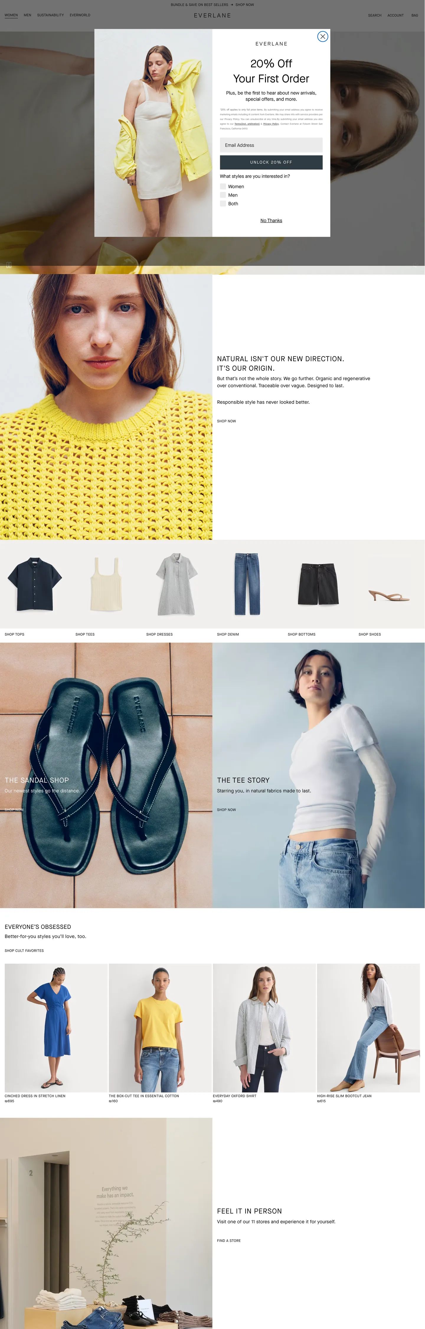
Everlane's storefront reads like a printed garment catalog rendered for the browser. The canvas is a warm off-white (`#faf9f8`) tinted just enough to read as cotton, not screen. Ink is a deep graphite black (`#121212`) used 438 times across text and 434 times across 1px hairlines — never the pure `#000000` that would feel pharmaceutical against the cream. Photography carries every chromatic moment: marled yellow knitwear, dark indigo leather sandals, sun-bleached hero portraits. The chrome stays out of the way, and the only saturated voltage in the entire system is the sky-blue focus ring (`#41a1e6`) that appears around an active text input — a single accessibility moment, not a brand color.
This page packages the storefront into a DESIGN.md file written to the Google Labs open specification. Inside: 20 colors tokens grouped into ink, surface, hairline, and semantic layers; 11 Maison Neue typography roles built around a 12px uppercase nav cap and a 32px hero h2 with `0.48px` tracking; a 4-step radius vocabulary that's effectively two values (`0px` everywhere, `20px` on one pill); a 9-step spacing scale anchored on the site's observed `4px`, `8px`, `12px`, `16px`, `24px`, `32px`, `40px` rhythm extracted from the `--atlas-space-*` CSS variable cascade; and 19 components entries covering the announcement bar, the top nav, the hero overlay, the product tile, the newsletter capture, the 4-up category strip, and the footer link cluster.
Feed the file to Claude, Cursor, or GitHub Copilot and the agent reproduces Everlane's catalog restraint — the `0px` cornered black CTA, the uppercase Maison Neue nav, the warm cream canvas, the single sky-blue focus halo — instead of inventing a generic apparel-template with rounded corners and saturated accents. Reference tokens directly in Tailwind config or CSS variables when you want one specific value; every hex, font, radius, and spacing entry is a quoted literal you can paste into a `theme.extend` block. The reason this system rewards study is that most direct-to-consumer apparel brands ship pill-shaped CTAs and beige accents in pursuit of warmth — Everlane gets warmth from the canvas and the photography, holds every button at `0px`, and lets the garment do the talking.
What makes it distinct
5
- Zero-radius CTA geometryprimary button sits at `0px` corners with `#121212` fill and white text, 47px height with no visible padding inset
- Uppercase nav typographyMaison Neue Book 12px with `0.24px` tracking carries every top-nav link, every category cap, and every footer column header
- Single chromatic momentsky `#41a1e6` appears only on the input focus ring against a `rgba(65, 161, 230, 0.2)` halo; the rest of the chrome is graphite, cream, and white
- Warm off-white canvas`#faf9f8` (atlas-background-main) sits one degree warmer than pure white, signalling cotton and linen over screen pixels
- Two-radius vocabulary`0px` on every interactive surface, `20px` reserved for the announcement-bar dismiss pill; cards default to `0px`, atlas-toolkit cards override to `24px`
everlane.com
Live at everlane.com
A snapshot of the brand in production. Scroll the frame to see the whole page.
Colors
20 colors
Everlane's system runs on #161912 as its primary voltage, used in 1 of 19 components. Type is set in Maison Neue Book across 11 tokens from 10px to 32px, weights 400–600. Shape language is sharp — components average 1px corner radius, favoring crisp rectangles.
Surface
Page and card backgrounds · 4
Text
Headlines, body, captions · 9
Borders & Hairlines
Dividers, outlines, rules · 2
Semantic
Status, errors, success, links · 3
Other
Specialty colors · 2
Typography
11 type tokens
Set in Maison Neue Book across 11 tokens, from 10px to 32px, weights 400–600. Shown in its own stack: where the font isn't installed, the fallback the file names stands in.
- hero-display32px · weight 400 · lh 1.4 · tracking 0.48pxThe quick brown fox jumps over the lazy dog
- display-md24px · weight 400 · lh 1.33 · tracking 0.96pxThe quick brown fox jumps over the lazy dog
- body-lg16px · weight 400 · lh 1.5 · tracking 0.32pxThe quick brown fox jumps over the lazy dog
- body-md16px · weight 400 · lh 1.5 · tracking 0.32pxThe quick brown fox jumps over the lazy dog
- body-sm14px · weight 400 · lh 1.43 · tracking 0.28pxThe quick brown fox jumps over the lazy dog
- nav-link12px · weight 400 · lh 1.3 · tracking 0.24pxThe quick brown fox jumps over the lazy dog
- category-cap12px · weight 400 · lh 1.33 · tracking 0.48pxThe quick brown fox jumps over the lazy dog
- micro-bold12px · weight 600 · lh 1.33 · tracking 0.24pxThe quick brown fox jumps over the lazy dog
- caption10px · weight 400 · lh 1.6 · tracking 0.24pxThe quick brown fox jumps over the lazy dog
- button-md15px · weight 400 · lh 1.2 · tracking 1pxThe quick brown fox jumps over the lazy dog
- input-md12px · weight 400 · lh 1.5 · tracking 0.4pxThe quick brown fox jumps over the lazy dog
Layout
Radii and spacing
6 corner radii and 9 spacing values. Shape language: sharp.
Radii
- none0px
- sm4px
- md8px
- lg20px
- card24px
- full9999px
Spacing
- xxs2px
- xs4px
- sm8px
- md12px
- base16px
- lg20px
- xl24px
- 2xl32px
- 3xl40px
Components
19 components
Each rendered from its tokens (color, type, radius, padding) on Everlane's own canvas.
- Button Primarybutton-primaryButton Primary
- Button Primary Activebutton-primary-activeButton Primary Active
- Button Secondarybutton-secondaryButton Secondary
- Button Textbutton-textButton Text
- Announcement Barannouncement-barAnnouncement Bar
- Announcement Dismissannouncement-dismissAnnouncement Dismiss
- Top Navtop-navTop Nav
- Nav Linknav-linkNav Link
- Hero Overlayhero-overlayHero Overlay
- Hero Subheadhero-subheadHero Subhead
- Category Capcategory-capCategory Cap
- Product Tileproduct-tileProduct Tile
- Product Metaproduct-metaProduct Meta
- Product Meta Muteproduct-meta-muteProduct Meta Mute
- Type here…text-inputText Input
- Type here…text-input-focusText Input Focus
- Hairline Dividerhairline-dividerHairline Divider
- Footer Headerfooter-headerFooter Header
- Footer Linkfooter-linkFooter Link
In use
The system, in use
Everlane's tokens on the kind of product it builds.
Build something people actually use.
A short paragraph of marketing copy that previews how the brand's display tier and body tier read together. Two sentences is usually enough.
FAQ
Everlane design system FAQ
Common questions about Everlane's tokens, components, and how to use this DESIGN.md in your project.
Read next
Related reading
Specs, directories, and component libraries that pair with this design system.
- Browse all design systemsThe full directory of DESIGN.md files on shadcn.io, with live mockups for each.shadcn.io
- Everlane — official siteThe Everlane storefront this DESIGN.md was extracted from on 2026-05-13.everlane.com (opens in a new tab)
- The DESIGN.md specificationGoogle Labs' open spec for machine-readable design system files — the format this page is built on.github.com (opens in a new tab)
Use it
Use Everlane in your project
One machine-readable file. Drop it into Claude, Cursor, or any AI tool that reads DESIGN.md.
Download the DESIGN.md
One machine-readable file: every color, type, radius, spacing, and component token of Everlane.
Feed it to your AI tool
Drop it into Claude, Cursor, or GitHub Copilot. The agent writes React components and Tailwind classes that match Everlane's visual language.
Reference the tokens directly
Or paste the values into your Tailwind config, CSS variables, or component library: every color, size and radius is a quoted, ready-to-copy value.
Read the full DESIGN.md: overview, rationale, do’s and don’ts
Overview
Everlane's storefront is a printed garment catalog rendered for the browser. The canvas runs warm off-white ({colors.canvas} — #faf9f8 declared in --atlas-background-main), the ink is deep graphite ({colors.ink} — #121212) at a text-count of 438 and a border-count of 434, and the only saturated voltage in the entire chrome is a sky-blue focus ring ({colors.focus} — #41a1e6) declared in --atlas-border-focus that appears around active text inputs against a rgba(65, 161, 230, 0.2) halo. There is no second brand color, no decorative gradient, no atmospheric background tint.
Catalog discipline: where most direct-to-consumer apparel brands ship pill-shaped CTAs and a beige or terracotta accent in pursuit of warmth, Everlane ships neither — the primary button is a hard-cornered black rectangle at 0px radius, and the warmth comes entirely from the cream canvas and the studio photography. The chrome reads as confidence by withholding. Unlike the convention of a 6–8px softened CTA on apparel sites, every interactive surface on Everlane holds its right angles, and the only rounded element in the captured chrome is a single 20px-radius pill on the announcement-bar dismiss.
Type runs Maison Neue (Milieu Grotesque) across every role with three weight axes — Maison Neue Book (the workhorse at weight 400), Maison Neue (the display tier at weight 400), and a single Maison Neue Demi appearance at weight 600 for one uppercase micro-label. Nav links sit at 12px / 16px line-height with 0.24px tracking, all uppercase. Hero h2 reaches 32px / 44.8px leading with 0.48px tracking — the largest type in the captured chrome. Body copy at 16px / 24px carries the editorial bands beneath the photography. The tracking values are the signature move: every uppercase role gets a deliberate letter-spacing kick (0.24px on 12px caps, 0.48px on 24px display, 0.96px on 24px campaign text) so the all-caps treatment reads as label, not shout.
Key Characteristics:
- Zero-radius CTA:
{component.button-primary}ships at{rounded.none}(0px) with{colors.ink}(#121212) fill, white text, 47px height, and no internal padding — a hard-cornered rectangle the brand uses as its default action. - Warm off-white canvas:
{colors.canvas}(#faf9f8) sits one degree warmer than pure white, declared in--atlas-background-main; signals cotton fiber rather than screen pixels. - Single chromatic moment:
{colors.focus}(#41a1e6) appears only on input focus rings, scoped to accessibility — never as a CTA fill or heading color. - Uppercase nav typography: every top-nav link, category cap, and footer header runs
{typography.nav-link}(Maison Neue Book 12px uppercase,0.24pxtracking). - Graphite ink, not black:
{colors.ink}(#121212) holds 438 text occurrences and 434 borders; the pure{colors.ink-pure}(#000000) is reserved for the nav-link extraction and 1px hairlines on the announcement bar. - Two-radius vocabulary:
{rounded.none}(0px) on every interactive surface;{rounded.lg}(20px) reserved for the single announcement-dismiss pill. - Tracking as signature:
0.24pxon nav caps,0.48pxon hero display,0.96pxon campaign display — every uppercase role carries a deliberate letter-spacing kick. - Photography carries warmth: marled yellow knitwear, indigo leather sandals, sun-bleached portraits handle every color note in the chrome — pigment is delegated to the garment, not the interface.
Colors
Ink
- Graphite Ink (
{colors.ink}— #121212): frequency 101 (clustered with#161912and#141414). Used as text (50), border (49), bg (2). The dominant body and CTA color — a deep graphite that holds against the cream canvas without going pharmaceutical. - Atlas Ink Primary (
{colors.ink-primary}— #1d1e20): declared in--atlas-heading-text-primaryand--atlas-text-primary. The toolkit-default heading color for atlas-shipped components; appears in modular review widgets and form labels. - Ink Secondary (
{colors.ink-secondary}— #4c4c4c): frequency 14. Used as text (7), border (7). The mid-gray secondary text grade — declared in--atlas-text-secondaryand used for caption tiers and footer fine-print. - Ink Muted (
{colors.ink-muted}— #737373): frequency 26. Used as text (13), border (13). The placeholder color inside the newsletter input — declared in--atlas-text-placeholder. - Pure Ink (
{colors.ink-pure}— #000000): frequency 878. Used as text (438), border (434), gradient (4), bg (2). The top-nav link color and the 1px hairline on the announcement-bar dismiss — the only place pure black appears in the chrome.
Surface
- Canvas (
{colors.canvas}— #faf9f8): the warm off-white default page floor, declared in--atlas-background-main. One degree warmer than pure white, signalling cotton over screen. - Surface Content (
{colors.surface-content}— #ffffff): frequency 107. Used as bg (16), border (45), text (46). The pure-white content fill behind product tiles and the newsletter input — declared in--atlas-background-content. - Surface Chip (
{colors.surface-chip}— #ebebea): frequency 2. Used as bg (1), border (1). The light-gray chip surface for the announcement-bar dismiss pill — declared in--atlas-chat-bubble-background. - Surface Bubble (
{colors.surface-bubble}— #322e2f): declared in--atlas-chat-bubble-text-primary. A near-black surface reserved for the support-chat bubble text layer.
Hairline
- Hairline (
{colors.hairline}— #000000): the 1px black hairline tone — same hex asink-pure, narrated separately because the role is a visible chrome line rather than text. - Hairline Soft (
{colors.hairline-soft}— #ebebea): same hex assurface-chip. The light-gray divider tone between editorial bands and inside footer column splitters.
Brand Voltage
- Focus Sky (
{colors.focus}— #41a1e6): frequency 0 raw, but declared as--atlas-border-focuswith argba(65, 161, 230, 0.2)halo in--atlas-focus-outline-color. The single saturated moment in the chrome, scoped to active text inputs. Layer "brand" per extraction. - Atlas Button Primary (
{colors.atlas-button-primary}— #3f5260): declared in--atlas-button-primaryand--atlas-primary-color. The atlas-toolkit's default primary fill — overridden to#121212on the homepage but present in modular review and form components.
Semantic
- Error (
{colors.status-error}— #be2119): declared in--atlas-text-negative,--atlas-background-error, and--atlas-heading-text-negative. The form-validation error state — appears on shipping-address errors and out-of-stock messaging. - Error Input (
{colors.status-error-input}— #cc3c28): declared in--atlas-input-error. A slightly brighter error tone reserved for input-border error states. - Success (
{colors.status-success}— #518b22): declared in--atlas-background-success. The order-confirmation surface. - Success Text (
{colors.status-success-text}— #366d12): declared in--atlas-text-positive. The order-confirmation text grade. - Caution (
{colors.status-caution}— #fdd926): declared in--atlas-caution-base. Reserved for shipping-delay or back-order warnings.
Inverse
- On Ink (
{colors.on-ink}— #ffffff): white text on the primary CTA and the hero overlay — declared in--atlas-text-primary-inverse.
Typography
Font Family
The system runs Maison Neue (Milieu Grotesque foundry) across every text role, split across three weight axes:
- Maison Neue Book — the workhorse at weight 400. Carries nav links, body, captions, button labels, and input fields.
- Maison Neue (regular) — the display tier at weight 400. Carries 24px and 32px headings and the editorial campaign text.
- Maison Neue Demi — a single weight-600 appearance, scoped to one uppercase 12px micro-label.
There is no separate display family. Maison Neue carries the entire scale with variation by weight axis (Book vs. regular vs. Demi) rather than by absolute weight number — Book and regular both register as weight 400 in the extraction, but the metrics differ.
Hierarchy
| Token | Size | Weight | Line Height | Letter Spacing | Use |
|---|---|---|---|---|---|
{typography.hero-display} | 32px | 400 | 1.4 | 0.48px | Hero h2 (DESTINATION ELSEWHERE) — the largest type in the captured chrome |
{typography.display-md} | 24px | 400 | 1.33 | 0.96px | Editorial campaign text — heaviest tracking in the system |
{typography.body-lg} | 16px | 400 | 1.5 | 0.32px | Hero overlay subhead and editorial body |
{typography.body-md} | 16px | 400 | 1.5 | 0.32px | Default running text (count 4 — appears in product descriptions) |
{typography.body-sm} | 14px | 400 | 1.43 | 0.28px | Footer links and product-meta lines |
{typography.nav-link} | 12px | 400 | 1.3 | 0.24px | Top-nav links — uppercase, the dominant chrome role |
{typography.category-cap} | 12px | 400 | 1.33 | 0.48px | Section markers above editorial bands |
{typography.micro-bold} | 12px | 600 | 1.33 | 0.24px | Single Maison Neue Demi uppercase span — the one bold instance in the chrome |
{typography.caption} | 10px | 400 | 1.6 | 0.24px | Smallest uppercase label tier (count 5) |
{typography.button-md} | 15px | 400 | 1.2 | 1px | Primary CTA label — heaviest tracking on a non-uppercase role |
{typography.input-md} | 12px | 400 | 1.5 | 0.4px | Newsletter input placeholder and value text |
Principles
Display tops out at 32px. The hero h2 (DESTINATION ELSEWHERE) at 32px / 44.8px leading with 0.48px tracking is the largest type in the captured chrome — smaller than the 96px campaign type most apparel brands ship, but tracking carries the editorial weight that absolute size doesn't.
Tracking as signature: every uppercase role in the system carries a deliberate letter-spacing kick — 0.24px on 12px nav caps, 0.48px on 24px display, 0.96px on 24px campaign text, and 1px on the 15px primary-button label. The tracking values scale with size in a roughly linear progression (~2–3% of font size), which is what makes the all-caps treatment read as label rather than shout. Where most apparel brands run uppercase headlines at default 0 tracking and let the weight carry the emphasis, Everlane holds weight at 400 and uses tracking as the typographic muscle.
Note on Font Substitutes
If Maison Neue is unavailable, Söhne (Klim Type Foundry) and Inter are the closest open-source-adjacent substitutes for the sans-serif family — geometry and x-height match within ~3% at body sizes. Preserve letterSpacing: 0.24px on nav caps, 0.48px on hero display, and 0.96px on campaign display when substituting; the tracking values are the signature metric, not the font itself. For the Maison Neue Demi role, Söhne Halbfett or Inter weight 600 are the closest matches.
Layout
Spacing System
- Base unit: 4px, with
--atlas-space-tiny(4px) as the smallest token in the cascade. - Tokens:
{spacing.xxs}2px ·{spacing.xs}4px ·{spacing.sm}8px ·{spacing.md}12px ·{spacing.base}16px ·{spacing.lg}20px ·{spacing.xl}24px ·{spacing.2xl}32px ·{spacing.3xl}40px. - Atlas cascade: the page declares
--atlas-space-4(4px),--atlas-space-8(8px),--atlas-space-12(12px),--atlas-space-16(16px),--atlas-space-20(20px),--atlas-space-24(24px),--atlas-space-32(32px), and--atlas-space-40(40px) — an exact 4px-grid with no half-step exceptions. - Button padding:
0on the primary CTA — the 47px height is achieved by line-height alone, not by internal padding. Atlas-toolkit buttons declare7px 12px(--atlas-button-padding-normal) and5px 12px(--atlas-button-padding-small), but the homepage CTA overrides both. - Input padding:
15px 50px 15px 15pxon the newsletter capture — extra right-side breathing room to accommodate the submit-arrow affordance. - Gutters:
4px(count 33) between product cells in the 4-up category grid; tight, so adjacent tiles effectively touch.
Grid & Container
- Top-nav height:
74px(declared in--header-height). Roughly twice the height of Glossier's 40px nav — Everlane gives the wordmark and the category list more breathing room. - Full-header height:
106px(declared in--full-header-height) including the announcement bar at the top. - Announcement bar:
32px(declared in--announcement-bar-height). A fixed top-of-viewport strip carrying shipping or promotion messaging. - Page width:
120rem(--page-width) — an unusually generous 1920px max-width that lets editorial photography breathe at desktop. - Product grid: 4-up at desktop with
4pxgutters between cells. Each product tile is a hard-cornered rectangle with the garment photograph occupying the full cell width and a 2-line meta stack beneath.
Whitespace Philosophy
The system gives editorial bands generous vertical breathing room (60–80px between sections) and compresses product grids to 4px gutters. The contrast is intentional: the page reads as "open editorial above, dense merchandising below," and the photography carries the visual weight rather than the chrome.
Elevation
The captured chrome runs largely flat. The atlas component toolkit declares several shadow variables — --atlas-shadow-medium (0px 8px 16px 0px rgba(55, 63, 71, 0.2)), --atlas-card-shadow (0px 2px 8px 0px rgba(55, 63, 71, 0.08), 0px 1px 2px 0px rgba(55, 63, 71, 0.12)), --atlas-popover-shadow (0 20px 48px 0 rgba(55, 63, 71, 0.16), 0 12px 24px 0 rgba(55, 63, 71, 0.2), 0 0 12px 0 rgba(55, 63, 71, 0.08)), and --atlas-select-panel-shadow (0px 8px 16px 0px rgba(55, 63, 71, 0.2)) — but these are scoped to atlas-toolkit popovers and select panels, not the homepage chrome.
- Flat (no shadow): body, hero, top nav, every editorial band, every product tile, every category card — 100% of the captured homepage surfaces.
- Atlas popover: the only elevated component in the system, reserved for help-chat dropdowns and account-select panels.
- No card-hover lift: product tiles do not gain a shadow on pointer hover; the title-underline pattern handles state instead.
Shadow absence as discipline: the homepage reads as museum-flat because the chrome refuses elevation. The atlas shadow tokens exist for modal layers, but the merchandising surfaces ship without any ambient lift — depth comes from photography composition and surface separation, not from layered shadows.
Shapes
The radius vocabulary is effectively two values.
{rounded.none}(0px) on every interactive surface: primary CTA, secondary CTA, text input, product tile, hero overlay, top nav, footer cell.{rounded.lg}(20px) on exactly one element: the announcement-bar dismiss pill.{rounded.sm}(4px),{rounded.md}(8px), and{rounded.card}(24px) are declared in atlas tokens (--atlas-chip-border-radius4px,--atlas-button-border-radius8px,--atlas-card-border-radius-small12px,--atlas-card-border-radius-normal24px,--atlas-drawer-border-radius24px) but are overridden to0pxon the homepage chrome.{rounded.full}(9999px) is declared as a fallback token but is not used in the captured chrome.
0px as identity: where the atlas toolkit declares an 8px button radius as default, the homepage chrome overrides every interactive surface back to 0px. The right-angle geometry is a deliberate brand override on top of a softer component library — softening to a 4px or 8px corner anywhere would push Everlane toward the apparel-template aesthetic the system is built to refuse.
Components
Buttons
button-primary — Graphite ink fill ({colors.ink} — #121212) with white text ({colors.on-ink} — #ffffff) and no border. 0px radius, 0 internal padding, 47px height — the height is carried by line-height alone. The default action across the chrome. Where atlas declares an 8px radius and 7px 12px padding for its toolkit buttons, the homepage overrides both.
button-primary-active — The press state. Background flips to {colors.ink-graphite} (#161912). No transform, no shadow change.
button-secondary — White fill ({colors.surface-content}) with ink text and a 1px ink border. Same 0px radius and 47px height. Used for inverse CTAs over photography hero panels.
button-text — Plain ink text, no surface, no border. Underlined on hover. Used for editorial "Shop now" links underneath product tiles.
Top Navigation
announcement-bar — A 32px-tall strip at the top of every page, declared in --announcement-bar-height. Cream canvas fill, ink text in {typography.nav-link} (Maison Neue Book 12px uppercase).
announcement-dismiss — A light-gray pill ({colors.surface-chip} — #ebebea) at {rounded.lg} (20px). The single rounded element in the captured chrome.
top-nav — White surface ({colors.surface-content}), 74px height (declared in --header-height). Everlane wordmark flush left, category nav center, account + bag utilities flush right. No bottom shadow, no hairline separator at rest.
nav-link — Pure-ink text ({colors.ink-pure} — #000000), 12px uppercase Maison Neue Book with 0.24px tracking. No underline at rest, underline on hover.
Hero
hero-overlay — Hero h2 in {typography.hero-display} (Maison Neue 32px / 1.4 / 0.48px tracking) burned into editorial campaign photography. Text color flips to {colors.on-ink} (white) over dark imagery.
hero-subhead — Editorial subhead in {typography.body-md} (Maison Neue Book 16px / 1.5 / 0.32px tracking), also rendered on the overlay against photography.
Editorial
category-cap — Ink uppercase label in {typography.category-cap} (Maison Neue Book 12px / 400 uppercase with 0.48px tracking). Used as section markers above editorial bands like THE SUMMER EDIT.
Product Tiles
product-tile — Cream canvas card ({colors.canvas} — #faf9f8) with 0px corners and no padding. Contains a full-width garment photograph above a 2-line meta stack (product title, regular price).
product-meta — Ink primary body line ({typography.body-sm} — Maison Neue Book 14px / 1.43 leading with 0.28px tracking), used for product titles.
product-meta-mute — Muted gray caption ({colors.ink-muted} — #737373) in {typography.caption} (10px uppercase), used for size or fit descriptors.
Forms
text-input — White surface ({colors.surface-content}), 1px graphite-ink outline ({colors.ink}), 0px radius, 45px height. Padding is 15px 50px 15px 15px — asymmetric right-side to accommodate the submit-arrow affordance inside the field. Placeholder text in {typography.input-md} (Maison Neue Book 12px / 1.5 with 0.4px tracking) at the muted gray ({colors.ink-muted} — #737373).
text-input-focus — The focused state. The 1px outline switches from graphite ink to {colors.focus} (#41a1e6) with a rgba(65, 161, 230, 0.2) outline halo declared in --atlas-focus-outline-color. The single chromatic moment in the captured chrome.
Dividers & Footer
hairline-divider — A 1px line at {colors.hairline-soft} (#ebebea) used between editorial bands. Lighter than the {colors.hairline} token used for input outlines.
footer-header — Pure-ink uppercase label in {typography.nav-link} (Maison Neue Book 12px uppercase) — same role as the top-nav link, reused for footer column headers.
footer-link — Plain ink text in {typography.body-sm} (Maison Neue Book 14px / 1.43 leading). No underline at rest, underline on hover. Dense rows, tight 4px vertical rhythm between links.
Do's and Don'ts
Do
- Hold every interactive surface at
{rounded.none}(0px). The atlas toolkit declares an 8px button radius as default; the homepage overrides it back to 0px for a reason — the catalog metaphor depends on the right angles. - Preserve
letterSpacingon every uppercase role exactly —0.24pxon 12px nav caps,0.48pxon 32px hero display,0.96pxon 24px campaign text,1pxon 15px button labels. The tracking values are the signature metric. - Use
{colors.ink}(#121212) for the primary CTA, never#000000. The graphite holds against the cream canvas; pure black goes pharmaceutical. - Reserve
{colors.focus}(#41a1e6) for input focus rings only. Render it with argba(65, 161, 230, 0.2)outline halo — both values are declared in atlas focus variables. - Lean on photography for warmth and color. The chrome is graphite, cream, and white; every chromatic moment lives in the garment photograph.
Don't
- Don't soften the primary CTA to a 4px or 8px corner — the homepage chrome overrides the atlas default
8pxback to0pxon purpose. A softened CTA would push the brand toward generic apparel-template territory. - Don't use
{colors.ink-pure}(#000000) for body copy — it appears 438 times as text on nav links and 1px hairlines, not on running paragraphs. Body copy and CTA fills sit at{colors.ink}(#121212), the warmer graphite. - Don't drop the tracking values when substituting fonts. The system's typographic identity is the letter-spacing kick on every uppercase role; rendering 12px Inter uppercase at
0tracking produces a different brand entirely. - Don't use
{colors.focus}(#41a1e6) for a CTA fill, a heading color, or a hairline. It is an accessibility token scoped to input focus rings — the moment it spreads to a second component, the focus signal becomes ambient decoration. - Don't add a card-shadow to product tiles. The atlas toolkit declares
--atlas-card-shadowfor popover surfaces, but the homepage merchandising tiles ship flat. A0px 2px 8px rgba(55,63,71,0.08)lift on hover reads as a generic e-commerce theme. - Don't replace the warm canvas (
#faf9f8) with pure white. The one-degree warmth shift is the difference between cotton-fiber catalog and screen-pixel storefront — pure white flattens the photography contrast.
Known Gaps
- Product detail pages (PDP): the homepage tile is captured, but the full PDP typography hierarchy (size selector, fit guide, add-to-bag CTA placement, fabric-composition table) is out of scope.
- Cart drawer and checkout: the bag-count indicator is captured, but the slide-in cart drawer and the full checkout flow are not.
- Transparency / pricing-breakdown pages: Everlane's signature "factory cost vs. retail markup" editorial pages run a separate typographic treatment with a horizontal price-breakdown bar — not represented in this DESIGN.md.
- Loyalty / member area: out of scope; the authenticated chrome isn't captured.
- Hover-state colors: not documented per the global no-hover policy. The actual
:hoverstyling on product tiles is a title-underline thicken; precise color extraction is unreliable. - Form-validation states: the newsletter input is documented at rest; error / success states are declared in atlas tokens but not visible in the captured chrome.
- Full Maison Neue weight ramp: the spec documents weight 400 (Book and regular) and one weight 600 (Demi) micro-label — the Bold and Mono members of the family are not present in the captured homepage chrome.
- International currency picker: the localized site shows USD shipping copy; the full currency-picker dropdown styling is not captured.
E-commerce & Retail
More systems like this
More DESIGN.md files in E-commerce & Retail.
Pricing
Build it with Pro
The DESIGN.md files are free. Pro adds 6,000+ blocks, premium templates and the MCP server, so your AI editor builds in your system for you.
4.9/5 out of 5 · 150+ reviewsfrom 150+ founders and developers.
Billing
Billed once a year in USD. Cancel anytime.
- How many people can use the license.
- Client work, SaaS products and anything you charge for.
- Production-ready React sections: hero, pricing, features, dashboards and more.
- Complete multi-page sites you can ship as they are.
- React icons from every major library, installable with one command.
- Presets that restyle every block, in light and dark.
- Lets your AI editor search, preview and install blocks for you.
- Priority requests are answered first.
Individual
For personal projects & open source
$32instead of $49/mo
$389 billed yearly
- Seats: 1 seat
- Commercial use: Personal & open source only
- Pro blocks: 6,000+ blocks
- Templates: All 14 templates
- React icons: 294k+ icons
- Themes: All 59 themes
- MCP server: Basic usage
- Support: Standard
Team
Most popularFor freelancers, agencies & startups
$66instead of $99/mo
$789 billed yearly · ≈ $13/dev/mo
- Seats: Up to 5 seats
- Commercial use: Included
- Pro blocks: 6,000+ blocks
- Templates: All 14 templates
- React icons: 294k+ icons
- Themes: All 59 themes
- MCP server: High usage
- Support: Priority
Organization
For companies with larger teams
$132instead of $199/mo
$1,589 billed yearly
- Seats: Unlimited seats
- Commercial use: Included
- Pro blocks: 6,000+ blocks
- Templates: All 14 templates
- React icons: 294k+ icons
- Themes: All 59 themes
- MCP server: Unlimited usage
- Support: Priority
Billed once a year in USD. Cancel anytime.
Individual
For personal projects & open source
$32instead of $49/mo
$389 billed yearly
- How many people can use the license.Seats: 1 seat
- Client work, SaaS products and anything you charge for.Commercial use: Personal & open source only
- Production-ready React sections: hero, pricing, features, dashboards and more.Pro blocks: 6,000+ blocks
- Complete multi-page sites you can ship as they are.Templates: All 14 templates
- React icons from every major library, installable with one command.React icons: 294k+ icons
- Presets that restyle every block, in light and dark.Themes: All 59 themes
- Lets your AI editor search, preview and install blocks for you.MCP server: Basic usage
- Priority requests are answered first.Support: Standard
Team
Most popularFor freelancers, agencies & startups
$66instead of $99/mo
$789 billed yearly · ≈ $13/dev/mo
Everything in Individual, plus
- How many people can use the license.Seats: Up to 5 seats
- Client work, SaaS products and anything you charge for.Commercial use: Included
- Lets your AI editor search, preview and install blocks for you.MCP server: High usage
- Priority requests are answered first.Support: Priority
Organization
For companies with larger teams
$132instead of $199/mo
$1,589 billed yearly
Everything in Team, plus
- How many people can use the license.Seats: Unlimited seats
- Lets your AI editor search, preview and install blocks for you.MCP server: Unlimited usage
- Secure checkout via Stripe
- Code lives in your repo
- Keep what you've shipped if you cancel
- License terms
Your system, built for you
Every block, template and icon, installed by your AI agent in your design system. The DESIGN.md files stay free.