Skip to content

Elicit Design System

Elicit's design system layers a serif display face, condensed grotesque body, and mono uppercase labels over a deep teal and off-white canvas. Tokens for React, Next.js, and AI coding tools via DESIGN.md.

Add shadcn.io to your AI agent. · Pro It installs blocks, icons and templates in your design system from a prompt, with Pro.

Set up MCP
Primary
#026370
Typeface
Special Gothic Variable
Shape
Mixed
Base radius
8px
Colors
10
Type tokens
12
Components
15
Spacing values
8

About

About Elicit DESIGN.md

Curated by Dov Azencot · Updated May 18, 2026 · Source elicit.com (opens in a new tab)

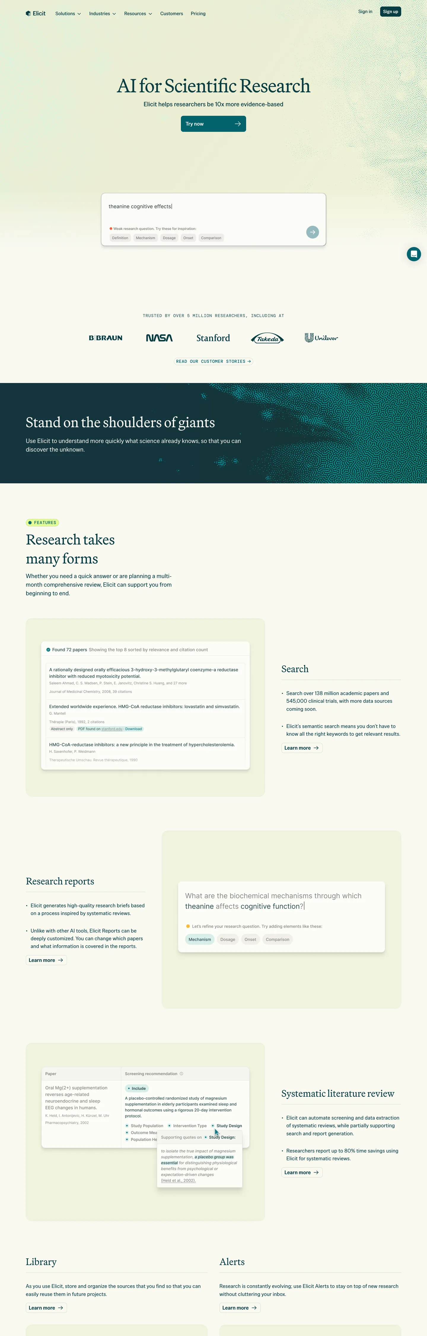
Elicit's marketing page is a library catalog before it is a product page. The hero presents a search field as the primary CTA — not a button, not a headline-led pitch, but a white input field with placeholder text ("e.g., Does zinc improve the duration of the common cold?") sitting in the center of an off-white canvas with institution logos (NASA, Stanford, Cornell, Harvard, Tulane) ranged below. The visual grammar quotes academic search rather than consumer software. Where Semantic Scholar, PubMed, and Google Scholar maintain either institutional austerity or consumer-web flatness, Elicit assembles the typography of a journal — display headlines in Martina Plantijn (a Dutch serif with old-style proportions), body text in Special Gothic Variable (a condensed grotesque that packs information at the column density of a printed abstract), and section labels in DM Mono uppercase (a fixed-width face that reads as archival notation).

The DESIGN.md file packages the system into 10 colors tokens, 12 typography tokens, 7 border-radius steps, 8 spacing values, and 15 components definitions. Color is spare: deep teal (#083d44) runs every surface that isn't the off-white canvas (#fcfcf8), and a single chartreuse accent (#e5ff97) appears as the primary CTA fill and as the "Search" interactive highlight — the only chromatic non-neutral in the system. The teal carries an unusual load: it functions simultaneously as the dark background for the hero band and the "Stand on the shoulders of giants" section, AND as the primary text and border color on the off-white sections below the fold. One hue, two roles.

Feed this file to an AI coding tool and it reproduces Elicit's specific moves: off-white parchment instead of pure white, deep teal as both text and background depending on section context, three-typeface stratification by semantic role, and chartreuse reserved for the single most important interactive moment on each section. The system rewards attention if you're building a research, documentation, or data-extraction product that needs to signal credibility through typographic precision rather than through gradient fills and illustration.

What makes it distinct

5

  1. Three-typeface systemMartina Plantijn serif for display, Special Gothic Variable grotesque for body, DM Mono uppercase for labels; each occupies a non-overlapping typographic tier
  2. Deep teal (#083d44) as structural inkused for text (113), bg (55), and border (113), functioning simultaneously as the darkest canvas and the primary text color
  3. Chartreuse accent (#e5ff97)acid-bright against the teal and cream surfaces; the only non-neutral brand color in the system, used for CTAs and interactive highlights
  4. Off-white canvas (#fcfcf8) with a barely-perceptible warm tintthe system's parchment substitute for academic publishing aesthetics
  5. Library-search UI archetypethe hero section contains a search-input field and database-count display rather than a standard headline-plus-CTA pattern

elicit.com

Live at elicit.com

A snapshot of the brand in production. Scroll the frame to see the whole page.

Elicit's website at elicit.com

Colors

10 colors

Elicit's system anchors on #026370 (primary) as its primary color. Type is set in Special Gothic Variable across 12 tokens from 14.4px to 64px, weights 400–600. Shape language is mixed across 15 components, blending pills, soft rounds, and squarer corners.

Brand & Accent

Sparing, CTA-only voltage · 2

Surface

Page and card backgrounds · 3

Text

Headlines, body, captions · 3

Borders & Hairlines

Dividers, outlines, rules · 2

Typography

12 type tokens

Set in Special Gothic Variable across 12 tokens, from 14.4px to 64px, weights 400–600. Shown in its own stack: where the font isn't installed, the fallback the file names stands in.

  • display-xl64px · weight 400 · lh 76.8px · tracking -1.28pxThe quick brown fox jumps over the lazy dog
  • display-lg48px · weight 400 · lh 64.8px · tracking -0.24pxThe quick brown fox jumps over the lazy dog
  • display-md32px · weight 400 · lh 42.24pxThe quick brown fox jumps over the lazy dog
  • heading-lg27.2px · weight 400 · lh 34px · tracking 0.1pxThe quick brown fox jumps over the lazy dog
  • heading-md20.8px · weight 400 · lh 29.12px · tracking 0.1pxThe quick brown fox jumps over the lazy dog
  • body-lg20px · weight 400 · lh 29px · tracking 0.15pxThe quick brown fox jumps over the lazy dog
  • body-md17.6px · weight 400 · lh 26.4px · tracking 0.25pxThe quick brown fox jumps over the lazy dog
  • body-sm16px · weight 400 · lh 24px · tracking 0.15pxThe quick brown fox jumps over the lazy dog
  • body-xs15.2px · weight 400 · lh 21.28px · tracking 0.15pxThe quick brown fox jumps over the lazy dog
  • label-mono14.4px · weight 500 · lh 18.72px · tracking 0.72pxThe quick brown fox jumps over the lazy dog
  • serif-accent48px · weight 400 · lh 33.6px · tracking -0.96pxThe quick brown fox jumps over the lazy dog
  • nav-label16px · weight 600 · lh 24pxThe quick brown fox jumps over the lazy dog

Layout

Radii and spacing

7 corner radii and 8 spacing values. Shape language: mixed.

Radii

  • none0px
  • sm6px
  • md8px
  • lg12px
  • xl16px
  • 2xl20px
  • pill100px

Spacing

  • xs4px
  • sm6px
  • md8px
  • base10px
  • lg16px
  • xl24px
  • 2xl32px
  • 3xl48px

Components

15 components

Each rendered from its tokens (color, type, radius, padding) on Elicit's own canvas.

  • Button Primary
    button-primaryButton Primary
  • Button Secondary
    button-secondaryButton Secondary
  • Top Nav
    top-navTop Nav
  • Nav Link
    nav-linkNav Link
  • Hero Heading
    hero-headingHero Heading
  • Section Heading
    section-headingSection Heading
  • Body Paragraph
    body-paragraphBody Paragraph
  • Section Label
    section-labelSection Label
  • Search Input
    search-inputSearch Input
  • Card
    cardCard
  • Card Teal
    card-tealCard Teal
  • Card Sage
    card-sageCard Sage
  • Hero Band
    hero-bandHero Band
  • Timestamp
    timestampTimestamp
  • Institution Logo
    institution-logoInstitution Logo

In use

The system, in use

Elicit's tokens on the kind of product it builds.

Build something people actually use.

A short paragraph of marketing copy that previews how the brand's display tier and body tier read together. Two sentences is usually enough.

Get startedLearn more
Marketing heroHeadline, sub-copy, primary CTA — the universal homepage opener.
Reporting · 14 min read

The quiet collapse of an old idea

For decades the consensus held that the system would correct itself. Then it didn't. This is the inside story of what changed, told by the people who watched it unravel.

"Nobody noticed because the failure was indistinguishable from progress."

By Sam Reporter · Updated 2 hours ago

Editorial articleMagazine-style longform with display headline.

FAQ

Elicit design system FAQ

Common questions about Elicit's tokens, components, and how to use this DESIGN.md in your project.

Read next

Specs, directories, and component libraries that pair with this design system.

Use it

Use Elicit in your project

One machine-readable file. Drop it into Claude, Cursor, or any AI tool that reads DESIGN.md.

Download DESIGN.md
  1. Download the DESIGN.md

    One machine-readable file: every color, type, radius, spacing, and component token of Elicit.

  2. Feed it to your AI tool

    Drop it into Claude, Cursor, or GitHub Copilot. The agent writes React components and Tailwind classes that match Elicit's visual language.

  3. Reference the tokens directly

    Or paste the values into your Tailwind config, CSS variables, or component library: every color, size and radius is a quoted, ready-to-copy value.

Read the full DESIGN.md: overview, rationale, do’s and don’ts

Overview

Elicit's design surface does not read as a startup's marketing page — it reads as a scholarly journal's index page crossed with a library catalog. Archival stratification. Three typefaces occupy three non-overlapping semantic registers: Martina Plantijn (a Dutch serif with old-style proportions) for display headlines that frame the research proposition, Special Gothic Variable (a condensed grotesque that packs text at the density of academic abstracts) for all body reading, and DM Mono for section labels and timestamps in uppercase — archival notation rather than UI chrome. The combination has no parallel in the AI research-tools category, where Consensus, Semantic Scholar, and Perplexity reach for standard sans-serif stacks and consumer-web spacing.

Color operates with similar constraint. Deep teal (#083d44) carries a dual load: it is the primary text color on the off-white canvas AND the full-bleed section background for the hero band and the "Stand on the shoulders of giants" section. The only departure from teal-and-off-white is chartreuse (#e5ff97) — an acid lime that marks the primary search button and the single interactive highlight per section. Where most research tools use navy or blue as the brand color, Elicit's teal reads more as an aged verdigris than as a technology signal.

Key Characteristics:

  • Deep teal (#083d44) runs simultaneously as text ink (113 occurrences), background fill (55), and border (113) — one hue, three structural roles.
  • Chartreuse (#e5ff97) is the sole chromatic accent; it appears 8 times total, always marking the primary interactive moment on each section.
  • Off-white canvas (#fcfcf8) with a faint warm tint — the parchment equivalent in a primarily digital system.
  • Three-typeface stratification: serif for display, condensed grotesque for body, mono for labels — each occupying a distinct tier with no overlap.
  • Hero section positions a search input field as the primary conversion element rather than a button CTA.
  • Institution logos (NASA, Stanford, Cornell, Harvard, Tulane) appear in their native rendering — not flattened to monochrome — as social proof for the academic audience.
  • No shadow tier; card separation comes from hairline borders and surface-color shifts.

Colors

Structural

  • Deep Teal (#083d44 — frequency 281): Used as text (113), bg (55), border (113). The structural spine of the system — simultaneously the darkest background tone, the primary text color, and the hairline border. The extraction merged a near-match dark teal variant into this cluster. No other system in the design directory uses the same hex value for both dark-mode backgrounds and light-mode text.
  • Canvas (#fcfcf8 — frequency 160): Used as text (60), bg (39), border (60). The parchment-tinted off-white; merged from #ffffff and #f6f8f8 in extraction. The warm tint is the critical difference from pure white — it grounds the academic aesthetic.
  • Pure Black (#000000 — frequency 1377): Used as text (685), border (685), shadow (7). The hairline and text color at maximum; appears at full opacity on borders and at near-full opacity on running text. The high frequency reflects the system's comprehensive border usage across card components.
  • Link Blue (#0000ee — frequency 340): Used as text (170), border (170). Browser-default hyperlink blue, retained without override — an unusual choice that reinforces the academic document aesthetic, where link color is considered a navigational affordance rather than a brand opportunity.
  • Ink Deep (#09272b — frequency 1): The darkest teal variant; appears in one section background as a depth stop.

Brand

  • Primary Teal (#026370 — frequency 28): Used as text (7), bg (13), border (7), gradient (1). The mid-range teal between the structural deep teal and the lighter gradient stops. Appears in section backgrounds, feature card fills, and the gradient band transitioning between dark and light sections.
  • Accent Chartreuse (#e5ff97 — frequency 8): Used as text (1), bg (5), border (1), gradient (1). The system's single chromatic accent — acid lime against the teal and off-white. The primary search button fill and the interactive highlight on the "Start for free" CTA section.

Surfaces

  • Surface Sage (#f3f6e4 — frequency 9): Used as bg (9). A warm sage-tinted off-white that differentiates certain card backgrounds from the main canvas without introducing a new hue register. Appears in the feature breakdown section.
  • Surface Cool (#e8eced — frequency 9): Used as bg (9). A slightly blue-gray off-white for cool-tinted card surfaces in the "Research takes many forms" section.

Typography

Font Families

Martina Plantijn Regular — a serif with Dutch old-style proportions — handles the display headline tier at 32-64px, weight 400. It carries the hero h1 and the major section feature headlines. This is the visual anchor that signals scholarly publishing over consumer tech. Special Gothic Variable (a condensed grotesque) runs all body text from 15.2-27.2px at weight 400. Its condensed x-height packs academic-density information into columns narrower than standard sans-serif systems. DM Mono at 14.4px weight 500 uppercase runs section labels, timestamps, and section category markers. Crimson Pro (a second serif) appears in one isolated decorative pull-quote element at 48px. Inter appears for exactly one button — the skip-to-content accessibility link — but is otherwise absent from the visible UI.

Hierarchy

TokenSizeWeightLine HeightUse
display-xl64px40076.8pxHero h1 ("AI for Scientific Research")
display-lg48px40064.8pxFeature section display headlines
display-md32px40042.24pxSub-section h3 display
heading-lg27.2px40034pxCard heading — h3
heading-md20.8px40029.12pxCompact card heading
body-lg20px40029pxHero sub-paragraph
body-md17.6px40026.4pxDefault running text
body-sm16px40024pxCompact prose
body-xs15.2px40021.28pxCaption-level prose
label-mono14.4px50018.72pxSection labels, timestamps (uppercase)
serif-accent48px40033.6pxDecorative pull-quote element
nav-label16px60024pxPrimary button label only

Principles and Substitutes

The three-typeface system is the hardest element to replicate. Martina Plantijn is not freely licensed; EB Garamond from Google Fonts carries the closest old-style serif proportions at display sizes. Special Gothic Variable (from Google Fonts) is available but requires variable-font support; Barlow Condensed at weight 400 is a non-variable fallback. DM Mono is freely available on Google Fonts.

Layout

The page uses a centered editorial column (~1200px max width) with section-level alternation between teal dark bands and off-white light bands. Internal content switches between single-column text, two-column text-plus-interface-screenshot, and three-column feature card grids.

  • Base spacing unit: 10px (high frequency at 101 occurrences in the extraction).
  • Card padding: spacing.lg (16px) for standard cards; spacing.xl (24px) for dark-teal feature cards.
  • Section vertical rhythm: spacing.3xl (48px) minimum between major sections.
  • Hero layout: search input centered in a single column, with institution logos ranged below in a horizontal trust bar.

The section-alternation rhythm (off-white → teal dark → off-white → teal dark) creates a chapter-break effect that maps to academic document structure more than to standard SaaS landing-page flow. Each band change marks a thematic shift in the research capability being demonstrated.

Elevation

No shadow tier exists in the system. Card separation on the off-white canvas uses 1px near-black hairlines at 8-12px radius. Cards on the teal dark sections use the same hairline but in the canvas off-white tone. The single elevation effect is the transition between the off-white canvas sections and the full-bleed teal bands — the abrupt color switch creates perceived depth through contrast rather than through any shadow or blur technique.

Shapes

The radius scale runs from sharp (0px for the primary button) to pill (100px for category tags):

  • rounded.none (0px) — the primary CTA button. The accessibility skip-link button and the primary search call-to-action use fully squared corners — a deliberate anti-consumer-UI choice that reads as form-over-function.
  • rounded.sm (6px) — minor UI elements, small chips.
  • rounded.md (8px) — search input fields and standard interactive inputs.
  • rounded.lg (12px) — default feature cards and content tiles.
  • rounded.xl (16px) — larger surface cards.
  • rounded.2xl (20px) — featured highlight cards.
  • rounded.pill (100px) — category tag filters (full pill on short text elements).

The 0px primary button is the system's most distinctive shape signal. At 44px height with squared corners, the chartreuse-filled search button reads closer to a database query submit button than to a consumer-app CTA. This is not a rounding omission — it is the archival aesthetic applied to interactive surfaces.

Components

button-primary — Chartreuse (#e5ff97) fill, deep teal text in Inter 16px weight 600, squared corners (0px radius), 12x24 padding, 44px height. The primary search button in the hero. Squared corners on a bright accent fill inverts the category convention — most systems pair high-saturation fills with generous rounding.

button-secondary — Deep teal fill, canvas-white text, DM Mono uppercase, squared corners. The "Start for free" variant and dark-section secondary CTAs.

top-nav — Deep teal background, canvas-white text in Special Gothic Variable 16px, 32px horizontal padding, 48px height. The nav reverses the canvas-and-ink order immediately, setting the teal-dominant tone before the off-white hero begins.

nav-link — Transparent, canvas-white text at 16px, 6x10 padding. No hover state captured. Links in the teal nav have no underline treatment — they rely on position and color to signal navigability.

hero-heading — Martina Plantijn 64px weight 400, -1.28px tracking, deep teal on canvas. The single h1 instance on the page.

section-heading — Martina Plantijn 48px weight 400, -0.24px tracking. Used for major feature section headlines ("Research takes many forms," "Stand on the shoulders of giants").

body-paragraph — Special Gothic Variable 17.6px weight 400, 0.25px tracking, deep teal. The default running text throughout off-white sections.

section-label — DM Mono 14.4px weight 500 uppercase, 0.72px tracking, deep teal. Used for section category markers ("TRUSTED BY OVER 5 MILLION RESEARCHERS", feature category timestamps). The uppercase mono label is the system's archival notation signal.

search-input — Canvas off-white fill, deep teal text, 17.6px Special Gothic Variable, 8px radius, 14x16 padding, 48px height, 1px pure black border. The hero's central conversion element; sits in an off-white field against the off-white canvas so only the border defines its boundaries.

card — Canvas off-white fill, 1px deep teal hairline border, 12px radius, 16px internal padding. The default feature card on light sections.

card-teal — Deep teal fill, canvas-white text, 12px radius, 24px padding. Used for the "Research experts" interactive demo cards in the dark section band.

card-sage — Sage-tinted off-white (#f3f6e4) fill, deep teal text, 12px radius, 16px padding. Appears in the feature breakdown section to differentiate feature cards from the main canvas.

hero-band — Full-bleed deep teal background, canvas-white text, 48x32 padding. The "Stand on the shoulders of giants" section and the hero section band. Background depth tier 1.

timestamp — DM Mono 14.4px weight 500 uppercase, deep teal. Used for timestamps and archival date markers (e.g., "ESTABLISHED 2021").

institution-logo — Transparent background, native-color logo rendering, 5x10 padding. Institution marks (NASA, Stanford) are NOT flattened to monochrome — their native colors are retained as credibility signals.

Do's and Don'ts

Do maintain the three-typeface role stratification: Martina Plantijn only at display sizes (32px+), Special Gothic Variable for all body reading, DM Mono only for labels and timestamps in uppercase. Crossing these role boundaries — running Special Gothic Variable at 48px as a headline, or DM Mono as body text — breaks the archival grammar the system is built on.

Do retain the raw browser-default link blue (#0000ee) for inline hyperlinks. The system deliberately does not override it, because academic documents treat hyperlink color as a navigational convention rather than a brand opportunity. Replacing it with teal or chartreuse would import a startup-brand signal into the scholarly register.

Do use the full-bleed deep teal band format for major section transitions. The abrupt teal-to-off-white alternation is the page's chapter-break mechanism — it does the organizational work that a fintech system would do with numbered sections or ruled lines.

Do keep the primary CTA button at 0px border radius. The squared chartreuse button is the system's most distinctive shape signal. Rounding it to 8px or 12px imports a consumer-app vocabulary that conflicts with the archival precision of the rest of the system.

Don't use chartreuse (#e5ff97) as a section background or decorative fill. Its role is strictly as an interactive fill for the primary action on each section — one per section, not more. Used as a background, the acid lime competes with the teal and loses the scarcity that makes it function as a highlight.

Don't use deep teal (#083d44) as a button fill on the off-white canvas. Its 113 occurrences are all as text and hairline border — the secondary button is the only teal-filled interactive element, and it lives in teal-background sections where the contrast reversal reads correctly. On an off-white canvas, a teal button reads as a text block rather than as an action.

Don't introduce a shadow tier on card components. The 0-shadow constraint is deliberate — the system achieves separation through hairline borders and surface-color switching between off-white, sage, and cool-gray. Adding drop shadows would introduce a consumer-web softness that conflicts with the archival document aesthetic.

Don't flatten institution logos to monochrome. The design retains native logo colors (NASA's meatball, Harvard crimson, Cornell red) as an explicit credibility signal to academic users. Forcing monochrome white or teal treatment would register as brand suppression to the exact audience that recognizes these marks.

Known Gaps

  • Interactive states: the search input's focus ring, error state, and filled state are not captured. The search is the primary conversion element and its interaction states are critical to the UX.
  • Dark mode: the system has no dark-mode variant documented here. The teal background sections are not a dark mode — they are full-bleed content sections. A true dark mode would require a complete surface inversion.
  • Mobile layout: the desktop-1440px layout is captured. The column collapse from two-column and three-column grids to single-column mobile layout is not documented.
  • Typography variable font ranges: Special Gothic Variable supports a width axis in addition to size. The marketing surface uses a single condensed width setting, but the full variable axis range is not explored or documented here.
  • Hover states: no hover behavior for navigation links, card interactions, or button press states is captured from the marketing surface.
  • Deep product UI: the research extraction interface, document summarization panels, and literature-map visualization are not represented here. This file captures the marketing surface only.
  • Accessibility contrast on sage surfaces: the sage (#f3f6e4) card background paired with deep teal (#083d44) text — verify WCAG AA compliance before using at small text sizes.

AI & LLM Platforms

More systems like this

More DESIGN.md files in AI & LLM Platforms.

Pricing

Build it with Pro

The DESIGN.md files are free. Pro adds 6,000+ blocks, premium templates and the MCP server, so your AI editor builds in your system for you.

4.9/5 out of 5 · 150+ reviewsfrom 150+ founders and developers.

Billed once a year in USD. Cancel anytime.

Individual

For personal projects & open source

$32instead of $49/mo

$389 billed yearly

  • How many people can use the license.Seats: 1 seat
  • Client work, SaaS products and anything you charge for.Commercial use: Personal & open source only
  • Production-ready React sections: hero, pricing, features, dashboards and more.Pro blocks: 6,000+ blocks
  • Complete multi-page sites you can ship as they are.Templates: All 14 templates
  • React icons from every major library, installable with one command.React icons: 294k+ icons
  • Presets that restyle every block, in light and dark.Themes: All 59 themes
  • Lets your AI editor search, preview and install blocks for you.MCP server: Basic usage
  • Priority requests are answered first.Support: Standard

Team

Most popular

For freelancers, agencies & startups

$66instead of $99/mo

$789 billed yearly · ≈ $13/dev/mo

Everything in Individual, plus

  • How many people can use the license.Seats: Up to 5 seats
  • Client work, SaaS products and anything you charge for.Commercial use: Included
  • Lets your AI editor search, preview and install blocks for you.MCP server: High usage
  • Priority requests are answered first.Support: Priority

Organization

For companies with larger teams

$132instead of $199/mo

$1,589 billed yearly

Everything in Team, plus

  • How many people can use the license.Seats: Unlimited seats
  • Lets your AI editor search, preview and install blocks for you.MCP server: Unlimited usage
  • Secure checkout via Stripe
  • Code lives in your repo
  • Keep what you've shipped if you cancel
  • License terms

Your system, built for you

Every block, template and icon, installed by your AI agent in your design system. The DESIGN.md files stay free.

Get Pro